10,000 search results
(0.026 seconds)
- DT Meman by DT Foundry,
$25.00 Meman is a practical sans serif that was enthusiastic about adding details to have more personality compared to a neo-grotesque typeface. The typeface was crafted between the concepts of mechanical oval forms and serpentine curves, with the help from open terminals, contrast joints. These 2 concepts are very different, but they balanced each other to help remain the neutral feeling as a whole. Many details are optimized so that on small scales, Meman has nothing special. But when use on bigger scales, letters are revealed to have been dived in visual flourishes, such as the "e". Also, to avoid broken fragments and remain neutral, some details were converted to alternatives. Meman has 9 upright weights (from Thin to Black), and some OpenType features like fractions, ligatures, custom decorative icons, and alternatives for "A", "E", "V", "Z", ... or "a". There are more than 660 glyphs, which support a wide range of Latin languages, including Vietnamese. For usability, the typeface was balanced and versatile, it can be pinned up as a headline or logo, and can still blend in a small paragraph.
 - Rapid Writing by Misprinted Type,
$38.00 Rapid Writing is based on the Rapid and Muscular Methods of writing, where the whole arm instead of the wrist is used to write. Copybooks and vertical writing fostered form at the expense of freedom. Speed and muscular movement have fostered freedom at the expense of form. This font is based upon form and movement and brings spontaneity and freedom to calligraphy! The font is full contrast, swashes, round forms, ligatures, contextual alternates and other surprises. OPENTYPE FEATURES • 34 Contextual Alternates • 32 Standard Ligatures • Several Stylistic Alternates (2 options for A-Z/0-9) • Ending Swashes (Each character (A-Z) has up to 12 swash endings) Not to mention the font has 710 glyphs. HOW TO USE THE ENDING SWASHES It’s very simple! Simply write the word+ > (greater symbol). For example: Typography> Typography>> Typography>>> etc. After each “>” you get a different ending swash for each character. So there are lot’s of different combinations and alternatives to suit your needs! The font also comes with a PDF Manual. If you have any questions, please get in touch at hello@eduardorecife.com
 - #NAME? by OtherwhereCollective,
$29.00 -OC Format Sans is the third incarnation of this geometric grotesk sans serif which fuses the style of Futura with the rhythm and proportions of Akzidenz. It comes in two styles, standard and a new Print family where crisp sharp edges have been made blunt in reference to the ink spread that occurs when printing on uncoated paper stock. It can give digital media a softer more approachable analog aesthetic. Typical of both grotesk and geometric styles the design has an even weight with minimal stroke contrast and the slanted form is an oblique rather than a true italic. The default double-story �a� and �g� give an academic touch, the single story versions of Set 1 are more friendly and approachable while Set 2 changes the look into something more scientific. Made with tireless attention to detail and kerning it's perfect for logotypes and extensive text, supports multiple languages and comes with a plethora of OpenType features including standard and discretionary ligatures, social icons, symbols, and multiple figure styles including roman numerals.
 - Canting by Omotu,
$16.00 Canting is a decorative serif font. It perfectly represents vintage esthetics in a modern and minimalist way. The font includes special uppercase letters and alternate characters. The font is perfect for elegant logo design, product packaging, quotes, poster design, brand identity, lettering, and many more. What's Include? 1. Uppercase characters with 3 styles (regular, outline, and rough) 2. Supports international languages 3. Opentype features: stylistic alternates with beautiful swashes 4. Accessible in the Adobe Illustrator Glyphs panel, or under Stylistic Alternates in the Adobe Photoshop OpenType menu, Adobe InDesign, Corel Draw, even work on Microsoft Word. 5. TTF and OTF files PUA Encoded Characters - Fully accessible without additional design software. Don't forget to visit our other products: Crown: https://fontbundles.net/omotu/218250-crown Sweet Candy: https://fontbundles.net/omotu/200017-sweet-candy Alitta: https://fontbundles.net/omotu/194813-alitta Sattay: https://fontbundles.net/omotu/188296-sattay Thanks for looking, and I hope you enjoy it! Please don't hesitate to drop me a message if you have any issues or queries. Regards, Omotu (ibnu.blawong2@gmail.com)
 - Diad by Andinistas,
$29.95 Diad was born on 2000 in order to design posters about second World War. The original idea was obtained by breaking, burning and getting wet a bunch of written copies with an old writing machine. Today, Diad is a small typographic system useful for bringing relevance to any content with a grunge look. Each and every detail passed through a strict experimentation process. Its outrageous and unconventional spirit travels from high leveled corrosion, up to a delicate visual neglect. Diad 2 and 3 work for designing words. Diad 1 is ideal for long phrases and titles. Diad dingbats includes 26 illustrations about motocross. In total, adding Diad 1,2 and 3, it has around 260 glyphs. Diad will make your design shine providing different graphic atmospheres, optimizing time and work to its users. Diad is perfect for graphic design on contexts such as death metal, drum and bass, films, war and horror video games. It could work also for logos, words, titles and short texts in covers, tags, clothes, wraps, cards, stickers, toys, bicycles, surf boards, etc.
 - P22 Preissig Calligraphic by P22 Type Foundry,
$29.95 P22 Preissig Calligraphic was originally designed by Czech typographer, artist, and designer Vojtěch Preissig (1873–1944). Preissig developed this type design in 1928 and has remained unpublished until recently. One can only speculate why this wonderful design was never produced into a commercially available typeface. His original designs feature an accompanying italic as well as small caps. Preissig had originally named the typeface design after his former employer in New York, Butterick Publishing Co. The ‘Butterick’ typeface retains the angularity of his previous typeface, Preissig Antiqua (AKA P22 Preissig Roman), but displays a more fluid calligraphic influence. P22 Preissig Calligraphic was started shortly after Richard Kegler saw the original drawings in an exhibit in Prague in 2004. A sympathetic security guard allowed a few photographs and the contraband images fueled a development of the typefaces. The design simmered for many years and is now ready to enter the world of contemporary design. P22 Preissig Calligraphic is a 2 font family that contains the originally designed small caps as an OpenType feature, as well as all the necessary diacritical to cover most European languages.
 - Ways by Fontfabric,
$30.00 Born at a crossroads, the collaborative sans family of 18 styles Ways is the latest arrival in our portfolio. The name is no coincidence, as Ways pulls out all the stops to bring you excellent legibility. Combined with brutal and elegant details for a distinct humanist flair, this sans offers perfect functionality across all weights. Visual compensations, extra white space, wider apexes, subtle tweaks, and moderate inktraps distinguish Ways among similar typefaces. Use over 690 glyphs, extended Latin and Cyrillic support, extensive OT features set, icon set of more than 60 navigation pictograms, and one variable style, to design full-fledged signage systems that get you from point A to point B without relying on G-Maps. Family overview: 9 weights (from Thin to Black) + italics Extended Latin Cyrillic 690+ glyphs languages 1 variable font (2 axes) 1 free font - Ways SemiBold OpenType Features: Localized Forms Standard Ligatures Contextual Alternates Lining Figures Tabular Figures Subscript Scientific inferiors Superscript (Superiors) Numerators Case-Sensitive Forms Standard and Discretionary Ligatures Stylistic Alternates Contextual Alternates
 - Goodrich by Hendra Pratama,
$15.00 WARNING! Roughed version is quite heavy to open. Highly recommended to install the font without previewing it first. GOODRICH come in 2 different styles, with same character; Bold & Strong, and can evoke a different emotions. It comes in both clean and rough styles in only Uppercase Latin characters. When choosing a font, it’s important to consider the visual theme of your design. A clean bold fonts can lend a more stronger tone to your design, making it a great choice for Logo or Title. On the other hand, a textured fonts can lend a more natural printed-looks, making them perfect for designing 70s-80s themed parties. It can be used for various design purposes ; Posters, Logos, Packaging, Books or Movie Titles. In summary, these fonts are versatile and can add a unique look to any design project. If you want to add a touch of nostalgia and elegance to your designs, these fonts were timeless asset. With plenty of vintage and retro design resources available, it’s easy to find the perfect ideas for your next project.
 - Delphi by Positype,
$22.00 Delphi grew from a logotype Lily Feinberg produced using Greek-column-inspired letterforms. As that concept expanded to include more and more letters, the typeface had its beginnings. Intertwined, kinetic, and deliberate, Delphi carves itself onto the page and screen, encouraging variation and experimentation. The letterforms’ unique construction and predispostion for experimentation inspired two varying sets: Delphi Dio, comprised of two-line strokes, and Delphi Tria, built of both 2- and 3-line strokes. With a design as elaborate, yet tightly tuned as this, the desire to add more and more was irresistible—you'll see a number of stylistic, swash, and titling alternates (and even more hidden away in further stylistic sets). Because Dio and Tria could only hold so much, alternate cuts were produced to better organize your options: the Delphi Alt fonts feature certain letter styles and stylistic alternate sets distinct from those in Delphi. Delphi’s sophisticated, striking letterforms make it an ideal display face for use at large sizes, and with so many unique details and alternate letterforms, it’s simply fun to use.
 - Ragazza Script by Latinotype,
$79.00 Ragazza Script isn’t just another display typeface. It honors the greatest handwriting skills but in a different way. Although It doesn't represent any traditional calligraphy style, it is still part of that expressive world. With more than 1000 glyphs, and taking advantage of the Opentype features, Ragazza is full of personality. When in use, it gives a feel very close to ornamental Copperplate mixed with some kind of modern 'high-contrast' typeface. Lots of alternates, swashes and initial capitals are the spine of this face, assuring almost infinite combination possibilities. The early forms that would eventually lead to what Ragazza is today, began as a college project –around 2006– in the context of the 'Hyperfuente' exercise developed during Typography 2, chair E. Longinotti, at the University of Buenos Aires. But that seed would never stop growing. Since then a lot of work had been made to take that initial project to a professional quality level. Ragazza Script is perfect for headlines and short phrases. It is the brand new modern script, designed by Guille Vizzari and published by Latinotype.
 - Core Sans DS by S-Core,
$20.00 Core Sans DS is a rounded version of Core Sans D and a modern interpretation of condensed sans-serif typeface designed by S-Core and the whole family consists of 2 widths (Condensed, Normal), 7 weights (Thin, Light, Regular, Medium, Bold, Heavy, Black) with their corresponding italics. Core Sans DS features a condensed geometric construction and has a large x-height which enhances legibility. The family is ideal for signage, headline as well as body text. Core Sans DS is a part of the Core Sans Series such as Core Sans N SC, Core Sans N, Core Sans NR, Core Sans M, Core Sans G,Core Sans A, Core Sans GS and Core Sans ES. Letterform in this type family is simple, clean and highly readable. The spaces between individual letter forms are precisely adjusted to create the perfect typesetting. Core Sans DS supports complete Basic Latin, Cyrillic, Central European, Turkish, Baltic character sets. Each font includes proportional figures, tabular figures, numerators, denominators, superscript, scientific inferiors, subscript, fractions and case features.
 - Elbflorenz by RMU,
$35.00 Another jewel of the vast treasure of historical font designs was digged out and brought to life again. Due to the courtesy of the Quay Brothers, London, who yielded to me an age-old brochure of Albert Auspurg’s ‚Miami‘, released by Schriftguss in 1934, I was able to redesign this elegant font. This font which I called ‚Elbflorenz‘, a cognomen for Dresden, contains West and Central European type faces as well as those for Romanian and Turkish. To get access to the historical number sign please use either the OT feature additional ligatures or ordinals.
 - Fosho by Chank,
$49.00 For more than 70 years the 10-foot tall letters displaying the word FOSHAY have illuminated the Foshay Tower in the Minneapolis skyline. However, the typestyle has never been made into a font before. This new modern font family, dubbed Fosho Book, is optimized for book print usage as well as functioning as big bold display type on screen. The Fosho fonts are available in three styles: Outlines, Dotted Bulb Inlines and Composite with both. You can use the three styles in overlapping colors for dramatic chromatic effects.
 - Trade Gothic by Linotype,
$42.99 The first cuts of Trade Gothic were designed by Jackson Burke in 1948. He continued to work on further weights and styles until 1960 while he was director of type development for Mergenthaler-Linotype in the USA. Trade Gothic does not display as much unifying family structure as other popular sans serif font families, but this dissonance adds a bit of earthy naturalism to its appeal. Trade Gothic is often seen in advertising and multimedia in combination with roman text fonts, and the condensed versions are popular in the newspaper industry for headlines.
 - Munky by It's me Simon,
$15.00 Munky, a big bowl full of slab serif goodness. It's got a cheeky, playful look with large, heavy serifs. Its shapes have a few kinks here and there. I would say that adds to its charm—and it does. It's great for headlines and titles but is also very legible in sentence case. It works great for branding and packaging, books, invitations and anything where you want a laid-back vibe—without being too childish. If the font were a celebrity, it would be more John Candy than John Malkovich.
 - Ballpoint by FontJuice,
$15.00 Ballpoint font family was designed by David Fox in 2021 for the FontJuice™ foundry. A rounded sans serif style, Ballpoint has a simplicity which does not reject traditional forms . It is non ornamental and non emotional, just clearly presentable. This font is suitable for logotype, brand, packaging, quotes, music poster, t-shirt, cover book and more custom design. More specifically, whilst the heavier weights are best used for display in advertising, the lighter weights remain readable in text. Ballpoint features uppercase, lowercase, numeral, punctuation & symbol, multilingual support.
 - Architype Ingenieur by The Foundry,
$50.00 Architype Ingenieur was inspired by Wim Crouwel’s late 1950s exhibition catalogues and posters, for which he had created a few geometrically constructed, simplified letterforms. In the 1960 Venice Biennale Dutch entry poster, he drew grid-based letters with 45-degree angles for ‘olanda’, the style influenced by his boyhood fascination with naval lettering. A subtle variation appeared in the Stedelijk Museum catalogue for painter Jean Brusselmans. Several dot matrix versions followed. The themes and systems in these early letterforms are encapsulated in this new four weight family Architype Ingenieur.
 - Mechanic Gothic DST by Red Rooster Collection,
$60.00 Based on character shapes with origins rooted in the work of 19th Century American wood type makers, DST Mechanic Gothic draws influence from the poster types found in the impactful advertising during the Industrial revolution. It has several classic condensed sans-serif elements, and although Darren Scott has injected a contemporary twist to refresh the character shapes, this typeface does not deny its roots. Darren Scott's original Mechanic Gothic design has been adapted and re-crafted to give a more conventional range of weights and italics for this exclusive re-release.
 - Chester Font Layer by Storictype,
$10.00 Introducing new layered font family it's call Chester , inspired from combine old postcard stamp and rustic sign painting with have unique decorative shapes. This is collection of type with a layered type system, many possibilities combination and options with 5 font system that can be layered to create different effect ( Basic , Inline, Inner dot, Gradient Inline, Shadow outline & Drop Shade ). You can use this font for various purposes.such as logo, product packaging, labeling, logo, classic shop, badges, quote, sign ,movie title, t-shirt, posters, lable, greetingcard, letterhead, book cover, any artwork.
 - Huevo by Burghal Design,
$29.00Versatile egg-shaped Huevo, like all Burghal Design fonts, includes upper and lower case letters, as well as numbers, symbols, punctuation, and accented foreign characters. Huevo is the head of the household known as Los Huevos. Tequila-guzzling, cerveza-swilling Huevo Loco is the boldest of Los Huevos and includes cocktail glass, olive, and eight ball dingbats. Huevo Loco can drink any other font under the table. Like most red-blooded American fonts, the favorite pastimes of Huevo Gordo are eating and couch warming, and boy, does it show! - The Rounded Font by Sven Pels,
$15.00 the rounded font is a slight condensed and fun rounded typeface that comes in three weights: light, regular & bold. all letters are designed in the same line thickness. the fun way that the characters flow makes the font a useful but also unique typeface to use. it works great as both body text and headers. especially when you use the different weights in the right way. as graphic designer sven pels often deletes the dots of both the i’s en j’s to make it unique but also just to break some rules… svenpels.com instagram.com/svenpels
 - Winery JNL by Jeff Levine,
$29.00 A rubber stamp printing set from the 1930s (or possibly earlier) was the model for Winery JNL. Containing a pleasant serif font, it also provided a few little touches unusual for such toy sets of the time. The horizontal crossbar of the H has a diamond embellishment, as does the horizontal stroke of the number 3. Additionally, the lower right tail of the G curves away from the letter and the Q has a spiral tail. Re-drawn from scans of the original stamp impressions, this typeface is available in both regular and oblique versions.
 - Trade Gothic Paneuropean by Linotype,
$42.99The first cuts of Trade Gothic were designed by Jackson Burke in 1948. He continued to work on further weights and styles until 1960 while he was director of type development for Mergenthaler-Linotype in the USA. Trade Gothic does not display as much unifying family structure as other popular sans serif font families, but this dissonance adds a bit of earthy naturalism to its appeal. Trade Gothic is often seen in advertising and multimedia in combination with roman text fonts, and the condensed versions are popular in the newspaper industry for headlines. - Cooper Black by URW Type Foundry,
$89.99Cooper Black The Cooper Black font should be used in display sizes only. Cooper Blacks serifs are rounded and the counters are small. Cooper Black was designed by Oswald B. Cooper for Barnhart Brothers & Spindler in 1921 for advertising and posters. The capital O and Q of the Cooper Black font are tilted back; in the lowercase, the dot on the I and j become elliptical. The extra bold Cooper Black font has a remarkable personality and reproduces well in sizes over 18 point in titles, subheadings and generally short sentences. - Minimaly by Luxfont,
$18.00 Introducing clean, minimalistic and actually fonts family. Balanced letter height and width - based on analysis of current design trends. Text typed in this font does not distract attention from design, but organically complements any design. Ideal for short phrases, footnotes and headlines. Font has High readability in large volumes of text. Branding with this font looks trendy and expensive. Minimaly font family is versatile in use and very modern. Features: Clean letters and absolute minimalism 6 fonts in family: - Thin, Thin Italic - Regular, Italic - Bold, Bold Italic Kerning ld.luxfont@gmail.com
 - Petter Secret by Allouse Studio,
$16.00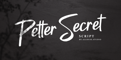 Petter Secret a Script Font, bold, elegant and manly! Petter Secret come along with Multi-Lingual Support. We highly recommend using a program that supports OpenType features and Glyphs panels like many of Adobe apps and Corel Draw, so you can see and access all Glyph variations. Petter Secret is perfect for any tittles, log, product packaging, branding project, megazine, social media, wedding, or just used to express words above the background. Enjoy the font, feel free to comment or feedback, send me PM or email. Thank You!
 - Lakony by Khoir,
$9.00 Lakony Regular, italic and display serif lacony are combined into one into a modern serif, lacony pays attention to high readability and a soft font model so that readers feel comfortable. lakony font also has unique alternates, making it easier for you to design as unique a text as possible. However, this does not leave behind the function of the font itself, namely readability, so this font is suitable for titles, posters, branding, invitation cards and much more. Lakony Regular Lakony Italic Lakony Display Uppercase Lowercase 75+ Language Alternates Font
 - Racetrack by Type Innovations,
$39.00 Racetrack is the work of American type designer, Alex Kaczun, and was conceived as a result of developing a logo for a client. Alex was experimenting with a uniform grid pattern, outline and inline, connecting the dots which lead to this interesting typeface effect. Racetrack is a bold display font, which also works well at many point sizes. It has a futuristic appeal with straight lines and sharp corners. The uniform strokes, inline treatment and symmetry make for a powerful headline. The applications for this font design are endless.
 - Arquitecta Office by Latinotype,
$16.00 We have adapted the version of our Arquitecta font for use in Microsoft Office™. It only has 4 variants: regular, italic, bold and bold italic. Font weights have been named in a way that can be clearly shown up in the font list in Office™ programs for the sake of a good hierarchy (the bold variant is quite bold and does not look the same as the original font). Arquitecta Office update: Improvements of proportions and drawing. The set was extended to the current one of Latinotype.
 - Vow by Thinkdust,
$15.00 Vow is an incredibly stylised font, strutting its stuff on the typography catwalk. Vow does everything to excess, even when cutting down: where it’s curvy, it’s very curvy, but where it’s thin, it’s thin. Vow’s regular weight has a certain boldness at text size, but its ultra-thin alternative is much better used at larger sizes, managing to take up very little space even when scaled up. Using a mix of the two creates a subtle emphasis, especially when coloured, which helps to create stunning messages in elegant ways.
 - Beatle by Lián Types,
$30.00 What if Platt R. Spencer and Charles P. Zaner were born in mid-20th Century? What if they were fans of The Beatles or The Mamas & Papas? Beatle is what those masters would have made. Letters shouting for peace, like a true hippie does, with a lot of elegance. With Beatle I wanted to mix the delicacy of engrossers script with the exuberance of flower power. The result is a font designed with freedom, full of provocative alternates and fat tails. Enjoy it and of course, let it be.
 - Greenaway Mignonettes by Wiescher Design,
$29.50 Kate Greenaway was a very famous British (1846-1901) author and illustrator of childrens books. Her books were an outstanding success in English publishing during the Victorian period. Recently I found these sweet Mignonettes in an old foundry specimen book. Mignonettes is derived from the French word "mignon" which stands for lovely, charming, sweet, delightful, pleasant and that does exactly describe these little drawings. I already published a Kate Greenaway's Alphabet a couple of years ago. So here is my second installment. Yours, Kate Greenaway fan Gert Wiescher
 - Caché by ArtyType,
$29.00 Caché is a stylish, condensed sans serif font family in 3 versatile weights (Light, Medium & Bold) with an extended Latin character set. The typeface features economical letterforms with distinctively sheared terminals and occasional stencil characteristics. Designed as a practical all-rounder, it really does live up to its name, providing legibility along with added panache to any heading or copy. In practice, its surprisingly adaptable to most projects; and as usual with ‘ArtyType’ fonts, there are several alternate characters available via the glyph palette, providing that extra dimension when personalising your design projects.
 - Big Top by Comicraft,
$19.00 Step Right Up, Step Right Up, the Font Circus is in town and ready to reveal our stupendous new tent-pole feature! Step inside for the best seat in the house. Ringmaster Roshell Beauregard dons his Big Top Hat especially for this occasion and promises us that Clowntime ain't over until the Bearded Lady takes a custard pie in the face. Our Big Top Bonanza performance begins with sideshow attractions and distractions, high-wire acrobats and low-cost rubber band guns. Can you smell the greasepaint and hear the roar of the crowd already...?
 - Impact Wide by Geoffrey Lee,
$21.00Impact wide was developed from the designer's original drawings for the production of 'Impact' metal type, with many detail changes because of the density of the letters. These include the restoration of the bevelled i and j dots of the original. Character maps show some useful alternative characters in both roman and italic. Included are a crossbar numeral 1, mirror quotes and some sorts which were cast in metal but never reproduced in digitized versions of the typeface. There is also a font-specific Euro symbol. (Impact is a trademark of The Type Museum, London). - Urban Tour by Roland Hüse Design,
$10.00 -This font has been basically designed for poster display in black weight and big size (mostly for capital letters). The rest of the family is a derivative work of it. I can’t guarantee if it works well on small size print. -Future updates may follow in the near future or on request. Please feel free to contact me via rolandhuse@aol.com about the following: -This family does not contain all the language extensions, but I am willing to create any extensions (including Cyrillic) on request; - Discovering kerning problems while using; Or any other question.
 - ASTYPE Ornaments Accolades C by astype,
$40.00 Accolades C and C2 share the same main ornaments but differ in finishing. Accolades C uses pearls and diamonds, C2 does not. Accolades CX is an additional fitting set of borders. All fonts are available in two variations. A clean one and a distressed, grungy version (old). The layout samples from the PDF-specimen are included in the font packages and stored in InDesign CS3 format. Mostly all of the featured fonts of the specimen are available on MyFonts, too. Have a look at Secca Art Std, Secca Saloon Std, Gracia, Battista and Prillwitz.
 - Compagnon by Hanoded,
$15.00 Compagnon is a friend, a partner. This handmade display font will come in super handy when you are working on that book cover, or the packaging of a product. It will shine on posters and websites and it will keep you warm at night. I guess that last bit is an exaggeration… Compagnon comes in three distinct styles: a ‘regular’ version, which is a bit rough around the edges, a ‘dirty’ version, with a juicy eroded look and a polka dot version. All three have their accompanying italics.
 - Pritchard by ITC,
$29.99Pritchard is the work of British designer Martin Wait, a capital, condensed sans serif font inspired by the geometric styles of the 1920s Soviet Constructivist movement. Despite unusual letterforms, Pritchard remains legible and effective in large display sizes. Two fonts make up the Pritchard family: Pritchard Regular and Pritchard Line Out. Pritchard Regular is a caps-only font, but Pritchard Line -- a bold, open font suitable for a wide variety of headline applications -- does include lowercase letters. A similar font from Linotype is Linotype Reducta. Unlike Pritchard Regular, Linotype Reducta's character set contains lowercase letters." - French Kiss by Robert Arnow,
$25.00 French Kiss is an expressive brush font that was drawn by hand on paper to ensure that it captured an intimate and personal quality. The texture of the brush has been left in, and can be seen when displayed at large sizes. French Kiss contains 28 alternates and ligatures for enhanced diversity and legibility. Unfortunately, the MyFonts display engine does not show the contextual alternates. Additionally, the entire font has been meticulously kerned, letter by letter to ensure a smooth flow, in spite of the expressiveness of the letters.