10,000 search results
(0.029 seconds)
- Simple Fact by Bogstav,
$10.00 Simple Fact is a family of 4 fonts and 2 sets of drawings. All fonts and drawing was made with the same inky pen, leaving a slightly blurred and rugged look
 - Thanks Valentine by Sakha Design,
$12.00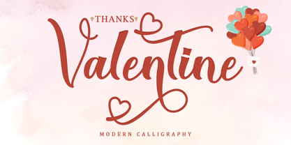 Thanks Valentine is a lovely and delicate script font that exudes elegance and class. This font was particularly crafted for those who need a beautiful and refreshing look to their designs.
 - Designers Gothic by Jonahfonts,
$30.00 Occasionally a designer needs the combination of caps and lower case glyphs for a particular purpose, visually or otherwise. Designer’s Gothic was designed with the Caps equal to the x height.
 - Liliming by Cubo Fonts,
$25.00 That font was designed for Liliming, a famous Shanghainese feminine fashion brand. As the brand itself, it shows a solid background - a former typewriter machine feeling - and a fresh creative touch.
 - Opz Popz JNL by Jeff Levine,
$29.00 Opz Popz JNL is a collection of fifty-two designs based on geometric designs and pop art (reminiscent of the 1960s). These images are perfect embellishments for retro-themed work projects.
 - Pekora by Typoforge Studio,
$15.00 To design the font Pekora I was inspired by a You And Me Monthly published by National Magazines Publisher RSW Prasa that appeared from May 1960 till December 1973 in Poland.
 - Arsis by URW Type Foundry,
$35.99 Arsis Regular Font was designed by Gerry Powell in 1937. It is a Serif (Antiqua) Modern Style font. Arsis Regular font attributes include roman serif, Didone, elegant, formal, modern style, feminine.
 - Print Illustrations JNL by Jeff Levine,
$29.00 Print Illustrations JNL gathers a number of charming and functional designs redrawn from vintage sources. There are attention getters, spot illustrations, catch words and decorative embellishments all in one digital file.
 - Catalistefa Signature by Letterena Studios,
$9.00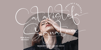 Catalistefa Signature is a lovely and delicate script font that exudes elegance and class. This font was particularly crafted for those who need a beautiful and refreshing look to their designs.
 - File Clerk JNL by Jeff Levine,
$29.00 File Clerk JNL was based on Cushing, a typeface found within the pages of the 1901-02 Pettingill & Co. (Boston) specimen book, and is available in both regular and oblique versions.
 - Verena by Autographis,
$39.50 Verena was written with a common felt marker pen, scanned and worked over, to keep just the right amount of roughness. The result is a very readable and usable handwritten font.
 - Bandoeng by HRDR,
$19.00 Bandoeng was inspired by the cover of the 1920 Nebiolo book. It is perfect for product logo, signage, branding projects, headlines, posters, packaging, clothing brand logos, Vintage design and much more.
 - Mixed Silhouettes by Intellecta Design,
$13.90 Mixed Silhouettes are inspired by people, animals and various situations. It includes a wide variety of topics and may be used individually or in combination with wide range of design possibilities.
 - Timelord by Comicraft,
$19.00 VWORP! VWORP! This font will travel through the four dimensions of time and space to materialise on your hard drive. TIMELORD was created for Telos publishing's line of DOCTOR WHO novellas.
 - Planta by Monotype,
$25.00 Planta is a bold sans serif with inverted contrast. It was inspired by brutalist architecture. One weight only, 4 widths and more than 350 glyphs. Planta supports most latin based languages.
 - Boholah by Sulthan Studio,
$10.00 Old style fonts or also writing from teenagers, as a form of expression for those who are bored or looking for cool and creative ideas by drawing something accompanied by writing.
 - Christy Marie by Elemeno,
$25.00Christy Marie likes fun fonts. This was the first font to meet with her approval. It's bouncy, teenage girl sort of font and would do well at parties or the mall. - Ranch Land JNL by Jeff Levine,
$29.00 Ranch Land JNL is based on a classic French Clarendon wood type, many of which were popular in the 1800s and are now associated with either Western motifs or circus events.
 - Blue Orchid JNL by Jeff Levine,
$29.00 A piece of 1940s sheet music for the song "Blue Orchids" was the inspiration for both the type design (based on the hand lettered title) as well as the font's name.
 - Schwarz by Miguel Ibarra Design,
$20.00 Schwarz is a Black Letter typeface inspired by all that is black. Jagged edges and sharp diagonals make Schwarz a head banging font. Some stylistic alternates and ligatures are also available.
 - Medium Roman by Monotype,
$29.99Medium Roman is an engravers, all-capitals font for invitations and stationery. Particular characteristics of the Medium Roman font are the tail on Q and the spurs on J and U. - Sportune by Raditya Type,
$11.00 Sportune is made to support the work of designers who are used to making works with a sporty style. This font is great for various design styles, modern or old school.
 - Grande Parade JNL by Jeff Levine,
$29.00Grande Parade JNL is a decorative version of Winnetka JNL, which was based on antique wood type. The look and feel of this design combines old-time typography and festive charm. - Tannarin BT by Bitstream,
$50.99Futuristic and spacey, Tannarin is a modular, cap-only typeface. Many letters are constructed of repeated components with the added twist of the round characters being shorter than the square characters. - Chendany by WNGSTD,
$10.00 Chendany is a friendly, neat, and cute-looking handwritten font. Not too thin and not too thick, balanced and varied, this font was designed to enhance the beauty of your projects.
 - Flax JY by JY&A,
$39.00David Philpott was inspired by the flax growing on the side of the motorway out of Wellington, New Zealand, and crafted this very distinctive, natural typeface family based on the plants. - Moving Van JNL by Jeff Levine,
$29.00Moving Van JNL is a classic sign painter's block Roman with angled [instead of rounded] corners and slab serifs. This style of lettering was most popular in the 1920s and 1930s. - Christmas Preference by Seemly Fonts,
$12.00 Christmas Preference is a clean, simple, and natural handwritten font. Not too thin and not too thick, balanced and varied, this font was designed to enhance the beauty of your projects.
 - Camden Queen by Asterisk,
$33.00 The font design is inspired by the long autumn evenings in London. Those "fast brown foxes" ran along the streets. Camden smelled delicious. And she was as beautiful as a queen.
 - Duesenberg by Zang-O-Fonts,
$25.00Duesenberg was designed to be similar to turn of the century fonts used primarily in newspapers. It has roman characteristics, yet is clearly not, and really doesn't fall under any category. - Blackletter Moderne JNL by Jeff Levine,
$29.00 Blackletter Moderne JNL was inspired by the original 1935 pencil drafts for “Deutsche Schrift” (German script); designed for the country’s railway system – and is available in both regular and oblique versions.
 - Marin by URW Type Foundry,
$39.99 Marin, a name that is associated with water and ships, looks very confident and follows the ideas of Eurostile, but in a stencil design. Marin was designed for the URW++ FontForum.
 - Ermin Sweet love by Four Lines Std,
$9.00 Ermin Sweet is a lovely and delicate script font that exudes elegance and class. This font was particularly crafted for those who need a beautiful and refreshing look to their designs.
 - Clarendon Paint by Open Window,
$19.95 Clarendon Paint offers a gritty twist on a classic font style (Clarendon). It was completely hand painted which makes the font an organic centerpiece to any of your grungy design applications.
 - Enchanted Land - Personal use only

- Defused - Personal use only

- Heller Sans JNL by Jeff Levine,
$29.00 Heller Sans JNL is based on the main letterforms of an experimental alphabet designed by Steven Heller; noted author of over 170 books on design and visual culture. Some modifications were made in turning his design into a digital font. In his own words, here is the background to this typeface: “I recently recovered this from the junk heap. It is a yellowing photostat of my first and only typeface design (1969-70). Total folly! At the time I was smitten by Art Moderne lettering. I called it “Klaus Boobala Bold” because I liked the K and B. I’ve lost the letters S through Z, which were made. The letters were drawn with compass, Techno pen (that frequently clogged). as well as a triangle and T-square. The inline and outline made no real logical sense. I based the design, in part, on Kabel, Avant Garde and it was a product of whatever I could accomplish with those tools. The caps-only alphabet was photographed and produced as a film negative that was cut in foot-long strips and spliced to fit on a Typositor reel. Sadly, the negatives made for the font were too brittle and the splice snapped apart in the Typositor. I worked on it for well over a month and used the face only once. I realized with this attempt, like so many other times I attempted different challenges, that type design — indeed mechanical drawing — was not my strong suit.” Heller Sans JNL is available in both regular and oblique versions.
 - Longhorn by Belldorado,
$20.00 I saw a cool UT-Ligature on an old (maybe 70's or 80's) Texas Longhorns fan-shirt - it was in 3D and I wanted something like that with my own initials A and B to print it on a baseball hat. I started drawing it and when I was finished, I thought it might be nice to do the same for my officemates. I needed another G, T and K. After finishing that I thought it might be cool to do this for other people as well. Since the source of all the 3D glyphs is found in the regular ones which get moved by a 45 degree angle and then connected with lines , I first draw all the uppercase regular glyphs. The thing that followed was kind of an addiction: after finishing the uppercase letters, I wanted to add lowercase letters, after finishing the 3D letters, I thought it would be nice to have a fill version to layer with the 3D letters. Having a rough, woodcut version of the regular style would be cool, too. And the font is also pretty much suited to make a stencil version. When all this was done, I was interested on how the font would look like without the serifs and curves instead of the 45 degree angles, so I did the Longhorn Sans. Good to use for all sports-related designs, especially retro-style soccer/football shirts. Uppercase characters can be combined to form ligatures or logotypes.
 - East by Tarallo Design,
$22.99 East is a simple and confident typeface. It is timeless and current, but with a subtle nostalgia of vintage Jazz albums, film credits, newspapers, and signage. The light weight has excellent legibility at small sizes. The Extra Bold weight will capture attention. Its condensed width allows a lot of text in little space. East is versatile, but would be a good choice for film titles, labels + packages, posters, publications or any design where space is limited. It has six weights between Light and Extra Bold. A variable font with weight and slant axes is available and included in a full family purchase. The OpenType features include; stylistic sets, a one story ‘a’, hooked letters, seriffed uppercase I and 1, a slashed zero, raised colon and punctuation (Spanish), several German eszetts, ligatures, diverse bullets, and vertically stacked pre-built fractions. It will support western and central European languages as well as other Latin-based written languages. Read on if you are not familiar with variable fonts. What makes a variable font special is that all font weights are inside of one file and you can incrementally control the width and italic slant between Light (300) and ExtraBold (800). These changes are commonly made with slide controls in the font/type palette of the software. Variable fonts are also smaller in file size, which benefit both web and software performance. Currently variable fonts are supported by Adobe, Sketch, Corel Draw, and most web browsers. Check for your software support here: www.v-fonts.com/support.
 - Caslon Antique by GroupType,
$19.00 Caslon Antique is a decorative American typeface that was designed in 1894 by Berne Nadall. It was originally called "Fifteenth Century", but was renamed "Caslon Antique" by Nadall's foundry, Barnhart Bros. & Spindler, in the mid-1920s. The design of the typeface is meant to evoke the Colonial era. Early printers would reuse metal type over and over again, and the faces would become chipped and damaged from use. Caslon Antique emulates this look. Despite the name, it is not a member of the Caslon family of typefaces. The renaming is believed to have been a marketing maneuver to boost the popularity of a previously unpopular typeface by associating it with the highly popular Caslon types. Caslon Antique is popular today when a "old-fashioned" or "gothic" look is desired. It is used by the musical group The Sisters of Mercy on their albums, for the logo of the musical Les Misérables, and for the covers of the books in A Series of Unfortunate Events. It is also frequently used on historical displays. It was used for the previous edition of the Warhammer Fantasy Role-Play. Most recently, it has been used on promotional material for the smash musical Monty Python's Spamalot on Broadway, the West End, and its tour of the United States. British 80's band The The also used the font in several of their music videos, usually displaying several lyrics from the song in the opening scenes. It used on the cover of Regina Spektor's album, Begin to Hope. This description was sourced (in part) from Wikipedia, the free encyclopedia.

