10,000 search results
(0.026 seconds)
- Amazed Breath by Almarkha Type,
$29.00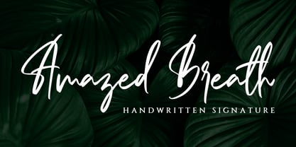 Amazed Breath is a classy script font that comes in Regular and Slant. Inspired by luxury, this font will look classy and awesome in many ways in your latest project. Amazed Breath is perfect for logos and branding, photography, invitations, watermark, advertisements, product designs, stationery, wedding designs, labels, product packaging, special events or anything that needs a handwritten taste.
 - Keynote Speaker NF by Nick's Fonts,
$10.00This curious little gem is patterned after a typeface named "Bloomsbury", released by P. M. Shanks & Sons, Ltd. of London in the 1920s. Its gentle curves and somewhat quirky construction combine to create a warm and friendly, if slightly offbeat, antique charm. Both versions of the font include 1252 Latin, 1250 CE (with localization for Romanian and Moldovan). - OL Hebrew Formal Script With Tagin by Dennis Ortiz-Lopez,
$30.00 This font contains every variant found in the Hebrew Bible such as the “mutilated” Waw in Numbers 25: verse 12, the small Heh in Genesis 2: verse 4 and the Nun Inversum before Numbers 10: verse 35 and after verse 36 and elsewhere as well as oversized consonants and various double-wide consonants used in inscriptions.
 - Aventra by Graphite,
$18.00 Aventra is a handmade organic sans serif typeface family. With curved edges and slightly uneven lines, it has a warm and friendly appeal. Its clean and minimal design makes it legibility and readable even in smaller point sizes. With a distinct and informal human touch, it is ideal for packaging, branding, display, posters, logos, advertising, signage and editorial design.
 - Ethnicity by Eurotypo,
$21.00This font is inspired and based on many indigenous geometric shapes (Mapuche and Diaguitas from South America). A collection of more than 50 glyphs that you may combine in different and creative ways, alternating the position of the modules is possible to produced a wide variety of linear strips or closed figures, frames, modular grids, textures, etc. - UT Sugar Cane by Uniontype,
$15.00 Sugar Cane by Uniontype is a fresh and light multilingual script inspired by vintage monoline fonts. It provides advanced typographical support with contextual alternates, ligatures and swashes. That way, you’ll have automatic access to the dozens of extra glyphs in each of the fonts. This font is good for menu, signs, packaging, posters, letterings and logos.
 - Roxon by Fo Da,
$7.00 Roxon is a sans serif typeface of 4 weights from Extra Light to Bold and can be used as both a headline and text face. Roxon is recommended for using in long-form writing and articles, since a serif is far more readable for longer passages of text. The typeface has a carefully crafted weight range, with ligatures.
 - Baron by Juraj Chrastina,
$39.00 After Baronessa - funny but not crazy cartoon style font, Baron is an other handmade typeface, warm and friendly but not excessively childish. If Baronessa is a little feminine, Baron is neutral and it's funny and serious at the same time. Baron can tell jokes without smiling. Because a joke can be funny even if the teller doesn't smile.
 - Abracadabra PW by Patty Whack Fonts,
$29.00This font is made of many unrestrained strokes of the pen and it is perfect for a freestyle look. It would be great to use for projects that you would want to look handwritten, lively and even calligraphic. It's very playful and mysterious. It's so much fun to use and can be used in a variety of ways! - Midtown Tessie NF by Nick's Fonts,
$10.00A sign at the 81st Street (Museum of Natural History) New York subway stop provided the pattern for this mosaic tile face. The font features a full-tile background at the bar position (shift-backslash) and left-and-right pointing fists at the brace positions as well as complete Latin 1252 and Central European 1250 character sets. - Retirement JNL by Jeff Levine,
$29.00 The hand lettered film credits for 1937’s “Make Way for Tomorrow” were done in a sans serif design with an ever-so-slight flare and a slightly semi-calligraphic look. Unusual in both style and varying character thicknesses, the lettering has been digitally redrawn as Retirement JNL, which is available in both regular and oblique versions.
 - Saturday Detentions by Bogstav,
$18.00 Saturday Detentions is based on the classic serif "High School" style. However, this version is handmade and a bit rugged here and there - and loose in a legible/organic way. I've added 7 different versions of each letter and they automatically cycle as you type - or you can manually choose the one you prefer from the glyph menu.
 - Saturator Serif FA by Fontarte,
$39.00 Saturator Serif FA is a younger brother of Saturator FA. It comes with upper and lower case letters and with diacritic characters for many Latin languages. Its informal and cheerful character allows for different creative ways of usage. This slab serif typeface is designed to accompany sans serif version. It has three variants: Regular, Italic and Shadow.
 - Uncertainty by Okaycat,
$25.50 Uncertainty 2010 Edition is an intensely textured typeface carefully rendered by hand. This font is faded with a chalk-like texture. Please be aware that working with this highly detailed font may slow some graphics software as it requires more memory. Uncertainty is extended, containing West European diacritics and ligatures, making it suitable for multilingual environments and publications.
 - WOODTYPE Collection by Borutta Group,
$19.00 WOOD TYPE COLLECTION from Mateusz Machalski is a set of wonderful, warm, and weathered hand made typefaces designed by Mateusz Machalski. The Inspiration for this collection comes from a wooden letter blocks and other old technologies used for printing. WTC supports 40 different languages and contains over 300 glyphs per style. The Family consists of 20 typefaces. ENJOY!
 - Mikeys Roman NF by Nick's Fonts,
$10.00Here's an amalgam of letterforms from two giants of the handlettering pantheon: an uppercase based on the work of Mike Stevens, and a lowercase based on the work of Alf Becker. The two work in perfect harmony to create warm, friendly and engaging headlines. Both versions contain the complete Latin 1252, Central European 1250 and Turkish 1254 character sets. - Paciencia by Typographias,
$16.00 This family started as a graduation project back in 2009, coming from calligraphic studies and sketches with a broad nib pen, based on humanist proportions and inclination. From its ink and paper origins it has come a long way until the current form, being digitalized and made into fonts through the course of the last 8 years.
 - JadeBud by Supfonts,
$14.00 JadeBud is a modern and elegant serif with incredible unusual lines that makes it far from the typical classic serif. Font is an open type with clean shapes and precise kerning. It includes ligatures encoded by the PUA. Language support: All European languages Don't forget to subscribe so you don't miss out on the new awesome fonts Dima
 - Fadista by Alex Beck,
$19.99 Fadista is an eccentric experimental typeface, inspired by the Portuguese fado music and letterings by the artist Stuart Carvalhais (1887–1961), created throughout the 1920ies and 1930ies. A strong and clean presence with a touch of quirky gives the typeface its overall character. Fadista includes various OpenType features that allow tailoring the type to custom needs, encouraging graphical exploration. Fadista is the result of meticulous research, graphic reinterpretation and systematization of the glyph palette, taking into account modern font standards. Balancing between a historic heritage and „hipster“ contemporary looks, Fadista represents a discourse about aesthetics, trends and currentness in graphic design. The stylistic variations of the glyphs in fadista work in an additive fashion, rather than completely altering the look of the typeface. This means that a basic framework of glyphs remains unaltered, while certain subgroups of characters are affected by the style choices. Through this behavior, stylesets in fadista work as a switch for the type of contrast you’d like entwined in the overall look of the typeface. Other unique features include stylistic alternates for specific glyph combinations, ligatures that allow internal character spacing and tiny diacritics that flow within cap height along normal height glyphs. Please note the lowercase characters within Fadista are uppercase alternates. Math operators are fully supported, as well as a wide range of symbols and punctuation. Supported Languages: Albanian, Danish, Dutch, English, Finnish, French, German, Icelandic, Italian, Malagasy, Norwegian, Portuguese, Romansh, Spanish, Swedish and Turkish. For further language support don‘t hesitate to get in touch. Fadista was awarded the Art Directors Club Bronze in the junior competition 2014 and the DDC Award 2014 in the category "Future“.
 - Engel New by The Northern Block,
$30.36 EngelNewSans is sans serif family of 12 weights and an upgrade of the typeface Engel also published by Die Gestalten Verlag. The project began with an extension to the original Engel character set and freshening up the typeface to suit the OpenType format. EngelNewSerif came about as a sibling to EngelNewSans as a corresponding serif family also of 12 weights, matching those of EngelNewSans. Both families are designed for a wide usage in running text and headlines. EngelNewSans is an evolved version of the original Engel typeface, which undergone improvements to the individual letterforms and the overall look which resulted in this sans serif type family with a more mature confident character and with softer, rounder and more harmonious shapes. The characteristics between the two could perhaps, very fittingly, be compared to a person showing different sides to their personality at different stages in life. With EngelNewSans portraying the more mature role while the original Engel shows traits of a cool teenager with rough edges, not yet fully developed. To make the light weights function with serifs attached for EngelNewSerif, the same low stroke contrast as seen in EngelNewSans was applied. Further discovery found that the serifs and the stem width had to be optically similar for the light weights not to appear too fragile. In the heavy weights however, the stroke contrast was higher than in the Sans versions, this was done to open up the counters and make room for the serifs to breathe. The intention of the families is to motivate an element of play and give the designer a larger selection to work with.
 - Diotima Classic by Linotype,
$29.99Diotima Classic is a total upheaval for the 21st century of Gudrun Zapf von Hesse's mid-20th-century Diotima, one of the most beautiful types ever cast in metal. Its roots lay in a calligraphic sheet written by Gudrun Zapf von Hesse. The text was the Hyperion to Diotima" by Friedrich Hölderlin; Diotima is the name of a Greek priestess in Plato's dialogue about love. In the philosopher's imagination, she should appear slim and beautiful. In 1948, Gudrun Zapf von Hesse finished the typeface's Roman. The Diotima family was released as a metal typeface for hand setting by D. Stempel AG in 1951-53. This original Diotima is a festive design particularly suited to invitations, programs, and poems. The delicate Italic drew attention to text passages that should be emphasized. Linotype's previous digital Diotima only had one weight, which looked great in display sizes, but was too thin for text setting. Diotima Classic has four weights. The new Regular has more robust serifs and thicker hairlines, making it more appropriate for text sizes. The Diotima variation with finer serif remains under the name Light. Gudrun Zapf von Hesse also took the opportunity in 2008 to add an extremely heavy weight to the family. In comparison to the old Diotima, letterforms of the Diotima Classic are more harmonious and balanced. The rhythm of the Italic letters in Diotima Classic is more consistent. The lining figures of the Diotima Classic align with caps, and the letter spacing of the tabular lining figures in Diotima Classic is significantly better. The forms of the figures have been improved as well." - Flink by Identity Letters,
$25.00 The joy of pure geometry, revisited. Geometric typefaces are a staple in every typographer’s toolbox since the 1920s. It was a time when iconic faces such as Futura, Erbar, and Kabel appeared on the scene and turned the world of type upside-down. Inspired by those early giants as well as later epigones with a legacy of their own (such as 1970’s Avant Garde Gothic), Flink is the Identity Letters take on this genre, characterized by a clean and focused appearance. With neat shapes and the look of pure geometry, Flink adapts to a vast range of applications and topics, from the fine print in contract to website body copy to logo design to billboard-size slogans. Its x-height is considerably larger than in classic geometric sans-serif fonts; its proportions are harmonized as opposed to strictly constructed. This makes for a more contemporary look, setting it apart from the classics. To further reduce the rigidity of a purely geometric composition, you can replace some letters with more humanist alternates, such as a, g, j, etc. This font family comes along in 8 weights from Thin to Black. Each weight consists of an Upright and Italic version. There are more than 750 characters per style, including two stylistic sets that offer variations to the look and feel of Flink, making it even more versatile. Plenty of additional Open Type Features like ligatures, case sensitive forms, old-style figures, and symbols make Flink a valuable tool for the discerning typographer. Flink is the reimagination of a classic genre, designed to suit the needs of our time. ––––– Please note: There is an upgraded Version available: Flink Neue
 - Molto by TypeTogether,
$49.00 Xavier Dupre’s Molto font family is a tonal master, creating tenderness in a slab serif and tempering toughness with flourishes. Slab serifs created their original niche by their ability to grab attention and overwhelm, which caused them to be seen as strong, dominant, and desired fonts, especially in advertising. Slab serifs are the result of placing defined edges on something meant to take up an inordinate amount of space, rather than meant to be graceful. Molto updates this concept to allow a greater, and gentler, range in the lighter weights. Molto’s nine weights are defined by their intended use. The two extreme weights (Hair and Fat) act as display partners for magazines, titles, and posters. The Hair weight is runway ready with its sturdy serifs, breathy internal space, and stable lettershapes that were designed both to perform and impress. Molto’s Fat weight packs maximum punch in a believable way. Its wide and deliberate curves contrast against thin connections and landing strip stems. Molto can be put to perfect use in a fashion magazine using swashy Hair headlines set against its darkest weight. Molto’s seven intermediate weights, with their classic and legible shapes, are meant for texts of all sizes. The notches on diagonals, distinct numerals, and acute terminals grant benefits from caption sizes up to headings. Molto’s refined light weights and punchy heavy weights set the stage for a swashy surprise — alternate capital letters act as refined garments laid atop its concrete skeleton. The Molto font family rejects saving space in favour of intensifying shapes, placing maximum weight on the edges for better legibility and impact. Latin-based digital and printed designs will benefit from Molto’s design voice and breadth. This means UI, video, and online text, and print materials like dictionaries, packaging, advertising, and branding can all put Molto’s robust forms to multipurpose use. Molto successfully creates balance in a slab serif design: an opinionated and striking type family, stalwart in captions and exuberant in display, thanks to swashes which add some originality to the slab category.
 - Tank by Typodermic,
$11.95 Are you tired of flimsy typefaces that can’t stand up to the rigors of modern design warfare? Then it’s time to enlist in the Tank army! Tank is a typeface that means business. With its heavy letterforms and industrial appearance, it commands attention and demands respect. The tight spacing and lack of negative space give it a robust precision that other typefaces can only dream of. It’s the perfect weapon for delivering a knockout blow with bold color blocks or as a photo cut-out effect. And don’t let the name fool you—this typeface may be called Tank, but it’s far from slow or clunky. It comes in a large Regular style that will leave your competitors in the dust, an ironically titled Light version that still packs a punch, and a pair of oblique styles that add a dynamic twist to your designs. So what are you waiting for? Show the world that you mean business with the heavy headline artillery of Tank. Most Latin-based European, and some Cyrillic-based writing systems are supported, including the following languages. A Afaan Oromo, Afar, Afrikaans, Albanian, Alsatian, Aromanian, Aymara, Bashkir (Latin), Basque, Belarusian (Latin), Bemba, Bikol, Bosnian, Breton, Bulgarian, Cape Verdean, Creole, Catalan, Cebuano, Chamorro, Chavacano, Chichewa, Crimean Tatar (Latin), Croatian, Czech, Danish, Dawan, Dholuo, Dutch, English, Estonian, Faroese, Fijian, Filipino, Finnish, French, Frisian, Friulian, Gagauz (Latin), Galician, Ganda, Genoese, German, Greenlandic, Guadeloupean Creole, Haitian Creole, Hawaiian, Hiligaynon, Hungarian, Icelandic, Ilocano, Indonesian, Irish, Italian, Jamaican, Kaqchikel, Karakalpak (Latin), Kashubian, Kikongo, Kinyarwanda, Kirundi, Komi-Permyak, Kurdish (Latin), Latvian, Lithuanian, Lombard, Low Saxon, Luxembourgish, Maasai, Macedonian, Makhuwa, Malay, Maltese, Māori, Moldovan, Montenegrin, Ndebele, Neapolitan, Norwegian, Novial, Occitan, Ossetian, Ossetian (Latin), Papiamento, Piedmontese, Polish, Portuguese, Quechua, Rarotongan, Romanian, Romansh, Russian, Sami, Sango, Saramaccan, Sardinian, Scottish Gaelic, Serbian, Serbian (Latin), Shona, Sicilian, Silesian, Slovak, Slovenian, Somali, Sorbian, Sotho, Spanish, Swahili, Swazi, Swedish, Tagalog, Tahitian, Tetum, Tongan, Tshiluba, Tsonga, Tswana, Tumbuka, Turkish, Turkmen (Latin), Tuvaluan, Uzbek (Latin), Venetian, Vepsian, Võro, Walloon, Waray-Waray, Wayuu, Welsh, Wolof, Xhosa, Yapese, Zapotec Zulu and Zuni.
 - Aspire by Grype,
$18.00 Geometric/Technical style logotypes have been developed for car chrome labels since the early 1980’s. The styles are loaded with inspiration for great font families, but surprisingly, many of these sleek logotypes are lacking an expansive family to enhance and express their brand in a richer sense, becoming true brand workhorses. The Aspire family finds its origin of inspiration in the ACURA automotive company logo, and from there expands to an 6 font family of weights & oblique styles. Aspire pays homage the techno display styling of the inspiration logotype, further evolving beyond its brand inspired origin to give birth to a font family that pulls on modern and historical styles. It adopts a sturdy yet approachable style with its uniform stroke forms and curves, and goes on to include a lowercase, numerals, and a comprehensive range of weights, creating a straightforward, uncompromising collection of typefaces that lend a solid foundation and a broad range of expression for designers. Here’s what’s included with the Aspire Family bundle: 477 glyphs per style - including Capitals, Lowercase, Numerals, Punctuation and an extensive character set that covers multilingual support of latin based languages. (see the 6th graphic for a preview of the characters included) Stylistic Alternates - alternate characters that remove the angled stencil cuts for a more standardized text look. 3 weights in the family: Light, Regular, & Black. 3 obliques in the family, one for each weight: Light, Regular, & Black. Fonts are available in TTF & OTF formats. The TTF format is the standard go to for most users, although the OTF and TTF function exactly the same. Here’s why the Aspire Family is for you: - You’re in need of automotive sans font family with a range of weights and obliques. - You’re love that ACURA letter styling, and want to design anything within that genre. - You’re looking for an alternative to Eurostile with more stylized letterforms. - You’re looking for a clean techno typeface for your starship console labelling. - You just like to collect quality fonts to add to your design arsenal.
 - Octynaz by Typodermic,
$11.95 The world has ended, and all that remains is chaos and destruction. The remnants of civilization are scattered, and the once-great cities are now nothing more than ruins. In this post-apocalyptic wasteland, communication is more critical than ever. Your message needs to cut through the noise and grab attention, but how can you do that when everything around you is broken and damaged? Enter Octynaz—a typeface that perfectly captures the desperate spirit of this new world. With its severe damage and broken counters, Octynaz embodies the shattered landscape of the post-apocalypse. But it’s not just a broken typeface—in fact, it’s even more powerful because of its flaws. OpenType-aware programs will automatically substitute bespoke pairs to produce a grungy, realistic appearance that will make your message stand out. When you use Octynaz, you infuse your words with frantic authority and shattered vigor. You’re not just communicating—you’re commanding attention. Your message becomes a rallying cry for those who remain, a beacon of hope amidst the darkness. Most Latin-based European writing systems are supported, including the following languages. Afaan Oromo, Afar, Afrikaans, Albanian, Alsatian, Aromanian, Aymara, Bashkir (Latin), Basque, Belarusian (Latin), Bemba, Bikol, Bosnian, Breton, Cape Verdean, Creole, Catalan, Cebuano, Chamorro, Chavacano, Chichewa, Crimean Tatar (Latin), Croatian, Czech, Danish, Dawan, Dholuo, Dutch, English, Estonian, Faroese, Fijian, Filipino, Finnish, French, Frisian, Friulian, Gagauz (Latin), Galician, Ganda, Genoese, German, Greenlandic, Guadeloupean Creole, Haitian Creole, Hawaiian, Hiligaynon, Hungarian, Icelandic, Ilocano, Indonesian, Irish, Italian, Jamaican, Kaqchikel, Karakalpak (Latin), Kashubian, Kikongo, Kinyarwanda, Kirundi, Kurdish (Latin), Latvian, Lithuanian, Lombard, Low Saxon, Luxembourgish, Maasai, Makhuwa, Malay, Maltese, Māori, Moldovan, Montenegrin, Ndebele, Neapolitan, Norwegian, Novial, Occitan, Ossetian (Latin), Papiamento, Piedmontese, Polish, Portuguese, Quechua, Rarotongan, Romanian, Romansh, Sami, Sango, Saramaccan, Sardinian, Scottish Gaelic, Serbian (Latin), Shona, Sicilian, Silesian, Slovak, Slovenian, Somali, Sorbian, Sotho, Spanish, Swahili, Swazi, Swedish, Tagalog, Tahitian, Tetum, Tongan, Tshiluba, Tsonga, Tswana, Tumbuka, Turkish, Turkmen (Latin), Tuvaluan, Uzbek (Latin), Venetian, Vepsian, Võro, Walloon, Waray-Waray, Wayuu, Welsh, Wolof, Xhosa, Yapese, Zapotec Zulu and Zuni.
 - Francisco by Homelessfonts,
$49.00 Homelessfonts is an initiative by the Arrels foundation to support, raise awareness and bring some dignity to the life of homeless people in Barcelona Spain. Each of the fonts was carefully digitized from the handwriting of different homeless people who agreed to participate in this initiative. Please Note: these fonts include only the latin alphabet; no accented characters, no numbers or punctuation. MyFonts is pleased to donate all revenue from the sales of Homelessfonts to the Arrels foundation in support of their mission to provide the homeless people in Barcelona with a path to independence with accommodations, food, social and health care. The world is a very big place, the world is for travelling. And that’s what Francisco did, travel. Though born in Spain, he was raised in Brazil, where he worked as a graphic designer. He spent years hitchhiking round South America, his eagerness to see and learn new things preventing him from settling in one place. He returned to Spain an old man, to find his roots. Francisco never dreamed he’d end up in the street: “The experience of the street has taken away my vanity,” or that he would grow as a person there. “The only thing I’ve learnt in life is that in life you have to learn, because if you spend your life without learning you haven’t lived.” In Barcelona, the street changed his life and taught him just how tough it can be. Tough, but full of good people. He says that’s the best thing about the street.
 - Smart Sans by Monotype,
$29.99 Smart Sans is a personal tribute to Leslie (Sam) Smart, the first type director to be hired by a major typesetting house in Canada. Smart was a twentieth century design pioneer who raised the standards of Canadian typography. Together with three of his peers, he established the first Type Directors Club in Toronto. After Smart's death in 1998, type designer Rod McDonald decided that something should be done to commemorate Smart's life and achievements. I had first thought of establishing a scholarship in Sam's name, but a typeface design soon replaced this idea," says McDonald. "Once I decided to design a typeface, however, it became a foregone conclusion that it would be a sans serif - for no other reason than that I loved the name Smart Sans." Two typefaces served as inspiration for McDonald's work. "Like thousands of designers, I'm keen on Matthew Carter's Helvetica Compressed series. And, when I was younger, I also loved Fred Lambert's Compacta," says McDonald. "I thought there might be a place for a small range that could take over from these 'old workhorses' and, in the process, bring a fresher look to the genre." McDonald drew three weights for the Smart Sans family, all ideally suited for setting attention-getting headlines and powerful display copy. The two-storied 'g' contributes to the design's lively personality, and the short 'r' helps maintain tight, even spacing. Smart Sans is the perfect homage to a great typographer, because it raises the bar on what to expect from condensed sans serif typefaces. Sam Smart would be pleased."
 - Heroe by Lián Types,
$37.00 DESCRIPTION Now my feelings about didones are more than evident. After some years of roman-abstinence (1) I present Heroe, an interesting combination of elegance and sensuality. Heroe, spanish for hero, takes some aspects of roman typefaces to the extreme like my main inspiration, the great Herb Lubalin, did in the majority of his works: Thins turned into hairlines, altered proportions (for display purposes), unique ball terminals, poetic curves and a graceful way of placing them together on a layout. Its classy style makes the font perfect for a wide range of uses. Imagine Heroe Inline (my favorite) dancing over a bottle of perfume; printed on the cover of a fashion magazine; lighting wedding invitations up. Its partner, Heroe Monoline, may help you to make more elaborated pieces of design. Just combine it with Heroe, or Heroe Inline and see how perfect they match. TECHNICAL The difference between Pro and Std styles is the quantity of glyphs. While Pro styles have all the decorative characters available, Standard ones have only the basic set of them. Heroe Monoline Big and Heroe Monoline Small were made for better printing purposes. If you need to print the font in small sizes, then your choice should be Small. Heroe Monoline has the same alternates (and open-type code) as Heroe Pro and Inline, plus some decorative ligatures. NOTES (1) After fonts like Breathe , Aire , and the award winning Reina , I started experimenting with scripts a little more. Erotica , Bird Script and Dream Script are examples of that.
 - CA Capoli by Cape Arcona Type Foundry,
$29.00 CA Capoli is a fine script typeface with a vintage touch. Perfect for illustrative titles or logotypes. It comes in two styles, Regular and Stroke. The inspiration came during our trip to Italy, where we took a short rest in a bar during a hot day. We discovered a simple ceramic ashtray on the table. The word “Nido” was inscribed in a typeface that looked like it dated back to the 1950s. We made some investigations about the word, its meaning and origin but it still remains a big mystery. Was it the name of a hotel or a restaurant or some vintage Italian cigarettes? We don’t know. We were so amazed about the design of the logo that we decided to create a typeface out of it. A sophisticated endeavor because we just had four letters. How could the rest of the letters – if it ever existed – have looked like? Our hypothesis is CA Capoli. A typeface with a full Central European character set and some nice alternative letters to chose from. When we thought about “Nido” and its possible derivation of hotel business, we felt like creating a small side project for this typeface, a brand for a fictional hotel called Hotel Capoli with business cards, letterheads, a reception book, key fobs and embroidered patches for the service dress of the hotel service stuff. The Hotel Capoli is located at the wonderful beach of Cape Arcona on the fictional country of Arcona Islands where our type foundry is located.
 - Tchig Mono by Eclectotype,
$30.00 This is Tchig Mono, a monospaced type family that doesn't take itself too seriously. Why make a monospaced font? For coding, sure, but display? It’s my humble opinion that it’s the aesthetic choices driven by the constraints of the monospaced environment that makes them attractive. It’s a challenge for the type designer to squash and expand glyphs into a rigid bounding box, and the more unorthodox shapes that spring from this have a feel about them which lends them to postmodernist layouts and hipsterish anti-design. And the payoff for the type designer - no kerning! Yay. So what’s different about Tchig? Like I said before, it doesn't take itself too seriously. Even the name Tchig is just a stupid, fun sound (although it does show off that nice g!). There are a selection of playful alternates that give text a slightly alien feel. Stylistic set 1 chops off ascenders and descenders of lowercase letters, giving it a kind of small caps meets unicase feel (it is also accessible using the small caps feature). The other sets (or stylistic alternates if you don't have access to stylistic sets) make certain letters more twirly, more square, more “experimental”. Automatic fractions use a half-width numerator and denominator so fractions like one half and five eighths have the same width as figures (and every other glyph). There you go then - a monospaced type family not initially intended for use in the usual ways monospaced families are intended to be used. Give it a try. You could even do some coding with it if you like.
 - Wonder Brush by Canada Type,
$29.95 Wonder Brush is a display typographer's guilty pleasure. It's one of very few fonts ever made that can take intense abuse and still look natural. Partly based on a 1969 Friedrich Poppl design called Poppl Stretto, but considerably fused with ideas found in interwar magazine ad lettering and signage, Wonder Brush caters to the idea that most graphic designers would rather use design elements they can enjoy. When you spend your days being "challenged" and "creatively tested" and "communicating the message," you can definitely use a little bit of playtime. And this font gives you just that, playtime on the job. Wonder Brush appears to be a straightforward narrow upright brush script. But it really is made of malleable rubber. Take it into a program like Adobe Illustrator, set something, stretch or squeeze, shear or warp, slant or transform… just play with it like they used to do in the 70s and 80s. You will soon discover that this font really is a big old top hat, and it's up to you and your mischief to pull rabbits or geese out of it. A single font that allows you to emphasize content or manage space mechanically without affecting the integrity of the type setting. And if your playtime includes fiddling with OpenType features, you're in for a bonus treat: Wonder Brush comes with over 800 characters, including a lot of alternates and extended language support. So tweak away until your eyes cry with joy. The only rules are the ones you set, and even those are meant to be broken.
 - Stubble by Aah Yes,
$12.00Stubble is a distressed grunge font with many useful variations that make things easy. It comes in both a Regular and Bold version, and a Smudged version as if the print block has slipped a little bit just at the vital moment. Also there’s 2 jumbled versions with the letters and numbers, and some punctuation, at odd angles and slightly off-whack; there’s 2 versions with little bits of overprint on most of the main characters (as if the corners of the block or stamp have just caught the paper); a couple of Caps Only versions; plus condensed and expanded versions of the main faces. The Bold version is not an exact expanded version of the Regular version, please note, the characters are different (i.e. the misprinting is different) in the two weights. Western and Central European accented characters are included, and there’s a set of replacements for double-letter combinations such as bb, dd and OO, TT, so that 2 different letters will appear - which avoids having exactly the same grunge letter appearing twice in succession (20 or more pairings for each case, all the pairings that reasonably exist) which work as ligature replacements. The whole family constitutes a comprehensive package that offers a great variety of ways of presenting a grunge typeface for display, headlines and posters, while maintaining the thread of the same sans-serif style. The zip package contains both the TTF and OTF versions of the font. Install only one version on the same machine, installing both versions may produce all sorts of erratic behavior. - Gunplay by Typodermic,
$11.95 Are you tired of weak, flimsy fonts that can’t handle the heat? Look no further than Gunplay—the tenacious stencil typeface that will make your message stand out from the pack. Inspired by the iconic 1972 film The Getaway, Gunplay exudes a gritty, rugged aesthetic that demands attention. With three different special effect styles, this font brings a bold and authoritative voice to your designs. Whether you’re looking to make a statement with a bold headline or add a touch of grit to your body text, Gunplay has got you covered. With its rugged design, this typeface can handle anything you throw its way. So if you’re ready to take your designs to the next level, give Gunplay a try. With its tough voice of authority, this font is sure to leave a lasting impression. Some Latin-based European writing systems are supported, including the following languages. Afaan Oromo, Afar, Afrikaans, Albanian, Alsatian, Aymara, Basque, Bemba, Bikol, Breton, Cape Verdean, Creole, Catalan, Cebuano, Chamorro, Chavacano, Danish, Dawan, Dholuo, Dutch, English, Estonian, Faroese, Fijian, Filipino, Finnish, French, Frisian, Friulian, Galician, Genoese, German, Guadeloupean Creole, Haitian Creole, Hiligaynon, Icelandic, Ilocano, Indonesian, Irish, Italian, Jamaican, Kaqchikel, Kikongo, Kinyarwanda, Kirundi, Lombard, Low Saxon, Luxembourgish, Makhuwa, Malay, Ndebele, Neapolitan, Norwegian, Novial, Occitan, Papiamento, Piedmontese, Portuguese, Quechua, Rarotongan, Romansh, Sango, Saramaccan, Sardinian, Scottish Gaelic, Shona, Sicilian, Silesian, Slovak, Slovenian, Somali, Sotho, Spanish, Swahili, Swazi, Swedish, Tagalog, Tetum, Tshiluba, Tsonga, Tswana, Tumbuka, Uzbek (Latin), Venetian, Võro, Walloon, Waray-Waray, Wayuu, Xhosa, Yapese, Zapotec Zulu and Zuni.
 - Ricardo by Bureau Roffa,
$19.00 Rather than confining itself to a single style, Ricardo combines the best of two worlds: the conceptual clarity of a geometric design with the legibility and warmth of a humanist design. Its open counters, crisp joints, and even texture allow for effective use in long-form text settings, while its simple geometric shapes combined with some unexpected details make it highly suitable for display settings such as branding and marketing. Ricardo contains seven carefully chosen weights, ranging from ExtraLight to ExtraBold. The Medium weight functions as a slightly darker alternative to the Regular. Ricardo’s 812 glyphs per style support over a hundred languages, and also include arrows and case-sensitive punctuation. The Ricardo family consists of three subfamilies: Ricardo, Ricardo ALT, and Ricardo ITA. Ricardo contains the most conventional forms, and is the most suitable option for long-form text. Ricardo ALT contains simplified shapes for the a, j, u, and t, which are also accessible through Stylistic Set 2 within Ricardo (in opentype-savvy applications). The cursive-like italics of Ricardo ITA provide a slightly more eccentric alternative to the standard italics. Furthermore, all styles contain stylistic alternates that swap the blunt apexes in A, M, N, V, W, v, w, y, and 1 for pointier ones. These are also accessible through Stylistic Set 1. Other opentype goodness includes: (discretionary) ligatures, smallcaps, case-sensitive forms, fractions, nine sets of numerals, and more. David Ricardo (1772-1823) is considered the first of the classical economists, and combined ground-breaking mathematical abstractions with an understandable down-to-earth way of explaining his ideas.
 - Dionisio by CastleType,
$49.00 Dionisio, a CastleType original, takes its inspiration from one of the overlooked treasures of the CastleType library: Ransahoff. The latter is extremely condensed and very elegant. I particularly like its hairline slab serifs and cross-bars. I decided to use it as a starting point for a new design, but to make the proportions more classic and to make it more sensuous with gentler curves and bracketed cross-bar serifs. The result is very Bodoni-like, but less extreme and more contemporary looking. Meanwhile, Dionisio maintains a hint of Ransahoff with condensed letterforms and very fine serifs. Dionisio brings together the best of both, making it the perfect choice where a slender, sophisticated typeface is needed. Dionisio is available in two widths: normal and condensed, five fonts each. Includes an extensive character set and OpenType features.
 - America Line by Kustomtype,
$30.00 Since its foundation in 1901, the iconic building in the Rotterdam neighborhood Kop van Zuid, is shining. Where previously the Holland America Line was housed, you will now find Hotel New York. A building with a tremendous history. We’re glad to take you back in time with captivating memories. In 1991, catering entrepreneurs Daan van der Have, Hans Loos and Dorine de Vos refurbished the at the time vacant property into a hotel/restaurant. To honor its 25 years existence, we celebrate this happening with a brand-new font, ‘America Line’. A tribute to Wim ten Broek, the multi-talented Dutch Graphic Designer. As early as the 1930’s before the Second World War, Wim ten Broek made the famous posters for the Holland-America Line. The influence of A.M. Cassandre here in, is clearly recognizable. Wim ten Broek also worked for HAL with large surfaces and fixed lines in which primary colors dominate, accentuated with shadows acquired by spraying technique. He also made graphic works for, among others, the World Exhibition in New York, the Dutch railway company ‘Werkspoor’ and the royal Dutch steel factory ‘Hoogovens’. His drawings and lettering gave me a love for the trade and naturally gave me a completely different view on fonts. That’s how I slowly but surely made my way to the trade. Based on the letters I had at my disposal from the Holland – America Line poster, I started to complete the alphabet in the same style as the original text. I digitized everything in order to acquire a usable and modern font. The Holland America Line Font comes with uppercase and lowercase with all the needs of modern times to create a good digital font and to be able to use it for all graphic purposes. The font is ideal for headtext, posters, logos, etc... Don't hesitate and use this unique historical font! It will give your work that glamour that you will find in few fonts. Enjoy the Holland America Line. The Holland America Line Font comes with uppercase, lowercase, numerals, punctuations so you can use the Holland America Line font to customize all your designs. The Holland America Line font is designed by Coert De Decker in 2018 and published by Kustomtype Font Foundry. The Holland America Line Font can be used for all graphic purposes. It is ideal for headtext, posters, logos, logos, letterhead, apparel design, package design, label design etc... Don't hesitate any longer and enjoy this unique historical font! It will give your work the glamour that you will only find in a few fonts. Enjoy your journey with the Holland America Line!
 - Type Master by VP Creative Shop,
$39.00 NOTE : If you want any specific ligature included, just write me a message and I will add it with next update :) Type Master is a sophisticated and delicate serif font that exudes elegance in every aspect. With its extensive collection of over 100 ligatures and alternate glyphs, this font offers endless possibilities for creative expression. Additionally, its support for 87 languages ensures that it is versatile enough to meet the needs of any project. Whether you are designing a logo, creating marketing materials, or crafting an editorial layout, Type Master is the perfect choice for adding a touch of refinement to your work. Language Support : Afrikaans, Albanian, Asu, Basque, Bemba, Bena, Breton, Chiga, Colognian, Cornish, Czech, Danish, Dutch, Embu, English, Estonian, Faroese, Filipino, Finnish, French, Friulian, Galician, Ganda, German, Gusi,i Hungarian, Indonesian, Irish, Italian, Jola-Fonyi, Kabuverdianu, Kalenjin, Kamba, Kikuyu, Kinyarwanda, Latvian, Lithuanian, Lower Sorbian, Luo, Luxembourgish, Luyia, Machame, Makhuwa-Meetto, Makonde, Malagasy, Maltese, Manx, Meru, Morisyen, North Ndebele, Norwegian, Bokmål, Norwegian, Nynorsk, Nyankole, Oromo, Polish, Portuguese, Quechua, Romanian, Romansh, Rombo, Rundi, Rwa, Samburu, Sango, Sangu, Scottish, Gaelic, Sena, Shambala, Shona, Slovak, Soga, Somali, Spanish, Swahili, Swedish, Swiss, German, Taita, Teso, Turkish, Upper, Sorbian, Uzbek (Latin), Volapük, Vunjo, Walser, Welsh, Western Frisian, Zulu Ligatures : IS, FO, OD, FA, TY, EX, NN, PI, EY, AY, SS, LL, FU, US, UT, AS, AN, AM, CI, LO, ES, RO, ET, TE, CK, OH, OO, OE, OC, KO, KE, KC, CH, SE, EA, UR, RS, KS, TH, TU, TT, TK, TL, HE, RG, EP, ER, RE, RC, LE, ND, ED, OF, HA, EN, CT, ST, NT, ON, ME, MO, NG, NC, UG, UC, OU, GH, OR, OP, EE, YO, VE, IT, WE, TI, FAS, FAST, CKS, OOD, FOOD, FOO, THEY, HEY, HYP, TYP, OUT, UST, URS, WAS, THE, WES, EST, WEST, ERS, EAST, EAS, LES, ENT, FOR, OUG, OUGH, ERE, TER, YOU, VER, HER, THER, THA, AND, ITH, THI, MENT, WERE, WER, ROM, THE How to access alternate glyphs? To access alternate glyphs in Adobe InDesign or Illustrator, choose Window Type & Tables Glyphs In Photoshop, choose Window Glyphs. In the panel that opens, click the Show menu and choose Alternates for Selection. Double-click an alternate's thumbnail to swap them out. UPDATES : COMING SOON Mock ups and backgrounds used are not included. Thank you! Enjoy!
 - Libertat by Elyas Beria,
$9.00 In a not-too-distant future, humanity was ruled by a powerful, technologically advanced empire known as the Synod. The Synod controlled all forms of communication, and through this, they controlled the minds of the people. But a small group of rebels, known as the Resistance, had managed to evade the Synod's surveillance and formed a secret underground movement. They were determined to overthrow the Synod and restore freedom to the people. One of the Resistance's key members was a young artist named Trystån. He had a unique talent for creating powerful, visually striking posters that captured the spirit of the Resistance's message and spread it to the masses. Trystån had just completed a new poster, one that would be critical to the Resistance's plans. It depicted a single, outstretched hand holding a traditional Kimarii laser staff, with the words "Libertat!" emblazoned across the top. The poster featured a striking and powerful font that perfectly captured the spirit of the Resistance's message. The font was a combination of bold lines, elegant confident curves, and strong angles, giving it a sense of strength and determination. The lettering was large and prominent, filling up much of the poster, making it hard to miss. The letters seemed to be almost carved into the surface, giving the impression of something that was permanent and unshakable. The font was colored in dark shades, and was a sans serif typeface, that gives the message a very modern and current feel yet also feels vintage and retro, connecting the present with the struggles of the past. And with multilingual support, the typeface ensured that the message of the Resistance could be disseminated in every language on the planet. The background was minimalistic and in contrast, with a neutral palette, with just a hint of a sand-like color, representing the harsh conditions of the land that the people were fighting for their rights. The focus was all on the lettering, and how it conveyed the message. The poster was indeed a moving piece of graphic design, with its strong, striking font, and powerful imagery. It was clear that Trystån had put a lot of thought and care into its design. The poster, he hoped, would connect with people on an emotional level and inspire them to rise up against the oppression of the Synod Empire. The poster was set to be distributed at a major rally in the capital, where the Resistance was hoping to gain the support of thousands of citizens. But the Synod was not about to let this happen. They had long suspected the existence of the Resistance and had been working to infiltrate their ranks and discover their plans. The night before the rally, the Synod launched a surprise raid on the Resistance's hideout, capturing Trystån and several other members of the Resistance. Trystån was thrown into sand pits and interrogated by the Synod's top agents. They wanted to know everything about the Resistance's plans, including the details of the poster and the rally. Trystån, knowing the importance of the poster, refused to give in, even under the harshest of conditions. Meanwhile, the rally was drawing near, and the Resistance was desperate to get the poster out to the public. They knew that it was their only hope of gaining the support they needed to overthrow the Synod. They came up with a plan to smuggle the poster out of the hideout, but it would be a risky endeavor. As the rally began, the Resistance made their move, slipping the poster into the hands of the crowd. Trystån's poster had made a big impact in the rallies, and soon it became the symbol of hope for the resistance, and the visual representation of their struggle for freedom. The poster had become the catalyst for the revolution, and it would be remembered for many years to come as the symbol of the fight for freedom and democracy. The image of the outstretched hand holding the Kimarii laser staff struck a chord with the people, and they began to rise up against the Synod's oppression. Trystån, still locked away in the sand pits behind a stasis feild, could only imagine the scene unfolding outside. But he knew that his work had helped to spark a revolution, and he felt a sense of pride and accomplishment. The Resistance, with the help of the rally, was able to overthrow the empire, and Trystån was released, celebrated as a hero and hailed as the artist who helped to bring about the new era of freedom and democracy. The poster Trystån had designed had become the symbol of a new era, and it would hang in museums and public places as a reminder of the power of resistance and art, in the face of oppression. Features: regular and light weights numbers and punctuation multilingual characters
 - Treasury Pro by Canada Type,
$79.95 The Treasury script waited over 130 years to be digitized, and the Canada Type crew is very proud to have done the honors. And then some. After seven months of meticulous work on some of the most fascinating letter forms ever made, we can easily say that Treasury is the most ambitious, educational and enjoyable type journey we've embarked upon, and we're certain you will be quite happy with the results. Treasury goes beyond being a mere revival of a typeface. Though the original Treasury script is quite breathtaking in its own right, we decided to bring it into the computer age with much more style and functionality than just another lost script becoming digital. The Treasury System is an intuitive set of fonts that takes advantage of the most commonly used feature of today's design software: Layering. Please do help yourself to the PDF and images in the MyFonts gallery for a quick look at the some of the limitless possibilities Treasury has to offer, from simple attractive elegance expressed in the main script, all the way into mysteriously magnificent calligraphic plates. To date in digital type history, this is the most comprehensive and versatile work of its kind. Every designer loves many options to experiment. Experimentation has never been as much fun and productive as it is with Treasury. If you're "compudling" your initial ideas for a layout, or you're just an alphabet fan who loves spending time with letters, working with Treasury is very inspiring and fulfilling. Some of Treasury's features are: - No more endless searching for initial caps that fit your project. The Treasury System lets you build your own initial caps, in any combination of colors, fills, linings or dimensions you like, with a few simple clicks of the mouse. - With two base styles and nine layer fonts, the Treasury System set helps you produce endless possibilities of alternation and variation in dimension, color, and calligraphic combinations to fit your layout's exact needs, down to the very last detail. - 12 pre-combined Treasury fonts are also there to help and inspire layout artists who love shortcuts and don't want to fiddle with too many layers in their layout. Available in small packages on their own, or as part of the complete Treasury package, these 12 fonts can start you up on your way to discovering the perfect fit for your layout. - Every single letter in the Treasury System comes with at least one alternative. Some characters have even three or four alternates. Although the main character set is an authentic rendition of Ihlenburg's 1874 classic, we made sure to include a treasure trove of alternates for maximum usability. - The most gorgeous set of numerals we have seen in a long, long time. The Treasury numbers are what really turned us onto this project in the first place. - Treasury Pro, the incredibly sophisticated OpenType version, combines the complete Treasury System into a single font, programmed for compatibility with Adobe's latest CS and CS2 software programs. Over 2000 characters in one font, for thousands of possibilities. Setting the ideal elegant wordmark, logotype, intitial cap, or headline, no matter how simple or complex, is as easy as taking a minute or two to push a few buttons in Illustrator, Photoshop, or InDesign. We can go on endlessly about the beauty and functionality of this Treasury set, but we really cannot do it justice with words. So try Treasury for yourself and see the amazing possibilities of fun and creativity it has. It can be used pretty much anywhere - signs, book covers, certificates, music inserts, movie posters, greeting cards, invitations, etc. Much thanks are due to the generous and considerable help Canada Type received from the Harvard Library in Boston, Klingspor Museum in Frankfurt, and many type hobbyists and researchers in Canada, England, Germany, the Netherlands, and the United States. Without them it would was near-impossible to track down the lost history of Hermann Ihlenburg, the most prolific German/American type designer and punch cutter of the 19th century. We hope Mr. Ihlenburg is proudly smiling down on us from type designer heaven.