10,000 search results
(0.019 seconds)
- Ring Wind by Ochakov,
$9.00 Typography exists to honor content. Like oratory, music, dance, calligraphy-like anything that lends its grace to language – typography is an art that can be deliberately misused. It is a craft by which the meanings of a text ( or its absence of meaning) can be clarified, honored and shared, or knowingly disguised. When we long for life without difficulties, remind us that oaks grow strong in contrary winds and diamonds are made under pressure. The Ring Font Family continues to grow strong.
 - Peacher by Edignwn Type,
$12.00 The Peacher perfectly represents crafted stuff of vintage script. This project was inspired by beautiful old labels. The product includes 4 styles (regular, rounded, rough and textured). This matches applies in some designs such as the logotype, poster, label, badge, packaging, branding, quotes and more custom design. Peacher includes : 4 style typefaces (regular, rounded, rough and textured) Uppercase, lowercase, numeral, punctuation and symbol 7 sets of alternates and swashes 25 ligatures Multilingual PUA Encoded Thank you for your support and choosing us.
 - Mefista by Grontype,
$18.00 The Mefista font is a masterpiece crafted from a rigorous and lengthy process. This font was written with care so as to produce a unique and diverse work by adding alternatives and some ligatures. This font can be used for print designs such as writing on invitation cards, magazine covers, greeting cards and so on. and can be used for company or logo taglines Features : Uppercase and Lowercase Ligatures and Alternates Numeral and Punctuations Thankyou for purchasing this fonts. Regards, Grontype
 - Nanami Pro by Thinkdust,
$19.00 Nanami Pro is the heavily engineered follow up to the hugely successful Nanami and Nanami Rounded font families. Nanami Pro contains all the wonder of the original Nanami families, but with vastly extended language support including Cyrillic and Extended Latin, leading to a total of 458 carefully crafted glyphs. The original Nanami was a key font in many a typography collection, but with these new multi-lingual credentials, Nanami Pro has become a true must-have font for anyone who’s serious about design.
 - Winterline by Almarkha Type,
$35.00 Winterline Sweety Script font with a natural feel, It has sweety swash that are perfect for any creative design. This handmade font will make your design has a beautiful natural touch for each details. It is perfect for any design project as Invitation,logo, book cover, craft or any design purposes. This font is PUA encoded which means you can access all of the magical glyphs and swashes with ease! It also features a wealth of special features including alternate glyphs and ligatures.
 - Salted by PintassilgoPrints,
$22.00 Somewhat extravagant and yet quite useful? Yes, absolutely. Meet Salted family: two awesome styles and a way cool picture font. Deliberately free-spirited, Salted – the Regular, yet regular is not quite an appropriate adjective for it – brings alternates and also discretionary ligatures that completely transform the font mood, adding unexpected touches of cursive script here and there and thus creating sort of a wild feel. Salted Sweet also brings alternates: 3 for letters, 2 for digits, and is way more even-tempered than it’s playmate. By the way, they play truly nice together. Enter the picture font and the team is complete for an exciting time. It’s said that the cure for anything is salt water: sweat, tears or the sea. We totally agree. Perhaps the cure for a boring design lies in a salted font. Give it a go!
 - Backstroke by Eclectotype,
$50.00 Normal and upright italic script fonts line a well-trodden path; left-leaning fonts (or "rightalics" as they're confusingly called), on the other hand, are a rarity. Here at Eclectotype Fonts we don't like to do things too conventionally, so here's Backstroke, a laid back script with a unique voice. With contextual alternates for start and end forms of certain characters, swash versions of L, Q and Z (surely the most used initial caps!), and a handful of stylistic sets, Backstroke is a restrained script. Stylistic sets are: 1. the start forms of i, j, m, n, and p are used always instead of only at word starts. 2. lower case ascenders get a whole lot loopier. 3. alternate versions of G, N and Y. 4. swash L, Q and Z. 5. swaps the default Polish script lslash for a more familiar version While fonts that lean the wrong way may be a bit more difficult to fit into your layouts than boring old regular italics, they will reward you with their individuality. Why not give it a go?
 - Graphit by HVD Fonts,
$40.00 Graphit is a typeface designed by Lit Design Studio & curated by HvD Fonts. It combines clear, geometric shapes with edgy yet finely-crafted details. Graphit features uncompromising characters such as G, Q, f, k and 1. It works well both for impactful headlines and for reading sizes. The type family consists of six weights plus matching italics. In early 2018, Livius Dietzel & Tom Hoßfeld started developing the typeface’s essential character and released a free font named after the studio, Lit. Just a few months later, Hannes von Döhren had a look at the typeface and suggested expanding it into a family – then publishing it with HvD Fonts. They drew every single letter from scratch, and also decided to give the font a new name — Graphit. The family features six low-contrast weights, ranging from Black to Thin. Every character has been crafted to give it a distinctive and individual feel. Medium, Regular and Light are optimized for usage in copy text. For smaller font sizes & longer body copy, the alternate character set features a double-story a and a simplified Q, f, r and t for improved legibility. All fonts are manually hinted for optimal performance on digital devices.
 - BillieBob by JOEBOB graphics,
$- BillieBob was made by cramping straight shapes into squares. Somewhat reminds me of pre cold-war Russian type.
 - RePublic by Suitcase Type Foundry,
$75.00In 1955 the Czech State Department of Culture, which was then in charge of all the publishing houses, organised a competition amongst printing houses and generally all book businesses for the design of a newspaper typeface. The motivation for this contest was obvious: the situation in the printing presses was appalling, with very little quality fonts existing and financial resources being too scarce to permit the purchase of type abroad. The conditions to be met by the typeface were strictly defined, and far more constrained than the ones applied to regular typefaces designed for books. A number of parameters needed to be considered, including the pressure of the printing presses and the quality of the thin newspaper ink that would have smothered any delicate strokes. Rough drafts of type designs for the competition were submitted by Vratislav Hejzl, Stanislav Marso, Frantisek Novak, Frantisek Panek, Jiri Petr, Jindrich Posekany, and the team of Stanislav Duda, Karel Misek and Josef Tyfa. The committee published its comments and corrections of the designs, and asked the designers to draw the final drafts. The winner was unambiguous — the members of the committee unanimously agreed to award Stanislav Marso’s design the first prize. His typeface was cast by Grafotechna (a state-owned enterprise) for setting with line-composing machines and also in larger sizes for hand-setting. Regular, bold, and bold condensed cuts were produced, and the face was named Public. In 2003 we decided to digitise the typeface. Drawings of the regular and italic cuts at the size of approximatively 3,5 cicero (43 pt) were used as templates for scanning. Those originals covered the complete set of caps except for the U, the lowercase, numerals, and sloped ampersand. The bold and condensed bold cuts were found in an original specimen book of the Rude Pravo newspaper printing press. These specimens included a dot, acute, colon, semicolon, hyphens, exclamation and question marks, asterisk, parentheses, square brackets, cross, section sign, and ampersand. After the regular cut was drafted, we began to modify it. All the uppercase letters were fine-tuned, the crossbar of the A was raised, E, F, and H were narrowed, L and R were significantly broadened, and the angle of the leg and arm of the K were adjusted. The vertex of the M now rests on the baseline, making the glyph broader. The apex of the N is narrower, resulting in a more regular glyph. The tail of Q was made more decorative; the uppercase S lost its implied serifs. The lowercase ascenders and descenders were slightly extended. Corrections on the lower case a were more significant, its waist being lowered in order to improve its colour and light. The top of the f was redrawn, the loop of lowercase g now has a squarer character. The diagonals of the lowercase k were harmonised with the uppercase K. The t has a more open and longer terminal, and the tail of the y matches its overall construction. Numerals are generally better proportioned. Italics have been thoroughly redrawn, and in general their slope is lessened by approximatively 2–3 degrees. The italic upper case is more consistent with the regular cut. Unlike the original, the tail of the K is not curved, and the Z is not calligraphic. The italic lower case is even further removed from the original. This concerns specifically the bottom finials of the c and e, the top of the f, the descender of the j, the serif of the k, a heavier ear on the r, a more open t, a broader v and w, a different x, and, again, a non-calligraphic z. Originally the bold cut conformed even more to the superellipse shape than the regular one, since all the glyphs had to be fitted to the same width. We have redrawn the bold cut to provide a better match with the regular. This means its shapes have become generally broader, also noticeably darker. Medium and Semibold weights were also interpolated, with a colour similar to the original bold cut. The condensed variants’ width is 85 percent of the original. The design of the Bold Condensed weights was optimised for the setting of headlines, while the lighter ones are suited for normal condensed settings. All the OpenType fonts include small caps, numerals, fractions, ligatures, and expert glyphs, conforming to the Suitcase Standard set. Over half a century of consistent quality ensures perfect legibility even in adverse printing conditions and on poor quality paper. RePublic is an exquisite newspaper and magazine type, which is equally well suited as a contemporary book face. - Poipoi by Dharma Type,
$14.99 Extraordinary impact and visual conspicuousness. Poipoi is a super 3D sans family for posters, logos and all display. The basic idea is not a brand new. The Stacking type system has been used since before wood type age. As you imagined, colored wood type(woodcut), many other engravings and contemporary printer machine print many colors separately with different printing plates for each color. Poipoi uses the same system for 3d effect. Please use Photoshop or Illustrator, or your favorite graphic design apps that can handle layers. Layers are the printing plates of wood type. You should be able to change text color for each layer. Poipoi "Standard" style is the base of this font family. You can add effects by stacking Highlight and shadow layers. Stacked layers in different color make the text in 3D. Instruction 1. Type your text as you like. 2. Set font-name "Poipoi" and font-style "Standard" 3. Set color of "Standard" layer. 4. Duplicate the "Standard" layer twice (One for Highlight, one for Shadow). 4'. The layer order should be Highlight, Standard, and Shadow from top to bottom. 5. Set font-style and color of "Highlight" and "Shadow" layers. 6. Adjust tracking if you need. (Please use same tracking value for all 3 layers.) For further detail, https://www.dropbox.com/s/xymis7dh5hwxn9q/Poipoi.pdf Poipoi Standard, Highlighted, and shadowed style can be used solely. Rounded terminals add soft, cute, and casual impressions to your design. Spec: Over 400 glyphs! Basic Latin ✓ Western Europe ✓ Central Europe ✓ South Eastern Europe ✓ Mac Roman ✓ Windows 1252 ✓ Adobe Latin 1 ✓ Adobe Latin 2 ✓ Adobe Latin 3 ✓ Almost all Latins are covered.
 - Yoko Smile - Personal use only

- Angel Light - Personal use only

- Chaos Times - Unknown license

- Asphodelª - Unknown license

- Terpsichore™ - Unknown license

- FF World by FontFont,
$30.99 British type designer Neville Brody created this display FontFont in 1993. The family contains 3 weights and is ideally suited for poster and billboards and sports. FF World provides advanced typographical support with features such as ligatures. It comes with proportional lining figures.
 - Knocked by Crumphand,
$25.00 Introducing a new Slab Serif fonts "Knocked" Knocked fonts is an inspiration to College fonts, Varsity fonts, Athletic fonts and Retro fonts. this Knocked fonts is pretty good and good for experimenting with your design. comes with 3 styles; Regular, Rough and Stripes.
 - Industria Serif by Resistenza,
$39.00 Industria Serif is a modern serif with a geometric touch. A large family composed by 2 axes, 3 styles in total 54 fonts. This font gives you the freedom to create a full brand indentity More About Opentype Features: https://bit.ly/opentype-rsz
 - Nakara by Kreuk Type Foundry,
$12.00 Nakara Serif is All-Caps Modern Serif Typeface with solid heavy impressions. Available in 3 styles: Regular Outline Rough Nakara Serif ideally suited for headline title, badges lockup, logo, branding, posters etc. Supports Multi-language, Stylistic Ligatures & PUA encoded for alternates styles.
 - Arbuz by Justyna Sokolowska,
$19.00 Arbuz is sans serif and distressed font. It has lowercases and three options for every letter. All of the characters have a high resolution so they can be used in a large size. Every variety contains 3 alternative characters with automatic replacement.
 - Panopticum by Vladislav Ivanov,
$20.00 Panopticum is a Vladislav Ivanov font family with 3 styles- Panopticum,Panopticum Re and Panopticum Broken. Panopticum is a custom font which is applicable for any type of graphic design - web, print, motion graphics, etc. and perfect for t-shirts and logos.
 - Six Pounder by Crumphand,
$20.00 Introducing, Sixpounder Fonts. inspired by indonesian Tribes, Tatto and Poster band. easy to read, easy access to opentype. What's Included The Fonts ? Uppercase Lowercase Symbols Numbers Stylistic Set 1 Stylistic Set 2 Stylistic Set 3 Stylistic Set 4 European Multilingual Thank You, Regards!
 - Al Seg23 by Nihar Mazumdar,
$0.50 Al Seg23 is an alphanumeric display that has 3 diagonals in each corner as opposed to just 1 in a traditional 14 or 16-segment display. This alphanumeric font has 23 segments, with 16 inside segments, 6 outside segments and a middle dot.
 - Cute Molly by MJB Letters,
$9.00 Cute Molly is a very cute handwritten font created with great attention to produce beautiful, funny and stunning works. Your project will definitely look very cool with this font which has 3 weights: regular, thin and bold. Grab it fast and happy designing!
 - Tangy Cream by Bogstav,
$18.00 Tangy Cream is handmade with a slightly geometric look. And to break the geometry, just a little bit, I have added 3 different versions of each lowercase letters. These automatically cycles as you type, leaving your text even more lively and organic looking!
 - Swissa Piccola by Jeremia Adatte,
$30.00 The Swiss typewriters were famous for their unique precision. As complex digitalizations and macro shots were a start for the inspiration and studies, each character has been carefully re-crafted from the ultra high def scans of the printouts made on a special bleed-proof paper. Today’s characters such as @, euro sign and most of accents have been crafted according the original alphabet design. The idea was to digitize and keep a saving of the original typewriter including all its functions (e.g. underlining key) . It’s surprisingly very legible at small sizes. Thanks to an x-height tighter and more spaced, a glyph design less detailed and more neutral/simple than other fonts found on american or italian typewriters. The final artwork can be set at very large sizes due to the highly detailed glyph design. Swissa Piccola Regular is loaded with more than 150 glyphs created with the typewriter to avoid letter repetition in a word. This OpenType feature can be accessed through the 'discretionary ligatures' option. Plus it comes with two stylistic sets : one with an original underlining feature, another with a slashed-x feature. In which all characters are unique and also have been originally typed with the typewriter. It contains more 600 glyphs in total. The two features are separated in another two fonts (Swissa Piccola Slashed x and Underlined) in case a non OT-savvy app is used. If you wish to obtain exactly the same prints as the original Swissa Piccola typewriter, you should set your font at 11.3 pt and 19.5 pt of line spacing. The Swissa Piccola font was originally offered in a dedicated limited edition packaging.
 - Technical SCRIPTURE by MMC-TypEngine,
$19.00 ‘Technical Scripture’ 2015-2021 A manuscript look, Pixel labyrinthine Display Type System… Plus, an Optical “Layered Game”, Retro Futuristic Sci-Fi Digital interface evolving placeholder… Now with 3D Styles! It was designed as a pair to its brother font ‘Technical Signature’ a Small Caps Font, both inspired by antique Greek, mosaics zig-zag ornaments “ancient times computer” intentionally as a Romanic variation with same metrics... Searching for Technical Solutions, it resulted in many combined styles by matching the primary ones so there’s plenty variations for multi-purpose texting like layered typesetting or simply monochromatic designs… Plus got accurate streaming resolution, therefore some sub-families like Stamp and Texture implicates greater points for minimum size as Regular and Light is appropriated to Small Optical Text reductions. *The New 3’s Upgraded Edition Improvements consisted of Correct ‘Font Info’ (verified data-debugging) rescaled glyphs, quick design review, better style linking with correspondent renamed fonts, addition of automatic OT features encoding, 3D Styles and Italics. Ps. This actual Typeface was quickly re-edited for technical reasons and hasn’t yet reached the intended design, it will soon receive a more tangible redesign upgrade, mainly in lowercases to enhance cursive style. Due to other priorities. Tip: Give preference to THE LYSERGIC UPPERCASES! Multilanguage Support: Western & Eastern European, Baltic, Turkish, Greek, and Cyrillic. This Type is pleasant to Technician Compositions, Such as Briefs layouts manuscript, Old Engineering & Crafts Logos or Support Text, Op-Art Posters, Stamps, Labels, movies and Cartoons Ludic Scripts, sites and of course Video Games! Try ‘Technical Scripture’ & Have some Power to the Pixel! Padang!
 - Alvia by Zane Studio,
$12.00 Alvia is a clean, modern script font that is carefully crafted with a touch of elegance. This font can be used to write letters, invitations, food products, headlines and more. It will turn any creative idea into a true work of art!
 - Marriage Script by Fokira,
$10.00 Marriage Script - Handwritten Script Font This font is perfect for svg designs, shirts, crafts, procreate, cricut projects, branding, blogs, logos, invitations and more! Most accent characters included. Enjoy the font, feel free to comment or feedback, send me PM or email. Thank you!
 - Teaberry Essence by Gassstype,
$22.00 Teaberry Essence is Sweetness Playful Font,elegant. This versatile has a wide range of applications ranging from greeting cards to kids’ crafts, and is guaranteed to add a sweet touch to your next design.social media posts,advertisements,watermark,invitation,stationery and any projects.
 - Kardust by ARToni,
$9.00 Kardust is geometric basic typeface with smooth touch of rounded corner. It is based on single line brings consistent width and character on each style. Each style is crafted separately without auto transformation to maintain the consistency as well as the characteristic itself.
 - Jubel by Sine,
$15.00 Jubel font is named after the German word for "celebration". Crafted with a natural, blocky style, Jubel is designed for various creative uses, including magazine titles, captivating headlines, book titles, distinctive logos, vibrant shop banners, attention-grabbing flyers, and impactful advertising headlines.
 - Cherry Lime by Fikryal,
$15.00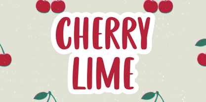 Cherry Lime is a fancy font perfect for crafting, branding, invitation, stationery, wedding designs, social media posts, advertisements, product packaging, product designs, label, photography, watermark, special events or anything. Cherry Lime with full set of uppercase letters, multilingual symbols, numerals and punctuation.
 - Hello Miracle by Letterafandi Studio,
$16.00 Hello Miracle is a cool and interestingly designed display font. It will elevate a wide range of crafting ideas, from cards, to branding, labels and much more. This font is PUA encoded which means you can access all of the glyphs with ease!
 - Drogheda by Fontdation,
$20.00 Introducing our latest font release: Drogheda. A reversed-contrast slab serif with a strong but flexible personality. Crafted with high attention to the details, gives you the best designing experience. Suits best for poster designs, headlines, quote writings, etc. THANKS AND ENJOY!
 - Cute Christmas Monogram by AEN Creative Studio,
$18.00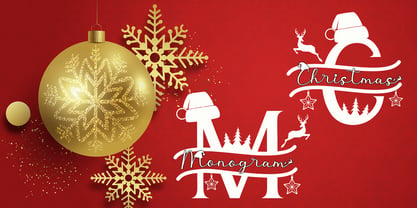 Cute Christmas Monogram is a joyful and festive duo font (decorative + script). It is ideal for Holiday-themed greeting cards and for any crafting project. This font is PUA encoded which means you can access all of the glyphs and swashes with ease!
 - Kaliurang Signature by Letterafandi Studio,
$10.00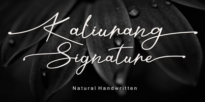 Kaliurang Signature is a modern handwritten font by Letterafa Studio. It has flowing letters that will give your designs a unique and sweet look. Kaliurang Signature is perfect for logos, greeting cards, package design, brand identity, craft design and any DIY project.
 - Zhivanii by Sipanji21,
$15.00 Zhivanii is a handwritten and modern display font. This enchanting font will turn any creative idea into a true standout. Get creative with its unique look, and use it to brighten up any crafting project! This includes both Latin and Cyrillic characters.
 - Food Zone by Seemly Fonts,
$12.00 Food Zone is a childish, easy-to-read display font that conveys impeccable friendliness. Whether you’re using it for crafts, digital design, presentations, or making greeting cards, this font has the potential to become your favorite go-to font, no matter the occasion!


