10,000 search results
(0.024 seconds)
- Darshye Script by Solidtype,
$15.00 Darshye Script is a calligraphy script font that comes with exquisite character changes, a kind of classic copper decorative script with a modern twist, designed with high detail for an elegant style. Darshye Script is interesting because it has a soft, clean, feminine, sensual, glamorous, simple and very easy to read typeface, because there are many fancy letter joints. I also offer a number of decent stylistic alternatives for multiple letters. Classic style is very suitable to be applied in various formal forms such as invitations, labels, restaurant menus, logos, fashion, make up, stationery, novels, magazines, books, greeting / wedding cards, packaging, labels or any type of advertising purposes. You need a program that supports OpenType features like Adobe Illustrator CS, Adobe Photoshop CC, Adobe Indesign, Microsoft Word 2010. It's perfect for logos, greetings, branding, quotes, prints, invitations, and crafts. All lowercase letters include an alternate, start & end swash, which makes the font look amazing! These are all coded with the Unicode PUA. Mac users can use Font Book and Windows users can use Character Map to view and copy any additional characters for pasting into your favorite text editor / application.
 - Goldenwick by LetterStock,
$25.00 Goldenwick This pair was inspired by lettering at invitation design that i got few weeks ago, it was crafted by hand specially to add natural handmade feeling in its brand identity than i make it clean with pentool. Opentype features Goldenwick font has 207 character set included. This font is very good for design logo, labels, packaging product, invitations, advertising and others, this font will make your design authentic and good looking with modern calligraphy style. If you’re looking for original calligraphy script font for your greeting card and make your design authentic, this item is a great choice to make your design looks great and unique. This fonts works with following languages: Afrikaans, Albanian, Asu, Basque, Bemba, Bena, Chiga, Cornish, Danish, English, Estonian, Filipino, Finnish, French, Friulian, Galician, German, Gusii, Indonesian, Irish, Italian, Kabuverdianu, Kalenjin, Kinyarwanda, Low German, Luo, Luxembourgish, Luyia, Machame, Makhuwa-Meetto, Makonde, Malagasy, Malay, Manx, Morisyen, North Ndebele, Norwegian Bokmål, Norwegian Nynorsk, Nyankole, Oromo, Portuguese, Romansh, Rombo, Rundi, Rwa, Samburu, Sango, Sangu, Scottish Gaelic, Sena, Shambala, Shona, Soga, Somali, Spanish, Swahili, Swedish, Swiss German, Taita, Teso, Vunjo, Zulu Thank you for using this font. LS
 - Mack Dutch by LetterStock,
$25.00 MackDutch MackDucth font pair was inspired by old magazine that i saw at barbershop. It was crafted by hand specially to add natural handmade feeling in its brand identity than i make it clean with pentool. We add some rough to make it retro feel, this font is bold so it can look strong if you use it for branding or even title for your retro poster design. Opentype features MackDucth font is a great retro rough font that will looks good in logotype, labels, t-shirt prints, product packaging, invitations, advertising and others. If you looking for retro rough font style, this font is a great choice for you to make your design awesome and flawless. This fonts works with folowing languages: Afrikaans, Albanian, Asu, Basque, Bemba, Bena, Chiga, Cornish, Danish, English, Estonian, Filipino, Finnish, French, Friulian, Galician, German, Gusii, Indonesian, Irish, Italian, Kabuverdianu, Kalenjin, Kinyarwanda, Low German, Luo, Luxembourgish, Luyia, Machame, Makhuwa-Meetto, Makonde, Malagasy, Malay, Manx, Morisyen, North Ndebele, Norwegian Bokmål, Norwegian Nynorsk, Nyankole, Oromo, Portuguese, Romansh, Rombo, Rundi, Rwa, Samburu, Sango, Sangu, Scottish Gaelic, Sena, Shambala, Shona, Soga, Somali, Spanish, Swahili, Swedish, Swiss German, Taita, Teso, Vunjo, Zulu Thank you for using this font. LS
 - Umkhonto by Scholtz Fonts,
$19.00 Umkhonto is the Zulu word for SPEAR, the traditional weapon of war that the Zulus used. The sharp points of the letters face upwards and represent the sharp points of the dangerous spears. The font includes a full 256 character set: all upper and lower case letters, as well as all numerals and punctuation. It also includes the most commonly used characters used in non-English European languages such as Spanish, French, German and Portuguese. The numerals are mono-spaced so that they will line up correctly in columns of figures. The letters of the alphabet are spaced according to their width and are carefully kerned.
 - Steagal by insigne,
$24.75 I love geometric sans serifs, their crispness and rationality. Le Havre taps into this style, but for a while, I've wanted to create a font recalling the printed Futura of the 1940s, which seems to have an elusive quality all its own. After seeing an old manual on a World War II ship, I developed a plan for "Le Havre Metal" but chose to shelve the project due to Le Havre's small x-height. That's where Steagal comes in. When Robbie de Villiers and I began the Chatype project in early 2012 (a project which led one publication to label me the Edward Johnston of Chattanooga!), we started closely studying the vernacular lettering of Chattanooga. During that time, I also visited Switzerland, where I saw how designers were using a new, handmade aesthetic with a geometric base. I was motivated to make a new face combining some of these same influences. The primary inspiration for the new design came from the hand-lettering of sign painters in the United States, circa 1930s through 1950s. My Chatype research turned up a poster from the Tennessee Valley Authority in Chattanooga, Tennessee, which exhibited a number of quirks from the unique hand and style of one of these sign artists. Completing the first draft of Steagal, however, I found that the face appeared somewhat European in character. I turned then to the work of Morris Fuller Benton for a distinctly American take and discovered a number of features that would help define Steagal as a "1930s American" vernacular typeface--features I later learned also inspired Morris Fuller Benton's Eagle. The overall development of Steagal was surprisingly difficult, knowing when to deliberately distort optical artifacts and when to keep them in place. Part of type design is correcting optical illusions, and I found myself absentmindedly adjusting the optical effects. In the end, though, I was able to draw inspiration from period signs, inscriptions, period posters, and architecture while retaining just enough of the naive sensibility. Steagal has softened edges, which simulate brush strokes and retain the feeling of the human hand. The standard version has unique quirks that are not too intrusive. Overshoots have almost been eliminated, and joins have minimal corrections. The rounded forms are mathematically perfect, geometric figures without optical corrections. As a variation to the standard, the “Rough” version stands as the "bad signpainter" version with plenty of character. Steagal Regular comes in five weights and is packed with OpenType features. Steagal includes three Art Deco Alternate sets, optically compensated rounded forms, a monospaced variant, and numerous other features. In all, there are over 200 alternate characters. To see these features in action, please see the informative .pdf brochure. OpenType capable applications such as Quark or the Adobe Creative suite can take full advantage of the automatically replacing ligatures and alternates. Steagal also includes support for all Western European languages. Steagal is a great way to subtly draw attention to your work. Its unique quirks grab the eye with a authority that few typefaces possess. Embrace its vernacular, hand-brushed look, and see what this geometric sans serif can do for you.
 - Popsmart by Bogstav,
$14.00 Popsmart means "smart or skilled in a superficial, self-righteous or annoying way" - but when I was young in the 1980ies, it was a positive thing to be popsmart. At least in Denmark! :) Anyway, I find this font to be smart in a positive way: It has a bouncy appearance ( with help from the Contextual Alternates, the font cycles the 6 different versions of each letter!) and a "go-ahead-and-type-anything-and-it-will-end-up-looking-good" kinda vibe.
 - PL Bernhardt by Monotype,
$29.99Ed Benguiat drew the PL Bernhardt font which was released in 1970. PL Bernhardt was modeled after a 1930/1931 design by Lucian Bernhard. All terminals on non-vertical strokes are diagonal so that lower and uppercase X looks as though they are dancing. - English Script Hand by Autographis,
$39.50 This is the classic English Script. Completely drawn by hand with a classic pen and then scanned and worked over just enough to keep that handmade touch. I didn't want this to look perfect, there are enough versions of this font that are way too slick.
 - P22 St G Schrift by IHOF,
$39.95 P22 ST.G Shrift is a font series based on the type designs of Stefan George with an italic version designed by Colin Kahn. Stefan George (1868-1933) was a German poet who led the revolt against realism in German literature. All of his works were privately published and the typefaces that were used reflected his neo-classic and anti-industrial (progessive) aesthetics; oftentimes consisting of his own hand lettering designs. The original font was cast in 1907 by a small foundry in Germany and was used primarily for the works of George as well as other books including a monumental edition of Dante's Divine Comedy. The ST.G Shrift Fonts contained in this set are derived from 3 known variations of the original roman typeface, St.G., found in various books published in Berlin in the early 20th century. ST.G Shrift One contains the most idiosyncratic characters, while ST.G Shrift Two uses more familiar characters as well as a redesign of characters including the t and the k to be more in keeping with modern san-serif designs. The OpenType version of the roman contains both one and two and expands on them by including central European characters, small caps, and small caps titling figures. The Small Caps titling figures are derived from the first version of the typeface. Below is a features list (accessible through the type palette in Adobe programs) and their functions: ST.G Shrift Opentype Features: Small Caps: Changes Lowercase to Small Caps Titling Figures: Changes Uppercase to Titling Caps, and Small Caps to Small Caps Titling Figures Contextual Alternates: Changes Character Set to match ST.G One and changes Small Caps to Titling Small Caps Ornaments: Changes < > and ? (greater, less and bullet) to ornaments ST.G Shrift Italic is an art nouveau version of the roman. The OpenType version includes central European characters, small caps, titling caps, titling small caps and ornaments.
 - America by Peliken,
$14.00 America otf color font. Letters and numbers in national flag design, stripes of red and blue, white stars ornament for festive decoration.You can use this font for design logos, quotes prints on t-shirts, Presidential election posters and other. OpenType-SVG Font was designed with Fontself Maker in Illustrator CC. WARNING Color fonts are pretty new technology - they currently show up in Photoshop CC 2017+, Illustrator CC 2018 and some Mac apps. Learn more about color font support on third-party apps here: https://www.colorfonts.wtf/
 - Aleut by Peliken,
$14.00 Tribal Aleut OTF color font. Native Historic font, traditional ethnic characters in style of customs and traditions of national culture. You can use this font for design logos, quotes prints on t-shirts and other. OpenType-SVG Font was designed with Fontself Maker in Illustrator CC. Contains only uppercase letters and digits. WARNING Color fonts are pretty new technology - they currently show up in Photoshop CC 2017+, Illustrator CC 2018 and some Mac apps. Learn more about color font support on third-party apps here: https://www.colorfonts.wtf/
 - Realitta Sinta by Zamjump,
$10.00 "Realitta Sinta" is a handwritten font that was created using the Infinite Painter application for sketches. This font is inspired by simplicity which is then attached to each stroke. Realitta sinta is a simple font that includes various features such as ligatures and alternates. Realitta Sinta suitable for various needs such as writing invitations, signatures, promo needs, business card design, Photography logos, casual wear, profession or work and others. Ligature and lowercase alternate swash are differentiators for various purposes or adjust the desired style,
 - Findon by MADType,
$21.00 Findon is a classic sans serif uppercase stencil typeface. It is reminiscent of the days before computers when the best way to reproduce letters quickly was to stencil them.
 - Bad Boy by BA Graphics,
$45.00If you are looking for some wild extreme grunge this is it. No holds barred this is some bad stuff. Let your imagination go there is no stopping here. - TT Bluescreens by TypeType,
$35.00 TT Bluescreens useful links: Specimen PDF | Customization options Please note! If you need OTF versions of the fonts, just email us at commercial@typetype.org Meet the upgraded TT Bluescreens! TT Bluescreens is a geometric sans serif with narrow proportions. The font has a memorable character, while remaining neutral, so it can be used in various design projects. The range of possibilities of the updated TT Bluescreens has become much wider! Condensed styles with narrowed proportions have been added. The classic styles of TT Bluescreens are universal and suitable for setting both in headings and in text arrays. Condensed styles are intended for non-standard design solutions. In small sizes, they are perceived as if having a texture, thanks to which they can become part of packaging or poster design. In large size they look extraordinary, but they are highly readable and convey information well. Variable font now changes along 3 axes: weight, width and slant. Even more options for those who love variety. The character set of TT Bluescreens was expanded, and additional extended Cyrillic and Latin characters were added. Expanded character set. Each style has 874 characters. This is 253 characters more than it there were in the previous version. New currency signs, arrows, punctuation and fractions were added. Number of OpenType features increased from 18 to 31! The font has become even more functional and convenient thanks to a large number of ligatures, stylistic alternatives and localizations. The quality of the contours has become even higher, diacritics were improved. The updated TT Bluescreens is suitable for the design of covers and posters, it will look aesthetically pleasing in packaging design. It can be used in the design of titles and disclaimers. Condensed styles are preferably used in large size. The TT Bluescreens font has 37 styles: 9 upright and 9 italics of standard width, 9 upright and 9 italics in Condensed, 1 variable style. Each style contains 874 characters. The font has 31 OpenType features, including ligatures, stylistic sets, and localizations.
 - Takox by John Moore Type Foundry,
$7.00 Takox is a display typeface based on a synthesis of righteousness extreme, futuristic spirit leads us to a way of plotting the words in a new way and in line with trends and technology synthesis century. Extreme music. Takox is provided with style forms to small caps, in both Regular and Italic. What was the inspiration for designing the font? Takox is the result of my own research in finding straight shapes of great simplicity. What are its main characteristics and features? Display font witn straight shapes of great simplicity. Usage recommendations: This letter design is ideal for use 3D extrusions, ideal to represent natural forms of cristals, metal or mechanical things. Fits indiustriales representations and aerospace, also for extreme music and avant garde.
 - Reline Rosery by Nathatype,
$29.00 Reline Rosery is an elegant serif font that radiates sophistication and grace. With its delicate letterforms and light weight, this typeface exudes a refined and gentle charm. The defining feature of this serif lies in its slender and graceful serifs, which add a touch of elegance to each letter. The light weight of the font enhances its delicate nature, giving it a subtle and airy appearance. This font is perfect for projects that require a refined and sophisticated typography choice. Reline Rosery captures the essence of timeless beauty. The serifs are meticulously crafted to create a sense of harmony and balance, while the light weight adds a contemporary twist. This font strikes the perfect balance between tradition and modernity. The letterforms are carefully designed to maintain legibility and clarity, even in the light weight. Each letter retains its distinctive characteristics, allowing your message to be easily understood. You can also enjoy the various features available in this font. Features: Alternates Ligatures Multilingual Supports PUA Encoded Numerals and Punctuations Reline Rosery fits in branding materials, book covers, wedding invitations, or any project that demands a touch of elegance, this font will bring a sense of refinement and beauty. It is particularly well-suited for applications related to luxury, fashion, beauty, and lifestyle. Find out more ways to use this font by taking a look at the font preview. Thanks for purchasing our fonts. Hopefully, you have a great time using our font. Feel free to contact us anytime for further information or when you have trouble with the font. Thanks a lot and happy designing.
 - Violety Dreams by Nathatype,
$29.00 Violety Dreams is a serene and elegant serif font that will transport your designs to a realm of beauty and sophistication. With its timeless letterforms and delicate swinging strokes on select letters, this typeface evokes a sense of tranquility and grace. This serif uniqueness in its graceful swinging strokes, which adorn certain letters, adding a touch of whimsy and charm. These elegant extensions create a sense of movement and fluidity, capturing the essence of grace and elegance. Inspired by the ethereal nature of dreams and the delicate beauty of violet flowers, Violety Dreams embodies a sense of tranquility and enchantment. The serif letterforms are meticulously crafted to exude elegance and sophistication, while the swinging strokes add a unique touch of whimsicality. This font strikes a perfect balance between classic charm and imaginative flair. The letterforms are designed with precision and clarity, ensuring legibility and readability. Each letter retains its distinctive shape, while the swinging strokes create a visual interest and draw the eye. You can use it in big text sizes to be greatly legible and enjoy the available features here. Features: Stylistic Sets Multilingual Supports PUA Encoded Numerals and Punctuations Violety Dreams is well-suited for headings, titles, invitations, wedding stationery, luxury branding, editorial layouts, branding materials, and any design project that calls for an elegant and dreamy typography. Find out more ways to use this font by taking a look at the font preview. Thanks for purchasing our fonts. Hopefully, you have a great time using our font. Feel free to contact us anytime for further information or when you have trouble with the font. Thanks a lot and happy designing
 - SF Old South Arabian by Sultan Fonts,
$9.99Historical Background Old South Arabian Script (OSA) was used before the Islamic era not only in the southwest corner of the Arabian Peninsula, but actually in the entire Peninsula. In addition, samples of OSA have been found as far as Uruk in Mesopotamia, Delos in Greece, and Giza in Egypt. Archaeological finds show that as far back as the 8th century BCE, OSA was used in trade, religious writing, and in civil records. Following the spread of Islam in Yemen, the decline of OSA began in the 7th century CE as it was gradually supplanted by Arabic script. OSA was typically known by the name of the then-dominant peoples in the Southern Peninsula. At various times, it was known as Sabaean, Qatabani, or Hadramite, among others. Although it was used for a variety of languages, OSA is most strongly associated with Sabaean. Many Peninsular languages borrowed OSA before introducing further changes of their own. Prime examples are the Thamudic, Safaitic, and Lihyanite scripts which eventually developed into independent scripts. The westward migration of the Sabaean people into the Horn of Africa introduced the South Arabian consonantal alphabet into the region. The transplanted script formed the roots of the Geez script of Ethiopia, which, in time and under presumably external influences, developed into a rich syllabary unlike any other Semitic script in history. Even a cursory examination of the letter forms of Modern Ethiopic writing reveal a striking similarity to South Arabian Script. OSA inscriptions typically reveal a dominant right-to-left directionality, although there are also many cases of alternating directions, known as boustrophedon writing. Figure 1 is a fine example of this style of writing. OSA inscriptions were discovered early in the 19th century. Soon thereafter, two orientalists, Gesenius and Rödiger, made great strides towards deciphering the script. Styles of Writing Old South Arabian inscriptions have survived primarily on stone, ceramic, and metallic surfaces. Hundreds of artifacts have been found and, to this day, continue to be discovered. Some of the best examples number of inscriptions on softer materials, such as wood and leather, have also been discovered. Although there is a significant difference between the styles of letters on the hard surfaces and those on the soft. Old South Arabian (Musnad) is composed of 29 letters , that is one letter more than the Arabic alphabet, which is between “S” and “Sh”, and names “Samekh”. Aspects of difference between Musnad and the present Arabic writing is that Musnad is written in separate letters, and the shape of the letters do not change according to its place in the word. However, some letters change according to the beginning of the writing. Musnad is either prominent, or deep. Prominent writings are for important writings and deep writings are for ordinary. The material on which the Musnad was written were stones, rocks, wood, and metal. In the course of its development the Musnad use appeared in the “Lehyanite’, “Thamudic”, “Safaitic”, pen to which many changes and amendments were made. And from it “Habashi’ writing was born. As regards his place among the Arabs of the Peninsula , when we look at the internet and its role in cultural dialogue , the Arabs of the Peninsula considered Musnad inscription which was indisputably their national writing until the dawn of Islam. It was used by people in all parts of Arabia in their homeland and abroad . It was their means of chronology and record of their glories and history.2- Features of Musnad Script: 1. It is written from right to left and vice versa. 2. Its letters are not joined. 3. Shape of letters are uniform despite their positions in the word. 4. Words are separated by vertical lines. 5. A letter is doubled in case of assertion. 6. No points and punctuations. 7. Easy to be learned by beginners. My OSA Musnad Font My design and technical work is only a treatment of the OSA Musnad as a symbol of writing. And it is possible to use in computer.. My design is not aimed at demonstrating the linguistic and intellectual structure of the Old South Arabian (Musnad). It is so simple that it could be easy to learn by learners and those who are interested in the OSA Musnad letters in computer. The basis of such importance is that it spares a lot of time and effort for researchers and students in this field. Formerly they used to write the Musnad texts either by handwriting or scan them , But now they can easily write its texts in OSA Musnad by using keyboard directly, so that they can change , amend and fulfill easily and accurately . So, we made use of speed, easiness and accuracy. And anyone interested in the South Arabian history in any part of the world can due to this design read and write OSA Musnad letters most easily. This design will also be used by historians and archeologists. , as well as specialist linguistics . The design also demonstrates the aesthetics of the Himyarit writing. About this font family Old South Arabian is An Arabic, Old South Arabian and Latin typeface for desktop applications ,for websites, and for digital ads. Old South Arabian font family contains two types: Old South Arabian and Old South Arabian serif. The font includes a design that supports Arabic, Old South Arabian and Latin languages. Old South Arabian typeface comes with many opentype features. - Protura by MIX.Jpg,
$15.00 Protura Sans Serif Masculine - 9 Font Weights With Italics Introducing Protura Sans Serif Masculine, a versatile and powerful font family designed to make a bold statement in your creative projects. With nine distinct font weights and accompanying italics, Protura offers unmatched flexibility for all your design needs. Key Features: Nine Font Weights: Protura Sans Serif Masculine boasts an extensive range of weights, from Light to Ultra Bold. Whether you're crafting a subtle headline or a powerful logo, you'll find the perfect weight to convey your message. Italics Included: In addition to the standard weights, Protura also provides elegant italic versions for each weight. These italics add a touch of sophistication to your typography, making it ideal for editorial work and branding projects. Masculine Aesthetic: Protura's design exudes strength and masculinity, making it an excellent choice for projects aimed at a bold and assertive audience. Its clean lines and sharp edges give your text a contemporary and impactful look. Versatile Usage: This font family is highly adaptable, suitable for a wide range of design applications, including branding, packaging, editorial design, posters, websites, and more. It's a true workhorse font that performs well in various contexts. Legibility: Protura prioritizes legibility without compromising on style. Its well-crafted letterforms ensure that your text remains clear and readable, even at small sizes. OpenType Features: Take advantage of OpenType features such as ligatures and alternate characters to add subtle design nuances and improve overall visual appeal. Multilingual Support: Protura Sans Serif Masculine supports a multitude of languages, making it a globally accessible font choice for your projects. Applications: Branding: Create impactful logos and brand identities that leave a lasting impression. Editorial Design: Enhance the readability and visual appeal of magazines, newspapers, and books. Web Design: Craft modern and engaging websites that resonate with your target audience. Packaging: Design packaging that stands out on the shelf and communicates product quality. Posters and Flyers: Grab attention with bold and stylish promotional materials. Unleash the power of Protura Sans Serif Masculine to elevate your design projects with a masculine, contemporary, and highly versatile typographic solution. With its extensive weight range and italics, this font family empowers you to create impactful and visually stunning designs.
 - Foreign Tourist JNL by Jeff Levine,
$29.00 A 1929 German travel poster had the caption “Wer schlafwagen reist spart zdeit und geld” (“Whoever travels in a sleeping car saves time and money”) hand lettered in an Art Deco sans serif style. This is now available as Foreign Tourist JNL, in both regular and oblique versions.
 - Meowtant Kittens by Hanoded,
$16.00 My youngest son Boris has his birthday in a week. He turns 8, and he loves to play with those Danish building blocks - you know what I’m talking about. Last year he developed an interest in Star Wars n(no idea how that came to be), so we bought him some Star Wars-themed blocks for his birthday. I am now watching the movies with him and it is fun to witness his enthusiasm. The only drawback is the fact that we now seem to have a Chewbacca in our home… Meowtant Kittens is a font I drew with a fineliner and then digitised. Of course the name was influenced by the movies I am watching with Boris, even though they don’t feature any Meowtant Kittens.
 - Growing Garden by Wyarecreatype,
$7.00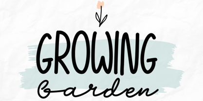 Growing Garden is an elegant and natural trio handwritten font. This original look will appeal to a wide range of crafty ideas. It looks stunning on wedding invitations, thank you cards, quotes, greeting cards, logos, business cards and every other design which needs a handwritten touch. Includes: Uppercase and lowercase For every questions or help, Please contact me. Happy Creating! Thanks!
 - Calaveras by Design is Culture,
$29.00 In August of 2009, I was commissioned by Zoo York, a New York City based skateboard company, to visit Buenos Aires to study and document street typography. As soon as my taxi driver took the bustling street Entre Ríos, it was clear that the city and I were going to be good friends. Many of the independently owned businesses on Entre Ríos are adorned with handmade signage. These signs are painted in a style called Fileteado which is a century-old Argentinian type of lettering and floral ornamentation. Nowadays, Fileteado is still a prominent part of the city’s landscape, coloring the façades of restaurants, bars and coffee shops. Calaveras and Diablitos are two new typefaces that were inspired by Fileteado. Stylistically, the fonts are a return to a rhythmic and playful sensibility reminiscent of Vitrina and Cuba, two fonts that I designed in 1996. Along with dynamism and dance, these new fonts incorporate a rigor and functionality essential to labelling any font a ‘workhorse.’ The names Calaveras and Diablitos, came from the name of a song by the infamous Buenos Aires rock band, Los Fabulosos Cadillacs. —Pablo A. Medina
 - Diablitos by Design is Culture,
$29.00 In August of 2009, I was commissioned by Zoo York, a New York City based skateboard company, to visit Buenos Aires to study and document street typography. As soon as my taxi driver took the bustling street Entre Ríos, it was clear that the city and I were going to be good friends. Many of the independently owned businesses on Entre Ríos are adorned with handmade signage. These signs are painted in a style called Fileteado which is a century-old Argentinian type of lettering and floral ornamentation. Nowadays, Fileteado is still a prominent part of the city’s landscape, coloring the façades of restaurants, bars and coffee shops. Calaveras and Diablitos are two new typefaces that were inspired by Fileteado. Stylistically, the fonts are a return to a rhythmic and playful sensibility reminiscent of Vitrina and Cuba, two fonts that I designed in 1996. Along with dynamism and dance, these new fonts incorporate a rigor and functionality essential to labelling any font a ‘workhorse.’ The names Calaveras and Diablitos, came from the name of a song by the infamous Buenos Aires rock band, Los Fabulosos Cadillacs. —Pablo A. Medina
 - Tramuntana 1 Pro by Vanarchiv,
$50.00 Tramuntana 1 Pro was inspired by the late Renaissance and Mannerist spirit and it was designed by Ricardo Santos during 2009 for his Master in Advanced Typography (Eina-Barcelona). This project was also inspired by Robert Granjon, Garamond and Sabon typefaces. The name tramuntana (Tramontane) is the Catalonian word for the cold wind that comes from the Pyrenees mountains and goes as far as the Balearic Islands. It was designed for editorial purposes (books and magazines). This typeface family contains different font versions for different optical sizes, caption, text, subhead and display, all of them with different x-height proportions and contrast. The serifs are asymmetrical and the letterforms have geometric modulated strokes which simulates the calligraphic variations. Its design approach gives a dynamic feeling, contributing to text flow and continuous reading. The kerning has been optimized for Baltic languages and Western, Southern, and Central European languages.
 - ZionTrain Cyrillic by AndrijType,
$27.00 Originally ZionTrain was built as a (probably first in Cyrillic!) navigation typeface for the Kharkiv identity project and Kharkiv subway and airport navigation systems. We wanted comprehensible, distinctive letterforms, that can help everybody on the way from Babylon to Zion. The project was used in Kharkiv promotion at homeland and abroad, but was rejected by the new government. As a corporate typeface it was used for a few cultural projects.
 - Gundrada ML by HiH,
$12.00 Gundrada ML was inspired by the lettering on the tomb of Gundrada de Warenne. She was buried at Southover Church at Lewes, Sussex, in the south of England in 1085. The Latin inscription on her tomb, STIRPS GUNDRADA DUCUM, meaning “Gundrada, descendant of the Duke” may have led to the speculation that she was the daughter of William, Duke of Normandy and bastard son of Robert the Devil of Normandy and Arletta, daughter of a tanner in Falaise. In 1066 William defeated Harold at the Battle of Hastings and was crowned William I of England. More commonly known as William the Conquerer, he commissioned a string of forts around the kingdom and charged trusted Norman Barons to control the contentious Anglo-Saxon population. William de Warenne, husband of Gundrada, was one of these Barons. There has also been the suggestion that Gundrada may have been the daughter of William’s wife, Matilda of Flanders, by a previous marriage. According to the Dictionary of National Biography (Oxford University Press, Oxford, England 1921-22), both of these contentions are in dispute. Searching the past of a thousand years ago is like wandering in a heavy fog: facts are only dimly in view. Regardless, I know that I found these letterforms immediately engaging in their simplicity. Unadorned and unsophisticated, they have a direct honesty that rests well in the company of humanistic sans serifs like Franklin Gothic or Gill Sans, appealing to a contemporary sensibility. The lettering on the tomb is in upper case only. Although Gundrada does not sound Norman French to me, her husband certainly and her father probably were Norman French. Nonetheless, the man that carved her tombstone was probably Anglo-Saxon, like most of the people. For that reason, we are quite comfortable with a fairly generic lower case from an Anglo-Saxon document of the time. The time was a time of transition, of contending language influences. This font reflects some of that tension. Features 1. Multi-Lingual Font with 389 glyphs and 698 Kerning Pairs. 2. OpenType GSUB layout features: onum, dlig, liga, salt & hist. 3. Tabular Figures and Alternate Old-Style Figures. 4. Alternate Ruled Caps (line above and below, matching to brackets). 5. Central Europe, Western Europe, Turkish and Baltic Code Pages. 6. Additional accents for Cornish and Old Gaelic. 7. Stylistic alternates A, E, y and #. 8. Ligatures ST, Th, fi and fl. 9. Historic alternate longs. The zip package includes two versions of the font at no extra charge. There is an OTF version which is in Open PS (Post Script Type 1) format and a TTF version which is in Open TT (True Type)format. Use whichever works best for your applications.
 - Sneakers Max by Positype,
$22.00 Sneakers was a typeface that I originally drew all the way back in 2005, with a release in 2006. Its most recent iteration, Sneakers Pro was released in 2009. Since then, the idea of reworking the design has lingered in the back of my head, but I wanted to add additional flexibility and value to anything offered beyond the originals. Sneakers Max does just that and I am happy to see it released and available to everyone. Sneakers Max raises the bar in terms of functionality… incorporating all of the options found in Sneakers Pro (e.g. Small Caps and a biform/unicase located now in Titling Alternates), but it expands the character offering, improves on letter designs (everything was redrawn) and explores more flexible settings by providing 5 distinct counter widths to keep more uniform multi-line settings with mixed letter heights. Special thanks to Potch Auacherdkul for his additions to the original character set and for his engineering skills.
 - Oriental Ornaments by Gerald Gallo,
$20.00 Oriental Ornaments was inspired by the ancient design motifs of the far east. There is an assortment of 85 ornaments located under the character set and shift + character set keys.
 - DF Tapa by Dutchfonts,
$39.00 DF Tapa is a typeface based on the vernacular, popular graphics used in Spain. They proudly announce the daily fresh snacks which are homemade and served in every proper bar.
 - Mercurial by Grype,
$16.00 Geometric/Technical style logotypes have been developed for car chrome labels since the early 1980’s, but automobile companies don't monopolize the style by any means. During the 80’s and 90’s, a lot of these logos leaned towards the geometric sans styles and the swiss styling of fonts like Handel Gothic, while playing with varying degrees of squared rounds and varying expanded widths per logotype. Mercurial has this flavor, but it wasn’t derived from logotypes. Instead, it began as a digitization of a film typeface from LetterGraphics in the early 70's known as "Sam". It visual ties to this genre of automotive logotypes and fonts like Handel Gothic lend a familiarity to it, yet it has an identity all its own. As with so many automotive logotypes, this singular style film typeface, lacked an expansive family which shows off all potential the logotypes have and what they "could" be and do. And that's where we come in. What originally began as this family’s Regular Width - Bold Style has been expanded into a collection of 3 Width Families, each containing 5 Weights. Here’s what’s included with the Mercurial Complete bundle: 396 glyphs per style - including Capitals, Lowercase, Numerals, Punctuation and an extensive character set that covers multilingual support of latin based languages. (see the final poster graphics for a preview of the characters included) 3 widths in the collection: Narrow, Regular, & Wide 5 weights in each width family: Light, Book, Regular, Medium & Bold. Here’s why the Mercurial Family is for you: - You’re in need of stylish sans font family with a range of widths and weights. - You’re love those 80’s automotive logos, but want more range of use. - You’re looking for an alternative to Handel Gothic. - You’re looking for a clean techno typeface for your rave poster designs. - You just like to collect quality fonts to add to your design arsenal.
 - Witch Whirlwind by Vozzy,
$14.00 Description: Step into the hauntingly nostalgic world of 80s horror films with 'Witch Whirlwind' a meticulously handcrafted font that channels the chilling essence of vintage movie posters. This font will infuse your designs with the eerie charm and crafty appeal you've been seeking. What Awaits You: Unique Font: 'Witch Whirlwind' boasts meticulously designed letters, numbers, and additional characters inspired by the spine-tingling aesthetics of the 80s. Multilingual Mastery: Your audience knows no bounds with our font, offering complete multilingual support. Why 'Witch Whirlwind' is the Choice for You: Recreate the authentic atmosphere of vintage horror films with this unique font. Elevate your poster designs, t-shirt graphics, and logos with an unmistakable crafty touch. Seamlessly adapt to different projects with multilingual support and versatile font formats. Seize this opportunity to infuse your designs with the spirit of the 80s. Download 'Witch Whirlwind' now and start creating captivating visuals.
 - Coffin Secrets by Vozzy,
$14.00 Description: Step into the hauntingly nostalgic world of 80s horror films with 'Coffin Stories,' a meticulously handcrafted font that channels the chilling essence of vintage movie posters. This font will infuse your designs with the eerie charm and crafty appeal you've been seeking. What Awaits You: Unique Font: 'Coffin Stories' boasts meticulously designed letters, numbers, and additional characters inspired by the spine-tingling aesthetics of the 80s. Multilingual Mastery: Your audience knows no bounds with our font, offering complete multilingual support. Why 'Coffin Stories' is the Choice for You: Recreate the authentic atmosphere of vintage horror films with this unique font. Elevate your poster designs, t-shirt graphics, and logos with an unmistakable crafty touch. Seamlessly adapt to different projects with multilingual support and versatile font formats. Seize this opportunity to infuse your designs with the spirit of the 80s. Download 'Coffin Stories' now and start creating captivating visuals.
 - Burnt Dreams by Vozzy,
$14.00 Description: Step into the hauntingly nostalgic world of 80s horror films with 'Burnt Dreams,' a meticulously handcrafted font that channels the chilling essence of vintage movie posters. This font will infuse your designs with the eerie charm and crafty appeal you've been seeking. What Awaits You: Unique Font: 'Burnt Dreams' boasts meticulously designed letters, numbers, and additional characters inspired by the spine-tingling aesthetics of the 80s. Multilingual Mastery: Your audience knows no bounds with our font, offering complete multilingual support. Why 'Burnt Dreams' is the Choice for You: Recreate the authentic atmosphere of vintage horror films with this unique font. Elevate your poster designs, t-shirt graphics, and logos with an unmistakable crafty touch. Seamlessly adapt to different projects with multilingual support and versatile font formats. Seize this opportunity to infuse your designs with the spirit of the 80s. Download 'Burnt Dreams' now and start creating captivating visuals.
 - Graveyard Wind by Vozzy,
$14.00 Description: Step into the hauntingly nostalgic world of 80s horror films with 'Graveyard Wind' a meticulously handcrafted font that channels the chilling essence of vintage movie posters. This font will infuse your designs with the eerie charm and crafty appeal you've been seeking. What Awaits You: Unique Font: 'Graveyard Wind' boasts meticulously designed letters, numbers, and additional characters inspired by the spine-tingling aesthetics of the 80s. Multilingual Mastery: Your audience knows no bounds with our font, offering complete multilingual support. Why 'Graveyard Wind' is the Choice for You: Recreate the authentic atmosphere of vintage horror films with this unique font. Elevate your poster designs, t-shirt graphics, and logos with an unmistakable crafty touch. Seamlessly adapt to different projects with multilingual support and versatile font formats. Seize this opportunity to infuse your designs with the spirit of the 80s. Download 'Graveyard Wind' now and start creating captivating visuals.
 - Lancelot Pro by Canada Type,
$39.95 When type historians look back on Jim Rimmer, they will consider him the last type designer who just couldn't let go of metal type, even though he was just as proficient in digital type. Lancelot is one definite case in point: A face designed and produced in digital as late in the game as 1999, only to spring onto the new millenium a couple of years later as a metal type cast in three sizes. That was Jim, a time traveler constantly reminding the craft of its origins. This particular time machine was originally designed as a simple set of attractive caps that emphasize the beauty of the variable conventional dialogue between the drawing tool and the intended final form, and the one exchanged within the totality of the forms themselves. Jim designed two weights, with contrast and counterspace being the main difference between them. In 2013, the Lancelot family was remastered and greatly expanded. Lancelot Pro is now a wonder of over 840 glyphs per font, including smaller versions of the caps in the minuscule slots, and alternates and ligatures that can transform the historic spirit of the original design into anything from half-uncial to outright gothic. Language support goes beyond the extended Latin stuff, to cover Cyrillic and Greek as well. 20% of the Lancelot Pro family's revenues will be donated to the Canada Type Scholarship Fund, supporting higher typography education in Canada.
 - Hispania Script by HiH,
$10.00 Hispania Script is a distinctive and distinctly nineteenth century script. It was released by Schelter & Giesecke of Leipzig, Germany around 1890. Particularly noteworthy are the sharply-pointed legs of the upper case ‘K’ & ‘R’ that seem to be characteristic of the period. Similar strokes, often with a slight curve, may be seen in typefaces like Alt-Romanish and Tinteretto by Schelter & Giesecke, Artistic and Lateinsch by Bauer and Berthold and the poster lettering of Edward Penfield. The angle of this script (approximately 24 degrees) and the sharp delicate points must have made the manufacture of this face in metal type a challenge. The resulting type was probably quite fragile and subject to accidental damage. Additionally, the sharp points would be subject to wear. With digital type, these concerns are eliminated. As far as I know, no one has ever dropped a digital letter on the floor. Nonetheless, creating a digital outline for a typeface like Hispania Script, with many crossing strokes, can be quite time-consuming. Even with an accurate scan of a good quality original, it is usually necessary to construct each crossing stroke separately and then remove the overlap in order to obtain a sharp and convincing intersection. Steep internal angles are often defined with two points, rather than one, to minimize ink or toner fill that can muddy the rendering in smaller sizes. Like all formal scripts, Hispania Script is always useful for announcements and invitations. However, the distinctiveness of of this design strongly suggests that there are other applications that may benefit from its use. Step outside the box and try it in some unexpected places. It is the unexpected that often draws a person’s eye.
 - Materia Pro by Elsner+Flake,
$79.00 Minimal, modular, modern—at first glance, Materia shows a contemporary flair, combining pure, strong geometrical form with a subtle, distinct appearance. Actually, the design was inspired by lettering from the turn of the 19th to the 20th century that still can be found in the East of France. While its formal origins date back as far as this, revived e. g. by the constructivists into the nineteen twenties and later on by Dutch information designer Wim Crouwel in the nineteen-sixties, the visual language of Materia still speaks of the »future«. Following a minimalistic concept the font is formally built on a grid. Wherever optical curves are needed for a smoother, more comfortable shape of letters than a simple rectangular block, diagonals cut off the egdes – like a diamond is cut to achieve more beauty. Thus headlines and texts set in Materia are given a certain »egdy« feeling, whereas their tonality is still kept well-balanced, keeping concentation all on information in a nonconfomist way. Materia comes in eight styles, from elegant Thin to attention-forcing Ultra. Even a regular Italic is available, following the classic type-set-principle. Two of the styles are explicitly designed for display use, Shadow and Code. Both are ready for combinations with Bold or each other respectively, the layering of Shadow and Code e. g. allows astonishing effects or highlighting within the letters. For OpenType-users Materia is a real Pro, containing accented Latin letters for over 70 languages, small caps, old style, tabular and lining figures and special condensed titling all caps for cases in which space is all that counts. How useful all of the above mentioned is may be seen in the book David Lynch – Lithos, designed by Koma Amok, published in 2010 by item éditions, Paris, and Hatje Cantz, Germany, which was typeset completely in Materia.
 - Dueblo by alphabeet.at,
$40.00 Dueblo is a font family in serif, sans serif and semi serif with variability in weight and serifs. It's a classical antiqua with a sans serif basis, a semi serif version, two decor styles for headlines and initials and the italics in sans and in serif. The small caps, alternates as well as other useful optional and contextual open type features are included in the fonts. It has been in development since 2012 and in use for several projects and publications since 2015. It was worked on until 2020, the cyrillic and greek letters were added, and it was built up in a new and modern way. Now it's really ready for building words and paragraphs.