10,000 search results
(0.023 seconds)
- Yiggivoo Unicode - 100% free

- Circulo by MMD Fonts,
$6.29 Bound to rules, unbound in the usage. Hyper geometric, and minimal contrast. Circulo V1 is based on a font project I originally started because of a client I had. I wanted to create a display and text font for their product design brand, which is all about reducing the amount of necessary materials and production steps. Before I started the course at tipo-g it was called -“REDUCE“ and was more or less finished. The concept was based on the name. How far can letter shapes be reduced to their core geometric concepts and still be identified as letters? But in a way, it lacked a unique approach and was just a generic geometric Sans Serif with a lack of finesse. There was already a glimpse of characteristics visible which would later define Circulo V1. The high focus on geometric shapes was not of the same severity, and the angle on the stems was less intense. Those, as I call them, fake serifs turned out to be a significant factor in legibility and the characteristic of the font. Besides those changes and improvements, I decided to implicate a new feature to the concept, a condensed style. I quickly realised that it is impossible to keep my perfect circles and half-circles in this style without breaking my rules for the font. This „problem“ turned out to be the most crucial feature of the condensed set. Circular-based Letters will ignore the rules and boundaries of the condensed style and stay as they are. This feature allows the user to create a unique rhythm in their texts, and if you use the variable font, you can decide how intense this rhythm will be. In this situation, the user can choose which letters are allowed to keep their shapes and which will be put in their condensed corset. All, some or none of them, you decide.
 - Bodicx by Gatra Std,
$15.00 Introducing a cute handwriting "Bodicx" Simple Fun Display Font! If you are needing a touch of casual modern San-Serif for your designs, this font was created for you! What's Included: Uppercase and Lowercase Number and Punctuation Support Language This font works best in a program that supports OpenType features such as Adobe Indesign, Adobe Illustrator CC and CS, or Adobe Photoshop CC and CS also CorelDraw More Questions? Here are some (potential) answers! Do not to resell this font in any way. Multilingual Support is included for Western European Languages If You interest this font for commercial use please contact me at : wahyuputrabangsa127@gmail.com Have a Wonderful Day, Gatra Std
 - Karika Swirls by Deniart Systems,
$20.00 Add charm with intricate swirls! Karika Swirls was inspired by our obsessive love of swirly patterns and symmetric designs. Karika, a Hungarian word for circle, is a charming way of saying we love circular symmetrical forms. These 52 original illustrations are great for creating stationery, adding borders to greeting cards or design projects, background images, etc. The glyphs can be used individually or combined with other glyphs to form complex patterns. Karika Swirls is part of the Karika Collection of fonts. These intricate swirls are symmetrically sized in height and width so they'll work charmingly together for any project. See also Karika Hearts and Karika Encore .
 - Nata by MysticalType,
$10.00 Nata is a sans serif family with fourteen weights plus matching italics. It was designed by Candi Erwanto in 2019. This sans serif family is based and influenced by geometric styles that were popular during the 1920s and 30s and have been optically corrected for better readability. Nata has a functional look with a warm touch. While thin and black weights are great players in display size, lightweights, regular, and medium are suitable for longer texts. Small x-height and curbed shape provide a distinctive elegance. Nata is equipped for complex and professional typography. This OpenType font family has extended characters to support Central and Eastern European and Western European languages.
 - Valuable Time by Bogstav,
$14.00 Sometimes you need a slim, elegant good old fashioned serif font. And, voila! Here you are - Valuable Time fits all those needs. I didn't spend much time cleaning up the letters, so they stand out just the way they are: organic and handmade!
 - BuddySystem - Unknown license

- Candycorn Overdose by Fontosaurus,
$19.95Candycorn Overdose represents how I used to feel on the morning after Halloween, way back when I was young enough to go out begging for candy. - VakaDi by Tadiar,
$15.00 vakaDi is stylish futuristic tech font designed for such areas as hi-tech, future, sport, space, army, games and many others. In the process of creating the font, we faced the choice of which letters are better - this or that... Each of them was beautiful in its own way and so we decided to include them all!:) Some you will find in upper case, others in lower case. Multilingual support (Latin extended). It is designed for header and text both.
 - Fidusmager by PizzaDude.dk,
$17.00 This is definitely a font suitable for kids toys. The letters are legible, and at the same time totally wacky! Kinda like what a kids toy should be! Fidusmager started out as a handdrawn, slightly rugged looking fon. However I ended up manually tracing each letter in order to have those smooth lines. By the way, Fidusmager is danish and actually means someone who’ll trick you - but as a kid I didn’t know that, and found that it most likely was something positive! :)
 - Catsme by Peliken,
$7.00 Cats OTF color font. Creative set of characters, kittens pictured in a variety of poses. You can use this font for design logos, quotes prints on t-shirts and other. OpenType-SVG Font was designed with Fontself Maker in Illustrator CC. Contains only uppercase letters and digits. WARNING Color fonts are pretty new technology - they currently show up in Photoshop CC 2017+, Illustrator CC 2018 and some Mac apps. Learn more about color font support on third-party apps here: https://www.colorfonts.wtf/
 - Polin Sans by Borutta Group,
$39.00 For several years I have been thinking about the design of a type family that explores, on the one hand, the modernist aesthetic that we know, from the Alphabet "a.r." designed by Władysław Strzemiński, and on the other, to the multiscript pre-war Warsaw. This is how the idea of creating the Polin Sans typeface was born. After researching on geometric variants of the Cyrillic alphabet, I was inspired by the text "Towards an open layout: A letter to Volodya Yefimov". I was intrigued by the fact that circular forms, which we are mostly familiar with in the Bulgarian Cyrillic, can be implemented in the classical version, without disrupting the reading process. At the same time, while working on typoteka.pl, I was fascinated by the Hebrew typeface jaffa, published by the Idźkowski & Sk-a foundry, which at some points looks like the Hebrew equivalent of the Alphabet "a.r.". Ben Nathan from Israel joined the project and was responsible for creating his native script. The idea of creating a multiscript family expanded to include Greek and Vietnamese. As a result, Polin Sans is a historical journey through the nooks and crannies of Polish modernism, which was created by people with diverse cultural backgrounds. The Polin Sans family was designed by Mateusz Machalski and Ben Nathan with the support of Michał Gorczyca and Małgorzata Bartosik.
 - Plumage by Wilton Foundry,
$29.00Plumage is somewhat unusual in that it has elements of calligraphy as well as script in a semi-loose form that gives it a pleasing appearance for both large and small sizes, and interesting flare finish strokes add to its unique character. As I read a dictionary description of "plumage", I realized that in many ways there is a parallel between a bird's plumage and how it is utilized in the context of writing: Plumage varies in pattern and arrangement for different purposes; what it expresses can of course be even more interesting. Plumage is disposable after a season, as new ones become available... imagine, a self-sustaining quill! - I guess that's equivalent to a refill or disposable pen. Historically, quill pens were made from feathers of a variety of birds, each chosen for its special characteristics. The sturdiest and most reliable feathers, however, come from turkeys, swans and geese. Feathers used to make pens are the stiff-spined flight feathers on the leading edge of the bird's wing. Pens for right-handed writers come from the left wing, and pens for left-handers, from the right! Each bird yields 10-12 good quills, and sometimes only 2 or 3 - so small a yield that the geese reared in England could not furnish nearly enough for local demand, and quills were imported from the Continent in large quantities. At one point St Petersburg in Russia was sending 27 million quills a year to the UK. It is said that geese were specially bred by US President Thomas Jefferson (1743-1826) to supply his own vast need for quills - in his lifetime he wrote almost 20,000 letters. The name "Plumage" was selected to pay homage to the noble birds that supplied countless quills for centuries of literary works. Plumage is recommended for any formal or informal invitation, decorations, awards, poetry, plaques, etc. We hope you will have the pleasure of using Plumage. - Halloween Rules by AEN Creative Studio,
$15.00 Halloween Rules is a cool-lettered and spooky decorative font. It is perfectly suitable for any Halloween-related project or crafty idea! Add it confidently to your favorite creations and let yourself be amazed by the outcome generated. Halloween Rules is PUA encoded, which means you can access all of the glyphs and swashes with ease!
 - Jossie by Olivetype,
$18.00 Jossie is a cool brush font. The style is a little bit rough, suitable for all of your logos, branding, social media, and crafty DIY projects. Features : Basic Latin A-Z & a-z Numbers Symbols, and punctuations Ligatures and swashes Multilingual support: from Afrikaans Albanian Catalan Danish to Dutch English Spanish Swedish Zulu. Accented Characters : ÀÁÂÃÄÅÆÇÈÉÊËÌÍÎÏÑÒÓÔÕÖØŒŠÙÚÛÜŸÝŽàáâãäåæçèéêëìíîïñòóôõöøœšùúûüýÿžß Thank you
 - Violetail by Balpirick,
$15.00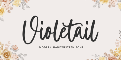 Violetail is a Modern Handwritten Font. Violetail Modern is an elegant and dainty handwritten font that features sweet and delicate swashes. This original look will appeal to a wide range of crafty ideas, from letterheads and titles, to stationery. Violetail also multilingual support. Enjoy the font, feel free to comment or feedback, send me PM or email. Thank you!
 - CoffeeMug by Ingrimayne Type,
$10.00 CoffeeMug has letters on coffee mugs. Upper-case letters have the handles to the left and lower-case characters have the handles to the right. The letters on the mugs are from the typeface InsideLetters. The typeface contains characters that will add color to letters. There are two ways to do this. One uses layers and the other a combination of characters, some with zero-width. A file in the gallery explains the ways that this can be done.
 - Octin Vintage by Typodermic,
$11.95 Introducing Octin Vintage, the typeface that combines toughness and style in a delicately textured design. With its versatile 2 styles—sans and serif—and 3 weights—regular, bold, and black—Octin Vintage is the perfect choice for any project that requires a bold, eye-catching headline. Whether you’re creating designs for police, sports, prison, construction, school, or military themes, Octin Vintage delivers the rugged, vintage look that will help your designs stand out. Its timeless appeal is sure to capture the attention of your audience and leave a lasting impression. And it’s not just about looks—Octin Vintage is designed for versatility and ease of use, making it an ideal choice for both experienced designers and beginners. With its finely crafted letterforms and subtle textures, Octin Vintage adds a touch of sophistication and style to any design. So if you’re looking for a typeface that combines toughness, style, and versatility, look no further than Octin Vintage. Try it out today and discover the difference that this delicately textured design can make in your next project Check out the rest of the Octin families: Octin Sports, Octin College, Octin Prison, Octin Stencil & Octin Spraypaint. Most Latin-based European writing systems are supported, including the following languages. Afaan Oromo, Afar, Afrikaans, Albanian, Alsatian, Aromanian, Aymara, Bashkir (Latin), Basque, Belarusian (Latin), Bemba, Bikol, Bosnian, Breton, Cape Verdean, Creole, Catalan, Cebuano, Chamorro, Chavacano, Chichewa, Crimean Tatar (Latin), Croatian, Czech, Danish, Dawan, Dholuo, Dutch, English, Estonian, Faroese, Fijian, Filipino, Finnish, French, Frisian, Friulian, Gagauz (Latin), Galician, Ganda, Genoese, German, Greenlandic, Guadeloupean Creole, Haitian Creole, Hawaiian, Hiligaynon, Hungarian, Icelandic, Ilocano, Indonesian, Irish, Italian, Jamaican, Kaqchikel, Karakalpak (Latin), Kashubian, Kikongo, Kinyarwanda, Kirundi, Kurdish (Latin), Latvian, Lithuanian, Lombard, Low Saxon, Luxembourgish, Maasai, Makhuwa, Malay, Maltese, Māori, Moldovan, Montenegrin, Ndebele, Neapolitan, Norwegian, Novial, Occitan, Ossetian (Latin), Papiamento, Piedmontese, Polish, Portuguese, Quechua, Rarotongan, Romanian, Romansh, Sami, Sango, Saramaccan, Sardinian, Scottish Gaelic, Serbian (Latin), Shona, Sicilian, Silesian, Slovak, Slovenian, Somali, Sorbian, Sotho, Spanish, Swahili, Swazi, Swedish, Tagalog, Tahitian, Tetum, Tongan, Tshiluba, Tsonga, Tswana, Tumbuka, Turkish, Turkmen (Latin), Tuvaluan, Uzbek (Latin), Venetian, Vepsian, Võro, Walloon, Waray-Waray, Wayuu, Welsh, Wolof, Xhosa, Yapese, Zapotec Zulu and Zuni.
 - Martini at Joe's by steve mehallo,
$19.56 Googie Architecture, also known as "Midcentury Coffee Shop Modern," was born in California during the Atomic Age. Martini at Joe's is based on lettering from several historic Googie sources - many of which no longer exist. The futuristic Martini at Joe's collection was named for Northern California's famous Italian-themed "Joe's" restaurants, some of which are still serving up large portions of charbroiled beef steak, canned buttered veggies and pretty decent martinis. Martini at Joe's contains many fabulous typographic extras – and is available in single font packages or as a 15 font interchangeable Megaset (with "italic-esque" obliques and "retro obliques"). Martini at Joe's is perfect for use as commercial signage, on the menu for your coffee shop, supper club, tiki bar, fish grotto, smorgy, space port or destination casino. It also holds its own in any vintage store, on greeting cards, t-shirts, hi-brow gallery announcements, product skins, your 'zine masthead, on the faceplate of your futuristic microwave oven, tv dinner packaging, at millionaire's conferences or even embellishing the fuselage of your latest jet airline venture. Martini at Joe's: there's no better way to say, "Hold the olive, I'm having a moment."
 - Jannson Map by RM&WD,
$35.00 For best results, use of OpenType features is strongly recommend. This font is inspired by Johannes Janssonius, well know as Jan Janszoon o Jan Janssonius (Arnhem, 1588 – Amsterdam, 1664), was a Dutch cartographer, publisher and engraver. Married to Hondius's daughter. He was the author of many masterpieces of cartography of the 1700s like Willem Blaeu and Hondius, famous maps with heavy use of decorations in the letterig to fill the spaces of oceans, seas, lakes and scrolls. Now you can easily recreate not just ancient maps without effort, but you can use this font creatively, to make unique, modern logos, product names, fresh packaging, hip fashion outfits, refined labels, signs, coordinated images ... Hundreds of alternatives to choose from and maybe to combine with other fonts in an original way. One extra font with 27 castles in Janszoon style are also usefull for map, of course, but also for many different creative artworks. Warning: Jannson Map having oversized swashes compared to the normal standards cannot be used with Windows Word because Word does not give the possibility to manage the line spacing professionally. Jannson Map works great with applications like Illustrator, In Design, quark Xpress, mac Text etc ...
 - Erotica by Lián Types,
$49.00 “A picture is worth a thousand words” and here, that’s more than true. Take a look at Erotica’s Booklet; Erotica’s Poster Design and Erotica’s User’s Guide before reading below. THE STYLES The difference between Pro and Std styles is the quantity of glyphs. Therefore, Pro styles include all the decorative alternates and ligatures while Std styles are a reduced version of Pro ones. Big and Small styles were thought for better printing results. While Big is recommended to be printed in big sizes, Small may be printed in tiny sizes and will still show its hairlines well. INTRODUCTION I have always wondered if the circle could ever be considered as an imperfect shape. Thousands of years have passed and we still consider circles as synonyms of infinite beauty. Some believe that there is something intrinsically “divine” that could be found in them. Sensuality is many times related to perfectly shaped strong curves, exuberant forms and a big contrasts. Erotica is a font created with this in mind. THE PROCESS This story begins one fine day of March in 2012. I was looking for something new. Something which would express the deep love I feel regarding calligraphy in a new way. At that time, I was practicing a lot of roundhand, testing and feeling different kinds of nibs; hearing the sometimes sharp, sometimes soft, sound of them sliding on the paper. This kind of calligraphy has some really strict rules: An even pattern of repetition is required, so you have to be absolutely aware of the pressure of the flexible pen; and of the distance between characters. Also, learning copperplate can be really useful to understand about proportion in letters and how a minimum change of it can drastically affect the look of the word and text. Many times I would forget about type-design and I would let myself go(1): Nothing like making the pen dance when adding some accolades above and below the written word. Once something is mastered, you are able to break some rules. At least, that’s my philosophy. (2) After some research, I found that the world was in need of a really sexy yet formal copperplate. (3) I started Erotica with the idea of taking some rules of this style to the extreme. Some characters were drawn with a pencil first because what I had in mind was impossible to be made with a pen. (4) Finding a graceful way to combine really thick thicks with really thin hairlines with satisfactory results demanded months of tough work: The embryo of Erotica was a lot more bolder than now and had a shorter x-height. Changing proportions of Erotica was crucial for its final look. The taller it became the sexier it looked. Like women again? The result is a font filled with tons of alternates which can make the user think he/she is the actual designer of the word/phrase due to the huge amount of possibilities when choosing glyphs. To make Erotica work well in small sizes too, I designed Erotica Small which can be printed in tiny sizes without any problems. For a more elegant purpose, I designed Erotica Inline, with exactly the same features you can find in the other styles. After finishing these styles, I needed a partner for Erotica. Inspired again in some old calligraphic books I found that Bickham used to accompany his wonderful scripts with some ornated roman caps. Erotica Capitals follows the essentials of those capitals and can be used with or without its alternates to accompany Erotica. In 2013, Erotica received a Certificate of Excellence in Type Design in the 59th TDC Type Directors Club Typeface Design Competition. Meet Erotica, beauty and elegance guaranteed. Notes (1) It is supossed that I'm a typographer rather than a calligrapher, but the truth is that I'm in the middle. Being a graphic designer makes me a little stubborn sometimes. But, I found that the more you don't think of type rules, the more graceful and lively pieces of calligraphy can be done. (2) “Know the forms well before you attempt to make them” used to say E. A. Lupfer, a master of this kind of script a century ago. And I would add “And once you know them, it’s time to fly...” (3) Some script fonts by my compatriots Sabrina Lopez, Ramiro Espinoza and Alejandro Paul deserve a mention here because of their undeniable beauty. The fact that many great copperplate fonts come from Argentina makes me feel really proud. Take a look at: Parfumerie, Medusa, Burgues, Poem and Bellisima. (4) Some calligraphers, graphic and type designer experimented in this field in the mid-to-late 20th century and made a really playful style out of it: Letters show a lot of personality and sometimes they seem drawn rather than written. I want to express my sincere admiration to the fantastic Herb Lubalin, and his friends Tony DiSpigna, Tom Carnase, and of course my fellow countryman Ricardo Rousselot. All of them, amazing.
 - Publishing Script by Fontscafe,
$39.00 Publishing script pack combines the sensuality and elegance of Tango Argentino, evocative of special moments, of the new avant-garde font "Publishing Script" with the wildness and daring of "Publishing Draft Script". Two handmade new script fonts with 105 variations, between alternatives and swashes, plus 32 exclusive stylistic Ligatures that convey unequivocally fluidity and audacity. The distinction and vintage-contemporary approach of "Publishing Script", from the handmade character of the universe of the Fonts Café creations, which conserves the depth of the vintage/retro style mixed with an avant-garde stylish look. The authenticity and the self-confident approach of the "Publishing Draft Script", as a tool to rediscover the most intimate human being feelings, which introduces the new Fonts Café concept of Bio-write script! A perfect combination of style, readability and flexibility, a "must have" for your next Publishing projects!
 - Office Typewriter by Ana's Fonts,
$16.00 Office Typewriter SVG font is a monospaced typewriter font in two styles: Regular and Underlined, and two weights: Regular and Bold. It is a SVG font in which each glyph is an image (instead of a vector). This means the typewriter texture could be captured in an extremely realistic way. In addition, each glyph has 3 variations that appear "randomly" via contextual alternates. This makes it versatile and fun to use in modern and vintage designs alike. This font is also very legible at a wide range of sizes (although it looks better at small and medium sizes, as the image can become blurry at larger font sizes), and looks great in both long or short texts, in digital collages, branding and packaging, social media posts, logotypes, etc. The Office Typewriter SVG font family includes: Office Typewriter font, in Regular and Bold weights Office Typewriter Underline, in Regular and Bold Office Typewriter Misprints, with assorted misprints, doodles, circles and underlines Software requirements for the SVG font: Photoshop CC2017+ // Illustrator CC2018+
 - Wolfsburg by MADType,
$21.00 Wolfsburg is a classic blackletter stencil typeface. It is reminiscent of the days before computers when the best way to reproduce letters quickly was to stencil them.
 - East Gates by Nathatype,
$29.00 East Gates is a mesmerizing display font that commands attention. Each letter is a work of art, meticulously crafted to elevate the overall appearance with a perfect blend of visible contrast and intricate details. The characters in East Gates boast a generous size, ensuring a bold and impactful presence. The visible contrast between thick and thin strokes adds a dynamic quality to the font, creating a sense of both strength and delicacy. What sets East Gates apart is the enchanting ornamentation gracing the letters, enhancing the overall beauty with a touch of intricate design. Enjoy the features here. Features: Multilingual Supports PUA Encoded Numerals and Punctuations East Gates fits in headlines, logos, posters, flyers, branding materials, greeting cards, print media, editorial layouts, and many more designs. Find out more ways to use this font by taking a look at the font preview. Thanks for purchasing our fonts. Hopefully, you have a great time using our font. Feel free to contact us anytime for further information or when you have trouble with the font. Thanks a lot and happy designing.
 - Zierde Grotesk by Lewis McGuffie Type,
$35.00 Zierde is a take on early advertising, small-copy grotesks of the late 19th/early 20th century, and is largely inspired by Miller & Richard’s own range of Grotesques. More importantly, Zierde is accompanied by a large set of ornaments (+200) which hark back to the look-and-feel of the early-modernist arts and crafts movement. The ornaments in, and presentation of, Zierde owe much credit to J.G Schelter & Giesecke’s 1913 type specimen book ‘Die Zierde’. The strong functional uppercase sans-serifs alongside luscious, beautiful patterns in ‘Die Zierde’ make for beautiful combinations. This early-modernist use of grotesk alongside ornament looks bizarre in the eyes of us used to seeing sans-serifs in more formal, sterile settings. The face itself retains some historical flourishes such as the eccentric leaning angle of the italics, the long cross-bar on the ‘G’, the gammy-leg of the ‘R’, a strange ampersand and some irregular terminals across the weights. Zierde is display face meant for headlines, titles, short-copy, labels and logos. It comes in caps and small caps, Latin and Cyrillic.
 - Westblue by Ditatype,
$29.00 Westblue is a captivating sans-serif display font. Crafted in bold style and intricate brushwork, this font is a versatile choice for designers seeking a perfect combination of impact and creativity. The characters in Westblue command attention with their substantial size and clean, sans-serif lines. What sets this font apart is the meticulously added brushed details, which bring an organic and handcrafted touch to each letter. These details create a sense of dynamism, making Westblue ideal for projects that demand both modernity and a hint of artistic flair. In addition, enjoy the features here. Features: Multilingual Supports PUA Encoded Numerals and Punctuations Westblue fits in headlines, logos, posters, flyers, branding materials, greeting cards, print media, editorial layouts, and many more designs. Find out more ways to use this font by taking a look at the font preview. Thanks for purchasing our fonts. Hopefully, you have a great time using our font. Feel free to contact us anytime for further information or when you have trouble with the font. Thanks a lot and happy designing.
 - Buddy Smile by Create Big Supply,
$15.00 Introducing Buddy Smile, a unique handwritten font that adds a splash of color, cheerfulness, and playfulness to your designs. With its charming and lively style, this font is perfect for enhancing your brand identity, book covers, children's events, quotes, and more. Buddy Smile brings a touch of personality to your projects with its combination of uppercase and lowercase letters. The fluid and organic strokes create a friendly and approachable feel, making your text feel warm and inviting. Whether you're designing a logo or crafting a heartfelt message, this font will leave a lasting impression. With its extensive language support, Buddy Smile ensures that your message can reach a diverse audience. Express yourself in different languages and connect with people from around the world. The font also includes numbers and punctuation marks, allowing you to maintain consistency throughout your designs. Experience the convenience of PUA (Private Use Area) Encoding, which provides access to special characters and glyphs. Customize your typography and add extra flair to your compositions, making them truly one-of-a-kind.
 - Heydista Notes by Colllab Studio,
$19.00 "Hi there, thank you for passing by. Colllab Studio is here. We crafted best collection of typefaces in a variety of styles to keep you covered for any project that comes your way! Heydista Notes is a traditional hand-written monoline signature font with clean, geometric outlines. This makes it the perfect choice for high-end branding or marketing materials. The font is modeled after the calligraphy of ancient Rome and Greece. It has a classic and timeless feel, but the clean lines give it a modern edge. Heydista Notes has been designed with attention to detail and with very high quality standards in mind. It includes over 200 glyphs, stylistic alternates with beginning and ending swashes that you can use with your designs, and alternate letters for each letter of the alphabet so you can create unique-looking words and phrases with ease. Whether you're looking for a classic feel or something more modern, Heydista Notes will elevate your designs to the next level. A Million Thanks www.colllabstudio.com
 - Aspire Narrow by Grype,
$18.00 While the Aspire family finds its roots of inspiration in the ACURA automotive company logo, with its wider base, the Aspire Narrow family condenses those styles into something more suitable for larger bodies of text in a more standardized width. Aspire pays homage the techno display styling of the inspiration logotype, further evolving beyond its brand inspired origin to give birth to a font family that pulls on modern and historical styles. It adopts a sturdy yet approachable style with its uniform stroke forms and curves, and goes on to include a lowercase, numerals, and a comprehensive range of weights, creating a straightforward, uncompromising collection of typefaces that lend a solid foundation and a broad range of expression for designers. Here’s what’s included with the Aspire Narrow Family bundle: 477 glyphs per style - including Capitals, Lowercase, Numerals, Punctuation and an extensive character set that covers multilingual support of latin based languages. (see the 6th graphic for a preview of the characters included) Stylistic Alternates - alternate characters that remove the angled stencil cuts for a more standardized text look. 3 weights in the family: Light, Regular, & Black. 3 obliques in the family, one for each weight: Light, Regular, & Black. Fonts are available in TTF & OTF formats. The TTF format is the standard go to for most users, although the OTF and TTF function exactly the same. Here’s why the Aspire Narrow Family is for you: - You’re in need of a narrow automotive sans font family with a range of weights and obliques. - You’re love that ACURA letter styling, and want to design with a narrow font within that genre. - You’re looking for an alternative to Eurostile with more stylized letterforms. - You’re looking for a clean techno typeface for your starship console labelling. - You just like to collect quality fonts to add to your design arsenal.
 - Rockeby Brush by My Creative Land,
$25.00 Rockeby Brush is a new font family that joins a well known collection - Rockeby Typography Toolbox. It contains 3 brush fonts - Dry, Rough and Clean - and a Brush Extras font that contains different design elements and graphic to complement your design whether it is a logo, website or a more complex design project. The Rough Brush font has a unique feature - the grunge texture that is applied not only to the letters but to the surrounding space as well. You can successfully mix and match all 50 fonts within Rockeby Typography Toolbox to get your design a stylish look. Rockeby SemiSerif Family ; Rockeby .
 - Furious Night by Hatftype,
$17.00 Furious Night - Blackletter Display Font is a display font that is inspired by gothic and horror style because its shape is very unique and is perfect for any project that you will use with this theme. Furious Night with opentype features such stylistic alternates, stylistic sets & ligatures good for logotype, poster, badge, book cover, tshirt design, packaging and any more. Features : 1.Uppercase & Lowercase 2.Multilingual support 3.Number 4.Symbol 5.Punctuation. 6.Extra Dingbat 7.Support in Mac and Windows OS -Support in design application (photoshop, illustrator, and more) There it is! I really hope you enjoy it
 - Painless Feedback by Bogstav,
$15.00 Here you go...a handmade sans font without much of surprise...actually, this is how I draw letters with my eyes closed...well, almost! I wanted to make a font with letters that were pretty obvious, but had that handmade look that I love so much. The result is this really painless font - it won't hurt or scare anyone, but it could help making your handmade things (such as posters, postcards, flyers, books and alike) come more alive! Anyway, I've added 3 different versions of each lowercase letter...just to add some spice to the painlessness of the font!
 - Stage Memory by Sarid Ezra,
$19.00 Introducing, new retro font, Stage Memory - a regular and italic serif Stage Memory is a retro and soft bold serif with regular and italic style that will make your presentation or logo even more stunning with vintage feels! This font will make your project looks retro, chic, and presentable. You can use this font for poster, event, or your social media post. Stage Memory also support Multi Language. You can access the underline just from ligature of opentype feature, just type underline + number(1-3) in the middle of the text for example Mem_2ory What will you get
 - Amberes Grotesk by Two Type Foundry,
$9.00 Inspired by the Art Nouveau movement in Belgium we've created a new and bold typeface. Amberes® is a sans serif font, it can be a loud and proud hero or a humble supporting actor, upgrading your lay-outs in no time. 3 weights plus matching Obliques. The font is distributed in OpenType format, including kerning and other features. This font also includes Latin extended glyphs, so it supports languages such as: Dutch, French, Vietnamese, German, English, Afrikaans, Catalan, Croatian, Czech, Esperanto, Hungarian, Latin, Latvian, Lithuanian, Maltese, Northern Sami, Polish, Serbian, Slovak, Slovene, Sorbian, Turkish and Welsh.
 - Neoland by Edignwn Type,
$18.00 The font collection is called "Neoland", it is a display font for logotype and badge. These collections contain script and serif font. This script font includes alternates and ligatures. The Neoland matches apply in some designs such as the logo, poster, label, badge, packaging, t-shirt, branding, quotes and more custom design. Neoland features : Uppercase, lowercase, numeral, symbol, punctuation, alternate (ss01-ss07), swash and ligature in script font All-caps, numeral, symbol and punctuation in serif font Multilingual PUA Encoded Neoland includes : 3 fonts (script, serif and dingbat) 12 hand-drawn illustrations in dingbat If you have any questions, please contact : edignwn11@gmail.com
 - LED pixel by TypoGraphicDesign,
$9.00 The typeface LED pixel is designed from 2020 for the font foundry Typo Graphic Design by Manuel Viergutz.The font system (sans-serif, slab serif, small caps & unicase) of the display typeface is inspired in the past and present. 60 + 1 (icons) font-styles (Circle, Circle Outline, Cross, Hex, Hex Outline, Line, Square, Square Cross, Square Half 1, Square Half 2, Square Outline, Square Circle, Square Star, Star, Triangle × 4) with 903 glyphs (Adobe Latin 3) incl. 300+ decorative extras like icons, arrows, dingbats, emojis, symbols, geometric shapes, catchwords, decorative ligatures (type the word #LOVE for ❤️ or #SMILE for
 - Ghost Place by Hatftype,
$15.00 Ghost Place - Halloween Display Font is a display font that is inspired by horror and gothic style because its shape is very unique and is perfect for any project that you will use with this theme. Ghost Place came with opentype features such stylistic alternates, stylistic sets & ligatures good for logotype, poster, badge, book cover, tshirt design, packaging and any more. Features : 1.Uppercase & Lowercase 2.Multilingual support 3.Number 4.Symbol 5.Punctuation. 6.Extra Dingbat 7.Support in Mac and Windows OS -Support in design application (photoshop, illustrator, and more). There it is. I really hope you enjoy it.
 - Al Bizantheum by Aluyeah Studio,
$120.00 Bizantheum, remarkable new modern display font. Inspired by the majesty and mystique of the Byzantine era buildings. Coming with 130+ stunning and super easy to use alternates. Very suitable for magazine, headline, website, ads, product package and all type of design project you have. Features: OpenType support Multilingual support (15 languages) PUA Encoded Super Easy to Use alternates - It's OpenType support but you can easily call alternates character using special combination like A.2 R.3 h.5 etc. so you don't need special software. To get results like the preview just type B.3iz.2ant.2he.2um
 - Pixerius Random by Shapovalov Fonts,
$9.00 Pixerius is a family of pixel fonts containing 3 characters in width and 12 styles, from square shapes to very rounded ones. There is also a tracing mixing letters of different widths in a random order. The font is suitable for logos, large headlines, posters and signs. It combines the classic retro character of 8-bit games and the playful character of a random set. Pixerius contains extended Latin, Cyrillic, ligatures and space invaders. It contains OpenType features: liga, numr, dnom, calt, ss01, ss02. The font is also case sensitive, has fractions, currency signs including the ruble sign.

