6,023 search results
(0.026 seconds)
- Maiers Nr 42 Pro by Ingo,
$42.00 A handwritten decorative font with brush characteristics This attractive decorative script is found in a pamphlet of script samples from around 1900 which was issued by Otto Maier publishing house in Ravensburg/Germany. The forms and flow of Maier’s Nr. 42 are obviously influenced by Art Nouveau. In the original sample, only the Latin alphabet appears. All other characters, especially the Greek and Cyrillic letters, were modeled on elements of the original. A typeface can first reveal a true "handmade" character when the letter forms do not continually repeat themselves – a completely normal occurrence with handwriting. Thanks to OpenType, some key letters of Maier’s Nr. 42 appear in various alternative forms depending on the combination of letters. For example, the difference is obvious between an e followed by i and an e followed by l. Using this principle, a number of letter combinations are presented with alternative character forms so that overall a very lively impression is created.
 - Groove Inktrap Display by Godbless Studio,
$30.00 BLANC GROOVE INKTRAP, a font with a futuristic and experimental concept created with a strong and charismatic character. following the current trend design style. BLANC GROOVE INKTRAP is made experimentally following a futuristic style recipe with alternate characters made with outstanding INKTRAP and display that makes this font more stylish and varied. BLANC GROOVE INKTRAP is a variable font that has 18 Font, 9 weights with 2 Variable from thin to black & Italic. also includes alternates that are more varied with variables. BLANC GROOVE INKTRAP is a versatile font system, designed primarily for display uses with a need of visual impact. What's Include : Thin & Italic Light & Italic ExtraLight & Italic Regular & Italic Medium & Italic SemiBold & Italic Bold & Italic ExtraBold & Italic Black & Italic Feature : Alternate Character Ligature Discretionary Ligature Multilingual Support Numeral & Punctuation Symbol etc Wish you enjoy our font and if you have a question, don't hesitate to drop message & I'm happy to help.
 - Samaritan Tall Lower by Comicraft,
$49.00 Fifteen hundred years from now, a man will be selected to go back in time to prevent a catastrophic event which turned his world into a dystopia. Sent back in time, he was enveloped in empyrean fire, the strands of energy that make up time itself. Crash-landing near Astro City in late 1985, he learned how to master and channel the empyrean forces that had suffused his body -- finally learning to control his powers in time to prevent the destruction of the Space Shuttle Challenger, the event he had been sent to avert. He described himself to journalists as nothing more than "a Good Samaritan", and has continued to help his fellow man in Astro City ever since. John JG Roshell has also been struggling with the empyrean challenge of fitting all of Kurt Busiek's ASTRO CITY dialogue into balloons with the regular Samaritan font, so he created the Samaritan Tall font to help his fellow comic book letterers! It's kinda the same thing, really.
 - Lahab by Arabetics,
$39.00 A connected typeface design with a calligraphic flavor. The Lahab (Arabic for flame) font family employs visual features from the Arabic Diwani Calligraphy. It has six members, normal, bold, and light, all of which come in two styles, regular and left-slanted italic styles. This font family design follows the guidelines of Mutamathil Taqlidi type style with one glyph for every basic Arabic Unicode character or letter, as defined in the latest Unicode Standards, and one additional final form glyph, for the freely-connecting letters in traditional Arabic cursive text. Lahab employs variable x-height values. It includes only the Lam-Alif ligatures. Soft-vowel diacritic marks, harakat, are selectively positioned. Most of them appear by default on the same level, following a letter, to ensure that they would not interfere visually with letters. Tatweel is a zero-width glyph. Keying the tatweel key before Alif-Lam-Lam-Ha will display the Allah ligature. Lahab includes both Arabic and Arabic-Indic numerals, in addition to standard punctuations.
 - Fallujah by Arabetics,
$39.00 A typeface design with extra isolated scattered letters and random careless look. It has six members, normal, bold, and medium, all of which come in two styles, regular and left-slanted italic styles. This font family design follows the guidelines of Mutamathil Taqlidi type style with one glyph for every basic Arabic Unicode character or letter, as defined by the Unicode Standards, and one additional final form glyph, for the freely-connecting letters in traditional Arabic cursive text. Fallujah employs variable x-height values. It includes only the Lam-Alif ligatures. Soft-vowel diacritic marks, harakat, are selectively positioned. Most of them appear by default on the same level, following a letter, to ensure that they would not interfere visually with letters. Tatweel is a zero-width glyph. Keying the tatweel key before Alif-Lam-Lam-Ha will display the Allah ligature. Fallujah includes both Arabic and Arabic-Indic numerals, in addition to standard punctuations.
 - Aeronaut by FaceType,
$39.00 A Neogothic typeface that radiates trendy ease and allows bicolor compositions. The decorative elements of Aeronaut, the swashes we call parachutes and the squiggly arrows of the upper-case characters soften the font’s Gothic appearance. It’s the reason why we labeled it a “Neogothic typeface that radiates trendy ease.” Make it as modern as you like it to be. · Aeronaut-Base combined with Aeronaut-Parachute allows bicolor compositions. Simply place them on top of each other to create playful, two-colored headlines. Aeronaut-Balloon is similar to Aeronaut-Parachute but offers even longer swashes. AeronautPlain is similar to Aeronaut-Base but works as a complete font on its own (as it contains all punctuation). We abandoned the swashes of the upper-case characters to keep the font pure and straight. · The glyphs of Aeronaut are derived from Textualis also known as Textura or Gothic Bookhand. Textualis represented the most calligraphic form of blackletter types and is today regarded as quintessentially Gothic. Aeronaut has been inspired by Kirchengotische Schrift, a font that can be found in a German font book from 1879 entitled Vorlegeblätter für Firmenschreiber. As its name suggests, it was designed for religious publications. · View other fonts from Georg Herold-Wildfellner: Sofa Serif | Sofa Sans | Mila Script Pro | Pinto | Supernett | Mr Moustache | Aeronaut | Ivory | Weingut · Language Report for Aeronaut / 175 languages supported: Abenaki, Afaan Oromo, Afar, Afrikaans, Albanian, Alsatian, Amis, Anuta, Aragonese, Aranese, Aromanian, Arrernte, Arvanitic, Asturian, Aymara, Basque, Bikol, Bislama, Bosnian, Breton, Cape Verdean, Catalan, Cebuano, Chamorro, Chavacano, Chickasaw, Cimbrian, Cofan, Corsican, Croatian, Czech, Danish, Dawan, Delaware, Dholuo, Drehu, Dutch, English, Estonian, Faroese, Fijian, Filipino, Finnish, Folkspraak, French, Frisian, Friulian, Galician, Genoese, German, Gooniyandi, Greenlandic, Guadeloupean, Gwichin, Haitian Creole, Han, Hiligaynon, Hopi, Hungarian, Icelandic, Ido, Ilocano, Indonesian, Interglossa, Interlingua, Irish, Istroromanian, Italian, Jamaican, Javanese, Jerriais, Kala Lagaw Ya, Kapampangan, Kaqchikel, Karelian, Kashubian, Kikongo, Kinyarwanda, Kiribati, Kirundi, Klingon, Ladin, Latin, Latino Sine, Lojban, Lombard, Low Saxon, Luxembourgish, Makhuwa, Malay, Manx, Marquesan, Meglenoromanian, Meriam Mir, Mohawk, Moldovan, Montagnais, Montenegrin, Murrinhpatha, Nagamese Creole, Ndebele, Neapolitan, Ngiyambaa, Norwegian, Novial, Occidental, Occitan, Oshiwambo, Ossetian, Palauan, Papiamento, Piedmontese, Polish, Portuguese, Potawatomi, Qeqchi, Quechua, Rarotongan, Romanian, Romansh, Rotokas, Sami Lule, Sami Southern, Samoan, Sango, Saramaccan, Sardinian, Scottish Gaelic, Serbian, Seri, Seychellois, Shawnee, Shona, Sicilian, Silesian, Slovak, Slovenian, Slovio, Somali, Sorbian Lower, Sorbian Upper, Sotho Northern, Sotho Southern, Spanish, Sranan, Sundanese, Swahili, Swazi, Swedish, Tagalog, Tetum, Tok Pisin, Tokelauan, Tshiluba, Tsonga, Tswana, Tumbuka, Tzotzil, Uzbek, Venetian, Vepsian, Volapuk, Voro, Walloon, Waraywaray, Warlpiri, Wayuu, Wikmungkan, Wiradjuri, Xhosa, Yapese, Yindjibarndi, Zapotec, Zulu, Zuni
 - Freitag Display by Zetafonts,
$39.00 Probably as a reaction to the pragmatism of modernist design, the seventies saw an explosion of buoyant, vivacious typography. Psychedelia fueled a return to the melting, lush shapes of Art Nouveau while Pop culture embraced the usage of funky, joyful lettering for advertising, product design and tv titling. New low-cost technologies like photo-lettering and rub-on transfer required new fonts to be expressive rather than legible, pushing designers to produce, bubbly, high-spirited masterpieces, where geometric excess and calligraphic inventions melted joyfully. Freitag is Cosimo Lorenzo Pancini's homage to this era and its typography. His starting point was the design of a heavy sans serif with humanist condensed proportions, flared stems and reverse contrast, that generated both the main family, and a variant display subfamily. The main typeface family slowly builds the tension and design exuberance along the weight axis - a bit like our desire for the weekend increases during the week. In Light and Medium weights the font shows a more controlled, medium-contrast design, tightly spaced for maximum display effect. The Book weight follows the same design but uses a more relaxed letter spacing to allow usage in smaller sizes and short body copy. As weight increases in the Bold weight the style becomes more expressive, with a visible reverse contrast building up and culminating in the Heavy weight with his clearly visible "bell bottoms" feel. In the display sub-family the design is pushed further by introducing variant letterforms that have a stronger connection to calligraphy and lettering. Also, the weight range becomes a optical one, with weights marked as Medium, Large, XLarge, as bringing the contrast and the boldness to the extreme creates smaller counterspaces that require bigger usage sizes. Another important addition of the display sub-family is the connected italics that sport swash capitals and cursive letterforms, developed with logo design and ultra-expressive editorial design in mind. To balance the extreme contrast in the XL weight, contrast of punctuation is reduced, creating a rich, highly-dynamic texture wherever diacritics and marks are used in the text. The full family includes 16 styles + 4 variable fonts, allowing full control of the design over its tree-hugging design space. All 20 fonts share an extended latin charset with open type features including case sensitive forms, single and double story variants and alternate glyphs. According to its creator, "Freitag is the typeface that sounds like an imaginary Woodstock where on the stage with Jimi Hendrix with Novarese, Motter, Excoffon and Benguiat playing onstage with Jimi Hendrix". Jeepers creepers!
 - Ashemore Softened by insigne,
$32.00 Following the success of the Ashemore family, it became clear that a rounded version of Ashemore would be a great addition to the product line that would allow designers even more design choices. Ashemore Softened’s rounder forms compliment the face well as the original font eschewed straight lines. The rounded terminators give the face a sense of friendliness that is unsurpassed. The distinct and flamboyant style of Art Nouveau and the Arts and Crafts style remain, but the blunted terminators give the face a more technological and contemporary look and feel. The Ashemore Softened family has a full range of six weights from thin to black and includes condensed and extended options for a total of 36 fonts. The typeface also includes some unique OpenType alternates that make the superfamily even more versatile. Ashemore Softened is equipped for complex professional typography, including alternates, small caps and many alternate characters. The face also has a number of numeral sets, including tabular figures, fractions, old-style, lining figures and superiors and inferiors. OpenType-capable applications such as Quark or the Adobe Suite can take full advantage of automatic ligatures and alternates. You can find these features demonstrated in the .pdf brochure. Ashemore Softened also includes the glyphs to support a wide range of languages, including Central, Eastern and Western European languages. In all, Ashemore Softened supports over 40 languages that use the extended Latin script, making the new addition a great choice for multi-lingual publications and packaging. The original Ashemore was designed by Jeremy Dooley with production assistance from Lucas Azevedo and Marcelo Magalhaes. Kerning assistance from iKern.
 - Bona Nova by Borutta Group,
$- ☞ Bona Nova is a collective revival project of Bona typeface designed in 1971 by the author of polish banknotes Andrzej Heidrich. Besides giving the project a digital font form the aim was to expand the base character set: preparation of small caps, designing the alternative glyphs and multiple opentype features. Working together with the author we designed two new text versions: regular and bold – to give the family a form of a classic script triad. ☞ It is accompanied by three title versions and three contour styles under the name of Bona Sforza. All styles contains over 1200 glyphs. ☞ Bona Nova is an unprecedented typographic adventure for our team. We hope that our work will allow the cultural heritage of Bona and the work of Andrzeja Heidricha to gain new followers and fans. This project connected three generations of graphic designers who graduated the same school – the Academy of Fine Arts in Warsaw. ☞ Bona Nova isn’t only a typeface. We have also prepared a book about the project (including an interview with Andrzej Heidrich, my text about the digitalisation and a font specimen). The Bona Nova release party was a big exhibition (over 1000 guests). I’ve invited 26 graphic designers to prepare their own initials of Bona Nova – they were presented as posters on exhibition too. LINKS Bona Nova WEB Bona Nova FP Bona-Nova-(FREE-FONT) Bona Nova Book BONA NOVA IN THE MEDIA Typeroom Typography Guru Slanted Designalley Stgu Typografie Info Wikipedia Bona Nova is a non-profit project, all founds that we raise we reinvest to develop the Bona Nova project (new styles, Cyrillic & Greek, extend character set).
 - TA Film Fiction Sans by Tural Alisoy,
$25.00 We've already updated and revitalized Film Fiction Sans to ensure it perfectly matches your evolving creative vision. The inclusion of tabular figures, old-style figures and alternative glyphs expands your design palette and allows you to adapt the font to your unique style. TA Film Fiction Sans has been updated experience the appeal – this can be your font of choice to enhance your brand identity, cinematic efforts and editorial design. This brilliant typeface is not just a typographic tool, but a creative catalyst for headlines, logos, web elements, signage, posters and fashion apparel, packaging. TA Film Fiction Sans does not follow trends, it defines them, imbuing each project with a true modern essence. Embrace the possibilities with 9 different styles, each boasting a large set of 758 glyphs. Discover additional features of OpenType features such as aalt, dnom, frac, kern, liga, numr, ordn, salt, sin, ss01, ss02, ss03, ss04, ss05, ss06, ss07, tabular figures, old-style figures and alternative glyphs. Not only does this font speak multiple languages, it also covers a variety of design needs – offering seamless language support for Western European, Central/Eastern European, Baltic, Turkish, and Romanian languages. Test your alphabet, explore the nuances and witness the transformation. And if you're at any creative crossroads, I'm here for you. If you want to customize TA Film Fiction Sans, need font files or have any other questions, please reach out to me at t@taft.work. TA Film Fiction Sans be the cornerstone of your creative journey. Elevate your designs, embrace innovation and redefine possibilities with TA Film Fiction Sans, where each character tells a story.
 - CA Normal by Cape Arcona Type Foundry,
$40.00 CA Normal is a typeface aiming for beauty without ostensible effects, merely relying on clarity and well balanced proportions. True beauty is not to be found in perfect geometry, so slight irregularities and inconsequences are spread throughout the typographic image. That’s perfection through imperfection. CA Normal merges influences from European grotesques and American gothics, breeding an experimental mongrel. The underlying concept stays in the background, giving the design a great self-evidence. Although it is doubtful if there can be such thing as neutrality, CA Normal comes pretty close to what people mean when speaking of a neutral font. Nevertheless it’s not faceless, anonymous or confound able. It’s just that the charm comes from subtle details rather than obvious design features. As good text typefaces must not be too smooth nor too agitated, CA Normal is smuggling little uneven details into the typographic image, that keep the readers eye awake. The well crafted oblique follows the grotesque tradition which knows no individually drawn italics. A rather unexpected addition is the reverse oblique, a style mainly used for maps. Under the classic surface lies a modern well equipped font, featuring small caps, a Central European character set and numerals in all kinds of flavors. Numerous ligatures round up the overall impression. By default CA Normal will set numbers as proportional lining figures. But if you prefer oldstyle figures, or tabular figures, just use the OpenType functions of your layout program. These allow access to the small caps as well, which feature a complete central European character set, brackets, punctuation and lining figures in small caps height.
 - Cocogoose Pro by Zetafonts,
$39.00 Discover Cocogoose Pro Narrow Weights! Designed by Cosimo Lorenzo Pancini in 2013, Cocogoose was first expanded in 2015 with the help of Francesco Canovaro who co-designed the decorative display weights and Andrea Tartarelli who developed the condensed widths. In 2020 a full redesign of the typeface has been published: Cocogoose Pro now includes new widths, weights, open type features and characters, thanks to the help of Mario De Libero. Influenced by vernacular sign-painting and modernist ideals, Cocogoose is drawn on a classic geometric sans skeleton, softened by rounded corners and slight visual corrections. Its very low contrast, dark color and tall x-height make it a solid choice for all designers looking for a powerful display typeface for logos, headings and vintage-inspired branding. The tall x-height makes texts set in Cocogoose very readable even at small sizes, while the bold regular weight allows for maximum impact when used as a branding, signage or decorative typeface. Cocogoose Pro was designed as a highly reliable tool for design problem solving, and given all the features a graphic designer needs, starting from its wide range of widths and weights. Its 2000+ latin, cyrillic and greek characters make sure it covers over 200 languages worldwide, while its comprehensive set of open type features allows faultless typesetting thanks to small capitals, positional numbers & case sensitive forms. A wide range of alternate letterforms, developed along nine different stylistic sets, gives you an extra level of design fine-tuning. The layerable and color-ready display variants include inline, outline, shadow and a letterpress version that can simulate the effect of old print, also thanks to programmed randomization of its letters. Cocogoose Pro has been completely re-engineered in 2020 to include extra features and technologies. A variable font version allows you to fine tune precisely the appearance of the text while minimizing download size on the web. A darkmode weight range has been added to the whole family, to keep consistency of effect when the typeface is used in reverse on the web and in dark mode interfaces. Also, a new text subfamily has been developed for body text usage, to keep the look and feel of Cocogoose while maximizing readability on screen and on the printed page.
 - Bulltoad by Typodermic,
$11.95 Bulltoad is a set of 32 fonts with thematic icon counters. The icons include apple, boat steering wheel, classic bomb, bone, butterfly, maple leaf, car icon, crosshair, crucifix, skull, U.S.A. Democrat icon, female symbol, fish, medical cross, hemp leaf, Jesus fish, jet airliner, old-fashioned key, heart, shamrock, male symbol, crescent moon, peace sign, pistol, question mark, U.S.A. Republican icon, rose, star, smiley face, star of David, sun, and lightning bolt. Most Latin-based European writing systems are supported, including the following languages. Afaan Oromo, Afar, Afrikaans, Albanian, Alsatian, Aromanian, Aymara, Bashkir (Latin), Basque, Belarusian (Latin), Bemba, Bikol, Bosnian, Breton, Cape Verdean, Creole, Catalan, Cebuano, Chamorro, Chavacano, Chichewa, Crimean Tatar (Latin), Croatian, Czech, Danish, Dawan, Dholuo, Dutch, English, Estonian, Faroese, Fijian, Filipino, Finnish, French, Frisian, Friulian, Gagauz (Latin), Galician, Ganda, Genoese, German, Greenlandic, Guadeloupean Creole, Haitian Creole, Hawaiian, Hiligaynon, Hungarian, Icelandic, Ilocano, Indonesian, Irish, Italian, Jamaican, Kaqchikel, Karakalpak (Latin), Kashubian, Kikongo, Kinyarwanda, Kirundi, Kurdish (Latin), Latvian, Lithuanian, Lombard, Low Saxon, Luxembourgish, Maasai, Makhuwa, Malay, Maltese, M?ori, Moldovan, Montenegrin, Ndebele, Neapolitan, Norwegian, Novial, Occitan, Ossetian (Latin), Papiamento, Piedmontese, Polish, Portuguese, Quechua, Rarotongan, Romanian, Romansh, Sami, Sango, Saramaccan, Sardinian, Scottish Gaelic, Serbian (Latin), Shona, Sicilian, Silesian, Slovak, Slovenian, Somali, Sorbian, Sotho, Spanish, Swahili, Swazi, Swedish, Tagalog, Tahitian, Tetum, Tongan, Tshiluba, Tsonga, Tswana, Tumbuka, Turkish, Turkmen (Latin), Tuvaluan, Uzbek (Latin), Venetian, Vepsian, Võro, Walloon, Waray-Waray, Wayuu, Welsh, Wolof, Xhosa, Yapese, Zapotec Zulu and Zuni.
 - Karlo by The Northern Block,
$28.95 Karlo is a super family of several branches, originating in the same lightweight skeleton. The lightweights are based on a pen of an even stroke-width. Inspired by the writings of calligrapher Edward Johnston, the family moves on in two directions in the heavier weights. Johnston demonstrated that the broad nib pen can produce different writing styles. Following this, one heavy weight has a humanistic low stroke contrast (KarloSerifBold and KarloSansBold), and another has a high stroke contrast of vertical axis with references to the 19th century jobbing typefaces (KarloOpen). The latter is inspired by Johnston’s demonstration of the broad nib pen, where he suggested fastening two pencils together. With each pencil representing an edge of the pen, it becomes more evident how the pen works in writing. The friendly informal look makes KarloSans and KarloSerif usable for both running text and for display sizes. KarloOpen, on the other hand, is solely designed for display purpose showing few words at a time. In Denmark, a guy named Karlo would typically be an old fellow with a slick hairstyle that makes an effort with his appearance. He is a handyman who can do a bit of this and that when needed. He is a happy go lucky kind of guy that takes one day at a time. To me, the typeface family has some of the same qualities. Check out Pyke which is a great pair for Karlo.
 - Collogue by Heyfonts,
$25.00 Collogue - Variable Font is a cutting-edge and versatile typeface that brings a new level of adaptability to display typography. Unlike traditional fonts with fixed styles, a variable font allows designers to manipulate various aspects of the typeface, such as weight, width, and slant, along a continuous spectrum. Here's a comprehensive explanation of the features and functions of the Display Variable Font: Key Features: -Adaptive Design Elements: The primary feature of the Display Variable Font is its adaptability. -Designers can seamlessly vary specific attributes of the font, including weight, width, slant, and more. -This flexibility empowers designers to fine-tune the typography to suit the visual aesthetics of their projects. -Single Font File, Multiple Styles: Display Variable Fonts consolidate multiple styles into a single font file. This eliminates the need for separate files for different styles, providing a streamlined and efficient solution for designers. -Smooth Transitions: Changes in the font attributes occur smoothly and continuously. Unlike traditional fonts that switch abruptly between styles, a Display Variable Font ensures a fluid transition, allowing for a more harmonious and visually pleasing typographic experience. -Precision Control: Designers have precise control over the variation axis, enabling them to adjust the font's appearance with granular precision. This level of control enhances the typographic customization possibilities and allows for fine-tuning based on specific design requirements. -Responsive Typography: Display Variable Fonts excel in responsive design. They adapt gracefully to various screen sizes and resolutions, ensuring optimal readability and aesthetics across different devices. Functions: -Dynamic Branding: For brands looking to establish a dynamic and adaptable visual identity, Display Variable Fonts offer the perfect solution. The font's ability to adjust seamlessly allows for a versatile and cohesive branding experience across diverse applications. -Editorial Freedom: In editorial design, Display Variable Fonts provide editorial teams with the freedom to experiment with typography. The font can be adjusted to suit different sections or emphasis points within publications, enhancing the overall visual appeal. -Web Design Innovation: Display Variable Fonts are at the forefront of innovation in web design. They enable designers to create dynamic and interactive typographic elements that respond to user interactions, contributing to a modern and engaging web experience. -Attention-Grabbing Displays: Whether used in signage, banners, or large-scale displays, Display Variable Fonts stand out with their adaptability. Designers can experiment with different styles within a single font to create attention-grabbing and visually dynamic displays. -Customizable Interfaces: In digital interfaces, Display Variable Fonts provide a customizable typographic experience. Designers can optimize text elements for different device sizes and orientations, ensuring a seamless and visually pleasing user interface. -Innovative Advertising: Display Variable Fonts offer a fresh approach to advertising typography. Brands and advertisers can leverage the font's adaptability to create visually striking and memorable campaigns across various media channels. In summary, Display Variable Fonts represent a groundbreaking evolution in typographic design, providing designers with unprecedented flexibility and control
 - DF Etalage Script by Dutchfonts,
$33.00 Etalage Script was drawn for the first time in the year 2000, based on a early 20th century lettering stencil with what farmer Boelema at Lalleweer stenciled his grainsacks. Eventually the script letter was developed as a typeface with a wink to the ‘lost’ display types for the ‘display window’ of graphic designer Ariënne Boelens, who in exchange made the website www.lalleweer.nl. What originated the Ariënne should be evident now.
 - RT Singular by Estudio Calderon,
$23.00 RT Singular is a Sanserif with human touch based on Renaissance inscriptions. It was designed in orden to be use specially in health, beauty and scientific brands. The version 1.0 of RT Singular includes a Regular style with the following specifications. - Available as a suite of OpenType® features, as ligatures and alternate characters - A character set supporting most Central European and many Eastern European languages - German capital sharp S
 - Cerkiymo by Hishand Studio,
$15.00 The strokes of the Cerkiymo font dance gracefully across the page, exuding an air of elegance and freshness. With its delicate curves and refined lines, the Cerkiymo font lends an elegant touch to any design, breathing a fresh sense of sophistication into each word. Perfect for logos, branding, invitations, stationery, wedding designs, social media posts, and much more. Complete with ligatures alternates regular italic hollow icon kerning multilingual support
 - The Hand by S&C Type,
$12.00 The Hand is a handwritten font designed by Fanny Coulez and Julien Saurin in Paris. We wanted to create the most generic, readable and finely balanced handwritten font, to work well in every kind of design. We also designed two playful dotted weights to add a fancy touch in your graphic design. We hope you will enjoy our work :) You could follow us on our Instagram: instagram.com/sc.type Merci beaucoup!
 - Seicori by Shakira Studio,
$17.00 Say hello to new serif font, Seicori! Introducing Seicori, a captivating font that takes you on a journey into the realm of psychedelia. Falling under the category of psychedelic serif display fonts, Seicori offers a mesmerizing experience that transcends traditional typography. With its regular and outline versions, Seicori invites you to explore two distinct yet interconnected dimensions. Follow my shop for upcoming updates, and for more of my work, Thank you
 - HU Suryeo by Heummdesign,
$15.00 HU Suryeo is a new typeface of Heumm's calligraphy that takes the motif from carefully written calligraphy. It follows the calligraphic shape of Korean classics and can be used for titles and body text without distinction. The stroke thickness, strength, and degree of bending were set differently for each style. The thinner it is, the sharper it is, and the thicker it is, the blunt and round it is.
 - Nirma by madeDeduk,
$15.00 Introducing Nirma Display Typeface, use this font for any branding, product packaging, invitation, quotes, t-shirt, label, poster, logo etc. Feature Uppercase & Lowercase Number & Symbol International Glyphs Multilingual support Feel free to drop us a message any time and follow my shop for upcoming updates Shoot me on email at: dedukvic@gmail.com and find more previews on my Instagram here : https://www.instagram.com/acekelgondolayu/?hl=en Hope you enjoy it.
 - Aron Wergel by madeDeduk,
$12.00 Aron Wergel is a Futuristic sans come with two style regular and rough. You can explore and combine creating rhythm and texture for comfortable reading. Use this font for any branding, product packaging, invitation, quotes, headline, label, poster, logo etc. Feature Uppercase & Lowercase Number & Symbol International Glyphs Multilingual support Alternative Ligature Feel free to drop us a message any time and follow my shop for upcoming updates Hope you enjoy it.
 - Deutschlands by Fikryal,
$20.00 Deutschlands – is Old Style Calligraphy font. This font is made in a modern style, very casual, and suitable for your various design needs. It’s perfect for logo, branding, title, social media posts, advertisements, product packaging, product designs, label, photography, watermark, special event, magazine, web design, etc. Features : Deutschlands ( Uppercase, Lowercase ) multilingual support Alternates If you have any questions please don’t hesitate to contact me follow my Instagram: @fkryall Thank you
 - Blunch by Estudio Calderon,
$35.00 Blunch is a new glyphic typeface that has flared slightly strokes. The design is based on many typographic references as Basilea, Stettler and Pascal. It includes three styles: Upright, slanted and backslanted. Blunch is equipped with an extended character set to support Central and Eastern European as well as Western European languages. I recommended use Blunch in the following design concepts: Brewing company Can beer desing Sports Branding Packaging design
 - Righten by Fikryal,
$18.00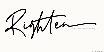 Righten – Eyecathcing Handwritten Font This font is made in a modern style, very casual, and suitable for your various design needs. It’s perfect for logo, branding, title, social media posts, advertisements, product packaging, product designs, label, photography, watermark, special event, magazine, web designs, etc. Features : Righten ( Uppercase, Lowercase ) Swashes multilingual support Ligatures If you have any questions please don’t hesitate to contact me follow my Instagram: fkryall Thank you
 - Icelander by Fikryal,
$18.00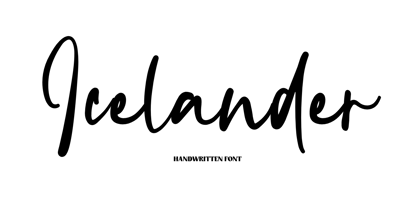 Icelander – is a modern handwritten font. This font is made in a modern style, very casual, and suitable for your various design needs. It’s perfect for logo, branding, title, social media posts, advertisements, product packaging, product designs, label, photography, watermark, special event, magazine, web design, etc. Features : Icelander ( Uppercase, Lowercase ) multilingual support Ligatures If you have any questions please don’t hesitate to contact me follow my Instagram: fkryall Thank you
 - Kamalla by madeDeduk,
$11.00 Introducing Kamalla is a cute font with a matching script and regular will be perfect for book, title branding, product packaging, invitation, quotes, t-shirt, label, poster, logo etc. Feature Uppercase & Lowercase Number & Symbol International Glyphs Multilingual support Ligature Feel free to drop us a message any time and follow my shop for upcoming updates Shoot me on email at: dedukvic@gmail.com if you have any questions Hope you enjoy it.
 - Outer Loop NF by Nick's Fonts,
$10.00Here’s the follow-up to my Route 66 series, patterned after the typeface used on signage on the U.S. interstate highway system for fifty years. The numbers and uppercase letters are true to the original, while a number of the lowercase letters show the influence of the new Clearview type. Both versions of the font include 1252 Latin and 1250 CE (with localization for Romanian and Moldovan) character sets. - Helado by B2302,
$39.00 Helado is an elegant, modern sans-serif font, based on the idea to work as close as possible on the geometric forms of the circle and the square. Following swiss design classics Helado comes in these weights: LIGHT, REGULAR, BOLD and EXTRABOLD. Helado might be used as a headline font, for any kind of layout, it might also be transformed into that fashion label logotype you are working on. Have fun!
 - DF Ariënne by Dutchfonts,
$33.00 The Etalage-script has been drawn for the first time in the year 2000, based on a early 20th century lettering stencil with what farmer Boelema at Lalleweer stenciled his grainsacks. Eventually the script letter was developed as a typeface with a wink to the ‘lost’ displaytypes for the ‘display window’ of graphic designer Ariënne Boelens, who in exchange made the website www.lalleweer.nl. What originated the Ariënne should be evident now.
 - Carnollia Signature by Hanaksara Studio,
$17.00 Carnollia Signature is a stylish signature font with a modern and natural handwriting impression. And it's perfectly suited to logos, posters, wedding details, postcards, branding, apparel, taglines, quotes, and much more. Carnollia Signature includes more than 100 alternates within the following OpenType features: 3 Sets of lowercase Stylistic Alternates, Underline Swashes, and more than 40 ligatures. Thank you for checking this product and we hope you enjoy it!
 - Leathercrafter JNL by Jeff Levine,
$29.00A popular hobby in the 1950s and 1960s was creating your own wallets, belts and other items from leather do-it-yourself kits. Stamped or carved initials, names or phrases were often added to the leather with special tools and templates - many featuring a Western-styled alphabet with a hand-lettered look. Leathercrafter JNL recreates that same look in a digital font format, complete with the unusual and contrasting letter shapes. - Order Form JNL by Jeff Levine,
$29.00 In the MacKellar, Smiths & Jordan type specimen book of 1892 are examples of Lining Gothic Extended, a wide sans serif typeface. A lining font has the numerals aligned with the capital letter height, rather than following the “Old Style” method of smaller figures that could also descend below the baseline. Order Form JNL is the digital version of this design, and is available in both regular and oblique versions.
 - Oho Julie by PaulaType,
$10.00 Introducing Oho Julie - A Chic Brush Stylist font perfect for high impact headlines This font is a perfect script designed for making your set of invitations, Brand, blog posts, and more completely beautiful Multilingual support for the following languages: Cornish, Danish, Dutch, English, Estonian, Faroese, Filipino, Finnish, French, Galician, German, Icelandic, Indonesian, Irish, Italian, Norwegian Bokmål, Norwegian Nynorsk, Portuguese, Spanish, Swahili, Swedish, Swiss German. Thank you Nursery Art
 - Dino Moose by madeDeduk,
$12.00 Introducing Dino Moose is a playful font and will be perfect for book, titlebranding, product packaging, invitation, quotes, t-shirt, label, poster, logo etc. Feature 3 font files Uppercase & Lowercase Number & Symbol International Glyphs Multilingual support Feel free to drop us a message any time and follow my shop for upcoming updates Shoot me on email at: dedukvic@gmail.com if you have any questions Hope you enjoy it.
 - Roller Hesoon by TypeClassHeroes,
$16.00 Retro and refined you can explore and combine creating rhythm for comfortable reading. Roller Hesoon supports more than 100 Latin-based languages and has extensive Cyrillic and Greek support for languages like Russian, Bulgarian, Ukrainian, and many more. Feature Uppercase & Lowercase Number & Symbol International Glyphs Multilingual support Alternative Ligature Cyrillic & Greek Feel free to drop us a message any time and follow my shop for upcoming updates. Hope you enjoy it.
 - Renais by Wiescher Design,
$39.50 Renais is a set of Renaissance Initials. The embellished letters are on the keys A through Z. The letters without embellishments are on the lowercase letters a through z. The embellishments without the letters are in alphabetical order on the following keys: 1234567890!§$%&/()=?,.-;:_ You can superimpose the three forms for special effects, they are designed to fit exactly over each other. Have fun! Gert Wiescher - forever discovering old fonts!
 - Incarceration JNL by Jeff Levine,
$29.00 The hand lettered Art Deco title on the cover of the sheet music for “There Must be A Bright Tomorrow (for Each Yesterday of Tears)” inspired the font Incarceration JNL, which is available in both regular and oblique versions. Incarceration JNL earns its dubious name from the fact the song was written by Prisoner No. 3223 (Wallace Wysocki) who was held in the Marquette State Prison, Marquette, Michigan (1931)
 - Molaste by madeDeduk,
$14.00 Molaste is a retro font come with 80's retro style serif. You can explore and combine creating rhythm for comfortable reading. Vintage and refined use this font for any branding, product packaging, invitation, quotes, headline, label, poster, logo etc. Feature Uppercase & Lowercase Number & Symbol International Glyphs Multilingual support Alternative Ligature Feel free to drop us a message any time and follow my shop for upcoming updates Hope you enjoy it.