10,000 search results
(0.019 seconds)
- Sament by Product Type,
$15.00 Sament is a Japanese Style typeface that is ideal for projects that require a distinctly Japanese and Asian touch. This typeface will add uniqueness and creativity to your work with its exquisite style and eye-catching appearance. With appealing characters and inspiration from Japan’s rich culture, the Sament typeface combines a traditional touch with a modern vibe. Each figure is designed with care and refinement, creating an alluring environment and highlighting the richness of Japan’s cultural history. You may add an authentic and appealing vibe to your promotional materials, poster designs, websites, and many other projects by utilizing the Sament font. This font will leave a lasting impact and quickly capture the attention of potential customers. Make your project stand out by using Sament as the main typeface. With its rich richness and distinct style, this typeface provides a visually pleasing experience. With Sament, your designs will create an exceptional experience, instantly engaging potential buyers. What’s Included : - File font - All glyphs Iso Latin 1 - We highly recommend using a program that supports OpenType features and Glyphs panels like many Adobe apps and Corel Draw, so you can see and access all Glyph variations. - PUA Encoded Characters – Fully accessible without additional design software. - Fonts include Multilingual support
 - Palmer Lake by Jen Wagner Co.,
$13.00 Features: Palmer Lake Print: Uppercase letters, numbers, & extended punctuation Palmer Lake Script: Lowercase letters, numbers, & extended punctuation Non-English support for the international designer Same stroke thickness with each font, so you don't need to make any time-consuming adjustments to get it looking right! Palmer Lake Print (uppercase font) letters are the same height as the Script lowercase letters, so making quotes is super easy! This is such a fun new duo, perfect for creating quotes, logos, or just adding a hand-written touch to any project! While other fonts usually take some size adjusting to look just right, Palmer Lake duo has the same stroke thickness for both fonts, so you can set each font to the same size and you're done! Plus, the uppercase letters of the Print font are the same height as the lowercase letters of the Script font (see the samples), so lining them up with one another is a breeze! Each font also has alternates for each letter, so when you type uppercase or lowercase for each font, the letters will change slightly. For example, tying in all caps with the Script font will connect each letter, whereas typing all lowercase will disconnect each letter. Test it out for yourself in the box above!
 - Champina by Forberas Club,
$16.00 Champina is handwritten font, Recommended uses for simple write, wall type, decoration, and poster. Free for personal use.
 - Serpentine by Image Club,
$29.99Dick Jensen (USA) designed Serpentine, is a contemporary-looking display font, for the Visual Graphics Corporation in 1972. With the rise of digital typesetting and desktop publishing, this typeface quickly became both popular and ubiquitous. This dynamic, wide, boxy design is identifiable via tiny triangular swellings at the stroke endings - what might be called semi-serifs. Serpentine is available in six different font styles: Light, Light Oblique, Medium, Medium Oblique, Bold, and Bold Oblique. Serpentine" is a greenish rock that sometimes resembles a serpent's skin, and is often used as a decorative stone in architecture. Though this font doesn't seem at all snaky or sinuous, it does have an architectural, stone-like solidity. The subtle, almost non-existent curves and semi-serifs keep it from being too stern or cold. Although the underlying strokes of each weight are similar, the six members of the Serpentine font family all present their own individual personalities. Serpentine Light lends itself well to text for onscreen displays, for instance, while the numbers from typeface's heavier weights are seen around the world on soccer jerseys! Additionally, the oblique styles convey a streamlined sense of speed, furthermore lending Serpentine well to sport and athletic applications (especially the faster, high-speed varieties). Because of its 1970s pedigree, Serpentine has come to be known as a genuine "retro" face. This makes the typeface even more appropriate for display usage, in applications such as logo design, magazine headlines, and party flyers. If you like Serpentine, check out the following similar fonts in the Linotype portfolio: Copperplate Gothic (similar serifs) Eurostile (similar width) Princetown (another "athletic" font) Insignia (similar "techno" feeling)" - Cabrito Semi by insigne,
$24.00 Relax. Deep breath. And step away to font nirvana with Cabrito Semi. Like its Cabrito relatives, Semi’s handwriting-inspired feel is mellow and care-free. But don’t misunderstand us. Even with its fun-loving peculiarities, this free spirit will command whatever party you invite it to. It’s a perfect blend of unique and functional. So what’s the secret of this little one’s strength? It’s pure balance. Cabrito Semi’s energy surges from deep within the relaxed, balanced tones of its humanist structure and calligraphic crafting. The 36 fonts of this well-crafted semi serif originate from the popular Cabrito, an insigne design slab serif developed for the kid’s book, The Clothes Letters Wear. Along with its other amigos, Inverto and Sans, Cabrito Semi rounds out this easy-going household of fonts. The four fonts play well together on anything from meals and candy to toys and cars. With the support of the other three, Semi makes a great choice for titles and moderately long text like you would use for websites, flyers, and packaging. Semi’s complete pack of alternates is accessible in any OpenType-enabled system. This kiddo has loads of alternates, swashes, and alternate titling caps to add a bit of sweetener to the balance. Also bundled are swash alternates, old style figures, and compact caps. Preview any and all of these features in the interactive PDF brochure. This font members of the family also consists of your glyphs for 72 languages. So who says you can’t love quirky? Take a look at Cabrito Semi--and any of the other members of the Cabrito family. You’re bound to find yourself loving fun all over again.
 - Yorkten by insigne,
$- Clean and welcoming, the distinct look of Yorkten is remarkably satisfying to the eye. Straight to the point, Yorkton features a fashionable, geometric composition with angled main stems. There are no fewer than fifty-four fonts in the family, all of which are characterized by one of three widths – extended, normal or condensed. Each individual subfamily is equipped with eight weights from Thin to Black with respective Italics, giving Yorkten a breathtaking range of fonts to boast. The greater value for you, though, is its members’ ability to work well together. With a deep toolbox of weights and widths to choose from, this family provides you with significant value and a broad number of design solutions, making sure you have the tools you need for each challenge. So where should you use the font? Jeremy Dooley designed Yorkten’s underpinning structure to be compact. Combined with its superior features and terrific legibility, this versatile font can be used effectively for many jobs, whether in print or on screen. Use it freely for e-books and apps. Yorkten is particularly great for headlines, banners, posters, and websites. As with all insigne fonts, fonts that are well received by the market are expanded into future variants such as rounded or slab serif types. Yorkten’s later expansions will increase the versatility and functionality of the family. There’s no need to wait for these future releases, though. This new face already complements a number of other insigne faces, such as Grayfel, Look, or the Cabrito Superfamily. So what are you waiting for? Get Yorkten today and bask in the rich potential it offers! Get Yorkten and luxuriate in its straightforward multifunctionality!
 - Serpentine by Linotype,
$29.00Dick Jensen (USA) designed Serpentine, is a contemporary-looking display font, for the Visual Graphics Corporation in 1972. With the rise of digital typesetting and desktop publishing, this typeface quickly became both popular and ubiquitous. This dynamic, wide, boxy design is identifiable via tiny triangular swellings at the stroke endings - what might be called semi-serifs. Serpentine is available in six different font styles: Light, Light Oblique, Medium, Medium Oblique, Bold, and Bold Oblique. Serpentine" is a greenish rock that sometimes resembles a serpent's skin, and is often used as a decorative stone in architecture. Though this font doesn't seem at all snaky or sinuous, it does have an architectural, stone-like solidity. The subtle, almost non-existent curves and semi-serifs keep it from being too stern or cold. Although the underlying strokes of each weight are similar, the six members of the Serpentine font family all present their own individual personalities. Serpentine Light lends itself well to text for onscreen displays, for instance, while the numbers from typeface's heavier weights are seen around the world on soccer jerseys! Additionally, the oblique styles convey a streamlined sense of speed, furthermore lending Serpentine well to sport and athletic applications (especially the faster, high-speed varieties). Because of its 1970s pedigree, Serpentine has come to be known as a genuine "retro" face. This makes the typeface even more appropriate for display usage, in applications such as logo design, magazine headlines, and party flyers. If you like Serpentine, check out the following similar fonts in the Linotype portfolio: Copperplate Gothic (similar serifs) Eurostile (similar width) Princetown (another "athletic" font) Insignia (similar "techno" feeling)" - Edgar No 9 by Type Innovations,
$39.00 Edgar No. 9 is an original design by Alex Kaczun. Edgar No. 9 is a derivative work based on his Big Boy typeface series. It was designed specifically for display headlines, logotype, branding and similar applications. Primarily a display, this extremely versatile font has generous proportions, large counters and loose fitting which also allow the font to work well across a wide range of text sizes. Edgar No. 9 is a heavy baroque slab serif and although it shares the underling skeleton of 'Big Boy', it is a much more compact in overall proportions and spacing. A handsome bold headline font that works well in text as well as display sizes—ideally suited for publications and advertising. Alex plans to expand the font series to include a large range of weights along with corresponding italics numbering 1 thru 9, as well as, true small capitals and old style figures. Distressed version(s) will also be available in upcoming releases. Stay tuned, more to come soon. The large Pro font character set supports most Central European and many Eastern European languages.variations to expand this 'hip' new font series. Groovin' baby.
 - Vernacular Sans by jpFonts,
$19.95 The Vernacular trilogy was designed by Swiss designer Hans-Jürg Hunziker, who had worked for Adrian Frutiger in Paris for many years. Based on the concept of a transitional Linear Antiqua, he has developed a colorful bouquet of typefaces that contain the entire spectrum of typefaces for book design and corporate identity. Thanks to his "Swiss school" and his outstanding skills, he has succeeded in giving the typefaces a particularly noble and sympathetic expression. In addition to the Sans family, there is a Serif family and a Clarendon family, each of which, including the separately drawn italics, is equipped with 12 font weights that are finely tuned to one another. Each of the 3 font styles develops its own character, but thanks to a concept that brings the different font styles closer together, they also work well together and complement each other perfectly. Sans and Clarendon have a vertical axis and similar endings in contrast to the Serif, which has a traditional diagonal axis and horizontal endings. The straight stems and the proportions are used as an element to stress the closeness of the typeface-trilogy. They thus share a comon feature. All fonts contain tabular and proportional figures as well as old style figures. Small caps and small cap figures are also available in all fonts. In addition, some fonts have alternative characters available via style set, such as «g», which can be used to further vary the typeface. Vernacular offers all the options for well-kept typesetting for print and web - for small and large orders.
 - Vernacular Serif by jpFonts,
$19.95 The Vernacular trilogy was designed by Swiss designer Hans-Jürg Hunziker, who had worked for Adrian Frutiger in Paris for many years. Based on the concept of a transitional Linear Antiqua, he has developed a colorful bouquet of typefaces that contain the entire spectrum of typefaces for book design and corporate identity. Thanks to his "Swiss school" and his outstanding skills, he has succeeded in giving the typefaces a particularly noble and sympathetic expression. In addition to the Sans family, there is a Serif family and a Clarendon family, each of which, including the separately drawn italics, is equipped with 12 font weights that are finely tuned to one another. Each of the 3 font styles develops its own character, but thanks to a concept that brings the different font styles closer together, they also work well together and complement each other perfectly. Sans and Clarendon have a vertical axis and similar endings in contrast to the Serif, which has a traditional diagonal axis and horizontal endings. The straight stems and the proportions are used as an element to stress the closeness of the typeface-trilogy. They thus share a comon feature. All fonts contain tabular and proportional figures as well as old style figures. Small caps and small cap figures are also available in all fonts. In addition, some fonts have alternative characters available via style set, such as «g», which can be used to further vary the typeface. Vernacular offers all the options for well-kept typesetting for print and web - for small and large orders.
 - Vernacular Clarendon by jpFonts,
$19.95 The Vernacular trilogy was designed by Swiss designer Hans-Jürg Hunziker, who had worked for Adrian Frutiger in Paris for many years. Based on the concept of a transitional Linear Antiqua, he has developed a colorful bouquet of typefaces that contain the entire spectrum of typefaces for book design and corporate identity. Thanks to his "Swiss school" and his outstanding skills, he has succeeded in giving the typefaces a particularly noble and sympathetic expression. In addition to the Sans family, there is a Serif family and a Clarendon family, each of which, including the separately drawn italics, is equipped with 12 font weights that are finely tuned to one another. Each of the 3 font styles develops its own character, but thanks to a concept that brings the different font styles closer together, they also work well together and complement each other perfectly. Sans and Clarendon have a vertical axis and similar endings in contrast to the Serif, which has a traditional diagonal axis and horizontal endings. The straight stems and the proportions are used as an element to stress the closeness of the typeface-trilogy. They thus share a comon feature. All fonts contain tabular and proportional figures as well as old style figures. Small caps and small cap figures are also available in all fonts. In addition, some fonts have alternative characters available via style set, such as «g», which can be used to further vary the typeface. Vernacular offers all the options for well-kept typesetting for print and web - for small and large orders.
 - Toulouse by Scholtz Fonts,
$21.00Toulouse is a city of culture. It has long nurtured literature, music, dance, theater and concerts. It is therefore an entirely appropriate name for an elegant and classical french-style font. Toulouse, the font, is classically calligraphic with a sharp-edged look to the character terminus that speaks of skilled penmanship. Careful attention has been paid to the weights of the vertical strokes, keeping them consistent with the pen angle, and enhancing the faithfulness of this font to the period style. Toulouse will be very useful wherever an ambience of measured elegance is required. It will enhance the appearance of advertisements, wedding and other invitations, as well as menus, headlines and posters. It contains a full character set and is professionally letter-spaced and kerned. - Algera by Wahyu and Sani Co.,
$25.00 It is spurless, minimum contrast with vertical cut terminals, and it is called Algera. It sounds strong and wild, doesn't it? This font family comes in 9 weights from Thin to Black with matching italics. Each family member of Algera also equipped with useful OpenType features such as Ordinals, Superscripts, Subscripts, Stylistic Alternates, Stylistic Sets, Proportional Lining, Standard Ligatures, Fractions, Localized Forms, also Numerators & Denominators. Each font has 490+ glyphs which covers Western & Eastern Europe, and other Latin based languages – over 200 languages supported! Algera will give you a different touch to your creative projects. This typeface will be a great choice for logos, posters, presentations, headlines, lettering, branding, quotes, titles, magazines, headings, web banners, mobile applications, art quotes, advertising, packaging design, book title, and more!
 - Jheronimus by Aronetiv,
$9.99 Jheronimus is a neo-humanistic grotesque. A font with an open aperture. It has straight terminals and a moderated height of the lowercase characters. Jheronimus is a font with a uniform ordered rhythm. Well readable on the screen in small size. Consistent letter proportions. The rounded elements are pill shaped and the font has pronounced connections strokes. Punctuation marks are well decorated. Jheronimus will satisfy the demanding typographer. There are oldstyle figures in the best traditions of humanism. The bright recognizable character is combined with a clear form. This creates a sharp, crystal impression. Jheronimus is suitable for the design of an ambitious, temperamental text. It is stylistically similar to the paintings of the Dutch artist Hieronymus Bosch. From this comes its name.
 - Bagilan by Queenop Studio,
$14.00 Bagilan - Modern Calligraphy Script Font Bagilan is an elegant, beautiful and flowing handwritten font perfectly for your favorite projects. This font is neatly crafted and very detailed. Whatever the topic, this font will be a great asset to your font library, as it has the potential to enhance any creation. Fall in love with her completely different and timeless style, and use it to create stunning designs. Many alternatives will help you create whatever design you need such as cute and girly handwritten letters and other designs that require a beautiful handwritten touch! Enjoy :) Contains full set: -Uppercase -Lowercase -Alternative -Ligatures -Punctuation -Number -Multilingual support. Need help or have questions let me know. I'm happy to help. Thanks & Congratulations on the Design.
 - Frink Rio by Brenners Template,
$19.00 Frink Rio Modren Grotesk Font Family It has evolved to converge wider and more trendy design needs. By designing the thin style vertical stem value as 10pt, the contrast between individual styles is ensured. Great care has been taken to ensure that the characteristics of individual Glyphs are well reflected in the each style. Extended Cyrillic language support will help make this font family more universal. And the support of various OpenType Features will respond to the designer's coverage in a variety of ways. OpenType Features Ligatures - fi, fl Small Caps (from lowercases) Ordinals (1st. 2nd. 3rd, 4~9th) Oldstyle Figures Tabular Figures Fractions Scientific Inferiors Superscrpt (lowercases. numbers) Check in advance how the apps you are using support these OpenType Features.
 - Dollan by Twinletter,
$14.00 Dollan, our newest whimsical typeface, is now available. This font is worth implementing in your remarkable projects since it is a distinctive and eye-catching display font that is dynamically crafted to bring out the originality in each letter. This typeface has a cheerful, unique, energetic, and unique vibe to it, and it will give your creative work a unique look as well. This font is perfect for games, sporting events, branding, banners, posters, movie titles, book titles, quotes, logotypes, and more. of course, your various design projects will be perfect and extraordinary if you use this font because this font is equipped with a complimentary font family, both for titles and subtitles and sentence text, start using our fonts for your amazing projects.
 - Douglas Adams Hand - Unknown license

- Roxborough CF by Connary Fagen,
$35.00 Roxborough CF is a dramatic serif, influenced by calligraphy and hand lettering. Built around a distinctive single-storey 'a' and full of rich detail, Roxborough pairs well with its expressive italics, lending an artful touch to text across print and digital. Roxborough CF pairs nicely with simple, bold headline typefaces, like Greycliff CF and Articulat CF. All typefaces from Connary Fagen include free updates, including new features, and free technical support.
 - Love America by Stefani Letter,
$12.00 Love America! It is an amazing and cute display font. This font will look outstanding in any context, whether it’s being used on busy backgrounds or as a standalone headline! This display font is the perfect choice for making original and outstanding designs. This font is PUA encoded which means you can access all of the cute glyphs with ease! It also features a wealth of including ligatures.
 - Aguellera by Letterara,
$12.00 Aguellera is an elegant font with a romantic appeal; this font is for those who are in need of an elegant and appropriately modern calligraphy script. Aguellera will turn any creative idea into a true piece of art! This font is PUA encoded which means you can access all of the amazing glyphs and swashes with ease! It also features a wealth of special features including alternate glyphs and ligatures.
 - SK Clarke by Salih Kizilkaya,
$12.99 SK Clarke is a font designed in memory of the famous inventor and science fiction writer Arthur C. Clarke. Clarke is a geometric sans serif font family. It offers full support for the Latin, Greek and Cyrillic alphabets and supports many different languages. This font family includes a total of 20 fonts and 17,820 glyphs, so it contains all the typographic materials you will need in your designs.
 - Badger Valley by Heinzel Std,
$10.00 Badger Valley is an elegant and modern sans-serif font. Fall for its ravishing style and use it to create gorgeous wedding invitations, beautiful stationary art, eye-catching social media posts, and much more! This font is PUA encoded which means you can access all of the amazing glyphs with ease! Features : Badger Valley Regular, Bold, and Italic versions, sans serif font, Numerals, and more punctuations. Multilingual support for various languages
 - Rheson by Twinletter,
$15.00 RHESON is the ideal font for any project that requires a small amount of gothic flair. Its various lovely and harmonious shapes let you select the perfect word for your project. The best part is that this font is of a high caliber, so you can be sure that your logo, label, badge, the newest music or movie videos, old-fashioned posters, and other items will all look their best.
 - Des Morgan by Reyrey Blue Std,
$14.00 Introducing Des Morgan. An unique, classic and elegant font with various alternates that will make your presentation or logo even more beautiful and stunning! . This font is perfect for branding, logos, wedding stationery, cards, gift designs, photography, watermark, product packaging and quotes. You won't get cute, whimsical, funny logos with this font. Only high-end, upscale, sophisticated Branding Design. Features : · All Uppercase and Lowercase · Number & Symbol · Supported Languages · Alternates and Ligatures
 - We Love Nature Stems Two by kapitza,
$85.00 We Love Nature Stems Two is a picture font consisting of 52 all new high quality, hand drawn illustrations with clean outlines and a minimum of vector points. Due to the overwhelming success of our flower font We Love Nature Stems, we have created this brand new set of original illustrations. We loved creating these beautiful new flowers and hope that you will love designing with them. Enjoy!
 - Gyro by Alandya TypeFoundry,
$18.00 Introducing " Gyro Serif Display ", Gyro Serif Display is designed with a conical stem to create a unique style and easy to read. Which are all equipped with plenty of language support and open type features. Gyro Serif Display was made to function especially well at large sizes. Gyro Serif Display is a very versatile font, covering a wide variety of projects, from bold magazine imagery, to branding, poster design, and more.
 - Mikhaloo by Letterara,
$12.00 Mikhaloo is a bold, playful, and fun display font. Whether you use it for cartoon-related designs, children's games, or just any creation that requires a lovely touch, this font will be an amazing choice, especially when combined with bright colors. Use it to make your ideas more realistic and create spectacular designs! This font is PUA encoded which means you can access all the beautiful glyphs with ease!
 - Chromate by Supfonts,
$18.00 Chromate - a charming family with 3 fonts in retro style of the 80s and 90s! The dense structure will give an incredible retro vibe to your project. There are 3 fonts at your disposal, Regular, Italic and Script. This set covers all your needs and allows you to keep the project in a single style. You no longer need to look for which font is suitable, everything is already here
 - Beauty Mothers by Juncreative,
$19.00 Beauty Mothers is a magical font, whose rounded characters will allow you to add a decorative touch within seconds! Get inspired by Beauty Mothers and create stunning designs, wedding invitations, birthday cards, greeting cards, and much more! This font is PUA encoded which means you can access all of the glyphs and swashes with ease! It also features a wealth of special features including alternate glyphs and ligatures.
 - Lamphier by Juliawan90,
$15.00 Introducing our new product called Lamphier a Spooky Playful Serif Font, Lamphier inspired by Playful style with spooky style typography theme. This font is suitable for book covers, children's books, comics, posters, packaging, merchandise, logotypes and much more. We highly recommend using a program that supports OpenType features and Glyphs panels like many of Adobe apps and Corel Draw, so you can see and access all Glyph variations. Happy Designing!
 - Rayleigh by Allouse Studio,
$16.00 Rayleigh a Handwritten font. Rayleigh come along with Stylistic Alternate, Swash, Underline Style and Multi-Lingual Support which will give you many choices to play around. We highly recommend using a program that supports OpenType features and Glyphs panels like many of Adobe apps and Corel Draw, so you can see and access all Glyph variations. Enjoy the font, feel free to comment or feedback, send me PM or email.
 - Leaders by Mans Greback,
$59.00 Leaders is a decorative blackletter typeface. Created by Måns Grebäck during 2020, this medieval style lettering can be used for modern contexts that require a touch of flourishing, as well as any middle age art or festive occation. OpenType functions such as ligatures and alternates are present in the typeface. It contains numbers and all symbols and punctuation you'll ever need. The font also has support for European, Latin-based languages.
 - Glow Night by Letterena Studios,
$17.00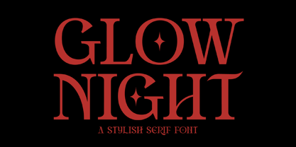 Glow Night is a classic serif font with a unique style and modern look. It is perfect for elegant and luxury logos, book or movie title design, fashion brands, magazines, clothes, lettering, quotes, and much more. Add it to any of your creative projects, and you will be amazed by the results. This font is PUA encoded, which means you can access all of the glyphs and swashes with ease!
 - Blooming Valerian by Letterhanna Studio,
$19.00 Blooming Valerian is a thin handwritten calligraphy font with beautiful curves, the slightly wide spacing makes this font look very elegant. Blooming Valerian is a romantic and sweet calligraphy typeface with characters that dance along the baseline. It will add a luxury spark to any design project that you wish to create! This font is PUA encoded which means you can access all of the amazing glyphs and ligatures with ease!
 - Dragon Heroes by Letterara,
$16.00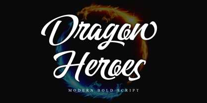 Dragon Heroes is a modern bold script font, carefully handcrafted to become a true favorite. Its casual charm makes it appear wonderfully down-to-earth, readable, and, ultimately, incredibly versatile. This font will look outstanding in any context, whether it’s being used on busy backgrounds or as a standalone headline! This font is PUA encoded which means you can access all of the glyphs and swashes with ease!
 - Ramadan Elegant by Marmara,
$23.00 If you are a graphic designer, magazine editor, fashion stylist, industrial designer, publisher, printer or have a creative business, this font is for you, I believe it is a font that should be in your font folder for all your work.. Make awesome logotypes; When you write any word, it almost gives a logotype effect, I enjoyed working on it very much, I'm sure you will like it too...
 - Signpost by Studio K,
$45.00 The name says it all. Signpost is a display font purpose-designed for directional, informational and publicity signage, as well as posters, public notices and advertisments. It comes complete with a choice of 'pointing hands' symbols and quartrefoil borders of the kind used on traditional British street signs. It is essentially a drop shadow version of my Red Top font family, which has a similar range of applications.
 - HK Kelie by HK Studio,
$25.00 HK Kelie is a light to medium-contrast typeface with swashy, medium bracketed serifs, and terminals in the appropriate places, as well as bracketed junctions in various letterforms. The main feature of the typeface is the disconnection between the bowls and the stems. However, the bowl is very close to the stem, creating the illusion of connection. HK Kelie is calm, attractive, and legible — but above all, it is sophisticated.
 - Strong Girls by Sarid Ezra,
$15.00 Introducing, Strong Girls - a layered font based on serif style! Strong Girls is a layered serif font that have 4 total font including regular, outline, extrude and long extrude. Like other layered font, you can stack all the style in the text so the design will looks 3D. You can use this font for any purpose like poster, sticker, vintage design, or anything. This font also support multi language.
