10,000 search results
(0.024 seconds)
- Mariné STD by TipoType,
$19.90Mariné STD is a geometric sans but with the softness of humanistic strokes. It’s mild contrast and multiple different styles allow Mariné to work well as both a text and display font. Mariné STD is a selected version of Mariné Family. - Ideal for print and identity works. - Works well for text or display uses. - Designed for web and apps. - Look serious or look casual. - Sugar Free by PizzaDude.dk,
$17.00 Don't be afraid to taste something sugar free - most times you will be surprised how good it tastes! My Sugar Free font may not look as very much at first glance - but play around with the Regular and Italic versions (and notice the 4 different versions of each letter, that automatically cycles as you type!) and you will see how lively the font is!
 - Kuzimy by Twinletter,
$15.00 Introducing kuzimy Arabic style font. With this, Font lets you create designer-quality designs with ease. You will get a variety of styles for your project. They come in upper and lower case and alternate with different shapes. You will be able to easily create professional designs with an Arabic Style theme. This font gives you the best results when used in your projects.
 - FF Karton by FontFont,
$62.99 Dutch type designer Just van Rossum created this display FontFont in 1992. The font is ideally suited for advertising and packaging, festive occasions, editorial and publishing as well as poster and billboards. FF Karton provides advanced typographical support with features such as ligatures. It comes with proportional lining figures. As well as Latin-based languages, the typeface family also supports the Greek writing system.
 - Goldtext by Attractype,
$10.00 f you like being creative with bold serif fonts, then the BOLDTEXT font could be your choice. The thick and sharp shape will direct the eye to your special design. A legible letter style will form words that are easy to read. You can use this font to design logos, titles, magazines, comics, text effects, banners and more. Feel free to contact me about this font.
 - Malmont by Larin Type Co,
$15.00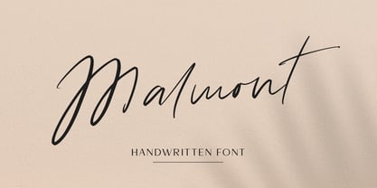 Malmont is an amazing handwritten font is light and elegant, and will emphasize your individuality in any project and will charm you with his signature. This font includes alternates and ligatures for lowercase. You can also use them to create a logo, branding, t-shirts, book covers, stationery, marketing, blogs, magazines, cosmetic, signboard and more. This font is easy to use has OpenType features.
 - Skinny Marker by Mvmet,
$12.00 Skinny Marker is a cool handwritten font, inspired by quick graffiti tags seen on streets. It will elevate a wide range of design projects to the highest level. You can use this font for many design ideas such as stickers, t-shirt designs, amazing logo designs, magazine or book covers, comics, cartoon drawings, and many more. This font will add a cool touch to your designs!
 - Darby Display by Courtney Rhodes,
$19.95Darby came about while playing with a loaded round-tipped brush. The letters remind me a bit of signage I remember seeing at county fairs in my youth. It's a casual comfortable font that lends itself well to outlining and drop shadows for emphasis. Not intended for long copy, it would work well in headlines or in signage where one is wishing to attract attention. - Kings Hutand by Multype Studio,
$29.00 Kings Hutand is a script type family of two fonts, a modern script font with bold style and modern looks. Have a unique style that will make your design look iconic. Kings Hutand can be used for logo, branding, packaging and and anything that requires bold script font. This font has of alternative characters,swashes, and ligatures that will make your design unique and beautiful.
 - Captura Now by TypeThis!Studio,
$54.00 Carefully refined shapes and sensitively balanced spacing and kerning create the gentle rythm that grants Captura Now its warm-hearted face, perfect in form and shape. Expanded with an enormous character set, Captura Now offers the freedom to transform your design into the Cyrillic-language world, as well as into any Latin based language — including Vietnamese. *Variable fonts work well in software that supports variable font technology.
 - Auberjean by Abbyland,
$15.00 Auberjean is a playful handmade display font, great for social posts, editorial design, posters, book covers, signs, and more! This font has a hip and contemporary feel. It works well for headlines as both uppercase and lowercase, as well as short blocks of text like quotes and info blurbs. The thick, rounded style means it looks great with an outside stroke or offset outline.
 - Blackpast by Sarid Ezra,
$15.00 Introducing, Blackpast, a futuristic logo font with alternates! Blackpast is a sans based font with unique lowercase that will make your design looks futuristic and modern. You can use this font for any purpose, especially to make logotype. You can mix and match the uppercase and lowercase to make your logo more readable. This font also have special alternates that will make your design more stand-out!
 - Inked Balterm by Adam Ladd,
$25.00 Inked Balterm is a hand-inked typeface with a humanist touch. It provides visual interest through the contrasting elements of the thin strokes mixed with the solid ball terminals. The placement of each ball terminal is varied and placed at the most defining point of interest and distinction in each letterform; creating an appealing visual rhythm. Great for display and works in smaller text settings.
 - Brain Squeeze by Hanoded,
$16.00 Brain Squeeze is a nice, fat, messy brush font. I made it with one of my late father in law’s prized Chinese brushes and my Chinese ink. If you look through my library, you will notice that I make a lot of fonts using these tools! Brain Squeeze will squeeze your Cabeza for some extra creativity, so what are you waiting for? Use it and have fun!
 - Mission Accomplished by Hanoded,
$15.00 Mission Accomplished is a fast and furious kind of font. I started jotting down letters with a marker pen as fast as I could to see what would come out. Well, this font came out. Mission Accomplished can be used virtually anywhere, but single origin coffee bean packaging and artisan marmalade labels come to mind. Comes with a bunch of cute discretionary ligatures as well!
 - FF Flightcase by FontFont,
$59.99 Dutch type designer Just van Rossum created this display FontFont in 1992. The font is ideally suited for advertising and packaging, festive occasions, editorial and publishing as well as poster and billboards. FF Flightcase provides advanced typographical support with features such as ligatures. It comes with proportional lining figures. As well as Latin-based languages, the typeface family also supports the Greek writing system.
 - Xaver Handwriting by Xaver Design Studio,
$25.00 Xaver Handwriting is in the sweet spot between authentic handwriting and very readable script. The original handwriting template was vectorized and optimized by hand. It contains lowercase and uppercase letters and can be used as a mixed flow text font as well as a capital font. It also offers language support for the entire European region, as well as for North & South America and Oceania.
 - Cronera by Sarid Ezra,
$15.00 Introducing, Cronera, Handcrafted Typeface with Outline! Cronera is a handcrafted font based in sans serif. With carefully crafted, this font have a hand lettering vibes that will make your design more natural and humanist. You can use this font for book cover, your t-shirt design, quotes, or even your branding! With outline version, this font will suitable for many projects. This font also support multilingual!
 - Worthbites by Invasi Studio,
$13.00 WORTHBITES is a Biteable, Uneven, Unexpected, and Playful font special for Food Display, that puts a smile on your projects and will inspire you to create something fun and memorable. WORTHBITES will help you to create special and touching typographical designs for fun or childish projects, It is perfect for headings, flyers, greeting cards, product packaging, book cover, printed quotes, logotype, apparel design, album covers.
 - Urban Daily by Mvmet,
$12.00 Urban Daily is a playful daily handwritten font, inspired by graffiti-style tags. It will elevate a wide range of design projects to the highest level. You can use this font for many design ideas such as stickers, t-shirt designs, amazing logo designs, magazine or book covers, comics, cartoon drawings, and many more. This font will add a super cool touch to your designs!
 - Murisa Paula by Murisa Studio,
$10.00 Do you want a unique and attractive display font?. Murisa Paula is the answer. This very attractive font will make you happy and excited. It has a unique shape with the edges of the letters torn to shreds, like torn paper. This type of lettering will make it easier for you to design a display product with a cracked effect or something else. Get it now.
 - Moku Brush by Deltatype,
$49.00 Moku Brush is a structural brush script inspired from handwriting with brush, with straight letterform you will get less formal but more sweet! Moku Brush come with nine weights, so you can use as body text or even better with headline. With nine variations, you can use this font in different sizes with different weights, you will get better balance when do type setup.
 - Angry Monkey by Fractal Font Factory,
$10.00 Angry Monkey is a vintage layered font. Contains 5 typography styles, uppercase and lowercase letters, and basic punctuation for each style. Well suited for headings, corporate identity, as well as the creation of various printed and digital products. The font is designed in the playful style of an angry monkey. The archive contains a bonus accompanying graphics for the design of T-shirts and other products.
 - Goth Chic by Comicraft,
$19.00 This pale face -- a Byronic offering from the disaffected youth section of our library -- will provide that slightly sad, sunken eyed feeling most closely associated with Doc Martins, heavy crosses and clothes as black as the blaquest heart... so if you're looking for tragic tramp stamp typography, we think our tattoo parlor maid to wear font will provide just the right amount of Goth Chic.
 - Costa Mala by Larin Type Co,
$14.00 Costa Mala feels playfully nostalgic and delivers an incredible vintage aesthetic.this font will look outstanding in both formal and non-formal designs. It will add charm and create a unique atmosphere in your design project. This font includes two styles: regular and outline, and also has alternatives that you can use to play with font dynamics. This font is easy to use and has OpenType features.
 - Lastero by Larin Type Co,
$15.00 Lastero this amazing handwritten font duo is light and elegant, will emphasize your personality in any project and will charm you with its signature. This font includes alternates for Uppercase and Lowercase, also a lot ligatures for lower case make your signature with them. You can use it to create logos, branding, t-shirts, book covers, stationery, marketing, blogs, magazines, cosmetics, signage, and more.
 - XXII Totenkult by Doubletwo Studios,
$21.99 The “XXII Totenkult” is inspired by the classical letterforms of old roman/renaissance typefaces and an ode to the decay. This is an allCapitals-font and the lowercase glyphs contain a variation of the uppercase. With activated “calt”-feature every second lowercase will be replaced by an alternate, this will give the font a more natural look. Detailed information here: XXII Totenkult on Behance.
 - FF Confidential by FontFont,
$59.99 Dutch type designer Just van Rossum created this display FontFont in 1992. The font is ideally suited for advertising and packaging, film and tv, editorial and publishing as well as music and nightlife. FF Confidential provides advanced typographical support with features such as ligatures. It comes with tabular lining figures. As well as Latin-based languages, the typeface family also supports the Greek writing system.
 - La Rosaleda by Mevstory Studio,
$15.00 La Rosaleda Font Duo is a ligature font pair with 30 amazing chic logo templates. With this open type font duo you can explore your creativity in unlimited way. To recreate your brand all you need is mix and match from the La Rosa font duo. This font duo is full of stylish ligatures, so that your writing with La Rosaleda can stand out. - Font Features: All fonts are OpenType fonts All fonts are fully vector designed Accurate kerning for all serif family Amazing ligatures to look natural in script font Alternative characters for script lowercase alphabets Multilingual Support for Both Scrip and Serif All OpenType fonts, Serif and Script. 30 Fully editable logos for Adobe Photoshop or Adobe Illustrator Font installing help file for PC and Mac Web-fonts for Script and Serif
 - Maria Aishane Script by Dora Typefoundry,
$14.00 Maria Aishane is a bold new type of modern modern calligraphy script that has an alternative. make your designs beautiful and look great. Maria Aishane includes all the basic characters and additional and alternative Latin characters, nice fonts for your invitation. Maria Aishane is just a simple typeface, all uppercase, lowercase letters, and only includes all the basic characters, numbers and punctuation. It is perfect for logo, greetings, branding, quotes, prints, invitations and crafting. All lowercase letters include alternates, beginning & end swashes, that makes the font look fabulous! These are all coded with PUA Unicode. Mac users can use Font Book and Windows users can use Character Map to view and copy any of the extra characters to paste into your favourite text editor/app. Thanks and have a wonderful day
 - Supernett by FaceType,
$19.90 Supernett was originally created in 2013. Now we decided to upgrade it: more styles, more glyphs, more features, more everything. Have fun with Supernett 2019! Supernett 2019 super revised version Supernett is a versatile handmade text- and display-family and is perfect for space-saving headlines. All letters and numerics are available in three variants which alternate randomly with OpenType Contextual Alternates activated. One of Supernetts key features is Wiggling & jumping letters: letters jump around the baseline or tilt forward and backwards without a plan. Combine this with OpenType Contextual Alternates and let Supernett look truly hand-drawn with a maximum effect when applied to big typesetting. Further features include small caps, glyph alternates, case-sensitive forms, fractions, symbols and many more. Supernett is a hand-drawn / handmade / handdrawn Sans-Serif font-family. Supernett is available in three weights, two widths, Uprights and Italics. The handmade family is tailored for large font sizes but also impresses with seamless legibility in small type sizes. Due to its display origin and slightly condensed appearance, make sure to increase the spacing a little when used in text setting. The extensive character set supports 209 Central and Eastern European as well as Western European languages (for details, please see below). Supernett Font and Feature Guide Download it | View it online Supernett OpenType Features Alternating Letters Letters and numerics are available in three variants which alternate randomly → OpenType Contextual Alternates Small Caps Supernetts Small Caps mixes Upper- and Lowercase letter forms. Choose between »Small Caps« or »OpenType All Small Caps«. The latter replaces lower- AND uppercase letters, as well as the dotted i and activates punctuation to match the small caps’ height. Wiggling letters All glyphs tilt slightly and randomly forward and backwards → OpenType Swashes (or OpenType Stylistic Set 06) Jumping letters Each single glyph moves individually up or down → OpenType Titling Alternates (or OpenType Stylistic Set 07) → for a stronger effect, add OpenType Stylistic Set 08 (Jumping Baseline MORE) Case-Sensitive Forms This feature shifts various punctuation marks to a position that works better with all caps typography. → activated when an app’s all-caps styling is applied Slashed Zero Make clear what you’re talking about and work with a slashed zero → OpenType Zero with a Slash Fractions Figures separated by a slash are substituted by proper fraction glyphs. A date however, written like 10/12/2019 will remain unchanged. → OpenType Fractions Alternate Glyph Set 1 → OpenType Stylistic Set 01 Alternate Glyph Set 2 → OpenType Stylistic Set 02 Alternate Glyph Set 3 The default glyph set. Activate it to disable Alternating Letters within OpenType Contextual Alternates. → OpenType Stylistic Set 03 Y Alternate Choose between two different styles of Y → OpenType Stylistic Set 04 Underlined Uppercase O & ordinals → OpenType Stylistic Set 05 → activate OpenType Ordinals to substitute No. by № Uppercase I Alternate There’s an alternate for the isolated ›I‹ (I love you) → included in OpenType Contextual Alternates → or activate OpenType Positional Forms: Automatic Form → substitute every single ›I‹ with OpenType Stylistic Set 09 Bullet Alternate Choose between two different styles of bullet (•) → OpenType Stylistic Set 11 Squares and Circles Type a – z and out pop squares and circles. All symbols are PUA-encoded for easy copy and paste between different applications. → OpenType Stylistic Set 10 → or open your apps’ glyphs panel and double-click the desired symbols Supernett is an organic and decorative hand-drawn / handmade Sans Serif display-family for packaging, posters, book-covers, kids- (children-), food- and logo-design and will best stand out in huge grades. Its handmade / hand-drawn origin is subtle yet visible. Supernett supports 209 languages Abenaki, Afaan Oromo, Afar, Afrikaans, Albanian, Alsatian, Amis, Anuta, Aragonese, Aranese, Aromanian, Arrernte, Arvanitic, Asturian, Atayal, Aymara, Bashkir, Basque, Belarusian, Bemba, Bikol, Bislama, Bosnian, Breton, Cape Verdean, Catalan, Cebuano, Chamorro, Chavacano, Chichewa, Chickasaw, Cimbrian, Cofan, Corsican, Creek, Crimean Tatar, Croatian, Czech, Danish, Dawan, Delaware, Dholuo, Drehu, Dutch, English, Esperanto, Estonian, Faroese, Fijian, Filipino, Finnish, Folkspraak, French, Frisian, Friulian, Gagauz, Galician, Ganda, Genoese, German, Gikuyu, Gooniyandi, Greenlandic, Guadeloupean, Gwichin, Haitian Creole, Han, Hawaiian, Hiligaynon, Hopi, Hotcak, Hungarian, Icelandic, Ido, Ilocano, Indonesian, Interglossa, Interlingua, Irish, Istroromanian, Italian, Jamaican, Javanese, Jerriais, Kala Lagaw Ya, Kapampangan, Kaqchikel, Karakalpak, Karelian, Kashubian, Kikongo, Kinyarwanda, Kiribati, Kirundi, Klingon, Ladin, Latin, Latino Sine, Latvian, Lithuanian, Lojban, Lombard, Low Saxon, Luxembourgish, Maasai, Makhuwa, Malay, Maltese, Manx, Maori, Marquesan, Meglenoromanian, Meriam Mir, Mirandese, Mohawk, Moldovan, Montagnais, Montenegrin, Murrinhpatha, Nagamese Creole, Ndebele, Neapolitan, Ngiyambaa, Niuean, Noongar, Norwegian, Novial, Occidental, Occitan, Oshiwambo, Ossetian, Palauan, Papiamento, Piedmontese, Polish, Portuguese, Potawatomi, Qeqchi, Quechua, Rarotongan, Romanian, Romansh, Rotokas, Sami Inari, Sami Lule, Sami Northern, Sami Southern, Samoan, Sango, Saramaccan, Sardinian, Scottish Gaelic, Serbian, Seri, Seychellois, Shawnee, Shona, Sicilian, Silesian, Slovak, Slovenian, Slovio, Somali, Sorbian Lower, Sorbian Upper, Sotho Northern, Sotho Southern, Spanish, Sranan, Sundanese, Swahili, Swazi, Swedish, Tagalog, Tahitian, Tetum, Tok Pisin, Tokelauan, Tongan, Tshiluba, Tsonga, Tswana, Tumbuka, Turkish, Turkmen, Tuvaluan, Tzotzil, Ukrainian, Uzbek, Venetian, Vepsian, Volapuk, Voro, Wallisian, Walloon, Waraywaray, Warlpiri, Wayuu, Welsh, Wikmungkan, Wiradjuri, Wolof, Xavante, Xhosa, Yapese, Yindjibarndi, Zapotec, Zulu, Zuni View other fonts from Georg Herold-Wildfellner Sofa Serif | Sofa Sans | Mila Script Pro | Pinto | Supernett | Mr Moustache | Aeronaut | Ivory | Weingut
 - Madurai Slab by insigne,
$24.00 Chennai’s market-tested type styles have taken new form once again. The geometric forms of Chennai and its derivant Madurai, both successful in web-based applications and logotypes, have now been adapted for the superfamily Madurai Slab, a potent, square slab serif ideal for headlines and posters. Under the surface of Madurai Slab’s straightforward geometric structure, the font’s exaggerated vertical serifs provide the face with an extra chunk that commands the reader’s attention and gives the font more impact in its heavier styles. The extra-fortified forms are anything but monotonous, though. The bolder structure of the slab is instead rational, diligently thought-out, with minimally contrasting strokes, making the sturdier look particularly legible in shorter textual content blocks. This child of Madurai contains a comprehensive range of nine weights--slender to black--and features condensed and extender selections for a complete set of fifty-four fonts. All users of the Madurai Slab collection can access numerous OpenType alternates. Madurai Slab is furnished for experienced typographers, together with alternates, compact caps and many alts like “normalized” capitals and lowercase letters that come with stems. The typeface also contains a range of numeral sets, together with fractions, old-style and lining figures with superiors and inferiors. OpenType-capable programs including Quark or the Adobe suite allow quick changes to ligatures and alternates. Previews of these options can be found in the .pdf brochure. Madurai Slab also features the glyphs to enable all Central, Eastern and Western European languages. In all, Madurai Slab supports around forty languages that utilize the prolonged Latin script, making it an excellent option for multi-lingual publications and packaging. This richness of options makes this the best slab serif family for websites as well as for print, motion graphics, logos, t-shirts and the like. Madurai Slab is a great choice when looking for a Neo-Grotesque slab serif font. In the hands of a learned designer, this new slab offers the potential for beautiful and well-blended layouts. With its widths adjusting to compact and extended content blocks, this typeface is perfect for the headings, captions and other brief, immediate messages that you need to drive your message home.
 - Quiroga Serif Pro by TipoType,
$29.00 Quiroga Serif began in 2007 with the name Quadratta Serif. This typography was designed for continuous text, legible at medium and small sizes, with great saving of space, optimized for 6, 8, 10 and 12 points. The morphology is a mix between tradition and innovation; it has a vertical axis, thick serifs, tall x-height, light modulation and a lot of internal space between letters: key to improve legibility at small sizes. Formally, my idea was to make a serif type that had a unique color, this is visible due to the light modulation. This is also complemented with the incorporation of not common, alternative signs. Some parts of the letters that are usually curb or diagonal where made horizontal (for example: a, q, p, etc.), this makes the eye of each character to be wide and unique. The serifs (wedge type) suffered diverse variations during the process. At the begining they where thicker and ended vertically, but this caused a great deal of printing errors. And so we decided to modify them by giving them an angle to avoid visible errors in medium and small sizes. The ch, and ll ligatures where rescued because they are a part of our current spanish alphabet. The historic ligatures and stylistic alternates give different options to users who want different alternatives within a text. The accentuation signs were composed in a middle line above all signs to avoid visual shock. We also gave plenty of importance to small caps numbers, mathematical signs and currency signs so that the could interact well.
 - Quarca by insigne,
$24.75 Quarca's masculine power runs strong across the page with bold self-assurance and a raw energy that courses through its thick veins. Don't think the continuous, smooth geometry of this semi-modular face is captively chained to the grid, though. Quarca has been cautiously optimized to engage the reader's eye. Achieving an attractive balance to its sturdy design, the open forms of this "rounded square" geometric sans -together with a tall x-height- make the font legible even when using the compact widths. This high-impact typeface definitely doesn't sacrifice versatility for style. These compact widths, with their raw heart and strength, are perfect for callouts, while the extended widths provide you with the platform for a punchy and extremely efficient headline. The font has a thinner weight and transcends to an intense bold. The face's geometric or technological construction also tends to make it right at home on the web. The family consists of 36 fonts -six weights plus italics. Where Quarca truly stands out, though, is its wide number of OpenType typographic choices and optional glyphs, allowing you to design your piece with a personal, one-of-a-kind variant touch. These variations consist of Experimental Capitals, Angled Capital Terminals, and "Future Stencil". In all, you can find more than one hundred of these alternate glyphs. Quarca is well-suited for anything you are able to throw at it. Devised for today's multi-disciplined designer, this clear and infinitely versatile family provides tremendous value to your toolbox.
 - Geo Deco by Tipo Pèpel,
$28.00 Geodeco font family brings to you the recovery of the typographic forms from the beginning of the 20th century, with a strong ArtDecó flavour but from a new point of view: modernity and geometry. Modernity in the visual contrast between lowercase and capital letters, where rounded shapes are opposed to the breaks and graphic tensions of the strokes of the capital letters. which gives it an enormous originality. Generous doses of internal whites, assure a powerful legibility even with the spite of its short ascending and descending strokes. What we get is a coherent and martial look where fluidity and homogeneity is the main note. Soft and rounded minuscule, with large internal whites for super legibility, bombproof, especially on screens, where Geodeco lives with an astonishing naturalness. The capital letters, used alone as display, or as companions of the minuscule characters, give the family a touch of originality and exotic flavor. Like the spices in the food; a brief but intense note. Breaking the rectangular shapes so that the appearance of the letter comes out benefits from enlarging the internal whites and making them consistent with the white of the lower case. GeoDeco works very well in plain text with the obvious limitation that it is not a type for small bodies, but exceptionality weldon for plain text and signage. Maximum visibility, total beauty on screens. A family of this new century with the flavour of that epoch of experimentation that were the years 20. Extensive multilanguage support and almost all Opentype functionalities. Try it and it will convince you - for sure!
 - Mono Spec by Halbfett,
$30.00 Mono-Spec is a monospaced family of sans-serif type. At least in default settings, all characters across the typeface share a common width. That fixed setting is condensed, and the aesthetic style of Mono-Spec’s letterforms is very industrial. A sister family, called Mono-Spec Stencil, is also available. Its design strays away from the mechanical nature of Mono-Spec, and it channels the spirit of resistance and street culture. Mono-Spec ships in two different formats. Depending on your preference, you can install the typeface as a single Variable Font or use the family’s five static OpenType font files instead. Those weights run from Light through Bold. While the static-format fonts offer a good intermediary-step selection, users who install the Variable Font have vastly greater control over their text’s stroke width. The Mono-Spec Variable Font’s weight axis allows users to differentiate between almost 1,000 possible font weights. That enables you to fine-tune your text’s exact appearance on-screen or in print. Whatever format you choose, the Mono-Spec fonts are equipped with several OpenType features. The most striking of these can be activated via a Stylistic Set. That will replace several letters – like “B”, “E”, “F”, “H”, and “I” with double-width alternates. Those alternates take up as much space as two characters placed next to each other otherwise word. The effect of Mono-Spec’s double-width alternates is striking, and their use strikes a strong chord in any display typography applying them.
 - Sherbrooke by Eyad Al-Samman,
$- Sherbrooke is a simple and sans serif font. I have chosen the name of this typeface after the "Sherbrooke" Street in Montreal, Canada, that I daily walked in for several months in the late 2005 while I was studying in Montreal, Quebec, Canada. I do adore this street and also I adore the whole city of Montreal. This font comes in two different weights. "Sherbrooke" can be used in wide fields of publications such as the titles of novels, literary texts, short stories, dictionaries, books, newspapers, websites, and magazines. It is suitable for T-shirts, mugs, advertisement light boards in malls, subtitles of movies, logos, cans of foods, and medicines' names. The font is more attractive when it is printed in calendars and for displaying the contents and paragraphs of electronic encyclopedias and different online websites. "Sherbrooke" is specifically designed for educational, journalistic, literary, and social purposes. The main characteristics of "Sherbrooke" Typeface are in its sans serif new designed letters and also in its lowercase special numerals. I think that these characteristics have made "Sherbrooke" exceptionally unique with its alphanumeric combinations. You can enjoy this typeface and use it anywhere at any product or service. It is simply gratuitous for all. The word "Sherbrooke" is a person's name. Sherbrooke Street - officially Rue Sherbrooke - is a major east-west artery at 31.3 kilometers in length and it is the second longest street on the Island of Montreal in Canada. The street is named for John Coape Sherbrooke, the Governor General of British North America from 1816 to 1818.
 - Gineso by insigne,
$- Michaelangelo. da Vinci. Bellini. Rafael. Masters of Italian art whose names have dwarfed those of many other great Italian artists. Yet relics from these other artists remain, though often unnoticed because of their practical nature. These unknowns are the Italian Masters of vernacular sign painting, and insigne now gives a nod to their work with its new sans serif, Gineso. Based on its inspiration, Gineso was created for posters, headlines and logotypes. (It does well in apps, too, though the sign painters probably weren’t thinking about that at the time.) Aesthetically remedied, yet still with an uncut charm, Gineso’s condensed qualities make it especially nice for signs and titling where horizontal space is at a premium. The tight, narrow forms of its geometric design leave you with a robust flavor that will remind you of mamma’s spaghetti. But don’t worry; the font’s ample counters ensure your audience won’t be reading through a bowl of pasta. These condensed forms look great on their own or when their seven different weights and matching italics are utilized together. With the included OpenType features, fractions and superior/inferior positions are also available to broaden your palette. Even more, this font is ready for complex, professional typography with OpenType features like alternate letters and a large character set including Central and Eastern European Languages. So when you find yourself (or your project) in a tight space, stir in Gineso to get the right taste for your copy. It may just make all the difference.
 - Verve by Altered Ego,
$65.00Called by some the "Archetype of the millennium", Verve is a seven-weight typeface family. It features a complete Adobe character set with kerning and fit to match. The alternate characters offer some variations on s,f,h,j,k,S,T,Y and others, plus this font has the Euro symbol. Verve is the fourth in an on-going series of condensed typefaces that I’ve been designing since 1989. My concept was to create an elegant condensed typeface that would be a "typeface for the millennium," in style and functionality. At the very core of all my designs is a typographic problem I wanted to solve, or a market niche that I think needs filled. Verve addresses both of those concerns, without copying or borrowing from its predecessors. There’s the challenge of creating a rich and interesting typeface with an austerity of line and elegance of form. I’m a minimalist by nature – but I wanted Verve to have a sensuous feel in certain respects – yet have that sensuality balanced by the uniformity of the uniform character widths. Gottfried Pott always stresses "theme and variation," and "point and counterpoint," and that’s what I’m doing in Verve. What one finds in musical composition is evident in Verve. Perfect for book covers, CD packaging, club flyers, retail packaging (especially bottles!), identity design and multimedia. The adventurous can try it in text, but it will give you a headache. The beauty of Verve is in thesize and weight variations which create a rich typographic texture in this font. - Cisalpin by Linotype,
$29.99 The ideal typeface for cartography The Swiss designer/typographer Felix Arnold designed Cisalpin during the late 1990s, after he had challenged himself to create a contemporary typeface that could be used for cartographic uses. Arnold came to the subject of cartographic typefaces after analyzing many maps and atlases, and discovering that there was no standard typeface for these types of documents. Like any good cartographic type, Cisalpin is very legible at small sizes. While he was drawing this typeface on his computer, Arnold used a reduction glass to refine his design, making it work in these situations. Cisalpin is a linear sans serif face, with slight resemblance to renaissance serif types. The various weights are all clearly differentiated from one another. And because space is often a premium on maps, Cisalpin runs narrow. Words close in around themselves to help them become more identifiable. The letterforms in Cisalpin are durable, and can maintain their readability when placed over complex backgrounds. They have open interior forms, flattened curves, tall x-heights, and a capital height that almost reaches the tops of the ascenders. Cisalpin also has pronounced Italics, with a very clear angle of inclination. Each letterform in the family has been optimized so that they cannot be easily mistaken for another. This again helps minimize the misunderstandings that often occur because of illegibility. Although Cisalpin was developed for use in cartography, it may be used for countless other purposes; any font that can work well in small sizes on a map could be used almost anywhere else!