1,315 search results
(0.023 seconds)
- Krays by Pesotsky Victor,
$10.00 «KRAYS» is an ultra-thin font display. Simple structure and fine uniform strokes contrast with bold squares in the structural units. The combination of gravity and lightness. Krays supports Basic Latin and Extended Latin, Cyrillic — in total about 90 languages are supported. The font has one Regular weight. All uppercase. Krays font was designed by Viktor Pesotsky.
 - Tamiami JNL by Jeff Levine,
$29.00Tamiami JNL is based on a popular old typeface from the early 1900s, best known as "Cuba". 90 miles Northwest of that tropical island is Miami, Florida... and the Tamiami Trail was one of the first connecting routes between the City of Tampa on the West coast of Florida and Miami on the East coast - hence the conjunction "Tamiami". - Kiss And Tell by Comicraft,
$49.00 You wanted the best and you got the best! Originally created for the KISS: PSYCHO CIRCUS comic in the late '90s, this thick/thin font is one of our most versatile and popular offerings. Features automatic alternates, Manga characters, Western & Central European language support and Crossbar I Technology™ to place that character in exactly the right spot!
 - Gulfs Display by Studio Sun,
$10.00 Gulfs Display Inspired by the 90's playful cartoon & comic books. This playful font comes in six widths; condensed, semi condensed, normal, semi expanded, expanded and extra expanded. This font can be used for modern and vintage designs, also can be easily paired with some graphic elements (Illustration, Photography) this font perfect for, Logotype, Branding, Title, and Packaging.
 - Baskerville by Linotype,
$40.99John Baskerville (1706-1775) was an accomplished writing master and printer from Birmingham, England. He was the designer of several types, punchcut by John Handy, which are the basis for the fonts that bear the name Baskerville today. The excellent quality of his printing influenced such famous printers as Didot in France and Bodoni in Italy. Though he was known internationally as an innovator of technique and style, his high standards for paper and ink quality made it difficult for him to compete with local commercial printers. However, his fellow Englishmen imitated his types, and in 1768, Isaac Moore punchcut a version of Baskerville's letterforms for the Fry Foundry. Baskerville produced a masterpiece folio Bible for Cambridge University, and today, his types are considered to be fine representations of eighteenth century rationalism and neoclassicism. Legible and eminently dignified, Baskerville makes an excellent text typeface; and its sharp, high-contrast forms make it suitable for elegant advertising pieces as well. The Linotype portfolio offers many versions of this design: ITC New Baskerville® was designed by John Quaranda in 1978. Baskerville Cyrillic was designed by the Linotype Design Studio. Baskerville Greek was designed by Matthew Carter in 1978. Baskerville™ Classico was designed by Franko Luin in 1995." - Viva Beautiful Collection by Cultivated Mind,
$19.00 Continue your branding with the ever popular Viva Beautiful font. A new hand-painted brush script collection by Cultivated Mind. Viva Beautiful is back with nine new fonts that include six scripts, a caps font, free words font, free extras and plenty of alternates/ligatures. There are five sets of alternates for every letter adding to the uniqueness of your designs. The new Viva Beautiful scripts are a much cleaner brush script than the original. All scripts come in pro and regular versions. Both versions are Latin Pro. Pro scripts include 260 alternates and 8 common ligatures. Ligatures are programmed to pop up when specific letter pairs are typed. Try the alternates and ligatures together to give your designs a realistic hand-painted look. The all caps font is a basic version that includes 5 common ligatures and looks great paired with the scripts. Regular versions include Latin Pro characters but do not include alternates and ligatures. Viva Beautiful Collection works best for beauty products, music branding, film, television, cookbooks, book covers, food marketing, magazines, and websites. Check out Cultivated Mind Type on Instagram for fun Viva design ideas. Bring beauty to your designs with Viva Beautiful! Fonts designed by Cindy Kinash. Poster designs by Corinne Alexandra.
 - Bullets by Wiescher Design,
$6.00 BulletNumbers come in very handy for all kinds of lists that don't exceed 100 categories. I have long since been using my own Bullets in positive and negative and four styles, serif, sans, engravers and script, a fitting one for every occasion. Now I added six more designs and perfected the Bullets for all of you. The following is a »must read«! Here is how to use them: (Important! Set letterspacing to '0', otherwise the two digit numbers will have gaps!!!) The numbers 1-0 reside on the standard keys. Two digit numbers 01-99 can be composed out of left and right half circles by using (lowercase) 'abcdefghij' for the first digit (left half circle) and 'lmnopqrstu' for the second digit (right half circle). The critical pairs (all combinations with 1) can be found in various places. Type '!' for 10, '#' for 11, '$' 12, '%' for 13, '&' for 14, '(' for 15, ')' for 16, '*' for 17, '+' for 18, ',' for 19, '-' for 21, '.' for 31, '/' for 41, ':' for 51, ';' for 61, '?' for 81, '_' for 91. The two arrows are on the < and > keys. '100' can be found with shift+option+1. Last but not least, the capital letter bullets A-Z can be found on the shift+letter A-Z. Your very practical Gert Wiescher
 - Baskerville Classico by Linotype,
$29.99John Baskerville (1706-1775) was an accomplished writing master and printer from Birmingham, England. He was the designer of several types, punchcut by John Handy, which are the basis for the fonts that bear the name Baskerville today. The excellent quality of his printing influenced such famous printers as Didot in France and Bodoni in Italy. Though he was known internationally as an innovator of technique and style, his high standards for paper and ink quality made it difficult for him to compete with local commercial printers. However, his fellow Englishmen imitated his types, and in 1768, Isaac Moore punchcut a version of Baskerville's letterforms for the Fry Foundry. Baskerville produced a masterpiece folio Bible for Cambridge University, and today, his types are considered to be fine representations of eighteenth century rationalism and neoclassicism. Legible and eminently dignified, Baskerville makes an excellent text typeface; and its sharp, high-contrast forms make it suitable for elegant advertising pieces as well. The Linotype portfolio offers many versions of this design: ITC New Baskerville® was designed by John Quaranda in 1978. Baskerville Cyrillic was designed by the Linotype Design Studio. Baskerville Greek was designed by Matthew Carter in 1978. Baskerville™ Classico was designed by Franko Luin in 1995." - Bullet Numbers by Wiescher Design,
$9.50 This is a must read!!! BulletNumbers come in very handy for all kinds of lists that don't exceed 100 categories. I have long since been using my own BulletNumbers in positive and negative and four styles, serif, sans, engravers and script, a fitting one for every occasion. Now I perfected them for all of you. Here is how to use them: (Important! Set letterspacing to '0', otherwise the two digit numbers will overlap!!!) The numbers 1-0 reside on the standard keys. Two digit numbers 01-99 can be composed out of left and right half circles by using (lowercase) 'abcdefghij' for the first digit (left half circle) and 'lmnopqrstu' for the second digit (right half circle). The critical pairs (all combinations with 1) can be found in various places. Type '!' for 10, '#' for 11, '$' 12, '%' for 13, '&' for 14, '(' for 15, ')' for 16, '*' for 17, '+' for 18, ',' for 19, '-' for 21, '.' for 31, '/' for 41, ':' for 51, ';' for 61, '?' for 81, '_' for 91. The two arrows are on the < and > keys. '100' can be found with shift+option+1. Last but not least, the capital letter bullets A-Z can be found on the shift+letter A-Z. Yours very practical Gert Wiescher
 - Baskerville LT by Linotype,
$40.99 John Baskerville (1706-1775) was an accomplished writing master and printer from Birmingham, England. He was the designer of several types, punchcut by John Handy, which are the basis for the fonts that bear the name Baskerville today. The excellent quality of his printing influenced such famous printers as Didot in France and Bodoni in Italy. Though he was known internationally as an innovator of technique and style, his high standards for paper and ink quality made it difficult for him to compete with local commercial printers. However, his fellow Englishmen imitated his types, and in 1768, Isaac Moore punchcut a version of Baskerville's letterforms for the Fry Foundry. Baskerville produced a masterpiece folio Bible for Cambridge University, and today, his types are considered to be fine representations of eighteenth century rationalism and neoclassicism. Legible and eminently dignified, Baskerville makes an excellent text typeface; and its sharp, high-contrast forms make it suitable for elegant advertising pieces as well. The Linotype portfolio offers many versions of this design: ITC New Baskerville® was designed by John Quaranda in 1978. Baskerville Cyrillic was designed by the Linotype Design Studio. Baskerville Greek was designed by Matthew Carter in 1978. Baskerville™ Classico was designed by Franko Luin in 1995."
 - Monotype Baskerville by Monotype,
$29.99 John Baskerville (1706-1775) was an accomplished writing master and printer from Birmingham, England. He was the designer of several types, punchcut by John Handy, which are the basis for the fonts that bear the name Baskerville today. The excellent quality of his printing influenced such famous printers as Didot in France and Bodoni in Italy. Though he was known internationally as an innovator of technique and style, his high standards for paper and ink quality made it difficult for him to compete with local commercial printers. However, his fellow Englishmen imitated his types, and in 1768, Isaac Moore punchcut a version of Baskerville's letterforms for the Fry Foundry. Baskerville produced a masterpiece folio Bible for Cambridge University, and today, his types are considered to be fine representations of eighteenth century rationalism and neoclassicism. Legible and eminently dignified, Baskerville makes an excellent text typeface; and its sharp, high-contrast forms make it suitable for elegant advertising pieces as well. The Linotype portfolio offers many versions of this design: ITC New Baskerville® was designed by John Quaranda in 1978. Baskerville Cyrillic was designed by the Linotype Design Studio. Baskerville Greek was designed by Matthew Carter in 1978. Baskerville™ Classico was designed by Franko Luin in 1995."
 - Parkour by Resistenza,
$39.00 Parkour Brush Font takes the repertoire of moves and free spirit of this modern sport and bring it to a graphic definition. Handwritten with authentic dry brush imperfections and a bouncy baseline to evoke the energy of this urban sport discipline which emphasizes the athlete to be strong and flexible as to be able to move quickly and efficiently through any given environment. Sounds like a fun game, right? This font comes with a full set of upper and lower case characters - giving you the extra freedom to turn your text into authentic custom-made hand lettering. Parkour Marker font Includes a large range of glyphs including numerals, punctuation & multilingual support. It comes with a perfectly paired handy set of bonus Swashes and extras perfect to complete and customize your layout. Perfect for branding, social media, stationery, advertising, logos, handwritten quotes, product packaging, header, poster, merchandise & greeting cards. Features: - OTF Font file - Punctuation & numbers - Splashes & Splatters - Alternate letters - Uppercase letters - Multi Language To enable the OpenType Stylistic alternates, you need a program that supports OpenType features such as Adobe Illustrator CS, Adobe Indesign & CorelDraw X6-X7. There are additional ways to access alternates, using Character Map (Windows), Nexus Font (Windows), Font Book (Mac) or a software program such as PopChar (for Windows and Mac).
 - Baskerville LT Cyrilic by Linotype,
$29.99John Baskerville (1706-1775) was an accomplished writing master and printer from Birmingham, England. He was the designer of several types, punchcut by John Handy, which are the basis for the fonts that bear the name Baskerville today. The excellent quality of his printing influenced such famous printers as Didot in France and Bodoni in Italy. Though he was known internationally as an innovator of technique and style, his high standards for paper and ink quality made it difficult for him to compete with local commercial printers. However, his fellow Englishmen imitated his types, and in 1768, Isaac Moore punchcut a version of Baskerville's letterforms for the Fry Foundry. Baskerville produced a masterpiece folio Bible for Cambridge University, and today, his types are considered to be fine representations of eighteenth century rationalism and neoclassicism. Legible and eminently dignified, Baskerville makes an excellent text typeface; and its sharp, high-contrast forms make it suitable for elegant advertising pieces as well. The Linotype portfolio offers many versions of this design: ITC New Baskerville® was designed by John Quaranda in 1978. Baskerville Cyrillic was designed by the Linotype Design Studio. Baskerville Greek was designed by Matthew Carter in 1978. Baskerville™ Classico was designed by Franko Luin in 1995." - Librum E by Hackberry Font Foundry,
$24.95 The major focus of my life and ministry at this point is book design. In the brave new world of 21st century self-publishing a new paradigm has arisen: the indie small shop. One of the problems is that all books are published as ebooks, and many books are published only as ebooks. There are two problems with this: character availability and licensing. The licensing problem is solved by including an ebook license with all of the Librum E fonts. The character availability is the core of the design. OpenType features do not work yet with ePUBs [though it is in the spec, if I understand correctly]. Kerning doesn't work, and so on. So these five fonts have only the 256-character [or less] ASCII set. A separate small caps is included. It has lining figures {proportional} and small caps instead of the graphics. The other four fonts have graphics to give bullet choices in lists, oldstyle figures {proportional}, and care given to character shapes so they will work better without kerning. For a great deal, see Librum Book Design Group , for a package containing all fifteen fonts!
 - Malnor Sans by Sikifonts,
$24.00 Malnor Sans is a normal sans serif family of 18 fonts. With modern style or neo-grotesque, Malnor sans has balanced proportions in every letter, and it's clean, minimal and cool. There are several alternative letters that can be used in both upright and oblique styles. Single story 'a' can give a more geometric impression, even though it is not purely geometric. There is also an alternative double story 'a' with a tail, a double story 'g' and an alternative 'l' that can be applied together via the 'salt' or 'stylistic sets' features for a slightly warmer feel. Malnor Sans currently has around 900 glyphs, including diacritical marks, that support a broad Latin-based language.
 - Stettinum Nicodemus Pro Sansum by Wardziukiewicz,
$20.00 Stettinum Nicodemus Pro is a project to revitalize lettering from tenement houses in Szczecin. The project includes the digitization of letter remains from ul. Kaszubska in Szczecin to form functional fonts. The main idea of the project was to preserve the disappearing remnants of Szczecin's typographic past, which, despite the span of glyphs limited by time, can be an inspiration for many future extensions of the already established family. Stettinum Nicodemus Pro Sansum is a family of typefaces consisting of 7 variations. The block structure with a regular structure and a relatively high minuscule allows for many different applications. Versions 700, 800 and 900 are intended for titles, headings and emphasis, typefaces 300 to 600 are text typefaces.
 - Alamia by Ani Dimitrova,
$29.00 The Alamia type family is a sans serif in 20 weights, ranging from Hair Line to Black with matching italics. Each style contains more than 900 glyphs. Alamia comes with an extended coverage of the Latin and Cyrillic Script. All weights of this family are equipped for complex, professional typography with OpenType Features including: Small Caps, Ligatures, Discretionary Ligatures, Superscript, Subscript, Tabular Figures, Old-Style Figures, Circled Figures, Arrows, Matching currency symbols and fraction.The construction of the characters combines clean grotesque style with modern, that gives the font an organic, warm and friendly touch. The Alamia font family is a perfect choice for body text, branding design, web design, editorial design and more.
 - Jumble by Laura Worthington,
$29.00 Jumble is friendly and cute treat for the eyes. Jumble draws you in with its thick, curvy strokes, jaunty counters, and a whimsical variety of counterforms with no two alike. For even more variety, Jumble includes 104 alternates for plus a handful of ligatures. Jumble conveys humor and warmth without being silly; its lack of straight lines and sharp edges makes it perfect for evoking tasty treats like frosted cakes or pies, or child-friendly toys and games. See what’s included! http://bit.ly/1RDnJjY This font has been specially coded for access of all the swashes, alternates and ornaments without the need for professional design software! Info and instructions here: http://lauraworthingtontype.com/faqs/
 - Ranked Script by Abbasy Studio,
$18.00 Introducing Ranked Script, A Retro Bold Script font. It was inspired by retro typography designs in 70's. There are more than 504 glyphs in this font including Multilanguage Support. OpenType features with Stylistic Alternates, Contextual Alternate and ligatures in some characters that allows you to mix and match pairs of letters to fit your design. Ranked Script also comes with Extrude Font version, so you can create your retro effect font in ease. Ranked Script is perfectly suitable for made to be applied especially in logo, and the other various formal forms such as invitations, labels, logos, magazines, books, greeting / wedding cards, packaging, fashion, make up, stationery, novels, labels or any type of advertising purpose.
 - Jagerlay by Picador,
$29.00 Jagerlay was brought to life to cope with diverse and complex data gathered in presentations, corporate identity and other office documents. Its geometric shape and characteristic endings are reminiscent of classic typography from Sci-Fi Movies from the 80's. The simple design makes Jagerlay outstandingly easy to use for every user. Jagerlay pairs with other typefaces in the blink of an eye – it goes well with display, serif or script fonts. The whole family consists of 9 weights and matching italics. Every style has almost 900 glyphs. Jagerlay has many opentype features such as tabular figures, fractions, superscript and subscript, small caps and arrows. Low contrast makes it easy to read. The rest makes it easy to use.
 - Lilith Script Pro by Monday Type,
$15.00 Lilith Script Pro is a family inspired from hand lettering and calligraphic typography that I've seen when in urban cities when I've travelled the world. Its strength is the magical mix of contextual alternates and 104 ligatures. Both open type enabled and completely automatic make sure that the flow of the writing will always be pleasant and perfect. The ligatures will always be substituted automatically through the "liga" feature, while the contextual alternates can be turned on and off through the "calt" feature. Lilith Script Pro is perfect for special logos and playful invitations or headlines. With its 574 glyphs per style there is really nothing you can't do with this family.
 - Diploma Script by Latinotype,
$45.00 Diploma Script was born from merging classic calligraphy and contemporary tools. The Copperplate style, which served as baseline for the development of the font, mixes harmoniously with brush pen drawing techniques that give Diploma Script a modern touch. The typeface provides elegance and legibility, while preserving characteristic shapes and strokes from the Copperplate style. Diploma Script covers a wide range of uses ranging from titles, logotypes, invitation cards, certificates and labels to small-sized texts. The family comes with initial, medial and terminal alternates that allow user to emphasize specific words. Figures, fractions and symbols are also included. Diploma Script includes a set containing more than 900 characters that support over 200 different languages.
 - Mersin by Hurufatfont,
$29.00 Mersin is a modern sans serif font family. The asymmetrical structure of the beginning and ending shapes of letters such as "Cc, Ss" is its most distinguishing feature. Mersin has a total of 20 fonts, includings 10 weights and their appropriate italics. With its 2-axis (Weight & Italic) Variable Version, Mersin offers the advantage of using a very rich weight between 100-900. It includes detailed ligatures such as "Th, Tl, Ti, Tä, Tä, Tü, Tö, iï, fä, fä, fö fü" for very wide and different accents. “Mersin Book” and “Mersin Book Italic” are specially designed for body texts and small fonts usages. Ideal for corporate identity, posters, brochures, guidance signages and all other kinds of graphic design works.
 - Okoye by XO Type Co,
$40.00 Okoye occupies a liminal space between the bonkers curviness of 19th-century grotesques and the sandblasted neutrality of 20th-century models. Both extremes are nice, but there’s something to be said for some neutrality with character left in place, yes? Okoye comes in 9 weights, Thin to Black. If you’re using it for interfaces, each weight lines up from 100-900 in the CSS specification you already know, with Regular sitting at 400 and Bold at 700. You’ll see what you expect to see without extra font-weight specification. There’s extensive Latin language support, a set of small caps which mirrors full-size caps (good for control labels), and arrows. Okoye will be your quirkhorse: hardworking, with personality.
 - Aloe by ROHH,
$29.00 Aloe is a characterful and friendly display font family inspired by headlines from 1930’s newspapers and calligraphy. The family consists of 9 weights, ranging from Thin to Heavy, with matching ornament fonts. It features a variable font with weight axis. Each weight has over 900 glyphs including advanced typographic features, such as vast number of stylistic alternates, swashes, titling and terminal forms, case sensitive forms, ligatures, symbols, ornaments as well as lining and old style figures, fractions, subscripts and superscripts. This original mixture of display typeface with calligraphy gives a versatile family great for all sorts of uses - from advertising, packaging, branding, wedding invitations, menu cards and other editorial uses to screen and web projects.
 - Ongunkan Sweden Futhark by Runic World Tamgacı,
$40.00 Prior to 500 AD the 24-rune Elder Futhark was used in Sweden. From 500 AD until 800 AD there were many Futharks which were transitions from the 24-rune Futhark to one of the 16-rune Futharks. By the end of this period the 24-rune Futhark was completely out of use , and only 16-runes Futharks were in use. By 900 AD two different types of Shorttwigs-Futharks had been born. One was popularized in Norway and the other was used in the west (the British islands). By 1000 AD the adjustment of the runes to the Latin alphabet had begun, and several versions are found up until the Dalrunes, about 1700-1800 AD.
 - Glimp Variable by OneSevenPointFive,
$60.00 Variable version of 'Glimp' font family Glimp Variable supports 3 axis flexibility across width, weight and italic in a single font. It also comes with the static styles available as options in the font style selection menu. It features rich set of opentype features such as stylistic sets, contextual alternates, case sensitive forms, superscripts, subscripts, fractions, and more. Glimp Variable is made to be your go-to choice for a wide range of projects, whether you're working on branding, web design, print materials, or presentations. It elevates your designs or brand effortlessly, embracing your creative vision. Variable Axis Ranges: Width - wdth - 75 to 100 Weight - wght - 100 to 900 Italic - ital - 0 to 1
 - Coffee Beans Time by TypoGraphicDesign,
$9.00 The typeface Coffee Beans Time is designed from 2018–2022 for the font foundry Typo Graphic Design by Manuel Viergutz and Annelena Grascht as a graphic design and photography project. The display font based on the original coffee beans and create a dingbat pattern. 3 font-styles (Dingbats, Mix, Coffee Ground) with 304 glyphs (Adobe Latin 2) incl. decorative extras like icons, arrows, dingbats, emojis, symbols, geometric shapes (type the word #LOVE for ♥︎ or #SMILE for ☺ as OpenType-Feature dlig) and stylistic alternates (2 stylistic sets). For use in logos, magazines, posters, advertisement plus as webfont for decorative headlines. The font works best for display size. Have fun with this font & use the DEMO-FONT (with reduced glyph-set) FOR FREE! ■ Font Name: Coffee Beans Time ■ Font Styles: 3 (Dingbats, Mix, Ground) + DEMO (with reduced glyph-set) ■ Font Category: Display for headline size ■ Glyph Set: 304 glyphs (Adobe Latin 2) incl. extras like icons (decorative extras like arrows, dingbats, emojis, symbols) ■ 93 languages: Afrikaans Albanian Asu Basque Bemba Bena Breton Catalan Chiga Cornish Danish Dutch English Estonian Faroese Filipino Finnish French Friulian Galician German Gusii Indonesian Irish Italian Kabuverdianu Kalenjin Kinyarwanda Luo Luxembourgish Luyia Machame Makhuwa-Meetto Makonde Malagasy Manx Morisyen North Ndebele Norwegian Bokmål Norwegian Nynorsk Nyankole Oromo Portuguese Quechua Romansh Rombo Rundi Rwa Samburu Sango Sangu Scottish Gaelic Sena Shambala Shona Soga Somali Spanish Swahili Swedish Swiss German Taita Teso Uzbek (Latin) Volapük Vunjo Welsh Western Frisian Zulu ■ Design Date: 2018–2022 ■ Type Designer: Manuel Viergutz und Annelena Grascht
 - Buballen by Alit Design,
$15.00 Presenting 🕌Buballen Arabic Typeface🕌 by alitdesign. Buballen Arabic Typeface is an elegant and sophisticated font product that is designed to add a religious and Islamic touch to your designs, making it an excellent choice for Ramadan promotions and other Islamic design projects. The font's carefully crafted design is sure to impress your audience and enhance the visual appeal of your designs. One of the standout features of Buballen Arabic Typeface is its support for PUA Unicode, which ensures that users can easily access all of the font's characters without any issues. The font also supports multilingual characters, making it perfect for use in various languages other than Arabic. With 739 glyphs characters, Buballen Arabic Typeface offers a vast range of options, allowing users to create unique and eye-catching designs. The font's characters are well-crafted and easily readable, making it an excellent choice for any design that requires an Arabic font. As a bonus, Buballen Arabic Typeface comes with a Buballen Dingbats font that includes a collection of 304 Islamic symbols and ornaments. These extra glyphs can be used to add a Islamic touch to your designs and enhance their visual appeal, especially during the holy month of Ramadan. In summary, Buballen Arabic Typeface is a versatile and elegant font product that is perfect for Ramadan promotions and other Islamic design projects. With PUA Unicode support, multilingual characters, 739 glyphs characters, and a bonus Buballen Dingbats font with 304 characters, this product offers everything you need to create stunning designs that resonate with your audience.
 - Mushym by Alit Design,
$18.00 Mushym Arabic Typeface is an elegant and sophisticated font product that is designed to add a religious and Islamic touch to your designs, making it an excellent choice for Ramadan promotions and other Islamic design projects. The font's carefully crafted design is sure to impress your audience and enhance the visual appeal of your designs. One of the standout features of Mushym Arabic Typeface is its support for PUA Unicode, which ensures that users can easily access all of the font's characters without any issues. The font also supports multilingual characters, making it perfect for use in various languages other than Arabic. With 845 glyphs characters, Mushym Arabic Typeface offers a vast range of options, allowing users to create unique and eye-catching designs. The font's characters are well-crafted and easily readable, making it an excellent choice for any design that requires an Arabic font. As a bonus, Mushym Arabic Typeface comes with a Mushym Dingbats font that includes a collection of 304 Islamic symbols and ornaments. These extra glyphs can be used to add a Islamic touch to your designs and enhance their visual appeal, especially during the holy month of Ramadan. In summary, Mushym Arabic Typeface is a versatile and elegant font product that is perfect for Ramadan promotions and other Islamic design projects. With PUA Unicode support, multilingual characters, 845 glyphs characters, and a bonus Mushym Dingbats font with 304 characters, this product offers everything you need to create stunning designs that resonate with your audience.
 - Cleodify by Namara Creative Studio,
$15.00 Inspired by bold & retro typefaces in the ’90s, Cleodify comes with a retro-ish style. The bold design combined with classical proportions gives a choice for creative work. Cleodify Sans is available in two style : Regular and Rounded. Features : Full Set of standard characters and punctuations. Alternates, ligatures and multilingual support characters. PUA Encoded | no special software needed to access extra characters.
 - Ye-As-Ta by Grummedia,
$20.00Ye-As-Ta is a unique interpretation of traditional brush drawn oriental calligraphy. A caps only font, the characters type English style left to right but appear laid on their side. When the text box is rotated 90 degrees clockwise the text reads top right to bottom left, oriental style. A fun typeface, though reading can require a little practice! - Cursive Signa Script Variable by Pedro Teixeira,
$670.00 Cursive Signa Script Variable, quite possibly the first true cursive and signature variable font. It has 90 styles that range between weight, slant and alternates. It can be use in a lot of projects, like logos, end of a statement, pairing with a beautiful sans serif like Aleante, in a title, invites and so on. Designed by Pedro Alexandre Teixeira
 - Shard by Device,
$39.00 Shard was originally commissioned for Nickelodeon’s 3D reboot of the Teenage Mutant Ninja Turtles franchise. It complemented the show’s new angular logo, which Rian Hughes also designed. There are alternative versions of many letters available in the upper and lower case keys, and a selection of around 90 ligatures that automatically substitute themselves in running text to give a tight, interlocked fit.
 - Stepback by We Make Font,
$16.00 Our new font family is modern and exclusive, designed for the most varied uses. With sober and sporty lines, it offers a rounded finish with a lot of sophistication. It ranges from ExtraLight to Black, offering 8 weight options, with regular and italic variations. With 499 glyphs, it can be used in over 90 languages, with a crisp layout and strong contours.
 - Caneline by Gatype,
$14.00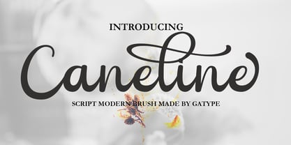 Caneline is an elegant classic script font, this font is equipped with various opentype features such as Stylistic Set & Ligature as well as multi-language support. Equipped with 90+ stylistic sets, this font has a large selection of glyphs / characters. This font is perfect for your design needs such as wedding invitations, logo designs, branding, social media designs, books, magazines, etc.
 - Bringhum by Letterhend,
$14.00 Introducing Bringhum, a bold and nostalgic typeface that captures the essence of the 90s era. Immerse yourself in its retro charm. This font is exceptionally well-suited for a range of applications, particularly for logos and various formal formats such as invitations, labels, magazines, books, greeting stationery, novels, and diverse advertising materials. Features :Uppercase & lowercase, Numbers and punctuation, Alternates & Ligatures , Multilingual, & PUA encoded
 - Eliptik by Yock Mercado,
$9.00 Eliptik is a typeface with disruptive shapes, inspired by the aesthetics of technology from the 80s and 90s, when they had a very particular style of seeing the future. It is an ideal typeface for large size display texts and wordmarks, designed in upper and lower case, it also has many stylistic variables (OpenType features) that give it more memorable and unique personality.
 - Acid Squares by Milan Vuckovic,
$29.00Acid Squares is a casual ornamental (fun) font. It was inspired by squares, the 70’s, the 90′s, street art and Berlin. Due to its limited readability it is recommended to use it in words that are common and uncomplicated or in logo design. As a decorative element it can be used well if the kerning is adjusted by the user. - Sauerkrauto Pro by Martin Lexelius Core,
$33.00 In the late 90’s, there were many German cars coming into Malmö (where I lived at the time). I was blown away by the font on the license plates. So strange, so strong, peculiar – but still macho. I built the uppercase from my own photos. After this I completed the font with my own lowercase, small caps and punctuation.