10,000 search results
(0.109 seconds)
- Elogy by PizzaDude.dk,
$20.00 Elogy not just a scratchy basic sans serif font - it is a font with a lot of attitude! Every single character is unique! I personally drew every single character - meaning that accented letters are unique! Elogy contains ligatures for both double lowercase, double uppercase and double numers! On top of that, it has got alternate letters for both upper- and lowercase! Talk about unique! You will need to use OpenType supporting applications to use the autoligatures,
 - Solina by Scratch Design,
$14.00 Solina is an exciting typeface that is inspired by the future life which is full of robots, mechanics, speed races, automotive and life in space. References to this font are based on the science-fiction visual of the modern-futurism mindset, making it perfect for any project that requires a futuristic and technologically advanced design. This font is perfect for creating sci-fi movie posters, technology-based branding, packaging, event and festival materials, automotive designs, and many more.
 - Welo Casual NF by Nick's Fonts,
$10.00Another tip of the hat to master draftsman Samuel Welo. His famous Studio Handbook was hand-lettered throughout, and provided the inspirations for many of Nick's favorite fonts. This little number is based on the unnamed style Mr. Welo used for much of his paragraph text. Use it when you want to convey homespun warmth and a handmade feel. Both versions of this font include the complete Unicode Latin 1252, Central European 1250 and Turkish 1254 character sets. - SF Pumice by Sultan Fonts,
$10.00 Pumice is a modern sans-serif typeface with characteristic and defined features. This font Name was inspired by the Aden pumice. Its design is composed of diverse 8 styles. Create unique designs by combining any of the upright weights with matching italics. Pumice includes a matching Latin design and support for Arabic, Persian, Kurdish, and Urdu. Pumice was specially designed for branding, advertising, editorial design, Web, and use on Tv and social media. Designers: Sultan Maqtari Publisher: Sultan Fonts
 - Novecento Slab by Synthview,
$22.00 Novecento Slab is the “slab serif” companion of Novecento Sans , a font family inspired on european typographic tendencies between the second half of 19th century and first half of the 20th. This font face is designed to be used mostly for headlines, visual identities or short sentences, both in big and small sizes. Novecento Slab family comes in 32 styles, speaks 76 latin based languages, has 590 glyphs and 16 stylistic opentype features for advanced typography.
 - Enchant by Beary,
$10.00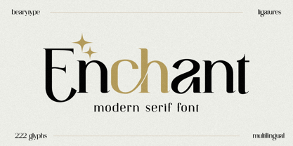 Introducing Enchant, the modern serif font that will elevate your designs to new heights. With its modern and sophisticated style, Enchant is the perfect choice for any project that demands elegance and class. Whether you're creating a website, presentation, or marketing materials, Enchant's unique blend of classic and contemporary design will leave a lasting impression on your audience. So why settle for ordinary fonts when you can have Enchant's timeless beauty? Upgrade your designs today with Enchant.
 - Cosmoball by Wacaksara co,
$15.00 Introducing Cosmoball, a bold connected script font inspire by a good smell and delicious taste of pancake, with a clear style and dramatic movement this font is great for your next creative project. Cosmoball comes with uppercase, lowercase, numerals, punctuations in script and sans version and so many variations on each characters include opentype alternates, common ligatures and also additional swash to let you customise your designs. Perfect to use for Logotype, Letterhead, Poster, Apparel Design, Label and etc.
 - Brooklyner by Hanoded,
$15.00 Brooklyner font is based on the typeface used for The Brooklynite, a magazine which saw its heyday in the 1920's. The typeface before you is an all caps affair, making it a perfect choice for headlines, posters and ads. Since I had to work with just a handful of glyphs (11 to be precise), it took me a while to design the rest. Brooklyner font is loose, cartoonesque and very legible - and it comes with extensive language support.
 - Laughs Qhuan by Namara Creative Studio,
$12.00 Decorative handwritten script font with natural touch, perfect for creating neat designs with a personal touch. It's perfect for branding projects, logo, wedding designs, social media posts, advertisements, product packaging, product designs, label, photography, watermark, invitation, stationery and any projects that need handwriting taste. Features : OTF File with Standard glyphs Alternates, Ligatures and Multilingual Support Works on PC & Mac with Simple installations PUA Encoded Characters, Fully accessible without additional design software. Hope you enjoy with our font!
 - LTC Forum Title by Lanston Type Co.,
$24.95 Forum Title was originally designed by Frederic Goudy in 1911. It was intended to be the heading font used for a book set in Kennerley. Based on inscriptional Roman stone cut capitals, this face is true to the early Roman forms which did not have a lower case. Forum exemplifies the classic Roman letterform at its finest. If a lower case were desired, Forum Title can be paired with Goudy Oldstyle for a harmonious hybrid font.
 - Carmen Sans by StudioJASO,
$26.00 Carmen Sans is a Geometric Sans that expresses modern vigor based on simplicity and clarity. The Hangul font is designed to deliver the same tone as the Latin font with its light curvature and structure, and it is suitable for display purposes by arranging letter heights between the two character sets. With the total of 9 styles, Carmen Sans works seamlessly in a variety of media and omnidirectional graphic designs, from editing to integrated applications for your brand.
 - Matty Salde by Negara Studio,
$19.00 Introducing Matty Salde! Is a script font. Written with a marker dipped in ink. With 33 ligatures. We write at a moderate speed so as to produce a solid brush effect. Matty Salde Features: Upper & lowercase characters, numerals, a large range of punctuation and Language Support. 33 ligatures are included for lowercase letters (see image). Matty Salde great for use on larger sizes. I just wanted to let you know that Matty Salde is our first script font. ~ Anugerah
 - Nitrous by Angga Mahardika,
$20.00 Nitrous is a script and serif typeface with elegance and vintage looks. This font has some of alternate characters, swashes and ligatures. You can design beautiful, elegant and diverse typographic elements with it. This font duo is effective on product packaging, particularly for wares that prefer a handcrafted, artisan approach to their finished presentation. Nitrous is ideal for strong branding, identity, and logo design, as its letter forms effortlessly express a tone of familiarity, reliability, and timelessness.
 - Brignell Sunday by IB TYPE Inc.,
$40.00 BRIGNELL SUNDAY is an eight font family designed by Ian Brignell. A relaxed, easy-reading companion for any day of the week. A clean, modern, friendly sans serif characterized by an open style with occasionally rounded corners, occasional curved junctures on diagonals and a slightly sloped lower case A. Brignell Sunday was born in 2006 and was inspired by corporate custom font ideas Ian designed for an LG Electronics sub-brand called Best Shop. Extended Latin set.
 - TE Almona Dewany by Tharwat Emara,
$95.00 The DEWANY (ALMONA DEWANY ) font is a font of original Arabic fonts and is specialized in writing in the offices of the Sultan and Arab’s Kings. It is also one of the most beautiful Arabic fonts as it has the flexibility to write official graduation certificates, certificates of appreciation, scientific progress and decorations. It is also commonly used in writing posters and sequences for serials, films, medals and decorations on clothes. The ALMONA DEWANY font has its aesthetics derived from its round and interlocking letters. In this version of Dewany font ( Almona Dewany ) you will find many of Arabian names, Ayat of Holley Quran and Good names of Allah (Asmaa Allah Al-Hosnna) and all of this is ready to written quickly by one click and choose glyphs you want to add.
 - Hubber by LomoHiber,
$16.00 Presenting my font called Hubber. This font has been inspirited by product retro posters from 60s-70s. I tried to make letters as much streamlined and gentle as possible. I hope you'll enjoy how sweet it came up. Hubber consists of such features as swashes, alternate glyphs, ligature, and additional shadow font. Hubber perfectly fits for retro designed logos, posters, prints. Hubber Features: Up to 19 alternates for each letter with swashes Contextual alternates feature will automatically match alternate letters depending on their position or pairing 21 ligatures Shadow effect font to save your time. Just place the layer with Shadow font behind Regular to make the shadow effect Carefully tuned kerning (preview above doesn't show it for some reason) If you have some issues, questions, please let me know: lhfonts@gmail.com Hope you'll enjoy using Hubber!
 - Sugarbang by astroluxtype,
$20.00 The 1960’s and 1970’s are the inspiration for Sugarbang! Everything from music packages, beach party movies of the 60’s to cereal box art of the 1970’s are reflected in the kooky style that this font evokes. Sugarbang! is built on a random baseline so letterforms bounce up and down adding to the “zany” look of the design. Look to the second font, Koo Koo Puff, to be the next release in the Cerealboxx collection. Available now. It is a minimal font set which includes uppercase and lowercase letterforms. Suggested uses for the font would be above 42 points in size. Please note its normal tight spacing and that cap “T” and cap “L” have been specially kerned to account for the overhang of certain other letterforms. Sugarbang! - just add milk and it’s sugar frosted font goodness.
 - Nebora by Product Type,
$15.00 Nebora is a typeface that makes a big statement with clean, basic lines and an emphasis on negative space. This geometric style font is excellent for magazine headlines, product packaging, posters, and more, and is inspired by the magnificent beauty and fresh air of the Arctic. In lowercase, Nebora is charming and charismatic; in capital letters, she is sophisticated and authoritative. The humanist feel adds warmth, while hard lines and sharp edges flow into the smooth rounded curve of the letters. To develop a typography-focused design that really jumps out, try it in 16 weights, including obliques. of course, your various design projects will be perfect and extraordinary if you use this font because this font is equipped with a font family, both for titles and subtitles and sentence text, start using our fonts for your extraordinary projects.
 - UXB by astroluxtype,
$30.00 UXB Stencil and its companion UXB Spray contain both the stencil and the sprayed letters in two fonts. The font is a headline display uppercase only character set, which is duplicated in the lowercase keys, identical in form (except for an alternate “Z”). No need to remember to hit the caps lock, the font will work with lowercase key strokes. UXB Spray is also a headline display uppercase only character set but, includes a few “drip” characters (find them in the lowercase key positions) these apply when you have held the spraycan over the stencil too long and made a mess. Use separately or together for a maximum design explosion. The fonts used together with color can create many nice design effects- by offsetting characters and putting one font in front of the other for a second effect. UXB it’s an emergency.
 - Great Monday by Designova,
$23.00 Great Monday is unique, fresh and beautiful handwritten font for branding / logo design / logotypes / greeting cards / promotional graphics and anything in between. Great Monday is completely handmade with passion, perfection as well as aesthetics at it's level best. Unique Ligatures We have created 14 unique ligatures to make sure the font looks beautiful and professional. Extended Character Sets Along with the basic Latin character set, we have added Western European, Central European, South Eastern European character sets for your convenience. The font contains a total of 336 glyphs. Advanced Kerning We have performed advanced, in-depth kerning for all possible letter combinations. What You Get This font being a handmade typeface, comes with only single weight (Regular). CREDITS: Font designed by Lis at Fontastica, produced by Fontastica, distributed by Designova. Created with ProCreate and Fontself on iPad Pro.
 - Pinky Lava by Attype Studio,
$12.00 Introducing Pinky Lava font, a beautiful typeface that features love-shaped holes in some of its letters. This font comes in both italic and display versions, giving you more flexibility in your design projects. With its multilingual support, Pinky Lava is perfect for creating designs in various languages. This font adds a touch of playfulness and romance to any project, making it ideal for creating natural handwritten logos and designs with love and Valentine's Day themes. Whether you're designing a greeting card, wedding invitation, or love-themed poster, Pinky Lava is sure to impress with its unique love-shaped holes and its playful yet professional vibe What's Included : - Pinky Lava Family Font - Multilingual Support Thank you for purchasing premium fonts from Attype Studio. Follow and explore our work on Pinterest & Instagram. If you have any question, don’t hesitate to contact us.
 - Gilbert Qualifi by EmbunStudio2018,
$20.00 Hello Everyone have a nice day, let me introduce our new Classy Serif Font called "Gilbert Qualifi" !! Are you ready to make the project more elegant and classy? makes every eye that sees it stunned and silent for a moment This font is part of our dedication to the world of fonts, the work that takes a long time, makes us make this font as our mainstay font Whether you have a client that needs a new chic logo, or you're designing your social media posts. Maybe you're preparing your wedding mood board, stationery, invitations, Gilbert Qualifi font is just perfect for all of that and more. you can check it all on preview !! Enjoy !! and start Creating !! Include Multilingual : ÀÁÂÃÅÄĄĀĂÆÇĆČĎÈÉÊËĘĒĖĚĞÌÍÎÏĪİÐÑŃŇÒÓÔÕÖŌŐOEŔŘØÙÚÛÜŪŮŰŲŚŠŞŁÝŸŻŹÞ àáâãąåäāăæçćčďđèéêëęěēėğıìíîïīðñńňòóôõöoőoeøùúûüūůűŭųþýÿŕřśšşłżźž
 - Aguas Frescas by Chank,
$99.00 The Aguas Frescas font family is an outline, hand-drawn display typestyle that reflects script handwriting with a lively, whimsical twist. It is a flowery little font that dances across headlines with a happy and likable good-natured attitude and a lyrical lilt. For extra OpenType tastiness, there are alternate versions of all the lowercase glyphs and a Contextual Alternates feature to make the letters flow together more smoothly and look more natural and handmade. And if you want to kick it up one notch further, you can combine the outline font Horchata with its “aguas frescas” companion font Tamarindo which is the solid, filled-in version of this font. Duplicate your text in overlapping layers of the two fonts for an brighter multi-color effect.
 - Overloaded by PizzaDude.dk,
$19.00 Overloaded is an excellent font for a wide variety of use - most likely something that needs a kind of worn look. Works well in both large and small sizes, that being headlines and/or display. Surprisingly versatile and will fit tons of different purposes. I put in 3 different versions of the lowercase letters for you to pick as you please, and play around with. Comes with multilingual support
 - Mohan by Allmo Studio,
$22.00 Mohan is a Bold Minimalist Elegant Fancy typeface font with tons of alternative characters, ornaments, multilingual support and unique ligatures. It's a very versatile font that works great in large and small sizes. Perfectly fit for your logo, headings, branding, magazine, cover album, book cover, movie, apparel design, quotes, invitations, flyer, poster, greeting cards, product packaging, printed quotes, or simply as a stylish text overlays to any background image.
 - Soursop by Inumocca,
$20.00 Soursop a cute handwritten font, Girly, fun and joyful character but strong and dynamic. Come with Swash for Complete your Typography. Exellent typeface to use for covering your Project, like Branding, Movie Title, Headline Letter, Bookcover or Book Content, Magazine cover, Poster, Quotes Lettering, Logos, and more your project design. - Unique glyphs - Multilingual Characters Support - UPPERCASE - Lowercase - Numeric - Symbol - Punctuation Character - PUA encoded - Soursop Reguler - Soursop Swash inumocca type
 - The Stylish Babes by PeachCreme,
$19.00 Here's our latest font release: the stylish babes! A messily whimsical script ready to brighten up your light-hearted projects. Inspired by texts written loosely by hand, this handwritten font is loaded with careless ligatures. There are 144 sloppy ligatures that will add a real authentic feel to your designs. the stylish babes is a perfect choice for handwritten notes, greeting cards, packaging, and of course, fun branding.
 - Duper Hamburges by Mightyfire,
$15.00 Duper Hamburges is here! With a funny, playful and modern looks, Duper Hamburges can bring happiness for both of writers and readers. If you want to write something fun, happy and cheerful, try to use Duper Hamburges. Enjoy this font in your children book, birthday card, fun poster, comic book, and any other arts. We're honored and proud if Duper Hamburges can be the part of your special works. Thank you :)
 - Fiery Sun by Epiclinez,
$19.00 Fiery Sun is a fun and bold display font. Carefully handcrafted to fit most of your projects, this font is going to become your favorite in no time! Its organic-style is suitable for creating any branding, product packaging, quote, t-shirt, label, poster, logo that you wish to develop. Fiery Sun contains 194 glyphs. Supporting more than 66 languages, from English to Zulu. I hope you enjoy it. Thanks
 - Gweneth embassy by Stringlabs Creative Studio,
$25.00 Gweneth celebrates all things comics. This gorgeous cartoonish display font will look simply magical in a wide range of design projects. It’s great for comics, cartoons, birthday invitations, and any creative project that needs a fun look! Gweneth is a flowing and elegant handwritten font, created with the help of a brush pen. Get inspired by its unique and beautiful style and add it to your favorite designs!
 - CCS Levior by Creative Corner Studio,
$19.00 CCS Levior is a classic modern font that is both stylish and unique with Narrow smooth curves and beautiful ligatures, tons of special alternative glyphs, ornament and multilingual support. It's a very versatile font that works great in large and small sizes. CCS Levior is perfect for branding projects, Logo design, Clothing Branding, product packaging, magazine headers, or simply as a stylish text overlay to any background image.
 - Neosim by Smartfont,
$20.00 A striking modern display font in three styles. Neosim is for any kind of design work. Every single letters have been carefully crafted to make your text looks beautiful. Created with creativity, passion and imagination. PERFECT FOR Titles, greeting cards (Christmas, Birthday, Helloween, other holidays), logos, posters, phrases, cover album, gift shops, books, comics, presentation, Pinterest or Instagram, other. Have fun with Neosim and expand your creativity in all areas.
 - Cuanky by Kereatype,
$14.00 Cuanky is a super fun, retro-style sans serif font with subtle serifs. It possesses a recognizable flair and evokes a sense of warm nostalgia. Available in both regular and italic styles, Cuanky also features a playful hint of the future. Cuanky is perfect for headlines or food-related designs, such as pizza, burgers, and restaurant themes. Additionally, it's well-suited for creating eye-catching posters with a cool aesthetic.
 - Wusel by Loreley Design,
$28.00 Named by the german word for bustling around, to scurry or swarming the Wusel has a very active appearance. It's completely handmade and doodely because of all the crisscrossing lines, which forms big, bold, sanserif letters. These are very good to read wether they're big or small. Just a very playful, fun and simple font to use for headlines, tags and all kind of things which need al little attention.
 - Laugh Together by Invasi Studio,
$19.00 Laugh Together is a dynamic display font inspired by urban streetwear culture and the vibrant world of brush paint tagging graffiti. With its bold and expressive style, Laugh Together makes a fun and bold statement in any design. This all-caps font features a complete set of A-Z alternates, allowing you to experiment and create unique combinations. Additionally, Laugh Together supports multilingual characters, making it versatile for various language requirements.
 - Yugoslavia - Personal use only

- Compiler by Identity Letters,
$39.00 Legible, technical, clear—with a hint of retro: Compiler is a no-frills font family straight from the heart of a microprocessor. Inspired by console typefaces, the humanist sans serif typeface combines a large x-height with striking serifs on certain letters such as i and l. Those serifs evoke the aesthetics of monospace typefaces for programming. Even though Compiler is a proportional typeface, this detail improves glyph recognition and helps differentiate between individual letters. Combined with vertical stroke ends, which allow for particularly even spacing, the serifs make for an extremely legible typeface. (Even in small sizes.) Brand recognition guaranteed: Compiler is ideal for applications that require a mechanical flavor without appearing offish. You can use it for websites, apps, branding, corporate design, annual reports, signage, and many other areas with perfect results. Compiler consists of two font families; the second one is Compiler Plain. In Compiler Plain, the signature letters lose their serifs and the forms of "a" and "g" are simplified. This way, the shapes are neutralized. The technical impression recedes into the background. Both families can be combined smoothly: you might use the standard Compiler fonts for display sizes and Compiler Plain styles for body copy. For total design control, you can toggle each of the defining design elements individually from Compiler to Compiler Plain and vice versa. Just use Stylistic Sets to fine-tune your Compiler fonts. Compiler provides you with 8 weights in 4 variations: Upright, Italics, Plain Upright and Plain Italics. That's a total of 32 fonts. Each style contains more than 860 glyphs, including advanced typographic tools such as proportional and tabular figures (both lining and old-style) or small caps—something you'll rarely find in this genre. Other glyphs are optimized for display sizes, such as circled figures and various arrows. There's also a set of glyphs designed for web use: with symbols for shopping carts, hamburger menus or checkboxes, you can implement your web projects elegantly and consistently without relying on third-party tools (like an external icon font). Powered by highly productive OpenType functions, Compiler is an intermedia workhorse straight from cyberspace.
 - Rip TAPE by TypoGraphicDesign,
$19.00 CONCEPT/CHARACTERISTICS The handmade, dirty and yet modern character of the font was designed with analog tape on paper and later digitized. The motto is sticky, wrinkled and rough APPLICATION AREA The dirty, rough and fancy font „rip TAPE“ would look good at display size for poster, flyer, comics and graphic novel lettering and logos. Headlines in magazines or websites, packaging, music covers or webbanner etc. TECHNICAL SPECIFICATIONS Headline Font | Display Font | Grunge/DIY Font „rip TAPE“ OpenType Font with & 78 glyphs & 2 styles (regular, fixed).
 - Orange Baroon by Attype Studio,
$14.00 Orange Baroon - Inspired by typeface on 70s era, Orange Baroon has the vintage font & retro with stencil look. with 2 font style, It's super easy to use stencil effect with Orange Baroon family font. Two style Font: Regular & Display Orange Baroon is perfect for vintage & retro style product, branding, logo, invitation, stationery, product packaging, merchandise, monogram, blog design, game titles, cute style design, Book/Cover Title and more. Features : - Orange Baroon Family Font - Ligatures - Multilingual Support --- Hope you enjoy with our font! Attype Studio
 - Black Thone by Attype Studio,
$12.00 Introducing Black Thone - Inspired by typeface on 70s era, Black Thone has the vintage font & retro font style. with 3 font style, It's super easy to use 3D effect wint Black Thone family font. Three style Font: Regular, Display & Extruded Black Thone is perfect for children product, branding, logo, invitation, stationery, product packaging, merchandise, monogram, blog design, game titles, cute style design, Book/Cover Title and more. Features : - Black Thone.otf - Black Thone Extruded.otf - Black Thone Display.otf - Multilingual Support --- Hope you enjoy with our font! Attype Studio
