1,110 search results
(0.042 seconds)
- Dx Grove by Dirtyline Studio,
$20.00 introducing Dx Grove, a vintage-inspired font that seamlessly blends nostalgia with elegance, making it the perfect choice for your design projects. This timeless serif font comes in 4 Style regular and Condensed including the italic too. offering you versatility and style for your graphic design, branding, and packaging projects. Capture the essence of the past with Dx Grove free-spirited vintage charm, bringing a touch of yesteryear to your creations. Ideal for wedding invitations, branding, or projects that need nostalgic 90’s font aesthetics, this hand-drawn typeface is bold and versatile.
 - Selebor by takoliko,
$10.00 Selebor is a slab serif font. Selebor inspired by the 80s and 90s vibe font. The font is perfect for you that want to create a project that have a retro feeling but not to old. it perfect for designing stickers, t-shirt, a food logo and design that used a smiley themed or vintage cartoon on it. Selebor can be used as a fun or a formal kind of project. It support multilingual language. It can easily be matched to your projects, and good for communicating your brands.
 - Billy Coaster by HIRO.std,
$20.00 Billy Coaster is a Modern Retro Typeface. This font describes about stylist, modern retro, modern vintage, cool, and easy to use. Billy Coaster Typeface inspired from the modern retro typography and designs in late 80's untill 90's. FEATURES - Uppercase and Lowercase letters - Support Opentype Features - Stylistic Alternates - Numbering and Punctuations - PUA Encoded Characters - Multilingual Support - Works on PC or Mac - Simple Installation USE Billy Coaster Typeface works great in Logotype, Branding, Apparel, Poster, Magazine and any projects that need Modern Retro taste. Enjoy using! Thanks. HIRO.std
 - Linotype Fehrle Display by Linotype,
$29.99Erich Fehrle designed this robust alphabet for headlines and titles in 1976. The constructed figures of Linotype Fehrle Display were built on the geometric form of the rectangle. Lines of text look closed and compact. The letter forms are the result of fine open spaces. Design-specific characteristics of Linotype Fehrle Display are its serif-like additions to the strokes of the figures a, c, G or M, and the alternating rounded and angular outlines of the figures a, e, s and others. Typefaces similar to Linotype Fehrle Display: Bigband, Frutiger 95. - Straight Angles by Celebrity Fontz,
$24.99Straight Angles is a precisely designed three-dimensional font with a clean and futuristic look. The predominant angles are 90 degrees and 180 degrees with parallel and perpendicular lines. Each character is surrounded by a crisp black border of even thickness throughout the font. Upper- and lower-case letters are the same, providing a constant maximum top height while the stems extending below are allowed to show off their distinct personalities in order to spice things up. The 3D extrusion effect makes text appear to stand out from the page. - Retro 86 by Parker Creative,
$18.00 Introducing RETRO-86 - A modern take on old-school computer graphic fonts. RETRO-86 was inspired by the low-resolution computer graphics of the 1970s, 80s, and 90s seen in classic games and on computer screens and interfaces. RETRO-86 features a beautifully limited, blocky design and is perfect for projects relating to the tech industry, the gaming world, and nostalgic work from the late 20th century. RETRO-86 is also a hyper versatile typeface. It comes in 2 complementary styles (regular, and shadow) and features 8 weight options each!
 - Clonoid by Dharma Type,
$19.99 Inspired by and tribute to arcade game logos in 80s and 90s. Clonoid can give futuristic, sci-fi and mechanical impression by its geometric framework but its rounded bowls and semi-rounded edges can make natural and soft impression too. And its orthodox letterform make it possible to use this font for all uses. Clonoid family consists of 12 styles, 6 weights (ExtraLight, Light, Regular, SemiBold, Bold and Black) & italics and it’s available in OpenType format. We released 4 big Sci-Fi families in 2013. Check it out! Clonoid Controller Geom Graphic Space Colony
 - Oskal by Pesotsky Victor,
$15.00 "OSKAL" is a font that appeared as an experiment to cross the neutral grotesque and antique. The idea is to make a strange hybrid out of a simple grotesque. The serifs are added in non-standard places and make this font unusual for perception. It's a sharp and active font that you can shout at or break down walls with. OSKAL supports Basic Latin and Extended Latin, Cyrillic — in total about 90 languages are supported. The font has one Regular weight, uppercase and lowercase, punctuation. OSKAL font was designed by Viktor Pesotsky.
 - PR Cauldron by PR Fonts,
$9.02 Whether your subject is scary, or just ancient, this font can help get the right feeling across. PR-Cauldron has capitals based on Uncials, and lowercase based on Celtic Minuscule. “Potion” has a rough finish, and “Curse” has the same letters dripping with gore, suitable for Halloween. Letters are size matched in both fonts, so you can put in as much, or as little messiness as you like. Combines well with: PR Bramble Wood 1, PR Bramble Wood 2, PR Hallow Doodles 01, PR Hallow Doodles 02, PR Swirlies 01, PR Swirlies 05
 - AT Bubley by Amera Type,
$20.00 Inspired by the archive of music flyers and skateboarding magazine created in the early 90s. Bubbley is made for the purposes of making posters, magazine headers, book titles, flyers and other print media. Bubbley is made for digital needs that are more modern but still have a vintage feel Every line and curve in letterform is made for the needs of the future industry, the latest version in the modern lettering industry. Bubbley is very suitable to be combined with the illustrations that we provide for free, to complete your needs
 - Trump Script by Canada Type,
$29.95 One of the earliest fonts published by Canada Type was Tiger Script, Phil Rutter's digitization of Jaguar, Georg Trump's 1967 wild calligraphic brush face. In 2010, when the font was revisited for an update, it was shown that it too light for applications under 24 pt, and too irregular for applications over 64 pt. So the face was redigitized from scratch. This new digitization brings a more seamless contour and a much steadier stroke, and much better outlines for use at both extremes of scaling. Language support was also greatly expanded, and many alternates and ligatures were added to the redigitized character set. The name was also changed to Trump Script, to better reflect the origins of the design. Trump Script is a master calligrapher's hand producing very uncommon jolts and bursts of sharpness. It showcases some of the most suprising letter forms ever drawn, like the very unique treatments of B, K, W, Y and Z. In the lowercase one can see the cattiest g ever made, and some of the wildest shapes in the f, j, p, y and z. Trump Script comes in all popular formats. The TrueType and PostScript packages are comprised of two fonts. The OpenType version, Trump Script Pro, combines both fonts into one, and includes features for intelligent substitution in software that supports advanced typography. Language support includes Western, Central and Eastern European character sets, as well as Baltic, Esperanto, Maltese, Turkish, and Celtic/Welsh languages.
 - Lincoln Electric by Canada Type,
$30.00 Lincoln Electric started its life as an in-house experimental film type Thomas Lincoln drew shortly after concluding his work as part of Herb Lubalin’s famed crew in the late 1960s,. The master alphabet was drawn on illustration boards using pen and ink and press-type lines. The typeface was initially made for use in the branding and promotional material of Lincoln’s new design outfit. This alphabet’s forms are a spin on Bifur, the all-cap deco face designed by Adolphe Mouron (known as Cassandre) in 1929, and published by the Deberny & Peignot foundry in France. Lincoln Electric evolves Cassandre’s idea further by constructing new shapes more in line with minimalist principles rather than art deco geometry — something clearly evident in Lincoln’s minuscules, which exhibit a clear connection to Bauhaus ideas More than 50 years after the typeface’s design, Thomas Lincoln found the original film alphabet tucked away in his archives and brought it over to Canada Type for digital retooling. The result is a modern and thoroughly elaborate set of fonts that belonging prominently in a 21st century designer’s toolbox. The following features are included in Lincoln Electric: • Three fonts for chromatic layering. • More than 1900 glyphs in each font. • Expanded Latin and Cyrillic character sets. • Small caps and Caps-to-small-caps. • Six different sets of stylistic alternates. • Ordinals and case-sensitive forms. For a showing of the stylistic set variations and a sample of demonstration of chromatic layering, please consult this PDF.
 - Ghost Sign JNL by Jeff Levine,
$29.00 Ghost Sign JNL is a spurred serif type design based on the faded lettering of an antique brick wall sign for Homer Hardware [located in Homer, NY] and is available in both regular and oblique versions. From Wikipedia: “A ghost sign is an old hand-painted advertising sign that has been preserved on a building for an extended period of time. The sign may be kept for its nostalgic appeal, or simply indifference by the owner. Ghost signs are found across the world with the United States, the United Kingdom, France and Canada having many surviving examples. Ghost signs are also called fading ads or brickads. In many cases these are advertisements painted on brick that remained over time. Old painted advertisements are occasionally discovered upon demolition of later-built adjoining structures. Throughout rural areas, old barn advertisements continue to promote defunct brands and quaint roadside attractions. Many ghost signs from the 1890s to 1960s are still visible. Such signs were most commonly used in the decades before the Great Depression. Ghost signs were originally painted with oil-based house paints. The paint that has survived the test of time most likely contains lead, which keeps it strongly adhered to the masonry surface. Ghost signs were often preserved through repainting the entire sign since the colors often fade over time. When ownership changed, a new sign would be painted over the old one.”
 - ATFAntique - Unknown license

- Seizieme by URW Type Foundry,
$49.99 In 1905 the Parisian typefounders Peignot & Cie. issued their Série 16. This clear roman with a large x-height and an italics soon enjoyed a great popularity. Coen Hofmann’s drawings made for the Seizième follow the original Peignot Série 16 as close as possible. The regular font has the original small caps, while all members of the family are enhanced, next to the ranging ones, with old style figures. Also superior and inferior figures are available. The original series did not have a bold version. This was, however, carefully drawn for this digital rendition. The Série 16 and its versions for the composing machines were much used for the type setting of scientific publications. That is why a comprehensive set of mathematical and sundry characters are added to the Seizième fonts. Next to the accented characters for the several West and East European languages the Seizième was also enhanced with a Cyrillic, also available in regular, italic and bold versions.
 - Finador by Julien Fincker,
$24.00 Finador is a modern, soft geometric sans family. The functional style of a geometric sans has been soften by open apertures and rounded corners. This makes it functional and friendly. The default version has open, modern apertures. Stylistic Set 2 includes the whole set with closed, classic apertures. A slightly different look. It´s like having a second font in just one font. So it´s up to you to choose the right look for your projects. The Finador family includes 8 weights, from thin to heavy + their matching italics. With 900+ glyphs per style it supports over 200+ latin based languages, includes an extended currency symbol set and a lot of Open Type Features like small caps, ligatures, fractions, alternates and many more. The lightest and boldest weights are good for display usage, while the middle weights can be also used for body text. As a versatile allrounder Finador supports almost every of your needs. It has the ability to become your next favorite workhorse family.
 - Comicade by LetterStock,
$20.00 Comicade Font This pair was inspired by the retro cartoon poster design that i saw on some coffee shop, It was crafted by hand specially to add natural handmade feeling in its brand identity than i make it clean with pentool. Opentype features Comicade font has 205 character set included Comicade Font is very good looking in logo, labels, product packaging, invitations, advertising and others. What includes * Multilingual support (Western European characters). This fonts works with folowing languages: Afrikaans, Albanian, Asu, Basque, Bemba, Bena, Chiga, Cornish, Danish, English, Estonian, Filipino, Finnish, French, Friulian, Galician, German, Gusii, Indonesian, Irish, Italian, Kabuverdianu, Kalenjin, Kinyarwanda, Low German, Luo, Luxembourgish, Luyia, Machame, Makhuwa-Meetto, Makonde, Malagasy, Malay, Manx, Morisyen, North Ndebele, Norwegian Bokmål, Norwegian Nynorsk, Nyankole, Oromo, Portuguese, Romansh, Rombo, Rundi, Rwa, Samburu, Sango, Sangu, Scottish Gaelic, Sena, Shambala, Shona, Soga, Somali, Spanish, Swahili, Swedish, Swiss German, Taita, Teso, Vunjo, Zulu Thank you for using this font. LS
 - Caslon #3 by Linotype,
$29.99The Englishman William Caslon (1672–1766) first cut his typeface Caslon in 1725. His major influences were the Dutch designers Christoffel van Dijcks and Dirck Voskens. The Caslon font was long known as the script of kings, although on the other side of the political spectrum, the Americans used it as well for their Declaration of Independence. The characteristics of the earlier Renaissance typefaces are only barely detectable. The serifs are finer and the axis of the curvature is almost or completely vertical. The overall impression which Caslon makes is serious, elegant and linear. Next to Baskerville, Caslon is known as the embodiment of the English Baroque-Antiqua and has gone through numerous new interpretations, meaning that every Caslon is slightly different. American Type Founders presented a Caslon in 1905 which is true to the forms of the original. This font is relatively wide and comes complete with small caps and old style figures. - Helicha by LetterStock,
$20.00 Helicha Font This pair was inspired by the retro cartoon poster design that i saw on some coffee shop, It was crafted by hand specially to add natural handmade feeling in its brand identity than i make it clean with pentool. Opentype features Helicha font has 205 character set included Bukle wrack Font is very good looking in logo, labels, product packaging, invitations, advertising and others. What includes * Multilingual support (Western European characters). This fonts works with folowing languages: Afrikaans, Albanian, Asu, Basque, Bemba, Bena, Chiga, Cornish, Danish, English, Estonian, Filipino, Finnish, French, Friulian, Galician, German, Gusii, Indonesian, Irish, Italian, Kabuverdianu, Kalenjin, Kinyarwanda, Low German, Luo, Luxembourgish, Luyia, Machame, Makhuwa-Meetto, Makonde, Malagasy, Malay, Manx, Morisyen, North Ndebele, Norwegian Bokmål, Norwegian Nynorsk, Nyankole, Oromo, Portuguese, Romansh, Rombo, Rundi, Rwa, Samburu, Sango, Sangu, Scottish Gaelic, Sena, Shambala, Shona, Soga, Somali, Spanish, Swahili, Swedish, Swiss German, Taita, Teso, Vunjo, Zulu Thank you for using this font. LS
 - Singel by Fontfabric,
$35.00 Singel is a neoclassical serif with semi-condensed proportions. As a contemporary interpretation, this typeface combines the rationalist modulated stroke with an elegant silhouette and crisp serifs. The altogether splendid appearance of Singel, completed with a full set of Small Capitals and true form of italics makes it perfect for any luxurious and graceful design. Other aspects of its characteristics include the consistency of 10 styles from Light to Bold; a coverage of Extended Latin and Cyrillic with span for more than 130 languages; a flawless functionality and support of many OpenType features, such as localizations, tabular numerals, inferiors and superiors, numerators & denominators, fractions, case sensitivity etc. Features: • Over 900 glyphs in 10 styles (Light to Bold); • Extended Latin and Cyrillic for more than 130 languages; • Tall x-height and Semi-Condensed proportions; • High contrast and modulated stroke with vertical stress; • Neoclassical characteristics and moderate apertures; • Full set of Small Capitals; • True form of italics; • Coverage of multiple OpenType features; • Suitable for wide design purposes.
 - Art Nouveau SCF by Scholtz Fonts,
$21.00 The Art Nouveau styles of the the turn of the 20th century (1890 - 1905) exhibited a bold approach to organic lines and lavish decoration. This new style was spread throughout the world and helped usher in a new era that led to modern art and design. Art Nouveau SCF is strongly influenced by the style of decoration and typography created by Rennie Mackintosh as well as the Art Nouveau movement in general (with particular reference to Gustave Klimt and Alphonse Mucha). However, it differs from much of the art nouveau typography in that it largely avoids the use of straight lines in its letter forms. It is a decorative, romantic font and its subtly curved bolder lines contrast with delicate tracery to create an intricate pattern of organic flowing shapes. Use Art Nouveau SCF for: -- posters -- wedding invitations -- advertising material for clothing and beauty products -- Music CD covers and advertising media -- Film advertising media
 - Selectric Century by Indian Summer Studio,
$45.00 Also known as Schoolbook. 900+ glyphs. After Linn Boyd Benton's and Morris Fuller Benton's 1894 lower contrast version of Scotch Modern, Didone. The part of the large project on revival and further development (by drawing many additional glyphs) of the 20th century’s typewriters’ fonts. And especially the most famous, versatile and beautiful typewriter: IBM Selectric’s golfball fonts, lost for the civilization for many decades after ‘80s, not being created since then in digital vector form. This new sub-project started in July 2018 for the restoration of the most beautiful classical typefaces, used during the 20th century on the extremely rare now IBM Selectric Composer typewriters / desktop publishing systems. Together with Nick Hamze and the Right Reverend Theodore Munk, the collectors of old typewriters. IBM showed the perfect taste by developing these best historical book typefaces of the human civilization for typewriters. So people could type then using both the real book faces, and the famous classical ones.
 - Pamithais Script by Creative Lafont,
$8.00 Pamithais Script is a unique blend of classic and modern font. It includes an imperfect style of ups and downs, like a dancing letters, smooth, clean and simple. Pamithais Script font perfect for wedding, event, invitation, escort card, table number, header menus, display, logos, slider blog, custom address, stamps, packaging, greeting card, etc. Pamithais Script comes with a complete set of standard characters, eastern diacritic symbols, consist 902 glyphs in total, and 501 alternative characters as OpenType features to play with. The alternative characters were divided into several OpenType features such as Ligature and Stylistic Sets. You can create an attractive message by using the alternate characters in your design. If you don't have a program that supports OpenType features such as Adobe Illustrator and CorelDraw X Versions, you can access all the alternate glyphs using Font Book (Mac) or Character Map (Windows). If you have any question, don't hesitate to contact me by email: Creative.lafont@gmail.com Thank You !
 - Base 05 is a unique and fascinating font designed by Clément Nicolle, also known by his pseudonym "StereoType." This font stands out due to its exceptional characteristics that masterfully blend the ...
- Amazing Slab by Zetafonts,
$39.00 Amazing Slab is a typeface family designed by Francesco Canovaro and Andrea Tartarelli as a development of the Amazing Grotesk family designed by Cosimo Lorenzo Pancini. Mixing an egyptian serif, low contrast approach with the curved endings and open shapes of humanist sans grotesques, it was developed to embody the energetic and friendly nature of the startup scene: a feeling of innovation, information and energy, with a desire for simplicity and straightforward communication. The basic design shapes for the font come from the strong personality of the extrabold letterforms drawn by Francesco Canovaro for his StartupItalia logo, that informed the display design of the four darkest weights (from medium to black). Each of these weights, has been paired with an inline version, designed by Mario De Libero, to extend the range of uses for the typefaces, from bold signage to logo design, to editorial titling. The lighter range of the family features two weights (regular and light) that are designed for text use, complemented by the thin and extralight weights that are better suited to big point size, for editorial and signage use. All the weights of Amazing Slab, as well the matching true italics forms, feature an extended charset of over 900 glyphs, covering 211 languages using latin, cyrillic and greek alphabets, and sporting a complete set of Open type features including positional numbers, annotation and case-sensitive forms, standard ligatures and a wide array of stylistic sets to customize glyph shapes for logo and display usage. With its friendly, energetic mood and its versatile range of application use, Amazing Slab is born to make every design project look simply... amazing! Suggested uses: old signage, logo design, editorial titling, display 21 styles: 8 weights, 8 italics, 4 inline styles, 1 variable font 965 glyphs in each weight Useful OpenType features: Small Capitals; Standard Ligatures; Discretionary Ligatures; Stylistic Alternates; Stylistic sets 01, 02, 03, 04, 05, 06; Ordinals; Fractions; Tabular Figures; Old-style Figures; Slashed Zero; Circled Numbers; Case Sensitive Forms; Numerators; Denominators; Subscript; Superscript; Scientific Inferiors; 211 languages supported: extended Latin, Cyrillic, Greek English, Spanish, Portuguese, French, Russian, German, Javanese (Latin), Turkish, Italian, Polish, Afaan Oromo, Azeri, Tagalog, Sundanese (Latin), Filipino, Moldovan, Romanian, Indonesian, Dutch, Cebuano, Malay, Uzbek (Latin), Kurdish (Latin), Swahili, Greek, Hungarian, Czech, Haitian Creole, Hiligaynon, Afrikaans, Somali, Zulu, Serbian, Swedish, Bulgarian, Shona, Quechua, Albanian, Catalan, Chichewa, Ilocano, Kikongo, Kinyarwanda, Neapolitan, Xhosa, Tshiluba, Slovak, Danish, Finnish, Norwegian, Sicilian, Sotho (Southern), Kirundi, Tswana, Sotho (Northern), Belarusian (Latin), Turkmen (Latin), Bemba, Lombard, Lithuanian, Tsonga, Wolof, Jamaican, Dholuo, Galician, Ganda, Low Saxon, Waray-Waray, Makhuwa, Bikol, Kapampangan (Latin), Aymara, Zarma, Ndebele, Slovenian, Tumbuka, Venetian, Genoese, Piedmontese, Swazi, Zazaki, Latvian, Nahuatl, Silesian, Bashkir (Latin), Sardinian, Estonian, Afar, Cape Verdean Creole, Maasai, Occitan, Tetum, Oshiwambo, Basque, Welsh, Chavacano, Dawan, Montenegrin, Walloon, Asturian, Kaqchikel, Ossetian (Latin), Zapotec, Frisian, Guadeloupean Creole, Q’eqchi’, Karakalpak (Latin), Crimean Tatar (Latin), Sango, Luxembourgish, Samoan, Maltese, Tzotzil, Fijian, Friulian, Icelandic, Sranan, Wayuu, Papiamento, Aromanian, Corsican, Breton, Amis, Gagauz (Latin), Māori, Tok Pisin, Tongan, Alsatian, Atayal, Kiribati, Seychellois Creole, Võro, Tahitian, Scottish Gaelic, Chamorro, Kashubian, Faroese, Rarotongan, Sorbian (Upper Sorbian), Karelian (Latin), Romansh, Chickasaw, Arvanitic (Latin), Nagamese Creole, Saramaccan, Ladin, Palauan, Sami (Northern Sami), Sorbian (Lower Sorbian), Drehu, Wallisian, Aragonese, Tuvaluan, Zuni, Montagnais, Hawaiian, Marquesan, Niuean, Yapese, Vepsian, Bislama, Hopi, Megleno-Romanian, Creek, Aranese, Rotokas, Tokelauan, Mohawk, Warlpiri, Cimbrian, Sami (Lule Sami), Jèrriais, Arrernte, Murrinh-Patha, Kala Lagaw Ya, Cofán, Gwich’in, Seri, Sami (Southern Sami), Istro-Romanian, Wik-Mungkan, Anuta, Cornish, Sami (Inari Sami), Yindjibarndi, Noongar, Hotcąk (Latin), Meriam Mir, Manx, Shawnee, Gooniyandi, Ido, Wiradjuri, Hän, Ngiyambaa, Delaware, Potawatomi, Abenaki, Esperanto, Folkspraak, Interglossa, Interlingua, Latin, Latino sine Flexione, Lojban, Novial, Occidental, Old Icelandic, Old Norse, Slovio (Latin), Volapük
 - Emynam Crew by Alit Design,
$23.00 Introducing the Emynam Crew: A Funky Retro Display Typeface Dear Design Enthusiasts, Are you ready to groove to the rhythm of creativity and nostalgia? Say hello to the Emynam Crew, the font that's bringing back the funky retro vibes of yesteryears with a modern twist. With its unique blend of style, flair, and a whopping 705 glyphs, this typeface is a must-have for anyone looking to make a statement. Key Features: Retro Vibes: Emynam Crew captures the essence of the 70s and 80s with its bold, funky letterforms. It's like a blast from the past, perfect for adding a touch of nostalgia to your designs. Ligatures and Alternatives: Dive into the world of creativity with multiple ligatures and alternative characters. Mix and match to create stunning, one-of-a-kind typographic compositions. PUA Multilingual Support: Emynam Crew is not just about style; it's about substance too. With PUA multilingual support, you can use this font to communicate in various languages, making it a versatile choice for global projects. Endless Possibilities: With 705 glyphs at your disposal, the possibilities are endless. Whether you're designing posters, album covers, branding materials, or anything else, Emynam Crew gives you the freedom to express your unique vision. Stylish Display: Make a bold statement with Emynam Crew as your headline or display font. Its eye-catching style ensures that your message won't go unnoticed. Perfect for Retro Revival: Whether you're working on a retro-themed project or just want to infuse a touch of nostalgia into your designs, Emynam Crew is your go-to choice. Easy to Use: Emynam Crew is designed with user-friendliness in mind. It's compatible with popular design software and is easy to install and use. Unleash your inner artist and let Emynam Crew transport your designs to a bygone era. Embrace the funk, the retro, and the style with this one-of-a-kind typeface. Don't miss out on this opportunity to own the Emynam Crew – a font that's all about style, character, and endless possibilities. Get ready to turn back the clock and add a touch of funky nostalgia to your next project. Order your Emynam Crew Typeface today and start designing with retro flair!
 - Carioca Script Pro by Stiggy & Sands,
$39.00 Our Carioca Script Pro was inspired the lettering from the RCA Records Stereo Action Series from the 1960's. It's a signature script that is both elegant yet slightly bouncy and truly sings…lending a happy-go-lucky flavor to any design. This script is loaded with extra features - truly giving Carioca Script Pro something to sing about. Opentype features include: - Swash Capitals. - Initial and Final forms of Lowercase letters via Stylistic & Contextual Alternates. - Full set of Inferiors and Superiors for limitless fractions. - Oldstyle figures. - Ordinals. - 10 Flourishes included in Carioca Script Pro. 90 Flourishes in Carioca Script Flourishes.
 - Nipok by Gravitype,
$14.90 Nipok is a single weight display typeface, inspired by the aesthetics of different decades. Rounded terminals and playful intersections from the 60’s and 70’s, joined with straight and compact lines from the 80’s and 90’s. The particular style is given by the alternation of upper and lower case letters, chosen to fill the empty spaces greatly and create harmony. In addition, alternates are included to give you more stylistic options. While by default this font is a semi unicase, the alternative glyphs extend the Ascent and Descent metrics. Multilingual support is available.
 - Banjelo by Keristyper Studio,
$14.00 Banjelo is inspired by the 90's vibes, making it feel retro, vintage, and classy. This font is good for logo design, Social media, Movie Titles, Books Titles, short text even long text letters, and good for your secondary text font with script, sans, or serif. Featured: * Standard Uppercase & Lowercase * Numeral & Punctuation * Multilingual : ä ö ü Ä Ö Ü ß ¿ ¡ * Alternate & Ligature * PUA encoded We recommend programs that support the OpenType feature and the Glyphs panel such as Adobe applications or Corel Draw. so you can use all the variations of the glyphs. Hope you enjoy our fonts!
 - Hepives by Nocturnal Workspace,
$12.00 Hepives born to be a clothing trademark for the adventurous lover community. Initially we only made a typographic logo with the name "HEPIVES" then we developed it again into a font. inspired by old vintage denim labels, old clothes commercials, labels on 90s tapes.. Ideal for use in logos, flyers, invitations, labels, clothes and more. FEATURES Standard Ligature Stylistic Alternate Fraction, Numerator, Denominator Includes a range of multilingual characters. To improve the quality of use & enrich the font family, we always update the fonts that have been published. Feel free to give us suggestions. Thank you!
 - Lychee Farmland by Putracetol,
$25.00 Lychee Farmland - Playful Sans Serif Font. This font is a playful quirky font with a lot of character ligatures, as many as 90 ligatures. With a soft and warm appearance, it is suitable for all ages from children, teenagers and the elderly. This font is perfect for logos, greeting cards, quotes, svg, clothes, posters, logos and more. This font can be installed on MAC OS and Windows OS, it can also be installed in the procreate and cricut applications. Come with lot of ligatures character, its help you to make great lettering, quote, logos and. This font is also support multi language.
 - Mountriel by Typetemp Studio,
$18.00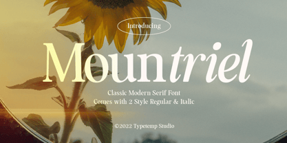 Mountriel - Classic Modern Serif Font is a stylish font It has both Classic modern and 80s 90s look. Comes with alternatives and ligatures, helps to create stunning logos, quotes, posts, blog posts. branding projects, magazine imagery, wedding invitations, and much more. WHAT'S YOU GET ? Unique Letterforms Works on PC & Mac Simple Installations Accessible in the Adobe Illustrator, Adobe Photoshop, Microsoft Word Fully accessible without additional design software. I really hope you'll get pleasure using Allenoire font and it will be perfect addition to your font collection! Contact me with an inbox message If you have any question. Thank you! Happy Creating.
 - EmBauhaus by Emboss,
$25.00 EmBauhaus is a display typeface, geometric in style, inspired by the face named after the world changing Bauhaus School. To aid readability I rethought the original typeface and closed all of the voids cut out of the strokes. We also modified the upper case to make it a more traditional design. An example of this is the upper case L, where a 90 degree angle was added. This typeface was designed to be used judiciously in a layout, to draw focus to words and headlines, using stark angles, radii and geometry to create visual rhythm and gestalt.
 - Base Neue by Power Type,
$15.00 Base Neue is the reincarnation of the basic typography (adaptation) of modern civilization. InkTrap is applied and many variations that can be used for this typeface, from very narrow media to extra-large publications. Weights from thin to black and then there are widths from Super Condensed to Super Expanded, which of course are all used in various media, from heading or titles to body text. Base Neue provides a total of 108 styles consisting of 782 glyphs per style. 95 different languages are supported, and it also has access to alternative letters and interesting ligatures.
 - BB Casual Pro by Bold Studio,
$49.00 BB Casual™ (Std/Pro) is a font family that appears between a contemporary neo and geogrotesque design. The characteristic is formed by the intermediate step of the font classifications on the most relevant shapes: geometry (shape and with), contrast (text and display), white space (initial and terminal) and chiriographic elements (linework, punctuation, style and variant). The character set also has a large selection of matching symbols and superscripts. ● 2 Variants: characterized and simplified ● 20 Stylistic-Sets ● 34 Styles ● 41 OpenType features ● 95 Languages Support ● 41,854 Glyphs (1,231/Style) Designer: Bold Publisher: Bold Design date: 2019-2020 Release date: 2020 Version: 2.0
 - ArchiType by Archiness,
$10.00 With the famous and much used Eurostile and Bank Gothic in my mind I wanted to design a mono-line font as simple and legible as possible. A square with rounded corners, i.e., the letter ‘o’ as its basis. From there on back to basics, so straights remained simple straights with 90° endings, whatever the angle. Numbers are monospaced. The result seems to be a pleasantly balanced and neutral font. Excellent for display purposes and surprisingly legible in even small sizes. This perhaps typical approach by an architect led to the name of the font: ArchiType.
 - Behind The Nineties Sans by Casloop Studio,
$9.00 Introducing Behind The Nineties Sans - the perfect counterpart to our beloved font, "Behind The Nineties." This new sans-serif addition effortlessly captures the classic vibes of the 80’s and 90’s while infusing a contemporary touch for a timeless yet modern aesthetic. Key Features: Sans Serif Sophistication: "Behind The Nineties Sans" exudes sleek and modern elegance, offering a clean alternative to its serif predecessor. Regular and Italic Styles: Whether you prefer a straightforward look or a touch of italicized flair, this font provides versatility for all your design needs. Classic with a Contemporary Twist: Embrace the spirit of the 80’s and 90’s with a font that seamlessly blends classic elements with contemporary sophistication. Editorial Excellence: Elevate your editorial projects with the precision and clarity of "Behind The Nineties Sans," ensuring a polished and professional appearance. Luxury Serif Companion: Pair it with "Behind The Nineties" serif font for a cohesive design that radiates opulence and luxury. Dramatic Impact: Make a statement with the font's dramatic presence, capturing attention and adding a bold touch to your creative endeavors. Multi-language support including Western European, Central European, South Eastern European, South American, Oceanian, and even Esperanto. "Behind The Nineties Sans" is your go-to font for achieving a harmonious blend of nostalgia and modern flair. It's time to redefine classic design with this exquisite sans-serif typeface.
 - ITC Astro by ITC,
$29.99ITC Astro is the typeface that proves you can get your work done while watching cartoons. “It all started as a series of doodles while I was watching The Jetsons,” recalls Sasa Petricic. “The show's impossibly simplistic vision of the twenty-first century cried out for a font that fit into that world -- a world where everyday objects can carry far more fun and personality than they should.” ITC Astro is the first commercial typeface design from Petricic, whose “day job” is working as a reporter for the Canadian Broadcasting Corporation. Petricic has filed stories from across Canada and around the world for CBC's flagship evening newscast, The National. His reports have also appeared on CNN and BBC Television. Petricic's work as a correspondent and video journalist have taken him to six continents, covering everything from famine and genocide in Africa to the war in Iraq. With such serious matters filling the hours of Petricic's day as a journalist, it's not hard to see why he conceived Astro as a welcome blast of whimsy. “As I began to draw the design,” he says, “I decided that every part of Astro should be a cartoon character unto itself.” Each character has its own baseline shadow (or coaster, or circular antigravity generator, depending on how you look at things). The angular caps dance jauntily, rocking from left to right, while a suite of companion small caps provide backup. The end result is a design quite unlike any other, with surprising charm and versatility. ITC Astro comes in a two-weight family of White and Black. - Smart Sans by Monotype,
$29.99 Smart Sans is a personal tribute to Leslie (Sam) Smart, the first type director to be hired by a major typesetting house in Canada. Smart was a twentieth century design pioneer who raised the standards of Canadian typography. Together with three of his peers, he established the first Type Directors Club in Toronto. After Smart's death in 1998, type designer Rod McDonald decided that something should be done to commemorate Smart's life and achievements. I had first thought of establishing a scholarship in Sam's name, but a typeface design soon replaced this idea," says McDonald. "Once I decided to design a typeface, however, it became a foregone conclusion that it would be a sans serif - for no other reason than that I loved the name Smart Sans." Two typefaces served as inspiration for McDonald's work. "Like thousands of designers, I'm keen on Matthew Carter's Helvetica Compressed series. And, when I was younger, I also loved Fred Lambert's Compacta," says McDonald. "I thought there might be a place for a small range that could take over from these 'old workhorses' and, in the process, bring a fresher look to the genre." McDonald drew three weights for the Smart Sans family, all ideally suited for setting attention-getting headlines and powerful display copy. The two-storied 'g' contributes to the design's lively personality, and the short 'r' helps maintain tight, even spacing. Smart Sans is the perfect homage to a great typographer, because it raises the bar on what to expect from condensed sans serif typefaces. Sam Smart would be pleased."
 - Doovy Groovy Party by Mofr24,
$11.00 Introducing the Doovy Groovy Party font! This stylized, psychedelic, and round Groove Display Font takes you back to the 90's and 00's era. With its multilingual support, it's perfect for creating a pop, funky, and bold vibe. What sets the Doovy Groovy Party font apart is its unique ability to capture the essence of the vibrant and energetic 90's and 00's era. Its stylized, psychedelic design evokes a sense of nostalgia while still offering a fresh and contemporary look. This font is a true standout, allowing your designs to stand out as well. For designers looking to create harmonious compositions, the Doovy Groovy Party font has a few relatives and typefaces that complement it beautifully. Consider pairing it with "Retro Sans Serif" for a bold and cohesive look, or experiment with "Funky Display" to amplify the funky vibes. These combinations will add an extra layer of creativity and versatility to your design projects. The Doovy Groovy Party font comes in three variations - Regular, Outline, and Shadow - making it a versatile tool for various design needs. The Regular version provides a solid foundation, ideal for headlines and titles that demand attention. The Outline variation adds an element of sophistication and can be used for modern designs, while the Shadow option creates depth and dimension for a more dynamic appearance. Additionally, this font boasts extensive multilingual support, ensuring that it can be used effectively across different languages and cultures. The Doovy Groovy Party font draws inspiration from the bold and expressive typography prevalent in the 90's and 00's. It captures the vibrant and carefree spirit of that era, where music, art, and pop culture collided to create an explosion of creativity. The psychedelic elements incorporated into the font pay homage to the colorful and trippy visuals that defined the time. This font encapsulates the nostalgia and excitement of those years, allowing designers to infuse their projects with a sense of fun and playfulness. We created the Doovy Groovy Party font with a passion for celebrating the bold and expressive designs of the past. We wanted to provide designers with a versatile tool that brings the nostalgic charm of the 90's and 00's to their modern projects. By using this font, you can effortlessly transport your audience to a time when colors were brighter, music was groovier, and creativity knew no bounds. Let your imagination run wild with the Doovy Groovy Party font and infuse your designs with a vibrant touch that will captivate and inspire! Unlock the power of nostalgia and creativity with the Doovy Groovy Party font. Its unique design, versatile variations, and multilingual support make it the perfect choice for posters, marketing materials, T-shirt designs, headlines, and much more. Get ready to groove and let this font elevate your creative projects to a whole new level!
