10,000 search results
(0.019 seconds)
- Radenes by Gian Studio,
$16.00 Radenes is my new elegant serif font that will give your projects a touch of luxury and style. It's perfect for logotypes, branding, monograms and wedding invitations, blog headlines, and more. Browse through all the previews and get as inspired as I was when creating this font. What did you get? -Uppercase Letters, Numbers, Punctuation & Symbols. Multilingual Support Important information: To access the alternatives, you must have access to an older version of Photoshop to copy/paste the glyphs from the included PSD, OR the Glyphs Panel, which can be found in Photoshop CC or any Version of Adobe Illustrator. Thanks.
 - Jozef by Underscore,
$35.00 Jozef is a serif typeface family with modern character and a firm voice. It is equally suited to setting text on screen and in print. With eight weights, matching italics, and decorative capitals it offers a plentiful typographic range, and provides language support for extended latin. The sharp serifs equip this typeface with a strong tone and clear legibility, while the italics offer a softer but equally solid appearance. Opentype features, number sets and a wide range of typographic characters make this a resourceful text typeface. Jozef was designed by Johannes Neumeier and published through Underscore in 2018.
 - Goudy Two Shoes by Canada Type,
$24.95Goudy Two Shoes is a digitization and expansion of a 1970s type called Goudy Fancy, which originated with Lettergraphics as a film type, then was released into the dry transfer (rub-on) arena, where it became really popular. This digital expansion of the original design contains many additional characters, including "plain" variants on the caps, as well as extra alternates and swashes, and even a few curly ornaments. Goudy Two Shoes comes in all popular font formats. The Postscript and True Type versions ship as 2 fonts, while the OpenType version is a single font programmed with features for OT-savvy applications. - Bowen Script by Ashton,
$9.00 The font was inspired by the persistent demands of editors for scripts which actually looked like real handwriting, a lot of historical fiction projects and a love of maps. While making a map for a prequel to Treasure Island I decided to make a font from the lettering of some Caribbean maps of the period. The glyphs are all hand drawn vector outlines which although very legible and consistent in style carry the variation and irregularity you expect from handwriting. This font has been featured on maps for books by authors such as Peter V. Brett, Mark Lawrence and Michael Crichton.
 - Brochette by Hanoded,
$15.00 A ‘Brochette’ in French is a skewer. I used to be a tour guide and some years ago, I guided a couple of tours in Mali. Every night at dinner we had the choice of a ‘Brochette de Capitaine’ (grilled Nile perch on a skewer) or a ‘Brochette de Bœuf’ (grilled beef on a skewer). Of course, every night the Brochette came with French fries and ‘petits pois’ (peas). It was really nice, but after 4 months of eating Brochettes, I longed for something different! Brochette is a very nice rounded font. It comes with curls, swirls and swashes.
 - Maracatu by Bruno de Aviz,
$5.00 The family of Tipografia Maracatu was born in 2020 when we could not leave the house because of the coronavirus epidemic. I had no idea how it would turn out. I just wanted to draw letters. When I finished the regular version, I thought it looked a lot like the art and music from the Northeast of Brazil, and that is why I came up with the name Maracatu. Maracatu is a musical-style original from the Northeast of Brazil. After I had the font style and the Regular version, I thought it would be nice to have Bold and Light.
 - Dambera by Tour De Force,
$25.00 Dambera is a made up word I used as planet name in my first comic published in a kids magazine when I was 6 years old. Dambera font has pretty similar reference - it's a simple script font I initially designed for wedding invitations and restaurant menus, but it can have wide appliance in every design field, from posters, book covers, outdoor signes to labels and packages. It contains a set of stylistic ligatures and swash alternates, as well as a small set of floral dingbats. Also contains a set of characters with specific endings (in OpenType terminology, better known under FINA term).
 - Mello by J Foundry,
$25.00 Mello is a bold, easy going Grotesque. It was designed for display, branding, advertising, packaging or anywhere a strong but friendly voice is needed. Mello features soft curves and rounded corners; set in 4 widths and 8 weights. The character set is robust, covering extended Latin. The default forms are contemporary with alternates including: single-story a, two-story g, rounded top A, traditional G, rounded leg R, rounded K, and rounded form y in both uppercase and lowercase, all separated into individual style sets for control and customization. A set of icons rounds out the character set, with hand signs and shapes.
 - Brooldy by Gatype,
$10.00 Brooldy is a beautiful mono-line font, perfect for logo design, branding, apparel design, signage, posters, wedding invitations and more. My goal with this font was to create an easy-to-read script font that would work for a variety of purposes. Brooldy are encoded with PUA Unicode, which allows full access to all additional characters without having to design special software. Mac users can use Font Book and Windows users can use Character Map to view and copy any additional characters to paste into your favorite text editor/application. Brooldy .OTF Hope you enjoy this font!
 - 1682 Writhed Hand by GLC,
$42.00 This funny font was created inspired from a contract of sale for a field prepared by a French notary in the end of the year 1682 (December seventh). We have worked to transform the almost illegible original form into a contemporary usable typeface, but keeping the special "writhed" appearance. It is a "pro" font containing Western (including Celtic) Eastern and Central European, Icelandic, Baltic, and Turquish diacritics. The numerous OTF alternates and ligatures(about 5 different glyphs or ligatures for almost each basic lower case letter) made the font looking like a real various hand as closely as we can do it.
 - Radiant by NicePrice Font Collection,
$4.99Radiant font was designed by Robert Hunter Middleton in 1938 and first appeared with the Ludlow Typograph Company. It displays the strong stroke contrast typical of transitional antiquas but has no serifs. It mixes characteristics of the antique style with that of the sans serif and is therefore referred to as a sans serif antiqua. The font Brittanic displays similar characteristics. The slender characters with their high x-heights give Radiant font an elegant, sophisticated look. The finer weights are a good choice for short and middle length texts and the bolder weights are good for headlines. - Siro by Dharma Type,
$29.99 Siro is a large x-height sans-serif family for text designed by Ryoichi Tsunekawa and the whole family consists of 7 weights from ExtraLight to Heavy and their matching Italics. The basic skeleton of their letterform was designed simply to create neutral, natural and clean impression and their very large x-height makes this family legible and readable even on small size screen. Siro supports almost all European languages: Western, Central, South Eastern Europeans and afrikaans. And proportional figures, superior figures, inferior figures, denominators, numerators, fractions, ordinals and case-sensitive-forms can be accessed by using OpenType features.
 - Daymore by Rillatype,
$15.00 Introducing, Daymore Font duo! Daymore is a duo font that complements each other. By using Daymore, you can simply use one font family without thinking about other fonts to complete the design you need. In the process of making this font, I was careful in choosing what font concept would be able to complement a bold sans serif font so that it could be balanced so that it would produce a blend of firm and strong sans serif fonts, as well as handwritten fonts that flowed naturally. The Daymore font duo is perfect for use as wedding invitations, branding, logos, etc.
 - Ascender Sans Narrow by Ascender,
$89.00Ascender Sans was designed by Steve Matteson as an inventive, exhilarating sans serif design that is metrically compatible with Arial. Ascender Sans offers enhanced on-screen readability characteristics and the pan-European WGL character set and solves the needs of developers looking for width-compatible fonts to address document portability across different platforms. The Ascender Sans Narrow offers enriched on-screen readability characteristics and the pan-European WGL character set and resolve the needs of developers looking for width-compatible fonts to address document portability across platforms. Ascender Sans Narrow contains regular, italic, bold and bold italic fonts. - Gageac by Eurotypo,
$29.00 Gageac is a classic "Didona" font, characterized by an extreme contrast in the thick and thin strokes, by the use of short serifs, and by the vertical stress of the letters. This typeface is slightly condensed, the ascenders were lowered, the thick strokes were exaggerated and enriched with a full set of OpenType features of tails, ligatures, alternates and swashes, giving them an excellent legibility and a very clear and elegant appearance. The italic version is a true "italic" so some glyphs were adjusted. Gageac Italic was carefully designed and drawn to be combined with Gageac Regular.
 - MapleOaks by Ingrimayne Type,
$14.95 In the early days of PostScript fonts, I designed a font of leaves called XLeafMeAlone. In 2006 I decided to revisit this topic and the result was two sets of new leaf fonts: MapleOaks and MoreLeaves. MapleOaks contains almost 100 images of maple, oak, and sycamore leaves, and MoreLeaves has almost 100 images of leaves of various other species. There are four MapleOak fonts. They have identical images; only the orientation of the images is different. In MapleOaksUR the tips of the leaves point to the upper right, in MapleOaksDR the tips point down to the right, etc.
 - EFCO Fairley by Ephemera Fonts,
$35.00 EFCO Fairley Font Collection includes 11 fonts that have different styles in sans, serif and script, which are all works great together or in their own. The script version also combined with ending swashes, use stylistic alternates from 0 to 9 to work with them. The Inspiration for this collection comes from today's graphic design trends. EFCO Fairley Font Collection was designed carefully to create dozens of font combinations and get really unique typographic for your project. It would be a perfect choice for posters, logos, t-shirt and magazine prints, eye-pleasing typographic designs and more.
 - HS Future Sans by Hiba Studio,
$59.00 HS Future Sans is the sans serif version of HS Future. It has three weights and was converted to OpenType to support Arabic, Persian and Urdu to be compatible with the various operation systems and modern software. The smoothing of this font and the combination of straight and curved parts without the serif gave the user additional option beside HS Future family. It made it a beautiful typeface appropriate to the titles, and able to meet the desire of the user in the design of ads and modern designs of various types of audio and visual.
 - Decavision by Swedish Columbia,
$1.99Decavision is a display font and is applicable for any type of graphic design, web & print, t-shirts, posters and logos. It’s not intended for text use or at small sizes. A font inspired by Division Of Laura Lee’s icon which was created by Shelby Cinca. The icon itself is inspired by early floppy disc copy-protection and Japanese fighting robot decals. Håkan Johansson picked up where the icon left off and created a corresponding font-family. The font focuses on simple shapes and the copy-protection tab detail to create a pleasing futurist display font. - Fast Hand by Gerald Gallo,
$20.00 The Fast Hand set was inspired by casual, neat hand lettering. They are casual and informal and ideal for use in conveying these qualities. They are excellent for casual text and at large sizes an effective casual display font. Both fonts have the same uppercase alphabet, numbers, punctuation, accented characters, symbols, and miscellaneous characters. As their names imply Fast Hand Lower Case has a lowercase alphabet while Fast Hand Small Caps has small caps in place of the lowercase alphabet. Fast Hand Lower Case and Fast Hand Small Caps are sold as a set priced at $20.
 - HS Amal by Hiba Studio,
$59.00 The earlier release of Hasan Amal typeface was in 2008. It has introduced modern OpenType Arabic Typeface which combines the features of Kufi and Naskh Style with noticeable both curvy and sharp segments beside the refinements of its letters which made it more readable. Hasan Amal is used in both titles and text in modern graphic and publication projects.It supports Arabic, Persian and Urdu languages and contains three weights: light, regular and bold. HS Amal is an OpenType family with (7) weights, produced to support Arabic, Persian and urdu. It contains many various alternatives and good additions.
 - Marlina Garden by Kotak Kuning Studio,
$17.00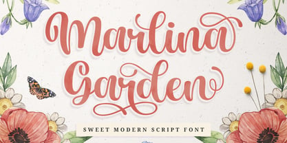 Marlina Garden is a sweet modern script font with a contemporary atmosphere and impeccable form, inspired by timeless classic calligraphy. This font was designed to enhance the beauty of your projects. Marlina Garden is perfect for many different projects such as logos & branding, invitation, stationery, wedding designs, social media posts, advertisements, product packaging, product designs, label, photography, watermark, special events, or anything. We highly recommend using a program that supports OpenType features and Glyphs panels such as Adobe Illustrator, Adobe Photoshop CC, Adobe InDesign, or CorelDraw, so you can see and access all Glyph variations. Thanks and have fun!
 - Uncia Black by Greater Albion Typefounders,
$12.00 Greater Albion Has been toying with thoughts of a “unicase” typeface for a while. On the other hand we’ve always wondered just what practical use they are. It is also a while since we’ve introduced a ‘handwritten’ design. Therefore, It struck us that one answer was something ‘hand-lettered’. These days many people do write in a sort of informal unicase don’t they? But, at the same time, we wanted it to have a little character. So here it is, a bit calligraphic, with a touch of black-letter and a cunning mix of upper- and lower-case forms Uncia Black!
 - Mr Jones by Miller Type Foundry,
$25.99 Mr Jones was originally conceived as a family for print design consisting of a sans and a headline. The lowercase are wide for legibility at small sizes while the caps are narrower to save space and keep an even balance of negative space when used in body copy. The overall widths of certain characters have been adjusted to almost extremes to keep an even balance of white space around each letter. He works well in body copy, but will need decreased tracking for larger settings. He comes with small caps; proportional, oldstyle, and tabular figures and discretionary ligatures.
 - Tsanger Yun Hei SC by Tsanger,
$198.00 Tsanger Yunhei was designed and published by Tsanger. Tsanger Yunhei contains 8 styles and family package options. The designer has made unique treatment on the shape and structure of the pen, based on the Chinese calligraphy style and writing, which makes it easier to identify under the same size of the font and group reading effect better. Tsanger Yunhei is more in line with the aesthetic habits of Chinese characters getting the reading an easy task. This font adopts GB 2312—1980 standard, with a total of 6763 Chinese characters, matching Latin letters, Greek letters, Hiragana, Katakana, Russian Cyrillic letters, etc.
 - Quitos by Nathatype,
$29.00 Want to transport your audience to a world of wonder with your branding? Want your headings to spark happiness and engagement? Quintos-Serif Font A modern and elegant serif font that’ll make your audience swoon and enhance your branding projects, printed materials, and website design. This font was created to bring out modernity and style. Ideal for social media banners; posts, and ads, printed quotes, t-shirt designs, packaging, or even as a modern text overlay to any background image. Features: Stylistic Set Alternates Swashes PUA Encoded Numerals and Punctuation Thank you for downloading premium fonts from Nathatype
 - Nouveau LX Expanded by Vanarchiv,
$31.00 The original design came from Berthold Herold typeface, designed by Hermann Hoffmann during 1913 (Art Nouveau style) in Germany. This project started from flyer printed during 1947 with movable type, the specimen was scanned as a source to development some of the uppercase letterforms. However the most unusual and tricky element from this sample is the leg from the uppercase (R) which is different from the original Herold design, until now I didn’t found where this version originally came from. This expanded version only contain the bold weight, however there are also stencil (Nouveau LX Stencil) and condensed version (Nouveau LX) available.
 - Retrosey by Garisman Studio,
$20.00 Inspired by the old style of letters used for signs or signs in the 60s era, Retrosey was born with two main styles; Retrosey One (Bold) and Retrosey Two (Inline). Born with the old spirit and evoking new styles from the past. Retrosey is able to fulfill your desire to feel the era again. Make it in your style with happiness! You can use Retrosey for the needs of making signs, signpainting, advertisements, price lists in stores, menu lists, posters, movie titles, book covers, main text in titles, clothing designs, or whatever you want by returning to the 60s era.
 - Aparo by DSType,
$40.00 Typography or Calligraphy. Unconnected or Connected. For us, at DSType Foundry, that was the main question. With Aparo, we tried to bring the best of the two worlds into a single, yet complex, typeface. Aparo appears to be a very simple bold italic roman typeface, but it has plenty of calligraphic flair, including swashes that make your words stand out, collision detectors so that you don't get weird combinations, alternate characters activated by default for improved calligraphic effect and a very extended character set in a total of 897 glyphs. Download our detailed type specimen for complete information on Aparo.
 - Hush Hush by Comicraft,
$49.00 If you thought you heard someone callin' your name just now, you might have caught the firm but soft spoken tones of Comicraft's classy balloon lettering font, HushHush. Created in the style of the newspaper strips of the 30s and 40s, HushHush captures the slick movements of the skilled hand letterers of that era. Gracing the pages of Jeph Loeb and Jim Lee's chart-topping BATMAN storyline -- which by a staggering coincidence was also called "Hush" -- these characters have brought to life the words of Two Face, The Joker, Scarecrow, Catwoman, Batman and Robin -- from every whisper to every scream.
 - MFC Haute Monde Monogram by Monogram Fonts Co.,
$19.95 The source of inspiration for Haute Monde Monogram is the 1934 "Book of American Types" by American Type Founders. Found in that specimen book was a wonderfully elegant traditional smallcap-Capital-smallcap monogram alphabet known as “Elite Monogram Initials”. This elegant typeface is now digitally remastered and updated for modern use with functionality beyond its original intentions. Download and view the MFC Haute Monde Guidebook if you would like to learn a little more. MFC Haute Monde Monogram comes complete with Pro format fonts. You will require with programs that can take advantage of OpenType features contained within the Pro fonts.
 - Gridlock by I Can Be Your Type,
$10.00A condensed font using constructivism history to convey the cold hearted steel of machinery and progress. Gridlock tries it's best to fit as much info as possible in a small space neatly in line and with the subtle curves and smoothness of bent steel. The inspiration for Gridlock actually came accidentally after designing some lettering for a self-promo project and it needed something that just was condensed with visual appear. So imagining about how condensed fonts feel, I imagined them being squished together just like cars in traffic are forced to work together to make it to their end destination. - Linotype Laika by Linotype,
$29.99Linotype Laika is part of the Take Type Library, chosen from the entries of the Linotype-sponsored International Digital Type Design Contests of 1994 and 1997. This fun font was created by Dutch designer Mark van Wageningen, who based its forms on those of a sans serif font but gave them wavy, irregular contours. They look almost as though they lie just under the surface of a pool and the movement of the water gives them their undulating appearance. The dynamic Linotype Laika is especially good for headlines in larger point sizes or shorter texts in point sizes of 14 or larger. - Fou Pro by URW Type Foundry,
$49.99 The Fou typeface family was designed as an alternative to Trade Gothic condensed bold. During the design process of a normally wide font variant a system developed that responds to white space and changing proportions. Thus, round transitions become rectangular and vice versa, space is made and space is taken away. This system and the associated changes are continued on a model with semi-serifs. Fou can also be used as an alternative to Din or the wider Q-Type, but in comparison offers more room for emphasis with its italics, expert sets and numerous special characters.
 - Neubau by TipografiaRamis,
$29.00 Neubau is a condensed geometric display typeface, designed in 2009. The inspiration for this face came from Joost Schmidt lowercase letters developed during 1925-28 in Bauhaus Dessau. Schmidt was one of the proponents of New Typography – a movement advocating the use of only lowercase letters which were constructed strictly geometrically using only ruler and compass. Neubau family consists of two subfamilies - Neubau Sans and Neubau Serif, each of them in three weights - light, regular and bold. Neubau typeface is recommended for use as a display font, and has been generated in a single OpenType format with Western CP1252 character set.
 - Nouveau LX by Vanarchiv,
$27.00 The original design came from Berthold Herold typeface, designed by Hermann Hoffmann during 1913 (Art Nouveau style) in Germany. This project started from flyer printed during 1947 with movable type, the specimen was scanned as a source to development some of the uppercase letterforms. However the most unusual and tricky element from this sample is the leg from the uppercase (R) which is different from the original Herold design, until now I didn’t found where this version originally came from. This font family only contain the bold weight, but there are also a stencil and expanded versions available.
 - Glitzy by Ingrimayne Type,
$9.95 Glitzy is a caps-only font with extreme contrast. It was inspired by Art Deco typefaces, especially Broadway by Morris Fuller Benton, but Glitzy is not an attempt to reproduce that typeface. The letters on the lower-case keys differ slightly from the letters on the upper-case keys. The large black interiors invite decoration and the family includes four faces with interior decoration. These four faces with interior decoration can be used in layers with the base font to add color to lettering. (OakPark is a another attempt to do high-contrast lettering with an Art Deco feel.)
 - Exelancer by Popskraft,
$19.00 We are proud to present the futuristic Excelancer font. This font was inspired by passion for space stories. The uniqueness of this font lies in the rare combination of a wibrant style of decorative capital letters and perfectly balanced lowercase charachters that read well in any massive text. Thus, you get a universal font kit with which all the tasks of futuristic design are solved. However, this font will become a decoration not only for fantastic stories, but also for everything related to technology, development, progress and even sports. In short, this is the pure energy of the future!
 - Gardenia by W Type Foundry,
$25.00 Gardenia is a grotesk sans-serif. It comes in 9 weights with matching italics. It was designed by Salvador Rodríguez in 2015/2016. It is characterized by legibility in the medium sizes, black and thin weights are great performers in display sizes. Gardenia is well suited for longer texts and headlines. It’s perfect for graphic design, web, print, motion graphics, interaction design etc… Gardenia is equipped with a wide range of opentype features. Learn about upcoming releases, work in progress and get to know us better! On Instagram W Foundry On facebook W Foundry Check out our website!
 - Sabastian by Letterara,
$12.00 Sabastian is the perfect handwritten font: Sweet, innocent, light, and charming, this one-of-a-kind typeface will add a unique charm to any design project! Sabastian font was created to look as close to a natural handwritten script as possible by including 73 ligatures. With built-in Opentype features, this script comes to life as if you are writing it yourself. You can see it in the picture shown. This font is PUA encoded which means you can access all of the amazing glyphs and swashes with ease! It also features a wealth of special features including alternate glyphs and ligatures.