10,000 search results
(0.019 seconds)
- Milady by Larin Type Co,
$16.00 Milady script font was inspired by romance, lightness and modern calligraphy. It will not leave indifferent those who are looking for a font in an elegant and modern handwritten style. This font fits perfectly into your project, with it you can easily give your design a more classic look or make it more elegant and romantic. All this can be done thanks to alternates. In this font I prepared many alternates so that you could make your project unique and choose what suits you! All characters of this font are PUA encoded.
 - Dream to Berich by Zeenesia Studio,
$19.00 Dream To Berich is a Bold vintage style serif font with strong character and soft features. modern and classic serif font with a clear and bold look. It’s a very versatile font that works great in large. Its comes with two style regular and italic / slant, Dream To Berich was built with openType features, stylistic Alternate and Ligature makes your project will be awesome!! Perfect for editorial projects, Logo design, web font, clothing branding, product packaging, magazine headers, or simply as a stylish text overlay to any background image.
 - Strelka by Eclectotype,
$40.00 Strelka Ultra is a space age, in-your-face headliner, perfect for your fledgling space tourism business or sentient robot army’s corporate identity. What’s included in Strelka Ultra then? Here goes... For that authentic space age look, a Cyrillic alphabet was a must. This is Eclectotype’s first font to include a Cyrillic character set. Small Caps are included for Latin glyphs, including numerals, and stylistic alternates are SS01 - alternative A and E, and SS02 - alternative y. Lastly, automatic fractions are there for all your (g)astronomic cookbook needs.
 - RMU Gilgengart by RMU,
$30.00 RMU Gilgengart is a revival of Hermann Zapf’s beautiful calligraphic blackletter font which was cut and first released by Stempel in 1952. This font comes with fine ligatures and swash letters. Before working with this font it is recommended to activate both OT features Standard and Discretionary Ligatures in order to get access to all ligatures. RMU Gilgengart contains the following swash letters: D, L, h, f, g, k, round s, and t, whereby you should use the small letters at the end of a word or slogan only.
 - Mag Mixer by ParaType,
$30.00 MagMixer, a display typeface, was designed in 2005 for ParaType by Dmitry Kirsanov. During work on Magistral the designer had an idea of creating a more decorative face based on Magistral shapes but reflecting an industrial and mechanichal approach. Each glyph has maximal contrast between strokes and horizontal shift in shape. The result is some strange and enigmatic but legible letterforms with active inner rhythm. Its letters are reminiscent of building construction, chess board, and many other things that corresponding to author's task. For use in advertising and display typography.
 - 1350 Primitive Russian by GLC,
$44.00 This rough font was inspired by a Russian Cyrillic hand of the 1350s “Russkaja Pravda” (a Russian text of common Laws). As a Pro font, it supports Western and Northern European, Icelandic, Baltic, Eastern, Central European and Turkish specific characters, as well as Old Russian glyphs, including many which fell out of use in the 1700s, except in religious texts — in all over 136 Russian glyphs. The upper and lower case have the same form and almost same size, like in the original texts, which had only one size and style.
 - Alathena by Studio Sun,
$20.00 Alathena was inspired by the French art decade between art nouveau to art deco, comes with 2 style, Alternative swash and Modern deco, with some modified ligatures. Available with 6 Weights, Thin, Extra Light, Light, Regular, Bold, Extra Bold with support 75+ language (Latin Pro), and contains OpenType features. - Matching small caps for all weights. - Old Style Figure. - Full "f" Ligature set. - 20+ Optional (discretionary) ligatures. - Over 400+ Swash Characters. - Automatic Fractions. - Automatic Ordinals. - Extended language support for most Latin-based Western and Central European languages, including all the swash and alternate characters.
 - Stillovers by Ardian Nuvianto,
$18.00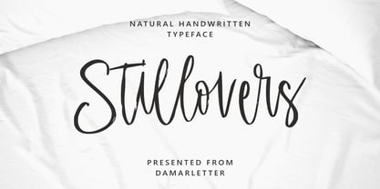 Stillovers is a chic, refined script font. Its stylish ligatures make this font the perfect match for any project. Stillovers is consisting of a fashionable style script make looks classy and touch of stylish. This font was created to look as close to a natural handwritten script as possible. Stillovers is perfect for branding projects, logos, wedding designs, social media posts, advertisements, product packaging, product designs, label, photography, watermark, invitation, stationery and anything that you want. This font is PUA encoded which means you can access all of the amazing glyphs and ligatures with ease!
 - Xanthine by Hanoded,
$15.00 Xanthine… is a purine base found in most human body tissues. Yes, you can forget that. I don’t even know what it means, but I suddenly realised that I was running low on fonts with an ‘x’ in the name. Xanthine font is a messy brush: it is all caps, but upper and lower case mingle freely. It comes with a whole bunch of diacritics and some interesting ligatures as well. I have included a very handy shapez pack and a truckload of arrows - anything to make you happy…
 - Mexifont by Peliken,
$12.00 OTF color font “Mexifont” Mexican National flag color creative letters and spanish national language symbols. Alphabet Mexico with capital letters, numbers, punctuation mark. You can use this font for design quotes prints on t-shirts, sport souvenirs, mexican food menu and other. OpenType-SVG Font was designed with Fontself Maker in Illustrator CC. Contains only uppercase letters and digits. WARNING Color fonts are pretty new technology - they currently show up in Photoshop CC 2017+, Illustrator CC 2018 and some Mac apps. Learn more about color font support on third-party apps here: https://www.colorfonts.wtf/
 - Staehle Graphia by Linotype,
$29.00Staehle Graphia Script was designed by Professor Walter Stähle in the 1960s. It is a very vertical font in the style of the printing on private correspondence in the 19th century. The elegant and sweeping capitals of Linotype Staehle Graphia Script are particularly well-suited to the beginning of passages or lines while the capitals of Linotype Staehle Graphia are better for longer texts. Both should be used with a relatively small line width. The lyricism and liveliness displayed by the font makes it the perfect choice for artistic texts such as poems. - Caffe by IHOF,
$24.95 Caffe was originally designed for the Artz Gallery Cafe in Budapest Hungary. The design is a contemporary handwriting style adapted from examples in lettering exercise books. It has been redrawn and expanded into six styles. The four weights were created by drawing the style using different mediums: Cappuccino in pen, Pastry in felt-tip, Lemonade in brush, and Tobacco—the original—in pencil. Poster and Poster Inline round out the family and are well suited for display purposes. This font family is perfect for bistro menus or other European-flavored poster and print design.
 - Griffo Classico by Linotype,
$29.99Griffo Classico™ was produced by Franko Luin in 1993. It is a revival inspired by the types cut by Francesco Griffo for the Venetian printer Aldus Manutius at the end of the fifteenth century. The roman is based on the type Griffo cut in 1496 for Bembo's de Aetna," and the italic on a type he cut in 1501 for an edition of Virgil. Griffo did not make separate italic caps, so Luin designed his own for Griffo Classico. This is a serviceable family with five weights, including small caps. - Informational Gothic JNL by Jeff Levine,
$29.00 The Wood-Regan Instruments Company (Wrico) of New Jersey manufactured for decades a line of lettering kits called the Wrico Sign Maker. With only special ink pens, plastic templates and a template guide anyone could letter clean, clear signs, posters and notices. Based on the same principles of architectural templates, the lettering was [for the most part] utilitarian and functional. Few templates were of stylized or decorative lettering. Informational Gothic JNL and its oblique version are based on the four inch high lettering templates from one of those kits.
 - Linotype Lichtwerk by Linotype,
$29.99Linotype Lichtwerk, from German designer Bernd Pfannkuchen, is part of the Take Type Library, chosen from the entries of the Linotype-sponsored International Digital Type Design Contest 1999 for inclusion on the Take Type 3 CD. This display font contains very narrow forms with a high x-height. It is reminiscent of the constructivism of the 1920s and was designed with a small number of basic forms. The high, thin letters form words and an overall picture which almost flickers on the page. Linotype Lichtwerk with its technical look is suited exclusively for headlines. - AM Siola by URW Type Foundry,
$39.99 AM Siola is designed as a pure display font. The starting point for this type design was a customized logotype. Logotypes usually just need the design of some characters to form a harmonious, individual lettering. Obviously, it is much more difficult to create a complete font on the basis of just a few characters. The semi-serifs partly running in the opposite direction form the basic idea for this font. AM Siola can well be used for packaging design, logo design and individual headlines for anything from advertising to posters.
 - Copyman by Roman Pavliuk,
$20.00 Copyman is an experimental one for the creative ones. Monumental & minimalistic, great for the contemporary & urban design, this font is a good choice for confident branding & logotypes as well as for brutal or futuristic interfaces. Copyman’s title is an anagram for a Company. First of all, this font was created for branding purposes of businesses, who want something as practical as a little bit different from what they already get used to. This chamfered typeface contains 8 styles, Regular & Italic, both Cyrylic & Latin, 287 glyphs, 8256 pairs, 119 groups, has well–balanced kerning & clever spacing.
 - Reforma Grotesk by ParaType,
$30.00 PT Reforma Grotesk was designed for ParaType in 1999 by Albert Kapitonov based on the letterforms of Russian pre-revolutionary hand composition typefaces: Uzky Tonky Grotesk («Condensed Thin Sans»), Poluzhirny Knizhny Grotesk («Semibold Book Sans») and Reforma, of H. Berthold and O. Lehmann foundries (St.- Petersburg). This extra compressed sans serif with distinctive letter shapes is typical for display fonts of the late 19th and early 20th centuries. For use in advertising and display typography. The face got 'Galina' prize at Kirillitsa'99 International Type Design Competition in Moscow.
 - Franklin Gothic by URW Type Foundry,
$39.99 By 1915, all the major foundries offered families of sans serifs, sometimes called Gothic in the USA. Franklin was a response suitable for countries in the vanguard of the machine age. Designed by Morris Benton in 1903-1912, Franklin has preserved its own personality ever since. The ITC Franklin Gothic font family is a redrawing by ITC that keeps the original strength intact, meeting the demand for a strong typeface. ITC Franklin Gothic is better read in display sizes and considered a standard in the newspaper and advertising fields.
 - Orenji by Hanoded,
$15.00 Orenji is the Japanese word for Orange: it is a phonetic translation of the English word. I was actually looking for a certain shade of orange (the color), when I stumbled upon this fun word. I already toyed with the idea of creating a font loosely based on my son Sam's handwriting and I figured Orenji would be a good name for it. Orenji is a fun, cute and extravagant font. It has some uniquely shaped glyphs, comes with a giggle and a hug and more diacritics than you can throw a banana at.
 - Futura Black by Bitstream,
$39.99Josef Albers drew a stencil sanserif form at the Bauhaus in 1923 (published in 1926); Paul Renner and the Bauer design office made a similar design into a typeface in 1929, and rather confusingly included it in the Futura series. Many websites erroneously attribute the stencil design to Josef Albers, but there is no evidence that the two met or collaborated on Futura Black. In 1929 Josef Albers and Jan Tschichold corresponded on the “Transito” typeface (another very similar stencil typeface, while Paul Renner was working with Jan Tschichold. - Snikers by Ronny Studio,
$15.00 Snikers Inspired by the realistic calligraphy marking style in many big cities. This style is bolder and easier to read, perfect for your "street art" design style. I incorporate real graffiti experience into computer fonts, I think it will be different to other fonts if you can feel it, because I draw graffiti, mark and throw up since I was in high school. Features : All Caps numbers and punctuation ligature and alternate multilingual Swash / Ornament PUA encoded Please contact us if you have any questions. Enjoy Crafting and thanks for supporting us! :) Thank you
 - Spekulatus by Bogstav,
$18.00 Spekulatus is a made up name, and that was what I needed for a font like this. I am not sure which category it fits in: grunge, square, handmade, rough or maybe even graffiti? Well, let's just say that it fits in all 5 - or perhaps even more? All letters are handdrawn, and messed up a bit with a thin fine white liner, leaving a gentle grungy and worn effect. I've added 5 different versions of each letter, which is quite nice - not having the same letters repeating all the time!
 - Aelita by ParaType,
$30.00 Aelita is a low contrast serif typeface in 6 styles. It's distinguished by lowercase character alternates that noticeably change the text pattern. The main character set is quite strict and is characterized by sharp and clear terminals and stiff junctions between stems and bowls. Alternates are more facile and calligraphic. Neutral design of the main character set makes the typeface suitable for scientific and literary texts. Alternates are ideally suited for science fiction, fantasy and art books. The typeface was designed by Natalia Vasilyeva and released by ParaType in 2014.
 - Macho Modular by CAST,
$45.00 Macho was designed in 2010 for MAN, Museo d'Arte Provincia di Nuoro, as a part of the corporate identity designed by Sabina Era. Macho is based on the idea of modular widths of the 20th-century typesetting systems, as the Olivetti Margherita and the hot-metal Linotype machine. The basic module is 7,5 percent of the body size (75 upm units) and every letter width is up to 20 modules. Every letter has the same width across different weights. Macho includes a large set of boxes and underlines that can be overlapped on the letters.
 - Ironbridge by Device,
$29.00 A cast iron plaque from Bristol Temple Meads Station serves as inspiration for this antique font. The plaque commemorates the design contribution of Isambard Kingdom Brunel, who in March 1833 at only 27 was appointed chief engineer of the Great Western Railway, the line that links London to Bristol. This helped establish Brunel as one of the world’s leading engineers. Impressive achievements along the route include viaducts at Hanwell and Chippenham, Maidenhead Bridge, Box Tunnel and Bristol Temple Meads Station. Ironbridge evokes industrial heritage, gothic spookiness or eroded heavy metal.
 - Happy Trails by Breauhare,
$35.00 Happy Trails is a font that is based on the lettering (all upper case) used on most Trailways buses from 1936 through the very early 1960s. It also has a newly created set of lower case letters which never existed before. The font was tweaked and digitized by Bob Alonso & John Bomparte. Happy Trails has not only the flavor of the early Trailways buses but also a folksy, Western feel to it, and it’s even a bit silly or goofy, a fun font that has a variety of uses.
 - Linea 72 by OLOF Type Foundry,
$25.00 Linea 72 is a typical seventies display typeface that was designed by Roland Hirter back in the phototypesetting days, when typefaces were really drawn by hand. In this static environment each work step took its time. With the decision to digitize this typeface his son Thomas Hirter also chose to develop it further with todays technical possibilities. That’s why the font now includes over 600 glyphs and ten stylistic sets, offering different stylistic alternates of several letters. Linea 72 comes in the two original styles Regular and Kontur.
 - Hesorder by Ronny Studio,
$15.00 Hesorder font Inspired by street graffiti markings style in many big cities. This style is bolder and easier to read, perfect for your "street art" design style. I incorporate real graffiti experience into computer fonts, I think it will be different to other fonts if you can feel it, because I draw graffiti, mark and throw up since I was in high school. Features : - All Caps - numbers and punctuation - Alternate - multilingual - Swash / Ornament - PUA encoded Please contact us if you have any questions. Enjoy Crafting and thanks for supporting us! :) Thank you
 - Bellina by Balevgraph Studio,
$14.00 Bellina is a thin lettered, light weight, delicate script font. This font is neatly crafted and highly detailed. Spanish was particularly created for those who need a beautiful and refreshing look to their designs. This font is PUA encoded which means you can access all of the glyphs and swashes with ease! What's Included : Uppercase, Lowercase, Numerals & Punctuations Ligature & Alternate Works on PC & Mac Simple installations Multilingual support PUA Encoded Compatible with Silhouette Studio, Cricut Design Space, Scan N Cut, Adobe Illustrator and other cutting and design programs.
 - The Stories by Struggle Studio,
$16.00 The Stories is a retro styled font with a stunning style that can make the most of your design projects. This font gives a touch of retro style that was famous in the 60-70s. This font has an alternative style for Uppercase and Lowercase, Ligature, which can be adapted to your design needs so you don't waste time creating extrusion effects. The total glyph for this Stories Script font is 454 and for Stories Display it is 185, so you can choose according to the right style.
 - Sidenty by Lady Rose,
$10.00 Sidenty is a wild calligraphy script. The typeface was drawn and created by Lady Rose between 2020 and 2021. Its open shapes are inspired by mid-century advertising, is full of life and emits liberty and optimism. The handwritten family consists of two weights: It is completed with a full alternate alphabet and a big set of ligatures, which together give the handwriting genuine dynamics and a natural flow. It has extensive lingual support, covering all European Latin scripts and contains all characters you'll ever need, including all punctuation and numbers.
 - Laca Text by Nova Type Foundry,
$21.99 Laca Text is a sans-serif version of Laca. It was designed starting from the shapes of Laca. It is a cleaner version of Laca. Laca Text has characteristics like a bigger x-height, open counters, and smaller ascenders. It works better in smaller text than Laca because it keeps the structure without the stylistic features of Laca. Laca Text has more straight lines and follows the round shapes of Laca. Laca Text, as the name says, is more proper for long text but also for identity and branding.
 - Winery JNL by Jeff Levine,
$29.00 A rubber stamp printing set from the 1930s (or possibly earlier) was the model for Winery JNL. Containing a pleasant serif font, it also provided a few little touches unusual for such toy sets of the time. The horizontal crossbar of the H has a diamond embellishment, as does the horizontal stroke of the number 3. Additionally, the lower right tail of the G curves away from the letter and the Q has a spiral tail. Re-drawn from scans of the original stamp impressions, this typeface is available in both regular and oblique versions.
 - Narrow Minded JNL by Jeff Levine,
$29.00 In the days of hand lettering, a common philosophy was "the problem creates the solution". Often times the layout artist would have to adapt the lettering style to fit the amount of copy on a line. A perfect example is during the early 1900s, when popular sheet music of the time almost seemed to be competing for how many words could be used within a song's a title. One such piece of sheet music offered up the tall, condensed and variable-width lettering found within Narrow Minded JNL.
 - Biffo by Monotype,
$29.99Biffo was designed by David Marshall and produced in 1964. The alphabet in handwritten style has the character of writing done with a broad tipped pen. The figures are round and flexible, even its vertical strokes have rounded edges, softening the look of the characters. The basic forms show parallels with a pear shape: generous in the lower third and thinning out as they move upward. Biffo is a unique, lively typeface perfect for personal correpondence and for communicating spontaneity. It is best for short and middle length texts as well as headlines. - Parma Typewriter Pro by No Bodoni,
$35.00 PARMA is a type-writer style face with the form and elegance of a Bodoni. Functional beauty was the aim of mating the two disparate ideas in one type, creating a utilitarian face with graceful features. We�re even converting the keys on our beloved old Olivetti portable to type in Parma Typowriter. And then we�re going to get a Lambretta scooter to go zipping around in and maybe one of those front opening Fiat cars for drives in the countryside. Hey, waiter! Where�s my order of Giambotti? And more Sangiovese for everyone!
 - Commercial Script by Monotype,
$29.99Commercial Script is a sophisticated copperplate script design. Its capitals are elaborate initials, and the lowercase letters join together in the style of real handwriting. Commercial Script's elegant refinement makes it a classic and ever-popular typeface. The spark behind this typeface comes from centries-old English Spencerian copperplate calligraphy. In 1985, the American typefoundry Barnhart Brothers & Spindler released a typeface in this style. This was redesigned by ATF's Morris Fuller Benton in 1906, and ATF released Commercial Script" in 1908. In 1994, Letraset' released this digital version of the typeface." - Dearest John by Outside the Line,
$19.00 Dearest John is the first font in the Love Letters series from Outside the Line. It is a bouncy hand lettered font. If you type caps and lower case you get one look. If you type all caps you get another look. Kind of 2 fonts for the price of one. I prefer to type caps and lower case and then go back in and tweak the headline a little to get the look I want. Dearest John was seen in the 2011 Typodarium Page-A-Day Calendar on 12-9-2011.
 - Trade Gothic Paneuropean by Linotype,
$42.99The first cuts of Trade Gothic were designed by Jackson Burke in 1948. He continued to work on further weights and styles until 1960 while he was director of type development for Mergenthaler-Linotype in the USA. Trade Gothic does not display as much unifying family structure as other popular sans serif font families, but this dissonance adds a bit of earthy naturalism to its appeal. Trade Gothic is often seen in advertising and multimedia in combination with roman text fonts, and the condensed versions are popular in the newspaper industry for headlines.