10,000 search results
(0.025 seconds)
- Quira by WildOnes,
$12.00 Quint Extended font has geometric construction with round details that creates elegant letter shapes. Modern and contemporary style and retro details make it an excellent choice for headlines, logotypes, branding, posters and magazines.
 - Velourist by Fargun Studio,
$15.00 Velourist is a bold display type that’s absolutely perfect for editorial headlines with retro looks. It’s unique, bold, and slim figure make it a great fit for t-shirts, posters, and magazine covers.
 - MBF Orbital Colony by Moonbandit,
$15.00 Orbital Colony is a modern futuristic scifi font. This typeface design is perfect for a clean and minimalist design theme. perfect usage includes logo, poster, display, headline, t-shirt design and many more.
 - Classic Story by RahagitaType,
$15.00 Classic Story is a suitable font for quotes that match love, affection and hope. In addition, you can use it as a headline on a poster, banner, name card, wedding invitation, and more.
 - September by Device,
$39.00 A modern, authoritative and robust design for headline and shorter texts, September has the requisite presence for corporate and academic use, company brochures, branding, sport packaging, television idents, posters, packaging and film titles.
 - Meghan by Akrtype Studio,
$15.00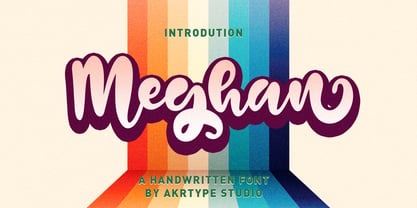 Meghan Smooth Handwritten Font is a casual and elegant handwritten font. Meghan Smooth Handwritten Font will look outstanding in any context, whether it’s being used on busy backgrounds or as a standalone headline!
 - Veilan by Andfonts,
$16.00 Veilan is a playful yet elegant thin serif font in two styles with alternates. It looks stunning on wedding invitations, headlines, quotes, greeting cards, logos, every other design which needs a unique touch.
 - Building by HafisHidayat,
$20.00 Building Script is a modern calligraphy design, including Regular. Can be used for various purposes. such as logos, product packaging, wedding invitations, branding, headlines, signage, labels, signatures, book covers, posters, quotes, and more.
 - Lebbad Script by Lebbad Design,
$45.00 Lebbad Script is a bold decorative script font. It's ideal to give your headlines a sporty, retro feel. This original font design contains an alternate set of connecting lower case characters and ligatures.
 - Candyman by Robert Petrick,
$19.95 Bold, Playful headline and text font with fun alternate glyphs that you can access on the glyph palette through programs such as Illustrator etc. Good for many categories such as food and entertainment.
 - Plastica Pro by RMU,
$35.00 Plastica Pro, inspired by a J. Lehmann design, is an ideal plastic font for posters, logos, corporate identity, headlines, booktitles, car and truck design etc. The Plus style includes Cyrillic and Greek glyphs.
 - KS Foo by Kreuk Type Foundry,
$12.00 KS Foo is Display typeface with countless possibilities. Sub-culture inspired display with sharp & striking form display. From Gigs posters to skateboard to clothing industries. Ideally suited for headline, logo, branding, posters etc.
 - Biloxi Calligraphy by Roland Hüse Design,
$15.00 Biloxi Calligraphy is heavier weight version with calligraphic strokes of a handwritten font of mine called "Biloxi Script". Casual handwritten style with a calligraphy feel, ideal for blog headers, menus, headlines and logotypes.
 - Willynta by Patria Ari,
$15.00 Introducing, Willynta, a beauty handwritten script with a twist of fun! The natural hand writing script is suitable for you who needs a typeface for headline, logotype, apparel, invitation, branding, packaging, advertising etc.
 - Display Plump by Gerald Gallo,
$20.00 Display Plump is a display font not intended for text use. It was designed specifically for display, headline, logotype, branding, and similar applications. There are numbers and punctuation located under their respective keys.
 - Bucknord by Sibelumpagi,
$15.00 Bucknord is a cool and playful handmade marker font. This font is designed to help your needs such as logos, product packaging, invitations, branding, headlines, signage, labels, book covers, posters, quotes, and more.
 - Dynamic Schematic by Trustha,
$17.00 Dynamic Schematic is a natural handwritten font, written with fun and relaxed. It comes with 400+ glyphs, which also include multilingual languages. Dynamic Schematic is perfect for headlines, branding, quotes, and many more.
 - Allista by Typefactory,
$14.00 Allista is a fancy handwritten font, carefully handcrafted to become a true favorite. This font will look outstanding in any context, whether it’s being used on busy backgrounds or as a standalone headline!
 - Display Gothic by Gerald Gallo,
$20.00 Display Gothic is a display font not intended for text use. It was designed specifically for display, headline, logotype, branding, and similar applications. Display Gothic has upper and lowercase alphabets, numbers, and punctuation.
 - Assembler by Fonthead Design,
$15.00Assembler is a font designed by Ethan Dunham that has a slightly bouncy, organic feel, but at the same time is mildly cold and angular. Suitable for headlines and single lines of text. - Diamond Lake by Rillatype,
$15.00 Introducing, Diamond lake! This font have strong and bold charasteristics that will make your design more standout from the others. this font is perfect for magazine, headline, packaging, branding, logotype, badge,book, etc.
 - Rahere Sans by ULGA Type,
$18.98 Rahere is a humanist sans with subtle features that give the typeface a distinctive, warm appearance without distracting the reader. Legible at large and small sizes, Rahere is a versatile family suitable for a wide range of applications such as annual reports, advertising, brochures, catalogues, information signage, screen text and visual identities. For projects that need to convey a sense of authority or credibility, this is the ideal sans serif to use. The family consists of six weights ranging from light to extra bold with corresponding italics and the character set covers most of the major European languages. Each weight contains lining & non-aligning numerals in both proportional & tabular spacing. The tabular numerals share the same width across all weights and styles – a must for financial tables in annual reports. Spirited and lively, the italic lowercase is more cursive and calligraphic than the roman, although it harmonises perfectly, displaying enough character to create emphasis without looking out of place. When used on its own, for pull-out quotes or poetry, the italic exudes a charm that draws attention to the text. The typeface is named after Rahere, a 12th-century Anglo-Norman priest, who founded St Bartholomew's Hospital, London in 1123. I will always be indebted to Barts (as it is now commonly known) because in 2007 I was successfully treated for relapsed testicular cancer. Way back in 1992 I designed my first sans serif, Charlotte Sans, and although it was relatively successful, I was never really satisfied with the end result: not enough weights & italics, a small character set, lack of accented characters, and my design skills were still in their infancy. Whilst Rahere shares many common elements with Charlotte Sans, it is much more than just a reworking; it represents over 20 years of accumulated knowledge and experience as a designer.
 - Cooper Nouveau by House Industries,
$33.00 Few fonts reach cult status. Despite its ubiquity—and perhaps because of its lack of subtlety—for a hundred years Cooper continues to draw the faithful. It’s even come to define an entire typographic genre and recently starred in its own documentary. Cooper Nouveau is Dave West’s imaginative contribution to the Cooper oeuvre. Drawn in 1966, Nouveau refreshes Oswald Cooper’s original italic with an energetic pitch, simplified contours, and a plump friendly figure. Uniform strokes and generous curves push the font’s playful personality and springy silhouette even further. A selection of swashed characters and ligatures offers options for lively logos and strong captions. While Cooper Nouveau looks laid-back and easy-going, it’s more than capable of pulling it’s own typographic weight. Put it to work where relaxed needs to project confident. Set Nouveau large for eye-magnet posters, packaging, and advertisements. Maximize its youthful energy for kids’ themes, craft action, and apparel bounce. Or set it alongside a master like Benguiat Buffalo or Chalet to show how Cooper Nouveau can communicate on paper and screens with an inherent ability to speak the language of style in many tongues. But like any cult icon: beware! Cooper has a way of setting the needle, and Nouveau just may become your go-to design fix. FEATURES ALTERNATES: Cooper Nouveau contains several alternate characters, which add flair to your designs and can help solve spacing issues LIGATURES: Many letter combinations in Cooper Nouveau form a ligature to solve spacing issues and produce more pleasing designs. COOPER NOUVEAU CREDITS Typeface Design: Dave West Digitization: Dave Foster Typeface Direction: Ben Kiel, with Ken Barber Like all good subversives, House Industries hides in plain sight while amplifying the look, feel and style of the world’s most interesting brands, products and people. Based in Delaware, visually influencing the world.
 - Temeraire by TypeTogether,
$49.00 Quentin Schmerber’s Temeraire serif font family was not designed to be invisible. It is a typographic exploration meant to be seen — with its beauty, one could even say beheld. While some fonts aim to be as easily ignored as possible, Temeraire is offered as a gift to wide-eyed readers with its anything-but-boring character and its conspicuous inconsistency in styles. Most type families increase the weight of each character to expand the family. Instead, research into 17th century sources produced Temeraire’s wide range of letterforms, from the predictable to the odd and loosely related through time. Each style is designed to work alongside the others but are also standalone homages to specific parts of English lettering tradition: gravestone cutting, writing masters’ copperplates, Italiennes, and others. Temeraire’s Regular style is a contrast-loving Transitional Serif with vertical stress, making it great for period and classic works, ironic pieces, and modern throwbacks. The weight of the Bold squares off the ends of each glyph to give it stability, and the italic style rings true: flowing, contrasting, and purposefully inconsistent. Temeraire’s Display Black style is one salvaged from expressive gravestone artistry. The details most easily noticed are the ‘g’ with its descending bowl that has been pressed back up in the centre, and the additional serif on the ‘t’ crossbar that holds its neighbouring character at bay. (The ‘g’ and ‘Q’ have loopless alternates.) The final style is the Italienne, the horizontally stressed counterpoint to the family. By design its characters flow and bend in ways not in step with the rest of the family. All the weight has been pushed to either hemisphere within each glyph, resulting in a display style that demands space and peacefulness around it so its presence can impress. As with all TypeTogether families, Temeraire meets the current designer’s needs. Not only does its five styles shine in print work, it includes alternates for when the defaults are too boisterous and has been expertly crafted for screens. The Temeraire serif font family is resurrected from echoes in time and finds its family relation through impeccable taste.
 - Mariage by Linotype,
$40.99Morris Fuller Benton, the principal designer of the American Type Founders, designed Mariage in 1901. Mariage, which has been sold under a plethora of different names during the last century, is a blackletter typeface belonging to the Old English category. The term blackletter refers to typefaces that stem out of the historical printing traditions of northern Europe. These letters, called gebrochene Schriften, or "broken type" in German, are normally elaborately bent and distorted. Their forms often print large amounts of ink upon the page, creating text that leaves a heavy, black impression. The Old English style is a subset of blackletter type that dates back to 1498, when Wynken de Worde introduced textura style printing to England. Continental printers had been printing with textura style letters since Gutenberg's invention of the printing press fifty years earlier. Italian printers stopped using them around 1470. For northern Europeans, texturas remained the most popular form of typeface design until the invention of the fraktur style in Nuremberg. Mariage is heavily classicized sort of Old English type. During the Victorian era, designers admired the Middle Ages for its chivalric, community-based values and its pre-industrial lifestyle. Yet they also found the basic medieval textura letterform too difficult to read by present standards. They desired to modernize this old style. Today, this sort of update is often referred to not as "modernization" but as classicism. Benton's design for ATF builds upon earlier Victorian classicist interpretations of Old English/textura letters. For an example of what these Victorian designs looked like, check out the popular 1990 revival of the genre, Old English . Old English style types often appear drastically different from other blackletters. For contrast, compare Mariage to a classical German fraktur design, Fette Fraktur , a schwabacher style face, or the popular early 20th Century calligraphic gothic from Linotype, Wilhelm Klingspor Gotisch . Especially in the United States, classicist Old English typefaces are thought to espouse tradition and journalistic integrity. These features, together with the inherent, complex beauty of Mariage's forms, make this typeface a perfect choice for certificates, awards, and newsletter mastheads. - Rainier by Kimmy Design,
$10.00 I was inspired to create the Rainier type family during my summer back home in the Pacific Northwest. The concept behind it may be simple - a hand crafted font family - but what it delivers is quite complex! Here is a breakdown of everything you get: FONT FAMILIES: Two sub-families with unique styles - Rainier North and Rainier West WEIGHTS: 4 weights per family, broken down numerically - 100 (light), 300 (regular), 500 (bold), 700 (black) OPENTYPE: In each family, there are tons of OpenType options, offering lots of customizable opportunities (in order to access all these goodies, you must be using Illustrator, Photoshop, Indesign or Publisher). Because Rainier is 100% handmade, contextual alternatives allow each letter has three subtle variations, this way it keeps that authentic hand-drawn look. Additionally, a full alphabet with special descending swashes, as well as start and end swashes for capitals and small caps. Titling alternatives offer a full character set just to help with readability! Meant for captions or smaller text, these letterforms are easy on the eye and a great complement to the regular alphabet. Stylistic Alternatives add a little fun, providing a unified cap height, no matter what case you are using (all caps, small caps or lowercase.) Discretionary Ligatures are created only for capitals, and takes specific letter pairs and creates a unique ligature between them To get a better understanding of everything, please check out the quicker user guide (http://bit.ly/1W0Bfma) and print if you so desire (http://bit.ly/23W9ZV6) that helps you navigate your way around and get the most out of Rainier! Unfortunately those links aren't working right now and soon I will have them fixed. So sorry! ORNAMENTS: In addition to the font, you get a set of awesomely rustic ornaments designed and drawn to go specifically with Rainier! - Rustic Northwest Illustrations - Banners & Flags - Frames - Flourishes - Lines & Line Breaks - Arrows There are a lot of extras packed in this set, so make sure you check out the Ornaments User Guide to get the most out of it! Check it out here: http://bit.ly/1rRVJRx And that’s all folks! Hope you enjoy Rainier!
 - Quirkley JNL by Jeff Levine,
$29.00When a type design job needs a bit of snap, yet needs to remain unconventional, think of Quirkley JNL. Its name speaks volumes - a bold, quirky sans serif - great for headlines and display work. - Pando Script by Resistenza,
$39.00 Pando Script is the a new brush script with inverted contrast and a lot of personality. Pando comes with many ligatures and alternates. We recommend to us it for headlines, labels, packaging and branding.
 - Neue Echo by RMU,
$30.00 Inspired by the former Schriftguss, Dresden, font Echo, this fresh-drawn und designed Neue Echo can be filled in many different ways, and makes it a great display font for labels, posters, headlines etc.
 - Barbiela Script by Bosstypestudio,
$14.00 Barbiela Script is a modern calligraphy cute font, Can be used for various purposes. such as logos, product packaging, wedding invitations, branding, headlines, signage, labels, signatures, book covers, posters, modern, script, quotes and others.
 - Peronel by Tanincreate,
$16.00 Peronel is a serif font with swash line under the lowercase letters. It has a regular and an italic style and works perfectly for logos, headlines, posters, packaging, postcards, social media and much more.
 - Hypertype by Fargun Studio,
$14.00 Hypertype is my new elegant serif display font that will bring a touch of style and luxury to your projects. It is perfect for branding, logotypes, blog headlines and many more your design needs.
 - Pro Sotan by Differentialtype,
$10.00 Pro sotan is a rounded sans serif font family that comes with 9 weights and matching italics. This font is ideal for typing in documents, headlines, packaging, logos, advertisements, corporate identities and much more.
 - Curly Q by Outside the Line,
$19.00 CurlyQ new from Rae Kaiser and Outside the Line. A curly, swirly, girly kind of font. A delightful headline font for your next garden party or note to the kids from the tooth fairy.
 - Albeit Grotesk Rounded Caps by Cloud9 Type Dept,
$40.00 Albeit Grotesk Rounded Caps is a graphic geometric rounded all caps display font family of four weights (Light, Regular, Medium and Bold) with slightly exaggarated diacritics for better readability making it ideal for headlines.
 - Telstar by Device,
$39.00 A space-age headline font, Telstar explores a computer-readable sci-fi aesthetic based on an obround lozenge pierced with off-centre holes; the left-right weight switch derives from early optical recognition typefaces.
 - PT Sewed by Volcano Type,
$19.00 PT Sewed is based on a set of monoline vectors/ letters. Designed for a cultural project. The sewed look was generated for an encyclopedia about jeans. Recommended only for T-shirt Designs and Headlines.
 - Display Dots Five by Gerald Gallo,
$20.00 Display Dots Five is a display font not intended for text use. It was designed specifically for display, headline, logotype, branding, and similar applications. Display Dots Five has an uppercase alphabet, numbers, and punctuation.
 - Transatlantic Cruise by Roland Hüse Design,
$13.00 Transatlantic Cruise is an elegant outline script, would look best on Menu headlines, Invitations, Logos and Postcards (especially sent from cruise ships! :) It contains basic latin western and central european language extensions and accents.
 - Sofya by Gaslight,
$30.00 This funny script font based on the logo which we did. It will look great on the package, restaurant menus, logos and magazine headlines. A large number of ligatures help you vary your design.