10,000 search results
(0.023 seconds)
- Suprapower SE by Hanken Design Co.,
$30.00 Suprapower™SE is a wide typeface for poster, packaging, headline, and titles. It is an update to the Suprapower™ typeface.
 - Cartes by insigne,
$39.00 Cartes has a bit of a strange origin story, as far as fonts go. It’s a combination of ideas from 1920’s advertising and hand-painted letters from the 1500s. The typeface was designed to flow with elegance and speed yet retain a sense of the handmade. The serifs flow with indentations implying movement and terminate with inky globules that lend your copy a sense of gravitas. This typeface can be used for headlines, short texts, posters, logos, headlines, headlines in big sizes or just as easily for ad text. At large sizes, pen strokes can be seen that give the typeface a touch of humanity and vigor. At smaller sizes the type is still unique, but readable.
 - Varien SS by Sensatype Studio,
$15.00 A Modern Strong Display Font that perfect for technology, sport, racing, action design project. A new Display Font that we created special for Headline, Title and more stand out typography needs, with extra outline that will add your variations. It's so perfect to add your style and headline overview. And specially for Headline font, we crafted for futuristic style and modern feels so enjoy to create any project that will show your main idea out. Varien Modern Strong Display Font ready with: Any options to get creative variations (combination of Outline Characters) Preview as a inspirations that you can do with Varien font Ready with All Uppercase characters Wish you enjoy our font. :)
 - Manchette by Abjad,
$45.00 Manchette is an Arabic headline typeface that was inspired by the hand-written Naskh newspaper headlines during the 60s-70s era in the Arab world. The word "manchette" is a french word, that means headline. It was used mainly by the Egyptian calligraphers and designers. The typeface presents sharp and contemporary details, while taking into consideration the original Naskh rules to echo the elegancy of the hand-written titles. Featuring many opentype features, such as contextual alternates, ligatures, and a small set of stylistic alternates. The typeface also features a dynamic Kashida that can be controlled through the variable fonts technology in the Variable GX file which contains all the weights as well.
 - Blue Plaque by K-Type,
$20.00 Blue Plaque is a distressed font that simulates the low relief, white-painted lettering on English Heritage plaques attached to buildings where famous people have lived. For creating mock plaques, a blank disk, with the English Heritage title at the top and the logo at the bottom, is included at the brace left { keystroke, and also at the section § keystroke. A blank plaque without the English Heritage title and logo is included at the bar | keystroke. A distressed English Heritage logo is included at the asterisk * keystroke. he outer ring of the blue plaques, which is glazed in dark grey, is included at the brace right } keystroke, and also at the plusminus ± keystroke. Photoshop's Outer Bevel Layer Style is perfect for adding a relief appearance to the letters. Buyers are welcome to request a 1000px jpeg image of a blank blue plaque by emailing K-Type directly https://www.k-type.com/contact/
 - TT Phobos by TypeType,
$35.00 TT Phobos useful links: Specimen | Graphic presentation | Customization options TT Phobos is a pliable display serif with a soft and gentle character. The features of the typeface are the moderate contrast between bold and thin strokes, pliable visual compensators, and the counter-clockwise bend of internal ovals. In addition to 6 weights and 6 italic, TT Phobos also includes two original decorative fonts, inline and stencil. Despite its pliability and display character, TT Phobos is dynamic enough and is well suited for text arrays even in large text blocks. The serifs of letters are completely asymmetrical and bring in dynamics when reading the text from left to right. Thanks to the harmonious contrast of black and white forms and internal negative spaces of the letters, as well as its broad letter spacing, the typeface is well read in small sizes. In this case, the character of the letters is completely preserved, partially thanks to the exaggerated elegant visual compensators. The ornamental pattern used in TT Phobos Inline varies for capital and lowercase letters. Capital letters implement a more complex double inline with a rhombic element in the middle, and in the lower case features a simplified form of the inline, made in a single movement. Thanks to the original cutting, TT Phobos Stencil stands out for its expression, and the rounded cuts add even more visual style to the font. TT Phobos consists of 14 faces: 6 weights (Light, Regular, DemiBold, Bold, ExtraBold, Black), 6 Italics, inline and stencil. There are 17 ligatures in TT Phobos, including several Cyrillic ones. The typeface has stylistic alternates, which adds an italic effect to the upright fonts, and a little solemnity of the upright version to the italics. In addition, we have not forgotten about the old-style figures and other useful OpenType features, such as ordn, sups, sinf, dnom, numr, onum, tnum, pnum, liga, dlig, salt (ss01), frac, case.
 - The font named Black Metal G encapsulates the raw energy and unbridled aggression found in the black metal music genre. Designed to echo the visual aesthetics commonly associated with this style of m...
- Cool Daddy by Hanoded,
$15.00 It’s a brand new year, but I have been going back in time. To the seventies to be precise. A ‘bubblegum’ font was on the top of my to-do list, so when it was finally finished, it reminded me of seventies posters. As if by magic, a catchy bassline started playing in my head and before I knew it, Boney M appeared - all dressed up in Purple and singing Daddy Cool. Cool Daddy is a fat, rounded bubblegum font, which will take you back to the decade of moustaches, afros and glitter. This ultra groovy font will funk up your designs 4-sho. So boogie on, take it back to your crib and get down with it. You diggin’?
 - Kenza by Alex Camacho Studio,
$20.00 Kenza is a serif geometric font, which is inspired by letterpress printing. Hand crafted wood letters used in the mid-20th century. It is characterized by being large, bold poster-block movable type.
 - Dress Shirt JNL by Jeff Levine,
$29.00 A sample of monogram lettering entitled "Style 204 - Modern Block" (probably circa 1940s) yielded the thin Art Deco alphabet model for Dress Shirt JNL, which is available in both regular and oblique versions.
 - Ribbonshoe by Curvature Creations,
$10.00 My font Ribbonshoe is created with Power Point shapes Block Arc and Punched Tape and they resemble ribbons and horse shoes. This font is very unique, stylish and very attractive to the eye.
 - Trainbridge by Curvature Creations,
$10.00 My font Trainbridge is created by Power Point shapes, Block Arc and flowchart. It resembles a train and bridge, which gives it a unique look that will be eye catching and out standing.
 - Webster by Solotype,
$19.95An ideal face for blocks of copy when you want them to look old. Very readable. Another faithful rendition of the original from the Keystone foundry. Actually several foundries worldwide offered this font. - Qeuliner by BaronWNM,
$14.00 Qeuliner is a font with a modern, sporty, and futuristic design. Carrying the form of oblique blocks separated by vertical lines. Very suitable for use on sports-themed displays, racing, games, space, etc.
 - LD Wanted by Illustration Ink,
$3.00Bring an old west flavor to your lettering projects. The block letters of this "Wanted" font are reminiscent of western posters and signs. It's a fun choice for cowboy scrapbook pages and cards. - Delvona by Great Studio,
$19.00 Delvona is a contemporary serif typeface, retro styled with a strong personality and a soft look. And also its high contrast and very simple and easily recognizable shape make it very easy to read. Delvona was inspired by the serif typography used in editorial headlines in the 80s. Delvona excels in display settings such as headlines, titles, branding projects, Logo design, packaging, magazine titles, advertisements, short or long text.
 - Aesthetic Moment by Mevstory Studio,
$25.00 Aesthetic Moment serif font with medium contrast. Inspired by classic fashion. Carefully designed with a short ascender to give a solid look, also the sharp serif makes the letters look more strong. Aesthetic Moment is a display-type which perfect for a headline, sub-headline, and short body text for magazine, books, fashion, quotes, hipster t-shirt, signboards, logo, and etc. A great choice for a brave concept!
 - Overskrift by PizzaDude.dk,
$17.00 Overskrift is headline in danish. My mind was set on making a font suitable for headlines, and that is exactly what this font is useful for - but, I found it suitable for many other things as well. I was thinking about packaging, posters, postcards and other things that needs a super legible handmade font! I have added 5 different versions of each letter, and they automatically cycle as you type!
 - Beauty Butterfly by Zeenesia Studio,
$12.00 Beauty Butterfly - A Beauty Typeface Beauty Butterfly is a beauty typeface that's perfect for creating gorgeous headlines and designs with personality. Beauty Butterfly makes an excellent typeface for vintage graphics, and the clean lines, elegant look to logos, wedding invitations, editorials, and more. Create gorgeous headlines with an all caps design, or try the lowercase for a delicate look that's simply beautiful. Download Beauty Butterfly for your next project today.
 - Isagi Blue by Lurinzu Studios,
$10.25 A techy, sci-fi condensed typeface that is inspired by the mixture of futuristic and athletic vibes into one out of this world headline typeface. This headline font best fits in large scale design when you want to immediately capture the attention of the viewers. This also fits with school-related, athletics, sports, future and science themed designs. *This font includes letters, numbers, multi-language, and all essential marks needed.
 - Crossfit by TypeThis!Studio,
$54.00 Crossfit is a new headline font family, designed by Anita Jürgeleit at TypeThis!Studio. It’s suitable for big sizes and titles, such as big movie posters, advertising or editorial headlines. Matching topics might be adventures, sports, strong nature and all kind of challenging life events. Its bold stability transformes your creation into a non questionable design. It is bold, clear and also friendly thanks to its rounded corners. www.typethis.studio
 - TS Karagoz by TSfonts Type Studio,
$35.00 Introduction: Karagoz is a playful and fun display typeface that has strong and powerful. It is designed to be bold and large. Karagoz is perfect for video games, cartoons, t-shirts, children’s books, captions, headlines, and posters. Weights and Languages: It consists of 1 Weight. It supports Latin, Arabic, Persian, and Urdu. Usage: Karagoz Font is used in headlines, posters, websites, social media, and visual identities. Designing & Developing: TSfonts Type Studio.
 - Unblocker by IKIIKOWRK,
$17.00 Proudly present Unblocker - Headline Type Unblocker emanates a bold personality that draws the eye and demands attention. Each letter strikes a perfect blend of boldness and finesse. The finely weighted strokes offer a sense of stability, making it an excellent choice for imposing headlines, titles, and banners that need to make an impact. Get a good offer & FREEBIE at www.ikiiko.com if you have any questions, you can contact us ikiikowrk@gmail.com
 - Good Reporting JNL by Jeff Levine,
$29.00 A September 29, 1920 edition of The San Diego Union ran the headline “Cicotte Confesses Baseball Fraud; Eight White Sox Players Indicted”. The White Sox baseball scandal was the first to reveal illegal gambling on the game. However, the headline itself was set in a bold slab serif type style [likely ATF Foster] which served as the model for Good Reporting JNL; which is available in both regular and oblique versions.
 - Belucian by Font Bureau,
$40.00 The Belucian series offers a distinguished text design supported by dynamic headline structure. In need of a distinctive display style, Smart magazine asked Font Bureau in 1990 to revise the work of Lucian Bernhard from 1925. David Berlow prepared Belucian Demi, now accompanied by Kelly Ehrgott-Milligan’s 1994 Demi Italic, added Book and Book Italic for text, and designed Ultra for dynamic impact in headlines; FB 1990–94
 - FF Sanuk Big by FontFont,
$57.99FF Sanuk Big is a clean and crisply drawn headline typeface intended for high legibility with a distinct character. Compared to the regular version, FF Sanuk Big has an extensively high x-height—with shorter ascenders and descenders. The tight spacing makes it perfect for big and powerful headlines. The family consists of 16 styles in total, including a wide range of weights and up-to-date OpenType features. - Materia Pro by Elsner+Flake,
$79.00 Minimal, modular, modern—at first glance, Materia shows a contemporary flair, combining pure, strong geometrical form with a subtle, distinct appearance. Actually, the design was inspired by lettering from the turn of the 19th to the 20th century that still can be found in the East of France. While its formal origins date back as far as this, revived e. g. by the constructivists into the nineteen twenties and later on by Dutch information designer Wim Crouwel in the nineteen-sixties, the visual language of Materia still speaks of the »future«. Following a minimalistic concept the font is formally built on a grid. Wherever optical curves are needed for a smoother, more comfortable shape of letters than a simple rectangular block, diagonals cut off the egdes – like a diamond is cut to achieve more beauty. Thus headlines and texts set in Materia are given a certain »egdy« feeling, whereas their tonality is still kept well-balanced, keeping concentation all on information in a nonconfomist way. Materia comes in eight styles, from elegant Thin to attention-forcing Ultra. Even a regular Italic is available, following the classic type-set-principle. Two of the styles are explicitly designed for display use, Shadow and Code. Both are ready for combinations with Bold or each other respectively, the layering of Shadow and Code e. g. allows astonishing effects or highlighting within the letters. For OpenType-users Materia is a real Pro, containing accented Latin letters for over 70 languages, small caps, old style, tabular and lining figures and special condensed titling all caps for cases in which space is all that counts. How useful all of the above mentioned is may be seen in the book David Lynch – Lithos, designed by Koma Amok, published in 2010 by item éditions, Paris, and Hatje Cantz, Germany, which was typeset completely in Materia.
 - SafetyPinned by Ingrimayne Type,
$14.95 The characters in SafetyPinned are composed of interlocked safety pins. The typeface lacks true lower-case letters but rather has two sets of capital letters.
 - Lettering Pen JNL by Jeff Levine,
$29.00 The rounded hand lettering for the circa-1920s sheet music title "I'm On My Way Back Home" inspired the font design for Lettering Pen JNL.
 - Stampede by FontMesa,
$25.00Stampede was created from a small sample of letters found on an old document dating back to 1902 from the Chicago, Indiana & Eastern Railway Co. - Kurilian by Wooden Type Fonts,
$15.00 A very unusual type based on wooden type designs of the 19th century, lacking lower case which may not have been designed for this font.
 - Hazim by Arabetics,
$39.00 Hazim is a display font designed with isolated letters. It uses thin white slits positioned within extra bold black space glyphs emphasizing the main visual characteristics of the Arabetic letters in two positions: initial/medial and final/isolated. The spacing widths between glyphs match that of the slits to give a virtual cursive look and feel. The name Hazim was chosen to honor a friend of the designer, Hazim al-Khafaji. Hazim supports all Arabetic scripts covered by Unicode 6.1, and the latest Arabic Supplement and Extended-A Unicode blocks, including support for Quranic texts. It comes with one weight and a left-slanted “italic”. The script design of this font family follows the Arabetics Mutamathil Taqlidi style and utilizes varying x-heights. The Mutamathil Taqlidi type style uses one glyph per every basic Arabic Unicode character or letter, as defined by the Unicode Standards, and one additional final form glyph, for each freely-connecting letter in an Arabic text. Hazim includes the required Lam-Alif ligatures in addition to all vowel diacritic ligatures. Hazims’s soft-vowel diacritic marks (harakat) are only selectively positioned with most of them appearing on similar lower or upper positions to make sure they do not interfere with the letters. Kashida is enabled.
 - Gogh by Type Forward,
$32.00 Gogh is a geometric sans serif with a modern look and traditional spirit. It blends evenly without overly distracting the reader, yet still keeps a rich and distinctive character. The generous x-height, easily distinguishable glyph forms, and open terminals help the eye perceive a block of text smoothly, making it clearly legible. Gogh thrives when used both on-screen and on print media. Gogh type family consists of 10 weights from Hairline to Black and their matching Italics. Gogh is also available as a fully functional variable font, which gives unlimited opportunity to explore typography without the restrictions of predefined weights. Gogh Variable is also the best option if used on the web as it has a much-reduced size compared to the original font family. Regardless of which Gogh family you choose, the typeface covers a broad spectrum of languages, as it includes Extended Latin and Cyrillic. And it also comes with an alternative stylistic set that will completely change the overall look of a paragraph, giving it a more contemporary and display appearance. In addition to that, Gogh type family is enriched with an extensive list of OpenType features for advanced typographic layout, including standard and discretionary ligatures, tabular and small figures, fractions, language localizations, case sensitive punctuation, and more.
 - Nixed by Gatype,
$14.00 Nixed is a cool and daring display font. Add it to your posters, headlines, banners, or anything that requires strong and modern typography.
 - JH Naskh Expanded by JH Fonts,
$120.00 JH Naskh Expanded font is designed based on Naskh calligraphy; it is typical for book covers including spine, headlines, short text paragraphs, poetry…..
 - Ultimate Victory by Epiclinez,
$18.00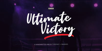 Ultimate Victory is an authentic handwritten brush typeface. This textured script font is suitable for posters, magazines, apparels, movie headlines, packaging and more.
 - Tart by Suomi,
$35.00 Headline font with extremely tight kerning with more than 1600 kerning pairs. Also with some discretionary ligatures and lining figures. That’s Tart. Sweet.
 - Ript Cure by insigne,
$19.99RiptCure is a futuristic, but usable typeface for everything from logotypes to magazine headlines. Several weights are included, including an interesting Ultra Light. - Bangke by Typefactory,
$14.00 Bangke is a textured brush font with rough and casual letters. It’s great for logos, branding, print projects and any attention drawing headline.
 - Damasquine by DePlictis Types,
$31.00 Damasquine works well for headlines and titles mostly, could be a sharp Art Deco reinterpreted typeface with a touch of archaic lettering inspiration.