7,762 search results
(0.027 seconds)
- Brush Script by Monotype,
$29.99Brush Script is a lively font with brush-written characteristics, designed by Robert E. Smith in 1942 for American Type Founders. Brush Script continues to be a favorite, despite competition from other similar typefaces of the period and more modern looking scripts digitized in recent years. Perhaps that's because Brush Script is peppy, informal, and unabashedly confident. The letterforms are casual, yet look as if they have been written quickly. Today, Brush Script is used for advertisements and sales materials, especially for luxury and consumer products. - Asterone by Letterhend,
$15.00 Asterone is a modern font family and works perfect for anyone who needs a typeface for headline, logotype, apparel, invitation, branding, packaging, advertising etc. Asterone comes in uppercase, lowercase, punctuation, symbols, numerals, stylistic set alternate, ligatures, etc also support multilingual.
 - Mystic Prophet - Unknown license

- Nothing by Dharma Type,
$19.99 The real handwriting script. Very powerful impression because of its heavy, wide and speedy shape. Award Winning No. 1 font 2007 at MyFonts and Rising Star. There is one more script designed by in the same concept. -Banana -Nothing
 - Courtside by Epiclinez,
$18.00 Courtside is a casual all caps handwritten font. It's easy to read and it has a playful feel to it at the same time. Get inspired by its simplistic charm and use it to brighten up any creative projects
 - Pansy Bo by Dharma Type,
$19.99 Based on some script in the 19th century. Inky texture gives realistic handwriting appearance. Smooth writing feeling creates antiqued and nostalgic atmosphere. There are two other script designed by in the same concept. -Daisy Lau -Lily Wang -Pansy Bo
 - Doyen-D by Substance,
$12.00 A distorted, broken & cracked typeface. Doyen-D.ScreenRegular uses the same letter forms as the rest of the Doyen-D family, however the letters have gone through a halftone screen print process, resulting in even further distortion of the typeface.
 - Microgramma by URW Type Foundry,
$35.00 Designed to Swiss principles by Alessandro Butti and Aldo Novarese for Nebiolo in 1952 as an improvement on the squared-off Bank Gothic capitals. The design was revisited by the same designers ten years later; Eurostile was the result.
 - MBF Raveny by Moonbandit,
$19.00 Raveny is a high contrast modern display font by moonbandit, This typeface is a unicase font, meaning that the uppercase and lowercase has the same height. Raveny also comes with multilingual support and several alternates for you to explore.
 - Display University by Gerald Gallo,
$20.00 Display University is a display font not intended for text use. It was designed specifically for display, headline, logotype, branding, and similar applications. The character set is in outline but the uppercase letters are the same shapes but solid.
 - PMN Caecilia eText by Monotype,
$29.99PMN Caecilia™ is the premiere work of the Dutch designer Peter Matthias Noordzij. He made the first sketches for this slab serif design in 1983 during his third year of study in The Hague, and the full font family was released by Linotype in 1990. The PMN prefix represents the designer's initials, and Caecilia is his wife's name. This font has subtle variations of stroke thickness, a tall x-height, open counters, and vivacious true italics. Noordzij combined classical ductus with his own contemporary expression to create a friendly and versatile slab serif family. With numerous weights from light to heavy, and styles including small caps, Old style figures, and Central European characters, PMN Caecilia has all the elements necessary for rich typographic expression. eText fonts - the optimum of on-screen text quality With our new eText fonts that have been optimised for on-screen use, you can ensure that your texts remain readily legible when displayed on smartphones, tablets or e-readers. The poor resolution of many digital display systems represents a major challenge when it comes to presenting text. It is necessary to make considerable compromises, particularly in the case of text in smaller point sizes, in order to adapt characters designed in detail using vector graphics to the relatively crude pixel grid. So-called 'font hinting' can help with this process. This, for example, provides the system with information on which lines are to be displayed in a particular thickness, i.e. using a specific number of pixels. As font hinting is a largely manual and thus very complex technique, many typefaces come with only the most necessary information. What is unimportant for a text printed in high resolution can result in a poor quality image when the same text is displayed on a screen, so that reading it rapidly becomes a demanding activity. Specially optimised eText fonts can help overcome this problem. An extremely refined and elaborate font hinting system makes sure that these fonts are optimally displayed on screens. Monotype has not only adopted font hinting for this purpose but has also thoroughly reworked the fonts to hone them for display in low resolution environments. For example, the open counters present in the letters C, c, e, S, s, g etc. have been slightly expanded so that these retain their character even in small point sizes. Also with a view to enhancing appearance in smaller point sizes, line thickness has been discreetly increased and x-height carefully adjusted. Kerning has also been modified. Don't leave the on-screen appearance of your creations to chance. Play it safe and use eText fonts to achieve perfect results on modern display devices. Many typefaces, including many popular classics, are already available as eText fonts and new ones are continually being published. The eText font you can purchase here are available for use as Desktop Fonts or Web Fonts. Should they be used in Mobile Devices such as smartphones, tablets or eReaders, please contact our OEM specialists at sales-eu@monotype.com. - Kaaos Pro by The Type Fetish,
$25.00 Kaaos Pro is based on the logo of the Finnish hardcore band of the same name. It was expanded to include extended Latin, extended Cyrillic and Greek alphabets so it will work with most languages in Europe and the Americas.
 - Nervatica by Tour De Force,
$25.00 Language is a must, please clean your book’s dust. If you move like a snail, you'll never end up on Yale. Teach your mind to rewind, never leave knowledge behind, what should be defined, is what you'll get as assigned.
 - Pasture by Ryan Keightley,
$19.00 Pasture is a display serif in a range of weights. Rounded interior and exterior corners, curvaceous details, and rotund terminals give it a warm, handmade quality. Classic style that is, at the same time, right at home in modern spaces.
 - Wire Mesh JNL by Jeff Levine,
$29.00Wire Mesh JNL is an outline variation of the same design that produced Shady Characters JNL (lettering printed over a simulated halftone). This time around, the end effect gives the impression of looking at lettering cut out of a mesh screen. - SomaSlab Tall by ArtyType,
$19.00 SomaSlab Tall has all the same characteristics as SomaSlab, transferred into a style which has been condensed along the horizontal axis only. Available in 2 weights, XBold & Heavy, with an extended Latin character set and several glyph alternates for maximum versatility.
 - Renslaer by Ingrimayne Type,
$7.00 A condensed and stiff-looking typeface with an enormous x-height, Renslaer is meant for use as a display face. It has the feel of some of the 19th century display faces, which often had the same sort of unpolished look.
 - Tower by Fenotype,
$19.95 Tower was originally created as a school assignment at the University of Industrial Art & Design Helsinki in 2006. Tower is an experimental dingbat font. Try writing different kind of towers: set font size and leading the same and start experimenting!
 - Blaak by Mans Greback,
$19.00 Blaak is an interpretation of a Modern Classic typeface with a beautiful and strong impression for editorial design. The sharp serif combined with curves gives Blaak a fabulous, glamorous and bold look; at the same time doesn't sacrifice its functionality.
 - Stencil Piece JNL by Jeff Levine,
$29.00 Based on an antique metal stencil plate used for identifying crates, bales or barrels, Stencil Piece JNL is one of the numerous stencil designs available through Jeff Levine Fonts. The type design is available in both regular and oblique versions.
 - Mariyam by MotionTail,
$18.00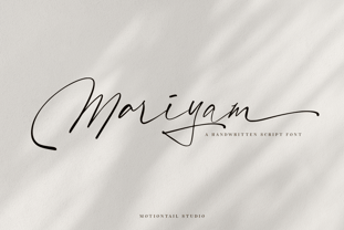 Mariyam Signature font a beautiful typeface awesome character. Mariyam Signature font it’s perfect for namecard, poster, logo, magazine, cover, banner, tshirt and headers, or even large-scale artwork. Features: • OpenType Features • Uppercase & Lowercase • Numeral & Punctuation • PUA Encoded • Multilingual support ÀÁÂÃÄÅÇEÈÉÊËIÌÍÎÏNÑOØÒÓÔÕÖUÙÜÚÛWYÝŸŸÆ
 - Revolver by Device,
$39.00 Designed for the seminal comics magazine of the same name, Revolver was one of Rian Hughes’ first typeface designs. Originally published as part of the FontFont range, it has now been remastered and includes full European glyph support and Opentype features.
 - Monster by Fenotype,
$19.95 Monster was originally created as a school assignment at the University of Industrial Art & Design Helsinki in 2006. Monster is an experimental dingbat font. Try writing different kind of monsters: set font size and leading the same and start experimenting!
 - Pretzel Dough by Celebrity Fontz,
$19.99 The Pretzel Dough font was inspired by a challenge to make the letters of the alphabet and numbers from the same bowl of pretzel dough. The result is this whimsical and fun typeface. Comes with full set of accented characters.
 - Upona by Bunny Dojo,
$17.00 Inspired by 19th century storybook lettering, Upona is a font fit to tell all tales. Fresh yet familiar, Upona blends classical styling with whimsical flourishes. Carrying a sense of history and tangibility, stories set in Upona are worth holding onto.
 - Boston Traffic - Unknown license

- Agudal MF by Masterfont,
$59.00 Fresh text font that will serve as title, signage etc.
 - Stuph by Tail Spin Studio,
$25.00Stuph Light is a collection of drawings pulled from one of the many sketch books Steve Zafarana is always doodling in. Because they are in a font, the drawings can be used in font format or opened and manipulated in vector programs like Freehand or Illustrator. Stuph Light continues to inflict upon an unsuspecting public Steves’ cockeyed outlook on the world that was started with ITC Fontoonies, ITC Gargoonies and ITC Backyard Beasties. Will this lunacy ever end? - Mrs Ant by Hipopotam Studio,
$20.00 Hand drawn serif typeface designed for one of our books. It has upper and lowercase characters with up to three alternate glyphs. Build in OpenType Contextual Alternates feature will automatically set alternate glyphs depending on frequency of appearance of the same character (even in web font but only in HTML5 browsers). The script doesn’t throw random glyphs. For example in the word “HIPPOPOTAMUS” you will automatically get three different “P” glyphs and two “O” glyphs. It really works great but of course you can always fine tune it by hand. Mrs Ant has an older brother. Mr Anteater was designed for headers for the same book.
 - Caerphilly by Hanoded,
$15.00 I really like Wales; I like the culture, the people and the language. I also like the Welsh legends, especially the ones about King Arthur and Merlin. I am reading a book about Arthur right now, so when I was working on this font, I wanted to give it a Welsh name. Caerphilly is a town in Southern Wales and is home to an immense 13th century castle (Castell Caerffili). Caerphilly font is based on a 16th century manuscript. I kept the glyphs rough, to give it ‘ye olde’ look. Comes with a hoard of diacritics, a bunch of double letter ligatures and some alternate glyphs as well.
 - Corpesh by Typotheticals,
$4.00 Corpesh was drawn in Adobe Illustrator during the wee hours of the night. It is a single weight set of fonts, no bold version. As is/was much of what I have done over the last year, it was created purely to pass time. As a self taught amateur in this field, I only do this for the enjoyment it brings me. This typeface is being released early, at the same time as 'Brainstroke', for exactly the same reason that typeface is, that being a health crisis. I know this typeface is not complete, with, as mentioned, no bold version, and probably never will have.
 - Rumpled by Ingrimayne Type,
$9.00 TapedUp, Tinkerer, and Rumpled are based on the template I used for several letterbat fonts—fonts made of wrenches and bolts, hammers, or paper clips. TapedUp can be thought of as a font made from masking tape, and Rumpled is the same design but the tape pieces are wavy. Tinkerer is the same design but with elements that resemble what might happen if one constructed letters from Tinker Toys. All are caps only, but some of the shapes on the lower-case keys differ from the corresponding shapes on the upper-case keys. The Rumpled family has four members, the regular, an oblique, a shadowed, and an oblique shadowed.
 - Mode by Daggertypo,
$24.00 Mode is a typographic experiment exploring how same sans serif form adapts to different circumstances and what are the possibilities in variations of Thin / Black, Contrast / Negative contrast. Two main groups are Mode 0 (with rounded shapes) and Mode 1 (with angular shapes). Each of them varies from Thin to Black in six cuts, in the same manner it varies from contrast shapes to negative contrast. Mode comes in total of 72 cuts regular and italic, it speaks majority of Latin based languages and is equipped with smcp, c2sc, Old style and all caps numerals. Mode is made by DAGGERtypo during a period of 2019/2020
 - Hand Of Sean by Sean Johnson,
$29.00 Hand Of Sean was created from the designer's own handwriting in 2008 for a personal project, but was made available to the public and quickly became very popular. The font was updated in 2013 with redrawn glyphs, improved spacing, better kerning and OpenType features. NEW OpenType features: if you type two of the same letter, the font will automatically substitute with two slightly different characters to make the font look more natural. This also happens with words containing the same vowel either side of a consonant, such as ‘solo’ or ‘data’. Please note that OpenType features are only available in programs that support them, such as Illustrator, Indesign, Quark or Photoshop.
 - Xtencil Pro by John Moore Type Foundry,
$25.00 Xtencil is a typeface inspired by the shapes of the drawing templates letters, based on the letter forms of Photo-lettering Glaser Stencil from universal teacher Milton Glaser who at the same time was influenced by the modernism and the Futura of Paul Renner. Xtencil is a round letter to create a great looks, ideal for posters and headlines. Xtencil not come as a drawing template, but as true Pro OpenType typography. Now in a complete family with upper and lower cases, an inline and a thickened Shadow versions to play with layers, also accompanied by a Dingbats font with fun graphics in the same spirit.
 - Eurostile Unicase by Linotype,
$29.99 Akira Kobayashi modified his Eurostile Next design into a fun unicase version. Ascenders and descenders have been traded in for alternates of letters that all share the same height. The effect is similar to using all caps, although this is quite a bit more quirky. For example, letters like the lowercase a and e are now the same height as their capital versions and the lowercase y has been raised to fit between the baseline and top height. Odd relationships such as these give Eurostile Unicase a fresh and funky feeling. Try using it for headlines and titles, then use Eurostile Next for the body text!
 - Kidsglow by Good Java Studio,
$22.00 Kidsglow is the perfect font for all your fun designs. The font file is equipped with ordinary characters (A-Z, a-z, 0-9, ligature and lots of punctuation), as well as more than 350 glyphs to support most Latin-based languages. Plus, it comes with super fun ligature! Everything is made with the same brush, and everything is the same size as Kids, so you can be sure they will work well together! It is suitable for you to use in making t-shirt design, quote, label, packaging, logo type, or long writing. Because we have compiled kerning and matrices that are tailored to your needs.
 - Dulce Chico by Good Java Studio,
$18.00 Dulce Chico is the perfect font for all your fun designs. The main font file is equipped with ordinary characters, as well as more than 350 glyphs to support most Latin-based languages. Everything is made with the same brush, and everything is the same size as Letter Kids, so you can be sure they will work well together! It is suitable for you to use in making t-shirt design, quote, label, packaging, logo type, or long writing. Because we have compiled kerning and matrices that are tailored to your needs. Dulce Chico features: - Fully coded PUA for full access to all characters - Multilingual Support
 - Streeters by Fontsphere,
$16.00 Streeters is a hand brush typeface, created for a specific project, where one of the assumptions in creating it was to combine the appearance of a manual brush, liquid paint but also a spatial effect. Uppercase and lowercase letters create a slightly different effect with the same character height. They are created in such a way that, in addition to writing with one letter case, it is also possible to mix and create many different combinations of uppercase and lowercase characters, for example, a unique look for the same repetitive words. The font is best for works where a non-standard, strong and distinctive form of communication is needed.
 - Odisseia by Plau,
$20.00 Odisseia: Monospaced Typeface Made on Earth by Plau. Plau presents Odisseia, a monospace type family in 8 styles designed with simplicity of shapes and a humanist touch. We’ve ventured into monospace territory, where all letters must occupy the same amount of space. This style is usually associated with typewriters and computer terminal fonts. Like all monospaced fonts, every letter align vertically in a multi-line setting. The rhythm created is peculiar, since large letters such as m and w occupy the same space as narrow ones like i. Because we have 4 different weights: light, regular, bold and black the design of some characters have to be adapted to fit the same width and achieve a constant light/dark value throughout. These features make Odisseia suitable for a specific yet considerable range of uses, from computer coding to systemized communication such as brand identities. This style has been used from high-end brand identity to cutting edge digital applications. Odisseia sets a little shorter in comparison with other monospaced fonts, and bears a large x-height.

