10,000 search results
(0.714 seconds)
- Rude Slab ExtraWide by DSType,
$50.00 Rude was designed as a dichotomy between the Grotesque and Humanistic typographic shapes: a no-nonsense Sans and a very muscular Slab Serif companion. Showing the historically demanded consistency for such kind of typefaces, this is one of DSType's most wide-ranging and flexible type systems, introducing seven weights across seven widths, from Thin to Black and ExtraCondensed to ExtraWide, along with a wonderful set of Icons.
 - Flawless Valentines by Aldedesign,
$25.00 Flawless Valentines is a beautiful and light handwritten font. Its unique feel and stunning impact will add a luxury spark to any design project you wish to create! This font is PUA encoded, which means you can access all of the amazing glyphs and ligatures with ease! Each Font Has: Stylish modern handwritten script Beautiful Swash (Ending tail) Beautiful Titling (Beginning tail) Special Ligatures Multilingual Support
 - Rude Slab SemiCondensed by DSType,
$50.00 Rude was designed as a dichotomy between the Grotesque and Humanistic typographic shapes: a no-nonsense Sans and a very muscular Slab Serif companion. Showing the historically demanded consistency for such kind of typefaces, this is one of DSType's most wide-ranging and flexible type systems, introducing seven weights across seven widths, from Thin to Black and ExtraCondensed to ExtraWide, along with a wonderful set of Icons.
 - Rude Wide by DSType,
$50.00 Rude was designed as a dichotomy between the Grotesque and Humanistic typographic shapes: a no-nonsense Sans and a very muscular Slab Serif companion. Showing the historically demanded consistency for such kind of typefaces, this is one of DSType's most wide-ranging and flexible type systems, introducing seven weights across seven widths, from Thin to Black and ExtraCondensed to ExtraWide, along with a wonderful set of Icons.
 - Isolde by Linotype,
$29.99There is not much I can tell about Isolde. It is a plain typeface, rather wide and with dominant serifs. Its italics are more slanted than usual. In fact only Caslon's italic can compete about that. Its width makes it more suitable for decorations than for larger amounts of text. The name comes from the medieval tale about Tristan and Isolde. Isolde was released in 1993. - Rude by DSType,
$50.00 Rude was designed as a dichotomy between the Grotesque and Humanistic typographic shapes: a no-nonsense Sans and a very muscular Slab Serif companion. Showing the historically demanded consistency for such kind of typefaces, this is one of DSType's most wide-ranging and flexible type systems, introducing seven weights across seven widths, from Thin to Black and ExtraCondensed to ExtraWide, along with a wonderful set of Icons.
 - BMF Brohan Black by BuyMyFonts,
$25.00Brohan Black is a monospaced font: each character has the width of the piece of paper from which it was cut with a pair of scissors. The loss is minimal, as the counters are as small as possible while still retaining maximum legibilty. To save ink, print negative. Recommended for cement companies, post-industrial record sleeves and heavy poetry. Also great for temporary signage. - JetJaneButton by Ingrimayne Type,
$15.00 JetJaneButton has letters on a design that looks like a computer button. Its letters are from JetJane Mono, a sans-serif monospaced font. The typeface contains characters that can add color to letters. There are two ways to do this. One uses layers and the other a combination of characters, some with zero width. This pdf file explains the how this can be done.
 - Rude Slab Condensed by DSType,
$50.00 Rude was designed as a dichotomy between the Grotesque and Humanistic typographic shapes: a no-nonsense Sans and a very muscular Slab Serif companion. Showing the historically demanded consistency for such kind of typefaces, this is one of DSType's most wide-ranging and flexible type systems, introducing seven weights across seven widths, from Thin to Black and ExtraCondensed to ExtraWide, along with a wonderful set of Icons.
 - Rude Slab ExtraCondensed by DSType,
$50.00 Rude was designed as a dichotomy between the Grotesque and Humanistic typographic shapes: a no-nonsense Sans and a very muscular Slab Serif companion. Showing the historically demanded consistency for such kind of typefaces, this is one of DSType's most wide-ranging and flexible type systems, introducing seven weights across seven widths, from Thin to Black and ExtraCondensed to ExtraWide, along with a wonderful set of Icons.
 - Darby Display by Courtney Rhodes,
$19.95Darby came about while playing with a loaded round-tipped brush. The letters remind me a bit of signage I remember seeing at county fairs in my youth. It's a casual comfortable font that lends itself well to outlining and drop shadows for emphasis. Not intended for long copy, it would work well in headlines or in signage where one is wishing to attract attention. - Mechacore by takoliko,
$9.00 Mechacore is a variable modern sans serif display typeface designed by Takoliko Studio. It comes with regular and stencil style, it have 5 weights and expanded width. Its inspired by a mecha cyberpunk sub genre. the modern and unique characteristics makes it suitable for attention grabbing design projects such as a engineering, technology, cyber media, army stuff, headlines, posters, social media displays and editorials.
 - Sentiment JNL by Jeff Levine,
$29.00 From the 1917 sheet music for "The World Has Been So Mean to Me" comes a wonderfully hand lettered chamfered sans with varying widths and character shapes, now released digitally as Sentiment JNL in both regular and oblique versions. This informal bit of lettering retains the stylish elements of the Art Nouveau period without the extreme eccentricities found in some typographic designs of the period.
 - Satchell by Lemonthe,
$13.00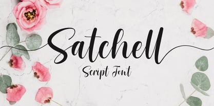 Satchell is a lovely and relaxed handwritten font. It is PUA encoded which means you can access all of the glyphs and swashes with ease! it has a gentle and beautiful flow, and as a result it will elevate each of the designs you wish to create!. It’s the perfect font for wedding invitations, stationery, photography, social media posts, product packaging, greeting cards, and much more!
 - Rude ExtraCondensed by DSType,
$50.00 Rude was designed as a dichotomy between the Grotesque and Humanistic typographic shapes: a no-nonsense Sans and a very muscular Slab Serif companion. Showing the historically demanded consistency for such kind of typefaces, this is one of DSType's most wide-ranging and flexible type systems, introducing seven weights across seven widths, from Thin to Black and ExtraCondensed to ExtraWide, along with a wonderful set of Icons.
 - Geonica by Struvictory.art,
$16.00 Geonica is minimalistic geometric sans serif font with different line width. Geonica is suitable for the design on the theme of architecture, game industry, minimalism ect. Geonica includes stylistic alternates for symbols: A, E, K, M, O, Q, T, V, W, g. There are also ligatures: AA, AJ, AM, LA, LM, MA, MM, OO, VV, fi, gg, gi, gj, oo, ri, rr, ti, vv, yy.
 - Rainbowie by Stephan Kamperman,
$18.00 Rainbowie is a font that's ideally used for festivals, artists and logos. It has 3 different widths to make it ideal to use in small and wide spaces. The font has a stencil style that can be used in suprising ways for an unique touch in your design. It also provides several special characters with a star, sun, cloud, trees, guitar, lightning bold and heart.
 - Quebra by Vanarchiv,
$55.00 Quebra is an extend display sans-serif font family with four widths (Extra Condensed, Condensed, Normal and Expanded) and ten weights, italics versions are available. The main strokes contain small breaks simulating modulated variations on the letterforms, these details are more present on large body sizes. All font versions contain Latin and Cyrillic encoding characters and also ligatures, case-sensitive forms, fractions, oldstyle and finally tabular figures.
 - Rude Icons by DSType,
$50.00 Rude was designed as a dichotomy between the Grotesque and Humanistic typographic shapes: a no-nonsense Sans and a very muscular Slab Serif companion. Showing the historically demanded consistency for such kind of typefaces, this is one of DSType's most wide-ranging and flexible type systems, introducing seven weights across seven widths, from Thin to Black and ExtraCondensed to ExtraWide, along with a wonderful set of Icons.
 - Rude SemiCondensed by DSType,
$50.00 Rude was designed as a dichotomy between the Grotesque and Humanistic typographic shapes: a no-nonsense Sans and a very muscular Slab Serif companion. Showing the historically demanded consistency for such kind of typefaces, this is one of DSType's most wide-ranging and flexible type systems, introducing seven weights across seven widths, from Thin to Black and ExtraCondensed to ExtraWide, along with a wonderful set of Icons.
 - Brandon Grotesque Condensed by HVD Fonts,
$40.00 Eight years after the initial release of Brandon Grotesque , the typeface has grown into a font family of 48 styles, including a version for small sizes and a space saving condensed version. This type family was completely drawn from scratch with the look and feel of the original normal-width version. Today, Brandon supports at least 116 languages, from Latin based languages to Greek and Cyrillic.
 - Fundevogel by Hanoded,
$15.00 Fundevogel is a Brothers Grimm fairytale about a boy who was found in a tree. The story, of course, has all the obligatory characters in it: a fair maiden, a wicked cook, an old forester and lots and lots of shapeshifting. And, yes, a happy end! Fundevogel font is a handmade fairytale font. It comes with extensive language support and all the cuteness you could wish for.
 - Rude Slab SemiWide by DSType,
$50.00 Rude was designed as a dichotomy between the Grotesque and Humanistic typographic shapes: a no-nonsense Sans and a very muscular Slab Serif companion. Showing the historically demanded consistency for such kind of typefaces, this is one of DSType's most wide-ranging and flexible type systems, introducing seven weights across seven widths, from Thin to Black and ExtraCondensed to ExtraWide, along with a wonderful set of Icons.
 - Rude SemiWide by DSType,
$50.00 Rude was designed as a dichotomy between the Grotesque and Humanistic typographic shapes: a no-nonsense Sans and a very muscular Slab Serif companion. Showing the historically demanded consistency for such kind of typefaces, this is one of DSType's most wide-ranging and flexible type systems, introducing seven weights across seven widths, from Thin to Black and ExtraCondensed to ExtraWide, along with a wonderful set of Icons.
 - Rude Slab Wide by DSType,
$50.00 Rude was designed as a dichotomy between the Grotesque and Humanistic typographic shapes: a no-nonsense Sans and a very muscular Slab Serif companion. Showing the historically demanded consistency for such kind of typefaces, this is one of DSType's most wide-ranging and flexible type systems, introducing seven weights across seven widths, from Thin to Black and ExtraCondensed to ExtraWide, along with a wonderful set of Icons.
 - Raspberry Sherbet by Hanoded,
$15.00 I have actually never had a sherbet. When I made this font family, I wish I had one, as it was a whopping 38 degrees (Celsius, not Fahrenheit…) outside. Raspberry Sherbet is a cute little font family, consisting of a rounded fat kids font and an inline version. Comes with all the bells & whistles, plus a super duper cooling effect when you use it!
 - Amateur Stencil JNL by Jeff Levine,
$29.00With all of the stencil fonts created by Jeff Levine from various vintage sources, you would think everything had already been covered. Not so. Along comes Amateur Stencil JNL. Modeled from a child's stencil set from the late 1950's or early 1960's, it vaguely resembles Futura, but its irregular widths and semi-stencil appearance sets it off greatly from that classic typeface. - Anglaise by Ladyfingers,
$39.00 Anglaise was designed for display and it likes to be big and present, filling the width of a whole spread. The repetition of vertical black and white space holds the typeface together and the contrasting straight and round shapes add the personality... for even more... use the OpenType features, and Anglaise will start merging and building new characters for you to play around with... Enjoy!
 - Mojacalo AH - Unknown license

- Hamerslag by Paweł Burgiel,
$38.00 Hamerslag is an ultra-condensed serif type family with uncomplicated, regular appearance, large x-height, relatively high contrast and modern glyphs shapes. Available in four styles, contain fraction- and scientific numerals, standard ligatures, currency symbols, proportional and tabular lining figures. Its wide character set support 200 Latin-script languages, 50 Cyrillic-script languages and 190+ romanizations/transliterations, e.g. The United Nations romanizations, Chinese official romanization (Hanyu Pinyin), BGN/PCGN (United States Board on Geographic Names and the Permanent Committee on Geographical Names for British Official Use), American Library Association / Library of Congress romanizations and others. The OpenType PostScript CFF (.otf) and OpenType TrueType TTF (.ttf) support encodings: Windows 1250 Latin 2 (Eastern European), Windows 1251 Cyrillic, Windows 1252 Latin 1 (ANSI), Windows 1254 Turkish, Windows 1257 Baltic, ISO 8859-1 Latin 1 (Western), ISO 8859-2 Latin 2 (Central Europe), ISO 8859-3 Latin 3 (Turkish, Maltese, Esperanto), ISO 8859-4 Latin 4 (Baltic), ISO 8859-5 Cyrillic, ISO 8859-9 Latin 5 (Turkish), ISO 8859-10 Latin 6 (Scandinavian), ISO 8859-13 Latin 7 (Baltic 2), ISO 8859-14 Latin 8 (Celtic), ISO 8859-15 Latin 9, ISO 8859-16 Latin 10, Macintosh Character Set (US Roman). Supported OpenType features: Acces All Alternates, Capital Spacing, Case-Sensitive Forms, Denominators, Fractions, Glyph Composition/Decomposition, Historical Forms, Kerning, Localized Forms, Numerators, Ordinals, Proportional Figures, Scientific Inferiors, Slashed Zero, Standard Ligatures, Stylistic Alternates, Subscript, Superscript, Tabular Figures. Kerning is prepared as single ('flat') table for maximum possible compatibility with older software.
 - Biblia Serif by Hackberry Font Foundry,
$24.95 This all started with a love for Minister. This is a font designed by Carl Albert Fahrenwaldt in 1929. In the specimen booklet there’s a scan from Linotype’s page many years ago. They no longer carry the font. I’ve gone quite a ways from the original. It was dark and a bit heavy. But I loved the look and the readability. This came to a head when I started my first book on all-digital printing written from 1994-1995, and published early in 1996. I needed fonts to show the typography I was talking about. At that point oldstyle figures, true small caps, and discretionary ligatures were rare. More than that text fonts for book design had lining OR oldstyle figures, lowercase OR small caps—never both. So, I designed the Diaconia family using the Greek word for minister. It was fairly rough. I knew very little. I later redesigned and updated Diaconia into Bergsland Pro—released in 2004. It was still rough (though I impressed myself). Now, with 4-font Biblia Serif family 13 years later, I’ve cleaned up, made the fonts more consistent internally, added more functional OpenType features, and brought the fonts into the 21st century. I used the 2017 set of features: small caps, small cap figures, oldstyle figures, fractions, lining figures, ligatures and discretionary ligatures. These are fonts designed for book production and work well for text or heads. Finally, in 2021, I went over the fonts entirely and remade them in Glyphs.
 - Andante by Ckhans Fonts,
$34.00 Andante is a modern sans serif with a geometric touch that support for 87 languages. It comes in 6 weights, 12 uprights and its matching Italic, so you can use them to your heart’s content, in each of which there are more than 883+ glyphs. Andante comprises 24 fonts, consisting of three distinct optical sizes: Display. Each one has been carefully tailored to the demands of its size. The larger Display versions are drawn to show off the subtlety of Andante and spaced with headlines in mind, while the Text sizes focus on legibility, using robust strokes and comfortably loose spaces. In the typeface, each weight includes extended language support, icons, fractions, tabular figures, arrows, ligatures and more. Perfectly suited for graphic design and any display use. It could easily work for branding, web, signage, corporate as well as for editorial design. documents and folders, mobile interface. Support for 87 languages. Afrikaans Albanian Asu Basque Bemba Bena Breton Catalan Chiga Colognian Cornish Croatian Czech Danish Dutch English Estonian Faroese Filipino Finnish French Friulian Galician Ganda German Gusii Hungarian Inari Sami Indonesian Irish Italian Jola-Fonyi Kabuverdianu Kalenjin Kinyarwanda Latvian Lithuanian Lower Sorbian Luo Luxembourgish Luyia Machame Makhuwa-Meetto Makonde Malagasy Maltese Manx Morisyen Northern Sami North Ndebele Norwegian Bokmål Norwegian Nynorsk Nyankole Oromo Polish Portuguese Quechua Romanian Romansh Rombo Rundi Rwa Samburu Sango Sangu Scottish Gaelic Sena Serbian Shambala Shona Slovak Soga Somali Spanish Swahili Swedish Swiss German Taita Teso Turkish Upper Sorbian Uzbek (Latin) Volapük Vunjo Welsh Western Frisian Zulu
 - Megre by JAB,
$16.00The courageous Russian author of the best seller Anastasia, Vladimir Megre, once said that this remarkable woman would inspire creative people around the world to produce their best work. Since I consider myself a creative person who has been deeply touched by her story, I sincerely hope that this will be true for me also. Anastasia talks a lot about God, the wonders of the natural world and how all things have been created so perfectly. This belief in universal perfection, however, is not confined to mystics alone. Many great mathematicians and scientists, including Albert Einstein, were of the same opinion. Having read Dan Brown’s The Da Vinci Code, I became quite fascinated with the so-called Fibonacci series; "a sequence of integers in which each integer (Fibonacci number) after the second is the sum of the two preceding integers; specif., the series 1, 1, 2, 3, 5, 8, 13, . . ." (Webster’s Dictionary). These mysterious numbers, which are said to give divine proportions, are found throughout nature in everything from a rose to a spiral galaxy. Many believe that this reinforces the argument that there is a divine intelligence back of creation. With that in mind, I thought it would be interesting to see if I could somehow create a font using these numbers in the design process. If I have succeeded - even partially - in attaining these mystical proportions, it will definitely have been worth all the hard work. And, I sincerely hope that many will enjoy using this font in producing their own best work. - Agilita by Linotype,
$29.99 Created by German designer Jürgen Weltin, Linotype’s Agilita is a contemporary humanist sans serif family with a wide variety of weights, including both ultra thin hairline options and heavier, dark type. Agilita has rather classical proportions; its clear ascenders and descenders lend more distinct word shapes. Weltin’s design has a dynamic, yet strong and very functional appearance with a fine but clear emphasis on the horizontals. This traditional approach makes it a versatile typeface for large-scale text setting, but it can also be used in complex information design projects, and orientation systems, for example. Hence it was developed carefully into a wide range type family system consisting of 32 styles. This even covers the requirements for display and headline setting. Corresponding condensed weights are suitable where horizontal space is scarce, as in narrow columns and tables, for example. The Agilta Hairline and Agilta Ultra Thin styles were especially made for display use. These fonts should be set at a minimum size of 20 pt for printed project, and about 40 pt on output to laser printers, depending on the paper used. Agilita’s character sets include special symbols and signs that may be used in dictionaries; like arrows for lemmata and signs for cross references, idioms or colloquial language. There are two sets of arrows available in each weight for use in orientation systems. Each font in the Agilta family is built according to Linotype’s Extended European character set guidelines. These offer support for more than 48 Latin-based languages used in Western, Central, and Eastern Europe, including Baltics and Turkey.
 - Aviano Royale by insigne,
$34.99 Aviano returns to lend its classic line to its newest variation, Aviano Royale--named so because of the rich flow the calligraphic capitals give the established font. The extended lowercase characters give an air of formality to the face as well and bestow on the family a deeper sense of wealth and power. This recent development of a timeless font, part of insigne’s annual tradition of adding to the Aviano family, was elected the clear winner in a poll of insigne design’s social media followers. And is it any wonder why? The long-handed elegance of Royale features graceful script capitals as well as widely tracked and smaller titling capitals, all which make Royale ideal in high-end applications and branding where titling with a taste of gentility is required. Royale’s suite boasts a number of OpenType alternates, most importantly of which are the alternate forms for the capitals. Whereas the default forms of the face are regal, it’s flourishes must be activated through the swash set. For a look more restrained, activate the stylistic alternates. It’s like having three different fonts in one! Additionally, there are baseline lowercase forms. The lowercase forms are 20% smaller in height than Aviano’s lowercase forms, so the families are not interchangeable. However, they can still be used well together. The script capitals could also be used separately as drop capitals and nicely complement any of the other 12 Aviano families. It’s time to look beyond common. For the look of refinement you desire, design with Aviano Royale.
 - Ramaskrig by Bogstav,
$17.00 Interesting script font with lovely crunchy details - comes with multilingual support and contextual alternates with 4 different versions of each letter, and they cycle automatically as you type!
 - Danu by Phoenix Group,
$12.00 Danu font is a font with a traditional style with a minimalist approach, this font is inspired by Javanese script with curved letters and some dots in it.
 - d puntillas A Lace - Personal use only

- Logistra by Riasyletter_Studio,
$19.00 Make the typography logo on your brand more elegant and professional by using the Logistra font, The Logistra font is a serif font that has thick and thin strokes that contrast in the glyphs and is made with a straight line structure and smooth curves so that the Logistra font looks professional and elegant, and there are alternative letters and ligatures to make your typography design look unique and attractive. Logistra font is also perfect for various projects such as hand lettering, merchandise, advertisements, invitations, social media posts, video thumbnails, quotes and etc. What's Included : - Logistra (otf/ttf/woff) - More than 280 of glyphs (include Uppercase, Lowercase, Numerals & Punctuations,Ligatures and Stylistic) - multilingual support - Works on PC & Mac - Simple installations - Accessible in the Adobe Illustrator, Adobe Photoshop, Adobe InDesign, even work on Microsoft Word. - PUA Encoded Characters (fully accessible without additional design software) Support For Language : Albanian, Basque, Breton, Chamorro, Danish, Dutch, English, Finnish, French, Frisian, Galician, German, Italian, Malagasy, Norwegian, Portuguese, Spanish, Alsatian, Aragonese, Arapaho, Arrernte, Asturian, Aymara, Bislama, Cebuano, Corsican, Fijian, French_creole, Genoese, Gilbertese, Greenlandic, Haitian_creole, Hiligaynon, Hmong, Hopi, Ibanag, Iloko_ilokano, Indonesian, Interglossa_glosa, Interlingua, Irish_gaelic, Jerriais, Lojban, Lombard, Luxembourgeois, Manx, Mohawk, Norfolk_pitcairnese, Occitan, Oromo, Pangasinan, Papiamento, Piedmontese, Potawatomi, Rhaeto-romance, Romansh, Rotokas, Sami_lule, Samoan, Sardinian, Scots_gaelic, Seychelles_creole, Shona, Sicilian, Somali, Southern_ndebele, Swahili, Swati_swazi, Tagalog_filipino_pilipino, Tetum, Tok_pisin, Uyghur_latinized, Volapuk, Walloon, Warlpiri, Xhosa, Yapese, Zulu, Latinbasic, Ubasic, Demo
 - Kudry by ParaType,
$40.00 Kudry is an elegant and noble typeface for extra large sizes. It looks good in cultural projects and exhibitions, logos, book covers, theater posters, wedding invitations, cosmetic and cake packaging,— basically any case in need of a beautiful typeface. It is a type family that consists of the modern serif and the contrasting sans serif, the weird serif and the stencil type. Both serif and sans have three options for different point sizes: Display for extra large sizes (from 72 pt or 96 px), Headline for large sizes (from 36 pt or 48 px) and Text for medium sizes (from 14 pt or from 24 px). Each style has a variety of alternate characters, swashes and ligatures, linear and old style figures, arrows and case-sensitive punctuation. The typeface supports major all European Latin and Cyrillic-based languages and all European Latin scripts. The authors of the typeface are Isabella Chaeva, Alexandra Korolkova and Nikolay Nedashkovsky. The character design of Kudry, details of the letters and alternates are an original contemporary solution based on the proportions and construction of the sans serif by N. N. Kudryashev. Digital versions of this typeface are Kudryashev and Petersburg, which can work in pair with Kudry in case you need a combination of a text serif and a display typeface. ITC Franklin Gothic, PT Root or Ida suit well as a paired text sans serif.

