10,000 search results
(0.073 seconds)
- Plz Print Bold Cond by Outside the Line,
$19.00 A bold, energetic, friendly font with a little bounce to it. A good, casual headline font. Works back well with Plz Print or Plz Script.
 - Ongunkan Runic Unicode by Runic World Tamgacı,
$50.00 It is the unicode version of the runic script. Can be used with virtual keyboards. You can download the keyboards here. https://www.babelstone.co.uk/Keyboards/Runic.html
 - The Good Stuff by Epiclinez,
$18.00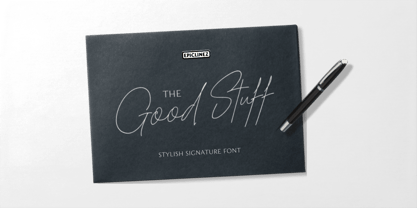 The Good Stuff is a handwritten signature script with a natural flow. This stylish font is a good choice for high-end, sophisticated Branding design.
 - The Essential by Earlyfair Studio,
$18.00 The Essential is a script font that combines minimalist and classical styling so that your design will look elegant when viewed. Hope you enjoy it!
 - Kachong by ZetDesign,
$13.00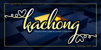 Kachong is a cute and elegant handwritten font with an incredibly friendly feel. It features gorgeous swashes and ligatures that make this script incredibly versatile.
 - Fashyon by Typo5,
$16.95Fashyon was created as an experiment blending script and calligraphic elements, and with a perfect balance between characters, looks dynamic yet with a classical look. - DR Lineart by Dmitry Rastvortsev,
$29.98 Display type-family in op-art style with Latin, Greek and Cyrillic scripts support. Award: The Best Of Ukrainian Design in Typestyle and typography 2016.
 - Shantine by Sibelumpagi,
$8.00 Shantine is a monoline script font with an elegant style. It has good readability and is perfect for logos, invitations, wedding, signatures, and much more!
 - Manuscrita by Celtibérica,
$19.00 What was the inspiration for designing the font? Spanish script from 16th Century. What are its main characteristics and features? Handwriting. Usage recommendations: Literature books.
 - Loose Leaf JNL by Jeff Levine,
$29.00Loose Leaf JNL is a handwritten script with a disconnected, scrawled look as if either written by a child or done as a casual notation. - FG Rakel by YOFF,
$13.95FG Rakel is a small old looking handwriting connected script font. I have found it useful on greeting cards and scrapbook journaling among other things. - Stitka by ARToni,
$19.00 Stitka is a chic, refined script font that emanates sophistication and elegance. Its stylish and ligatures make this font the perfect match for any project.
 - Adventure by ParaType,
$30.00 PT Adventure™ was designed by Natalia Vasilyeva and licensed by ParaType in 2001. An original calligraphic script. For use in advertising and display typography.
 - dearJoe 2 by JOEBOB graphics,
$19.00 DearJoe 2 is the second of four handwritten scripts by JOEBOB graphics. A complete character set with numbers and most (but not all) special signs.
 - Sweet Steeffie by Hanoded,
$15.00 Sweet Steefie is a cursive, feminine script. It is highly legible, contains a full range of accents and is very useful for all your projects.
 - Minnie by Lebbad Design,
$24.95 Minnie is a clean monoline upright script. This fun-loving font is great for headline display and text use. It comes with numerous alternate characters.
 - Amelie by Typadelic,
$19.00This is a connected script font with a trendy flair. You can add little flourishes to the beginning or end letters for a whimsical touch. - Distinction by Great Lakes Lettering,
$12.00 Distinction Is a brand new font from Great Lakes Lettering. A high contrast brush script with a ton of usefulness. Make you mark with Distinction.
 - Bayern Handschrift NF by Nick's Fonts,
$10.00A hundred-year-old offering from Bauer & Company, named simply "Manuscript," provided the inspiration for this elegant script face. The name translates as Bavaria Handwriting. - Reinert by E-phemera,
$12.00Reinert is a casual script font inspired by a few words in a magazine ad layout from the mid-1930s hand-lettered by Allen Reinert. - Chorettan by OCSstudio,
$12.00 Chorettan is a hand-written script. This is perfect for branding, wedding invitations, cards, social media, or maybe for your logo products, and also websites.
 - Anjelina by Nandatype Studio,
$12.00 Anjelina is a beautiful and romantic script font. It is PUA encoded which means you can access all of the glyphs and swashes with ease!
 - Susa by Hubert Jocham Type,
$29.90 Susa is an elegant and flowing brush script typeface. Ideal for short text in the lighter weights and for headlines in bold and heavy weights.
 - Breakdance by Trustha,
$15.00 Breakdance is a vintage font duo. Combination of sans and script with sharp textures making all your creative projects getting a vintage and authentic impression!
 - RMU Initials by RMU,
$20.00 Four fonts entirely of decorative initials of which the uppercase basic letters of RMU Initials One are occupied by Walthari initials, the lowercase ones by Eckmann initials, both released first by Rudhard’sche Gießerei, Offenbach, Germany, about 1900. RMU Initials Two consists of Jubilaeumsinitialen in the uppercases and Augsburger Initialen in the lowercases. RMU Initials Three comes with floral ornaments, whereby the lowercase initials can be colorized by yourself due to non-joining elements. RMU Initials Four consists of hand drawn initials by Rudolf Koch and letters of a former Klingspor font called Queen.
 - Plastilin by ParaType,
$25.00 Plastilin type family of two weights obtained its name due to the soft, curved, stroke terminals of characters (J, K, L, R and others) and the little pointed serifs, as if extruded from stroke plastic mass. The character set has a lot of additional Latin and Cyrillic ligatures, as well as several alternate letter forms. Plastilin was designed for ParaType by Oleg Karpinsky in 2005. It is for use both in display setting and short text passages. In 2008 the author added two weights (Light and Black) and improved letterforms of some characters.
 - Architype Albers by The Foundry,
$50.00 Architype Konstrukt is a collection of avant-garde typefaces deriving mainly from the work of artists/designers of the inter-war years, whose ideals have helped to shape the design philosophies of the modernist movement in Europe. Due to their experimental nature character sets may be limited. Architype Albers draws on early grid-based attempts by Josef Albers, in 1926, to design an alphabet by reducing the forms to purely geometric elements – the square, triangle and parts of a circle – and in the process creating an unusual stencil effect typeface.
 - Elbflorenz by RMU,
$35.00 Another jewel of the vast treasure of historical font designs was digged out and brought to life again. Due to the courtesy of the Quay Brothers, London, who yielded to me an age-old brochure of Albert Auspurg’s ‚Miami‘, released by Schriftguss in 1934, I was able to redesign this elegant font. This font which I called ‚Elbflorenz‘, a cognomen for Dresden, contains West and Central European type faces as well as those for Romanian and Turkish. To get access to the historical number sign please use either the OT feature additional ligatures or ordinals.
 - Tre Giorni by Eurotypo,
$60.00 Tre Giorni, is a variant of the "Due Giorni" font with the possibility of combining between the two. This useful writing font is very expressive, fresh, agile and organic. It comes in two styles: Solid and outline (just a little shine) Each font contains 571 glyphs with many OpenType features: standard and discretionary ligatures, stylistic alternates, decorative characters, old-style figures, small caps, titles, case sensitives, and ornaments. Specially designed for creating eye-catching headlines, logos, packaging, greeting cards, advertisements and websites. It also has good readability for longer texts.
 - Architype Van Doesburg by The Foundry,
$99.00 Architype Konstrukt is a collection of avant-garde typefaces deriving mainly from the work of artists/designers of the inter-war years, whose ideals have helped to shape the design philosophies of the modernist movement in Europe. Due to their experimental nature character sets may be limited. Architype Van Doesburg derives from the 1919 experimental geometric alphabet by Theo van Doesburg, whose work was heavily influenced by De Stijl theories, specifically rectangularity. The typeface has been constructed on the same 5 x 5 grid, and is limited by his ‘single alphabet’ theory.
 - Nat Grotesk by ParaType,
$30.00 Nat Grotesk family consists of 14 styles including 6 narrow ones. It has a half-closed sans serif design with simple and clear lettershapes. Due to compact proportions the face is very space saving, but nevertheless it is rather legible even in small sizes. The bold weights demonstrate increased contrast. The font is recommended for text and display typography as well as for headlines and advertising. It was designed by Natalia Vasilyeva and released by ParaType in 2007. The upgraded version with extended character set was released in 2009.
 - Boxed by Tipo Pèpel,
$18.00 Boxed typography is a new and extensive 18 weight typeface, brightly conceived and designed to look good on small screen devices, but offering also enlightened looks on paper. The semi-modular geometric font shapes seek to be fully responsive to the grid of screen«s pixels to deliver a crisp, fluid reading rate. Due to its extensive range of weights and subtle difference in thickness, compensating for the stain of characters between different CSS styles is really easy. It offers an extensive set of Latin characters, even the Cyrillic.
 - MVB Peccadillo by MVB,
$39.00MVB Peccadillo is an interpreted revival of a metal typeface popular in the 19th Century, then known as Skeleton Antique. Highly condensed with extra short descenders, the face makes a big impact in a narrow space. Holly Goldsmith worked from letterpress-printed specimens of 96-point, antique metal type, deliberately retaining subtle distortions due to type wear and letterpress impression. Alan Dague-Greene, referring to printed samples of Skeleton Antique, adapted the design to create two additional optical sizes: “Eight” for smaller text and “Twenty-four” for subheads. - Architype Van der Leck by The Foundry,
$50.00 Architype Konstrukt is a collection of avant-garde typefaces deriving mainly from the work of artists/designers of the inter-war years, whose ideals have helped to shape the design philosophies of the modernist movement in Europe. Due to their experimental nature character sets may be limited. Architype Van der Leck originates from the lettering that Bart Van der Leck created for ‘Flax’ magazine in 1941. The letterforms‘ restricted shapes and abstract, stencil-like forms reflect the strong geometric language of De Stijl and show influence from his abstract paintings.
 - Scape by Reserves,
$39.99 Scape is a precisely drawn, contemporary stencil face built from a single weight rounded end stroke. The fine, linear rounded forms create a subtle contrast to the raw utilitarian nature of the stenciled characters. Extremely versatile, Scape is highly legible due to it’s upright, consistently balanced sans letterforms. Stylistically, it exemplifies refinement and clarity with an distinct edge. Features include: Precision kerning Expanded ligature set Alternate characters (O, _, ®) Alternate zero Extended language support (Latin-1 and Latin Extended-A) *Requires an application with OpenType and/or Unicode support.
 - Tiemann by Linotype,
$29.99Tiemann Antiqua was designed by Walter Tiemann in 1923 and appeared with the Klingspor font foundry. It is one of the modern book typefaces created in the first half of the 20th century, but differed from most in its Modern Face forms. It displays the same strong stroke contrast and flat serifs but its proportions have more in common with those of neorenaissance fonts. Tiemann Antiqua is an elegant, legible font suitable for books and longer texts, but also found in headlines, newspapers and magazines due to its classic yet unusual appearance. - Slinkster by Will Ryan,
$- Big. Bold. Beautiful. Slinkster is an intricately unique display face created by carefully overlapping equally-sized circles. The geometric patterns formed become increasingly mesmerizing the larger the type is set. Slinkster works best for display, headers, logotypes, and any other large-scale applications that allow the viewer to become hypnotized by its complexity. Due to how detailed Slinkster is, you may experience some lagging as it can take a while to render. Like this font? Consider donating to encourage further development and new fonts! Donations accepted through this Paypal address: willryan042@gmail.com
 - Prapen by TypeClassHeroes,
$29.00 Prapen and Prapen Neu is a Monospaced sans serif family. Design with various width and weight that you can explore and combine creating rhythm and texture for comfortable reading. This font supports more than 100 Latin-based languages and has extensive Cyrillic and Greek support for languages like Russian, Bulgarian, Ukrainian, and many more.In variable version, it allows multiple options when designing, adapting to different composition solutions. Feature Uppercase & Lowercase Number & Symbol International Glyphs (Cyrillic & Greek) Multilingual support Ligature Feel free to drop us a message any time and follow my shop for upcoming updates
 - New Letter Gothic by ParaType,
$30.00 New Letter Gothic was designed for ParaType by Gayaneh Bagdasaryan based on monospaced Letter Gothic font by Roger Roberson, 1956–62. Due to clear and easy-to-read lettershapes of Letter Gothic the font is rather popular now for display and advertising matters. The idea was to create a font similar to Letter Gothic in lettershapes but with proportional widths of letters. For use in both display and text setting. New Letter Gothic has been adjudged an Award for Excellence in Type Design at Kyrillitsa ’99 International Type Design competition in Moscow, 1999.
 - Overly Sweet by Bogstav,
$16.00 Usually I prefer desserts that aren't overly sweet, but a week ago I lost my sense of tasting - due to Corona, and when I wanted something sweet...I preferred it overly sweet...of course because I hardly could taste the overwhelming sweetness! But now, I have my sense of tasting (and smelling!) back, and everything is back to normal. And since I completed this easy-recipe-inspired handmade font while suffering from Corona, I thought I'd name it Overly Sweet. And...well. because, the font is somewhat overly sweet (without being over the top sweet!)