10,000 search results
(0.158 seconds)
- Euroscript by profonts,
$41.99 Euroscript Pro is the handwriting of Ralph M. Unger, a very talented and hard-working German type designer. Unger has redesigned a large number of beautiful ancient typefaces during the last few years. Peter Rosenfeld of profonts persuaded him to try and produce his own very beautiful handwriting. Kind of hesitant at the beginning of the design process, Unger's joy and excitement about the project was continuously growing during the design process. He designed not only the standard character complement West, but added all of the Eastern European Latin glyphs and, on top of that, even the complete Cyrillic characters. Born and grown up in Th�ringen, former East Germany, Unger has a fair knowledge of Polish and also Russian (Cyrillic). Euroscript Pro is a very beautiful, casual, informal and modern handwriting of a contemporary type designer. Even though a digitized handwriting, it keeps a very natural and pleasant look, at the same time being generous and well-readable. The individual characters combine quite easily and perfectly with no need for extra variants.Euroscript Pro is well-suited for plenty of applications, e.g. personal correspondence, invitations, greeting cards, headlines etc.Euroscript Pro is supplied in the complete Latin character set (West + East) plus Cyrillic.
 - Surprise Pro by Naghi Naghachian,
$58.00 Surprise Pro is designed by Naghi Naghashian. It is a delicate decorative headline font. The character set of this Font supports most western languages including: Afrikaans, Basque, Breton, Catalan, Danish, Dutch, English, Finnish, French, Gaelic, German, Icelandic, Indonesian, Irish, Italian, Norwegian, Portuguese, Sami, Spanish, Swahili and Swedish. There are 17 additional symbol characters: euro, litre, estimated, omega, pi, partialdiff, delta, product, summation, radical, infinity, integral, approxequal, notequal, lessequal, greaterequal, and lozenge. It also includes the characters necessary to support the following central European languages: Croatian, Czech, Estonian, Hungarian, Latvian, Lithuanian, Polish, Romanian, Serbian (Latin), Slovak, Slovenian and Turkish.
 - Cerebri Sans by Hanken Design Co.,
$30.00 Cerebri Sans is a design inspired by early geometric and grotesque typefaces. Subtle humanist details provide an undercurrent of warmth that simmers just beneath the bones of its contemporary simplicity. Cerebri Sans’ concept involved the development of a hybrid appearance. Its soft elegance and finely-tuned legibility make it appropriate for a vast range of applications including headlines, editorials, publishing, advertising, corporate communications, white papers, educational texts, web content, and mobile applications. Cerebri Sans' multilingual support is extensive, covering Basic Latin, Western European, Euro, Baltic, Turkish, Central European, Romanian, Vietnamese, Pan African Latin, Pinyin and Igbo Onwu for global accessibility.
 - Uranos by Paweł Burgiel,
$38.00 Uranos is a serif type family with uncomplicated appearance and modern, geometric glyphs shapes. Available in three styles, include many stylistic alternates and automatic ligature creation. Character set contain the complete Unicode Latin 1252 (Western European; ANSI), 1250 Latin 2 (Central European), 1254 Turkish, 1257 Baltic. Supported OpenType features: Acces All Alternates, Capital Spacing, Case-Sensitive Forms, Contextual Alternates, Fractions, Kerning, Localized Forms, Ordinals, Proportional Figures, Slashed Zero, Small Capitals, Small Capitals From Capitals, Stylistic Alternates, Stylistic Set (1-20), Superscript, Tabular Figures, Titling. Kerning is prepared as single ('flat') table for maximum possible compatibility with older software.
 - Karolinus Fraktur by Cercurius,
$19.95 A slightly regularized digital version of a late Baroque Fraktur type, probably from the beginning of the 18th century, issued by the Norstedts type foundry in Stockholm in 56 point size as "Sju petit fraktur nr 2". This digital font is designed for rather large sizes, at least 30 points. The font includes accented letters for all Western languages, as well as a long s and the usual Fraktur ligatures, e.g. ch, ck, st, tz. The font can be used for logos, packaging, posters, restaurant menus, beer and wine labels etc. associated with traditional German and Scandinavian culture.
 - Lucky Duke by Keristyper Studio,
$14.00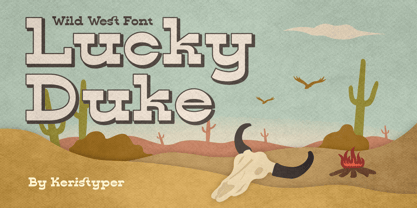 Introducing Lucky Duke font a western display typeface, inspired by cowboy wild west styles. This font is good for logo design, Social media, Movie Titles, Books Titles, short text even long text letters, and good for your secondary text font with sans or serif. **Featured:** * Standard Uppercase & Lowercase * Numeral & Punctuation * Multilingual : ä ö ü Ä Ö Ü ß ¿ ¡ * Alternate & Ligature * PUA encoded We recommend programs that support the OpenType feature and the Glyphs panel such as Adobe applications or Corel Draw. so you can use all the variations of the glyphs. Hope you enjoy our fonts!
 - Bank Of England by K-Type,
$20.00 Bank of England is loosely based on the blackletter lettering from Series F English twenty pound banknotes introduced in 2007. The font takes inspiration from German Kanzlei (Chancery) typefaces and the English calligraphers John Ayres and George Bickham. For designers using OpenType-aware applications, Bank of England includes Swash versions of all uppercase letters and ampersand, Alternates for nine lowercase letters and capital Z, and sixteen ornamental flourishes. Western European accented characters are included, and also a simplified St. Edward’s Crown (Elizabeth II’s coronation crown) at the Section (§) and PlusMinus (±) keystrokes (Windows Alt-0167 and Alt-0177).
 - Fendesert by Edignwn Type,
$18.00 Elevate your designs with Fendesert – the ultimate vintage and stamp font duo. This collection features a pair script and san serif font in regular, rough, and stamp styles. Plus, you get 20 hand-drawn western illustrations for added creativity. Perfect for logos, branding, apparel, and more. Unlock vintage charm with Fendesert. Fendesert font features : - 3 style typefaces (regular, rough and stamp) - Uppercase, lowercase, numeral, symbol, punctuation and alternate in script font - All-caps, numeral, symbol and punctuation in sans serif font - Multilingual - PUA Encoded Fendesert includes : - 7 fonts (script, sans serif and dingbat) - 20 hand-drawn illustrations in dingbat
 - Grindmore by LetterStock,
$25.00 **Grindmore Font** This pair was inspired by the vintage poster design that i saw on some coffee shop, It was crafted by hand specially to add natural handmade feeling in its brand identity than i make it clean with pentool. **Opentype features** Grindmore font has 222 character set included Cricket Font is very good looking in logo, labels, t-shirt prints, product packaging, invitations, advertising and others. * Multilingual support (Western European characters). This fonts works with folowing languages: English, Danish, Dutch, Estonian, Faroese, Filipino, Finnish, French, German, Hungarian, Icelandic, Irish, Italian, Norwegian, Polish, Portuguese, Spanish, Swedish. Thank you for using this font. LS
 - Safrina by Cocodesign,
$12.00 Safrina Script is a modern calligraphy design, including Regular. This font is casual and beautiful with swash. Can be used for various purposes. such as logos, product packaging, wedding invitations, branding, headlines, signage, labels, signatures, book covers, posters, quotes, and more. Safrinal Script includes a change of the OpenType language style, binding and international support for most Western languages. To activate the OpenType Stylistic alternative, you need a program that supports OpenType features such as Adobe Illustrator CS, Adobe Indesign & CorelDraw X6-X7, Microsoft Word 2010 or newer versions. How to access all alternative characters using Adobe Illustrator:
 - Rustic TC by Tom Chalky,
$19.00 Proudly introducing Volume Rustic, where hand-craftsmanship meets professional design. Each of these meticulously handcrafted fonts were thoughtfully designed to harmoniously complement one another, oozing the essence of authenticity, warmth, and the human touch. These fonts are tailor-made for projects that celebrate the organic, the handmade, the local, and everything that puts people at the center. Compatible & Multilingual The fonts are in the OpenType font format. OpenType fonts are accepted within the vast majority of design software (including mobile and tablet design apps). Multilingual support is also included for Basic Latin, Western European, Euro & Pan African Latin.
 - Pseudo-Hellenic by Simeon out West,
$18.00 Pseudo-Hellenic is a font based the Greek typeface of Firmin Didot. The original Greek typeface became standard during the Victorian era and remained popular until the last part of the twentieth century. Pseudo-Hellenic seeks to create an environment reminicent of the many Greek texts and is meant to re-create their ethos while communicating with a non-Greek speaking audience. Pseudo-Hellenic with full punctuation, a character 221 glyph character set that allows the user to type in most Western European Latin alphabet languages. Being a decorative font, it works best at larger point sizes.
 - Bhortead by Vultype Co,
$29.00 Bhortead that has a vintage theme that you can use for your project. This font has 2 styles, Clean and Rough, and so you can use that style according to the type of project. This font has many OpenType features so you can combine each font to be more dynamic. Special features include: stylistic alternates, ligatures and swashes. Bhortead includes western European characters (multilingual support). All characters have an imperfect shape that gives a natural look in design. It cooperates well for creating the traditional style logos, labels, package design, lettering for t-shirts and much others.
 - Blom by The Northern Block,
$29.95 Blom is a humanist sans with subtle squarish character in reverse contrast. The combination of heavy horizontals and modern geometry give the typeface a unique visual aesthetic whilst making small text perfectly readable. Blom bucks the trend of conventional letterforms in favour of a versatile typeface with bags of originality, that is both inventive in style yet completely functional in a wide range of intended uses. Details include 463 characters, six weights with matching italics and five variations of numerals. Opentype features include inferiors, superiors, fractions, slashed zeros, case-sensitive forms, ligatures and language support covering Western, South and Central Europe.
 - North Block by BoxTube Labs,
$24.00 North Block is a true sports branding classic. It's timeless shapes and features will give you an instant athletic feel to your project. North Block Regular got chamfered corners for that powerful and edgy visual performance and North Block Soft has rounded corners for a softer, more subtle approach. These fonts are perfect for sports logos, branding, posters, apparel design, magazine headlines, labels and so much more. North Block features a character set with support for most western languages including: Afrikaants, Basque, Breton, Catalan, Danish, Dutch, English, Finnish, French, Gaelic, German, Icelandic, Indonesian, Irish, Italian, Norwegian, Portuguese, Sami, Spanish, Swahili and Swedish.
 - Propisi by ParaType,
$25.00The typeface was designed at ParaType (ParaGraph) in 1997 by Manvel Shmavonyan for Russian primary school sample writing schoolbooks. The typeface is based on script fonts presented in the book 'Rodnoy Mir' by. L.I.Tikunova. The first version of the font included just letters of Russian alphabet and basic set of figures and signs. The second version with extended set of alphabetic letterforms was developed in 2004 by Gennady Fridman. Current third version that covers full Cyrillic and Western code pages was prepared by Gennady Fridman and released in 2009. Medium style also was added by him in 2009. - Regia Sans Pro by Latinotype,
$49.00 Regia Sans is a typeface that was designed in 2008 in Concepción, Chile, and was first released for sale by Latinotype. It is a very thin and condensed font with a modular design, well-suited for short texts, logos, magazines, posters, etc. This new version includes more than 1,300 characters in Opentype format, many ligatures (including diacritical marks and numbers), two groups of alternate characters, and some swash characters. Languages include: Basic Latin, Western European, Euro, Catalan, Baltic, Turkish, Central European, Romanian and Pan Africa Latin. Photos by Sergio Recabarren. Designed in 2010 by Luciano Vergara.
 - Duran by The Northern Block,
$- Duran is a strong, versatile geometric sans with industrial quality. Inspired by technical style letterforms with simple construction, the typeface is useful in both large format and body text. Its compact lateral shape helps save space across layouts and is good to go across a wide range of modern applications. Details include seven weights with matching italics and over 670 characters per style. Opentype features consist of eight variations of numerals, including inferiors, superiors, fractions, case figures and circled figures. Additional features include case-sensitive forms, stylistic alternates, ligatures, game symbols, arrows and language support covering Western, South and Central Europe.
 - Bitterbrush by Hanoded,
$17.00I needed a name with ‘brush’ in it and most have already been taken, so I did a little digging and found out that Purshia tridentata, a flowering plant native to the mountainous areas of western North America is called bitterbrush. It is also known as antelope brush, quinine brush and buckbrush - but I settled on Bitterbrush. There’s nothing bitter about Bitterbrush. It is actually a very sweet hand brushed font. It comes with ligatures for double letter combinations and a truck load of diacritics. And (something I am very proud of): it supports the Vietnamese language! - LTC Twentieth Century by Lanston Type Co.,
$49.95 Twentieth Century was Lanston Monotypes answer to Futura. In fact Saul Hess's redrawing of Futura is so close that this new digital revival includes alternates of the long lost original letterforms originally designed by Paul Renner for Futura, but were left out of the released version that has become so popular. 20th Century is a modern sans serif with apparent geometry yet still a certain warmth in its design. The OpenType version of LTC Twentieth Century incorporates the alternate Renner glyphs with two sets of alternate lowercase characters. The font also includes oldstyle numerals and a full Western and Central European character set.
 - Glancias by ScovType,
$45.00 Glancias Display is a contemporary typeface for article headings. In order to create a style that merges serif and sans serif and to attemp a minimalistic final appearance, Glancias Displas removed the serifs while remaining the high-contrast strokes which are usually found in a serif font. By removing serifs and cutting stroke ends vertically and horizontally, the font has been built in a modern, sleek, neutral and also concise look. Over 400 glyphs in total including upper and lowercase characters, figures, ligatures and signs are available. Glancias Display covers Latin based languages of North and South America and most of Western Europe.
 - Biscuits And Spam by Kitchen Table Type Foundry,
$10.00 I remember that my auntie once made a dish called ‘Macaroni and Smac’. It consisted of little ‘elbow’ macaroni, Spam (which in Holland was called Smac), cheese and ketchup. I am sure it didn’t contain on of your five a day, but it was delicious. As far as I know, I have eaten it only once, but it did make a lasting impression! Biscuits & Spam is a handmade ‘Western’ style font, which I found in my ‘unfinished fonts’ folder. It comes with multilingual support, a full set of alternates for the lower case letters and a really happy vibe.
 - Krazy Klown by Comicraft,
$19.00 It’s Krusty! It’s a Krypt Kicker! It’s a Killer Kween! Its serifs are like dynamite with a Laser Beam! KomiKraft’s new font Krazy Klown isn’t just white greasepaint and clown shoes, it’s hiding in the drain system ready to surprise you with alternate Kharakters, Killer ligatures… and did we mention Krazy Klown shoes? Kooky John K Roshell has kooked up a kinky font that is the perfect Kompliment to Monster Mash and Carry On Screaming. It’s a little bit Tiki and a whole lotta Kicky! Features two weights with alternate uppercase alphabets • Languages: Western & Central Europe • Features: Automatic Alternates & Connecting Ligatures
 - Black Engine by Linecreative,
$14.00 The Black Engine condensed slab serif font is vintage-inspired with a touch of classic style but gives it a tough feel. This font is built on a solid foundation, strong visuals, vintage motion, and a modern minimalist style. Black Engine is perfect for Jersey, athletics, posters, branding projects, Logo design, Clothing Branding, product packaging, for magazine titles. for something sports themed, album title, etc What you get dear, you will get : Black Engine- A clean Slab serif font including Upper & Lowercase characters(ALL CAPS), Numbers and Punctuation Supports Multi linguage (Latin Western Europe), Numbers and Punctuation
 - Be Bright by Seniors Studio,
$13.00 Be Bright is a sweet elegant handbrushed calligraphy font. It has a varying baseline with separate swashes that can be applied to the beginning and ends of all lowercase letters. Painted on paper, then scanned, vectorized and carefully made into a font. Be Bright includes several ligatures and international support for most western languages. For the separate swashes font, type lowercase a-z for the beginning swashes and end swashes (access to the glyphs panel is not available, just add swashes manually). The font is perfect for branding, logos, greeting cards, wedding stationery, quotes and more.
 - FM Bolyar Pro by The Fontmaker,
$29.00 Bolyar Pro type family is the ancestor of our successful font Bolyar . We decided to develop it to a new higher level - making it more sophisticated, detailed and useful at the same time. The new improved Bolyar is able to satisfy every typographic taste and meet the ever growing design requirements for high quality typefaces. If you are addicted to classic vintage style, then you could easily use Bolyar Pro for almost anything - from letterhead, logos and catchy headlines to elegant packaging, book covers and wine labels. Alternates, Swashes and Ligatures will help you customize almost every single letter and fit perfectly to your artwork. Bolyar Pro type family is showing an abundance of many new useful features and options like: - Five weights each sold as separate font - Over 1200 glyphs per weight - Full multilingual support of all European languages as well Greek and Cyrillic - Brand new Alternates and Swashes fully supported in all languages (even with accented characters) - Many useful ligatures - Full Open Type and True Type support for Mac and Win Platforms - New Bolyar Ornaments - a new complimentary font exclusively designed to fit the new Bolyar Pro, containig decorative shields, frames, ornaments and borders. Bolyar Pro font family is great for any kind of labels - in this link you could see some amazing examples how to use it alone or in combination with our Bolyar Ornate Pro font family.
 - Black Drum by Coniglio Type,
$19.95 Black Drum is a rare revival typewriter face, made digital from analog samples gathered with great care by Coniglio Type. A time and place; type and life. Black Drum is contemporary designer type, made from the struck steel hammers of an Art Deco Period san serif face transferred from a mechanical 1926 custom editor Royal Portable typewriter. Anna Conroy of Type Heritage, LLC, Philadelphia comments on Black Drum and its new place in time today: “Wow! nice lookin’ face Joseph! —Perfect, somewhere between Cable; [Rudolph Koch, 1927] (which was about the first transatlantic telegraph cable) with its raised x-height; and Futura [Paul Renner, 1928]. Yup, it has that great “Monopoly Game” question mark -- and all on a period-piece typewriter! You should have no trouble grafting that sorely needed Euro symbol.” –And he very well did! Author: Joseph Coniglio Producer: Coniglio Type MyFonts debut: October 2021
 - Cutoff Pro by URW Type Foundry,
$49.99 The first plain weight of Cutoff was designed in 2005 to be used in Miele, an independent Italian free magazine. The need was for an elegant, unusual and legible semi-serif with contemporary flavour. I was fascinated by the deconstructivist work of Jeff Keedy (Hard Times Thick), Phil Baines (Can You, You Can) and Otl Aicher (Rotis), so my aim was to get the feeling of a cut transitional typeface; at the same time felt the exigence to work on the whole shape of the glyphs, in order to soften the “90s deconstructivist” effect and obtain a more balanced and readable design. In the last years I further worked on the typeface adding the other styles, extending the character set and refining the letterforms. Finally the precious collaboration with URW++ brought in 2010 to a complete OpenType Pro font family, with multilingual and advanced typographic features. Fulvio Bisca, July 2010
 - 8th Avenue by Our House Graphics,
$16.00 Inspired by the strange, blocky lettering on the sides of a set of a set of plastic kitchen containers in my childhood home, 8th Avenue is a sophisticated, somewhat syncopated font with a retro look and feel that at the same time brings a very modern attitude to your design. 8th Avenue works well as display font for packaging, headlines and logos. Those pastel turquoise plastic boxes from the early 1950s, with white screen printed letters reading FLOUR, SUGAR, COFFEE etc. on one side were a simple quiet presence in our home back then and for decades after. Seeing them, even that soft blue-green colour felt like home. SUGAR, the soul survivor of that set has become one of those mundane items of daily life that somehow become simple icons of another time, ripe with memories. Obviously I had to make a font. September 2014
 - Fancy Free JNL by Jeff Levine,
$29.00 Up until the late 1920s, it was a popular habit in American songwriting to use African Americans as the topic of compositions using denigrating themes, words and even exaggerated character illustrations on the covers of the published sheet music. One such example of what was considered "entertainment" for its time was a piece entitled "Little Black Me". While this now socially and morally unacceptable piece of forgettable tripe is collected by some only for the historical documentation of the times they reflected, one good "positive" came out of this negative chapter of our country's musical heritage: The beautiful floral ornamented letters in the song's title has yielded Fancy Free JNL. Originally hand-lettered on an arc, these spurred Roman letters have been re-drawn, and are offered in both the regular design and a companion version with the ornamentation removed for lettering that is less ornate.
 - Identity Check by Hanoded,
$15.00 Every time I bring my youngest son to his swimming lessons, I need to show my Covid Vaccination Pass; a QR code on my phone. I thought that I would be off the hook after I showed it the first time, but no, not at the swimming pool! It feels a bit like a bad comic book, so I decided to name this comic book style font Identity Check. Of course, I should have called it Covid Vaccination Check, but that is just too much and it probably won’t sell. Who wants a font called Covid?? ;-) Identity Check is a comic book style font. The glyphs are wider than I am used to (it seems I AM capable of learning new tricks), but the effect is rather nice. Identity Check comes with extensive language support, including Cyrillic and Vietnamese. Plus two sets of alternate glyphs, that cycle as you type.
 - Braga Huis by Juru Rancang Studio,
$15.00 Braga Huis typeface is a font family that is inspired by the famous street in Bandung that was made to embodies the atmosphere and the environment of Netherland-Indie city at its golden time, whereby all the elements were designed to give the impression of structural, artistic, and advance. Braga Huis typeface has a strong Art Deco character, where the impression is depicted from the strong lines, curvy passion so it is very appropriate to describing the future atmosphere from the perspective of the 19th century. Braga Huis typeface has 3 font styles consisting of uppercase, lowercase and various alternative options that can be customize to your taste, poster is one of the media form of presentation that we believe is very appropriate for this type of font. But whatever the medium is, honestly we say; using Braga Huis typeface will make your artwork will never be cracked by time.
 - René Menue by URW Type Foundry,
$39.99 Some time ago, I started to think about the idea of combining my passionate hobby cooking with my profession as a graphic designer. While browsing through cooking books, cooking magazines and graphic publications I noticed that there were no symbols and drawings easily recognizable for interested cooks (hobby or professional). So I decided to create symbols for all the classical cooking paraphernalia still found in grand mother’s kitchen cabinet. René Menue Symbol contains 99 kitchen symbols of classical design and quality. To complement the symbols typographically, there is René Menue, a fitting linear Sans Serif typeface with plenty of extra characters such as ligatures, figures etc. René Menue is a modern, slightly condensed and economic design with round shapes, very modern but classical at the same time. These features make it perfectly usable in many different publications, not necessarily restricted to cooking… A successful cooking and enjoy your meal!
 - Herochin by DonyaDesign,
$12.00 Herochin is a modern calligraphy design, including Regular. This font is elegant and beautiful with swash. Can be used for various purposes. such as logos, product packaging, wedding invitations, branding, headlines, signage, labels, signatures, book covers, posters, quotes, etc. Herochin chooses changes to the OpenType, Bond and international language styles for reviews of Most Western Languages. To activate the OpenType Stylistic alternative, you request a program that supports the OpenType feature such as Adobe Illustrator CS, Adobe Indesign & CorelDraw X6-X7, Microsoft Word 2010 or a newer version. How to access all alternative characters using Adobe Illustrator: https://www.youtube.com/watch?v=XzwjMkbB-wQ Herochin coded PUA Unicode, which was given full access to all additional characters without having special design software. Mac users can use the Letter Book, and Windows users can use Character Maps to view and use one of the characters to paste into your favorite text editor / application. How to access all alternative characters, use Windows Character Map with Photoshop: https://www.youtube.com/watch?v=Go9vacoYmBw If you need help or have questions, please let me know. I am happy to help: Thank you & Congratulations on the Design
 - Monotype Goudy by Monotype,
$40.99Over the course of 50 years, the charismatic and enterprising Frederic W. Goudy designed more than 100 typefaces; he was the American master of type design in the first half of the twentieth century. Goudy Old Style, designed for American Type Founders in 1915-1916, is the best known of his designs, and forms the basis for a large family of variants. Goudy said he was initially inspired by the cap lettering on a Renaissance painting, but most of the flavor of this design reflects Goudy's own individualistic style. Recognizable Goudy-isms include the upward pointing ear of the g, the diamond-shaped dots over the i and j, and the roundish upward swelling of the horizontal strokes at the base of the E and L. The italic was completed by Goudy in 1918, and is notable for its minimal slope. Goudy Bold (1916-1919) and Goudy Extra Bold (1927) were drawn not by Goudy, but by Morris Fuller Benton, who was ATF's skillful in-house designer. Goudy Catalogue was drawn by Benton in 1919-1921 and was meant to be a medium weight of Goudy Old Style. Goudy Heavyface was designed by Goudy for Monotype in 1925, and was intended to be a rival to the successful Cooper Black. Goudy Modern was designed by Goudy in 1918; its small x-height, tall ascenders and shorter caps impart a spacious and elegant feeling. Benton designed Goudy Handtooled, the shaded version that has just a hairline of white through its bold strokes. The Goudy faces, especially the bolder weights, have long been popular for display and advertising design. They continue to pop up all over the world, and still look reassuring to our modern eyes." - Goudy Ornate MT by Monotype,
$29.99Over the course of 50 years, the charismatic and enterprising Frederic W. Goudy designed more than 100 typefaces; he was the American master of type design in the first half of the twentieth century. Goudy Old Style, designed for American Type Founders in 1915-1916, is the best known of his designs, and forms the basis for a large family of variants. Goudy said he was initially inspired by the cap lettering on a Renaissance painting, but most of the flavor of this design reflects Goudy's own individualistic style. Recognizable Goudy-isms include the upward pointing ear of the g, the diamond-shaped dots over the i and j, and the roundish upward swelling of the horizontal strokes at the base of the E and L. The italic was completed by Goudy in 1918, and is notable for its minimal slope. Goudy Bold (1916-1919) and Goudy Extra Bold (1927) were drawn not by Goudy, but by Morris Fuller Benton, who was ATF's skillful in-house designer. Goudy Catalogue was drawn by Benton in 1919-1921 and was meant to be a medium weight of Goudy Old Style. Goudy Heavyface was designed by Goudy for Monotype in 1925, and was intended to be a rival to the successful Cooper Black. Goudy Modern was designed by Goudy in 1918; its small x-height, tall ascenders and shorter caps impart a spacious and elegant feeling. Benton designed Goudy Handtooled, the shaded version that has just a hairline of white through its bold strokes. The Goudy faces, especially the bolder weights, have long been popular for display and advertising design. They continue to pop up all over the world, and still look reassuring to our modern eyes." - Goudy Handtooled by Monotype,
$40.99Over the course of 50 years, the charismatic and enterprising Frederic W. Goudy designed more than 100 typefaces; he was the American master of type design in the first half of the twentieth century. Goudy Old Style, designed for American Type Founders in 1915-1916, is the best known of his designs, and forms the basis for a large family of variants. Goudy said he was initially inspired by the cap lettering on a Renaissance painting, but most of the flavor of this design reflects Goudy's own individualistic style. Recognizable Goudy-isms include the upward pointing ear of the g, the diamond-shaped dots over the i and j, and the roundish upward swelling of the horizontal strokes at the base of the E and L. The italic was completed by Goudy in 1918, and is notable for its minimal slope. Goudy Bold (1916-1919) and Goudy Extra Bold (1927) were drawn not by Goudy, but by Morris Fuller Benton, who was ATF's skillful in-house designer. Goudy Catalogue was drawn by Benton in 1919-1921 and was meant to be a medium weight of Goudy Old Style. Goudy Heavyface was designed by Goudy for Monotype in 1925, and was intended to be a rival to the successful Cooper Black. Goudy Modern was designed by Goudy in 1918; its small x-height, tall ascenders and shorter caps impart a spacious and elegant feeling. Benton designed Goudy Handtooled, the shaded version that has just a hairline of white through its bold strokes. The Goudy faces, especially the bolder weights, have long been popular for display and advertising design. They continue to pop up all over the world, and still look reassuring to our modern eyes." - Goudy by Linotype,
$39.00Over the course of 50 years, the charismatic and enterprising Frederic W. Goudy designed more than 100 typefaces; he was the American master of type design in the first half of the twentieth century. Goudy Old Style, designed for American Type Founders in 1915-1916, is the best known of his designs, and forms the basis for a large family of variants. Goudy said he was initially inspired by the cap lettering on a Renaissance painting, but most of the flavor of this design reflects Goudy's own individualistic style. Recognizable Goudy-isms include the upward pointing ear of the g, the diamond-shaped dots over the i and j, and the roundish upward swelling of the horizontal strokes at the base of the E and L. The italic was completed by Goudy in 1918, and is notable for its minimal slope. Goudy Bold (1916-1919) and Goudy Extra Bold (1927) were drawn not by Goudy, but by Morris Fuller Benton, who was ATF's skillful in-house designer. Goudy Catalogue was drawn by Benton in 1919-1921 and was meant to be a medium weight of Goudy Old Style. Goudy Heavyface was designed by Goudy for Monotype in 1925, and was intended to be a rival to the successful Cooper Black. Goudy Modern was designed by Goudy in 1918; its small x-height, tall ascenders and shorter caps impart a spacious and elegant feeling. Benton designed Goudy Handtooled, the shaded version that has just a hairline of white through its bold strokes. The Goudy faces, especially the bolder weights, have long been popular for display and advertising design. They continue to pop up all over the world, and still look reassuring to our modern eyes." - TA Charged by Tural Alisoy,
$20.00 Consisting of 5 fonts in 5 weights, it features an extended charset of over 520 glyphs, covering multilingual support, including Western European, Central European, and Southeastern European. Complete with advanced open type features like stylistic alternates, discretionary ligatures, ordinals, small caps, fractions, and case-sensitive forms. The elegant and refined details seen in this font provide a new aesthetic input, satisfy contemporary style, and give a range of choices for luxury typographic projects. This font is perfectly suited for high-impact headlines. Advance open-type features are stunning on logos, branding, magazines, website, etc. Supports languages: Afrikaans, Albanian, Asu, Azerbaijani, Basque, Bemba, Bena, Bosnian, Catalan, Cebuano, Chiga, Colognian, Cornish, Corsican, Croatian, Czech, Danish, Dutch, English, Estonian, Faroese, Filipino, Finnish, French, Friulian, Galician, Ganda, German, Gusii, Hungarian, Icelandic, Ido, Inari Sami, Indonesian, Interlingua, Irish, Italian, Javanese, Jju, Jola-Fonyi, Kabuverdianu, Kalaallisut, Kalenjin, Kinyarwanda, Kurdish, Latvian, Lithuanian, Lojban, Low German, Lower Sorbian, Luo, Luxembourgish, Luyia, Machame, Makhuwa-Meetto, Makonde, Malagasy, Malay, Maltese, Manx, Maori, Morisyen, North Ndebele, Northern Sami, Northern Sotho, Norwegian Bokmål, Norwegian Nynorsk, Nyanja, Nyankole, Occitan, Oromo, Polish, Portuguese, Romanian, Romansh, Rombo, Rundi, Rwa, Samburu, Sango, Sangu, Sardinian, Scottish Gaelic, Sena, Shambala, Shona, Slovak, Slovenian, Soga, Somali, South Ndebele, Southern Sotho, Spanish, Swahili, Swati, Swedish, Swiss German, Taita, Taroko, Teso, Tsonga, Tswana, Turkish, Turkmen, Upper Sorbian, Vunjo, Walloon, Welsh, Western Frisian, Wolof, Xhosa, Zulu
 - Caslon Antique - Unknown license

