10,000 search results
(0.033 seconds)
- Winner by sportsfonts,
$19.00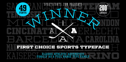 Winner™ and Winner Sans™—Classic athletic aesthetics, finally as a versatile contemporary super family. Just when you thought there was nothing left to add to the classic sports design, we lifted it to a whole new level. Whatever you want to set in whatever space, with seven weights in seven widths both with or without serifs, you’ll definitely find the right proportions for it! Winner supports not only most Latin-based languages but also Greek. Its extensive character set also contains currency signs, arrows, as well as a wide range of numerals from small figures to Roman numerals. Furthermore, its sophisticated OpenType layout features give you access to alternative letter shapes, fractions, tabular figures, and contextual alternates. With more than 24,000 glyphs in 49 fonts, Winner leaves nothing to be desired. Grab Condensed Regular for free and give it a spin!
 - Frontis by Tipo Pèpel,
$24.00 Inspired by the Roman lettershapes that Asensio y Mejorada drew in 1780, Frontis is a text typeface that takes this reference just as a starting point. The delicate appearance of Neoclassical fonts becomes confidence in Frontis. The characters have a solid skeleton, and the text looks classy in the condensed half of the family. A style that shines especially at display sizes. A collection of vegetal motifs and some stylistic uppercase ligatures complete the character set. These extra shapes serve to frame and bring together all the weights and styles in the type family. The lapidary ligatures and the ornaments underline the 18th-century roots of the design. There is a connection between Frontis and those classic letters that were once engraved on stone. And yet, the design is daring enough to make it a perfect choice for contemporary use.
 - Panorama SG by Spiece Graphics,
$39.00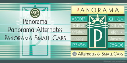 Here is a profoundly delicate and graceful design that has its roots in art deco fashion. This elegant typeface is based on an old 1930s lettering style popularized by Carl Holmes in his wonderful book on the subject. Somewhat condensed with a very tall lowercase, Panorama carries itself beautifully. It is similar to such classics as Stellar and Optima with stems flaring slightly at the ends. Panorama has a great number of alternate capital, small capital, and lowercase characters including two sets of alternate figures. Panorama, Panorama Alts, and Panorama SC are also available in the OpenType Std format. Some new characters have been added to these OpenType versions. Advanced features currently work in Adobe Creative Suite InDesign, Creative Suite Illustrator, and Quark XPress 7. Check for OpenType advanced feature support in other applications as it gradually becomes available with upgrades.
 - Robson by TypeUnion,
$20.00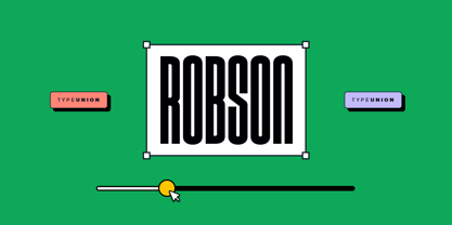 Robson is a fluid, condensed, uppercase font made up of eight weights, as well as a variable, that will provide instant visual impact to your projects. The font is made up of 486 glyphs which features extensive language support & stylistic alternates to give your designs the versatility they require. The font has a retro edge to it by using rounded structures on the A, M, N, W and Y glyphs that are reminiscent of posters and promos from the 70s and 80s. The ultra tight thin weight is made to be used at super sizes to bring a focal point to your designs. Robson is meant to be seen big (well, he's a bit of a show-off) Robson is perfect for your digital, print or branding projects. Or, for a poster on your fridge that says "You rock".
 - M Ling Wai P HK by Monotype HK,
$523.99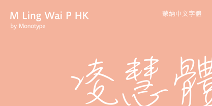 M Ling Wai is a humanistic script based on a real handwritten style. It has a feminine, urban and lively character filled with literate finesse. M Ling Wai was written with a thin ball pen by a young woman in a unique, personal, running writing style, such that it is real, natural and feminine. Contrast of strokes is low and the text is visible and eye-catching. Its light to medium stems (豎) make it suitable for small text and subheading with little conglutination. All strokes are highly irregular, inconsistent, irregularly oriented and tightly coupled or connected. Spatial distribution, positioning, size and relative proportion of radicals fully reflect a natural and personal favor. It is one of the first proportional width font in a full scale. It is best suited for casual lively text, illustrations, set upright (non-slanted), non-condensed.
 - Kairos Sans by Monotype,
$50.99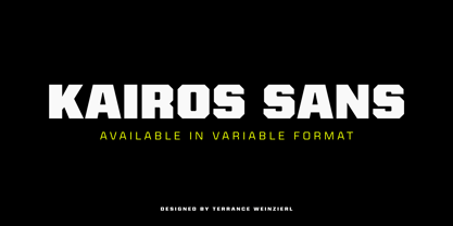 Kairos Sans, designed by Terrance Weinzierl, is an octagonal sans serif influenced by 19th Century Grecians, with the weights and widths of a contemporary palette. The bold simplicity radiates in headlines and sub-heads, with suitable performance in text. Of course, it pairs perfectly with the slab serif companion, Kairos . Kairos Sans is available in 48 styles; 8 weights in 3 widths, all with matching italics. Condensed, Regular and Extended widths range from Thin to Black. There are 4 Rough styles as well, bringing the whole family to a total of 52 styles. It comes in Latin, Greek and Cyrillic scripts. It also comes with some extras and OpenType features: Small capitals, proportional and tabular figures, superscript and subscript figures, support for fractions, ornaments, arrows and Stylistic Alternates. It often looks athletic, industrial, and stern. Kairos Sans is stout, but has energy.
 - Cindie Mono by Lewis McGuffie Type,
$34.99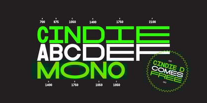 Cindie Mono is a multi-width display font. Six different widths – A (condensed) through F (super extended) – mathematically correspond with one-another creating a stackable type family. Each face contains all caps full West, Central and East European language support. All diacritics and marks are done in a hairline to add style and contrast. And Cindie Mono is ideal for posters, headlines and display lettering. The inspiration for Cindie Mono came from the lettering styles on optometrists sight-test posters. Then through several stages of development the overall concept for Cindie became of a half-broken Commodore64 and the computer from the 1985 movie 'Weird Science' hooked up to a dot-matrix printer spitting out reams of mechanical but distorted mono-lettering all the while an old modem you can't seem find keeps beeping and beeping and beeping...
 - Eirene Sans by Tomtype,
$4.90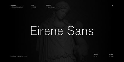 Eirene Sans is a sans serif type family inspired by grotesque typefaces with some humanistic characteristics. Simple, modern, and functional are the principal features of this type family; the uppercase glyphs present a sophisticated personality. There are 5 weights available and matching italics. It is a bit more condensed than normal width and the difference between thin and thick stems and the unique terminals make the type family have this humanistic personality. It has rounded forms in some letterforms and special characters (i, j, ., :, etc.), humanistic terminals, and very thin ink traps. Eirene Sans is perfect for digital and non-digital designs; it can be used in magazine titles, logo designs, packaging designs, and web designs. Features: 5 weights and matching italics Opentype features Arrow set Stylistic alternates (ft) Stylistic changes in italics Fractions Subscripts Inferior and superior numbers Language support (Latin extended)
 - Geogrotesque by Emtype Foundry,
$69.00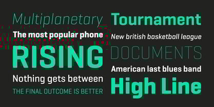 Geogrotesque is a semi modular with a subtle rounded finish typeface. All the characters are based in the same formal principle with its corresponding optical adjustments in order to adapt the system to an alphabet for texts. Although the type family has a geometric or “technological” construction, the rounded finish provides it a warm appearance, making the typefaces nicer and nearby. Geogrotesque has been conceived to be used as a display typeface in publications or intermediate length texts, most of all the Thin and Ultralight weights which were meant to be used in big sizes. The type family consists of 14 styles, 7 weights (Thin, UltraLight, Light, Regular, Medium, SemiBold and Bold) plus italics and it’s available in Open Type format. For more details see the PDF. Related: Geogrotesque Stencil, Geogrotesque Condensed, Geogrotesque Expanded, Geogrotesque Slab and Geogrotesque Sharp.
 - Film P3 by Fontsphere,
$16.00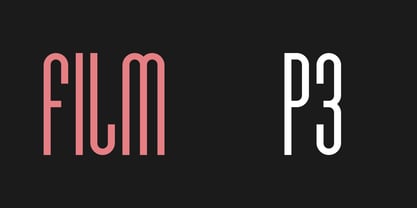 Film P3 - Ultra Condensed sans-serif typeface. It refers to characteristic typefaces such as Film Poster or Film P2 (which were inspired by futuristic movie posters). Film P3 is deliberately more versatile and designed to be used successfully in a huge variety of projects. In addition, the letters retain their unique and distinctive style, which allows them to stand out from the crowd. The Film P3 family has 9 members that are complementary and allow the expression of the projects to be very varied and adapted for appropriate use. They look good in many sizes, single words, slogans, titles, sentences as well as longer texts. Fonts include multilingual support, numerals, and a large range of special characters. Film P3 typeface offers many creative possibilities in graphic design and digital art. For print, brand identity, web design, and much more.
 - Geogrotesque Slab by Emtype Foundry,
$69.00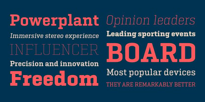 Geogrotesque Slab is the ideal companion of the popular Geogrotesque. The challenge was to achieve a fully recognizable font that works as part of the existing family, for that reason the Slab version conveys the same message in a different way. The new font remains clean and tech with a human touch yet provides a new security, confidence and firmness thanks to the serifs. This new addition, combined with Geogrotesque, Geogrotesque Stencil and Geogrotesque Condensed Series provides even more design options and now there’s a Geogrotesque for every need. The type family consist of 14 styles 7 weights (Thin, UltraLight, Light, Regular, Medium, SemiBold and Bold) plus italics. It is available for desktop and WebFont and includes ligatures, tabular figures, fractions, numerators, denominators, superiors and inferiors with support for Central and Eastern European languages. For more details see the PDF.
 - Column Sans by Campotype,
$25.00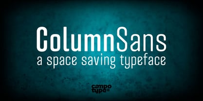 Column Sans, talking about space efficiency. The character set that condensed can maximize the use of limited space without losing good legibility aspects. The typeface is very appropriate to be used as a text in a small column widths, display text, caption, title, author credit on the film, etc. Column Sans is available in OpenType format in the three weights Light, Regular, and Bold, whereby there are corresponding italics for all variants. In the same narrow italic versions, the "a" has a closed form while the "f" has a descender. Besides of standard ligature, this typeface is also equipped with some additional ligature and deligature like "fr", "tt", "cb", "ch", "ck" and so on as well as three "stylistic ligature": "the", "Mr" and "Mrs". Please find more information about the OpenType Manual of this typeface on the gallery page (pdf) if possible.
 - Zin Display by CarnokyType,
$46.00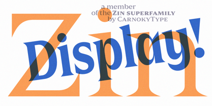 Zin Display is a contemporary typeface designed for various situations of typographic usage. Characteristic feature is a large x-height and balance between neutral construction of letters (strictly vertical axis), dynamic open forms (opened terminals) and sharp instrokes, outstrokes and serifs. Another typical feature is a visually narrower connection between stems and strokes. The complete font family consist of three width proportions (Normal, Condensed and Extended). Every sub-family has 5 weights, ranging from Light to Black with matching Italics. Zin Display can be effectively used especially for display typesetting but works for longer text as well. It can be used especialy in magazine layouts and editorial design, as well in advertising typography, orientation systems, corporate identities and many other situations. Zin Display is a member of the Zin super family, which also includes Zin Sans, Zin Slab and Zin Serif fonts.
 - Queulat Soft by Latinotype,
$-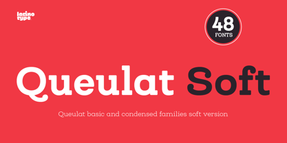 The font is the soft version of the Queulat basic and condensed families, but keeping the same features as the original typeface. Queulat Soft is a hybrid font that combines different styles, reflecting charm, freshness and, especially, a strong personality. The font is inspired by Modern and Grotesk styles. The former is shown in some characteristic features such as teardrop terminals, which give the typeface an attractive unique look, making it an ideal choice for logotypes and labelling. The latter, with its rationality, makes Queulat Soft a stable and strong face for headings and subheadings. The combination of styles can be clearly seen by comparing the Regular with the Alt version. The Regular version is more simple than the Alt one. Differently, the alternative version possesses more features of the Modern style, like teardrop terminals in ‘k’ and ‘v’.
 - Bourgeois Slab by Barnbrook Fonts,
$75.00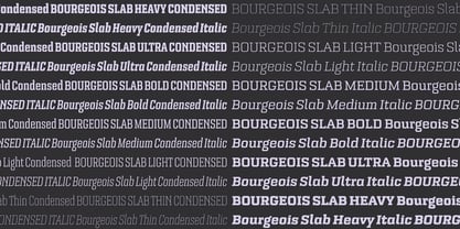 Bourgeois Slab is built upon the framework of Bourgeois, our popular geometric type family. As with the sans-serif Bourgeois, Slab’s letter forms are thoroughly contemporary in look and feel. Echoing mid-century modernism in style, Slab’s overall look is friendly and businesslike, more expansive and expressive than Bourgeois’s pared-down asceticism. The slab-serif’s development and vigorous uptake during the early-Victorian-era Industrial Revolution, means that we endow slab-serif faces with characteristics of sturdiness, durability and trustworthiness. At the same time, we appreciate the slab-serif’s raison d’etre: They’re made to grab your attention. Bourgeois Slab and Slab Condensed when combined, offer 24 styles suited for text of all kinds and sizes. Both are particularly good for for text-heavy projects and for designers seeking a robust, authoritative-but-genial voice for branding and logo work.
 - Intro by Fontfabric,
$47.00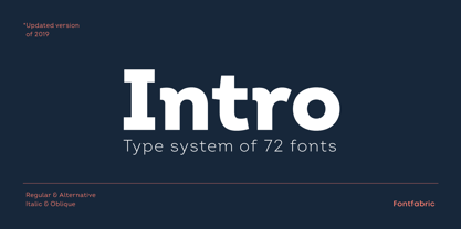 Let us introduce you the official big update of Intro type family with essential upgrades to this contemporary sans serif. The weight distributions completely revised has brought 8 new weights and matching italics resulting in 72-fonts family with 22 fonts extra. Intro’s refined playfulness is further emphasized with additions of multiple ingredients, such as carefully adjusted Oblique alternatives next to the existing upright alternatives. All these styles are now available as a Condensed version. On top of that, there are 3 inline fonts. The glyph case was expanded to cover Extended Latin and Cyrillic with adequate language localization. The OpenType features rewritten and improved now allow case-sensitive forms and contextual alternates, and plenty of stylistic alternates. The standard numerals set includes as well tabular figures and symbols, superiors and inferiors, numerators and denominators, plus fractions.
 - Bradley Type by ITC,
$40.99The details that work for ITC Bradley Hand™ at smaller sizes, might be a little too distracting for some at larger, display sizes. Bradley Type™, is a little softer, more refined, and a touch more condensed - especially useful if space is an issue. It can be used as a compliment or counterpart to Bradley Hand, or on its own for short bursts of text or headlines. Richard Bradley explains, I designed the family for casual home computer users as well as professional graphic communicators. For anyone who's looking for a handwriting typeface, Bradley Type can be used at a variety of sizes for diverse projects." For added versatility, it's available in three weights, from the lean Regular, through Bold, and Heavy; and a number of ligatures and alternates for variety, and that little added flair." - JMTF Robin by John Moore Type Foundry,
$55.00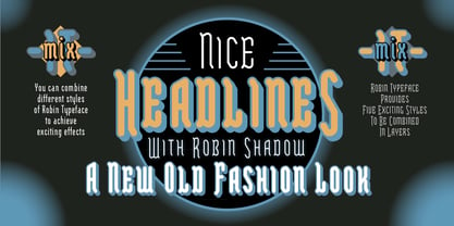 JMTF Robin is a new post-modernist typeface in the spirit of Art & Crafts, born as a concept of a reformulation of a Gothic traditional building structure. Interestingly medieval structural architectural rescue form is for creating a font of traits absolutely contemporary without losing its artisan flavor. JMTF Robin is then a modular typography with very specific characteristics that provides an innovative texts while an appearance of great personality. Early versions of Robin was winners in Letras Latinas 2006. JMTF Robin representing a before and after in terms of contemporary texts composition. JMTF Robin is a typeface family that is presented in a wide variety of forms, from JMTF Robin in condensed forms to other roman proportions like Robin9, ideal for text, also JMTF Robin comes in Shadow and Double Outline. I dedicate this letter to creative genius William Morris father of modernism.
 - Aldo Pro by Sacha Rein,
$21.17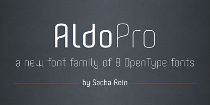 Aldo Pro is a contemporary sans serif OpenType font family designed by Sacha Rein. With 8 weights from hairline to black and an extended latin character set of 690 glyphs it is suitable for all typesetting needs, from advertising and branding to web and screen. Aldo Pro is the evolution of the free Aldo semi-bold font published on dafont.com in 2007, and which has been downloaded over 700.000 times. « I have gotten quite a lot of feedback on the original Aldo over the years and tried to integrate most of it into Aldo Pro. The x-height has been reduced to make for a less condensed, more legible font, which makes it more useful for body text than before. By popular demand the X glyphs have been changed to a more ‘classic’ shape. The font also contains some useful ligatures now. »
 - Mrs Keppel by The Ampersand Forest,
$19.00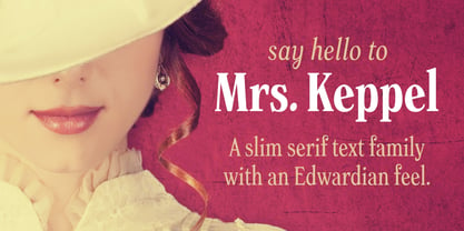 Remember when you first saw the credits of a Woody Allen movie and thought, "I love that typeface!" Well, maybe that was just us. That typeface—Windsor (specifically Windsor Light Condensed)—is a classic. But it has problems. The letterforms are sometimes REALLY wonky. And the ampersand is a tragedy. Plus, there's no italic, and the weights and widths available in digital form are a hodgepodge. That's where Mrs. Keppel comes in. Alice Keppel, one of the most famous illegitimate members of the Windsor household ever, lends her name to this typeface family with numerous weights and a true italic. It's a slim serif with Edwardian leanings. She's approachable, she's refined. She's equally charming and at home in mercantile settings, in elegant settings, in populist settings, and in Polite Society. She's a design response to a genuine need. She's Mrs Keppel!
 - Mashok by Twinletter,
$18.00 Mashok is a retro condensed font that exudes a vintage feel, perfect for adding a touch of nostalgia to your designs. This font features a tall and narrow letterform, making it ideal for creating eye-catching headlines and titles. With its unique stylistic alternates and ligatures, Mashok adds an extra level of charm and personality to your designs. Whether you’re creating posters, book covers, or other graphic design projects, Mashok is sure to make your text stand out. Give your designs a retro flair with Mashok today! What’s Included : - File font - All glyphs Iso Latin 1 - Alternate, Ligature - Simple installations - We highly recommend using a program that supports OpenType features and Glyphs panels like many Adobe apps and Corel Draw so that you can see and access all Glyph variations. - PUA Encoded Characters – Fully accessible without additional design software. - Fonts include Multilingual support
 - Calicanto by Sudtipos,
$39.00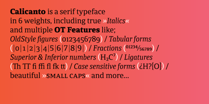 Alejandro Freitez’s first commercial typeface is inspired by contemporary serifs and newspaper typography. Calicanto is a compact typeface with strong serifs, symmetrical curves and a vertical axis. It has open counters and a generous x-height with slightly condensed characters and low contrast strokes. The design of its letters are simple (with a precise rationale), and it is ideal for combining different variables and typographic bodies, for digital and printed media. Each of the 12 variables has 750 glyphs (supporting more than 90 languages), with small caps, ligatures, lining figures by default, OldStyle and tabular, mathematical and currency symbols for each set of numerals, intelligent fractions, lower and upper numerals, glyphs sensitive to capital letters and circular numerals, among other OpenType functions that make it ideal for composing demanding texts for books, magazines, newspapers, annual reports, and much more.
 - Dealers by Gumpita Rahayu,
$20.00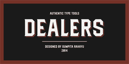 Back to the past when the old building and the beauty of a old store decorated by distinctive signage. With a clear feels of authentic historical value and the today's needs must be balanced in order to create the nostalgic feels. Introducing an authentic touch based on old fashioned signage developed into the wood type feels, and it's called Dealers. Dealers is a development of the classic taste wood type to form a solid blocked shapes, modern serifs, and with all caps based characters and slightly condensed. With specific characteristics, dealers font is intended for coffee shops, stores, restaurant menu that you want to create the impression of a classic and harmonious. With the addition of catchwords in the OpenType features, allowing you to be more creative to meet the requirements on the design you create.
 - Snatch by Latinotype,
$29.00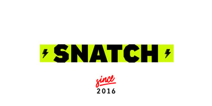 Snatch is a dynamic and expressive type system designed for impassioned and unprejudiced creative directors who look to combine the rough with the sexy. The font is well-suited for publishing projects, branding and packaging. Snatch is composed of three sections: a group of sharp-shaped uppercase fonts (small caps and all caps) in 5 weights, a set of script catchwords and eclectic sets of dingbats and flags that communicate the blue-sky thinking and feel of the project. Snatch—a collaborative project between Bercz and Latinotype Team—is the wild, condensed sister of BOWIE and it was developed by Valentina Vega, Rodrigo Fuenzalida and César Araya, under the supervision of Dany Berczeller, Daniel Hernández y Luciano Vergara. The family consists of 5 weights, ranging from Thin to Black, and comes with a 679-character set that supports 206 languages.
 - Gothiks Round Compressed by Blackletra,
$50.00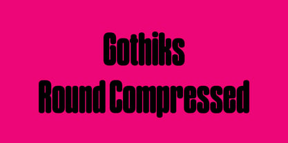 Gothiks Round Compressed is the rounded version of Gothiks Compressed. It is a 6-weight display sans-serif influenced by Texturas. The rhythm and verticality of Texturas can be easily identified on the letters with diagonal strokes like A N M K k V v W w X x Y y Z z: here they are all vertical. This kind of morphology was chosen because it accepts condensation in a very natural way, giving to this sans-serif a very unique personality. It has an extensive character set—with extensive language support—and many OpenType features like fractions, small capitals and different figure sets. Default figures align with lowercase. The typeface’s name refers to the plural of the word Gothic, which in turn can refer to both sans-serifs or Blackletter, depending on geographic location. Use it BIG!
 - Mamute by PintassilgoPrints,
$18.00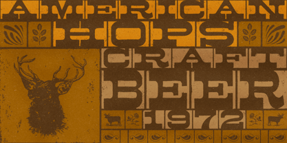 Mamute is a block rockin' family with a cool letterpress look. Its upper- and lower-case slots hold glyphs with slightly different textures for a natural look. Numbers and punctuation marks also have alternate versions. Just trigger the Contextual Alternates feature to easily cycle the alternate glyphs, preventing double letters from displaying the same texture. Mamute is a highly decorative typeface available in 2 widths, regular and condensed, each also offered as a layered font, a handy and playful way for adding shades to your composition. There’s also a generous ornaments font and a catchwords one to spice up your designs. Mamute is based on Aldine wood type spirit (as there were many incarnations of it!), from circa 1870. Please note that this family has a limited character set and doesn't bring diacritics nor accented characters. But yet it does rock, you bet!
 - Compasse by Dharma Type,
$24.99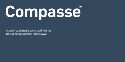 Compasse is a semi-condensed sans-serif family designed by Ryoichi Tsunekawa and the whole family consists of 12 style: six weights from Thin to ExtraBold and their matching Italics. The range of styles provides flexibility for title, headline and body text. And the large x-heights increases legibility and readability. The basic skeleton of their letterform was not designed over-modularly but moderately semi-modularly (adjusted by designer's experience). Therefore the typical artificiality and unnaturalness which come from module-design does not exist in this family. The sophisticated letterform and its universal, neutral, and standard design make it possible to be used across a wide range of applications in all medias, all purposes. Compasse supports almost all european languages: Western, Central, South Eastern Europeans and afrikaans. And superior figures, inferior figures, denominators, numerators and fraction can be accessed by using OpenType features.
 - Bronex Pro by Alit Design,
$15.00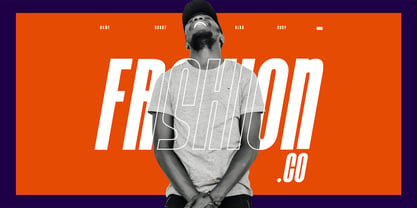 "BRONEX Pro Typeface" is a modern sans serif font that comes in a variety of weights, ranging from Thin to Heavy. It has a high body, making it easy to read even in small sizes. The font includes 494 glyphs, which allow for a wide range of typographic possibilities. In addition to the regular weight, "BRONEX Pro Typeface" also includes a condensed version, which is ideal for situations where space is limited. The font supports Private Use Area (PUA) encoding, allowing you to access special characters and symbols that are not available in standard character sets. Overall, "BRONEX Pro Typeface" is a versatile font family that can be used in a variety of design contexts, from branding and advertising to editorial and web design. Its clean and modern aesthetic make it a popular choice for designers looking for a fresh and contemporary look.
 - Didonesque Stencil by Monotype,
$31.99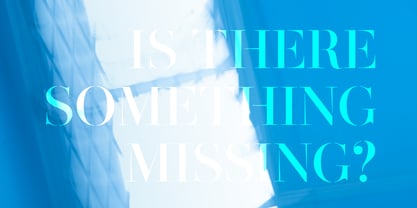 Less is More. This stencilled version takes away some of Didonesque’s structure while adding another level of distinguished style and supreme elegance. The Elegante fonts epitomise the style required for high-end fashion and beauty applications with their crisp curves combined with tapered serifs and terminals – instantly creating a polished and fashionable aesthetic. Didonesque Stencil was designed for large display purposes, branding, corporate identities, headlines, advertising, wedding invitations and the like. Of particular note are the minimal ball terminals which are available by activating Stylistic Set 2 – they’re perfect for adding that extra bit of magic to your typographic designs. Key Features: • 4 Stencil weights in Roman and Italic styles • 4 Stencil Elegante weights in Roman and Italic styles • 4 weights in Condensed style • Small Caps, Petite Caps, Alternates, Ligatures and Contextual Alternates • Full European character set (Latin only) • 780 glyphs per font.
 - Cottorway Pro by FoxType,
$25.00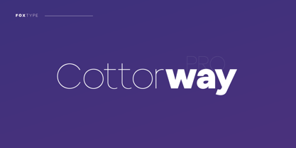 Cottorway Display Pro is a Brand New Elegant Typeface From a powerful font family of cottorway with 54 Varients. It has a dependable and uncompromising style, with controlled letterforms and modern touches. It looks amazing in logos, magazines, and movies. Cottorway Font would be perfect for branding, headlines, Captions, paragraphs, and posters. The various weights allow you to experiment with a wide range of applications. It's created to make an impression without sacrificing its beauty and readability. It's shown a clean, minimalist, warmth, quirky, yet still purposed to be versatile The Typeface includes Nine Weights -Thin, ExtraLight, Light, Regular, Medium, SemiBold, Bold, ExtraBold and Black. Numerals and extended punctuation (200+ Glyphs). Updated and reworked Glyphs Expert kerning and quality crafting. Normal, Italic, Condensed and Outline Varients are Included. Thank you for taking the time to look into the font.
 - ITC Rastko by ITC,
$29.99ITC Rastko began as a series of initial letters for a book of poetry. Serbian designer Olivera Stojadinovic had been working with a small publishing house creating a special series of books under the Masterpieces" brand. Her goal was to draw a new set of initial letters for each book. ITC Rastko, named after the Serbian poet Rastko Petrovic, was a project that required initial letters for the entire alphabet. Once Stojadinovic had drawn the majority of the capital letters, she realized that a companion lowercase would make a distinctive script typeface. Sketches of the letters were drawn quickly with a pointed pen. Stojadinovic then refined these, keeping the spontaneous, hand-drawn quality. Capitals are wide and flourished, while the lowercase letters are more condensed and subdued. It's no surprise that the capitals also make great initial letters." - Fabrics - Personal use only

- Above the Beyond by My Creative Land,
$27.00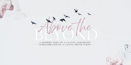 Above the Beyond is a font family that contains a high contrast Contemporary Garamond Serif and a Casual Signature Brush script. The serif comes in two styles - Regular and Italic - the italic angle is similar to the one used in the Script font. The main difference between traditional Garamond and Above the Beyond Garamond is that the ascenders are significantly shorter which makes the serif fonts more suitable for branding design and helps to reduce the distance between lines without scarifying the legibility. The Italic style has many stardard ligatures as well as calligraphic ones. Above the Beyond Script is full of OpenType enhancements such as ligatures and alternates - everything that is needed to create an organic handwritten look. It is fully unicode mapped and can be used in any software - either using OpenType panel of the application in use or your OS default Font management software - Character Map or FontBook - by copy-pasting the glyphs you need. The font family is perfect for all kind of designs: quotes, t-shirt, branding, social media, magazines, cards, packaging etc.
 - Minah by Afkari Studio,
$17.00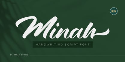 Minah - Handwriting Script Font Minah is the latest modern handwriting Script font made as naturally as possible, minah modern script font is perfectly made to be applied in logo brands, invitations, labels, magazines title, books, greeting cards, wedding cards, packaging, fashion, makeup, stationery, novels, labels or any type of advertising purpose. Minah Handwriting Script font was simple and casual that contained Open Type features such as Stylistic Sets, Stylistic Alternates, Contextual Alternate, and ligatures. This modern script font also contains begin, middle, and ending swash which makes it very easy to use, it will help you to create your own customized design. Just rely on your creativity! Features; - Uppercase, Lowercase, Number, and Punctuation - Special alternates and ligatures - Works on PC & Mac - Simple installations - Accessible in Adobe Illustrator, Adobe Photoshop, Adobe InDesign, and even work on Microsoft Word - Fully accessible without additional design software. - Mültîlíñgúãl Sùppört for; ä ö ü Ä Ö Ü ß ¿ ¡ Hope you enjoy our font and this font is a useful font for your projects!
 - Swift by Linotype,
$30.99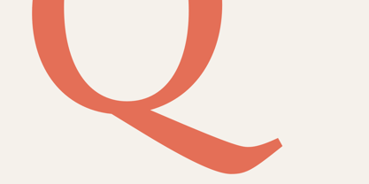 Gerard Unger developed this newspaper font between 1984 and 1987 for Dr.-Ing. Rudolf Hell GmbH, Kiel. He was mainly influenced by William A. Dwiggins (1880-1956), the typographic consultant of Mergenthaler Linotype, who started to develop more legible, alternative fonts for newspaper printing as early as 1930. Swift was named after the fast flying bird. Austere and concise, firm and original, Swift is suited for almost any purpose. Swift has been specially developed to sustain a maximum of quality and readability when used in unfavorable print and display processes, e.g. newspapers, laser printing and low resolution screens. Its robust, yet elegant serifs and its large x-height provide an undeniable distinction to the typeface, making it suitable for corporate ID and advertising purposes as well. Swift 2.0 family was designed in 1995. It's an improved version with technical and aesthetic enhancements and new family members. The Cyrillic version was developed for ParaType in 2003 by Tagir Safayev. Please note that this family includes only basic latin characters; it does not include accented characters required for western and central Europe.
 - Bloem by Eurotypo,
$24.00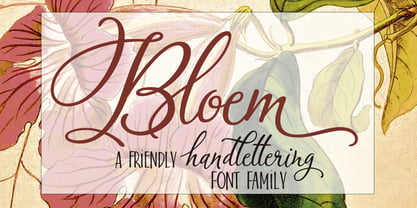 Bloem, two new fonts with oodles of character designed by Carine de Wandeleer. Its slight bounce and intentional irregularity gives your words a wonderful flow. The thick and thin strokes in this typeface combine balance and harmony. This new font family includes a sans regular and a script font. The script has OpenType features such as Stylistics and Contextual alternates, Swashes, Ligatures, up to nine Stylistic sets by letter that allow you to mix and match pairs of letters and a Central European language support to fit your design. This will help your creativity and make it easier to make the impressive and elegant typographic work. All OpenType features may only be accessible via OpenType-aware applications, or the Character Map to view and copy any of the extra characters to paste into your favorite text editor/app. Bloem Sans is a complementary handmade font, that works in harmony with Bloem script to create accurate typographic designs quickly! Bloem looks lovely on wedding invitations, greeting cards, logos, business-cards, fashion, magazines, food packaging and menus, book covers and whatever your imagination holds!
 - Wildly by Eurotypo,
$36.00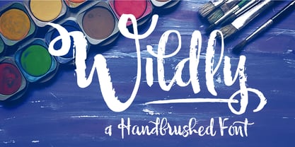 Wildly is a casual, modern and hand brushed font. I've designed Wildly carefully with the intention to preserve in its glyphs the original tell-tale dry brush imperfections and a bouncy baseline for a more personalized effect even more authentic. As an exclusively Open Type release, with 622 glyphs and 50 ornaments, it has several special alternatives for all letters with lots of possibility an an infinity of combinations. There are plenty of options to allow you to create something unique and special: standard and discretionary ligatures, swashes and stylistics alternates for each letter. These lovely fonts have already an extended character set to support Central and Eastern as well as Western European languages. This will help your creativity and make it easier to make the impressive and elegant typographic work. This font is a perfect choice for greeting cards, posters, labels, t-shirt design, logos, and more. Wildly was designed to make your project more beautiful and attractive! To activate the optional glyphs you may click on buttons in any OpenType savvy program or manually choose the characters from Glyph Palette.
 - Lotter by Kaer,
$19.00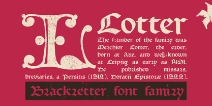 Lotter blackletter with Drop caps One fine day I found a vintage book, it called “A treatise by the Dominican friar-writer Marcus von Weida on the Brotherhood of the Holy Rosary”. It was printed in 1515 by Melchior Lotter in Leipzig. The text was illustrated by hand-colored engravings on religious and liturgical themes and beautiful initials I like. Lotter was the last name of a family of German printers, intimately connected with the Reformation. An innovation by the elder Lotter was his use of Roman types for Latin, reserving the Gothic types for German. I'm happy to present to you my new font family. Lotter font family has Drop cap and Regular styles. It's all you need to precisely imitate medieval style text. Use Drop cap style as a decorative element at the beginning of a paragraph or section, other part of the paragraph should be in Regular style. You’ll get: * Drop cap & Regular styles * Uppercase and lowercase * Multilingual support * Numbers * Symbols * Punctuation * Ligatures Please feel free to request any help you need: kaer.pro@gmail.com Best, Roman.
 - Evalfey by insigne,
$35.00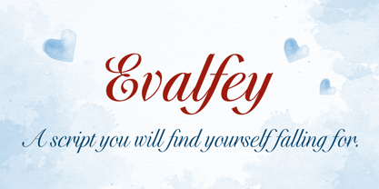 Love at first sight: Evalfey is a script you will find yourself falling for. It has a smooth, sophisticated look to it, but don't be fooled by its elegant appearance – this script is actually very simple and easy to use. The tall x-height, flag like terminals and flame-like smooth, sweeping strokes give this font a fluid, flowing quality that will help enhance your design. Evalfey Script is a great font for a wedding invitation or similar. The elegant, brushed look and strong "nuptial" feel make this the perfect choice for wedding invitations, save-the-date cards, thank you notes, and more. Evalfey is the perfect font for any wedding invitation or ceremony. Simple and elegant, Evalfey is a good choice for the wedding that likes to stand out from the crowd. The tall x height, graceful flag-like terminals, and wavy sweeping strokes give this font a regal appeal. Evalfey is a perfect combination of elegance and simplicity for your wedding invitation, announcement card or other special document. Production assistance from Lucas Azevedo and ikern.
 - House Easter by Gilar Studio,
$16.00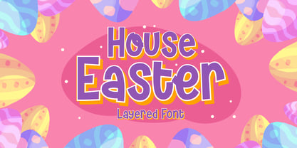 House Easte a Handwritten Display Font With 3 Style (Regular,Outline and Shadow) You Can Mix And Match for Your Awesome Project This fonts is ideal for crafting, branding and decorate your any project. This fonts are perfect for wedding invitation or your blog. Also with their help, you can create a logo or beautiful frame for your home. Or just use for your business, book covers, stationery, marketing, magazines and more. FEATURES : Uppercase & Lowercase Number & Punctuation More than 244 of glyphs PUA Encode 10 Ligatures Alternate 8 OpenType features were detected in the font (aalt dlig frac liga ordn salt sups kern) Support for 67 languages detected The alternative characters were divided into several Open Type features can be accessed by using Open Type savvy programs such as Adobe Illustrator, Adobe InDesign, Adobe Photoshop Corel Draw X version, And Microsoft Word. And this Font has given PUA unicode (specially coded fonts). so that all the alternate characters can easily be accessed in full by a craftsman or designer. Check my other Font here https://gilarstudio.com/
