10,000 search results
(0.024 seconds)
- Baby Font, as evocative as the name suggests, is a typeface imbued with whimsy, warmth, and the tender feel reminiscent of childhood. Designed with a gentle nod to the softness and playfulness that c...
- The font named "Yahoo" crafted by GautFonts hails from a unique niche in typography, characterized by its playful yet recognizably bold aesthetic. This typeface draws inspiration from the iconic Yaho...
- The font named "BLUSH BEAR" by SpideRaY is a charming and playful typeface that captures the essence of fun, creativity, and warmth. Designed with a gentle nod to whimsical storytelling and the light...
- Alisal by Monotype,
$29.99 Matthew Carter has been refining his design for Alisal for so long, he says, that when he was asked to complete the design for the Monotype Library, it was almost as if he were doing a historical revival of his own typeface. The illusion even extended to changes in his work process: although he now does all his preliminary and final drawing on screen, the first trial renderings of Alisal were done as pencil renderings. Alisal is best classified as an Italian old style design. Originally created between the late 15th and mid-16th centuries in northern Italy, the true Italian old styles were some of the first roman types. They tend to be the most calligraphic of serifed faces, with the axis of their curved strokes inclined to the left, as if drawn with a flat-tipped pen or brush. These designs offer sturdy, free-flowing and heavily bracketed serifs, short descenders, and a modest contrast in stroke weight. Alisal has nearly all the classic Italian old style character traits, plus a few quirks of its own. It is calligraphic in nature, with more of a pen-drawn quality than faces like Palatino or Goudy Old Style. It is more rough-hewn than either Goudy's Kennerley or Benton's Cloister, and is generally heavier in weight than most of the other Italian old style designs. One place where Alisal makes a clean break with traditional old style designs is in the serifs. While sturdy and clearly reflecting pen-drawn strokes, Alisal's serifs have no bracketing and appear to be straight strokes crossing the main vertical. Like Caslon or Trajanus, Alisal is a handsome design when viewed as a block of copy. Ascenders are tall and elegant, and serve as a counterpoint to the robust strength of the rest of the design. Alisal is available as a small family of roman and bold with a complementary italic for the basic roman weight, providing all that is needed for the majority of text typography. Alisal is not as well-known as some of Carter's other typefaces, but this lovely and long-incubated design was certainly worth the wait.
 - Noad Sans by Groteskly Yours,
$60.00 Noad Sans is an experimental sans serif typeface with a strong character and some very unique visual features. At the core of Noad Sans is a sturdy sans serif with closed apertures and fairly simple letterforms. The defining feature of Noad Sans, however, is its visualised nodes: all control points of Bézier curves in each of the fonts in the family are intentionally visualised. The effect of this feature is largely defined by the usage: in titles and larger bodies of text, the visualised nodes stand out and create a rhythmic pattern of their own. In smaller sizes, the sans serif base of the font becomes more prominent and the nodes create a visual fuzz. Noad Sans comes in 6 styles and as a Variable Font with two axes–Optical Size and Slant. The size of each node can be changed from the smallest (Mini and Mini Italic) to the largest (Extra and Extra Italic). Variable Font technology allows you to fine tune the size of the nodes and the slant angle, so that your version of Noad Sans can be truly unique. Noad Sans has a large character set of 570+ glyphs, covering the vast majority of Latin based languages. In addition to that there are dozens of special characters, punctuation, numbers, and symbols. Noad Sans is equipped with a number of useful OpenType features, such as Case-Sensitive Punctuation, Stylistic Alternates, Ligatures, Fractions and many more. Noad Sans began as an experimental project, and during its development the spirit of experimentation was at the heart of the project. Thanks to the unique nature of the typeface, it can feel at home in a variety of settings: from web development, graphic and product design to more novel uses like 3D and NFTs. Noad Sans type family includes 6 static fonts (Mini, Mini Italic, Regular, Regular Italic, Extra and Extra Italic) and one variable font. Each style can be purchased separately. There is a free trial version of Noad Sans that can be downloaded free of charge on MyFonts. For more information on the typeface, feel free to download Noad Sans PDF Specimen.
 - Balietta by Almarkha Type,
$33.00 Balietta - Lovely Script font with a natural handwritten feel. This handmade font will make your design has a beautiful natural touch for each details. It is perfect for any design project as Invitation,logo, book cover, craft or any design purposes. This font is PUA encoded which means you can access all of ligatures.
 - Chickenz by Typogama,
$19.00 The Chickenz dingbat font is a series of symbols based inspired by the wild west, from cowboy silhouettes and playing cards to a series of office shapes that can be used in any corporate layout. These designs were conceived as part of the Jackazz family but can also be mixed with any other typefaces.
 - Miffiest by Fridaytype,
$15.00 Miffiest - Stylish Calligraphy Fonts Miffiest is a stylish calligraphy font. Inspired by sketches, there are several characters that have unique ligatures and give a different impression from other fonts. Miffiest comes with multilingual support as well. Files Included: - Uppercase & Lowercase - Numbers & punctuation - Multilingual - Ligature - Alternative Drop any message if you have any questions, Thanks! Fridaytype
 - Romantic Couple by Bluestudio,
$15.00 Romantic Couple is the perfect collection of fonts for any design project that requires a light and charming feel. Use it to turn any design project into a true standout! Romantic Couple includes Multilingual support - spread your message globally AÀÁÂÃÄÅCÇDÐEÈÉÌÍÎÏIÌÍÎÏNÑOØÒÓÔÕÖUÙÜÚÛWYÝŸÆßÞþ Encoded PUA Characters Fonts are fully accessible without additional design software. Happy designing...! Thanks.
 - Cashmere by Larin Type Co,
$12.00 Cashmere - sweet handwritten font with an incredible charm. Clean, elegant, it fits and turns any design project into a true stand out! Use this font for branding or create a logo, a beautiful frame for your home, decorate any project. Or just use it for book covers, stationery, marketing, a blog, magazines, and more.
 - Mermaid Babies by Subectype,
$14.00 Mermaid Babies is a fun, jolly and incredibly charming display font. It embodies playfulness and authenticity and is the perfect choice for any children activity or school project. What's Included : - Multilingual Support I hope you enjoy this font. If you have any questions please don't hesitate to drop me a message :) Thank You, Subectype
 - Love Casual by Gatype,
$14.00 Introducing new Love Casual Serif Typefaces with lots of alternative characters, multilingual support and unique ligatures. Love Casual is a very versatile font. Perfect for branding projects, logos, magazine imagery, wedding invitations, posters, apparel, packaging, website headers, or simply as a stylish text overlay onto any background image. Any Questions? Just Ask! Hope you enjoy !
 - Fontazia Pop62 by Deniart Systems,
$20.00 Dress it up and get into the 60's groove! Fontazia Pop62 features 62 unique pop flowers inspired by the flower-power era. These simple long-stem florals are great for nostalgic designs as well as any modern project where a little bloom is what you need. A great addition to any font library!
 - Fox Cat by Pixel Colours,
$24.00 Fox Cat is a font that features imperfect strokes with a handwritting style. It looks great in quotes, social media posts or simply as a stylish text over any background. It works great for greeting cards, stationery or any project that requires a beautiful, informal design. Includes: Uppercase, Lowercase, Numerals and Punctuation Language support
 - Brskovo by TypeClassHeroes,
$14.00 Introducing Brskovo is a modern uppercase serif, use this font for any branding, product packaging, invitation, quotes, t-shirt, label, poster, logo etc. Feature - Uppercase & Lowercase - Number & Symbol - International Glyphs - Multilingual support - Alternative - Ligature Feel free to drop us a message any time and follow my shop for upcoming updates Hope you enjoy it.
 - Rosereta by Almarkha Type,
$33.00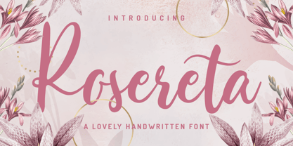 Rosereta - Lovely Script font with a natural handwritten feel. This handmade font will make your design has a beautiful natural touch for each details. It is perfect for any design project as Invitation,logo, book cover, craft or any design purposes. This font is PUA encoded which means you can access all of ligatures.
 - Drettany Signature by Typebae,
$15.00 Drettany Signature Font is a captivating handwritten signature script font that exudes elegance and sophistication. Its gracefully flowing curves and delicate strokes add a touch of refinement to any design project. Whether used for branding, invitations, or any creative endeavor, this font is sure to leave a lasting impression with its enchanting and distinctive charm.
 - The font named "Hendrix Demo" by The Scriptorium is a vivid encapsulation of both creativity and tribute, designed with an essence that echoes the legendary flair of Jimi Hendrix, to whom it ostensib...
- Rogsant Soft by Mans Greback,
$69.00 Rogsant Soft is a luxurious sans serif typeface that masterfully blends contrasting letterforms with a gentle flow and delicate rounded edges. Created by Mans Greback & Delaga, this fine and tasteful font emanates beauty and sophistication, making it a perfect choice for luxury branding, high-end fashion, and elegant design projects. The allure of Rogsant Soft lies in its attention to detail and meticulously crafted letterforms, which create a harmonious balance between refinement and legibility. With its clean and polished appearance, Rogsant Soft is an ideal choice for both print and digital designs that demand a touch of finesse and grace. The font is built with advanced OpenType functionality and has a guaranteed top-notch quality, containing stylistic and contextual alternates, ligatures, and more features; all to give you full control and customizability. It has extensive lingual support, covering all Latin-based languages, from Northern Europe to South Africa, from America to South-East Asia. It contains all characters and symbols you'll ever need, including all punctuation and numbers. Mans Greback is a typeface designer from Sweden, whose love for design and typography drives him to create innovative and versatile fonts. His commitment to quality and originality has earned him respect and appreciation from designers worldwide.
 - Rationell by PeGGO Fonts,
$29.00 Download PDF Instructions from https://peggofonts.com/download/Rationell-Instructions_4.59.pdf Behance presentation https://www.behance.net/gallery/88695175/Rationell Rationell is a functional multipurpose corporate typeface, based on classic 1950's swiss rationalism, subtle tuned on a XIX century didonesque modernist structure, a contemporary interpretation with the eyes of the Latin idiosyncrasy. Designed in 12 upright weight with 12 matching Italic, from Hairline to ExtraBlack, average weights (Light to Bold) are easily read on text sizes, printed and digital media, while Hairline to ExtraLight and ExtraBold to ExtraBlack are especially suitable for big contexts like headlines, poster and higher sizes as big as storefronts, monumental billboards or building size printed mesh covers. 40 OpenType features: Standard and Discretionary Ligatures, Lining, Old Style and tabular numerals, scientific and fractional forms, slashed zero, stylistic and contextual alternates (rounded dots, "Il" readability, auto roman numbers, auto group enclosed numbers, slashed zero on alphanumeric contexts), sensitive case, localized forms, glyphs composition/decomposition, access to all alternates. Rationell has a serious but kind timeless look, an ideal voice for corporate publishing, branding, wayfinding and complex technical information systems. It Supports 222 Latin based languages, with +2200 glyphs Rationell is capable to solve the most advanced nowadays global design needs.
 - Allioideae by URW Type Foundry,
$49.99 This fine lined display type face was named Allioideae because of the ascenders of the lower cases. They are rising upright with a single stroke and are ending - depending on the font style - into a spherical blossom. The name was chosen concerned to the plant allium, that forms an umbel at the top of a leafless stalk, when it is blooming. Allioideae is the name of a subfamily of monocot flowering plants in the family Amaryllidaceae. The name is derived from the generic name of the type genus, Allium. The wide and round capital letters are showing a nice contrast to the lower cases and giving the font a kind of female feeling. That provides a functional and lovely use in headlines for all beauty and cosmetics issues.The typeface appears in 4 different styles. a plain style – Allioideae, a stencil style - Allioideae Stencil, a (dotted) style for both - Allioideae Dot and Allioideae Stencil Dot. It supports multi language as it covers all the latin diacritics and a cyrillic character set. Lots of numbers as monospaced, lining figuers, old styles, sub- and superscript and many fractions in two different styles are giving a nice finish to that font. Also some matching ornaments are included.
 - Spitzkant by Julien Fincker,
$29.00 About the design Spitzkant is a serif typeface family that is characterized by strong contrasts. Pointed, sharp serifs and edges contrast with round and fine forms, making it very individual and expressive. This makes it particularly suitable for branding, editorial, packaging and advertising. The high-contrast display version has been complemented by a lower-contrast text version, making Spitzkant in combination suitable for both strong headlines and extensive body text. An allrounder that can be used for many purposes. Features The Spitzkant Head and Text family has a total of 2 optical sizes, 5 weights and 20 styles, from thin to bold and matching italics. With over 850 characters, it covers over 200 Latin-based languages. It also has an extended set of currency symbols and a whole range of open type features. For example, there are alternative characters as Stylistic Sets, Small Caps, automatic fractions and many other features. Ligatures Especially the extensive selection of ligatures (standard and optional) is a special feature which was an important part during the design process. With over 95 different ligatures there are many possibilities to give headlines and logos an individual touch. Get the Variable Font here: https://www.myfonts.com/fonts/julien-fincker/spitzkant-variable/
 - Phorfeit BRK Pro by CheapProFonts,
$10.00 Part futuristic + part rounded = totally psychedelic. This font is perfect for that 70s hippie look. I have totally redrawn the outlines, and redesigned a couple of glyphs that were too "mechanical". the slanted version has a 20 degree slant, and this speedier variant of Phorfeit BRK Pro is ready for use (for those who use software where you cannot slant the upright version yourself). ALL fonts from CheapProFonts have very extensive language support: They contain some unusual diacritic letters (some of which are contained in the Latin Extended-B Unicode block) supporting: Cornish, Filipino (Tagalog), Guarani, Luxembourgian, Malagasy, Romanian, Ulithian and Welsh. They also contain all glyphs in the Latin Extended-A Unicode block (which among others cover the Central European and Baltic areas) supporting: Afrikaans, Belarusian (Lacinka), Bosnian, Catalan, Chichewa, Croatian, Czech, Dutch, Esperanto, Greenlandic, Hungarian, Kashubian, Kurdish (Kurmanji), Latvian, Lithuanian, Maltese, Maori, Polish, Saami (Inari), Saami (North), Serbian (latin), Slovak(ian), Slovene, Sorbian (Lower), Sorbian (Upper), Turkish and Turkmen. And they of course contain all the usual "western" glyphs supporting: Albanian, Basque, Breton, Chamorro, Danish, Estonian, Faroese, Finnish, French, Frisian, Galican, German, Icelandic, Indonesian, Irish (Gaelic), Italian, Northern Sotho, Norwegian, Occitan, Portuguese, Rhaeto-Romance, Sami (Lule), Sami (South), Scots (Gaelic), Spanish, Swedish, Tswana, Walloon and Yapese.
 - Frogurt by Missy Meyer,
$14.00 Frogurt is a soft, plump, rounded slab serif font full of fun! Its fat curves make me think of frozen yogurt, and I've always preferred the shorthand "frogurt" to "fro-yo." I was inspired by a 30-year-old hand-carved wooden sign; when I went to try to find a font with a similar look, I couldn't really find anything soft and funky enough! It was a real Goldilocks situation: that one was too thin, that one's corners were too sharp, that one's baseline was too strict. So since I couldn't find something I liked, I made something I liked! I gave Frogurt big pillowy slab serifs, a slightly irregular baseline, and just enough tilt and variation to be fun while still keeping things really clean and readable. The outlines are cleaned up and sharp, so Frogurt will work well for both printing and cutting. Frogurt clocks in with just over 570 glyphs total, including all of the basics (A-Z, a-z, 0-9, and a ton of punctuation), plus over 310 extended Latin characters for language support, and over 50 alternates and ligatures to add some variety and flair. Frogurt is PUA-encoded for easy access to all characters.
 - Nanami Handmade by Thinkdust,
$10.00 Can we get a drum roll please? It’s not every day that a new link in a best selling chain is forged. First, there was Nanami, a font which took the world of type by force, storming to the top of MyFonts Hot New Fonts list; then there was Nanami Rounded, the most successful follow-up since Terminator 2. Well, say Hasta La Vista to boring design because now, there’s Nanami Handmade. With all the geometric, Japanese inspiration and style of the first two iterations, Nanami Handmade carries a quirky, mischievous charm. The font has a charisma matched by roguish anti-heroes; bad guys you love to love and good guys the other good guys hate, but everyone knows they’re what the audience turns up to see. Nanami Handmade comes in two styles, a solid and a hand-drawn, each of which has eight weights. Mix and match between these options to create a balanced piece which makes good use of the tactile, warm, earthy nature of the font. With these sans-serif styles working well in small and large sizes, both on and off screen, Nanami Handmade’s applications are virtually endless. Get your own piece of typography’s elite now, with Nanami Handmade, by Thinkdust.
 - Ribbons by Positype,
$20.00 Ribbon type. Holy grail of complex-lettering-turned typeface or an elusive Loch Ness monster that is often teased, possibly seen in the wild, but never confirmed? From the amazing lettering artist and author Martina Flor and masterful type designer Neil Summerour, comes the aptly named Ribbons. Ribbons is a sincere and well-conceived approach to providing a reliable solution to ribbon and ribbon-styled type for creative professionals when a lettering artist just isn’t available. Ribbons provides both flat and ‘folded’ options with the Regular and Fold styles, but then raises the bar with separate layer styles that will allow you to easily create the elegant back and forth movements produced with ribbon-style lettering we have all come to appreciate. These layer options are provided in both ‘smooth’ and ‘pleated’ connected styles. Flor and Summerour didn’t stop there. Each typeface was expanded with a number of stylistic alternates, additional swashed and flourished letters, ligatures, and even more in order to provide as many decorative options as possible to the creative. To round out the nine fonts available in the typeface and to ‘put a bow on it’, they’ve added a separate Shadow style and two different color fonts (available exclusively with family purchases).
 - Berndal by Linotype,
$29.99Bo Berndal, the master Swedish typographer, is the eponymous designer of Berndal, a contemporary text family with five different styles. This family represents a new achievement for Bo Berndal, who has spent many years working to optimize text legibility in the printed media. Several small tricks make the Berndal family an interesting milestone in legibility. Berndal's letterforms contain large x-heights. Large x-heights open up the counterforms of letters, making text appear lighter on a page, but their correspondingly shorter ascenders and descenders can hinder legibility. This does not occur in Berndal at all! Coupled with this experiment, Berndal's various font weights display a certain softness and roundness. The letterforms themselves are relatively wide, with an overall consistency in width. The calligraphic nature of the strokes has been minimized, yet a contrast stroke-thickness is still to be noticed within the alphabet. Berndal's five styles offer almost everything that one could want from a good text family. The Regular weight may be paired with Small Caps, Italic, Bold, and Bold Italic. All styles ship in the OpenType format, and include tabular and old style figures. The two italic weights are made up of true italics, not obliques. The Berndal family is a part of the Take Type 5 collection from Linotype GmbH." - Hyptis by TripleHely,
$16.00 “Hi! I’m Hyptis – the script font based on brush handwriting. I was drawn with a soft, wet brush and digitally cleaned with care, but some of my characters keep their natural texture. If you are looking for a font for logos, postcards, product packaging, quotes, text overlays – or anything else – I am a good choice!” Hyptis has two types of embedded auto-replacement: lowercase letters without connecting strokes (for a case of the last character of the word), and ligatures (for a case of two letters that do not pair well together). These features work well in many apps (even simple ones like Notepad/TextEdit), and if you need to customize their application – you could use programs that support OpenType features (for example, Adobe apps or CorelDraw). All these additional glyphs are PUA-encoded, so if your software does not support OpenType — you could access them through Character Map (Windows) or Font Book (Mac). Hyptis also has wide multilingual support: Western-, Central- and Eastern-European, Baltic, Turkish, Latin-type Africans, and Asian (94 languages in total). And finally, Hyptis comes with a bonus font, Hyptis Swashes, that includes a set of 26 swashes – linear, round or oval. To type it you could simply use small letters from ‘a’ to ’z’.
 - Targa Pro by Zetafonts,
$39.00 For many years license plates in Italy have been using a quite peculiar sans serif monospace typeface with slightly rounded corners and a geometric, condensed skeleton. These letterforms have been used by Cosimo Lorenzo Pancini as an inspiration for Targa, published as the first-ever Zetafonts typeface in 2003. Almost twenty years later, Francesco Canovaro has brought the project under scrutiny for a complete redesign, keeping its inventions, solving its issues, and making it into a versatile multi-weight typeface. The original type family has been developed in two subfamilies: Targa Pro Mono (which keeps the original monospace widths) and Targa Pro Roman (with proportional widths), both in five weights plus italics. The original family also included the handmade version Targa Hand which has been paired with a new Targa Pro Stencil to allow for more versatility and choice for display use. All weights of Targa Pro feature an extended latin character set covering over 200 languages, as well as a full set of Open Type features including positional numbers, alternates and stylistic sets. Halfway between postmodern appropriation of utilitarian design and rationalist design, Targa Pro sits comfortably at the crossroads between artificial nostalgia and modernist functionality, ready to surprise the user with its versatility and quirky Italian flavour.
 - Bengala by Andinistas,
$59.95 Bengala is a font based on Calligraphy & Geometry designed by Carlos Fabián Camargo. Its purpose is to be an innovative typographic system combining Script letters with geometric and hard Caps letters. The contradictory styles are ideal for designing covers, posters, branding and packaging. Its smooth calligraphic look meticulously incorporates characters to design logos and phrases that communicate dynamism and strategy. Bengala Script was inspired by Mistral by R. Excoffon. Bengala Script provides violent and unstable lines with generous spacing between the letters and tight horizontal proportions, producing showy upper and lower case italics inspired by French Gothic calligraphy late fifteenth century. For this reason, Bengala Script retains some uninterrupted calligraphic logic, up and down sometimes higher or shorter than the height of the lowercase, creating dynamism through a variable amount of contrast between thick and thin strokes. Bengala Dingbats has 62 drawings designed to accompany the designs. Script and Caps Bengala have different gender and the similar X height produces more visual appeal. This way Bengala Caps - inspired by the Porshe logo, due to its geometric uppercase Roman construction, extended horizontal proportions, light caliber, rounded strokes terminations and generous spacing between letters. Special thanks to John Moore and Manuel Corradine for their help with Open Type.
 - Quell by Underscore,
$35.00 Quell is a novel attempt to bridge the gap between geometrically constructed shapes on the one hand, and modulated strokes and subtle calligraphic influence on the other hand. The visual tension in Quell stems from conflict between two tendencies: The perfectly round shapes are geometrically constructed, yet the contrast of stroke widths and oblique line terminations suggest calligraphic roots. How this dualism affects typographic impression is up to designers and typographers using Quell — as variable font the seamless transition between modulated contrast and linear appearance offers unique typographic possibilities. Linear appearance gives the text a solid and compelling voice, whereas the modulated styles convey elegance, vibrance and a delicate tone. Quell is suited to display setting, headlines, way finding and identity. The combination of linear and contrast variants provides typographic range to convey different stance while rooted in the same visual heritage. In short paragraph typesetting the fonts have a modern look and characterful tone, but should not be overused for longer texts. Quell has been in development for over a year, and is the proud third release under the Underscore label. Released in 2018 this design by Johannes Neumeier is available from the Underscore webshop as well as selected retailers.
 - Hydrargyrum by Type Minds,
$15.00 Hydrargyrum is the Latin form of a Greek word meaning "liquid silver" - mercury. The Hydrargyrum typefaces are designed with characteristics both of a metal and a liquid. The basic shapes of the letters are generally rigid and rectangular (particularly in style C), but the forms are enhanced by fluid curves and gently rounded corners. Hydrargyrum is not recommended for use at small sizes or in lengthy passages of text. It performs best in display-sized settings. Hydrargyrum consists of three styles, each in medium and semibold weights with matching obliques. The A style features solid, standard letterforms including the two-story a and g. Style B substitutes the a, g, M, and N (and related glyphs including numero and trademark symbols) for alternate shapes. The third subfamily takes the rectangular theme to an extreme, eliminating as many slanted strokes as possible from the letterforms. This makes some C-style letters ambiguous with one another, such as the U's and V's. As such, the C style is best used carefully even at larger sizes. The Hydrargyrum fonts are style linked within each style subfamily with, for example, Hydrargyrum A Medium as the regular style, Hydrargyrum A Medium Oblique as the italic, Hydrargyrum A SemiBold as the bold option, etc.
 - Bordonaro Spur by Estudio Calderon,
$35.00 Bordonaro Spur - Bordonaro Script’s partner - is a typography strongly influenced by old beer labels and includes some serifs based on Frederic W. Goudy’s Copperplate, but with some softened spurs adding an elegant and soft texture to the text. It is ideal to be used on large bodies and has a set of special ligatures ideal to be used in branding. Psss...Check out the NEW Bordonaro Spur with Rounded corners , same version but soft! FEATURES Co = company1 Co = company2 Estd = established Inc = incorporated Ltd = limited Mc = mac Rd = Road St = street And also from Adobe CC you can activate Style Sets (SS) and get ideal ligatures for ordinal numbers: 1st = st 2nd = nd 3rd = rd 4th = th Bordonaro Script and Bordonaro Spur are two typographic styles that were designed under the same characteristic features with the idea of combining them to obtain better results, for that reason, we recommend merging them in a creative way and you will realize everything you can design with them. The banners designs are based on old brands of beer labels, coffee packaging, sports logos and in some cases we use Copperplate Gothic but only as a complementary font in order to harmonize the layout of the elements in each banner.
 - Fresh Spirit by Yumna Type,
$25.00 It can be a time-wasting process to find a perfect font for your projects that unfortunately may end in unexpected results as you want to stand out your unique designs without spending hours on searching the right font. For that reason, we would like to introduce you to Fresh Spirit. Fresh Spirit is a unique display font in round, twisting styles on the letters' edges. It is very suitable to apply for products related to food and drink especially fruit due to its fun, cute characteristics. Fresh Spirit font, which provides a clipart in line with the theme as a bonus, will create some soft, fun, adorable nuances and increase visual attractiveness to your designs. In addition, you can enjoy the available features here. Features: Multilingual Supports PUA Encoded Numerals and Punctuations Fresh Spirit fits best for various design projects, such as brandings, headings, magazine covers, quotes, printed products, merchandise, social media, etc. Find out more ways to use this font by taking a look at the font preview. Thanks for purchasing our fonts. Hopefully, you have a great time using our font. Feel free to contact us anytime for further information or when you have trouble with the font. Thanks a lot and happy designing.
 - Molhim by Ethar Elaagib,
$79.00 About Molhim: I first designed Molhim in 2016 as a personal project to digitalize my handwriting. Molhim 2016 was a static typeface, including two weights, and supported basic Arabic only. Since it was my first typeface to design, it had several issues regarding letterform design and aesthetics, good curve drawing, proportions, font programming, and correct OpenType features. So, in 2019 I started redesigning my handwriting font from the beginning to produce a neat Multi-lingual typeface suitable for diverse purposes. Arabic letterforms are redrawn with a focus on proportions and unity. Molhim Variable characteristics: Supports basic Arabic, and Arabic script-based languages, such as Persian and Urdu. Supports Basic and extended Latin characters. Includes 200+ ligatures and alternate styles for a natural flow of letters. Latin small letters have both separated and connected script forms. The variable font comes in two axes, Weight (wght) and Softness (SOFT): The Weight axis ranges from thin to bold, while Softness changes the stroke's cap from a round cap to a sharp projecting cap. Although I see the new Molhim Variable as a different typeface, I decided to keep the name 'Molhim' for the new typeface with the addition of 'Variable'. Molhim is an Arabic word that means 'inspiring'; this is how I hope people would perceive my handwriting.
 - Megumi by Eclectotype,
$70.00 Megumi was originally commissioned as a headline face for a fashion and lifestyle magazine with a heavy Japanese influence. The uppercase letters are narrow and have an almost monospaced aesthetic, being influenced by Romaji letterforms. Serifs are severe, and curves sinuous. Although experiments were made with extra weight, it was decided that only this ultra light weight would be developed, to be set large in headlines. The italic has an over-the-top 35° slant (so slanted in fact that the backslash from the italic is the exact same shape as the forward slash in the Roman) and a discretionary ligature feature that can be engaged to add extra interest to headlines. The Roman has a few wide alternate glyphs for round uppercase characters. Both styles have a stylistic set (ss03) feature which switches regular parentheses for angle brackets, which the Art Director thought “looked cool”. In a mess of venture capitalist pull-outs and Covid related issues, the publication never came to be, but the Hipster Japanophile Magazine World’s loss is your gain, as this beautifully crafted, editorial oddity is now available to license. Use it editorially, obviously, but it would also look great on posters, perfumes, postmodern publications, and perhaps some other things that don’t begin with p.
 - Oktah by Groteskly Yours,
$15.00 Oktah is a geometric grotesk that comes both as a variable font and 22 static fonts: 11 uprights and 11 matching italics, which make it a great tool for those seeking a versatile font with a strong character and high legibility. Throw in a very pleasing look, elegant curves and a wide range of weights, and you'd get what Oktah aspires to be: a perfect typographic tool for every need.In Oktah, elegant geometric curves meet bold strokes and wide apertures. Round letters are nearly circular, but, to boost readability, slight changes were introduced for optical compensation. Oktah is also equipped with amazing OpenType features: case sensitive punctuation, ligatures, fractions, superscript and subscript figures, two kinds of circular figures, stylistic & contextual alternatives and much more! Oktah supports all major European languages, as well as Vietnamese and some dozens of foreign languages that you may encounter in your designs. We've got all that covered. The glyph count for each of the styles is 800+ characters. Two styles (Extra Light and Bold Italic) are free to try and experiment with. If you need wide language support and more extensive OpenType features, consider taking a look at Oktah Neue, a bigger version of the classic Oktah.
 - PF Encore Sans Pro by Parachute,
$79.00 Encore Sans Pro is a sans serif which projects an image of reliability, authority and competence making it ideal for corporate applications. A functional typeface which combines utility with style. It’s subtle round characteristics such as the slightly curved-in edges, create a distinctly contemporary look, blending effectively traditional with modern details. Encore Sans Pro has received 3 international awards and distinctions including a Silver at the european ED Awards 2010. This is a contemporary typeface which may function as the perfect alternative to several overused classic sans. Encore Sans Pro does not pretend being different but it does claim its own personality. It is simple and stylish. Furthermore, it is extremely versatile. It comes with 22 weights and supports simultaneously Latin, Greek and Cyrillic. Each font contains 1535 glyphs and is loaded with 22 advanced OpenType features. Extreme weights, such as the elegant hairline, are carefully designed to establish an even color throughout, while ultra black despite its heavy characteristics is quite legible and powerful. Other intermediate weights such as light and book are ideal as body text for magazines and catalogs. Every font in this series has been completed with 270 copyright-free symbols, for packaging, public areas, environment, transportation, computers, fabric care and urban life.
 - Stars & Love by Roland Hüse Design,
$22.00 Stars & Love is a bold, cursive brush calligraphy font, influenced by retro script style with a friendly rounded look and flourished elegance. It features stylistic alternates, contextual alternates, standard ligatures and terminal forms (beginning and ending characters are a bit different) that ensures multiple options for you to choose from for your design work. This font comes in two instances, a Bottom Heavy and a Regular version. Being friendly yet elegant in its visual presence, Stars & Love is perfect for Love theme designs, premium packaging, stationery design, invitations, posters, logos, custom products and more. The Character set covers most Latin languages. Font Guide PDF Font presentation video For feedback, customisation or extra character request please email me at fonts@rolandhuse.com Font Features: • Latin character set: Uppercase & Lowercase A - Z • Stylistic Alternates (up to 3 Sets) • Contextual Alternates (Initial and Final Forms) • Standard Ligatures • Underline Swashes (Stylistic alternates for underscore) • Numerals & Punctuation • Accented Characters • Symbols (Currencies and basic symbols such as @ # % etc.) Please refer to the Font Guide pdf for more details. To access all features of Stars & Love such as stylistic alternates etc., it's highly recommended to use professional design software such as Adobe Illustrator, Adobe Photoshop, Adobe InDesign or Procreate (via 'add text' feature).
 - Monolight by Mostardesign,
$25.00 The Monolight font family is a modern and versatile creation that perfectly blends roundness and simplicity to give your designs a modern and elegant look. With its low-contrast characteristics, this font family can be used for a wide variety of communication projects, ranging from advertising posters to institutional communication media, to professional presentations. In addition to its aesthetic design, Monolight offers advanced technical features, including a set of stylistic variants that allow you to explore different options for customizing letter style. This font is also case sensitive, meaning uppercase and lowercase letters are designed to work harmoniously together. Furthermore, Monolight comes equipped with a complete set of old-style and tabular numerals, providing great precision in tables and professional documents. This feature is particularly useful for professionals in marketing, finance, and accounting who seek to give their tables a professional and well-organized appearance. Finally, the Monolight font is available in 9 weights ranging from Thin to Heavy with corresponding italics, allowing designers to play with contrasts and typographic effects to give their creations a unique and personalized look. With its advanced features and elegant design, the Monolight font is the perfect tool for communication and design professionals looking to create modern and professional projects that stand out from the competition.