10,000 search results
(0.075 seconds)
- Vermina by Flawlessandco,
$9.00 Vermina is a beautifully crafted Sans-Serif that is perfect for any design project. An Original typeface that suitable for any graphic designs such as branding materials, t-shirt, print, business cards, logo, poster, t-shirt, photography, quotes .etc This font support for some multilingual. Modern Sweet Retro that contains uppercase A-Z and lowercase a-z, alternate character, numbers 0-9, and some punctuation. If you need help, just write me! Thanks so much for checking out my shop!
 - Hockleys by Maulana Creative,
$11.00 Hockleys is a Cursive script font. With light mono-line stroke, slant and fun character with a bit of ligatures and a bit lower alternates. To give you an extra creative work. Hockleys font support multilingual more than 100+ language. This font is good for logo design, Social media, Movie Titles, Books Titles, a short text even a long text letter and good for your secondary text font with sans or serif. Make a stunning work with Hockleys font. Cheers, MaulanaCreative
 - Electronica by Graviton,
$20.00 Electrónica font family has been designed for Graviton Font Foundry by Pablo Balcells in 2019. It is a rounded, geometric sans serif typeface with display details and sharp, playful shapes for a fun and laid back usage. Electrónica has been conceived to be most suitable for logos, headlines and display design pieces as well as short length text blocks. Electrónica consists of 12 styles, 8 of which containing small caps and glyph coverage for several language and 4 of which are free.
 - Amore Roses by Maulana Creative,
$11.00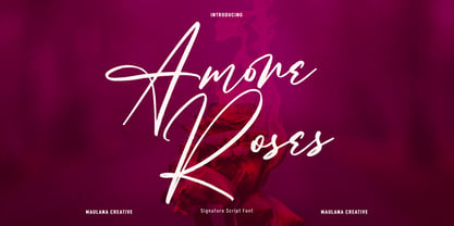 Amore Roses is a beauty elegant signature script font. With high contrast stroke, fun character with a bit of ligatures and alternates. To give you an extra creative work. Amore Roses font support multilingual more than 100+ language. This font is good for logo design, Social media, Movie Titles, Books Titles, a short text even a long text letter and good for your secondary text font with sans or serif. Make a stunning work with Amore Roses font. Cheers, Maulana Creative
 - Dreamotions by Maulana Creative,
$14.00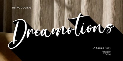 Dreamotions is a handwritten script font With high contrast stroke and fun character. It has Opentype features of ligatures character, To give you an extra creative work. Dreamotions handwritten script font support multilingual more than 100+ language. This font is good for logo design, Social media, Movie Titles, Books Titles, a short text even a long text letter and good for your secondary text font with sans or serif. Make a stunning work with Dreamotions handwritten script font. Cheers, MaulanaCreative
 - SG Sunblum by Studio Gulden,
$20.00 Introducing the "SG-SUNBLUM" font, a modern sans-serif typeface that stands out from the crowd with its extraordinary design elements. This font features sleek, elongated lines and bold, asymmetrical letterforms that give it a dynamic and eye-catching appearance. It also includes an extensive range of special characters and multilingual support for added versatility. Whether you're looking for a font for a headline, logo, or any other design project, SG-SUNBLUM is sure to make a bold statement and capture attention.
 - Summit Foxes by Maulana Creative,
$14.00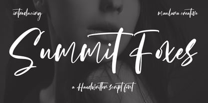 Summit Foxes is an expressive handwritten script font. With high contrast stroke, fun character with a bit of ligatures and alternates. To give you an extra creative work. Summit Foxes font support multilingual more than 100+ language. This font is good for logo design, Social media, Movie Titles, Books Titles, a short text even a long text letter and good for your secondary text font with sans or serif. Make a stunning work with Summit Foxes font. Cheers, Maulana Creative
 - Fallen City by Maulana Creative,
$15.00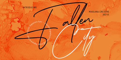 Fallen City is a Casual Expressive Signature font. With light mono-line stroke, slanted and fun character with a bit of ligatures and lowercase alternates. To give you an extra creative work. Fallen City font support multilingual more than 100+ language. This font is good for logo design, Social media, Movie Titles, Books Titles, a short text even a long text letter and good for your secondary text font with sans or serif. Make a stunning work with Fallen City font. Cheers, MaulanaCreative
 - Farloxy by Maulana Creative,
$14.00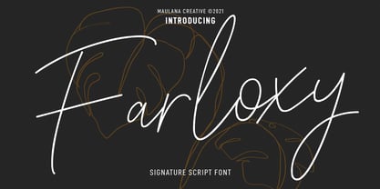 Farloxy is a Casual Signature script font. With light mono-line stroke, slant, Condensed and fun character with a bit of ligatures and lowercase alternate. To give you an extra creative work. Farloxy font support multilingual more than 100+ language. This font is good for logo design, Social media, Movie Titles, Books Titles, a short text even a long text letter and good for your secondary text font with sans or serif. Make a stunning work with Farloxy font. Cheers, MaulanaCreative
 - Nebulosa by Graviton,
$20.00 Nebulosa font family has been designed for Graviton Font Foundry by Pablo Balcells in 2020. It is a futuristic, slightly extended sans serif typeface with semi rounded endings that provide a softened aesthetic without losing its solidity. Nebulosa has been conceived to be most suitable for logos, headlines and display design pieces as well as short length text blocks. Nebulosa consists of 10 styles, 8 of which containing small caps and glyph coverage for several language and 2 of which are free.
 - Kakadu by Ludwig Type,
$55.00 Kakadu is a squarish sans serif, designed to work equally well on paper and on screen. The angular curves in this typeface create a firm and dependable appearance. The square-like forms also provide an inward openness and allow large and open letterforms, adapting perfectly to the orthogonal pixel grid of the monitor. Kakadu works well in small sizes while, it appears strong and distinguished in larger ones. Play the classic snake game and see the Kakadu fonts in action here.
 - Sack and Jelly by Maulana Creative,
$12.00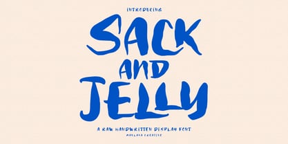 Sack and Jelly is a fancy handwritten font. With bold contrast stroke, fun character with a bit of ligatures. To give you an extra creative work. Sack and Jelly font support multilingual more than 100+ language. This font is good for logo design, Social media, Movie Titles, Books Titles, a short text even a long text letter and good for your secondary text font with sans or serif. Make a stunning work with Sack and Jelly font. Cheers, Maulana Creative
 - MC Dear Eloise by Maulana Creative,
$13.00 Dear Eloise is an unique fancy signature script font. With regular mon-line stroke, fun character with a bit of ligatures and alternates. To give you an extra creative work. Dear Eloise font support multilingual more than 100+ language. This font is good for logo design, Social media, Movie Titles, Books Titles, a short text even a long text letter and good for your secondary text font with sans or serif. Make a stunning work with Dear Eloise font. Cheers, Maulana Creative
 - MC Syntak by Maulana Creative,
$16.00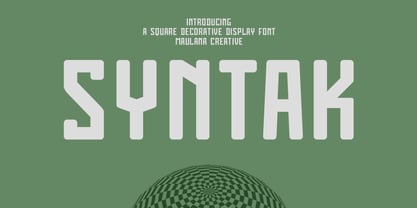 Syntak is an all caps Tech vibe square-is Display Sans font. Regular stroke, fun character with a bit of ligatures and alternates. To give you an extra creative work. Syntak font support multilingual more than 100+ language. This font is good for logo design, Social media, Movie Titles, Books Titles, a short text even a long text letter and good for your secondary text font with script or serif. Make a stunning work with Syntak font. Cheers, Maulana Creative
 - MC Camcode by Maulana Creative,
$12.00 Camcode is a semi Bitmap style with round edges Display sans font. Regular stroke, fun character with a bit of ligatures and alternates. To give you an extra creative work. Camcode font support multilingual more than 100+ language. This font is good for logo design, Social media, Movie Titles, Books Titles, a short text even a long text letter and good for your secondary text font with script or serif. Make a stunning work with Camcode font. Cheers, Maulana Creative
 - MC Karbin by Maulana Creative,
$16.00 Karbin is an All Caps sans Display font with slant style. Round Heavy stroke, fun character with a bit of ligatures and alternates. To give you an extra creative work. Karbin font support multilingual more than 100+ language. This font is good for logo design, Social media, Movie Titles, Books Titles, a short text even a long text letter and good for your secondary text font with script or serif. Make a stunning work with Karbin font. Cheers, Maulana Creative
 - Moressans by IKIIKOWRK,
$17.00 Introducing Moressans - Luxurious Type, created by ikiiko. Moressans is a sans serif type with a thin and rounded shape. A simple font, with a thin size, adds to the impression of elegance and also fashionable too. This typeface is perfect for an elegant logo, branding, fashion brand, luxury brand, layout magazine, beauty product, packaging product, quotes, or simply as a stylish text overlay to any background image. What's included? Uppercase & Lowercase Number & Punctuation Alternates Multilingual Support Works on PC & Mac
 - Grafilone by Linotype,
$29.99Linotype Grafilone is part of the Take Type Library, which features winners of Linotype’s International Digital Type Design Contest. In creating his font, Bo Berndal combined elements of the constructed and Art Deco styles. Slender and angular, Grafilone is mechanically exact and coolly resesrved. A distinguishing characteristic is the combination of angular and sloping strokes, which give the font a dynamic feel. Grafilone is particular good as a headline font and for initials when combined with constructed sans serif fonts. - Brad Rowland by Maulana Creative,
$15.00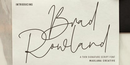 Brad Rowland is a fancy handwritten script font. With medium contrast stroke, fun character with a bit of ligatures and alternates. To give you an extra creative work. Brad Rowland font support multilingual more than 100+ language. This font is good for logo design, Social media, Movie Titles, Books Titles, a short text even a long text letter and good for your secondary text font with sans or serif. Make a stunning work with Brad Rowland font. Cheers, Maulana Creative
 - Quiney Loves by Maulana Creative,
$14.00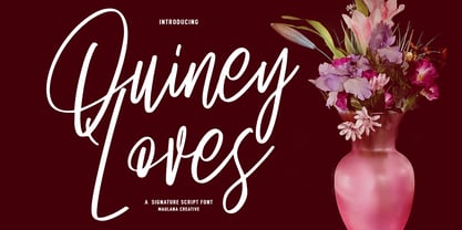 Quiney Loves is a slanted modern signature script font. With regular contrast stroke, fun character with a bit of ligatures and alternates. To give you an extra creative work. Quiney Loves font support multilingual more than 100+ language. This font is good for logo design, Social media, Movie Titles, Books Titles, a short text even a long text letter and good for your secondary text font with sans or serif. Make a stunning work with Quiney Loves font. Cheers, MaulanaCreative
 - Kristafly by Maulana Creative,
$11.00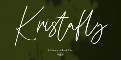 Kristafly is a brush script font With rough brush stroke and fun character. It has Opentype features of rich ligatures character, To give you an extra creative work. Kristafly brush script font support multilingual more than 100+ language. This font is good for logo design, Social media, Movie Titles, Books Titles, a short text even a long text letter and good for your secondary text font with sans or serif. Make a stunning work with Kristafly brush script font. Cheers, MaulanaCreative
 - Warzone by Arterfak Project,
$23.00 Warzone is a minimalist techno font. Based on sans serif design, developed to techno style with the minimalist stencil concept and sharp edges. Quipped with extra alternate characters that give you more variations on your design. This font has geometric shapes that are perfect for a futuristic theme, techno, digital, sci-fi, and hipster style. Warzone is an all-caps font that has a solid version in the lowercase. A great choice to apply for many purposes. Thank you and happy designing!
 - Astavilla by Maulana Creative,
$11.00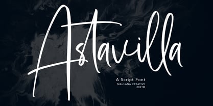 Astavilla handwritten script font, with contrast felt-tip stroke, uprights and fun character. It has Opentype features ligatures of character and alternate lowercases, To give you an extra creative work. Astavilla script font support multilingual more than 100+ language. This font is good for logo design, Social media, Movie Titles, Books Titles, a short text even a long text letter and good for your secondary text font with sans or serif. Make a stunning work with Astavilla font. Cheers, MaulanaCreative
 - Minora by Alex Meier,
$40.00 Minora is a contemporary sans serif type family of three weights. Glyphs with open, plain and reduced forms are attributes of Minora. Several OpenType features allow different figure sets, fractions and more. Minora had its beginning in 2007 during Alex Meier’s Typedesign study (CAS Typedesign) at the ZHdK in Zurich (Switzerland). After graduation, Alex Meier continued working on this project in a shared studio with his former fellow student Dominique Kerber . He completed this fully developed font in April 2011.
 - Nastyflashy by Maulana Creative,
$11.00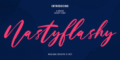 "Nastyflashy" is an expressive brush script font. With regular brush stroke, fun character with a bit of ligatures and has a two files lowercase alternates and swashes. To give you an extra creative work. "Nastyflashy "font support multilingual more than 100+ language. This font is good for logo design, Social media, Movie Titles, Books Titles, a short text even a long text letter and good for your secondary text font with sans or serif. Make a stunning work with "Nastyflashy" font. Cheers, MaulanaCreative
 - Le Patterns by Maulana Creative,
$11.00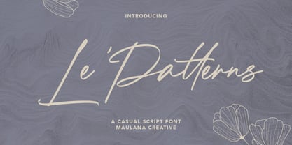 Le Patterns is a casual script font, With a high contrast stroke clean and fun characters. It has Opentype features of ligatures, makes it a perfect choice for branding and digital designs. Use this font for logos, social media, websites, blogs, instagram, social media, business cards, branding, and more! Le Patterns font support multilingual more than 100+ language. and good pair for your secondary text font with sans or serif. Make a stunning work with Le Patterns script font. Cheers, MaulanaCreative
 - Kartbones by Maulana Creative,
$15.00 Kartbones is a Casual Signature script font. With thin contrast stroke, super slanted and Unique Upper and lower character with a bit of ligatures. To give you an extra creative work. Kartbones font support multilingual more than 100+ language. This font is good for logo design, Social media, Movie Titles, Books Titles, a short text even a long text letter and good for your secondary text font with sans or serif. Make a stunning work with Kartbones font. Cheers, MaulanaCreative
 - Breul Grotesk by Typesketchbook,
$55.00 Taking inspiration from an attempt to marry art with industry of Bauhaus (1919), Brueul Grotesk is classic and straightforward, cutting back superfluous elements. A Sans Serif type, it’s like a design from the Machine Age. It comes in A and B sets to offer end variations—choose the bulbous terminals set if you need a less stern impression. It is then suitable for diverse demands. Brueul Grotesk has A and B sets with 16 weights each, giving you an all-purpose usage typeface.
 - Gastank by Maulana Creative,
$14.00 Gastank is a modern handwritten script font, With a rough marker brush stroke and fun characters. It has Opentype features of ligatures, makes it a perfect choice for branding and digital designs. Use this font for logos, social media, websites, blogs, instagram, social media, business cards, branding, and more! Gastank font support multilingual more than 100+ language. and good pair for your secondary text font with sans or serif. Make a stunning work with Gastank marker handwritten script font. Cheers, MaulanaCreative
 - The Impostor by Maulana Creative,
$15.00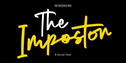 The Impostor is a regular casual script font. With sharp felt-tip stroke, slant and fun character with a bit of ligatures. To give you an extra creative work. The Impostor font support multilingual more than 100+ language. This font is good for logo design, Social media, Movie Titles, Books Titles, a short text even a long text letter and good for your secondary text font with sans or serif. Make a stunning work with The Impostor font. Cheers, MaulanaCreative
 - Honey Rain by Maulana Creative,
$14.00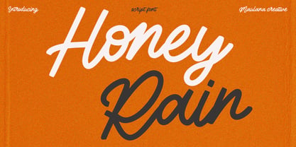 Honey Rain is a fancy handwritten script font. With regular mono-line stroke, fun character with a bit of ligatures and alternates. To give you an extra creative work. Honey Rain font support multilingual more than 100+ language. This font is good for logo design, Social media, Movie Titles, Books Titles, a short text even a long text letter and good for your secondary text font with sans or serif. Make a stunning work with Honey Rain font. Cheers, Maulana Creative
 - Sofia Hives by Maulana Creative,
$13.00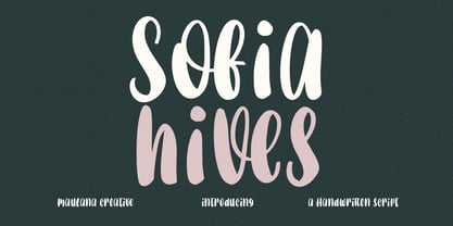 Sofia Hives is a fancy handwritten script font. With bold high contrast stroke, fun character with a bit of ligatures and alternates. To give you an extra creative work. Sofia Hives font support multilingual more than 100+ language. This font is good for logo design, Social media, Movie Titles, Books Titles, a short text even a long text letter and good for your secondary text font with sans or serif. Make a stunning work with Sofia Hives font. Cheers, Maulana Creative
 - Handu by Alex Jacque,
$20.00 Handu, designed by Alex Jacque in 2012, is an affable hand-drawn sans-serif inspired by the hand-painted type and signage on the streets of Kolkata, India. Fitting then that it come to life with brush and paint. When used for display purposes the organic, painted texture of Handu's glyphs really shines. At smaller point-sizes the hand-drawn aesthetic still translates. Handu comes in two styles, regular and shadow. Use each independently or overlay them for a little youthful emphasis.
 - NewNerdish by Ingrimayne Type,
$9.95 A sans-serif face in which the circular elements have become almost square, NewNerdish resembles a number of typefaces which have become associated with a modernistic, computer look. There is little or no variation in the weight of horizontals, diagonals, and verticals. It comes in two widths each with five weights and each weight has an oblique version, which has the same letter shapes as the upright version. The ShadowedInside style is designed to be used in a layer with the Shadowed style.
 - Blackbirdy by Maulana Creative,
$15.00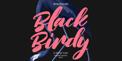 Blackbirdy is a super slanted script font. With bold contrast stroke, slanted, fancy and fun character with a bit of ligatures and lowercase alternates. To give you an extra creative work. Blackbirdy font support multilingual more than 100+ language. This font is good for logo design, Social media, Movie Titles, Books Titles, a short text even a long text letter and good for your secondary text font with sans or serif. Make a stunning work with Blackbirdy font. Cheers, MaulanaCreative
 - Pure Grapes by Maulana Creative,
$13.00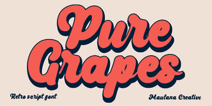 Pure Grapes is a fancy handwritten script font. With bold contrast stroke, fun character with a bit of ligatures and alternates. To give you an extra creative work. Pure Grapes font support multilingual more than 100+ language. This font is good for logo design, Social media, Movie Titles, Books Titles, a short text even a long text letter and good for your secondary text font with sans or serif. Make a stunning work with Pure Grapes font. Cheers, Maulana Creative
 - Brojeria by Maulana Creative,
$14.00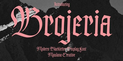 Bojeria is a Classic modern Blackletter font. With medium high contrast stroke and smooth edges, fun character with a bit of ligatures and alternates. To give you an extra creative work. Bojeria font support multilingual more than 100+ language. This font is good for logo design, Social media, Movie Titles, Books Titles, a short text even a long text letter and good for your secondary text font with sans or serif. Make a stunning work with Bojeria font. Cheers, Maulana Creative
 - Anklettes by Maulana Creative,
$15.00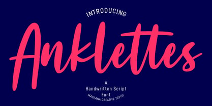 Anklettes is a fancy handwritten script font. With bold stroke, slant and Unique Upper and lower characters with bit of ligatures and alternate lowercase. To give you an extra creative work. Anklettes font support multilingual more than 100+ language. This font is good for logo design, Social media, Movie Titles, Books Titles, a short text even a long text letter and good for your secondary text font with sans or serif. Make a stunning work with Anklettes font. Cheers, MaulanaCreative
 - Just Hopes by Maulana Creative,
$12.00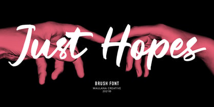 Just Hopes is an script font. With natural feel brush stroke, slanted and fun character with a bit of ligatures and vector version. To give you an extra creative work. Just Hopes font support multilingual more than 100+ language. This font is good for logo design, Social media, Movie Titles, Books Titles, a short text even a long text letter and good for your secondary text font with sans or serif. Make a stunning work with Just Hopes font. Cheers, MaulanaCreative
 - Kasa Green by Maulana Creative,
$11.00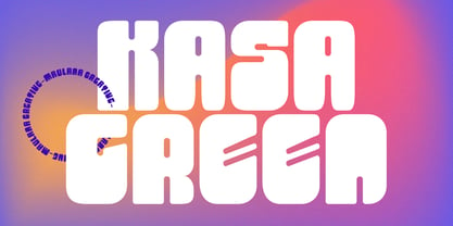 Kasa Green is a fancy handwritten script font. With bold contrast stroke, fun character with a bit of ligatures and alternates. To give you an extra creative work. Kasa Green font support multilingual more than 100+ language. This font is good for logo design, Social media, Movie Titles, Books Titles, a short text even a long text letter and good for your secondary text font with sans or serif. Make a stunning work with Kasa Green font. Cheers, Maulana Creative