10,000 search results
(0.028 seconds)
- Coachella by Sarid Ezra,
$15.00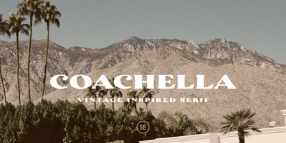 Introducing Coachella, a serif typeface with vintage vibes! Coachella is a vintage inspired serif that will make your project more vintage and modern. You can use this font for any project, such as poster, music concert announcement, or for your logo. This font have a rough detail that will make your design more handmade. This font also support multi language.
 - Secret Mango by Bejeletter,
$14.00 "Secret mango" ia a simple character shapes and open counters, make for an exceptionally legible design. Secret mango consist 9 weight of slab serif with matching oblique to make more touch and allowing you to make each word look completely stylish. True to the reflection of Slab serif, always associated with confidence, solidarity and courage, "Secret Mango" represents all of that.
 - Frusta by District,
$20.00 Frusta is an earnest family of slab-serifs softened by tapered serifs and slightly squared curves that give it a warmth often absent in other slabs. Monoline and with a geometric foundation, this three-weight family includes true italics that can be their own headline face. The airy, yet sturdy construction makes this perfect for small text, infographics, and headlines of all sizes.
 - Chantila by Tropical Sunlight Co.,
$20.00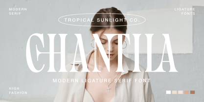 Chantila - Modern Serif Font The font is called "Chantila", it is modern serif with fashionable themes. The font comes with many beautiful ligature features. This collection matches apply in some designs such as the logotype, quotes, wedding invitation, business card, packaging, branding, and more custom design. Chantila font includes : Uppercase, lowercase, numeral, symbol and punctuation Alternate and Ligature Multilingual PUA Encoded
 - Claire Murphy by Sarid Ezra,
$17.00 Introducing, Claire Murphy - a stylish italic serif with bunch of alternates! Claire Murphy is a classic and stylish italic serif with a bunch of alternates that will make your presentation or logo even more stunning and elegant. You can use this font for any purpose, such as a wedding invitations, logo, or instagram post. This font also support multilingual and already PUA Encoded.
 - Bolognia by Craft Supply Co,
$15.00 Bolognia is a classic serif typeface with high-contrast leaning to the concept of contemporary typefaces. Bolognia has a tall x-height value, modern proportion, transitional serif and extreme stroke contrast with vertical stress. Available in 6 weights, this typeface is a good choice to provide clear solutions for a variety of situations and settings such as editorials and headlines.
 - Aligha by Zane Studio,
$20.00 Introducing the new Elegant Modern Serif!!! Aligha is a modern, elegant and classy serif typeface, best suited for displaying titles, logos, branding, magazines, product packaging and invitations. Shiny comes with clean lines and smooth curves that add an extra touch of class to any project. Aligha is built with OpenType features and includes 110 ligatures, alternatives, numbers, punctuation, and also supports other languages.
 - Alore by AB Studio,
$9.49 Alore is a modern serif font family in geometric design, based on the complimenting design of AB ONE. By focusing on the small details during the design, a font was made that comes with a very dynamic style, combining modern elements with classical serif elements. Use Alore for a wide range of your projects, from headlines all the way to messages and text.
 - Stymie by Linotype,
$40.99In 1931, Morris Fuller Benton created the Stymie typeface for the American Type Founders (ATF). Stymie is a reworking of a slab serif type that was popular in Europe at that time, Memphis. For the past one hundred fifty years, slab serif types (sometimes called Egyptian or Egyptienne-style faces) have been a popular choice for headline text in newspapers, magazines, and advertising. - Resvina by Yohanes Oktav,
$15.00 Resvina is a Serif Display Typeface that seamlessly blends classic elegance with a modern touch. With its sophisticated serifs and high contrast, it commands attention for headlines and titles. What sets Resvina apart is its extensive alternates and ligature options, providing designers with creative freedom and versatility. Ideal for projects that demand refined typography, Resvina adds a timeless charm to any design
 - Oblygasi by Wildan Type,
$14.00 Oblygasi is a modern serif font with a unique ligature and aletrnate style. A simple serif with a touch of curves on the top and bottom of the stemp gives a special impression. Combaine with high contrast and slat style perfect for feminine logo signs, fashion heads & editorial designs, branding projects, Clothing Branding, packaging, magazine headings, advertising, T-shirts, postcards and much more.
 - The Roseberry by me55enjah,
$8.00 Introducing The Roseberry, a classic handmade serif. The Roseberry is a handmade serif display typeface, inspired by classic western poster. Imperfect lines and edges lead us to a classic look. In 3 different kind of style, The Roseberry can simply give a vintage vibe on your design. Features: * 3 different style: Roseberry Solid, Outline & Codet. * All caps, numbers and punctuation.
 - Luxury Home by Fo Da,
$5.00 Luxury Home is a slab serif typeface of 9 weights from Extra Light to Extra Black and can be used as both a headline and text face. "Luxury Home" is recommended for using in long-form writing and articles, since a serif is far more readable for longer passages of text. The typeface has a carefully crafted weight range, with ligatures .
 - Cardin by Flavortype,
$19.00 We're introducing Cardin, A Big, Bold, Juicy script paired with bold serif. A captivating duo that effortlessly combines the bold playfulness of script with the timeless elegance of serif. With two distinct styles, this font set offers the perfect blend of contemporary trends and a touch of vintage allure, resulting in a harmonious balance that is both visually striking and versatile.
 - Les Folies JNL by Jeff Levine,
$29.00An early 20th-Century French lettering book displayed at an online image sharing site stood out with a hand-lettered version of a classic Victorian font. The lettering - a spur serif top and a split serif (or "Western-style") bottom is the basis for Jeff Levine's Les Folies JNL. All of the nuances and idiosyncracies of hand-lettering are left intact. - Argumend by Ayca Atalay,
$29.00 Argumend | A Humanistic Slab Serif Typeface Argumend is a versatile slab serif typeface with a wide range of Opentype features. Create strong and eye catching headlines with its upper case ligatures or make use of its many weights and true italics to create mindful body copy; either way, Argumend is rich with typographic options to help create attention worthy text.
 - Zenaida by Hanken Design Co.,
$30.00 Zenaida is a distinctive display serif font adorned with stylized serifs, evoking a floral essence. Its graceful, flowing ligatures and stylistic alternates add an organic touch to text. Featuring a range of styles including Regular, Medium, Bold, ExtraBold, and an additional semibold weight, Zenaida offers versatility across various design applications, providing a diverse set of options to infuse character and distinction into projects.
 - The Franky Dunkey by Zeenesia Studio,
$17.00 The Franky Dunkey is a Bold style serif font with strong character and soft features. modern and classic serif font with a clear and bold look. It’s a very versatile font that works great in large. Perfect for editorial projects, Logo design, web font, clothing branding, product packaging, magazine headers, or simply as a stylish text overlay to any background image.
 - Luxiana by Canden Meutuah,
$15.00 Serif is a modern serif font packaged in a modern and classy style, complete with access to your feature to access a large selection of alternative letters and ligatures, the choice of letters you like from various uppercase and lowercase letters for a luxurious impression and elegant appearance. this is equipped with full uppercase, lowercase, numbers and punctuation + Multi-language support
 - Kangmas by Azzam Ridhamalik,
$12.00 Introducing Kangmas, a nostalgic retro serif font with regular and true italic style. This font has rounded serif inspired by all the retro aesthetics making a comeback and the awesome classic "Cooper Black" typeface, but includes more modern letter shapes in it. The combination make it has a nostalgic retro vibes and also gives modern looks at the same time.
 - Fatkat by HansCo,
$15.00 Fat Kat is a bold retro serif fonts that feels clean and fun an incredible modern retro aesthetic. This font features a ligature feature on capital letters which allows the font to look unique with a wavy style. Use this Fat Kat serif font to add that special modern retro touch to any design idea you can think of! Enjoy!
 - FTMilky by Factory738,
$15.00 The FTMilky Serif is a lovely classic serif font family. The mix of modern and vintage elements results in an elegant design. The different weights give you a variety of options for determining the best typographic color for your project. The available Ligatures and Italic styles provide a variety of different characters that give your project design an unique shape.
 - The Antique by Almarkha Type,
$29.00 The Antique - Vintage Serif is a inspired by classic fonts with retro style combined with decorative Serif style nuances of western back to the era of the 70's - 80's, a style that is timeless The Antique is perfect for vintage social media posts, Craft , Product packaging, product designs, label, branding projects, logo, advertisements, watermark, invitation, stationery and any projects
 - Epic Miracle by Prestige Artsy Studio,
$29.99 Epic Miracle is beautiful rounded bold retro serif with a 90s touch. A great serif that works beautifully in modern designs. You can definitely create amazing logos, headings, apparel designs and more. Epic Miracle is an essential font for branding as well if you want to go BOLD. I can't wait to see what you can create with Epic Miracle!
 - Quadrim by Artisticandunique,
$40.00 Quadrim - Serif Font Family - Multilingual -12 Style (2020) On the basis of Quadrim, it is a mix of the old-fashioned Roman serif family. The old style serif combination combines, modern aesthetics with fantasy and Art Nouveau serif fonts, making Quadrim a versatile family that can be used in many different design projects. This font offers a wide variety of styles to help you discover the best mood for your projects, from body text to large titles, from classic styles to modern and bold styles. It is very suitable for book and magazines, magazine covers, editorial, titles, websites, logos, invitations, branding, advertising and more. CHARACTER RANGES : Basic Latin, Latin-1 Supplement, Latin Extended-A, Latin Extended-B, General Punctuation, Currency Symbols, CJK Symbols And Punctuation, Private Use Area (plane 0), With this font you can create your unique designs. If you have a question, please contact me. Have a good time.
 - Carnaby Street by Mysterylab,
$19.00 Carnaby Street is a vintage style bold font that pairs strong rectangular framing with softer rounded elements. It has a cool, funky, and groovy vibe, while still retaining a strong sense of linearity and geometry. This lettering style conjures up the retro vibes of the 1960s swinging London scene, or the psychedelic poster art of posters and handbills for the Fillmore Auditorium and Avalon Ballroom in San Francisco in the mid to late '60s. It represents a new take on a classic array of hand lettered stylings that have their roots both in the Art Nouveau Movement and the hippie counterculture movement of the 1960s and early 1970s.
 - Memoire by Reserves,
$49.00 Memoire is an elegant linear hairline contemporary sans. It is based on the underlying form of Vanitas, yet is rendered in a nearly monolinear hairline weight. Memoire is intended to be used selectively for headline use starting at 60pt and above. Stylistically, Memoire retains Vanitas’ alluring, sophisticated sensibility that is directly inspired by high fashion. The delicate linear form creates a sense of cohesiveness and lends the typeface an intriguing lightness of character. The upright styles are complimented by a pairing of optically adjusted true italics, which were purposefully adapted to retain the sharpness of their counterparts. Abandoning traditionally executed cursive italic letterforms retains Memoire’s sharp characteristic through each style.
 - Buckwheat TC by Tom Chalky,
$12.00 Introducing the Buckwheat Font Collection; Each and every font within the Buckwheat Collection was carefully created to be timeless, super versatile, and effortlessly cohesive. An essential kit to come back to time and time again for any number of design projects; from clean and modern, to rough and organic. What's Inside? - Buckwheat TC Regular: A condensed heading/titling font boasting real small caps (along with numerals, currency glyphs and more to match the small caps). - Buckwheat TC Sans: A rounded sans-serif font with several stylistic alternatives for various capitals (A, B, G, H, J, K, P, and R). - Buckwheat TC Script: Tying everything together, a simple yet effective monoline script font designed to look great big or small. - Rough and Smooth Styles: All of the aforementioned fonts are available in both smooth and textured styles. The textures are consistent throughout the collection, improving the cohesion of the fonts and eliminating the need to texture them yourself. - All of the typefaces within this collection include multilingual support and a full western character glyph range.
 - Syncopate Pro by Stiggy & Sands,
$29.00 The Syncopate Pro Family is a unicase design where the traditional lowercase x-height has been abandoned and a single uppercase height rules the design of all of the alpha and numeric glyphs. Some uppercase glyphs are copied to their lowercase slots, where other lowercase glyphs such as the a, e, and r, are scaled up to uppercase heights. This motif allows for a vast array of typesetting possibilities. A modern and stylish sans inspired by the many trendy sans serif typefaces that are prevalent today, the Syncopate Pro Family, primarily intended for display and headline use, also works well for limited text runs. The thin and regular weights and wide body impart a certain level of elegance, while the unicase approach keeps the look lively and fresh. The bold weight imparts a powerful substantiality, lending a strong corporate presence to any design. Opentype features include: - Stylistic Alternates for a collection of alternate Small Caps - Full set of Inferiors and Superiors for limitless fractions - Lining and Proportional figure sets
 - Recta by Canada Type,
$24.95 Recta was one of Aldo Novarese’s earliest contributions to the massive surge of the European sans serif genre that was booming in the middle of the 20th century. Initially published just one year after Neue Haas Grotesk came out of Switzerland and Univers out of France, and at a time when Akzidenz Grotesk and DIN were riding high in Germany and Gill Sans was making waves in Great Britain, it was intended to compete with all of those foundry faces, and later came to be known as the “Italian Helvetica”. It maintains traditional simplicity as its high point of functionality, while showing minimal infusion of humanistic traits. It shows that the construct of the grotesk does not have to be rigid, and can indeed have a touch of Italian flair. While the original Recta family lacked a proper suite of weights and widths, this digital version comes in five weights, corresponding italics, four condensed fonts, and small caps in four weights. It also includes a wide-ranging character set for extended Latin language support.
 - Frambuesa by Sudtipos,
$39.00 Organic versus geometric are two different universes that converges on nature systems and has its reflection on this new sans serif typeface. Frambuesa is a half humanist-half geometric sans that merges decorative curves with straight lines looking for a balance. The result: a solid but somewhat romantic, nostalgic type program that go ahead harmoniously, dancing to the rhythm of a naturally imperfect melody. Frambuesa can’t hide its family genetics. Structure and proportions come from Elisetta, her older sister they so both have a really good text performance. Regular variables and italics feel comfortable in a lot of contexts and are useful for little words or big title compositions. All seven weights are carefully adjusted to achieve soft transitions between one and the other resulting in high readability levels on program combinations and complex uses. This new font family name is a tribute to Lucia’s childhood, a very happy one. Frambuesa honors this sweet intense red fruit that her grandpa’s Coco gave to his grandchildren every Sunday in the summer.
 - Enamela by K-Type,
$20.00 Enamela (rhymes with Pamela) is a monoline square sans that is available in normal width and condensed versions. Although rooted in the early years of sans serif type, the Enamela fonts have a timeless quality that is practical and unpretentious. The letterforms derive from vitreous enamel signage dating from the Victorian era and widely used in Britain for street nameplates, Post Office signs, the plates on James Ludlow wall postboxes, railway signs and direction signs, as well as for circular Automobile Association wayfinding plaques throughout the first half of the twentieth century. The quirky terminals, stemming from the compression of geometric type, invite comparison with the Charles Wright fonts used for UK vehicle registration plates. Enamela and Enamela Condensed are both available in three weights – regular, medium and bold – and as italics (optically corrected obliques). A commonly used alternative M with a vertex that touches the baseline is provided at the Alt-M (µ) keystroke on a Mac, or Alt-0181 on Windows. A commonly used G with a plain vertical throat, no crosspiece, is assigned Unicode FF27 (full width capital G).
 - Interval Next by Mostardesign,
$25.00 Interval Next is a modern sans serif font family that is the successor of the successful Interval Sans Pro. Designed by Olivier Gourvat, Interval Next typeface consists of 16 fonts in 8 weights — Ultra Light, Light, Book, Regular, Medium, Semi Bold, Bold, Black— and has 4 styles. This super family combines a humanist mind with its contrasted shapes and a modern look with its open counters. With its four versatile styles (Condensed, Narrow, Roman and Wide) Interval Next has a creative palette able to meet the modern typographic demands. Its OpenType features will provide you almost unlimited multilingual support as well as small caps, case sensitive forms, proportional and tabular figures, slashed zero, numerators, superscripts, denominators, scientific inferiors, circled figures, subscript, ordinals, fractions, arrows and f-ligatures. Also extremely functional for professional editorial design, Interval Next has a pro kerning and would be extremely suitable for mobile applications, e-books, web sites, headlines, posters, signage and many more. Interval Next covers a large spectrum of languages such as West European, East European and the Cyrillic.
 - Slate by Monotype,
$34.99 A typeface of grace, power and exceptional versatility, the Slate collection is a truly beautiful design that achieves stellar levels of readability, both in print and on screen. Created by the award winning type designer Rod McDonald, this six-weight sans serif family is a rare example of sublime aesthetics meeting world-class functionality. The typeface’s legible letterforms embody an amalgam of the best traits of both humanistic and grotesque letterforms. “I didn’t want a face with an ‘engineered’ look, or with any noticeable design gimmicks or devices,” admits designer McDonald. “I wanted a pure design. I confess that I was ruthless with any character that wanted to stand out from the rest.” The Slate collection is available in six weights with complementary italics, with slight changes in structure from the light to the black weights. Its light weight is reminiscent of early American sans. Whether for use in display work or in longer-form settings, few typefaces possess the beauty and power of this design, leaving the Slate family an excellent addition to any designer’s typographic quiver.
 - Manufaktur by Great Scott,
$12.00 MANUFAKTUR is a gas-pipe sans. A typeface influenced by an cast iron sign on an old Swedish industrial machine. The simple curves of the characters suited well for an 21st century update and the new and modern MANUFAKTUR is now a variable typeface with thousands of combinations of width and weight. MANUFAKTUR comes with stylistic alternates (smaller glyphs with underline) and small caps. The small caps also works as lowercase glyphs by default. With an OpenType-enabled app - or your website - you can control the width and weight of the typeface via a slider or with code. VARIABLE FONT SUPPORT: Currently Adobe only supports variable fonts in Photoshop and Illustrator. InDesign are still waiting on variable font support. This hardworking sans serif is perfect for display use, signage, poster, prints, editorial use, branding, logos, magazines, films and lots more. The variable weight and width makes MANUFAKTUR very versatile and flexible. If variable fonts isn't your bag MANUFAKTUR also comes predetermined weights and widths as a traditional font.
 - Uni Neue by Fontfabric,
$29.00 Uni Neue is the whole new redesigned version (remake) of Uni Sans – one of the most recognizable and signature font families of Fontfabric type foundry. From major changes like proportions, widths and thickness (weights) to the smaller details, this new family enables us to feel and understand the font at a completely new level. Uni Neue is а modern sans serif with a distinctive character and geometric feel. The rounded corners give the typeface a friendly look, yet it retains a professional quality suitable for branding even the most serious corporate identities. The attention to detail paid during its development means that this typeface offers a vast range of design possibilities – it helps users create eye-catching designs and brands that really stand out. It is perfect for TV, screen, editorial and publishing, logos, branding, advertising and packaging. It supports a wide range of languages, including Extended Latin, Cyrillic and Greek. The family has seven weights, ranging from Thin to Black, with corresponding italics. The font was manually hinted to ensure great web and desktop performance.
 - Ansage by Sudtipos,
$49.00 Ansage does not claim to be neutral; it escapes from the rationalist sans of closed strokes and regular forms. Meaning Announcement in German, Ansage is versatile and communicates effectively across a broad range of media and formats such as branding, posters, websites, apps, titles and compositions with little spacing). Ansage is a sans serif font with a strong personality that emerges from an interest in and the study of a wide variety of typographic specimens of Gothic fonts from the nineteenth century. The design process behind Ansage brought about constant transformations in form; the result is a compact and robust font, with a large x-height, small ascenders and descenders, and open terminals that grow in expressiveness as it increases in weight. It is available in 10 weights, ranging from Hairline to Black, and 3 widths – Condensed, Regular and Expanded – plus italics, which make a total of 60 perfect variables to combine and contrast with each other. In addition, it also includes multiple open-type functions such as alternative styles, Old Style Figures, Tabular Forms, fractions, case sensitive, ligatures and more.
 - Marzano by FontMesa,
$35.00 Marzano is a geometric sans serif font that's ideal for headlines, logos, text and advertising, the name comes from the ever so sweet and wonderful San Marzano plum tomato grown in Italy. Marzano includes stylistic alternates, small caps, swash caps, case sensitive forms, old style figures, tabular figures, small caps figures, small caps old style figures, small caps question mark and exclamation point. Since a lot of people today like to type in code using the copyright and trademark symbols in place of a C or R we've decided, the first time to offer two registered trademark symbols, one that's the same size as the copyright symbol and an alternate version that's reduced in size and sits at the caps height. Marzano Slant is set at 6 degrees and is perfect for when you want the look of an italic but don't have the horizontal space in your page design for a full 12 degree italic. At FontMesa all of our italic fonts are cleaned up placing all nodes at extremas.
 - Mairy by Typesketchbook,
$39.00 Mairy font family is a modern sans serif font family. Featuring 9 separate weights each followed by own true italics Mairy is positioned somewhere between rounded sans with humanist touch. In fact the humanist presence in Mairy is a little bit more than the usual doze adding more calligraphic elements mostly noticeable in italic weights but also very important in regulars. This symbiosis of Grotesk geometry with handwriting is well balanced regarding contrast and legibility so that at the end we have a highly usable font family. Light weights are very tender and elegant while the old and blacks are soft, friendly and full of vitality. The mid weights are just perfect with their medium contrast and excellent legibility. Mairy is very fresh font family and is surprisingly flexible when it comes to screen or print use – it is optimized for both even if the conditions are poor. Use it with OpenType compatible software and explore its true potential by accessing additional set of ligatures, alternates and multilingual support.
 - #NAME? by OtherwhereCollective,
$29.00 -OC Format Sans is the third incarnation of this geometric grotesk sans serif which fuses the style of Futura with the rhythm and proportions of Akzidenz. It comes in two styles, standard and a new Print family where crisp sharp edges have been made blunt in reference to the ink spread that occurs when printing on uncoated paper stock. It can give digital media a softer more approachable analog aesthetic. Typical of both grotesk and geometric styles the design has an even weight with minimal stroke contrast and the slanted form is an oblique rather than a true italic. The default double-story �a� and �g� give an academic touch, the single story versions of Set 1 are more friendly and approachable while Set 2 changes the look into something more scientific. Made with tireless attention to detail and kerning it's perfect for logotypes and extensive text, supports multiple languages and comes with a plethora of OpenType features including standard and discretionary ligatures, social icons, symbols, and multiple figure styles including roman numerals.