3,519 search results
(0.018 seconds)
- Rude Wide by DSType,
$50.00 Rude was designed as a dichotomy between the Grotesque and Humanistic typographic shapes: a no-nonsense Sans and a very muscular Slab Serif companion. Showing the historically demanded consistency for such kind of typefaces, this is one of DSType's most wide-ranging and flexible type systems, introducing seven weights across seven widths, from Thin to Black and ExtraCondensed to ExtraWide, along with a wonderful set of Icons.
 - ITC Bauhaus by ITC,
$40.99 ITC Bauhaus was designed by Edward Benguiat and Victor Caruso in 1975. They based it on a prototype face drawn by Herbert Bayer in 1925 while he was teaching at the Bauhaus School in Dessau, Germany. ITC Bauhaus has simple geometric shapes and monotone stroke weights. The rounded, open forms and quirky geometric gyrations of ITC Bauhaus will make contemporary graphic designs look both fun and stylish.
 - Rude by DSType,
$50.00 Rude was designed as a dichotomy between the Grotesque and Humanistic typographic shapes: a no-nonsense Sans and a very muscular Slab Serif companion. Showing the historically demanded consistency for such kind of typefaces, this is one of DSType's most wide-ranging and flexible type systems, introducing seven weights across seven widths, from Thin to Black and ExtraCondensed to ExtraWide, along with a wonderful set of Icons.
 - Renard Moderne NF by Nick's Fonts,
$10.00Twentieth Century Poster, designed by Sol Hess for Lanston Monotype in the 1940s, provided the inspiration for this family of faces. Although, historically, the design falls outside the time period normally considered the Art Deco era, its sensibilities are pure Art Moderne. Both versions of this font contain the Unicode 1252 (Latin) and Unicode 1250 (Central European) character sets, with localization for Romanian and Moldovan. - Rude Slab Condensed by DSType,
$50.00 Rude was designed as a dichotomy between the Grotesque and Humanistic typographic shapes: a no-nonsense Sans and a very muscular Slab Serif companion. Showing the historically demanded consistency for such kind of typefaces, this is one of DSType's most wide-ranging and flexible type systems, introducing seven weights across seven widths, from Thin to Black and ExtraCondensed to ExtraWide, along with a wonderful set of Icons.
 - Cruxially by Proportional Lime,
$19.99 Religious symbols are endless much like that amazing variety of types of religion. This font contains nearly 500 glyphs. Many are crosses, but there are other treasures besides. 50% of the profits from this font will be donated to the restoration fund of the historic Beckerath Organ at Trinity Lutheran in Cleveland, Ohio which radically changed the course of organ building in the western hemisphere.
 - Rude Slab ExtraCondensed by DSType,
$50.00 Rude was designed as a dichotomy between the Grotesque and Humanistic typographic shapes: a no-nonsense Sans and a very muscular Slab Serif companion. Showing the historically demanded consistency for such kind of typefaces, this is one of DSType's most wide-ranging and flexible type systems, introducing seven weights across seven widths, from Thin to Black and ExtraCondensed to ExtraWide, along with a wonderful set of Icons.
 - Japan Stamp by Pavel Boog,
$26.00 Japanese stamp - when creating this font, the author wanted to create a font unlike any other, taking inspiration from Japanese culture and history. It is one of a kind and unique font. It will immerse you in the historical era and add mystery to any of your projects. Anyone who wants to stand out among all this font will suit as out of place.
 - Beckinslade by Greater Albion Typefounders,
$15.95 Beckinslade is a lovely elaborate blackletter face, released just in time for Christmas, but useable at any time of the year. It is in the best traditions of Victorian Gothic revival, drawing inspiration from a range of sources and marrying them into one homogenous whole. The emphasis is on aesthetics rather than historical accuracy. Great fun though for anywhere ‘ye olde’ look is desired.
 - Gaisma Latin by Lamatas un Slazdi,
$29.00 Art Nouveau typeface "Gaisma Latin" ("Light" in Latvian) draws inspiration from Vienna Secession movement and Nordic National Romanticism. The work on the design started as drawings of several characters for the graphic standard for the Jugendstil museum in Riga. It contains characters for all the European languages as well as a huge set of contextual and stylistic alternates and historical characters to replicate texts of the era.
 - MOLARUD by Twinletter,
$13.00 Introducing MOLARUD Font – a captivating display typeface that effortlessly captures the authenticity of handwriting! Elevate your projects with the artistic touch of MOLARUD, a seamless fusion of style and individuality. Explore MOLARUD today to see your creative visions come to life! What’s Included : File font All glyphs Iso Latin 1 Alternate, Ligature Simple installations PUA Encoded Characters – Fully accessible without additional design software. Fonts include Multilingual support
 - Gotica Lumina by Omine Type,
$24.00Gotica Lumina is a an attempt to make blackletter more legible to the 21st century's eye. It is available in two styles: soft (for text) and sharp (for display). Both of them have an alternate font, which contains stylistic alternate forms for several characters, for a more “traditional” look. Opentype features: four styles of figures and currencies, ligatures (f-ligatures and c-ligatures), historical forms (long-s). - Rude ExtraCondensed by DSType,
$50.00 Rude was designed as a dichotomy between the Grotesque and Humanistic typographic shapes: a no-nonsense Sans and a very muscular Slab Serif companion. Showing the historically demanded consistency for such kind of typefaces, this is one of DSType's most wide-ranging and flexible type systems, introducing seven weights across seven widths, from Thin to Black and ExtraCondensed to ExtraWide, along with a wonderful set of Icons.
 - Plam by Plamen Atanasov,
$20.00 PLAM is a sans serif font in Geometric style, based on the new concept ofstructure and ratio between the elements of the letters. The proportions are subordinated to the decorative element present inall signs, which creates a sense of rhythm, dynamics and drive. The representation of PLAM in various designs reveals itsartistic touch - a symbiosis between the classical and decorative vision reveals various application options.
 - Bordeaux by ITC,
$40.99David Quay designed Bordeaux to exhibit characteristics common in the typefaces of the Romantic era, the period which produced the novels of Victor Hugo, the music of Berlioz and the fairy tales of Hans Christian Andersen. Bordeaux displays the emotive quality one associates with the times. The font is intended for titles and headlines and combines well with Syntax for the body of the text. - Dobra Slab by DSType,
$26.00 Dobra is a very geometric and robust typeface with Sans and Slab Serif companions, specially suited for magazines and newspapers, although it works great as a corporate typeface. With five weights ranging from Light to Black with matching italic, available in both styles this highly readable typeface is full of OpenType features such as Small Caps, Tabular Figures, Central Europe characters and Historical Figures, among others.
 - Rude Icons by DSType,
$50.00 Rude was designed as a dichotomy between the Grotesque and Humanistic typographic shapes: a no-nonsense Sans and a very muscular Slab Serif companion. Showing the historically demanded consistency for such kind of typefaces, this is one of DSType's most wide-ranging and flexible type systems, introducing seven weights across seven widths, from Thin to Black and ExtraCondensed to ExtraWide, along with a wonderful set of Icons.
 - Rude SemiCondensed by DSType,
$50.00 Rude was designed as a dichotomy between the Grotesque and Humanistic typographic shapes: a no-nonsense Sans and a very muscular Slab Serif companion. Showing the historically demanded consistency for such kind of typefaces, this is one of DSType's most wide-ranging and flexible type systems, introducing seven weights across seven widths, from Thin to Black and ExtraCondensed to ExtraWide, along with a wonderful set of Icons.
 - SAWYA by Twinletter,
$13.00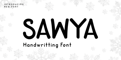 Introducing SAWYA Font – a captivating display typeface that effortlessly embodies the authenticity of handwriting! Elevate your projects with the artistic touch of SAWYA, a seamless blend of style and individuality. Explore SAWYA today to witness your creative visions come alive! What’s Included : File font All glyphs Iso Latin 1 Alternate, Ligature Simple installations PUA Encoded Characters – Fully accessible without additional design software. Fonts include Multilingual support
 - Pixwar by FSdesign-Salmina,
$39.00 An epochal battle in form of font. Calligraphic characters and pixel fight against each other in this experimental font. Two historical epochs collude. You decide the destiny of the battle using the shift button. The font is based on OpenType technology. Ligatures are required for its correct functionality and must be switched on (both on professional and office applications). May the best win, with Pixwar.
 - Milanette by ParaType,
$25.00 Milanette is a set of 74 original vignettes designed by calligrapher Lyudmila Mikhailova. These light, graceful, dynamic flourishes -- tiny graphic compositions -- present visual replicas of her emotions and realize her innate love for intrinsic beauty of the world. The font can be used in book compositions, especially for poetry and historical fiction, in magazines, in package design of jewelry, perfume, cosmetics. Released by ParaType in 2011.
 - ITC Braganza by ITC,
$29.99ITC Braganza is the work of British designer Phill Grimshaw, an elegant typeface steeped in historical inspiration. Reminiscent of the handwritten manuscript styles of the 16th century, the name Braganza refers to Catherine, Duchess of Braganza, who was a prominent figure in Portugal at the time. The vertical script style displays the elegance and refinement which distinguished the Royal Courts of the 16th century. - Mergansers by Tyler Jamieson Moulton,
$11.00 Merganser is a Typeface intended for text and copy and was inspired to serve the avid community of Birders. Birders and birding material historically have a lot to say. Merganser serves that tendency because its designed legible at small scales. The Natural world also inspires the slightly humanist strokes of Merganser. Merganser was created as part of the Type@Cooper winter certificate in Type Design.
 - Rude Slab SemiWide by DSType,
$50.00 Rude was designed as a dichotomy between the Grotesque and Humanistic typographic shapes: a no-nonsense Sans and a very muscular Slab Serif companion. Showing the historically demanded consistency for such kind of typefaces, this is one of DSType's most wide-ranging and flexible type systems, introducing seven weights across seven widths, from Thin to Black and ExtraCondensed to ExtraWide, along with a wonderful set of Icons.
 - Rude SemiWide by DSType,
$50.00 Rude was designed as a dichotomy between the Grotesque and Humanistic typographic shapes: a no-nonsense Sans and a very muscular Slab Serif companion. Showing the historically demanded consistency for such kind of typefaces, this is one of DSType's most wide-ranging and flexible type systems, introducing seven weights across seven widths, from Thin to Black and ExtraCondensed to ExtraWide, along with a wonderful set of Icons.
 - Rude Slab Wide by DSType,
$50.00 Rude was designed as a dichotomy between the Grotesque and Humanistic typographic shapes: a no-nonsense Sans and a very muscular Slab Serif companion. Showing the historically demanded consistency for such kind of typefaces, this is one of DSType's most wide-ranging and flexible type systems, introducing seven weights across seven widths, from Thin to Black and ExtraCondensed to ExtraWide, along with a wonderful set of Icons.
 - Koysan by Pesotsky Victor,
$10.00 Koysan is made for vivid headings, but it can also be used to type small paragraphs and texts. In a text set, it gives sharp, barbed textures, but compensates with half-ovals. The font combines the linear counteraction of thin vertical and horizontal lines with sharp and rigid strokes and smooth geometric ovals. Koysan supports Basic Latin, Extended latin and Cyrillic. Font designed by Victor Pesotsky.
 - Anne Bonny by Melli Diete,
$50.00 Anne Bonny is a modern face with a candy touch. She is noble and confident, bloomy and playful. If you want to give your texts a warm and fabulous note, Anne Bonny is the right one. You can choose between a range of Open Type Features, for example the Swashes Feature for decorating the Upright styles letters as well as the Italics. Share your vision!
 - Slatterine by Greater Albion Typefounders,
$11.95 Slatterine is a retro-futuristic family, inspired by the second streamline era of the 1950s It's ideal for any design work that needs to suggest bygone visions of the future, or to have a retro-space-age effect. Slatterine's horizontally shaded glyphs give a strong sense of motion, whether coupled with the regular form's sharply leaning oblique angle, the perpendicular form, or the reverse leaning 'Lefty'.
 - Futurex Striped - Unknown license

- Futurex Alienated - Unknown license

- Futurex Punched - Unknown license

- Just Calling by Din Studio,
$29.00 Say hello to Just Calling , designed with modern style. It will make your design more beautiful. It's suitable for branding, web design, personal signature (logo) and many other modern designs. It has support for multiple languages and many ligatures. Thanks for visiting and purchasing my font! Best regards Donis
 - Portculliard by Greater Albion Typefounders,
$18.00 Greater Albion always releases a Black letter each year, hopefully well before the Christmas seas (which we seem to have managed this year - September). There is something about this year's project which suggests a caste portcullis to us. Why not visit ye olde world in your next designer project?
 - Trashbone by Arterfak Project,
$18.00 Introducing Trashbone, a playful marker font, designed with an additional rusty effect applied to the strokes. This font represented courage, youth, spirit, freedom, that recommended for many themes such as sports, dark, teen, movement, adventure, etc. Equipped with ligatures, alternates, and multilingual support! Thank you for visiting and enjoy!
 - Kofin by Attractype,
$14.00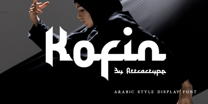 Kofin is arabic style display font that looks stylish, elegant and futuristic. Kofin will perfect for your latest project. Kofin is perfect for many your projects like logo branding, photography, watermarks, invitations, visiting cards, advertisements, product designs, stationery, wedding designs, labels, product packaging, special events and much more.
 - Travel Poster JNL by Jeff Levine,
$29.00 A 1927 travel poster for visiting what was then Palestine and Near East was hand lettered in an early Art Deco thick-and-thin type face. The lettering was redrawn digitally, and is now available as the aptly-named Travel Poster JNL, in both regular and oblique versions.
 - Ohio by Wiescher Design,
$39.50 OHIO is a rough headline type in the tradition of Louis Oppenheimer. It is closely related to Lo-Type from Berthold, redesigned in the 1980s by Erik Spiekermann. Matter of fact, I discovered Ohio while visiting Erik in Berlin, searching his endless archive. Your typeface-looter Gert Wiescher
 - Bella Vista by Din Studio,
$22.00 Bella Vista is a monoline script and is suitable for any design like branding, fashion, print template, quotes, weddings and more. Features : 121 Beautiful Alternates 6 Beautiful Ligatures PUA encoded Multilingual Support Numerals and Punctuation (OpenType Standard) Thanks for visiting and purchasing my font Donis M Din Studio
 - Alta California by steve mehallo,
$18.80 Alta California became designer steve mehallo's "vector-based artist's response" to the early Apple Macintosh bitmapped font San Francisco. Alta California was developed using "sampled" wood type and letters from numerous historical sources. The name comes from the Alta California newspaper, the first daily published in California, one of a dubious Barbary Coast nature, a sheet that shaped the bias of San Franciscans and attracted its own grade of reporters, including a printing specialist who went under the nom de plume Mark Twain. Alta California's edges were meticulously redrafted by hand, with letterpress-inspired fallout and 19th century pointing hands. The final collection of rough hewn letters jump, dive, fall, zag and zig. Alta California looks great on greeting cards, food packaging, as retail signage for boutiques, vintage stores or at D.I.Y. sales, on band posters or club cards, in and around historical quarters, or for use on any ransom note that needs to evoke a wild west look and feel.


