10,000 search results
(0.034 seconds)
- Travel Poster JNL by Jeff Levine,
$29.00 A 1927 travel poster for visiting what was then Palestine and Near East was hand lettered in an early Art Deco thick-and-thin type face. The lettering was redrawn digitally, and is now available as the aptly-named Travel Poster JNL, in both regular and oblique versions.
 - Ohio by Wiescher Design,
$39.50 OHIO is a rough headline type in the tradition of Louis Oppenheimer. It is closely related to Lo-Type from Berthold, redesigned in the 1980s by Erik Spiekermann. Matter of fact, I discovered Ohio while visiting Erik in Berlin, searching his endless archive. Your typeface-looter Gert Wiescher
 - La Babaca - Personal use only

- Sheila by Laura Worthington,
$25.00 Sheila strikes the perfect balance between casual handwriting and careful calligraphy, making it both approachable and aspirational. Put Sheila’s airy, breezy letterforms to use in friendly or feminine settings like inspirational quotes and fashion layouts. Contextual alternates and ligatures lend Sheila natural-looking connections; swash forms add flair. Great news! Laura Worthington fonts have been specially coded so that almost anyone can access all of the swashes, alternates and ornaments without the need for professional design software. For more information and instructions, visit: http://bit.ly/1qJNnsO
 - Times Eighteen by Linotype,
$29.00In 1931, The Times of London commissioned a new text type design from Stanley Morison and the Monotype Corporation, after Morison had written an article criticizing The Times for being badly printed and typographically behind the times. The new design was supervised by Stanley Morison and drawn by Victor Lardent, an artist from the advertising department of The Times. Morison used an older typeface, Plantin, as the basis for his design, but made revisions for legibility and economy of space (always important concerns for newspapers). As the old type used by the newspaper had been called Times Old Roman," Morison's revision became "Times New Roman." The Times of London debuted the new typeface in October 1932, and after one year the design was released for commercial sale. The Linotype version, called simply "Times," was optimized for line-casting technology, though the differences in the basic design are subtle. The typeface was very successful for the Times of London, which used a higher grade of newsprint than most newspapers. The better, whiter paper enhanced the new typeface's high degree of contrast and sharp serifs, and created a sparkling, modern look. In 1972, Walter Tracy designed Times Europa for The Times of London. This was a sturdier version, and it was needed to hold up to the newest demands of newspaper printing: faster presses and cheaper paper. In the United States, the Times font family has enjoyed popularity as a magazine and book type since the 1940s. Times continues to be very popular around the world because of its versatility and readability. And because it is a standard font on most computers and digital printers, it has become universally familiar as the office workhorse. Times™, Times™ Europa, and Times New Roman™ are sure bets for proposals, annual reports, office correspondence, magazines, and newspapers. Linotype offers many versions of this font: Times™ is the universal version of Times, used formerly as the matrices for the Linotype hot metal line-casting machines. The basic four weights of roman, italic, bold and bold italic are standard fonts on most printers. There are also small caps, Old style Figures, phonetic characters, and Central European characters. Times™ Ten is the version specially designed for smaller text (12 point and below); its characters are wider and the hairlines are a little stronger. Times Ten has many weights for Latin typography, as well as several weights for Central European, Cyrillic, and Greek typesetting. Times™ Eighteen is the headline version, ideal for point sizes of 18 and larger. The characters are subtly condensed and the hairlines are finer. Times™ Europa is the Walter Tracy re-design of 1972, its sturdier characters and open counterspaces maintain readability in rougher printing conditions. Times New Roman™ is the historic font version first drawn by Victor Lardent and Stanley Morison for the Monotype hot metal caster." - Times Europa LT by Linotype,
$29.99In 1931, The Times of London commissioned a new text type design from Stanley Morison and the Monotype Corporation, after Morison had written an article criticizing The Times for being badly printed and typographically behind the times. The new design was supervised by Stanley Morison and drawn by Victor Lardent, an artist from the advertising department of The Times. Morison used an older typeface, Plantin, as the basis for his design, but made revisions for legibility and economy of space (always important concerns for newspapers). As the old type used by the newspaper had been called Times Old Roman," Morison's revision became "Times New Roman." The Times of London debuted the new typeface in October 1932, and after one year the design was released for commercial sale. The Linotype version, called simply "Times," was optimized for line-casting technology, though the differences in the basic design are subtle. The typeface was very successful for the Times of London, which used a higher grade of newsprint than most newspapers. The better, whiter paper enhanced the new typeface's high degree of contrast and sharp serifs, and created a sparkling, modern look. In 1972, Walter Tracy designed Times Europa for The Times of London. This was a sturdier version, and it was needed to hold up to the newest demands of newspaper printing: faster presses and cheaper paper. In the United States, the Times font family has enjoyed popularity as a magazine and book type since the 1940s. Times continues to be very popular around the world because of its versatility and readability. And because it is a standard font on most computers and digital printers, it has become universally familiar as the office workhorse. Times™, Times™ Europa, and Times New Roman™ are sure bets for proposals, annual reports, office correspondence, magazines, and newspapers. Linotype offers many versions of this font: Times™ is the universal version of Times, used formerly as the matrices for the Linotype hot metal line-casting machines. The basic four weights of roman, italic, bold and bold italic are standard fonts on most printers. There are also small caps, Old style Figures, phonetic characters, and Central European characters. Times™ Ten is the version specially designed for smaller text (12 point and below); its characters are wider and the hairlines are a little stronger. Times Ten has many weights for Latin typography, as well as several weights for Central European, Cyrillic, and Greek typesetting. Times™ Eighteen is the headline version, ideal for point sizes of 18 and larger. The characters are subtly condensed and the hairlines are finer. Times™ Europa is the Walter Tracy re-design of 1972, its sturdier characters and open counterspaces maintain readability in rougher printing conditions. Times New Roman™ is the historic font version first drawn by Victor Lardent and Stanley Morison for the Monotype hot metal caster." - Times Ten by Linotype,
$40.99In 1931, The Times of London commissioned a new text type design from Stanley Morison and the Monotype Corporation, after Morison had written an article criticizing The Times for being badly printed and typographically behind the times. The new design was supervised by Stanley Morison and drawn by Victor Lardent, an artist from the advertising department of The Times. Morison used an older typeface, Plantin, as the basis for his design, but made revisions for legibility and economy of space (always important concerns for newspapers). As the old type used by the newspaper had been called Times Old Roman," Morison's revision became "Times New Roman." The Times of London debuted the new typeface in October 1932, and after one year the design was released for commercial sale. The Linotype version, called simply "Times," was optimized for line-casting technology, though the differences in the basic design are subtle. The typeface was very successful for the Times of London, which used a higher grade of newsprint than most newspapers. The better, whiter paper enhanced the new typeface's high degree of contrast and sharp serifs, and created a sparkling, modern look. In 1972, Walter Tracy designed Times Europa for The Times of London. This was a sturdier version, and it was needed to hold up to the newest demands of newspaper printing: faster presses and cheaper paper. In the United States, the Times font family has enjoyed popularity as a magazine and book type since the 1940s. Times continues to be very popular around the world because of its versatility and readability. And because it is a standard font on most computers and digital printers, it has become universally familiar as the office workhorse. Times™, Times™ Europa, and Times New Roman™ are sure bets for proposals, annual reports, office correspondence, magazines, and newspapers. Linotype offers many versions of this font: Times™ is the universal version of Times, used formerly as the matrices for the Linotype hot metal line-casting machines. The basic four weights of roman, italic, bold and bold italic are standard fonts on most printers. There are also small caps, Old style Figures, phonetic characters, and Central European characters. Times™ Ten is the version specially designed for smaller text (12 point and below); its characters are wider and the hairlines are a little stronger. Times Ten has many weights for Latin typography, as well as several weights for Central European, Cyrillic, and Greek typesetting. Times™ Eighteen is the headline version, ideal for point sizes of 18 and larger. The characters are subtly condensed and the hairlines are finer. Times™ Europa is the Walter Tracy re-design of 1972, its sturdier characters and open counterspaces maintain readability in rougher printing conditions. Times New Roman™ is the historic font version first drawn by Victor Lardent and Stanley Morison for the Monotype hot metal caster." - Times Ten Paneuropean by Linotype,
$92.99In 1931, The Times of London commissioned a new text type design from Stanley Morison and the Monotype Corporation, after Morison had written an article criticizing The Times for being badly printed and typographically behind the times. The new design was supervised by Stanley Morison and drawn by Victor Lardent, an artist from the advertising department of The Times. Morison used an older typeface, Plantin, as the basis for his design, but made revisions for legibility and economy of space (always important concerns for newspapers). As the old type used by the newspaper had been called Times Old Roman," Morison's revision became "Times New Roman." The Times of London debuted the new typeface in October 1932, and after one year the design was released for commercial sale. The Linotype version, called simply "Times," was optimized for line-casting technology, though the differences in the basic design are subtle. The typeface was very successful for the Times of London, which used a higher grade of newsprint than most newspapers. The better, whiter paper enhanced the new typeface's high degree of contrast and sharp serifs, and created a sparkling, modern look. In 1972, Walter Tracy designed Times Europa for The Times of London. This was a sturdier version, and it was needed to hold up to the newest demands of newspaper printing: faster presses and cheaper paper. In the United States, the Times font family has enjoyed popularity as a magazine and book type since the 1940s. Times continues to be very popular around the world because of its versatility and readability. And because it is a standard font on most computers and digital printers, it has become universally familiar as the office workhorse. Times™, Times™ Europa, and Times New Roman™ are sure bets for proposals, annual reports, office correspondence, magazines, and newspapers. Linotype offers many versions of this font: Times™ is the universal version of Times, used formerly as the matrices for the Linotype hot metal line-casting machines. The basic four weights of roman, italic, bold and bold italic are standard fonts on most printers. There are also small caps, Old style Figures, phonetic characters, and Central European characters. Times™ Ten is the version specially designed for smaller text (12 point and below); its characters are wider and the hairlines are a little stronger. Times Ten has many weights for Latin typography, as well as several weights for Central European, Cyrillic, and Greek typesetting. Times™ Eighteen is the headline version, ideal for point sizes of 18 and larger. The characters are subtly condensed and the hairlines are finer. Times™ Europa is the Walter Tracy re-design of 1972, its sturdier characters and open counterspaces maintain readability in rougher printing conditions. Times New Roman™ is the historic font version first drawn by Victor Lardent and Stanley Morison for the Monotype hot metal caster." - Times by Linotype,
$40.99In 1931, The Times of London commissioned a new text type design from Stanley Morison and the Monotype Corporation, after Morison had written an article criticizing The Times for being badly printed and typographically behind the times. The new design was supervised by Stanley Morison and drawn by Victor Lardent, an artist from the advertising department of The Times. Morison used an older typeface, Plantin, as the basis for his design, but made revisions for legibility and economy of space (always important concerns for newspapers). As the old type used by the newspaper had been called Times Old Roman," Morison's revision became "Times New Roman." The Times of London debuted the new typeface in October 1932, and after one year the design was released for commercial sale. The Linotype version, called simply "Times," was optimized for line-casting technology, though the differences in the basic design are subtle. The typeface was very successful for the Times of London, which used a higher grade of newsprint than most newspapers. The better, whiter paper enhanced the new typeface's high degree of contrast and sharp serifs, and created a sparkling, modern look. In 1972, Walter Tracy designed Times Europa for The Times of London. This was a sturdier version, and it was needed to hold up to the newest demands of newspaper printing: faster presses and cheaper paper. In the United States, the Times font family has enjoyed popularity as a magazine and book type since the 1940s. Times continues to be very popular around the world because of its versatility and readability. And because it is a standard font on most computers and digital printers, it has become universally familiar as the office workhorse. Times™, Times™ Europa, and Times New Roman™ are sure bets for proposals, annual reports, office correspondence, magazines, and newspapers. Linotype offers many versions of this font: Times™ is the universal version of Times, used formerly as the matrices for the Linotype hot metal line-casting machines. The basic four weights of roman, italic, bold and bold italic are standard fonts on most printers. There are also small caps, Old style Figures, phonetic characters, and Central European characters. Times™ Ten is the version specially designed for smaller text (12 point and below); its characters are wider and the hairlines are a little stronger. Times Ten has many weights for Latin typography, as well as several weights for Central European, Cyrillic, and Greek typesetting. Times™ Eighteen is the headline version, ideal for point sizes of 18 and larger. The characters are subtly condensed and the hairlines are finer. Times™ Europa is the Walter Tracy re-design of 1972, its sturdier characters and open counterspaces maintain readability in rougher printing conditions. Times New Roman™ is the historic font version first drawn by Victor Lardent and Stanley Morison for the Monotype hot metal caster." - Insula - Unknown license

- Dragon Fruit by NJ Studio,
$19.00 Hi...Thank for your visit :) dragon fruit a handwritten script font. It features beginning swash and ending swash characters that will take your projects to the next level! This font is PUA code which means you can easily access all the glyphs and swashes that are full of swash! It also features many special features including glyphs. font designs that are made for various vector designs, printing such as digital wedding blogs, online shops, social media, while printing can be used in the field of product clothing, accessories, bags, pins, logos, business cards, watermarks and many others ... so it can make your product look cute and attractive, and also Multilingual support!!! Happy design ...
 - Bradrock by Arterfak Project,
$19.00 Introducing Bradrock, a vintage slab serif typeface. Inspired by old-school cowboy design, and circus-style. Bradrock has a more decorative typeface by adding bold bifurcated serif on the letterforms. This font is a perfect choice for vintage or old-school themes. Bradrock is an all-caps font, which represented strength, confidence, and an old-school aesthetic. You can use this font for many purposes such as vintage logos, mugs, embroidery, prints, display, short text, packaging, cards, emblem, signage, and many more! Equipped with special characters to get your design more powerful. TTF & OTF in a zip file including : Uppercase Small-caps Numbers & punctuation Accented characters Stylistic alternates Stylistic set 01-03 That's all, folks! Thank you for visiting.
 - Christian Signature by NJ Studio,
$19.00 Hi...Thank for your visit :) Christian Signature a stylish signature font with 51 ligatures, 26 swash and ending swash. It features ligatures characters that will take your projects to the next level! This font is PUA code which means you can easily access all the glyphs that are full of swash! It also features many special features including glyphs. font designs that are made for various vector designs, printing such as digital wedding blogs, online shops, social media, while printing can be used in the field of product clothing, accessories, bags, pins, logos, business cards, watermarks and many others ... so it can make your product look swash and attractive, and also Multilingual support!!! Happy design ...
 - Loventine by NJ Studio,
$19.00 Hi...Thank for your visit :) Loventine a modern calligraphy font with alternates, love swash, beginning swash and ending swash. It features ligatures characters that will take your projects to the next level! This font is PUA code which means you can easily access all the glyphs that are full of natural! It also features many special features including glyphs. font designs that are made for various vector designs, printing such as digital wedding blogs, online shops, social media, while printing can be used in the field of product clothing, accessories, bags, pins, logos, business cards, watermarks and many others ... so it can make your product look natural and attractive, and also Multilingual support!!! Happy design ...
 - Monkey by NJ Studio,
$19.00 Hi...Thank for your visit :) Monkey a script font. It features 2 beginning swash, 2ending swash and 7 stylishtic set alternate characters that will take your projects to the next level! This font is PUA code which means you can easily access all the glyphs and swashes that are full of swash! It also features many special features including glyphs. font designs that are made for various vector designs, printing such as digital wedding blogs, online shops, social media, while printing can be used in the field of product clothing, accessories, bags, pins, logos, business cards, watermarks and many others ... so it can make your product look cute and attractive, and also Multilingual support!!! Happy design ...
 - Daddy Day by NJ Studio,
$19.00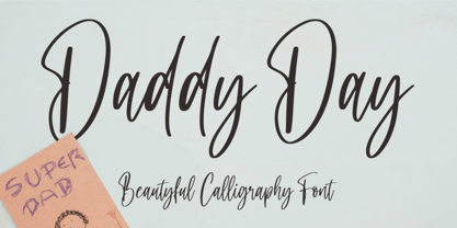 Hi...Thank for your visit :) Daddy Day a beautyful calligraphy font with beginning and ending swash. It features ligatures characters that will take your projects to the next level! This font is PUA code which means you can easily access all the glyphs and swash that are full of beautyful! It also features many special features including glyphs. font designs that are made for various vector designs, printing such as digital wedding blogs, online shops, social media, while printing can be used in the field of product clothing, accessories, bags, pins, logos, business cards, watermarks and many others ... so it can make your product look beautyful and attractive, and also Multilingual support!!! Happy design ...
 - Hello Mermaid by NJ Studio,
$19.00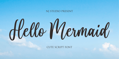 Hi...Thank for your visit :) Hello Mermaid a cute script font with beginning and ending swash. It features ligatures characters that will take your projects to the next level! This font is PUA code which means you can easily access all the glyphs that are full of natural! It also features many special features including glyphs. font designs that are made for various vector designs, printing such as digital wedding blogs, online shops, social media, while printing can be used in the field of product clothing, accessories, bags, pins, logos, business cards, watermarks and many others ... so it can make your product look natural and attractive, and also Multilingual support!!! Happy design ...
 - Sasa by NJ Studio,
$19.00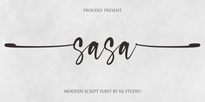 Hi...Thank for your visit :) Sasa a modern script font with beginning and ending swash. It features ligatures characters that will take your projects to the next level! This font is PUA code which means you can easily access all the glyphs and swash that are full of authentic! It also features many special features including glyphs. font designs that are made for various vector designs, printing such as digital wedding blogs, online shops, social media, while printing can be used in the field of product clothing, accessories, bags, pins, logos, business cards, watermarks and many others ... so it can make your product look authentic and attractive, and also Multilingual support!!! Happy design ...
 - Sweet Song by NJ Studio,
$19.00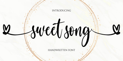 Hi...Thank for your visit :) Sweet song a handwritten script font. It features beginning swash and ending swash characters that will take your projects to the next level! This font is PUA code which means you can easily access all the glyphs and swashes that are full of swash! It also features many special features including glyphs. font designs that are made for various vector designs, printing such as digital wedding blogs, online shops, social media, while printing can be used in the field of product clothing, accessories, bags, pins, logos, business cards, watermarks and many others ... so it can make your product look cute and attractive, and also Multilingual support!!! Happy design ...
 - Lampard Signature by NJ Studio,
$19.00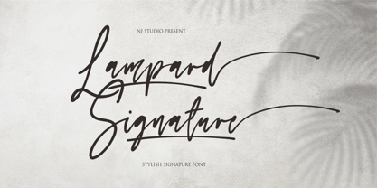 Hi...Thank for your visit :) Lampard Signature a stylish signature font 9 swash and ending swash. It features ligatures characters that will take your projects to the next level! This font is PUA code which means you can easily access all the glyphs that are full of swash! It also features many special features including glyphs. font designs that are made for various vector designs, printing such as digital wedding blogs, online shops, social media, while printing can be used in the field of product clothing, accessories, bags, pins, logos, business cards, watermarks and many others ... so it can make your product look swash and attractive, and also Multilingual support!!! Happy design ...
 - Dairy day by NJ Studio,
$19.00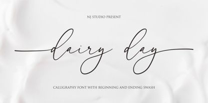 Hi...Thank for your visit :) dairy day a modern calligraphy font with beginning and ending swash. It features ligatures characters that will take your projects to the next level! This font is PUA code which means you can easily access all the glyphs that are full of natural! It also features many special features including glyphs. font designs that are made for various vector designs, printing such as digital wedding blogs, online shops, social media, while printing can be used in the field of product clothing, accessories, bags, pins, logos, business cards, watermarks and many others ... so it can make your product look natural and attractive, and also Multilingual support!!! Happy design ...
 - Chieezy Burger by Arterfak Project,
$15.00 Say hello to Chieezy Burger! Yes, this font is tasty, created especially for food branding and food advertising. Inspired by visualization of tasty burgers, crunchy chips, and cheerful emotion of the people who enjoy foods, drawn become the playful alphabet, with natural strokes. Chieezy Burger is available in 4 styles: Regular, Distressed, Outline, and Shadow. You can make a playful typographic design without losing a delicious impression from the whole design. You can use the font individually or combine them as well. This layered font is also complete with OpenType features and multilingual support. PUA Encoded, so you can access the special characters without special application. Thank you for visiting, stay healthy!
 - Make Cake by NJ Studio,
$19.00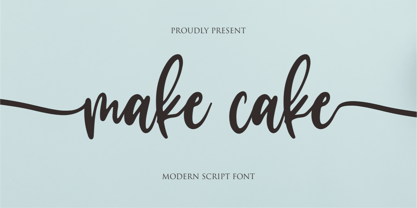 Hi...Thank for your visit :) Make cake a script font. It features beginning swash and ending swash characters that will take your projects to the next level! This font is PUA code which means you can easily access all the glyphs and swashes that are full of swash! It also features many special features including glyphs. font designs that are made for various vector designs, printing such as digital wedding blogs, online shops, social media, while printing can be used in the field of product clothing, accessories, bags, pins, logos, business cards, watermarks and many others ... so it can make your product look cute and attractive, and also Multilingual support!!! Happy design ...
 - Get Married by NJ Studio,
$19.00 Hi...Thank for your visit :) Get Married a modern calligraphy font with 192 alternate, swash and ligature. It features ligatures characters that will take your projects to the next level! This font is PUA code which means you can easily access all the glyphs that are full of natural! It also features many special features including glyphs. font designs that are made for various vector designs, printing such as digital wedding blogs, online shops, social media, while printing can be used in the field of product clothing, accessories, bags, pins, logos, business cards, watermarks and many others ... so it can make your product look natural and attractive, and also Multilingual support!!! Happy design ...
 - Rich and Famous by NJ Studio,
$19.00 Hi...Thank for your visit :) Rich and Famous a modern script font with beginning and ending swash. It features ligatures characters that will take your projects to the next level! This font is PUA code which means you can easily access all the glyphs and swash that are full of authentic! It also features many special features including glyphs. font designs that are made for various vector designs, printing such as digital wedding blogs, online shops, social media, while printing can be used in the field of product clothing, accessories, bags, pins, logos, business cards, watermarks and many others ... so it can make your product look authentic and attractive, and also Multilingual support!!! Happy design ...
 - Horst More by MIX.Jpg,
$10.00 Horst More is a retro soft serif typeface comprising 18 fonts. It can handle most typographic applications from branding to body copy with its range of weights and inherent legibility. Whatever you type will have a friendly message, but it really comes into its own when you start applying some of the additional ligatures and alternates that are built into this type family. You’ll soon be creating distinctive typographic compositions that are pleasing to the eye. There are 18 fonts, 9 weights altogether. It has an extensive character set that covers all Latin European languages. Key features: 9 weights in Roman and Italic Alternates Ligatures Thanks for visiting and purchasing my font! Ekayasa Mix.Jpg
 - Delauney by Arterfak Project,
$17.00 Delauney is a display font, inspired by the Art Deco style from the 1920s. Delauney visualizes luxurious looks, elegance, and wealth. This font is an all-caps font designed with geometric shapes and firm strokes that gives a clear look and minimalist. Delauney also has some OpenType features and accented characters to give you many alternatives in your creative process. A great choice for your headline, title, label, editorial, logotype, quotes, typography, and more! Delauney provides three styles : Regular: The main style for display or headline Shadow: Secondary style that you can use to beautify the Regular one. Catchwords: Available in three languages; English, Spain & Bahasa. Complete your words to look more decorative. Thank you for visiting Happy designing!
 - Neospace Circuit Exp - Personal use only

- NS Blackbooks Victorian by Novi Souldado,
$35.00 Reminiscing the old era of historical books (seriously, that old), circa 19th century. We crafted the letters by connecting the dots from the past with research for every flow, ornaments, look, and feel, to precisely aim for that perfect shape. Ephemera Blackbooks are born with a dark and robust personality. Feel the European historical mood right away, even with just typing it with your keyboard. You don't even realize when the design is done cause we make it so easy as a one-click-time-machine to your works using Ephemera Blackbooks font. It will be a perfect armory for a vintage headline, old book cover concept, sign, posters, playing cards deck design, vintage labels, beer labels, bar decoration, apparel, merchandising, you name it. OTF Features : Stylistic Set 01 to 07 and Ligature Glyph Count : 355 glyphs Language support : Afrikaans, Albanian, AsuBasque, Bemba, Bena, Breton, Catalan, Chiga, Cornish, Danish, Dutch, English, Estonian, Faroese, Filipino, Finnish, French, Friulian, Galician, German, Gusii, Indonesian, Irish, Italian, Kabuverdianu, Kalenjin, Kinyarwanda, Luo, Luxembourgish, Luyia, Machame, Makhuwa-Meetto, Makonde, Malagasy, Manx, Morisyen, North Ndebele, Norwegian, Bokmål, Norwegian Nynorsk, Nyankole, Oromo, Portuguese, Quechua, Romansh, Rombo, Rundi, Rwa, Samburu, Sango, Sangu, Scottish Gaelic, Sena, Shambala, Shona, Soga, Somali, Spanish, Swahili, Swedish, Swiss German, Taita, Teso, Uzbek (Latin), Volapük, VunjoZulu
 - Sociato by insigne,
$35.00 Introducing Sociato: a typographic trendsetter. It's a quirky font that perfectly blends modernity and antiquity. The French Revolution was a period of uncompromising innovation in art and fashion, with celebrity artists, notably Jacques Louis David, creating propaganda for the new regime. This regime failed, but we have rare historical artifacts related to this historical upheaval. The typeface was inspired by a declaration published during the French Revolution that extolled the development of a new religion, the cult of the Supreme Being. It's a stunning piece of work, with a wild, baroque layout and hand drawn typography. Words leap off the page in a cascade of sounds and shapes, and quirky letterforms give it a lively, almost mischievous character. It's a veritable goldmine of typographic ideas. This typeface is based on the hand lettering in the original manuscript, but it has been enhanced by adding a full variety of characters. The typeface comes with a comprehensive range of diacritics, including old-style figures. The typeface is suitable for a wide range of uses, including titles and headers, and it should look beautiful in any typographic setting. Use Sociato to create a revolutionary identity, as bold and audacious as the French Revolution!
 - Neospace Exp - Personal use only

- Snow White by NJ Studio,
$19.00 Hi...Thank for your visit :) Snow White a script font is a beautiful script font with beginning and ending swash. It features White-themed characters that will take your projects to the next level! This font is PUA code which means you can easily access all the glyphs and alternates that are full of love! It also features many special features including glyphs and alternate. font designs that are made for various vector designs, printing such as digital wedding blogs, online shops, social media, while printing can be used in the field of product clothing, accessories, bags, pins, logos, business cards, watermarks and many others ... so it can make your product look cute and attractive, and also Multilingual support!!! Happy design ...
 - Cutmark by J Foundry,
$25.00 INDUSTRIAL-STRENGTH UTILITY. Designed for function. Cutmark fonts features common 45˚ chamfered corners, flattened ink traps and wide apex forms. Customize the look with alternates including an Angled Set, Straight Set, Beam I, single-story a, and hooked l. The OpenType version includes 10 weights in 3 widths with matching italics. Variable Font Cutmark Variable contains the full family of styles in a single file! Select variations along width, weight and slant axes. Test and explore at jfoundry.com. Cutmark Variable is included in the complete package at no additional cost. Use which ever font format you prefer! Please email hello@jfoundry.com for any questions. Variable Fonts require MacOS 10.14 or higher. For browser and software support visit: v-fonts.com/support
 - Sinkwitz Gotisch by preussTYPE,
$29.00 Sinkwitz Gotisch is a new release of the font of the same name originally designed by Paul Sinkwitz in 1942. The Sinkwitz Gotisch was 1942 by Schriftguss AG Dresden font cast first cast and later supplied by the East German firm VEB Typoart. Paul Sinkwitz (1899-1981) has created them. This font displays not the characteristics of a chunky Gothic, which have influenced the image of national socialism. Paul Sinkwitz was a painter, graphic artist, wood engraver, was interested in religious topics, which he had presented in numerous graphics. But also his interpretation of his Gothic font is modern, without having the font this is ugly. In addition to the GOTISCH he created Roman Uppercase letters, which perfectly harmonize with the lowercase letters. This extra font is called BASTARD. The digital version of Sinkwitz is a beneficial addition to a Gothic with calligraphic character and should be in any historically interested graphic design.
 - Bix Bats by Linotype,
$29.99The Bix Bats symbol family was developed in 2003 by Argentinean designer Victor Garcia to complement his display text font Bix Plain. Bix Bats contains four different symbol fonts. Most of the characters in these fonts have their lower halves reversed out. Typing a line of text in these symbol fonts, or mixing these symbol fonts with Bix Plain, will create a very interesting text effect: the bottom half of your lines of text will be reversed out, on top of a colored bar. Bix Bats Arrows contains numerous possible arrow combinations, from archery references to the American recycling symbol. Bix Bats Funny includes all of the symbols needed for a party, from beer steins to bunny rabbits! Bix Bats Shiny has enough starbursts to light up a night sky, and in Bix Bats Wired you will find all of the technological accessories needed to be in the now. All four fonts are included in the Take Type 5 collection from Linotype GmbH." - Dutch Mediaeval Book by Canada Type,
$29.95This is the elaborately expanded version of what is arguably the most classic and popular of all historic Dutch faces: Sjoerd Hendrik de Roos's Hollandse Mediaeval from 1912. Over the decades, many pressmen and typography connoisseurs have gushed loving prose about this typeface. An extended family of two weights, corresponding italics, small caps, four condensed fonts, four book fonts, a set of initials and some very Dutch ornaments, Dutch Mediaeval is a versatile workhorse that flows comfortably and artistically, with the elegance of the main weights nicely complemented by the sturdiness of the bolds. Very few text faces are this clean and inviting while being crafty as well. The Dutch Mediaeval family comes with quite a few OpenType features and extended Latin language support. - Apocalypso by Barnbrook Fonts,
$30.00 Apocalypso is a pictogram font for the end of the world. The name Apocalypso is a portmanteau of the words apocalypse (end of the world) and calypso (joyful improvised music), with a meaning analogous to the idiom ‘fiddling while Rome burns’. The Apocalypso family is more of an art project than a practical font and contains a series of crosses and pictograms. The crosses add decorative detailing to typographic layouts, whilst the pictograms can be deployed to express the forthcoming apocalypse. Apocalypso was originally published in 1997, a few years before the turn of the millennium. It is both a document of the ideas of the time and a scarily prophetic vision of a possible world that has now largely come to pass.
 - Dutch Mediaeval by Canada Type,
$29.95This is the elaborately expanded version of what is arguably the most classic and popular of all historic Dutch faces: Sjoerd Hendrik de Roos's Hollandse Mediaeval from 1912. Over the decades, many pressmen and typography connoisseurs have gushed loving prose about this typeface. An extended family of two weights, corresponding italics, small caps, four condensed fonts, four book fonts, a set of initials and some very Dutch ornaments, Dutch Mediaeval is a versatile workhorse that flows comfortably and artistically, with the elegance of the main weights nicely complemented by the sturdiness of the bolds. Very few text faces are this clean and inviting while being crafty as well. The Dutch Mediaeval family comes with quite a few OpenType features and extended Latin language support. - Rodrigues PERSONAL USE ONLY - Personal use only

- Keratine by Zetafonts,
$39.00 The letterforms that we now accept as the historical standard for printing latin alphabets were developed in Italy around the end of 1400. Deriving from Roman capitals and from italic handwriting, they soon replaced the blackletter letterforms that were used a few years before by Gutenberg for his first moveable types. Between these two typographical traditions there's an interesting and obscure middle ground of historical oddballs, like the Pannartz-Sweynheym Subiaco types, cut in Italy in 1462. Keratine is the result of Cosimo Lorenzo Pancini's exploration of that territory. Like our Kitsch by Francesco Canovaro it explores the impossible territory between antiqua and blackletter, not as a mere historical research, but rather as a way to re-discover and empower an unexpected and contemporary dynamism. Using contemporary digital aesthetics to combine the proportions of humanistic type with the gestural energy of Fraktur letterforms, Keratine develops a "digitally carved", quasi-pixelated appearance (clearly stressed in Keratine's italics) that allows an unexpected balance between small-size readability and display-size personality. Keratine also relies heavily on a variable identity as the letterforms change dynamically with weight, developing from a contrasted, text-oriented light range to more expressive and darker display range, for a total of 8 weights with italics. Open type features and glyph alternates further enrich the usage possibility of this typeface that embodies our contemporary swap culture by embracing the contradictory complexity at the crossroads between Gothic and Humanist styles, while playfully empathising with a digital, brutalist spirit.


