10,000 search results
(0.117 seconds)
- Broone by Asenbayu,
$15.00 Broone is a stunning versatile decorative display font. The proportion of wavy shapes with serif outlines can add a youthful and natural touch to any design project. You can use this font in modern and retro designs. This font is suitable for attractive packaging label designs, unique desired logos, poster designs, fashions and much more. This font contains standard glyph, alternates, ligatures, symbol, punctuation and multilingual supports.
 - Snow Atisen by Differentialtype,
$10.00 Snow Atisen is a festive and fun handwritten font. Perfect for adding a touch of holiday magic to Christmas cards, New Year's decorations, winter designs and other fun projects. Comes with 3 styles that you can mix and match. This font has the potential to become your favorite font of choice, whatever the occasion, spread the joy of the season with this unique font.
 - Baby Stingrays by Gassstype,
$27.00 Introducing our latest display typeface called Baby Stingrays - Strong Bold All Caps Font Display Vintage Serif with can make your logotype become more interesting. Font is 2 Style Best Vintage font and multilingual support. inspired by the decorative arts and architecture movement Baby Stingrays fonts is perfect for your project and allows you to create designs, headlines, posters, logos, badges and many more that are beautiful.
 - Back Wild Graffiti by Sipanji21,
$15.00 "Back Wild" is a bold and chubby graffiti font that includes swash characters. Fonts with these attributes generally feature bold and wide letterforms, often with playful and rounded elements. Swash characters add decorative and stylish touches to the font, If you have any specific questions or if there's anything specific you'd like to know or discuss about graffiti fonts or design, feel free to ask!
 - Mr Orange by Hipopotam Studio,
$28.00 Mr Orange is a typeface based on our handwritten letters which we used in some of our books H.O.U.S.E, D.E.S.I.G.N and Who Eats Whom. It has up to three alternate glyphs for each character, even for every diacritic letter. We do use our fonts in our books so we know that switching alternate glyphs can be a pain in the ass. Thats why we’ve created a very cool Contextual Alternates feature. It automatically sets alternate glyphs depending on frequency of appearance of the same character. The script doesn’t throw random glyphs. It’s checks if lets say letter “A” appears more then once in a sequence of characters. For example in the word “ANAKONDA”, the third “A” and the second “N” would be changed to glyphs from first stylistic set, the second “A” would also be changed but to glyph from second stylistic set. We’ve designed different rules for basic characters and different for diacritics and punctation. It really works great but of course you can always fine tune it by hand. This option has one obvious advantage for web fonts. Browsers that support OpenType calt feature will be able to display alternate characters. And since you can’t put by hand alternate glyphs on your website this is the only way to use them.
 - Fireplace by Mans Greback,
$59.00 Fireplace is a decorative logotype font. Drawn and created by Mans Greback in 2020, this script typeface has a cozy and warm holiday vibe, bringing the thoughts to a Christmas Eve and winter season. It is a vintage sport lettering that has velocity, style and class. Use + * ¤ × to create snowflakes, sparkles and stars. Use [ ] < > after any word to create a swash. Example: Snow] For a longer swash, use several characters: Decorative>>>> The typeface is provided in four styles: Regular, Italic, Bold and Bold Italic. Each style contains alternates and ligatures, giving the calligraphy true customized possibilities. The font has extensive lingual support, covering all European Latin scripts. It contains all characters you'll ever need, including all punctuation and numbers.
 - Colosseum by Alan Meeks,
$45.00 Although a sans serif, Colosseum owes its style to the original Trajan Roman form. Borrowing some characteristics from Friz Quadrata, in its san serif form it is more adaptable to text usage whilst still having a modern and original look which works well in headlines.
 - Hunky Dory NF by Nick's Fonts,
$10.00 Here's a page from the Page Company, circa 1850, originally called Doric. This version is reasonably faithful to the original, but streamlined for better reporduction at a variety of sizes. Both versions support the Latin 1252, Central European 1250, Turkish 1254 and Baltic 1257 codepages.
 - Golf by FontForum,
$19.99 Golf was originally designed by Henry Reinhard Möller in 1935 for Schriftguss KG. Coen Hofmann redrew the capitals and then added lower case letter and Cyrillic alphabets by himself. This digital version of the original typeface is best used in sizes above 24 points.
 - King Tut by Canada Type,
$24.95 King Tut is a restoration and expansion of the original Egyptian Expanded, a single bold face cut in 1850 by Miller & Richard, the famous Edinburgh founders. This aesthetic, though originally issued to help drive simple print advertising of those days, is perhaps the longest lasting genre of typeface. This aesthetic flourished in the later part of the 19th century, helped by the surge of similar faces from England (such as Figgins' Antique 6 and Expanded Antique), and became the defining index of the old American wild west that continues to this very day. King Tut serves up its impact through a balance between the wide, compact letterforms and elegant curvature that manages to come through even in confined areas. The family's weight variety allows for more options in counterspace use as well as precision in the amount of curve definition and contrast needed by the typographer. The lighter weights completely oppose that 19th century boldness and expose the alphabet's skeleton in a strive for simplicity that fits modern applications. With generous language support to boot, King Tut's diverse offerings make it an essential addition to today's designer repertoire.
 - Port Vintage by Onrepeat,
$25.00 Guided tour available here. Port Vintage is a new typeface expanded upon the original Port typeface, released in 2013, and being an experimental Didone typeface with a modern twist, inspired by the well known forms of typography masters such as Bodoni and Didot and the exuberance and elegance of calligraphy typefaces. A lot of changes were made, the whole typeface is now softer and has less rough edges, the time it took to mature made it possible to achieve an entirelly new and distinct flavour from the original Port, giving away the rough edges from Port and giving place to the soft transitions and curved connections between the stems and serifs of Port Vintage. Port Vintage melts the straight lines and strong contrasts of the Didone typefaces with the elegant lines of calligraphy in a geometric way, resulting in exuberant characters with geometric swashes that can be combined in countless ways. The result of this experiment is Port Vintage, an unique and rich display typeface meant to be used on big sizes and it’s main perk is the amount of alternative characters it features. Port Vintage is Open-Type programmed and includes hundreds of alternates, from swashes to titling alternates, ligatures and stylistic sets with each character having a thin version of itself, giving complete freedom to all your creative needs. Port Vintage is available in 10 different styles: Port Vintage Regular, being the base version and featuring the whole base character set; Port Vintage Regular Decorated, featuring richer forms and containing more ornamentated and more extravagant characters; Port Vintage Medium and Port Vintage Medium Decorated, designed for the occasions you need a bit more thickness and the decoration variants: Port Vintage Ornaments, containing a wide set of elements meant for the creation of fillets, vignettes and fleurons, resulting in an almost infinite number of possible combinations to embellish your designs and Port Vintage Words, a set of some of the most common words used in English, Spanish, French, German, Italian and Portuguese. All styles, except Port Vintage Ornaments and Port Vintage Words, include italic styles. For a better understanding of all the uses of Port Vintage and the full character list the reading of the manual is recommended.
 - Lhont Down by Alit Design,
$15.00 Introducing Lhont Down Typeface The Lhont Down font is designed with a serif font concept that has a decorative display style. Irregular dynamic shapes but impressively bold and unique make the font "Lhont Down" different and steal attention. The "Lhont Down" font has 2 font styles, namely decorative ones with irregular shapes with standard or normal font styles. Can be combined so that the designed design has a different rhythm. The lhon Down font is perfect for serious or non-serious design concepts, also suitable for classic retro designs, fashion, pop designs and so on. Serif typefaces such as "Lhont Down" are very easy to apply to any design, especially those with an retro and classic concept, besides that this font is very easy to use both in design and non-design programs because everything changes and glyphs are supported by Unicode (PUA). The "Lhont Down"contains 692 glyphs with many unique and interesting alternative options.
 - Ordillon Handwriting by Letterara,
$14.00 Ordillon Handwriting is a beautiful original handwritten font with a unique feel and a stunning impact. It will add a unique spark to any design project that you wish to create! This font is PUA encoded which means you can access all of the amazing glyphs and ligatures with ease!
 - Wesley SRF by Stella Roberts Fonts,
$25.00 Wesley SRF is another of the Ray Larabie originals provided to Stella Roberts Fonts. This stylized sanserif has a clean look for both text and display puposes. The net profits from my font sales help defer medical expenses for my siblings, who both suffer with Cystic Fibrosis and diabetes. Thank you.
 - Wrenchworks SRF by Stella Roberts Fonts,
$25.00 The 80s era of techno/angular/mechanical fonts is typified in Wrenchworks SRF. The original design is by Ray Larabie with a remix by Jeff Levine. The net profits from my font sales help defer medical expenses for my siblings, who both suffer with Cystic Fibrosis and diabetes. Thank you.
 - Alpaim by EchadType,
$6.00 Alpaim is a minimalist sans serif font. Uniform characters and sharp geometric features create light modular sensation. Architectural nature of this font is perfectly suited for display use, graphic design, branding and even technical lettering. Originally designed in thin condensed version, now includes weight and width variation, Latin diacritics and Hebrew.
 - Golden Estella by Timurtype,
$14.00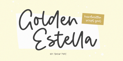 Introducing by Timur type Proudly Present, Golden Estella Golden Estella A Handwritten Script Font Golden Estella is perfect for product packaging, branding project, megazine, social media, wedding, or just used to express words above the background. Golden Estella multilingual support. Embelish your designs with our original fonts.Enjoy the font,Thank you!
 - Amsterdam Kindom by Letterara,
$13.00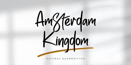 Amsterdam Kingdom is a beautiful original handwritten font with a unique feel and a stunning impact. It will add a unique spark to any design project that you wish to create! This font is PUA encoded which means you can access all of the amazing glyphs and ligatures with ease!
 - Faux Hebrew by Page Studio Graphics,
$24.00 The simulated font is based on the characteristic Hebrew calligraphy. Some of the original Hebrew characters have been given new roles, others modified to resemble modern Latin characters. The font includes an upper case alphabet, numerals, and basic faux punctuation, plus Harp of David, Menorah, and Star of David symbols.
 - Edgewise NF by Nick's Fonts,
$10.00Considerable heft and clean lines—with a few whimsical grace notes—characterize this font, based on a typeface originally named "Ryter Night". Powerful yet playful, this gentle giant is the perfect choice for engaging headlines. Both versions of the font include 1252 Latin, 1250 CE (with localization for Romanian and Moldovan). - Extravaganza by Solotype,
$19.95Originally, this 1870s wood type font was called Armenian. We came across a showing of alphabet at the South Street Seaport in New York, bought it and immediately drew the additional characters needed to make the font. We used it for some circus program work that was part of our livelihood. - Everleigh by Gleb Guralnyk,
$14.00 Everleigh is an elegant thin typeface inspired by antique old school fonts. It includes lots of ligatures and stylistic alternates helps to create an authentique and original lettering compositions. Also this font has multilingual support. Check out all available characters on the previews. Thank you and have a nice day!
 - Educator JNL by Jeff Levine,
$29.00Educator JNL joins the large library of Jeff Levine's stencil fonts and was re-drawn from a set of individual letter stencils with the distinctive look of Franklin Gothic. All of the irregularities of the original die-cut letter forms were left intact, giving a "real world" look to the font. - Rosa Stencil by Schriftgestaltung,
$19.00English Scripts are nice and decorative. I wanted to make them strong and expressive, too. - Sangor by Grontype,
$12.00 Sangor is an unique vintage condensed font. This font designed all round corners that makes it look more soft and charm. Sangor is regular and outline all-caps font that is great for short headlines and titles, but it looks great in print design, vintage mood board, branding, logotypes, titles, editorial design and modern and vintage design. Sangor Features: Single weight Punctuation & Characters Ligatures Glyphs included superscript & Symbol Currencies Multilinguals Thankyou for picking up this font, Happy creating. Regard, Grontype
 - Elbow Grease by Hanoded,
$15.00 Elbow Grease was made with, yes, you’ve guessed it: Elbow Grease! It started off as a grungy font, but it didn’t look right, so I reworked all the glyphs. Then I forgot to save the font, so I had to start all over again. Naming a font was never this easy! Elbow Grease is a didone-ish font with some seriously warped glyphs, a lot of panache and a ‘get-it-done’ attitude. Also comes with a toolkit full of diacritics.
 - Begonia by Grontype,
$14.00 Description: Begonia is an unique bold with curve and pointy edge style font, inspired from begonia flower that traditionally symbolic of uniqueness, harmony, gratitude, or caution, which is make this font has its own characteristic. Begonia is all-caps font equipped with extra ligatures and alternates. Begonia is perfect for branding, text header, t-shirt design, logotype and other stunning graphic design. Begonia Features: Uppercase glyphs Lowercase glyphs Numeral and Punctuations Currencies Standard Ligatures Stylistic Alternates Thankyou for choosing this font Regard, Grontype
 - Mefista by Grontype,
$18.00 The Mefista font is a masterpiece crafted from a rigorous and lengthy process. This font was written with care so as to produce a unique and diverse work by adding alternatives and some ligatures. This font can be used for print designs such as writing on invitation cards, magazine covers, greeting cards and so on. and can be used for company or logo taglines Features : Uppercase and Lowercase Ligatures and Alternates Numeral and Punctuations Thankyou for purchasing this fonts. Regards, Grontype
 - Jugendstil Initials by HiH,
$16.00 Jugendstil Initials were designed by Heinrich Vogeler around 1905, based on the German blackletter tradition. A similar set of initials by Vogeler, but based on roman letters was released by Rudhardsche Geisserei of Offenbach at about this time. I believe the originals were woodcuts. The backgrounds to the letterforms may be seen as examples of Heimatkunst, an art movement within Germany that drew deliberate inspiration from the rural countryside. Like the Arts and Crafts Movement in England a little earlier, Heimatkunst may be seen, in part, as a romantic rejection of urban industrialization, while at the same time representing a back-to-roots nationalism. Like any river, it was fed by many streams. Jugendstil Initials is an experiment with which I am most pleased. It is far and away the most complex font HiH has produced and I was uncertain whether or not it could be done successfully. To oversimplify, a font is produced by creating outlines of each character, using points along the outline to define the contour. A simple sans-serif letter A with crossbar can be created using as few as 10 points. We decided to make a comparison of the number of points we used to define the uppercase A in various fonts. Cori, Gaiety Girl and Page No 508 all use 12 points. Patent Reclame uses 39 and Publicity Headline uses 43. All the rest of the A’s, except the decorative initials, fall somewhere in between. The initial letters run from 48 points for Schnorr Initials to 255 for Morris Initials Two, with 150 being about average. Then there is a jump to 418 points for Morris Initials One and, finally, to 1626 points for Jugendstil Initials. And this was only after we selectively simplified the designs so our font creation software (Fontographer) could render them. The average was 1678, not including X and Y. There was no X and Y in the original design and we have provided simple stand-ins to fill out the alphabet, without trying to imitate the style of the orginal design. We did a lot of looking to find a compatible lower case. We decided that Morris Gothic from the same period was the best match in color, design and historical context. We felt so strongly about the choice that we decided to produce our Morris Gothic font for the purpose of providing a lower case for Jugendstil Initials. The long s, as well as the ligatures ch and ck are provided. at 181, 123 (leftbrace) and 125 (rightbrace) respectively. This font was a lot of work, but I think it was worth it. I hope you agree.
 - Slim Nouveau JNL by Jeff Levine,
$29.00 At times, one source of inspiration can generate more than one idea. This was the case with the 1918 sheet music for the song "You're Still an Old Sweetheart of Mine". The cover displays the title in a hand lettered narrow Art Nouveau Sans serif style. A number of characters were revised and the overall font was compressed by 25% to create a whole new look and feel. The end result became Slim Nouveau JNL. This was the same material used to originally model Easy Money JNL, which is truer to the original lettering design. The font is available in both regular and oblique versions.
 - Peckham Press by EllenLuff,
$28.00 Peckham Press is a bold hand-pressed typefamily, with a raw aesthetic and solid industrial style. The font brings a spirit of street culture, with its defiant shapes, rough edges and unadulterated imperfections. It works best in strong design, and situations that require an authentic voice. This font is handmade and includes full original texture with density variants and original nicks and grit, with access options to suit different needs. The vector format allows the textured affect show up on any program, no additional software or updates required.Peckham Press supports a wide range of latin languages and paired with it's diverse flexibility allows it to handle projects of any size.
 - Whisky Italics by Corradine Fonts,
$24.95 Whisky is a blackletter font family with a casual touch that makes it look friendly and current. The stroke varies its thickness and angle endings making it form very dynamic bodies of text. Whisky Italics are the corresponding versions to the original Whisky fonts made to complement the family with a new style. Like the original Whisky family Whisky Italics includes seven weights, each with a fill and a inline version that allow you to develope more colorful applications overlaping them as layers. Also by using Open Type features you can access to an extended set of characters wich contains swashes and alternative endings to make more playful compositions.
 - Pandilla by Typozon,
$39.00 Pandilla was inspired from personal sketches and letters developed by the past of the years making graffiti art. the forms of this typeface are related with the graffiti and street scenes of the different cities around the world and takes traits and elements of the Handstyle, Classic graffiti, Brazilian Pichação and different urban letters. This font has a variety of objectives, the first is to create a legible version of the graffiti inscriptions and use this typography for different print pieces, the second objective is to give back the essence of the meaning of the word "Pandilla", this word has been transformed for the past of the decades and now is associated with negative things. The original meaning of this word is a group of people who feel a close relationship, which usually have a friend or close interaction with ideals or common philosophy among members. Pandilla is to be used in different print purposes and graphic pieces like: Posters, Brochures, Magazines, Business cards and different stuff that uses big type sizes and big display formats.
 - Trump Soft Pro by Canada Type,
$39.95 Trump Soft Pro is the softer, round-cornered version of Trump Gothic Pro, the popular condensed gothic seen on films, magazines, book covers and frashion brands all over the globe. Trump Soft offers a friendlier grade of the same economic functionality, clear modular aesthetic and extended character sets as Trump Gothic. The sharper Trump Grothic series is a reconception of ideas from Georg Trump’s seminal 1955 Signum typeface and its later reworking (Kamene) by Czech designer Stanislav Marso. Originally cobbled together for a variety of film projects in the late 1990s and early 2000s, the Trump Gothic family was made available for the general public in 2005. Shortly thereafter, it became extremely popular. It continues to be used extensively today. In 2013, the typeface was redrawn, refitted, optimized and greatly expanded into a multiscript family of six fonts, each containing over 1020 glyphs and a wealth of OpenType features, including small caps, caps-to-small-caps, stylistic alternates, unicase/monocase alternates, fractions, ordinals, class-based kerning, and support for Latin, Cyrillic and Greek locales.
 - Faber Fraktur by Ingo,
$22.00 A modern black-letter, so to speak. Composed of a few basic elements with a wide-quill ductus. Faber Fraktur was based on the idea that it must be possible to create a modern black-letter type. The typeface is ”constructed“ according to the same principles as a script without serifs: as few varied basic forms as possible, omission of frills which make the type difficult to read and repetition of similar forms. The typical contrasting strokes of the original handwritten black-letter script are retained nonetheless. The elements of this typeface were even pre-formed with the quill. All characters are reduced to their basic skeleton. The fanciness and manifold ”breaks“ or fractures typical of black-letter typefaces are considerably reduced to just a few essentials. Faber Fraktur is a very legible type perfectly suitable for long texts. It does not appear nearly as foreign and archaic as the old black-letter fonts. The capital letters especially have a charm of their own radiating a kind of playfulness in spite of their severe form.
 - Argyle Rough by Type Associates,
$24.95 Argyle Rough was originally developed for a packaging campaign in the late 80s in my studio and sat around in various stages of completion until I decided to autotrace my original drawings. I liked the quirky roughness and decided that it did not detract from the charm of the original, in fact it improved it and saved me a whole lot of work. The original campaign called for a few additional alternate characters for use at either end and double in the middle of words, ee, ff, ll, ss etc and a stylized Th, always useful. I hope you enjoy Argyle Rough, named after the world’s largest diamond mine – a rough diamond, get it?
 - Good Karma Smooth by Positype,
$15.00 Good Karma (its namesake) will be extended to you as you use this new relaxed script family. Originally, produced from hand and the sumi brush of Neil Summerour, Good Karma Smooth is a smooth digitization of the original exemplars in Good Karma. Good Karma Smooth is filled with a lot of heart, reliable and genuine movements, and a wide range of letter options to befit any project needing an honest hand-lettered look. And on top of that, proceeds form the sale of this typeface will be distributed to charities and organizations intent on combatting the Covid-19 global pandemic. Each typeface comes with an additional set of stylistic alternates (upper AND lowercase) that harmonize wonderfully when you have the Opentype Ligature feature active. Additionally, special double-letter ligatures have been produced for specific combinations in need of more expressive flair, as well as a few swashes that work with the economical strokes originally produced from the sumi brush. To further expand the usefulness of this peaceful script, a separate Caps/Small Caps font has been added that provides the simple contrast needed to bring the script fonts forward. Rather than limit the personality of this script, various styles have been produced to complement the original Regular—Upright, Wide, Wide Upright, and the aforementioned Caps fonts are included in hopes of helping you find the perfect variation needed for your composition.
 - LTC Italian Old Style by Lanston Type Co.,
$39.95LTC Italian Old Style is not to be confused with the English Monotype font also called Italian Old Style, which is an earlier design from 1911 based on William Morris’s Golden Type that is based on Nicholas Jenson’s Roman face. Goudy went back to Jenson’s original Roman and other Renaissance Roman faces for his inspiration and the result is what many consider to be the best Renaissance face adapted for modern use. Bruce Rogers was one of the biggest admirers of Italian Old Style and designed the original specimen book for Italian Old Style in 1924 using his trademark ornament arrangement. These ornaments are now contained in the pro versions of the Roman styles—Regular Pro and Light Pro. With most digitizations of old metal typefaces, one source size is often used as reference (as was Goudy’s method for his own cuttings of his Village foundry types) so that all sizes refer to one set of original artwork. The original hot metal fonts made by Lanston Monotype (from Goudy’s drawings) and other manufacturers used two or three masters for different size ranges to have optimal relative weights—smaller type sizes would need proportionally thicker lines to not appear thin and larger sizes would require thinner lines to not appear to bulky. The variations in size ranges can also be affected by the size of the cutter head in making the master patterns. The light weights of LTC Italian Old Style were digitized from larger display sizes (14, 18, 24, 30, 36 pt) and the regular weights were digitized from smaller composition sizes (8,10,12 pt). The fitting for the regular weights is noticeably looser to allow for better setting at small sizes. Very few font revivals take this approach. Italian Old Style, originally designed by Frederic Goudy in 1924, was digitized by Paul Hunt in 2007. In 2013, it has been updated by James Grieshaber and is now offered as a Pro font. The newly expanded Pro font includes all of the original ligatures, plus small caps and expanded language coverage in all 4 Pro styles. - Seizieme by URW Type Foundry,
$49.99 In 1905 the Parisian typefounders Peignot & Cie. issued their Série 16. This clear roman with a large x-height and an italics soon enjoyed a great popularity. Coen Hofmann’s drawings made for the Seizième follow the original Peignot Série 16 as close as possible. The regular font has the original small caps, while all members of the family are enhanced, next to the ranging ones, with old style figures. Also superior and inferior figures are available. The original series did not have a bold version. This was, however, carefully drawn for this digital rendition. The Série 16 and its versions for the composing machines were much used for the type setting of scientific publications. That is why a comprehensive set of mathematical and sundry characters are added to the Seizième fonts. Next to the accented characters for the several West and East European languages the Seizième was also enhanced with a Cyrillic, also available in regular, italic and bold versions.
 - Geogrotesque Condensed Series by Emtype Foundry,
$69.00 The popular Geogrotesque family becomes an extended system with the inclusion of three new members to the family; Geogrotesque Condensed, Geogrotesque Compressed and Geogrotesque Extra Compressed. The condensed series keep the spirit of the original one, and give way to a superfamily up to 56 styles. This new system fluidly varies between widths, ranging from the original width to a 55% of it in the narrower one. As their original partner, the new fonts are great headline families for publications, but will also work in text of intermediate length and point size. The Geogrotesque superfamily offers now one font for each design need. It is available in Open Type format and includes Ligatures, Tabular Figures, Fractions, Numerators, Denominators, Superiors and Inferiors. All of them with support for Central and Eastern European languages. This type family consists of 42 styles, 7 weights plus italics in 3 widths. For more details see the PDF.