10,000 search results
(0.042 seconds)
- 1420 Gothic Script by GLC,
$38.00 This script font was inspired by the type most commonly used during the period 1300s to 1500s. It is a compromise between historic truth and contemporary use. We particularly thank very much the Paris Sorbonne University professor who gave us freely and patiently numerous and valuable advice and criticism for this work. This font includes “long s”, naturally, as typically medieval, a lot of ligatures as “ff, ffi, fi, ft, sd, pp...”, some special glyphs frequently used as abbreviation in Latin texts during the medieval era for replacing letter groups such as “qui, qua, que, quia, quam, per, pri, pre...”, but also a few final and initial characters and final addable loops. Instructions for use, added, helps to identify them on keyboard. It can be used for web-site titles, posters and fliers design, editing ancient texts or greeting cards, all various sorts of presentations, as a very decorative, elegant and luxurious font... This font remains clear and easy to read over a wide range of sizes. Its original medieval size is about 18/24 points.
 - Langston by Type Innovations,
$39.00 Langston is an original design by Alex Kaczun. It’s part of a series of lettering experiments, manipulating body proportions, characteristic elements and spacing to achieve some dramatic visual effects. It is hard to characterize if Langston is an outline or inline font. The outline has the same thickness and proportions as the stems. And the inter-letter spacing is also visually similar. This creates a dynamic and interesting visual harmony throughout. Furthermore, certain design elements like the accents and punctuation symbols, break with the outline treatment, and morph into an interesting play between inline and outline. The overall effect is stunning and mesmerizing. Langston is a display font not intended for text use. It was designed specifically for display headlines, logotype, branding and similar applications.This attractive display comes in roman with lower case and lining figures.The font is also available with true small capitals and old style figures. A special version was created with decorative initial capitals to further enhance the possibilities. The large Pro font character set supports most Central European and many Eastern European languages.
 - Antique Olive by Linotype,
$40.99 Original sanserif designed in 1962 for Fonderie Olive by the late Roger Excoffon. Excoffon achieves brilliant personal effects by calculated breaking of accepted design canons. Antique Olive™ font field guide including best practices, font pairings and alternatives.
 - Pekoe JNL by Jeff Levine,
$29.00 Jeff Levine Fonts offers its interpretation of Tea Chest, an Art Deco serif stencil font originally designed in 1939 by Robert Harling for the Stephenson-Blake type foundry. Pekoe JNL is available in both regular and oblique versions.
 - Weg by Huerta Tipográfica,
$18.00 WEG* font is an experimental type system where legibility isn’t the focus. This project studies how glyphs are constructed and how their ductus can be modified. I explored how far I can move the limits if I don’t worry about the legibility. In Weg, letters are built by a single line that connects them, along with words and paragraphs. When weight decreases, the legibility of the signs increases. This is the first stage. It’s a project in expansion. The set contains uppercase, lining figures and basic punctuation in three weights: Regular, Light and Thin. The current supported languages are Spanish, Guaraní and English. If you need any other language, please let me know. I would like to expand the character set. Second stage project WEG is an experimental in-expansion font family. Here I present to you the second stage. I’m planning the first upgrade for middle 2021. I’m preparing a pattern set for July 2021. Here you can see the first four patterns. If you buy the font before July 2021, you’ll get this upgrade! • Second stage April - July 2021: pattern set (first four ready). • This upgrade will be available on August 2021.
 - Bramber by Rocket 88 Foundry,
$35.00 The design of Bramber was inspired by Allied propaganda posters of the second World war, especially Russian posters. It has a distinctive solid, geometric appearance. Bramber also has a feel of mid 1980s design. Bramber is ideal for use as a distinctive headline or display font.
 - Mencken Std by Typofonderie,
$59.00 An American Scotch remixed in 27 fonts Mencken has twenty seven styles, divided into three widths, three optical sizes, romans and italics. Generally, optical size typeface families belong to a same common construction. It falls into the same category of type classification, while presenting different x-heights or contrasts. Mencken is unique because it is designed according to different axis and optical sizes. Firstly, Mencken Text is a low-contrast transitional typeface, designed on an oblique axis, asserting horizontal with featuring open counters. Its capitals follow Didots to better harmonize the rest of the family. On the other side of the spectrum, Mencken Head (and narrow variations) is designed on a vertical axis, high contrast, in a contemporary Didot style. The Mencken is therefore a typeface answering to different sorts of uses, whose design is different according to its uses: from oblique axis in small size to vertical axis in large sizes. Vertical proportions (x-height, capitals height, etc.) were calibrated to be compatible with many Typofonderie typeface families. Lucie Lacava and I followed the idea launched by Matthew Carter few years ago for some of his typefaces intended for publications. From Baltimore Sun’s project to Typofonderie’s Mencken It is a bespoke typeface for American newspaper The Baltimore Sun started at the end of 2004 which marks the beginning of this project. The story started with a simple email exchange with Lucie Lacava then in charge of redesigning the American East Coast newspaper. As usual, she was looking for new typeface options in order to distinguish the redesign that she had started. At the time of its implementation, a survey of the newspaper’s readers has revealed that its previous typeface, drawn in the mid-1990s, was unsatisfactory. The Mencken was well received, some reader responses was particularly enjoyable: “It’s easier to read with the new type even though the type is designed by a French.” Why it is called Mencken? The name Mencken is a tribute to H. L. Mencken’s journalistic contributions to The Sun. According to the London Daily Mail, Mencken ventured beyond the typewriter into the world of typography. Because he felt Americans did not recognize irony when they read it, he proposed the creation of a special typeface to be called Ironics, with the text slanting in the opposite direction from italic types, to indicate the author’s humour. Affirming his irreverence, the Mencken typeface does not offer these typographic gadgets. Henry Louis Mencken (1880 — 1956) was an American journalist, satirist, cultural critic and scholar of American English. Known as the “Sage of Baltimore”, he is regarded as one of the most influential American writers and prose stylists of the first half of the twentieth century. He commented widely on the social scene, literature, music, prominent politicians and contemporary movements. Creative Review Type Annual 2006 Tokyo TDC 2018
 - Aliykit Open by John Moore Type Foundry,
$35.00 Aliykit Open a decorative OpenType font generated from geometry with parallel lines of open and closed forms, by the way they can fit inside the Art Deco style but is part of the design influence of Venezuela in the area of art and cinetic art, his set of characters includes letters for western and eastern European languages and Cyrillic, also provides several ligatures that link between them. It is ideal for decorative display headlines to large sizes.
 - Filibuster NF by Nick's Fonts,
$10.00The Ayes have it! The 1909 specimen catalog from the H. C. Hansen Type Foundry of Boston contained a lovely decorative face named Congress, which is the pattern for this font. It's a winning choice for distinctive headlines, and the uppercase letters are also suitable by themselves for use as decorative initials. The PC Postscript, Truetype and Opentype versions contain the complete Latin language character set (Unicode 1252) plus Central European (Unicode 1250) languages as well. - Chancy JNL by Jeff Levine,
$29.00 A short-lived TV game show from 1977 called “Second Chance” has its logo lettered in a bold, block type style with slightly chamfered corners. This inspired Chancy JNL, which is available in both regular and oblique versions. While “Second Chance” only lasted one season, the show was re-tooled - and debuted in 1983 as “Press Your Luck” – which ran until 1986.
 - Koo Koo Puff by astroluxtype,
$20.00 Does the world really need one more vernacular pop culture typeface? We here, at astroluxtype shout a resounding yes! Sure, at myfonts.com, you can find the apex of fine font design that will have your mind and eyes burst with joy at the level of sophistication and craftsmanship they exhibit- Koo Koo Puff Light Condensed and Regular Condensed are not one of those fonts. But if kooky goofy is your thing, we're selling it at the astroluxtype booth. Koo Koo Puff Regular Condensed is the companion font to Koo Koo Puff Light Condensed. Both fonts includes an upper and lowercase glyph set. Regular Condensed has a different upper and lowercase “O” from the original Koo Koo Puff Light Condensed. Spacing metrics are looser, as well. The font is not a match for Light Condensed, it is a separate font. Both are headline display faces, for optimum usage it is recommended to be set at 48 points or larger in size. Look to astroluxtype’s Sugarbang ! as the first in a series of fonts inspired by vintage product packaging, Koo Koo Puff is the second release in the Cerealboxx series. The third font is in the fridge getting cool now, watch for it in the future. Rave on you design genius.
 - Lotter by Kaer,
$19.00 Lotter blackletter with Drop caps One fine day I found a vintage book, it called “A treatise by the Dominican friar-writer Marcus von Weida on the Brotherhood of the Holy Rosary”. It was printed in 1515 by Melchior Lotter in Leipzig. The text was illustrated by hand-colored engravings on religious and liturgical themes and beautiful initials I like. Lotter was the last name of a family of German printers, intimately connected with the Reformation. An innovation by the elder Lotter was his use of Roman types for Latin, reserving the Gothic types for German. I'm happy to present to you my new font family. Lotter font family has Drop cap and Regular styles. It's all you need to precisely imitate medieval style text. Use Drop cap style as a decorative element at the beginning of a paragraph or section, other part of the paragraph should be in Regular style. You’ll get: * Drop cap & Regular styles * Uppercase and lowercase * Multilingual support * Numbers * Symbols * Punctuation * Ligatures Please feel free to request any help you need: kaer.pro@gmail.com Best, Roman.
 - Waltari by HiH,
$12.00 Designed by Heinz Konig, Waltari was released by the Rudhard'schen Giesserei of Offenbach A.M., Germany in 1900, and reflects all the flamboyant exuberance of that period. Waltari is a Jugendstil rotunda, combining its blackletter roots with a strong Roman influence in an effort to achieve a broader appeal than the traditional forms. As a rotunda, Waltari is easily read by readers who are not comfortable with the schwabachers and frakturs in common use in German printing. Waltari, with its decorative flourishes, has the amazing ability to be both traditional and youthful at the same time. Especially useful for for scrapbooks and invitations. The Waltari ML package includes: 1. Glyphs for ANSI 1250 Central European, 1252 Western Europe, 1254 Turkish and 1257 Baltic code pages. Total 319 glyphs. 2. Total of 472 kerning pairs. 3. OpenType GSUB features: Salt, dlig, hist and ornm. 4. Proportional Numbers 5. Alternate w and z. 6. Original design decorative ornaments The zip package includes two versions of the font at no extra charge. There is an OTF version which is in Open PS (Post Script Type 1) format and a TTF version which is in Open TT (True Type)format. Use whichever works best for your applications.
 - Pinatas Marks by Piñata,
$12.00 Original Foundry: TypeType Original name: TT Marks The typeface Pinatas Marks is made in the style of the traditional American sign painting, which is the traditional art of painting on buildings, billboards and signage for the purpose of announcing or advertising of products, services, and activities. Font family Pinatas Marks consists of 32 fonts and has 8 different weights: Thin, ExtraLight, Light, Regular, Medium, Bold, ExtraBold, Black. Pinatas Marks is looking great on all the modern information media, ranging from small labels to entire text blocks.
 - Braston by Dora Typefoundry,
$23.00 Introducing our new typeface, Braston - A modern, unique and decorative serif typeface that comes with a binder and alternative characters that are perfect for creating variety in your designs. Braston is a mix of sweet curves with lowercase sets and strong impact fonts for uppercase sets making it even more elegant this typeface will allow you to create stunning and original layouts for print and web, Branding, Logo Design, invitations, quotes, blog headers , posters and advertisements. use it endlessly. Features • Full set of uppercase, lowercase letters • Ligatures • Alternates • Numbers, symbols & punctuation • Characters with accents • Supports Multiple Languages • PUA Encoded WHAT’S INCLUDED • Braston – Regular This type of family has become a work of true love, making it as easy and enjoyable as possible. I really hope you enjoy it! I can't wait to see what you do with Braston! Feel free to use the #Dora Typefoundry tag and # Braston font to show what you've done Thank You!
 - Predy by Eurotypo,
$55.00 In the era of digital types, the round handmade cursive continues to intrigue many type designers, probably by their beautiful and graceful calligraphic origins. However, what is certainly true, is that all good traditional pen-formed script may be suitable for a wide range of fine graphic works. The Predy typeface is based on the famous style of the 19th Century: The English handwriting made by pen. It is a connected cursive in the tradition of the “ronde”. This typeface is constructed upon their vigorous ascenders with loops, two times the lengths of the descenders with an extremely short x-high. The uppercase is a classical modern roman typeface (Didona) that are accompanying with a set of accurate flourished capitals as alternates of the calligraphic style. Predy font comes with a set of decorative glyphs including old style figures, terminal letters, ligatures, alternates and swashes. This font will lend elegance and sophistication to a wide variety of design projects like wedding, invitations cards, logotypes, packaging and posters.
 - LHF Equinox by Letterhead Fonts,
$39.00 Classic extended style with jumbo decorative caps.
 - Renaisperian by Intellecta Design,
$22.90fancy decorative frame with a script capital - Demis by Tour De Force,
$25.00 Supreme decorative typeface, with wedged display serifs.
 - Schindler by Red Rooster Collection,
$45.00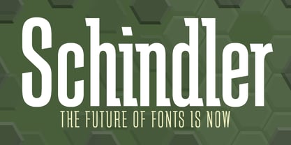 An original design.
 - Sinclair Script by Red Rooster Collection,
$45.00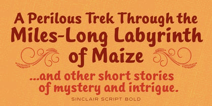 An original design.
 - Grove Script by Red Rooster Collection,
$45.00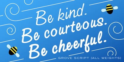 An original design.
 - Pipeline by Red Rooster Collection,
$45.00An original design. - Javelin by Red Rooster Collection,
$45.00An original design. - Iron Maiden by Red Rooster Collection,
$45.00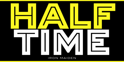 An original design.
 - Dew by ParaType,
$25.00 Dew is a script font with blobs on the stems that according to author’s imagination resemble dew drops on the caules. It gives an impression of fragrance and freshness and thus can be used for informal headings and short advertising texts for perfumes and cosmetics. The font was developed by Ekaterina Pulenko and released by ParaType in 2009.
 - Winter Pen by Abo Daniel,
$13.00 Introducing WINTER PEN - simple signature font - This font is great for branding, logo, signature, packaging, t-shirt design, social media and anything your project that need an elegant taste. It came with two styles : Regular and Italic. Features: Uppercase Lowercase Number & Punctuations Multilingual Support PUA Encoded Hope you love it Grab it fast... regards, Abo Daniel Studio
 - Shocker by Vozzy,
$10.00 Introducing original label font named Shocker. This font has a multilungual characters support (check out all available characters on previews). The font family has three styles: Regular, Rough and Lightning. This font will look good on any designs like a poster, T-shirt, label, logo, etc.
 - Grandix by ZetDesign,
$15.00 Grandix is a very elegant handwritten font. created with original handwriting in mind for a flexible and beautiful font. The font is equipped with an open type feature for easy creation. These fonts are also created in several families to give the user the choice they want.
 - Rocket Pop by astroluxtype,
$20.00 Rocket Pop and Rocket Pop Outline are influenced by product packaging and cereal box art from the 1960's and 1970's. The fonts will work as companions or separate. Best used over 36pt as a headline display face, these fonts will bring a bold playfulness to any project where a vintage or retro style is in the concept. The style reflects the era when things were indeed, mad, where men (and some women) did crazy art for vinyl records, food packaging and kiddie products. Sugar frosted blue donut cereal is yummy for your tummy like... Rocket Pop and Rocket Pop Outline. Buy both and get the discount! Watch for the Cerealboxx Set coming soon that will include the astroluxtype fonts, Sugarbang! Koo Koo Puff and Rocket Pop together in one box.
 - ginger2 - Unknown license

- Kari Pro by Positype,
$45.00 I have always enjoyed this typeface and have had fond memories from the time I originally drew its predecessor, Kari. Now with almost 100 new ligatures, alternate and swash characters, Kari Pro has a great deal more personality and versatility. Subsets from the original Kari have been integrated into each unified weight adding both lining and hanging (oldstyle) numerals as options as well.
 - Saltstar by Grontype,
$16.00 Saltstar is an modern elegant san serif font, created with care. The font is rounded point and unique shapes. It come with extra ligatures and alternative. This font is specially created for your branding need such as invitational card, flyer font, magazine heading layout and any other project. Saltstar Features: Uppercase Characters Lowercase Characters Numerals, Punctuation, Currency etc Multilingual Support Thankyou for choosing this font, Happy creating Regard, Grontype
 - SK Lisovik by Shriftovik,
$32.00 SK Leshiy is an authentic monumental font inspired by ancient Slavic legends and fairy tales. This font combines geometric and natural forms, each of its symbols creates a unique image of a fabulous creature that hides in the forest thicket. The SK Leshiy font has a basic and alternative character sets that allow you to expand the font's capabilities and its decorative functions. The font supports a multilingual set and an extended table of Cyrillic and Latin characters.
 - Nightfate by Sipanji21,
$13.00 Nightfate is a unique display font with a graffiti-like appearance. Use this font for any crafting project, apparel design, logotype, advertising, wall decoration, and pretty much anything that requires a personalized look. Take your designs to the next level with this stunning font! have a nice day.
 - Luxart by Fontiko,
$14.00 Luxart is a modern Serif Decorative font inspired by the 1920's, Art Deco and Gatsby styles. This font looks luxury, stylish, elegant and neat. This font is great for logo branding & invitations, photography, quotes, wedding design, business cards, posters, watermark, holiday cards, special events and much more.
 - Nxrma by NXRMALIST,
$20.00 Nxrma is a font designed by Nxrmalist. This font has a design that combines calligraphy, modern, and geometry. This font is designed to make it easier for designers to create custom typefaces, logos, or for decoration. The neat design makes it easy for designers to create cool works.
 - Ansley by ErlosDesign,
$17.00 Ansley - A Lovely Script Font by erlosDESIGN Ansley is a romantic, elegant and flowing modern calligraphy font. It has beautiful and well balanced characters and as a result, it matches a wide pool of designs. This font is perfect for invitation, wedding decoration, signs, logos, quotes and more!
 - Gunsmoke by FontMesa,
$25.00Gunsmoke is a revival of a James Conner's Sons font that's been listed under different names such as Extended Clarendon Shaded, Original Ornamented and Galena. Dating back to 1888 this font was available with an original lowercase, numbers and punctuation. Today we've expanded the set to include the original shaded version a regular black, open left, open right and a fill font for the two open faced versions. The single Gunsmoke fill font is in alignment with the Gunsmoke Open R version and will also work with Gunsmoke Open L by shifting your fill font layer to align with the Open L version. You will need an application that works in layers in order to use the fill font with the Gunsmoke Open L and R fonts. Make sure you check out the left and right pointing gun hands on the less than and greater than keys, the gun alone is on the left and right brace keys. Remember to check your gun in with the Marshal when entering Dodge City. - Juslia Sophia by Bosstypestudio,
$14.00 Juslia Sophia is an cute calligraphy luxury font that comes with a very beautiful character change, a kind of classic decorative script with a modern touch, designed with high detail to present an elegant style.
