10,000 search results
(0.038 seconds)
- Your Everything by Yoga Letter,
$15.00 "Your Everything" is a very beautiful and unique calligraphy font. This font is decorated with a unique and attractive butterfly. This font is perfect for valentine, christmas, winter, wedding, photography, promotion, and others. The decoration on this font is very easy to use, because it has been specially designed and there are instructions for its use in the preview. Thank you:)
 - Hearts Love Smile by TypoGraphicDesign,
$9.00 The typeface Hearts Love Smile (All We Need Is LOVE) is designed in 2018–2021 for the font foundry Typo Graphic Design by Manuel Viergutz. A font-collection from rough hand-printed old wood letters, rubber-stamps and plastic stamps till clean vectors, photos … 302 glyphs of LOVE. Decorative extras like icons, arrows, dingbats, emojis, symbols, decorative ligatures (type the word LOVE for ♥ or SMILE for ☻ as OpenType-Feature dlig). For use in logos, magazines, posters, advertisement and packaging plus as webfont for decorative headlines. The font works best for display size. Have fun with this font & use the DEMO-FONT (with reduced glyph-set) FOR FREE! ■ Font Name: Hearts Love Smile ■ Font Styles: 1 Icons + DEMO (with reduced glyph-set) ■ Font Category: Display for headline size ■ Glyph Set: 302 glyphs / decorative extras like arrows, dingbats, emojis, symbols ■ Design Date: 2021 ■ Type Designer: Manuel Viergutz
 - Kitcat by Solotype,
$19.95This was a favorite of the old time job printers; decorative but readable. The MacKellar foundry was the largest and most creative of the old foundries, and decorative fonts like this one came out at the rate of several every year. - Eixample Dip by Type-Ø-Tones,
$55.00 The Eixample project is inspired by modernist signage of various examples found in the Eixample neighbourhood in Barcelona. The name of each subfamily is related to its location or to specific elements of the original sign. Dip is the abbreviation for Carrer Diputació (Diputació Street), where the original sign spells Farmacia Específicos Diputación. The reference taken from the pharmacy sign is a curious model, where sans-serif lowercase letters coexist with script uppercase. This fundamentals create the system that we have introduced in Eixample Dip. The capitals are built with contained decoration to achieve maximum compatibility between letters. The script capitals are the default uppercase but we have also included alternative capitals, a slab style that can be combined with the scripts. The narrow influence of the original sign is correlated with the Narrow styles of the Dip family. But for more versatility, Eixample Dip explores normal widths and weights as well. Furthermore an Inline version was added to the suite.
 - Roots N Branches by Crumphand,
$16.00 Hello, Introduce the new font : Roots N Branches Roots N Branches inspired by hipster life. Handmade fonts & Sharpie marker What's Included Inside The Fonts ? Uppercase Lowercase Symbols Numerals European Multilingual Thank You, Regards!
 - Face Type by TypoGraphicDesign,
$9.00 The typeface Face Type is designed from 2021 for the font foundry Typo Graphic Design by Manuel Viergutz. A mix from the TGD font collection with 1 font-style (Icons) incl. decorative extras like icons, dingbats, emojis and stylistic alternates (4 stylistic sets). For use in logos, magazines, posters, advertisement plus as webfont for decorative headlines. The font works best for display size. Have fun with this font & use the DEMO-FONT (with reduced glyph-set) FOR FREE! ■ Font Name: Face Type ■ Font Styles: 1 font-style (Icons) + DEMO (with reduced glyph-set) ■ Font Category: Display for headline size ■ Glyph Set: 357 glyphs incl. decorative extras like icons ■ Design Date: 2021 ■ Type Designer: Manuel Viergutz
 - TG Halo by Weishan Gao,
$50.00 TG HALO font is a relatively round font, which can be used in catering industry, children's products and so on. The application of title and text can be well recognized.
 - Althawra Fikra by syria arabic,
$8.00 This is an Arabic font designed according at the standards of Calligraphy. It contains a consistent styling and can be used in many functions.
 - HildiniaDonut by JOEBOB graphics,
$- HildiniaDonut is the second font designed by Hilde Rikken (age 10). I think a mouse took a little bite out of all the characters...
 - Letter Head by Gleb Guralnyk,
$15.00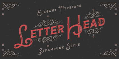 Introducing steampunk classic look typeface "Letter Head". It's a vintage font with decorative elements.
 - American Advertise 016 by Intellecta Design,
$15.95a classic decorative caps font digitized from the wood type classics heritage from America's - Twentieth Century by Monotype,
$29.99 Twentieth Century was designed and drawn by Sol Hess in the Lanston Monotype drawing office between 1936 and 1947. The first weights were added to the Monotype typeface library in 1959. Twentieth Century is based on geometric shapes which originated in Germany in the early 1920's and became an integral part of the Bauhaus movement of that time. Form and function became the key words, unnecessary decoration was scorned. This clean cut, sans serif with geometric shapes was most appropriate. The lighter weights of the Twentieth Century font family can be used for text setting; the Twentieth Century bold and condensed fonts are suitable for display in headlines and advertising. Commonly spelled 20th Century.
 - 1509 Leyden by GLC,
$49.00 This script font was inspired by the type used in Leyden by Jan Seversz to print Breviores elegantioresque epistolae [...], author Francesco Filfelo, circa 1509. The original font contains all lower case characters, except w, eth, thorn, lslash, oslash and so... and almost upper case. In addition, one set of small lombardic initials were also nearly complete. It take place instead of the Bold style (in only one package)offering a real and rare complete historical printing set... The original small "a" hight was 2,8 mm !, the upper case hight no more than nearly 5 mm, the initials hight almost 15 mm, covering nearly two lines. This font includes "long s", naturally, as typically medieval and also a few ligatures, but not any variants. We have entirely recreated some characters, upper, lower and initials, to fill gaps. It is used as variously as web-site titles, posters and fliers design, publishing texts looking like ancient ones, or greeting cards, all various sorts of presentations, menus, certificates, as a very decorative, elegant and unusual font, besides its historical scrupulous reality... This font supports enlargement as well as small size.
 - Museum Initials by Wundes,
$12.00Museum is the Wundes foundry's first font revival. These letter forms are scanned from the engravings of Freeman Delamotte who in 1879 published a spectacular set of ancient and mediaeval ornamental alphabets. The original forms for this font were created in 1490, a few years before Columbus discovered America. There was not much information on the origin of this font, save that it came from a British museum, hence the name. The original character set was missing the letters J,P,V and W so I've constructed these letters in the same style to complete the alphabet. Other than those 4 additions, the engravings are true to their original forms. - Fason by Green Type,
$37.00 Fason is a decorative font family. Designed for use in the fashion industry, fashion magazines, branding and packaging. Fason is also perfect for wedding invitations, greeting cards and posters. It is also suitable for use in online activities. Fason contains basic and alternative stylistic sets, decorative swash initials & final forms, many useful Open Type features, as well as discretionary ligatures to decorate your design.
 - Freak by HiH,
$10.00 Freak was originally released by The Great Western Type Foundry in 1889. According to Maurice Annenberg, Great Western became Barnhart Brothers & Spindler when the Barnhart brothers bought out the Toepfer family in 1868.The plant superintendent, Charles Spindler, became Secretary of the new firm. Specimen books as late as 1899 show the name Great Western alongside the BB&S name. At some point, prior to 1925, Freak was renamed “Bamboo” by BB&S. It was delisted when BB&S was absorbed by ATF in 1929. Listed in McGrew under “Bamboo”.
 - Bannikova by ParaType,
$30.00 Designed at Polygraphmash type design bureau in 1946-51 by Galina Bannikova, inspired by Russian Grazhdansky early- and mid-18th century typefaces as well as Roman Humanist typefaces of the Renaissance. With the archaic features of some characters the face is well recognized because of unique shapes. It is one of the best original typefaces of the Soviet typography. The typeface is useful in text and display composition, in fiction and art books. The revised, improved and completed digital version was designed at ParaType in 2001 by Lyubov Kuznetsova.
 - Ogre by Australian Type Foundry,
$30.00A funky, lively display font originally designed for a tourism publication. - Art Nouveau 2 BA by Bannigan Artworks,
$19.95This is an original font designed in the Art Nouveau style. - Touch - Personal use only

- Anzura by Mightyfire,
$10.00 Anzura is a decorative font that can be used for book title, logo brand, poster and many more. The looks is vintage classic yet clean, with a little decoration on each letter. We have two styles, Anzura Regular and Anzura Shadow. Both are beautiful! Enjoy in cooking something creative with Anzura font! :)
 - Quetzal by Scriptorium,
$12.00Quetzal is a decorative font designed to look like letters formed by mosaic tiles in a Mayan or Aztec style. The font features two different character sets and customizable over-and-under decorative tails which can be added to any character to make hundreds of possible combination forms which nest together attractively. - Garamond #3 by Linotype,
$40.99Opinion varies regarding the role of Claude Garamond (ca. 1480–1561) in the development of the Old Face font Garamond. What is accepted is the influence this font had on other typeface developments from the time of its creation to the present. Garamond, or Garamont, is related to the alphabet of Claude Garamond (1480-1561) as well as to the work of Jean Jannon (1580–1635 or 1658), much of which was attributed to Garamond. In comparison to the earlier Italian font forms, Garamond has finer serifs and a generally more elegant image. The Garamond of Jean Jannon was introduced at the Paris World’s Fair in 1900 as Original Garamond, whereafter many font foundries began to cast similar types. Morris F. Benton’s Garamond appeared in 1936 and is based on the forms of Jean Jannon, which already displayed characteristics of the Transitional style. - Dante by Monotype,
$39.00 Dante was designed by Giovanni Mardersteig. Mardersteig started work on Dante after the Second World War when printing at the Officina Bodoni returned to full production. He drew on his experience of using Monotype Bembo and Centaur to design a new book face with an italic which worked harmoniously with the roman. Originally hand-cut by Charles Malin, Dante was adapted for mechanical composition by Monotype in 1957. The new digital font version has been re drawn, by Monotype's Ron Carpenter, free from any restrictions imposed by hot metal technology. The Dante font family was issued in 1993 in a range of three weights with a set of titling capitals. Dante is a beautiful book face which can also be used to good effect in magazines, periodicals etc. Dante® font field guide including best practices, font pairings and alternatives.
 - Garamond Classico by Linotype,
$29.99Opinion varies regarding the role of Claude Garamond (ca. 1480–1561) in the development of the Old Face font Garamond. What is accepted is the influence this font had on other typeface developments from the time of its creation to the present. Garamond, or Garamont, is related to the alphabet of Claude Garamond (1480–1561) as well as to the work of Jean Jannon (1580–1635 or 1658), much of which was attributed to Garamond. In comparison to the earlier Italian font forms, Garamond has finer serifs and a generally more elegant image. The Garamond of Jean Jannon was introduced at the Paris World’s Fair in 1900 as Original Garamond, whereafter many font foundries began to cast similar types. Garamond Classico is based on the forms of Jean Jannon, which already displayed characteristics of the Transitional style. - Mussica Italic by Corradine Fonts,
$35.00 In 2009, Corradine Fonts released one of its most successful projects: Mussica, an experimental and hybrid typeface that explore the exaggeration of ascenders and descenders in a high contrast style. Now, around eight years later, we are proud to introduce Mussica Italic, which surpass the original version in quality and quantity of ornamental possibilities while try to maintain its proportions and looking. Mussica Italic is programmed to obtain a smart replacement of swashes, endings and ligatures using the Open Type features, but you can also explore manually its wide range of alternatives to get the best graphic result according to your requirements. Mussica Italic supports most of Western and Central European languages.
 - Titling Stencil JNL by Jeff Levine,
$29.00 Titling Stencil JNL is an extra bold stencil treatment of R. Hunter Middleton’s ‘Karnak’ (produced in 1936 for Ludlow) and is a companion font to both Bookkeeping JNL and Bookkeeper JNL (a lightweight version of the type design). Middleton based his ‘Karnak’ family of typefaces on the geometric slab-serif ‘Memphis’, which was designed in 1929 by Dr. Rudolf Wolf and released originally by the Stempel Type Foundry of Germany. According to Wikipedia, ‘Karnak’ was named after the Karnak Temple Complex in Egypt, in reference to the fact that early slab serifs were often called “Egyptians” as an exoticism by nineteenth-century type founders.” Titling Stencil JNL is available in both regular and oblique versions.
 - Calafati Soft by Wannatype,
$24.00 Basilio Calafati (1800–1878) worked as a magician under the name of Salamucci in the Wiener Prater. Later he obtained the license for a roundabout and other amusement facilities in the Wiener Prater. Calafati typeface family is characterised by little contrast and strong emphasis on the horizontals. It is a robust font that has many applications. Its character shapes are simple and relatively unembellished. With regard to metrics and proportions it combines perfectly with the Wien Pro and the Liebelei Pro. Calafati is available in weights light, regular, medium, bold and black. In 2022, Calafati received a major update. The recent family, Calafati Soft, is an 100% offspring of sharp-edged Original Calafati.
 - Zeta by Roy Cole,
$34.00 Zeta was developed by Roy Cole, the British typographer and book designer. It is his second typeface family, completed in 2006, and comprises six fonts. As with his other typeface families - Lina, Colophon and Coleface - Zeta is a sans-serif typeface, particularly notable for its fluidity and strong legibility. Whilst the proportions of Zeta are derived from classical models, the letter forms themselves are totally modern in concept. For example, when used for blocks of text little line spacing is needed to achieve good readability. Zeta is conceived as an easy reading typeface presenting an up-to-date impression wherever it is utilized. Due to its origins it really comes into its own when used for book design.
 - Candida by Linotype,
$50.99Candida roman was designed by Jakob Erbar and appeared after his death with the typeface foundry Ludwig & Mayer in Frankfurt am Main in 1936. Due to the original designer’s death, the italic was designed by Walter Höhnisch shortly thereafter. In 1945 the roman was reworked, the breadth of the figures was reduced and the strokes made heavier. The bold weight followed in 1951. Later the typeface was expanded with further weights, which have for the most part fallen out of use. Three weights can still be found in catalogues, available as early as 1937 for the Linotype machine. Candida is a modest text font which retains its legibility even in smaller point sizes. - Egon by TipografiaRamis,
$29.00 Egon is a contemporary Slab-Serif typeface family built in ten styles—extra-light, light, regular, bold and black weights in roman and italic respectably. This is a refreshed (second) edition of Egon Serif, originally designed in 2008. The typeface has been updated—four new styles in ExtraLight and Black weights were added to the family and minor adjustments to glyph shapes (mostly italics) have been made.The typeface is designed with industrial and architectural flavor, as homage to Egon Eiermann, one of Germany’s great architects of 20th century. Egon is ideal as text and display font for publication use. Egon is released as OpenType single master with a Western CP1252 character set.
 - 1776 Independence by GLC,
$38.00 1776 Independence was designed inspired mainly from the Caslon typeface used by John Dunlap in the night of 1776 July 4th in Philadelphia to print the first 200 sheets of the Congress' Declaration of Independence establishing the United States of America. I just added accented letters and a few others, with respect for the original design. A render sheet,enclosed with font file, help to identify them on keyboard. It can be used as web-site titles, posters and fliers, editing ancient texts, menus or greeting cards as a very decorative font... This font supports as easily enlargement or small size, remaining clear and easy to read from 8 or 9 points to 72 and over. It gives a smart look especially to prints.
 - Taste Of Heaven by Crumphand,
$16.00 Introducing the new hand made font " Taste Of Heaven " This font made from real hand writing. Looks clean and cool What's Included ? Uppercase Lowercase Symbols Numerals Multilingual Supports Thank You, Regards!
 - HandsOn by Letterhead Studio-VG,
$20.00 HandsOn font was developed in the late 90s. Font shape looks like manual drawing. Suitable for decoration of children's books.
 - Late Frost by Gleb Guralnyk,
$13.00 This calligraphic script font is called Late Frost. It's an elegant decorative font with lots of ligatures and multilingual support.
 - Utica JNL by Jeff Levine,
$29.00Utica JNL takes the basic components of Boat Decals JNL and reworks the characters into a bold, block font with thick-and-thin line variations. - Foda Kufi by Fo Da,
$70.00 Foda Kufi is a Arabic modern Kufi typeface with a touch of historical and Islamic styles, consists of 6 weights: 4 main fonts and two Extra weights for decorations. Foda Kufi is particularly suitable for Headlines, display settings, in titles or decorations.
 - Harvest Barn by Konstantine Studio,
$15.00 Harvest Barn, a fresh beautiful rustic farmhouse font. Inspired by the rustic home decor concept and farmhouse feels. It would be a perfect mate for branding, logo, rustic wedding concept, home decor, journal, poster quote, vintage flea market promotion, etc. So versatile, right?
 - Christmas Laurent by Yoga Letter,
$18.00 "Christmas Laurent" is a beautiful and unique handwritten font with Christmas decorations on the letters. Equipped with uppercase letters, lowercase letters, numerals, punctuation, swash, titling, alternates, and multilingual support Very suitable for Christmas, Christmas gifts, Christmas decorations, Christmas ornaments, winter, and others.
 - Quid Pro Quo by Hanoded,
$10.00 Quid Pro Quo is a nice, handwritten, trashy font. Cursive and decorative, straightforward, yet twisted.
