843 search results
(0.007 seconds)
- Linotype BioPlasm by Linotype,
$29.99Linotype BioPlasm is a display face created by Italian design Mauro Carichini in 2002. It distorts and deletes parts of letters, creating the appearance of a living, typographic organism in pages of text. Lines set in Linotype BioPlasm seems bubble to the surface, and always hints at some sort of unrevealed secret. Although only parts of most letterforms are visible, the high x-heights of Linotype BioPlasm's letters make its text surprisingly legible for such a concept-font. For usage in products ranging from Sonic to Science, Linotype BioPlasm may be the font for you! - Sys 2.0 by FSD,
$60.27Sys is a condensed font designed to work well at small sizes (i.e. phone books, maps, or the like) but it has enough personality to be used at big sizes, too. The TrueType version, thanks to its incredibly accurate hinting, may be used to replace amazingly well TrueType system fonts in every platforms, in web or other screen applications. After the succcess by the first version designed ten years ago, the version 2.0 has numerous improvements in the design of the glyphs, new Unicode ranges, useful OpenType features and enhanced readability. - Nerone by The Ampersand Forest,
$20.00 Nerone is a quasi-unicase display type family in four weights, from light to black. In its lighter versions, it's reminiscent of dignified flared serifs like Albertus. In its black version, it's comparable to display faces like Serif Gothic, with a hint of Mostra-like despotism... Inspired by ancient Roman capitals, Nerone takes a whimsical look at how they might turn into a black fatface, and how a matching lowercase might give the whole affair a whimsical feel — specifically when applied to fun branding and marketing uses. Part of The Ampersand Forest's Sondheim Series.
 - Erehwon Roman NF by Nick's Fonts,
$10.00This charming font, with its hints of the exotic, originally carried the rather prosaic name of Show Card Roman. It appeared in the book "Art Alphabets and Lettering: an encyclopedia of lettering including the most important standard alphabets and such classics as are in most demand for the use of engravers, designers, and all lovers of art" by the evidently rather verbose J. M. Bergling (1866-1933). As a nod to its exotic overtones, the font is named after the 1872 utopian novel of the same name by Samuel Butler. - Foundry Context by The Foundry,
$90.00 Foundry Context is a sans serif family designed to be universal in many contexts – hence the name. A ‘no-nonsense’ typeface, reminiscent of 19th century sans serif faces, Foundry Context has very round, pure letterforms, crafted without being over refined, and having minimal stroke contrast in the neo-grotesque style. A hint of personality has emerged from the very drawing of the proportions, strokes, and terminals, yet Foundry Context is still neutral enough to compete in the grotesk arena, and at the same time has something new to say.
 - Maver by Ani Dimitrova,
$30.00 Maver is a 7 - style font family designed by Ani Dimitrova. Maver containing Regular, Italic, Round, Round Italic, Modify and Modify Italic weights. All weights contain standard ligatures, proportional figures, tabular figures, old-style figure, numerals, and arrows, matching currency symbols and fraction. The fonts are carefully hinted and its wide proportions make them a perfect choice for screen usage. This style palette offers a flexible range for display typography. The Maver type family is ideally suited for magazines, branding, posters, as well as web and screen design and more.
 - ITC Mister Chuckles by ITC,
$29.99Round, firm, and bursting at the seams with good humor, ITC Mister Chuckles is based on the premise that barrel shapes have pleasant associations. Think: beer-barrel polkas, a barrel of fun, or a barrel of laughs, and you'll get the idea. Designer Nick Curtis has combined sans serif sturdiness, a hint of 1930s deco and a handful of giggles in this remarkably versatile all-cap face. If the typographic occasion calls for mirth and merriment, invite Mister Chuckles to the party. You'll have more fun than a barrel of monkeys! - Songs of Moravia by Mans Greback,
$69.00 Songs of Moravia is a beautiful script typeface. Its decorative capitals, adorned with delicate swashes and swirls, evoke the rich heritage and melodious charm of European design. Songs of Moravia captures the genuine spirit of folk tunes, offering a hint of tradition woven with modern craft, perfectly suited for projects that seek to marry the old with the new. Gentle yet vibrant, this type is a delightful choice for invitations and formal design. Use underscore _ to make a swash after any word, or multiple underscores for different lengths. Example: Baseball_
 - Konsecta by Alandya TypeFoundry,
$19.00 Konsecta - Unique and versatile serif display Konsecta serif display is a single weight typeface that aims to explore new design solutions. With a bold form a strong contrast, this design hints both at past typeface styles while being unique and original in it’s appearance. This font is suitable for use in many design forms, for example magazines, postcards, logos, DIY Projects, invitation card, quotes, vintage look design, wedding projects and much more. If you like unconventional solutions and edgy design, Konsecta serif display is the font to go for.
 - Boo Meringue NF by Nick's Fonts,
$10.00The inspiration for this font made its first appearance in the 1897 American Type Founders specimen book, under the name "Lithotint". As the name suggests, the original was tinted gray (diagonal lines formed the body); this version is solid and spooky, too. The font contains a few ghostly graphics, including ghosts at the bracket positions, a haunted house at the backslash position, and a scary backdrop at the ASCII tilde and ASCII circumflex positions. Both versions of the font include 1252 Latin, 1250 CE (with localization for Romanian and Moldovan). - Zaphire by 38-lineart,
$24.00 Zaphire is a humble sans serif font, delicately infused with a hint of monographic handwriting, seamlessly blending classic elegance with a touch of contemporary experimentation. Comprising a singular variable font, it gracefully encompasses the essence of 49 distinct fonts, gracefully navigating through 7 weights and 7 widths. Its uniqueness is understated yet undeniable, making it a valuable addition for those seeking to infuse creativity into various artistic endeavors. Zaphire's versatility extends gracefully to contemporary art, posters, and provides an enriching touch to the written word in books and magazines
 - Marazion by Studio K,
$45.00 Marazion takes its name from a Cornish seaside resort in the UK's West Country. It was inspired by some hand lettering I came across at a local inn on the seafront where I was enjoying a lunchtime pint (always a good place to seek inspiration in my experience!) Being based on a hand drawn script Marazion is a smooth, fluid and rounded font that is both fresh and distinctive. Personally, I think it is well suited to applications in food and fashion, but in practice its uses are more or less universal.
 - Smart Cookie by PizzaDude.dk,
$15.00 Smart Cookie is a happy and handmade font, ideal for packaging, posters or books (especially children's books!) It's highly legible and comes int 3 versions: Regular, Shine and Layer. Mix the Regular and Shine layer (using different colours) to make a cool shiny effect, or use the Shine version where the colours rely on the fore- and background colours...also a nice way of making your text stand out!
 - Clumsy by Gaslight,
$15.00 Clumsy is a two weight all caps handcrafted awkward font with alternates for all characters and digits. The font was inspired by a few lines of text from an old soviet book about vine. Clumsy is a good choice for small amounts of text. When Clumsy is used in OpenType applications, its Contextual Alternates feature produce a striking random-like effect on glyphs distribution, achieved by cycling through alternates. When not using the Contextual Alternates feature, you can still pick the alternates in the Glyphs palette or use the alternates available from the keyboard upper and lower case.
 - Integral CF by Connary Fagen,
$35.00 Integral CF is designed for maximum visual and emotional impact with its stunning, superbold letterforms. An all-caps titling font family, Integral's six weights excel in posters, social media, headlines, video, and print. Hidden behind the linear, confident construction is a hint of roguish charm. Designed to be bold and large, Integral pairs nicely with lighter typefaces that provide contrast, such as a sans serif like Greycliff CF, Criteria CF, or Work Sans. Text-friendly serifs like Artifex CF are also pair well with Integral. All typefaces from Connary Fagen include free updates, including new features, and free technical support.
 - Benton Modern RE by Font Bureau,
$40.00 Benton Modern was first prepared as a text face by Font Bureau for the Boston Globe and the Detroit Free Press. Design and proportions were taken from Morris Fuller Benton’s turn-of-the-century Century Expanded, drawn for ATF, faithfully reviving this epoch-making magazine and news text roman. The italic was based on Century Schoolbook. This version of the family is part of the Reading Edge series of fonts specifically designed for small text onscreen, having been adjusted to provide more generous proportions and roomier spacing, and having been hinted in TrueType for optimal rendering in low resolution environments.
 - Roscha by Luhop Creative,
$14.00 Roscha is a fully reconsidered high contrast transitional serif, which is perfectly adapted to modern realities and requirements. When starting this project, we wanted to try to draw a modern serif with the precisely verified shapes, high contrast and detailed elaboration of each character. Roscha is perfect for use in magazines, in the fashion industry, in the branding of premium goods and services. Roscha is quite versatile and suitable for use both in headings and in text arrays. In addition, we have done manual hinting in the typeface, and now it can be used with a clear conscience in the web and applications.
 - Balkey by Flawlessandco,
$9.00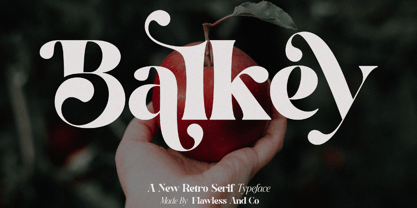 Balkey is a captivating retro serif font that brings a touch of fun and uniqueness to your designs. With its distinct style and nostalgic charm, Balkey is perfect for projects that demand a hint of playful elegance. An Original typeface that suitable for any graphic designs such as branding materials, t-shirt, print, business cards, logo, poster, t-shirt, photography, quotes .etc This font support for some multilingual. Modern Sweet Retro that contains uppercase A-Z and lowercase a-z, alternate character, numbers 0-9, and some punctuation. If you need help, just write me! Thanks so much for checking out my shop
 - Beeching by Greater Albion Typefounders,
$14.95 Beeching is a family of six typefaces designed to combine extreme legibility with a hint of retrospective character. It is inspired by the lettering used in the Leslie Green designed stations of the London Underground and is as up to date today as it was the day those stations opened. The Beeching faces (Regular, Bold, Small Capitals, Small Capitals Bold, Shadowed and Small Capitals Shadowed) are ideal for use in large scale signage that needs to be seen over long distances. We feel the family provides a clear demonstration that traditional details, such as serifs and ligatures serve to enhance legibility.
 - Copenhagen Grotesk by David Engelby Foundry,
$- From Weimar to København/Copenhagen, picking up some decadent traits on its journey. The design of Copenhagen Grotesk is inspired by the great German grotesque type design history, although it will not fall into ranks in all aspects. Indeed, Copenhagen Grotesk will not be put into one single time pocket of style, so you'll notice that there's a hint of art deco style in its capital letters. The visual expression is first and foremost firmly rooted in the style of Scandinavian design, so feel free to use Copenhagen Grotesk for functional typographic design in relation to multiple media types.
 - VLNL Breakz by VetteLetters,
$35.00 Donald DBXL Beekman needed a break. And he took it too. While sitting there consuming a sandwich and a half-pint of milk, he took up his ruler and pencil. By the time there was no milk left and only some bread crumbs remained on his plate, VLNL Breakz was finished. That’s DBXL for you. Get your letters during your break. VLNL Breakz was originally designed as the headline and logo font for the breakdance competition Amsterdam Breakz, but turned out to be very versatile. It has 4 variations, Regular and Condensed widths / Bold and Light weights.
 - Bogue by Melvastype,
$29.00 Bogue is a soft serif type family of 8 weights and matching italics. The soft forms gives it a friendly and approachable character with a hint of retro feeling. Bogue comes with a lots of stylistic alternates that makes it very versatile in various uses like logos, editorial design, branding, web design, package design and much more. You can use it to create short powerful phrases and headlines and also use it in longer text like lead paragraphs and body texts. So if you are looking for a versatile soft serif font with a friendly character you have found it!
 - Chesterfield by ITC,
$39.00Alan Meeks designed Chesterfield in 1977. Chesterfield is a retro typeface, harkening back to decorative design from the turn of the century. There are many subtle art nouveau traits and curves in Chesterfield, and a hint to Frederic Goudy's work as well. Chesterfield is a display typeface, and should not be used in sizes below 12 point. This typeface would be a great fit for newsletter headlines, or signs for country stores. There are two styles of Chesterfield available: Chesterfield, and Chesterfield Antique. Chesterfield Antique is a more antiquated version of the typeface, and its letters appear slightly corroded. - ITC True Grit by ITC,
$29.99ITC True Grit is the work of American designer Michael Stacey, a bold distinctive typeface. An enthusiastic collector of vintage graphic design, Stacey says that he is especially intrigued by lettering styles from the days when most display typography was done by hand. The style for ITC True Grit was taken from the 1930s and updated for digital imagine. Stacey say his goal was to retain the casual feel of handlettering yet impart the crisp finish of current precision typography." ITC True Grit is a hybrid design, a cross between German Blackletter and brush script with a hint of Jugendstil thrown in." - VVDS Rashfield by Vintage Voyage Design Supply,
$20.00 Rashfield is a soft serif type family in 5 weights and italics. Inspired by classical Windsor mood in Woody Allen movie titles, with outward bent h, m, n and a lot of modern alternates. Softly character with a hint of retro feeling. Rashfield has a lots of stylistic alternates that makes it very playful in various uses like logos, prints, branding, web design, packaging and more. Use it to create short powerful phrases and headlines and also use it in longer text like paragraphs and block texts. Perfect for modern projects with a little retro mood feel.
 - GreenCherry by Vishwakarma Studio,
$10.00 GreenCherry typeface is for regular texts. I have designed every glyph with kept perfection in mind. I also retained symmetry throughout all glyphs. They look very premium when placed together. The typeface has 3 fonts - Thin, Normal & Bold. Every font has 210 glyphs and supports Western European languages. It has essential OpenType features like Kerning and Hinting. Hence you can use it wherever you want. It works very well with print media and web media as well. This typeface is suitable for Websites, Apps, Blogs, Book Publication, Stationery, Signage, and other Printing media. I am sure you will enjoy this typeface.
 - PMN Caecilia eText by Monotype,
$29.99PMN Caecilia™ is the premiere work of the Dutch designer Peter Matthias Noordzij. He made the first sketches for this slab serif design in 1983 during his third year of study in The Hague, and the full font family was released by Linotype in 1990. The PMN prefix represents the designer's initials, and Caecilia is his wife's name. This font has subtle variations of stroke thickness, a tall x-height, open counters, and vivacious true italics. Noordzij combined classical ductus with his own contemporary expression to create a friendly and versatile slab serif family. With numerous weights from light to heavy, and styles including small caps, Old style figures, and Central European characters, PMN Caecilia has all the elements necessary for rich typographic expression. eText fonts - the optimum of on-screen text quality With our new eText fonts that have been optimised for on-screen use, you can ensure that your texts remain readily legible when displayed on smartphones, tablets or e-readers. The poor resolution of many digital display systems represents a major challenge when it comes to presenting text. It is necessary to make considerable compromises, particularly in the case of text in smaller point sizes, in order to adapt characters designed in detail using vector graphics to the relatively crude pixel grid. So-called 'font hinting' can help with this process. This, for example, provides the system with information on which lines are to be displayed in a particular thickness, i.e. using a specific number of pixels. As font hinting is a largely manual and thus very complex technique, many typefaces come with only the most necessary information. What is unimportant for a text printed in high resolution can result in a poor quality image when the same text is displayed on a screen, so that reading it rapidly becomes a demanding activity. Specially optimised eText fonts can help overcome this problem. An extremely refined and elaborate font hinting system makes sure that these fonts are optimally displayed on screens. Monotype has not only adopted font hinting for this purpose but has also thoroughly reworked the fonts to hone them for display in low resolution environments. For example, the open counters present in the letters C, c, e, S, s, g etc. have been slightly expanded so that these retain their character even in small point sizes. Also with a view to enhancing appearance in smaller point sizes, line thickness has been discreetly increased and x-height carefully adjusted. Kerning has also been modified. Don't leave the on-screen appearance of your creations to chance. Play it safe and use eText fonts to achieve perfect results on modern display devices. Many typefaces, including many popular classics, are already available as eText fonts and new ones are continually being published. The eText font you can purchase here are available for use as Desktop Fonts or Web Fonts. Should they be used in Mobile Devices such as smartphones, tablets or eReaders, please contact our OEM specialists at sales-eu@monotype.com. - ITC Ballerino by ITC,
$29.99Vienna designer Viktor Solt has a love affair with handwriting. “Usually” he says “when I start with a specific calligraphic style I take some historic specimens and try to integrate their main features into my own handwriting.” Although there are hints of various 18th-century calligraphic styles in Ballerino it was not based on any historical model. The swash ascenders and descenders on the lowercase are all slightly different; this and the rough texture of the edges gives Ballerino a distinctly hand-written feel. The swash caps are meant to be used only in conjunction with the lowercase not to be combined with each other. - Myna by Milatype,
$15.00 Myna is a modern geometric sans font family, primarily designed to be a lightweight web font. But is also suitable for any other purpose, such as brand design or editorial design, or any other use case that require clean and elegant geometric sans font. It contains 54 styles, divided into Condensed, Regular and Expanded weight, with 18 styles in each (9 upright, and 9 italic styles), ranging from Thin to Black styles, and are all available in one variable font. All styles are manually TrueType hinted to produce sharp glyph outlines for easier reading at small text sizes. And all contain OpenType features: Fractions, Kerning, Ordinals, Scientific Inferiors, Subscript, Superscript.
 - Diaria Sans Pro by Mint Type,
$- Diaria Sans Pro is a sans-serif counterpart of Diaria Pro. With its extensive 9 weights and corresponding italics, extensive language support, and various OpenType features it is meant to build visual heirarchies of any detail and complexity in editorial design. This modern sans-serif typeface designed as a universally legible medium for both titles and paragraph text. Its large x-height and static exteriors allow comfortable reading in printed narrow columns as well as in screen graphics. Some of the styles of Diaria Sans Pro can be found in Mint Type Editorial Bundle together with other fonts which make some great pairs. Check it out!
 - Monterey Pop by K-Type,
$20.00 Monterey Pop oozes 1960s freedom and optimism, and is based on Tom Wilkes’s poster lettering for the Monterey International Pop Festival in June 1967, the event which heralded the legendary Summer of Love. The fonts include a newly-designed lowercase and a full complement of Latin Extended-A characters. In addition to the normal font, Outline and Thinline versions with matching spacing and kerning are supplied for use separately or overlapped with the regular font for bicolor effects. The Outline font is best for darker lines, and the Thinline font is designed for white and tinted outlines which can tend to halo and appear slightly bolder.
 - Blossom Lovely by Romie Creative,
$13.00 blossom lovely is an elegant monoline script font that works just fine. I've always dreamed of designing a font that feels welcoming, Smooth lines, single weight lines and charming variations of blossom lovely achieve the ideal balance of humanity and clarity. This font is perfect for branding and marketing campaigns that call for personality and friendliness. My goal with this font is to create a readable script font that will serve a variety of purposes. This font maintains personality in creating a consistent character set. It has a handmade taste and provides a hint of authenticity; perfect for your upcoming project. Do not miss!
 - TT Commons™️ Pro by TypeType,
$39.00 Introducing TT Commons™️ Pro, version 3.300! We’ve extended our bestseller and made it even better by adding the Greek alphabet and updating the OpenType features. The TT Commons™️ Pro typeface currently includes: 5 different subfamilies: Standard, Condensed, Compact, Expanded, and Mono; 102 font styles + 2 variable fonts: TT Commons™️ Pro Variable and TT Commons™️ Pro Mono; 1546+ characters in each Mono font style set and 1656+ characters in each Standard, Condensed, Expanded, and Compact font style; 275+ languages support, along with the Vietnamese and Greek alphabets (in all subfamilies but Mono); flawless kerning and manual TrueType hinting; 32+ OpenType features.
 - Picastro by URW Type Foundry,
$39.99 Marit Otto about Picastro: The revolutionary typeface. Picastro is a fusion of Picasso and Castro. Don’t be alarmed by the second name! It is no political statement. Both characters represent different qualities in the typeface. The Picasso influence is the artistic, freestyle and frolic part. The Castro influence is the firm, square, perseverant look with a hint of propaganda to it. To combine two opposite inspirational sources (innovative versus persistent) makes the shape a bit edged. This typeface is very suitable for all kinds of graphic design (flyer, posters, CD covers and artworks) but also casual enough for (non academic) letter and text writing.
 - Trigot by Volcano Type,
$19.00 Trigot is a modular typeface. Every form and every character is constructed from the basic geometric form of the triangle. The simple construction trigot resembles strongly is a gothic blackletter font. The letters are inspired by the ductus and forms of medieval typefaces and have a similar complex expression. The main singularity of Trigot lies in the strong contrast between clear geometry and the complex expression of a blackletter typeface. The name, "Trigot", hints the gothic influence and the triangular modules. Trigot is a modern display font -- it can be used for posters, striking visuals and titles but also for longer phrases and quotes.
 - Friday After by Adita Fonts,
$16.00 Friday After is a vintage calligraphy font that exudes timeless charm and sophistication. Inspired by the elegance of classical handwriting, this font features intricately crafted letterforms with graceful curves and delicate strokes. Its vintage appeal transports you to a bygone era, adding a touch of refinement to your designs. Perfect for invitations, greeting cards, and projects that require a touch of old-world beauty, Friday After captures the essence of traditional calligraphy with a hint of nostalgia. This font is PUA encoded which means you can access all of the amazing glyphs and ligatures with ease! COMPATIBILITY Windows Apple/Mac Linux Easily convert to webfont Cricut Silhouett
 - Lemon Flower by chicken,
$17.00 A flower became crushed in the door frame of the studio (a fancy shed at the end of an overgrown garden)... pretty pale yellow stamens scattered on the floor... I sprinkled some on the scanner and arranged them into a light and airy font for springtime. There are two alphabets, both uppercase, but one with doubled uprights for variety, and to provide a hint of extra weight. I didn't want to distort the natural shapes, or make up any of my own, so some letterforms are pretty quirky, and some characters just weren't possible... but there's a hidden bunch of flowery and grassy ornaments.
 - Hazelnut Pro by Eimantas Paškonis,
$- This small family can be counted as 4 fonts in 2. Because both weights contain small caps, 12 sets of stylistic alternates, and a decorative swashed form. That’s not counting dozens of ligatures in both multilingual latin and Cyrillic scripts. Plus ordinals, case-sensitive forms, and manual hinting. Due to its geometric nature, designers can manipulate vectors to change letters' dimensions for logotypes. They may seem modular, but every glyph was shaped individually to give handmade imperfections, reminiscent of wood type press. This allows for plenty of details at large sizes. Regular versions are multilingual but include only standard ligatures and case-sensitive forms.
 - Syracuse by Woodside Graphics,
$19.95Syracuse is a font inspired by the typefaces of the "Arts & Crafts" designers of the early 20th Century. As such, it has a distinct "hand" look. In "Syracuse" you will find hints of Dard Hunter's work at the Roycrofters in East Aurora, New York, a little of the Art Nouveau style of 1900 Vienna, even a touch of Charles Rennie Mackintosh's design ideas in Glasgow, Scotland. The font was named for the city in New York where Gustav Stickley produced his Craftsman furniture. Syracuse owes a debt to all of these sources yet is original and different from any other "Arts & Crafts" font available. - Letraset Crillee by ITC,
$40.99Crillee is a family of our styles that was originally produced by Letraset. In 1980, Dick Jones designed Crillee Italic. Jones also designed the family's second style, Crillee Extra Bold Italic, in 1981. Peter O'Donnell designed Crillee Bold Italic in 1986. The fourth style, Crillee Italic Inline Shadow, was completed by Vince Whitlock. At the time of Crillee's development, Jones, O'Donnell, and Whitlock were all employees of the Letraset Type Studio. Crillee's slight lean to the right and geometric forms create a feeling of power and speed. Crillee should be spaced closely in word settings and is perfect for anything which should have a cool, modern appearance.