10,000 search results
(0.042 seconds)
- Holgada by Graviton,
$24.00 Holgada font family has been designed for Graviton Font Foundry by Pablo Balcells in 2020. It is a geometric sans serif typeface with refined rounded endings that provide a soft and friendly appearance. Its generic shapes make it suitable for any kind of project, text length and size. Thanks to its clear legibility, it can be used in long body texts in very small sizes, in big size headlines and everything in between. The rounded endings not only provide a particular softness when used in body text, but also a distinctive touch when used in display situations such as logos and headlines. Holgada consists of 12 styles, each containing small caps and glyph coverage for several languages.
 - Wolpe Fanfare by Monotype,
$50.99 “Fanfare is such a fun typeface,” says Toshi Omagari, who revived the design for The Wolpe Collection. “It was my happiest discovery when I was digging through the Monotype archive. I came across it and had to check the designer’s name.” No wonder: Fanfare is modern, light and playful – not what you’d expect from an 80-year old design. From the original, very heavy weight design, Omagari started by creating a black weight, followed by four lighter weights for Wolpe Fanfare, preserving the character of the letterforms all the way down to a thin version. “I wanted to do more than digitize the original weight,” he says. “It’s surprisingly modern, and its skeleton, its basic structure, is so beautiful.” The new design packs more into a small space than most typefaces. It’s a natural for publication and advertising design. With displays capable of revealing fine details such as Fanfare’s subtly slanted baseline, its lovely forms will easily translate to mobile devices. With an extended European character set that includes Greek and Cyrillic language support, Wolpe Fanfare can speak in many languages.
 - Affair by Sudtipos,
$99.00 Type designers are crazy people. Not crazy in the sense that they think we are Napoleon, but in the sense that the sky can be falling, wars tearing the world apart, disasters splitting the very ground we walk on, plagues circling continents to pick victims randomly, yet we will still perform our ever optimistic task of making some little spot of the world more appealing to the human eye. We ought to be proud of ourselves, I believe. Optimism is hard to come by these days. Regardless of our own personal reasons for doing what we do, the very thing we do is in itself an act of optimism and belief in the inherent beauty that exists within humanity. As recently as ten years ago, I wouldn't have been able to choose the amazing obscure profession I now have, wouldn't have been able to be humbled by the history that falls into my hands and slides in front of my eyes every day, wouldn't have been able to live and work across previously impenetrable cultural lines as I do now, and wouldn't have been able to raise my glass of Malbeck wine to toast every type designer who was before me, is with me, and will be after me. As recently as ten years ago, I wouldn't have been able to mean these words as I wrote them: It’s a small world. Yes, it is a small world, and a wonderfully complex one too. With so much information drowning our senses by the minute, it has become difficult to find clear meaning in almost anything. Something throughout the day is bound to make us feel even smaller in this small world. Most of us find comfort in a routine. Some of us find extended families. But in the end we are all Eleanor Rigbys, lonely on the inside and waiting for a miracle to come. If a miracle can make the world small, another one can perhaps give us meaning. And sometimes a miracle happens for a split second, then gets buried until a crazy type designer finds it. I was on my honeymoon in New York City when I first stumbled upon the letters that eventually started this Affair. A simple, content tourist walking down the streets formerly unknown to me except through pop music and film references. Browsing the shops of the city that made Bob Dylan, Lou Reed, and a thousand other artists. Trying to chase away the tourist mentality, wondering what it would be like to actually live in the city of a billion tiny lights. Tourists don't go to libraries in foreign cities. So I walked into one. Two hours later I wasn't in New York anymore. I wasn't anywhere substantial. I was the crazy type designer at the apex of insanity. La La Land, alphabet heaven, curves and twirls and loops and swashes, ribbons and bows and naked letters. I'm probably not the very first person on this planet to be seduced into starting an Affair while on his honeymoon, but it is something to tease my better half about once in a while. To this day I can't decide if I actually found the worn book, or if the book itself called for me. Its spine was nothing special, sitting on a shelf, tightly flanked by similar spines on either side. Yet it was the only one I picked off that shelf. And I looked at only one page in it before walking to the photocopier and cheating it with an Argentine coin, since I didn't have the American quarter it wanted. That was the beginning. I am now writing this after the Affair is over. And it was an Affair to remember, to pull a phrase. Right now, long after I have drawn and digitized and tested this alphabet, and long after I saw what some of this generation’s type designers saw in it, I have the luxury to speculate on what Affair really is, what made me begin and finish it, what cultural expressions it has, and so on. But in all honesty it wasn't like that. Much like in my Ministry Script experience, I was a driven man, a lover walking the ledge, an infatuated student following the instructions of his teacher while seeing her as a perfect angel. I am not exaggerating when I say that the letters themselves told me how to extend them. I was exploited by an alphabet, and it felt great. Unlike my experience with Ministry Script, where the objective was to push the technology to its limits, this Affair felt like the most natural and casual sequence of processions in the world – my hand following the grid, the grid following what my hand had already done – a circle of creation contained in one square computer cell, then doing it all over again. By contrast, it was the lousiest feeling in the world when I finally reached the conclusion that the Affair was done. What would I do now? Would any commitment I make from now on constitute a betrayal of these past precious months? I'm largely over all that now, of course. I like to think I'm a better man now because of the experience. Affair is an enormous, intricately calligraphic OpenType font based on a 9x9 photocopy of a page from a 1950s lettering book. In any calligraphic font, the global parameters for developing the characters are usually quite volatile and hard to pin down, but in this case it was particularly difficult because the photocopy was too gray and the letters were of different sizes, very intertwined and scan-impossible. So finishing the first few characters in order to establish the global rhythm was quite a long process, after which the work became a unique soothing, numbing routine by which I will always remember this Affair. The result of all the work, at least to the eyes of this crazy designer, is 1950s American lettering with a very Argentine wrapper. My Affair is infused with the spirit of filete, dulce de leche, yerba mate, and Carlos Gardel. Upon finishing the font I was fortunate enough that a few of my colleagues, great type designers and probably much saner than I am, agreed to show me how they envision my Affair in action. The beauty they showed me makes me feel small and yearn for the world to be even smaller now – at least small enough so that my international colleagues and I can meet and exchange stories over a good parrilla. These people, whose kindness is very deserving of my gratitude, and whose beautiful art is very deserving of your appreciation, are in no particular order: Corey Holms, Mariano Lopez Hiriart, Xavier Dupré, Alejandro Ros, Rebecca Alaccari, Laura Meseguer, Neil Summerour, Eduardo Manso, and the Doma group. You can see how they envisioned using Affair in the section of this booklet entitled A Foreign Affair. The rest of this booklet contains all the obligatory technical details that should come with a font this massive. I hope this Affair can bring you as much peace and satisfaction as it brought me, and I hope it can help your imagination soar like mine did when I was doing my duty for beauty.
 - Catchye by MJType,
$25.00 Introducing catchye a captivating serif font that combines timeless elegance with modern flair. Its refined letterforms and balanced proportions make it perfect for logos, editorial designs, and packaging. Embrace Catchye’s allure and elevate your typographic compositions with sophistication and charm.
 - Kigelio by Ivan Rosenberg,
$15.00 KIGELIA is a stylish display serif font inspired by fashion magazines and romance. It is great for short headlines and titles, but it looks great in advertising, vintage mood board, branding, logotypes, packaging, titles, editorial design and modern and vintage design.
 - Bokeseni by AukimVisuel,
$9.00 Bokeseni is a cute and casual sans serif font with an undeniably clean feel. It includes a condensed, and expanded version. With its neat and beautiful arrangement of letters, this typeface will look outstanding in both formal and non-formal designs.
 - Nigo by Linecreative,
$16.00 Nigo is a stylish font It has both modern and retro look - clear, modern and fun, Perfect for make any project like header, quote, layout magazine and other. Even better if you use it on 60s and 70s design project
 - Aphrodite Slim by Typesenses,
$57.00 Aphrodite Slim Pro is not just a lighter version of its sister Aphrodite Pro. Aphrodite Slim Pro has duplicated the quantity of characters of its partner, and that means more than 500 new glyphs, reaching a total of more than 1000. More delicate and meticulous, Aphrodite Slim Pro is once more a new typography with deep calligraphic ideals: We immersed ourselves into the world of each calligraphy ductus and each calligraphy masters by studying from decoration to lettering books. This was the key for the logic of Aphrodite Slim’s behavior. The new concept of Aphrodite Slim Pro was to join diverse styles of calligraphy in one in order to achieve an autonomous expressiveness, in fact, this is what calligraphy aims to, and we agreed to bring those ideals to the world of typography: It is justifiable to be inspired in hundred-year-old calligraphies, but it is even better if the results you obtain have a plus. A personal plus. During the creation process we were wondering whether it was possible to mix certain strokes of such rigid styles as uncial, (Li·n’s favourite style), with strokes of the copperplate, (Sav’s favourite style), and also to take and mix cualities of cancelleresca cursiva, formata and moderna; finally giving our creation a roman-transition italic look. So Aphrodite Slim takes ideals and aspects from those formal styles, following its own logic though, and emphasizing the fact of being a decorative typography. Calligraphy masters of our past are who we are in debt with. They are the cause we have lovely letters now. They have been spontaneous at the moment of creation, what differs from the type-designers of nowadays, whose spontaneity is more limited. Digital faces that we are used to see these days are a result of long hours of optical adjustments, grids, macros and inspirations of other existing typography, but without personal contributions. Aphrodite Slim wants to refute this. Its mission is to rescue de spontaneity of the artesanal lettering in order to obtain unique words; those which only calligraphy masters of our past or lettering artists of our present could give us. We have worked hard to achieve this, making Aphrodite the most universal font we could: It was necessary to study the most common words, focalizing more in the ones referring to “sensitivity”, of four of the most spoken languages in the world. Aphrodite Slim has an enormous quantity of decorative characters and special ligatures for phrases and words in English, French, Spanish and German. (See English, Français, Español, Deutsch PDF in the gallery section). We promise there is no existing type that decorates/ligates glyphs and words like Aphrodite Slim does: It is the first time a font like this really considers its purpose. -The way glyphs are ligated is insane- : Aphrodite Slim rescues some ideals of persons like Jan van den Velde (Italian cancilleresca writing of XVI Century) who understands ascenders and descenders as possibilities to beautify the lines of writing with curved strokes that seem to be dancing above and below of the words. This master also creates ascenders and descenders even where they are not necessary, on letters that do not actually need them: Aphrodite Slim takes this ideal. The font counts with a wide range of glyphs that seem not to be satisfied with its more primitive form and prefer to extreme their parts to be decorative. It also existed masters of calligraphy like José de Casanova of XVII Century, who, with a magnificant skill and a really personal mark, had the particularity of ligating words that were actually separated with spaces. This is another innovative feature in Aphrodite Slim. An investigation of the most common beginnings and endings words of the English language was done. Having that feature activated (discretionary ligatures), common words will start to ligate or to be decorated even when they are separated by spaces. Impossible to forget Francesco Periccioli of XVII Century and our experience us designers to face with works of him: His letters, that today are included in the group of cancellerescas modernas, have been a direct inspiration to the oldstyle figures and historical forms variables in Aphrodite Slim. Giovanni Antonio Tagliente (XVI Century) and his particular way of making tails and diagonals longer than usual, qualities that our creation reflects too. Finally, our adventures in Biblioteca Nacional and Barrio San Telmo, Buenos Aires, were essential for us to make Aphrodite Slim more complete and interesting: Sav did an excellent work when studying how the decorative miscellanea and swirls of early XX century were. She also investigated what particularities made those roman titling characters look antique so she could rescue some ideals for the oldstyle figures and historical forms variables. This also leaded her to create the ornaments variable in Aphrodite Slim. We are really proud of presenting Aphrodite Slim Pro, a typography that was the result of days and nights of working hard, because we do love what we do; and we are glad we are living in a present that gives us the possibility to spread this kind of art, because that is the way we consider our job: Aphrodite Slim Pro is Art. Hope you can appreciate the enormous work this type has. Features. Aphrodite Slim Pro is the most complete variable. It includes more than 1000 glyphs. Thanks to the Open-Type programming, it counts with a easy way to change/alternate glyphs if the application in which the font is used supports this. The variables contained in Aphrodite Slim Pro are also offered separately. Aphrodite Slim Text: It is the variable for lines and paragraphs. Thus it is the least ornamental and the most accurate to achieve a satisfying legibility. It has the Standard Ligatures feature in order to improve the possible conflicts some glyphs could have by others. Aphrodite Slim Contextual: It is the one that makes emphasis in decorating. It has the particularity of ligating/decorating words of common use in English, French, Spanish and German. It also has the quality of ligating common beginnings and endings of the common words in English. Aphrodite Slim Stylistic: With similar features of Slim Contextual. It includes a set of decorative numbers for a display use. Aphrodite Slim Swash: This one has special beginnings and endings to decorate words. Aphrodite Slim Endings: It makes words look as a signature. Aphrodite Slim Historical: It adds an antique look to the written word. It also has the special historical ligature function. Aphrodite Slim Titling: This one is the most decorative. Its copperplate inspired ornaments give words a special color, in order to handle the quantity of decoration, it comes with the standard ligature feature, which has the most common ligatures plus others that make decorative swirls not to be conflictive. Aphrodite Slim Ornaments: A set of 52 ornaments. Aphrodite Slim Pro includes all this features plus the Stylistic Set 1; Stylistic Set 2 and the possibility of Slashed Zero. We recommend you to check out the gallery in order to see all these features in action.
 - FF Kaytek Slab by FontFont,
$50.99 Kaytek™ Slab is a fresh take on the correspondence typefaces of the 90s - which were originally designed for the demands of office environments. Just like its predecessors, this text typeface is robust and hard-working - meaning it works well in challenging design or printing environments - but it’s not without personality. Look closer at the lowercase g and a, especially in the italic, and you can see some unexpected elements of subversiveness within the design. This blend of sturdiness and quirkiness means it’s just as relevant for information-heavy projects, such as annual reports, as it is in more expressive environments. Although first and foremost designed for text, Kaytek Slab’s details shine through in its heavier weights and larger sizes, meaning it also has display potential. Every style of the typeface takes up exactly the same amount of space, thanks to the way Radek Łukasiewicz created the design. He based the entire typeface on a single, master set of proportions. This means designers can switch between styles without the text being reflowed, making it particularly useful in magazines, where space might be limited, and also on the internet, where hover links appear in a different style. As well as its roots in the office, Kaytek Slab draws on a little bit more 90s nostalgia. It’s named for the first and only Polish walkman, and embodies the same solid, no-nonsense shapes that made the analogue technology of the era so charming. Kaytek Slab is robust and solid. Kaytek Slab comes in 12 weights, from Thin to Black Italic, and offers multi-language support. Kaytek Sans, Kaytek Headline and Kaytek Rounded, are also available.
 - Befrung by IbraCreative,
$17.00 Berfung is an elegant and commanding black condensed sans-serif font that exudes a sense of modern sophistication. With its tall, slender letterforms, this typeface makes a bold statement, offering a perfect balance between space efficiency and visual impact. The even stroke width and sharp edges contribute to its contemporary aesthetic, while the condensed design allows for efficient use of space, making it ideal for impactful headlines, striking signage, and sleek branding applications. Berfung’s distinctive presence and streamlined structure make it a versatile choice for design projects that demand a refined, edgy, and space-conscious typographic solution.
 - Avris by Miosis,
$30.00 This is Avris, an exceptional and feminine stencil font. The base was designed in 2015. The word ‘avris’ derives from the latin rara avis, which means “rare bird”. Stencil fonts were initially designed for mass production and transportation companies. Unlike this one, Avris’ curvy and minimalistic design feels and looks like the wings of birds, flying above the quiet ocean. It also has a roman, calligraphic and cryptographic touch to it. It can be used for editorial (fashion) magazines and poster designs. Looks great in headlines! Also the numerals are a must see when you put it in use.
 - Nacinth by Mans Greback,
$29.00 Nacinth is a wild calligraphy script. The typeface was drawn and created by Måns Grebäck between 2018 and 2020. Its open shapes are inspired by mid-century advertising, is full of life and emits liberty and optimism. The handwritten family consists of three weights: Nacinth Thin, Nacinth Medium and Nacinth Bold. Its multiple alternate alphabets gives the font a true handwritten feeling. Use it for a logotype, a greeting card or as a headline. The font contains all characters you'll ever need, including all punctuation and numbers. It has an extensive lingual support, covering all European Latin-based scripts.
 - Baby Rihana by Strong,
$19.00 Baby Rihana is a smooth, elegant and flowing handwritten font. It has a very well balanced character and as a result it fits into a wide range of designs. Blushing's history features varied baselines, smooth lines, beautiful glyphs and stunning alternatives. Add to your most creative ideas and see how they make it happen! Baby Rihana has 387 Alternatives, including multi-language support. With OpenType features with alternative styles and elegant binding. The OpenType feature works automatically, but you can access it manually and for the best results necessary for your creativity in combining these Glyph variations.
 - Kenac by Latinotype,
$29.00 Kenac is an elegant, fresh and modern serif typeface, with unusual yet functional shapes, that combines characteristics of Roman type with elements of calligraphy and Victorian style. Its singular modulation and contrast between thick and thin strokes make it look great in titles. In order to ensure ease of use, the Kenac family includes only 5 weights while its matching italics provide contrast and make the font a harmonic choice for continuous text. Kenac has a unique appearance that makes it ideal for editorial design such as book covers and magazine website's headers as well as brand identity design.
 - Mellyna by HandletterYean,
$16.00 Mellyna is an elegant and flowing handwritten font. It is PUA encoded which means you can access all of the glyphs and swashes with ease! It features a varying baseline, smooth lines, gorgeous glyphs and stunning alternates. It maintains its classy calligraphic influences while feeling contemporary and fresh. Fall in love with this font and bring your projects to the highest levels! To access the alternate glyphs, you need a program that supports OpenType features such as Adobe Illustrator CS, Adobe Photoshop CC, Adobe Indesign, and CorelDraw. More information about how to access alternate glyphs, check out this link: http://goo.gl/ZT7PqK
 - Astagie by Slide Shoot,
$12.00 Astagie Serif is a balanced, smooth, elegant and stylish serif font. It has a beautiful character. It fits perfectly with invitation card designs, company logos, movie titles, movie names, business cards, book titles, brand names and various other designs. Astagie Serif is a subtle serif font that exudes sophistication and elegance. Its stylish alternations and ligatures make this font the perfect partner for any project. FEATURE : - Ligatures - Uppercase and lowercase - Numbering and Punctuation - Works on PC or Mac - Simple Installation - Supports Adobe Illustrator, Adobe Photoshop, Adobe InDesign, also works in Microsoft Word Hope you like it. Thank you.
 - School Trip by Epiclinez,
$16.00 School Trip is a fun and cute handwritten font. It has a playful vibe and it’s easy to read. Get inspired by its simplistic charm and use it to brighten up any creative projects Features : Basic Latin A-Z, a-z, numbers, symbols, and punctuations School Trip is supporting 66 Languages: from Afrikaans Albanian Catalan Danish to Dutch English Spanish Swedish Zulu. Accented Characters : ÀÁÂÃÄÅÆÇÈÉÊËÌÍÎÏÑÒÓÔÕÖØŒŠÙÚÛÜŸÝŽàáâãäåæçèéêëìíîïñòóôõöøœšùúûüýÿžß Thank you
 - Segno Brush by FSdesign-Salmina,
$39.00 Segno. A Splash of Freshness. Cool, young and fresh, Segno surprises with his informal character and convinces for its careful execution. Its rounded forms and serifs evoke discretely the flow of a brush. Due to its moderate inclination Segno is easily readable and suits to more typographic purposes than you probably would expect from an informal typeface. Add a splash of freshness to your artwork, with Segno.
 - Rahido by Twinletter,
$15.00 This relaxed and formal Rahido font with a san serif look is for you if you like fonts that look cute and pretty. Its lovely curves make it ideal for any type of visual design in your project, and when used, it has a lovely appearance. Your various design projects will, of course, be flawless and extraordinary. Start using our fonts in your amazing projects today.
 - Marca by ArimaType,
$18.00 Marca is a futuristic sans serif font family with calculations to develop your designs and products. By utilizing geometric calculations, and remain logical, so as to maintain balance in each shape. So that you will get a clean, neat, and perfect shape. Marca comes in 9 weights and italics to match, making it 14 styles. It makes it perfect for all your creative projects. ArimaType@gmail.com #1266576
 - Agitha by Awan Senja,
$14.00 Agitha is a lovely, round lettered handwritten font. This font is PUA encoded which means you can access all of the glyphs and swashes with ease! It features a varying baseline, smooth lines, gorgeous glyphs and stunning alternates. Fall in love with its incredibly versatile style and use it to create gorgeous wedding invitations, beautiful stationary art, eye-catching social media posts, and much more!
 - The Story Begins & Ends by Comicraft,
$19.00 It is NOT the END, my friend. Beyond the Saga, beyond the Hype, Beyond the expectations of marketing executives and studio shareholders lie prequels AND sequels. It has been said that every journey has a first step as THE STORY BEGINS, and every Generation has a Legend, a Story, a Franchise and an inevitable descent into mindless exploitation where THE STORY ENDS. It's true, all of it!
 - Billion Dreams by Mans Greback,
$59.00 Billion Dreams is a cool logotype script font. It has thick brush strokes that gives character and personality to any graphic. It contains stylistic alternates, swash alternates, ligatures and swash characters -- all to give the font a great variability and avoid repetitiveness. It has an extensive lingual support, covering all European Latin scripts. The font contains all characters you'll ever need, including all punctuation and numbers.
 - Sketchzone by Mozatype,
$13.00 Sketch Zone is a unique and interesting display font. Incredibly versatile, this font fits a wide pool of designs. Fall in love with its quirky style and use it to create spectacular projects! What’s Included : – Works on PC & Mac – Easy to use ( Installations ) – Easy Convert to webfont – Compabilty Windows, Apple, Linux, Cricut, Silhouette and Other cutting machines Thanks for downloading, and I hope you enjoy it!
 - Signature Present by Fikryal,
$23.00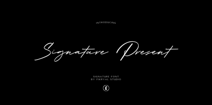 Signature Present – Signature Font is a meticulously crafted typeface that exudes elegance and sophistication. This font is designed to add a touch of personal flair and exclusivity to your projects, making it an ideal choice for various creative endeavors. With its exquisite strokes and graceful curves, Signature Present embodies the art of calligraphy, making it perfect for adding a luxurious and handwritten feel to your designs.
 - Querino Script by Mans Greback,
$59.00 Querino Script is an extra-bold script font, created by Måns Grebäck during 2018 and 2019. It comes as a regular, upright version and as italic. Also check out its sister typeface Querino Sans. The font is multilingual and has an extensive range of glyphs; it supports all Latin-based European languages, contains numbers as well as all symbols and characters you'll ever need.
 - Viking Drink by Fo Da,
$15.00 Viking Drink is a display font derivative from serif family of eight weights ranging from Regular to Bold and matching Italics, which gives it a full range of expression and suitability for advertising, interfaces and corporate design. Viking Drink provides 3 FREE weights ( Regular, Italic and Bold ). It has 17 ligatures that add powerful effect when used for creating logos or headlines. It also supports many languages.
 - Azingdar by Stringlabs Creative Studio,
$25.00 Azingdar feels playfully nostalgic and delivers an incredible vintage aesthetic. It will elevate a wide range of design projects to the highest level, be it branding, headings, wedding designs, invitations, signatures, logos, labels, and much more! This font is PUA encoded which means you can access all of the glyphs and swashes with ease! It also features a wealth of special features including alternate glyphs and ligatures.
 - Sensory Overload by Hanoded,
$15.00 Whenever I create a font using a Chinese brush and ink, it almost always comes out scary-looking. Sensory Overload is not like that: it is quite a neat and tidy font, even if it is a little rough around the edges. Sensory Overload is an all caps typeface and would be ideally suited for book covers, headlines, packaging and posters. Comes with an overload of diacritics.
 - Commander by Red Rooster Collection,
$45.00 Commander is a compressed serif font family and is an original creation of Steve Jackaman (ITF). It was designed in 1994 exclusively for the Red Rooster Collection. The family excels at display sizes and in headlines, and its masculine nature lends itself well to projects about sports, science fiction, and academia. Wherever Commander ends up in your project, it is guaranteed to draw attention!
 - Weirdtopia by Invasi Studio,
$19.00 Weirdtopia - is retro, fun, and playful. It really ties together your piece to make it feel retro. Perfect for making any project like header, quote, layout magazine, and others. Even better if used on the 60s and 70s design projects. A mix of psychedelia and groovy, it came with open-type features such as stylistic alternates that you can modify to fit your own style.
 - Wild Autumn by Epiclinez,
$18.00 Wild Autumn is a fun and fancy handwritten font, designed to become a true favorite. It maintains its classy calligraphic influences while feeling contemporary and fresh. Fall in love with it and bring your projects to a new height. So what’s included: Basic Latin A-Z & a-z. Numbers, symbols, and punctuations Multilingual Support. Accented Characters : ÀÁÂÃÄÅÆÇÈÉÊËÌÍÎÏÑÒÓÔÕÖØŒŠÙÚÛÜŸÝŽàáâãäåæçèéêëìíîïñòóôõöøœšùúûüýÿžß Thank you. We hope you enjoy the font.
 - Rundgotisch by HiH,
$10.00 One of my favorites. Rundgotisch is a easy to read for eyes that are accustomed to roman letterforms, yet keeps in touch with its blackletter roots. It was released around 1900 by Schelter & Giesecke of Leipzig, Germany. Can be used to set short text passages and pairs easily with many different decorative initials of the period. A very useful typeface. Don't leave home without it. According to Bringhurst, Schelter & Giesecke was formed in 1819 by Johann Gottfied Schelter and Christian Friedrich Giesecke. This old German printing house was sucked up by state-owned Typoart in 1946, after Marshall Zhukov and the Red Army had established Soviet dominion over East Germany.
 - Young Itch AOE by Astigmatic,
$19.95Ok, so many of you are now probably wondering if I am a teenager. Nope. But I was once, and I had alot of pent up angst like alot of other teens, and maybe this typeface is my outlet for what is left of those teenage days of mine. Take it as you will, but Young Itch is a bold, scratchy, handdrawn typestyle, with that feel of grunge and pent up anger. The typeface comes with its own persona, but I bet it would work itself well into a wide array of designs. Ventilate your current or past teen angst with Young Itch today! - Envelove by Sudtipos,
$39.00 «Envelove» is the brand new typographic challenge handwritten by Yani Arabena and designed along with Guille Vizzari and Ale Paul, for Sudtipos. It all started as a game for Yani. A carefree and spontaneous calligraphy, making use of the pointed nib with black ink, exploring its expressive possibilities pressing against paper. With time that nib turned into her dearest tool to flow through her writing, breeding this particular style of hers that let her trespass the barrier that kept personal and professional passions apart. All that inspiration is present in «Envelove», a play on words that reflects the love of letters. An expressive free-and-easy typeface that follows no formal calligraphic model and lets itself go with the meaning of words, rhythm and sensations. «Envelove» successfully joins three different fonts, «Envelove Script»—free, spontaneous and unique of its kind—going together with «Envelove Caps»—an uppercase style that builds controlled but dynamic words thanks to its alternates and ligatures, and to its own true Small Caps set as well—and «Envelove Icons», ideal to decorate and bring to life any written message. «Envelove» encourages you to write as if you have a nib, ink and an envelope. It invites you to take part in other worlds like a magic cocktail, a summer night, a long-awaited reunion, a first dance, a dish cooked with your own hands. The fashion world, gourmet, stationery, scrapbooking and everyone where a Handmade or Handcrafted feel is craved for, save a special place for «Envelove». (The illustration series that are shown with «Envelove» were made by the incredible Argentine illustrator Eugenia Mello.)
 - Summer Safari JNL by Jeff Levine,
$29.00 Inspired by an image of a 1960s rock and roll concert poster for “The Beach Boys Summer Safari”, this typeface captures the casual, informal lettering of the main headline and makes it available digitally. Evoking sunny days of fast cars, pretty girls and riding the waves, the playfully hand lettered Summer Safari JNL is available in both regular and oblique versions.
 - Amorphic by Ali Güzel,
$11.00 Chrome Balance is an experimental bitmap font created by photographing hand-modeled play dough and adding a chrome effect. It has a unique and dynamic look and is designed to accompany bold and simple designs such as album covers, posters etc.. The vector version of the same form has also been converted to the vector format, font named Amorphic. IG: algzl
 - French Song JNL by Jeff Levine,
$29.00 From the titles and credits of the 1952 British comedy “Song of Paris” comes this whimsical, hand lettered type design that’s casual, playful and charming. The digital version is called French Song JNL, and is available in both regular and oblique versions. This font release is the 1800th type design Jeff Levine Fonts has issued since its inception in January, 2006.
 - Mackless Script by Sibelumpagi,
$12.00 Mackless is a clean script font inspired by hand-lettering, bold script, brush script, and logotype. It comes with an extra extruded font for a good combination on your design need, and includes OpenType features with PUA encoded such as alternates and ligatures. Mackless would be good for branding, logotype, poster, badge, book cover, invitation, t-shirt design, packaging and many more.
 - Gracious Azaleas by Intellecta Design,
$15.50 Gracious Azaleas, the flourished ornaments typeface, was designed entirely by hand, without use of auto-tracing, by Iza W. Its well elaborated and unusual design was inspired by old cross-stitch and craft books. Good to use in arts and crafts works, books of arts, stationery, publishing stuff and many other applications. Another recherché masterpiece by Iza W from Intellecta Design.