10,000 search results
(0.202 seconds)
- Little Muffin by Factory738,
$15.00 LittleMuffin is a lovely serif font family with a modern feel. The elegant design was created by fusing modern and vintage elements. When it comes to choosing the right typographic color for your project, the different weights give you a lot of options. The available Ligatures and Italic styles provide a diverse range of characters to make your project design stand out. 5 Weights (Light, Regular, Semibold, Bold, Black) 2 Styles (Regular and Italic) Basic Latin A-Z and a-z Numerals & Punctuation Stylistic Ligatures and Alternate glyps Multilingual Support for ä ö ü Ä Ö Ü ... Free updates and feature additions Thanks for looking, and I hope you enjoy it.
 - Pocky Block by Arterfak Project,
$16.00 Introducing Pocky Block, a font that's bold and blocky with elegant and modern design. This font exudes a sporty, assertive, and daring vibe, making it a perfect fit for designs with sports, adventure, or futuristic themes. It's great for stickers, movie posters, flyers, displays, logos, motion graphics, advertising, and more. Pocky Block comes in two styles: Regular and Slanted. The Slanted style highlights a spirit of enthusiasm, speed, and confidence. This thick font also boasts over 100+ ligatures, allowing you to create dynamic and sophisticated letter combinations. What you'll get : All capital characters Numbers, punctuation & symbols Stylistic alternates Stylistic set 100+ Ligatures Multilingual support Help file. Thank you for your appreciation!
 - Pilfnof by Eksign,
$13.58 Pilfnof contains: - 394 glyphs which include: Basic Latin, Latin Extended - A, Latin 1 - Supplement and General Punctuation. - 4 weights: Light, Regular, Bold and Black Pilfnof is a reverse contrast serif font family. Purpose of the project was to design a standing out modern serif which revolves around reverse contrast. Width of strokes is fully reversed. Weight, width and contrast are regular while x-height is high. It contains uppercase and lowercase letters and lining figures. Pilfnof is perfect for use in Branding and Publications. It can be used both for text as well as headings and titles. Heavy weights are ideal for headlines while light weights are suitable for body text.
 - Samrose by Letterhend,
$16.00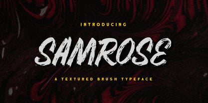 Introducing, Samrose. A unique textured brush typeface with bold and strong feel. This font perfectly made to be applied especially in logo, and the other various formal forms such as invitations, labels, magazines, books, greeting / wedding cards, packaging, fashion, make up, stationery, novels, labels or any type of advertising purpose. Features : uppercase & lowercase (alternates) numbers and punctuation Ligatures and alternates multilingual PUA encoded We highly recommend using a program that supports OpenType features and Glyphs panels like many of Adobe apps and Corel Draw, so you can see and access all Glyph variations. Email us to letterhend@gmail.com if you need something! Happy Designing!
 - HS Hadeel Serif by Hiba Studio,
$50.00 HS Hadeel Serif is a versatile display typeface designed for use in titles and graphic projects that support Arabic, Persian and English. It draws inspiration from the modern kufi style and features a unique blend of sharp and curved lines that lend a beautiful and geometric structure to each character. Based on the original HS Hadeel typeface, HS Hadeel Serif includes a serif on some of its characters to provide a more traditional look. Two weights are available for this typeface: Regular and Bold. HS Hadeel Serif represents a valuable addition to Arabic typography, offering designers a visually striking and flexible option for their projects.
 - Makeshift by Create Big Supply,
$25.00 Elevate your designs with the captivating allure of Makeshift Font. This extraordinary display typeface brings a bold and fun look, infusing your creations with a powerful and distinctive touch. Perfect for designers seeking originality, Makeshift Font is poised to make a lasting impression on logos, headlines, posters, product packaging, and more. Its versatility shines through in both digital and print mediums, making it a must-have for innovative projects. Makeshift Font boasts an extensive range of features, including uppercase and lowercase letters, numbers, punctuations, and comprehensive multilingual support. With PUA encoding, accessing the wide array of glyphs and swashes becomes effortless, empowering you to effortlessly customize your designs.
 - Adams by Canada Type,
$24.95 Adams is a revival and major expansion of Dolf Overbeek's Studio typeface and Flambard, its bold counterpart, originally published by the Amsterdam Type Foundry in 1946 and 1954. This digital version adds small caps and a new light weight. Adams is a simple upright, flat brush script, with stroke angles carefully designed to give the same color in all sizes. It is reminiscent of the sign lettering commonly found in the 1930s and 1940s. The Adams fonts are available in all popular font formats, and the character sets cover a wide range of codepages, including Central and Eastern European languages, Esperanto, Turkish, Baltic, Celtic/Welsh.
 - Bloom Beauty by Flawlessandco,
$9.00 Introducing "Bloom Beauty" - a whimsical and bold handwritten font that adds a touch of humor and playfulness to your designs. With its lively and expressive letterforms, Bloom Beauty brings a sense of fun and joy to any project. There's some connected letters and some alternates that suitable for any graphic designs such as branding materials, t-shirt, print, business cards, logo, poster, t-shirt, photography, quotes .etc This font support for some multilingual. Also contains uppercase A-Z and lowercase a-z, alternate character, numbers 0-9, and some punctuation. If you need help, just write me! Thanks so much for checking out my shop!
 - Pop Cubism by K-Type,
$20.00 The Pop Cubism fonts are inspired by Roy Lichtenstein who combined the strong outlines and benday dots of Pop Art with the fragmented viewpoints and facet line divisions of Cubism. The bold letterforms are derived from a variety of styles, both serif and sans, angular and rounded. Pop Cubism is available in two packages: Pop Cubism Shaded is a single font which contains the lines and dot tones for use in a single color. The Pop Cubism Color Kit contains three matching fonts (Pop Cubism Outline, Pop Cubism Halftone Underlay and Pop Cubism Color Underlay) for overlaying different colors of lines, dot tones, and background color.
 - Black Rocket by Letterhend,
$19.00 Black Rocketis a standout handwritten font with a touch of grunge and free look and feel. If you want to pick bold and standout font for your design, this is the font that you're looking for! This font is perfect for packaging, flyer design, event poster, event greeting,or any type of advertising purpose. Features : uppercase & lowercase numbers and punctuation multilingual PUA encoded We highly recommend using a program that supports OpenType features and Glyphs panels like many of Adobe apps and Corel Draw, so you can see and access all Glyph variations. How to access opentype feature : letterhend.com/tutorials/using-opentype-feature-in-any-software/
 - Bastinson by Letterhend,
$19.00 Bastinson is a monoline script with a touch of retro look and feel. Looks great to be paired with bold consendsed sans serif typeface. This type of font perfectly made to be applied especially in logo, headline, signage and the other various formal forms such as invitations, labels, logos, magazines, books, greeting / wedding cards, packaging, fashion, make up, stationery, novels, labels or any type of advertising purpose. Features : uppercase & lowercase numbers and punctuation multilingual alternates / swashes and ligatures PUA encoded We highly recommend using a program that supports OpenType features and Glyphs panels like many of Adobe apps and Corel Draw, so you can see and access all Glyph variations.
 - Steel by Cerri Antonio,
$35.00 STEEL regular, outline and bold, is a 3-font system that can be layered in different ways to create infinite title effects used commonly in poster and 3D logo design. Steel’s layer combinations give you complete control in producing styles like outline, 3D, and beveled. It can be used alone and/or in layers, and allows you adjust leading and kerning. Each font has similar metrics, so when your title is set, copy and paste-in-place to create layers of different weights/styles to build out your desired effect. Steel works great in any graphics application that allows you to utilize layers or 3D effects.
 - Huxley Cyrillic by HiH,
$12.00 Huxley Cyrillic is based on our Huxley Amore Bold, retaining all the Western and Central European characters of the latter, while adding upper and lower case Cyrillic characters. Huxley Cyrillic, like Huxley Amore, is visually simple and direct and yet sophisticated and unexpected. Those are the qualities that give it such freshness in so many applications. This font is intended for display use. It is highly condensed and is therefore difficult to read below 18 points. It works well at 36 points, but really works best at 48 points and larger. Huxley Cyrillic has 499 glyphs. I think we should have made at least one more!
 - Siah by Si47ash Fonts,
$19.00 Extra bold, extremely black! Siah font comes with 2 weights and provides a modern and clean sans serif Arabic/Persian type experience for headlines and headings! Siah means "Black" in Persian. This font also supports basic Latin. The complete font family is a great choice for all graphic designers, typographers and visual artists. Shahab Siavash, the designer has done more than 30 fonts and got featured on Behance, Microsoft, McGill University research website, Hackernoon, Fontself, FontsInUse,... Astaneh text and headline font which is one of his latest designs, already got professional typographers, lay-out and book designers' attention as well as some of the most recognizable publications in Arabic/Persian communities.
 - Kinsale Display by Fontdation,
$15.00 Introducing our new font Kinsale Display. A bold and strong looking display font that not only heavily inspired by the vintage/classic letterforms, but also some touch of modern twists and absurdities. Mouse-crafted with high attention to details; clean lines, sharp edges and tempting curves. Its wide and blocky letterforms make Kinsale is a great spacekiller. Suits best for title/headline, logo/logotype, packaging/label designs, etc. Packed with 300+ glyphs, weaponized with standard upper/lower case characters, numerals, punctuations, some multilingual letters, alternate characters, and ligatures. This font is a must have item for your designing arsenal. Get yourself one and start creating something cool! THANKS AND ENJOY!!!
 - Black Ground by Letterhend,
$16.00 Black Ground a unique brush typeface with bold and strong feel. This font perfectly made to be applied especially in logo, and the other various formal forms such as invitations, labels, magazines, books, greeting / wedding cards, packaging, fashion, make up, stationery, novels, labels or any type of advertising purpose. Features : uppercase & lowercase (alternates) numbers and punctuation Ligatures and alternates multilingual support PUA encoded We highly recommend using a program that supports OpenType features and Glyphs panels like many of Adobe apps and Corel Draw, so you can see and access all Glyph variations. Email us to letterhend@gmail.com if you need something! Happy Designing!
 - Synth2 by Pasternak,
$15.00 The font has a truly futuristic nature. It perfectly conveys the atmosphere of technology and futurism and it's the best choice for sci-fi and hi-tech topics and pictures. The font letters are unrounded, it's build is very simple and straight. The font includes 7 styles: thin, extra light, light, regular, medium, bold, and black. With the variety of font widths, there is the ability to make different combinations in graphic or web design projects as well. Carefully kerned letters look well in paragraphs and titles. Special attention to uppercase headings. The font counts 477 glyphs for each style. The thin style is free to use.
 - Hodgepodge by Outside the Line,
$19.00 Hodgepodge is a confused mixture of letters that somehow work together. While I know this has been done before I create fonts that I need. And I occasionally have found a need for this. And it was not there, so now it is. There is a mixture of light and dark, bold and regular, caps and lower case but not where you would expect them to be. Since this is a headline font you can set the headline and then easily go back and change a letter here or there to get the best-looking combination. Hodgepodge was in the 2011 Typodarium Page-A-Day Calendar on 7-17-2011.
 - Qadi by Linotype,
$187.99Qadi is a modern Arabic display face that includes the traditional range of letterforms. These extra bold shapes are striking, graceful, and confidently calligraphic. Produced in the mid 1980s under the design direction of the noted British typographer Walter Tracy, Qadi proved to be a very popular typeface for magazine and newspaper publications. Qadi has been updated to take full advantage of digital technology for accurate diacritical positioning and kerning refinements, ensuring high quality Arabic typesetting. The OpenType font incorporates the Arabic codepage, and supports Arabic and Persian. It also includes both tabular Arabic and Persian numerals, as well as Latin figures and complete punctuation. - Mogaster by Letterhend,
$17.00 Introducing, The Mogaster - a bold monoline script with a touch of vintage look and feel. You will get 3 styles of font. This type of font perfectly made to be applied especially in logo, headline, signage and the other various formal forms such as invitations, labels, logos, magazines, books, greeting / wedding cards, packaging, fashion, make up, stationery, novels, labels or any type of advertising purpose. Features : uppercase & lowercase numbers and punctuation multilingual alternates / swashes and ligatures PUA encoded We highly recommend using a program that supports OpenType features and Glyphs panels like many of Adobe apps and Corel Draw, so you can see and access all Glyph variations.
 - Calfine by Letterhend,
$17.00 Introducing, Calfine, a Bold and strong serif with high contrast weight. This font very suitable to be used as a title or display, make it looks great and stands from the crowd. This font perfectly made to be applied especially in logo, and the other various formal forms such as invitations, labels, logos, magazines, books, greeting / wedding cards, packaging, fashion, make up, stationery, novels, labels or any type of advertising purpose. Features : uppercase & lowercase numbers and punctuation multilingual PUA encoded We highly recommend using a program that supports OpenType features and Glyphs panels like many of Adobe apps and Corel Draw, so you can see and access all Glyph variations.
 - Birdman by Yock Mercado,
$9.99 Birdman is a modern blackletter font that merges rebellion and chicano style, elevating them to a new dimension of minimalism and edginess. With its trendy and condensed design, this geometric typeface captivates instantly. Its versatility makes it the perfect companion for impactful headlines, high-flying logos, and groundbreaking advertisements. Birdman challenges typographic conventions with its boldness, attracting all eyes with its simple elegance. With Birdman by your side, words take flight, releasing their rebellious and contemporary essence. Each stroke is a cry of originality, and each letter tells a tale of modernity and authenticity. Feel how this font elevates your designs, soaring toward new typographic horizons.
 - Beckford Script by Dear Alison,
$29.00 Brush lettered scripts have such a quick expressive quality to them and have amazed me since I was a little girl. The quick whip of the wrist can make or break a letterform so easily. They are filled with personality and visual flavor. Beckford Script taps into that association and brings a quick handed sassiness reminiscent of vintage travel brochures and old pulp and romance novels. But for whatever you might need this script for, you'll find it up for the task. Spice up your font collection and pick up Beckford Script today!
 - Draconian by madeDeduk,
$15.00 Draconian is a old school typeface with cool character! Draconian perfect for poster design, book covers, merchandise, fashion campaigns, newsletters, branding, advertising, magazines, greeting cards, album covers, and quote designs and more.
 - Classical by Elemeno,
$10.00Classical has the look and feel of a simplified old English Swash font, but it's much more legible. It was created for use as drop caps and has a limited character set. - ITC Bodoni Seventytwo by ITC,
$29.99Giambattista Bodoni (1740-1813) was called the King of Printers; he was a prolific type designer, a masterful engraver of punches and the most widely admired printer of his time. His books and typefaces were created during the 45 years he was the director of the fine press and publishing house of the Duke of Parma in Italy. He produced the best of what are known as modern" style types, basing them on the finest writing of his time. Modern types represented the ultimate typographic development of the late eighteenth and early nineteenth centuries. They have characteristics quite different from the types that preceded them; such as extreme vertical stress, fine hairlines contrasted by bold main strokes, and very subtle, almost non-existent bracketing of sharply defined hairline serifs. Bodoni saw this style as beautiful and harmonious-the natural result of writing done with a well-cut pen, and the look was fashionable and admired. Other punchcutters, such as the Didot family (1689-1853) in France, and J. E. Walbaum (1768-1839) in Germany made their own versions of the modern faces. Even though some nineteenth century critics turned up their noses and called such types shattering and chilly, today the Bodoni moderns are seen in much the same light as they were in his own time. When used with care, the Bodoni types are both romantic and elegant, with a presence that adds tasteful sparkle to headlines and advertising. ITC Bodoni™ was designed by a team of four Americans, after studying Bodoni's steel punches at the Museo Bodoniana in Parma, Italy. They also referred to specimens from the "Manuale Tipografico," a monumental collection of Bodoni's work published by his widow in 1818. The designers sought to do a revival that reflected the subtleties of Bodoni's actual work. They produced three size-specific versions; ITC Bodoni Six for captions and footnotes, ITC Bodoni Twelve for text settings, and ITC Bodoni Seventytwo - a display design modeled on Bodoni's 72-point Papale design. ITC Bodoni includes regular, bold, italics, Old style Figures, small caps, and italic swash fonts. Sumner Stone created the ornaments based on those found in the "Manuale Tipografico." These lovely dingbats can be used as Bodoni did, to separate sections of text or simply accent a page layout or graphic design." - ITC Bodoni Twelve by ITC,
$29.99Giambattista Bodoni (1740-1813) was called the King of Printers; he was a prolific type designer, a masterful engraver of punches and the most widely admired printer of his time. His books and typefaces were created during the 45 years he was the director of the fine press and publishing house of the Duke of Parma in Italy. He produced the best of what are known as modern" style types, basing them on the finest writing of his time. Modern types represented the ultimate typographic development of the late eighteenth and early nineteenth centuries. They have characteristics quite different from the types that preceded them; such as extreme vertical stress, fine hairlines contrasted by bold main strokes, and very subtle, almost non-existent bracketing of sharply defined hairline serifs. Bodoni saw this style as beautiful and harmonious-the natural result of writing done with a well-cut pen, and the look was fashionable and admired. Other punchcutters, such as the Didot family (1689-1853) in France, and J. E. Walbaum (1768-1839) in Germany made their own versions of the modern faces. Even though some nineteenth century critics turned up their noses and called such types shattering and chilly, today the Bodoni moderns are seen in much the same light as they were in his own time. When used with care, the Bodoni types are both romantic and elegant, with a presence that adds tasteful sparkle to headlines and advertising. ITC Bodoni™ was designed by a team of four Americans, after studying Bodoni's steel punches at the Museo Bodoniana in Parma, Italy. They also referred to specimens from the "Manuale Tipografico," a monumental collection of Bodoni's work published by his widow in 1818. The designers sought to do a revival that reflected the subtleties of Bodoni's actual work. They produced three size-specific versions; ITC Bodoni Six for captions and footnotes, ITC Bodoni Twelve for text settings, and ITC Bodoni Seventytwo - a display design modeled on Bodoni's 72-point Papale design. ITC Bodoni includes regular, bold, italics, Old style Figures, small caps, and italic swash fonts. Sumner Stone created the ornaments based on those found in the "Manuale Tipografico." These lovely dingbats can be used as Bodoni did, to separate sections of text or simply accent a page layout or graphic design." - ITC Bodoni Ornaments by ITC,
$29.99Giambattista Bodoni (1740-1813) was called the King of Printers; he was a prolific type designer, a masterful engraver of punches and the most widely admired printer of his time. His books and typefaces were created during the 45 years he was the director of the fine press and publishing house of the Duke of Parma in Italy. He produced the best of what are known as modern" style types, basing them on the finest writing of his time. Modern types represented the ultimate typographic development of the late eighteenth and early nineteenth centuries. They have characteristics quite different from the types that preceded them; such as extreme vertical stress, fine hairlines contrasted by bold main strokes, and very subtle, almost non-existent bracketing of sharply defined hairline serifs. Bodoni saw this style as beautiful and harmonious-the natural result of writing done with a well-cut pen, and the look was fashionable and admired. Other punchcutters, such as the Didot family (1689-1853) in France, and J. E. Walbaum (1768-1839) in Germany made their own versions of the modern faces. Even though some nineteenth century critics turned up their noses and called such types shattering and chilly, today the Bodoni moderns are seen in much the same light as they were in his own time. When used with care, the Bodoni types are both romantic and elegant, with a presence that adds tasteful sparkle to headlines and advertising. ITC Bodoni™ was designed by a team of four Americans, after studying Bodoni's steel punches at the Museo Bodoniana in Parma, Italy. They also referred to specimens from the "Manuale Tipografico," a monumental collection of Bodoni's work published by his widow in 1818. The designers sought to do a revival that reflected the subtleties of Bodoni's actual work. They produced three size-specific versions; ITC Bodoni Six for captions and footnotes, ITC Bodoni Twelve for text settings, and ITC Bodoni Seventytwo - a display design modeled on Bodoni's 72-point Papale design. ITC Bodoni includes regular, bold, italics, Old style Figures, small caps, and italic swash fonts. Sumner Stone created the ornaments based on those found in the "Manuale Tipografico." These lovely dingbats can be used as Bodoni did, to separate sections of text or simply accent a page layout or graphic design." - ITC Bodoni Brush by ITC,
$29.99Giambattista Bodoni (1740-1813) was called the King of Printers; he was a prolific type designer, a masterful engraver of punches and the most widely admired printer of his time. His books and typefaces were created during the 45 years he was the director of the fine press and publishing house of the Duke of Parma in Italy. He produced the best of what are known as modern" style types, basing them on the finest writing of his time. Modern types represented the ultimate typographic development of the late eighteenth and early nineteenth centuries. They have characteristics quite different from the types that preceded them; such as extreme vertical stress, fine hairlines contrasted by bold main strokes, and very subtle, almost non-existent bracketing of sharply defined hairline serifs. Bodoni saw this style as beautiful and harmonious-the natural result of writing done with a well-cut pen, and the look was fashionable and admired. Other punchcutters, such as the Didot family (1689-1853) in France, and J. E. Walbaum (1768-1839) in Germany made their own versions of the modern faces. Even though some nineteenth century critics turned up their noses and called such types shattering and chilly, today the Bodoni moderns are seen in much the same light as they were in his own time. When used with care, the Bodoni types are both romantic and elegant, with a presence that adds tasteful sparkle to headlines and advertising. ITC Bodoni™ was designed by a team of four Americans, after studying Bodoni's steel punches at the Museo Bodoniana in Parma, Italy. They also referred to specimens from the "Manuale Tipografico," a monumental collection of Bodoni's work published by his widow in 1818. The designers sought to do a revival that reflected the subtleties of Bodoni's actual work. They produced three size-specific versions; ITC Bodoni Six for captions and footnotes, ITC Bodoni Twelve for text settings, and ITC Bodoni Seventytwo - a display design modeled on Bodoni's 72-point Papale design. ITC Bodoni includes regular, bold, italics, Old style Figures, small caps, and italic swash fonts. Sumner Stone created the ornaments based on those found in the "Manuale Tipografico." These lovely dingbats can be used as Bodoni did, to separate sections of text or simply accent a page layout or graphic design." - ITC Bodoni Six by ITC,
$40.99Giambattista Bodoni (1740-1813) was called the King of Printers; he was a prolific type designer, a masterful engraver of punches and the most widely admired printer of his time. His books and typefaces were created during the 45 years he was the director of the fine press and publishing house of the Duke of Parma in Italy. He produced the best of what are known as modern" style types, basing them on the finest writing of his time. Modern types represented the ultimate typographic development of the late eighteenth and early nineteenth centuries. They have characteristics quite different from the types that preceded them; such as extreme vertical stress, fine hairlines contrasted by bold main strokes, and very subtle, almost non-existent bracketing of sharply defined hairline serifs. Bodoni saw this style as beautiful and harmonious-the natural result of writing done with a well-cut pen, and the look was fashionable and admired. Other punchcutters, such as the Didot family (1689-1853) in France, and J. E. Walbaum (1768-1839) in Germany made their own versions of the modern faces. Even though some nineteenth century critics turned up their noses and called such types shattering and chilly, today the Bodoni moderns are seen in much the same light as they were in his own time. When used with care, the Bodoni types are both romantic and elegant, with a presence that adds tasteful sparkle to headlines and advertising. ITC Bodoni™ was designed by a team of four Americans, after studying Bodoni's steel punches at the Museo Bodoniana in Parma, Italy. They also referred to specimens from the "Manuale Tipografico," a monumental collection of Bodoni's work published by his widow in 1818. The designers sought to do a revival that reflected the subtleties of Bodoni's actual work. They produced three size-specific versions; ITC Bodoni Six for captions and footnotes, ITC Bodoni Twelve for text settings, and ITC Bodoni Seventytwo - a display design modeled on Bodoni's 72-point Papale design. ITC Bodoni includes regular, bold, italics, Old style Figures, small caps, and italic swash fonts. Sumner Stone created the ornaments based on those found in the "Manuale Tipografico." These lovely dingbats can be used as Bodoni did, to separate sections of text or simply accent a page layout or graphic design." - Merchant Trade JNL by Jeff Levine,
$29.00 A precursor to Art Deco headline/display sans serif typefaces with thick and thin strokes is the Matthews Series (circa 1902). It was manufactured and sold through the Inland Type Foundry of St. Louis, MO. Digitally redrawn as Merchant Trade JNL, it’s now available in both regular and oblique versions.
 - Termit by Ditatype,
$29.00 Termit is a striking display font designed with a game theme, featuring large letters with a fairly thick weight and a rectangular shape with sharp corners. This font shows large letters that demand attention and create a bold statement. The rectangular shape with sharp corners in Termit adds a sense of structure and stability to the font. The clean lines and defined angles create a visually bold and impactful appearance. This unique feature evokes a sense of strength and resilience, reflecting the competitive and strategic nature of the gaming world. Each character shares the same height and width, creating a cohesive and pleasing visual experience. With its low-contrast design, it offers a subtle and understated look. The minimal variation in stroke width adds a sense of uniformity and simplicity to the font, allowing the overall design to take center stage. This feature ensures that the focus remains on the content while still maintaining a strong visual impact. Enjoy the available features here. Features: Stylistic Sets Multilingual Supports PUA Encoded Numerals and Punctuations Termit fits in headlines, logos, posters, titles, branding materials, print media, editorial layouts, website headers, and any other game-themed projects. Find out more ways to use this font by taking a look at the font preview. Thanks for purchasing our fonts. Hopefully, you have a great time using our font. Feel free to contact us anytime for further information or when you have trouble with the font. Thanks a lot and happy designing.
 - Black Wizard by Mans Greback,
$59.00 Black Wizard is a bold and funky sans-serif font that is perfect for adding a touch of playfulness to your designs. With its wobbly and uneven letters, Black Wizard exudes a playful and cartoonish quality that is sure to make your project stand out. This font is ideal for Halloween-themed designs, as its bold and scary appearance can add an extra element of spookiness to your work. But it's not all frights and scares - the funny and lighthearted nature of Black Wizard also bring a touch of humor. Black Wizard comes in four styles: Regular, Italic, Straight, and Straight Italic, giving you plenty of options to choose from for your design needs. Additionally, a Symbols font is included with various Halloween-themed symbols that can be added to your text to enhance the spooky vibe. Use the character ¤ anywhere in a word to make a Halloween symbol. Example: Scare¤Crow. To add different symbols like ghosts and bats, use multiple ¤ characters. Example: Dark¤¤¤Night. The font is built with advanced OpenType functionality and has a guaranteed top-notch quality, containing stylistic and contextual alternates, ligatures and more features; all to give you full control and customizability. It has extensive lingual support, covering all Latin-based languages, from Northern Europe to South Africa, from America to South-East Asia. It contains all characters and symbols you'll ever need, including all punctuation and numbers.
 - Young Money by Mans Greback,
$69.00 Young Money is a script font that expresses a sense of forwardness and spontaneity. Its calligraphic strokes were created with a brush, giving it a wild and fast appearance that's perfect for conveying energy and movement. This font is ideal for sporty designs, trendy logos, and anything that requires a touch of youthful vigor. With its Bold and Italic styles, Young Money is versatile enough to be used for a variety of design purposes. The Italic style gives the font a more emphasized look, while the Bold style adds an extra level of impression and strength. The swashes included in the font allow for even more customization, giving designers the ability to create truly unique and expressive designs. Whether you're designing a logotype, poster or product brand, Young Money is a font that perfectly captures the spirit of youth and vitality. Use underscore _ after a word to make a swash. Example: Wild_ Use multiple underscores to make longer swashes. Example: Bonfires_____ Use # after any letter to make a swash version. Example: Spring#Zone# The font is built with advanced OpenType functionality and has a guaranteed top-notch quality, containing stylistic and contextual alternates, ligatures and more features; all to give you full control and customizability. It has extensive lingual support, covering all Latin-based languages, from Northern Europe to South Africa, from America to South-East Asia. It contains all characters and symbols you'll ever need, including all punctuation and numbers.
 - Tertius by Scholtz Fonts,
$21.00 Tertius, with its high ascenders and clubbed serifs, is a modern interpretation of the classic Carolingian style (7th - 9th centuries AD). There was no capital form in the Carolinian hand and Roman square capitals were originally used with it. The Carolingian hand began, after a while, to develop more cursive tendencies as people looked for a way to speed up the writing process. I have “capitalized” on this trend and have devised an appropriate and dramatic set of flowing capitals for this family. With its elegant swashes and bold letter shapes, Tertius embodies the romance of medieval life, of knights, castles, and chivalry. Tertius comes in four styles:- -- Regular: with elegant, smoothly penned characters; -- Crenellated: written with a scratchy pen over rough parchment -- many drops of ink and blotches have been left on the parchment (“Crenellated” means battlements -- the rough protrusions on the top of castle walls); and -- Romantic: the capitals have been loosely overwritten generating a contemporary version of illuminated capitals. -- Illuminated: richly decorated illuminated capitals for use with Tertius Regular (28 characters) All fonts have been carefully crafted, letterspaced and kerned and contain full character sets of 237 characters.
 - Nori by Positype,
$49.00 First, the important information…Nori is a hand-lettered typeface that contains over 1100 glyphs, 250 ligatures, 487 alternate characters, 125+ swash and titling alternates, lining and old style numerals. To make sure it is perfectly clear—Nori is the result of brush and ink on paper. The textures produced in each glyph are real and the imperfections are intentional and add to the sincerity of the letters. I say this to be as blunt as possible in order to avoid confusion and to frame what this typeface represents—calligraphic, handwritten letters captured digitally for their warmth and poetic variation for print and screen. Like my handwritten, calligraphic or brush-driven faces before it (the Baka series and the TDC2 2010 winning typeface, Fugu), Nori is a product of my analog and digital hand. To view the words and sentences formed by this typeface is to look at how my hands, yes hands, make letters. The fluidity, as well as the irregularity, is human, honest and intentional—to do so lets the brush I am holding breathe life into each letter. Once digital, any number of points and repetitive processes can’t mask its influences—and I like that. The brush, a simple instrument, my tool, my friend designed to emulate traditional Japanese sumi-e brushes... the Pilot Japan Kanji Fude brush pen. Each letter, each variation was written over and over again until I found the right combination. From there, each was scanned, digitized and optimized. Points were removed in order to ‘clean’ the glyphs up some but I did not want to compromise the integrity of the actual brush stroke. Once this base set of characters (about 350) were completed, the thoughtful manipulation of the glyphs, their gestures and forms were further expanded to solidify the embellishments used within the ligatures, alternates, swashes and additional features. This process was admittedly self-indulgent to an extent. I wanted the words created with this typeface to have the flexibility of variation and cohesiveness of movement that someone fluidly producing these letters by hand might have. I hope you enjoy this typeface as much as I did during the six months working on it. A specimen and style guide is included with the purchased of Nori.
 - Standing Stones by Solotype,
$19.95Redrawn from a strange type originally made about 1850, and sold by the Connors Foundry, New York. We cannot guarantee that Connors originated it, since they were among the first to have facilities for pirating other foundries' types. - Moldr by Deltatype,
$49.00 Moldr, a sans-serif with modular grid structure, inspired from handmade letter to industrial machine mold, Moldr come with 9 weights in complete family, Support many language with standard Adobe Lain 4 glyphs, world-ready and mark2mark support.
 - Eckhardt Showcard JNL by Jeff Levine,
$29.00Eckhardt Showcard JNL and Eckhardt Showcard Two JNL are drawn from more lettering found in an old sign painting book. Jeff Levine has continued naming a series of fonts for the late Albert Eckhardt, Jr. (1929-2005) who had owned Allied Signs in Miami, Florida from 1959 until his passing. Al was a talented lettering artist and a good friend to Jeff. - Crossell by Emboss,
$35.00 Crossell is a display typeface inspired by linoleum cuts and old comic strips. It comes in three weights and can be purchased solo or as a family. Take it home and give it a spin today.