10,000 search results
(0.257 seconds)
- Kicked Display by Prioritype,
$23.00 "Kicked Display" is a display font with a unique and bold contrasting style. It is this bold and thin that makes this font memorable. Designing with pastel colors also looks more maximal with this font. Features: Uppercase, Lowercase, Numeral, Punctuation & Multilingual. Multilingual contained: Afrikaans, Albanian, Asu, Basque, Bemba, Bena, Breton, Catalan, Chiga, Cornish, Danish, Dutch, English, Estonian, Filipino, Finnish, French, Friulian, Galician, German, Gusii, Indonesian, Irish, Italian, Kabuverdianu, Kalenjin, Kinyarwanda, Luo, Luxembourgish, Luyia, Machame, Makhuwa-Meetto, Makonde, Malagasy, Manx, Morisyen, North Ndebele, Norwegian Bokmål, Norwegian Nynorsk, Nyankole, Oromo, Portuguese, Quechua, Romansh, Rombo, Rundi, Rwa, Samburu, Sango, Sangu, Scottish Gaelic, Sena, Shambala, Shona, Soga, Somali, Spanish, Swahili, Swedish, Swiss German, Taita, Teso, Uzbek (Latin), Volapük, Vunjo, Zulu. Thanks!
 - Black Script by Fenotype,
$35.00 Black Script is a bold connected script family with plenty of weights: Regular, Bold, Inline versions, Caps, Ornaments and Printed versions of all those. For the best price purchase either Black Script Family or Black Script Printed Family or Black Script Complete Pack which contains all versions of the font. Black Script is equipped with automatic OpenType Ligatures, Swash and Stylistic Alternates to let you customise your designs. Find even more alternates from Glyph Palette. Black Script Caps is a block letter font designed to work alone or to support the script. Caps is equipped with Swash alternates. Black Script is a great font family for creating ambitious headlines, logos & posters with a custom-made feeling.
 - ED Laurentsa by Emyself Design,
$9.00 Introducing - ED Laurentsa is a classic serif font family consisting of 9 Weights (Thin, ExtraLight, Light, Regular, Medium, Semibold, Bold, ExtraBold, and Black). Try DEMO Version : https://emyselfdesign.gumroad.com/l/pgtit ED Laurentsa has a classic minimalist look with a condensed style and has a wide variety from thin to black to suit your needs. This font is perfect for your design needs, such as logo design, branding, apparel, headings, web, etc. This font can also be easily combined with other fonts to create the perfect typography. Bold fonts are perfect for displays such as logos, or in-text headings. while the font with a thin style is suitable for covers, posters, or social media posts.
 - Billiboldy by Gie Studio,
$10.00 Are you planning to do an amazing piece of work to make lots of people smile happily while taking your hat off every time? If so, this is the right time to give your work a little touch with a sincere and elegant writing. Introducing Billiboldy- A New Bold Script Font Billiboldy is a cursive and thick lettered handwritten bold script font, crafted to give your headlines and logotype projects a stylish touch. This font reads as strong, dynamic and can add tons of nostalgic character to your designs. This font includes Multilingual Options to make your branding globally acceptable. Features: - Ligatures - Stylistic Sets - Multilingual Support - PUA Encoded - Numerals and Punctuation - Special underscore character 7 style - Special doodles for front and back of letters or sentences Thank you for your visit and downloading premium fonts from Gie Studio
 - Bad Rascal by Mans Greback,
$69.00 Bad Rascal is a script typeface. This flowing brush font in a fat style gives any project the attention it deserves. Use it for a bold logotype or headline to give your work that extra-bold look. Use underscore _ to make a swash underline. Example: Powers_ Use multiple underscores to make a swashes of different lengths. Example: Baddest_______ (Download required.) The Bad Rascal family consists of the fonts Regular and Italic. The font is built with advanced OpenType functionality and has a guaranteed top-notch quality, containing stylistic and contextual alternates, ligatures and more features; all to give you full control and customizability. It has extensive lingual support, covering all Latin-based languages, from Northern Europe to South Africa, from America to South-East Asia. It contains all characters and symbols you'll ever need, including all punctuation and numbers.
 - Ink Outlaw by Rochart,
$25.00 Ink Outlaw is not just a font; it's a rebellious statement in every stroke. Inspired by the raw energy and urban artistry of graffiti and vandalism, this font unleashes a torrent of creativity onto your canvas. Each letter is a work of defiant art, meticulously designed to capture the edgy spirit of street culture. With Ink Outlaw, your designs will command attention and provoke thought. Its bold and irregular lines, dripping paint effect, and rugged edges give your text a gritty, authentic graffiti feel. Whether you're working on posters, apparel, album covers, or any project that needs an unapologetically bold aesthetic, Ink Outlaw will be your accomplice in making a powerful statement. Embrace the outlaw spirit, break free from conformity, and let Ink Outlaw become the voice of your artistic rebellion. Transform your designs into urban masterpieces with this distinctive and daring font.
 - Toms Finger by CozyFonts,
$20.00 Toms Finger Family fonts is a hand drawn sans serif series containing Regular weight (Toms Finger), Bold weight (Toms Thumb), and Light weight (Toms Pinky). Drawn entirely using his finger tip on a tablet Tom created this font to be user-friendly for Notes, Signs, Posters, Ads, Captions or anything where the writer wants to convey a casual, non invasive voice in the copy. Toms Finger Family is legible in a wide range of sizes in all weights.
 - Opal by Linotype,
$29.99 Opal Pro is a text family designed by Hannes von Döhren in 2008. It gives every text a noble character. The typeface has long ascenders that clearly rise above the capital letters and a low x-height. Opal’s letters sport inktraps at stroke junctions, which on one hand create a cutout feeling and on the other hand strengthens the image in larger point sizes. In total, the letterforms have clear emphasis on their verticals and horizontals; they do not fear the weight on their curves. In addition to the Italic and Bold, the Opal type family includes a Script face, whose letterforms include connections, similar to handwriting. On top of that, the typeface possesses swash letters for italic and script, small caps, many ligatures and borders & ornaments. With a little bit of care, designers will be able to create the finest of traditional, elegant work with this family.
 - TF The Fest by Tyfomono,
$29.00 Take your design game to the next level with a bold, thick and expressive font that truly looks hand painted. The Fest uses authentic looking fonts and is sure to grab the attention of customers and designers alike. We made 2 styles for The Fest, it lets you explore and improve the personality of your design works. This version is also great for blocks of text and small print. Slanted - With a little improvement for the slanted version, The Fest Slanted is fit for the any size. These style is alternative of your choices for the look.
 - MVB Cafe Mimi by MVB,
$39.00Kanna Aoki was designing fabrics and dishware for several major manufacturers when she designed MVB Cafe Mimi. The design came from a few words Aoki painted as decoration for a set of cappuccino cups. Aoki created the Regular weight for MVB Fonts using a brush. The Bold was adapted after digitization. Using several double-letter ligatures, the fonts can feel as natural and spontaneous as the original hand-painted lettering. Despite its curlicues and free-flowing forms, great care was taken to keep this script balanced and legible. It skips and hops along the baseline but doesn't lose its step. - RePublic by Suitcase Type Foundry,
$75.00In 1955 the Czech State Department of Culture, which was then in charge of all the publishing houses, organised a competition amongst printing houses and generally all book businesses for the design of a newspaper typeface. The motivation for this contest was obvious: the situation in the printing presses was appalling, with very little quality fonts existing and financial resources being too scarce to permit the purchase of type abroad. The conditions to be met by the typeface were strictly defined, and far more constrained than the ones applied to regular typefaces designed for books. A number of parameters needed to be considered, including the pressure of the printing presses and the quality of the thin newspaper ink that would have smothered any delicate strokes. Rough drafts of type designs for the competition were submitted by Vratislav Hejzl, Stanislav Marso, Frantisek Novak, Frantisek Panek, Jiri Petr, Jindrich Posekany, and the team of Stanislav Duda, Karel Misek and Josef Tyfa. The committee published its comments and corrections of the designs, and asked the designers to draw the final drafts. The winner was unambiguous — the members of the committee unanimously agreed to award Stanislav Marso’s design the first prize. His typeface was cast by Grafotechna (a state-owned enterprise) for setting with line-composing machines and also in larger sizes for hand-setting. Regular, bold, and bold condensed cuts were produced, and the face was named Public. In 2003 we decided to digitise the typeface. Drawings of the regular and italic cuts at the size of approximatively 3,5 cicero (43 pt) were used as templates for scanning. Those originals covered the complete set of caps except for the U, the lowercase, numerals, and sloped ampersand. The bold and condensed bold cuts were found in an original specimen book of the Rude Pravo newspaper printing press. These specimens included a dot, acute, colon, semicolon, hyphens, exclamation and question marks, asterisk, parentheses, square brackets, cross, section sign, and ampersand. After the regular cut was drafted, we began to modify it. All the uppercase letters were fine-tuned, the crossbar of the A was raised, E, F, and H were narrowed, L and R were significantly broadened, and the angle of the leg and arm of the K were adjusted. The vertex of the M now rests on the baseline, making the glyph broader. The apex of the N is narrower, resulting in a more regular glyph. The tail of Q was made more decorative; the uppercase S lost its implied serifs. The lowercase ascenders and descenders were slightly extended. Corrections on the lower case a were more significant, its waist being lowered in order to improve its colour and light. The top of the f was redrawn, the loop of lowercase g now has a squarer character. The diagonals of the lowercase k were harmonised with the uppercase K. The t has a more open and longer terminal, and the tail of the y matches its overall construction. Numerals are generally better proportioned. Italics have been thoroughly redrawn, and in general their slope is lessened by approximatively 2–3 degrees. The italic upper case is more consistent with the regular cut. Unlike the original, the tail of the K is not curved, and the Z is not calligraphic. The italic lower case is even further removed from the original. This concerns specifically the bottom finials of the c and e, the top of the f, the descender of the j, the serif of the k, a heavier ear on the r, a more open t, a broader v and w, a different x, and, again, a non-calligraphic z. Originally the bold cut conformed even more to the superellipse shape than the regular one, since all the glyphs had to be fitted to the same width. We have redrawn the bold cut to provide a better match with the regular. This means its shapes have become generally broader, also noticeably darker. Medium and Semibold weights were also interpolated, with a colour similar to the original bold cut. The condensed variants’ width is 85 percent of the original. The design of the Bold Condensed weights was optimised for the setting of headlines, while the lighter ones are suited for normal condensed settings. All the OpenType fonts include small caps, numerals, fractions, ligatures, and expert glyphs, conforming to the Suitcase Standard set. Over half a century of consistent quality ensures perfect legibility even in adverse printing conditions and on poor quality paper. RePublic is an exquisite newspaper and magazine type, which is equally well suited as a contemporary book face. - Geiger by WyldType,
$14.99 Geiger is a geometric typeface inspired by type found in the intros of Commodore 64 games, its attention to the grid and its limited set of building blocks. The design of Geiger respects these criteria to create a sturdy alphabet without diagonals, and loosen its grip on the classic limitations to produce a complete character set worthy of today`s high-resolution displays with a retro touch. The properties of classic computing platforms, like their limited memory and low-resolution displays, required that the designers and programmers of the time devise and use certain techniques to produce interesting visual results. These platforms offered limited sets of default building blocks from which to build more complex graphics and type, and some skilled coders would work around these limitations to produce the unexpected. One of the areas that saw experimental digital type flourish is the Commodore 64 intro scene. The Geiger family includes four styles (regular, oblique, bold and bold oblique), all include common ligatures (fi, ff, ffi, fj, fl, jj, tt, Th, TT) and a few stylistic alternates (K, L). A particular attention was paid to the pattern created by the vertical stem and negative spaces of tightly set text, especially for Geiger Bold. Geiger produces good results at a size of 30pt or more, but we suggest using it at higher display sizes.
 - Haigrast Serif by Mans Greback,
$59.00 Haigrast Serif is a font that combines classic and modern design elements to create a look that is both tasteful and fashion-forward. This serif font is regular but with a very modern feel, making it the perfect choice for designers looking to add a touch of sophistication to their work. The sharp, crisp lines and swash alternates in addition to the decorative letterings add a unique touch, making Haigrast Serif a versatile font that can be used in a variety of projects. Whether you're creating a stylish magazine layout, a cool fashion logo, or a balanced design piece, Haigrast Serif is the perfect font to make your work stand out. Designed by Mans Greback in 2023, this font is the perfect choice for designers who want to make a bold statement in their design work. The Haigrast Script family consists of six high-quality fonts: Regular, Italic, Bold, Bold Italic, Black and Black Italic The font is built with advanced OpenType functionality and has a guaranteed top-notch quality, containing stylistic and contextual alternates, ligatures and more features; all to give you full control and customizability. It has extensive lingual support, covering all Latin-based languages, from Northern Europe to South Africa, from America to South-East Asia. It contains all characters and symbols you'll ever need, including all punctuation and numbers.
 - remakeoffabulous3 - Unknown license

- Love Parade outline - Unknown license

- DS Comedy Cyr - Unknown license

- Antique Tuscan Condensed by Wooden Type Fonts,
$20.00A revival of one of the popular wooden type fonts of the 19th century, condensed, bold, curved serifs, a very useful design for display. - Case Closed JNL by Jeff Levine,
$29.00 Case Closed JNL is a bold, slab serif stencil font inspired by a set of brass stencils spotted for sale in an internet auction.
 - FF Mambo by FontFont,
$41.99 Canadian type designer Val Fullard created this display FontFont in 1992. The family contains 3 weights: Light, Medium, and Bold and is ideally suited for festive occasions, music and nightlife as well as poster and billboards. FF Mambo provides advanced typographical support with features such as ligatures, titling alternates, alternate characters, and case-sensitive forms. It comes with tabular lining figures.
 - Namyv by Poloskov,
$14.50 Namyv is the first font I did ... and now it’s improved! I combined all the best of the font. It’s unique and interesting. A great choice for website and app designs. I'm using Namyv Bold for posters and other print designs. It's very strong! And you can combine Namyv font with any Sans Serif font. They will look fantastic. Cyrillic characters included!
 - Florest Display by Kaligra.co,
$19.00 Florest Display is a clean bold and simple vintage sans serif font, with smooth edges and touch of many beautiful alternate characters make this font look Elegant & stylist. It contains an uppercase alphabet with numbers and symbols. Designed with Stylistic Alternates and Contextual Alternate in some characters that allows you to mix and match pairs of letters to fit your design.
 - Lumiere Rosie by Kaligra.co,
$29.00 Introducing Lumiere Rosie – A Gorgeous modern sans serif with ton of stylistic alternates to choose. Its bold clean and simple. Works wonderfully on its own for logos, headlines, posters, packaging and many more! And with Three different weights to choose, your option to create more unique and versatile design is a lot wider. Have fun and create more. Your Imagination only your limit!
 - NorB Scribe by NorFonts,
$28.00 NorB Scribe is a handwritten text font witch can be used with any word processing program for text and display use, print and web projects, apps and ePub, comic books, graphic identities, branding, editorial, advertising, scrapbooking, cards and invitations and any casual lettering purpose… or even just for fun! It comes with 6 weights featuring Light, Normal, Bold with their Italic version.
 - Creamy Mango by Olivetype,
$18.00 Creamy Mango is a bold and super cute display font. This font is suitable for headlines and branding! It's unique and attention-grabbing, while still maintaining a cute aesthetic. It's super fun! So what’s included : Basic Latin Uppercase and Lowercase Numbers, symbols, and punctuations Multilingual Support. Fully accessible without additional design software Simple Installations Works on PC & Mac Thank You.
 - Fragilers by Alandya TypeFoundry,
$21.00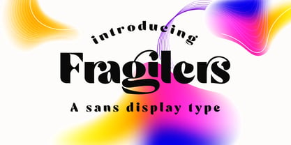 Fragilers is a bold sans display with high contrast, making it a versatile and elegant typeface. Fragilers contrast lines and smooth terminals give a sleek and elegant look to logos, holiday cards, wedding invitations, quotes, advertisements, and more. Fragilers is a versatile typeface full of character to enrich your designs. And of course multilingual support. Create awesome layouts of your designs with Fragilers.
 - Binary Groove by Hipfonts,
$17.00 Binary Groove is a bold and dynamic font that captures the essence of the 1980s retro-futuristic style. The geometric shapes and sharp edges of each letterform evoke a sense of technology and progress, while the rounded edges add a touch of playfulness. The font features a sleek and modern design that is perfect for headlines, posters, packaging, and branding projects.
 - FF Ticket by FontFont,
$41.99 German type designer Daniel Fritz created this display FontFont in 2000. The family has 8 weights, ranging from Thin to Bold (including italics) and is ideally suited for advertising and packaging, editorial and publishing as well as poster and billboards. FF Ticket provides advanced typographical support with features such as ligatures, alternate characters, and case-sensitive forms. It comes with tabular lining figures.
 - JF Matisse by The Jumping Foxes,
$60.00 A font inspired from Henri Matisse’s cutouts and color palette. The font was created from outlining forms without being constrained by any reason or rational proportions. It has a deliberately disorienting and unsettling tone. Tension exists throughout sometimes clear and abrupt lines, creating a vibrant and rebellious font. It’s best used for short and bold headlines or titles. This font shouts attention.
 - Moyshire by Rillatype,
$13.00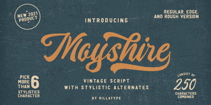 Moyshire is a vintage script font with a little touch of brush to make this font more bold and eye catching. this font is perfect for branding logo, illustration, or apparel design. This font also support multilingual, number and symbol. This font comes with 3 version, Regular, Rough, and Edge. Features : uppercase & lowercase numbers and punctuation multilingual alternates / swashes and ligatures PUA encoded
 - Modern Monarch by RagamKata,
$16.00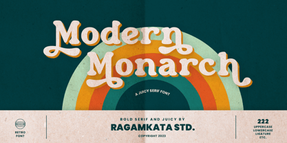 Modern Monarch is a retro display serif font that exudes a classic charm and bold character. With its design inspired by retro styles, this font brings an elegant touch and evokes a sense of the past. Modern Monarch Features: • Uppercase And Lowercase • Alternates And Ligatures • Numerals & Punctuation • Accented characters • Multilingual Support • Unicode PUA Encoded Thanks and have a wonderful day .
 - FF Beekman Square by FontFont,
$41.99 Dutch type designer Donald Beekman created this display FontFont in 1999. The family has 6 weights, ranging from Light to Bold (including italics) and is ideally suited for film and tv, music and nightlife as well as poster and billboards. FF Beekman Square provides advanced typographical support with features such as ligatures and case-sensitive forms. It comes with proportional lining figures.
 - Bakrie by 160 Std,
$20.00 Bakrie is a bold and incredibly unique display font. Masterfully designed to become a true favorite, this font has the potential to bring each of your creative ideas to the highest level! suitable for use in many design forms, for example Headline, Magazines, Postcards, Logos, DIY Projects, Brand, Apparel, Quotes, and much more.
 - Churchward Lorina by BluHead Studio,
$25.00 Churchward Lorina is a four weight typeface family originally designed in 1996 by New Zealand type designer Joseph Churchward. A personable geometric sans serif, it possesses some of Churchward's trademark quirkiness but reamins highly legible and readable on screen as well as in print. The family includes Light, Regular, Bold and Black.
 - Tropical Times by Sarid Ezra,
$19.00 Introducing Tropical Times - a handwritten tropical vibes font Tropical Times is a bold handwritten typeface with tropical and summer vibes. You can use this font for any purpose, especially for quotes, branding, book cover, or even merchandise. With stylish ligatures that will make your project more natural and handmade.This font also support multilingual.
 - Aqum Two by Slava Antipov,
$19.00 Aqum Two is a minimalistic geometric sans serif font family with rounded corners and ends. This shape gives it a friendlier look. This family consists of 4 fonts: Bold with uppercase and lowercase letters, Small caps have tiny uppercase , Curl have 290 alternate glyphs, Classic is a simple font with all caps.
 - Newsbreak JNL by Jeff Levine,
$29.00Breaking news! Hallandale JNL has been italicized and run through a line filter (courtesy of Ray Larabie of Typodermic Fonts)! The result: Newsbreak JNL... a bold, techno-style font with all of the headlines and the first on the scene when the latest news matters... Get the whole story first... with Newsbreak JNL! - Lichtspielhaus by Typocalypse,
$19.00 Lichtspielhaus is an ultra condensed Lichtspiele spin-Off with 8 weights. It still transports you back to a time where neon lights and marquee letters decorated cinema facades. There are 8 styles: Hairline, Thin, Light, Regular, Medium, Bold, Black and Heavy. "Lichtspielhaus" is the first part of a new Type Noir Quadrilogy.
 - Sablon B by Roman Cernohous Typotime,
$29.00 As a stand-alone version of our original Sablon, Sablon B delivers a bold expression without any distracting moments. The completely redesigned letters and numerals are available in four weights and are complemented by a vintage stylistic set based on lower horizontal lines. Wide language support including a complete set of Cyrillic characters.
 - Kirha by Twinletter,
$15.00 Introducing our newest gothic font called Kirha blackletter font, presenting a vintage and elegant style. With a classic typeface, this font evokes confident elegance with striking details on each side of the lettering. Use this font to enhance visual projects that require a bold classic look that exudes style, elegance, and strong personality.
 - Sweet Ponch by Gleb Guralnyk,
$12.00 Hi, introducing a bold smooth font Sweet Ponch. It has a rounded simple shape in a childish funny style. It's perfect for various food packaging, logo design and lettering compositions. Ponch font has a west european multilingual support, check out a screenshot with all available characters. Thank you and have a nice day!


