10,000 search results
(0.038 seconds)
- Satampra by Scriptorium,
$24.00Satampra evokes the spirit of Arabic calligraphy with a hint of something strange and magical. It is an unusual calligraphic font based on an obscure hand lettered style with unique overlapping character strokes. It fits the theme of oriental fantasy and would work well with the fonts in our Arabian Nights Fonts and Art package. Satampra is an upper-case only font, but the lower case positions have alternative versions of the upper case character set. - Rustic Stamp by Okaycat,
$24.50 Rustic Stamp presents gritty lettering produced by unknown and ancient mechanical means. Perhaps it was even meticulously hand-crafted. The effect is a near-magical quality laid over Rustic Stamp's jittery baseline, giving this font a unique character intensity. Great for a storybook, adding fantasy or nostalgic elements to the text, or if simply a faded worn look is required. Rustic Stamp is extended, containing West European diacritics and ligatures, making it suitable for multilingual environments and publications.
 - Resize by sizimon,
$15.00 Resize is a handmade typeface that is inspired from hand-drawn lettering. It is suitable for your awesome works such as product packaging, posters, social media posts, advertisements and product designs. It contains a full set of lower and uppercase letters, a large range of punctuation, numerals, and multilingual support, also has alternative characters. To enable the OpenType Stylistic alternates, you need a program that supports OpenType features such as Adobe Illustrator CS, Adobe Indesign & CorelDraw X6-X7.
 - Rootsy by HIRO.std,
$24.00 Rootsy is a Modern Retro Script Font. Rootsy has more than 553 Glyphs, It was very inspired from the modern retro typography designs in late 80's untill 90's. This font template contains Modern Retro, Retro, Cool, Readable, Stylish, catchy and easy to use. FEATURES - Ligatures - Stylistic Alternates - Stylistic Set - Extra end Swash - Uppercase and Lowercase letters - Numbering and Punctuations - Multilingual Support - Works on PC or Mac - Simple Installation Hope you like it. thanks. HIRO.std
 - Juggling Squad by Bogstav,
$19.00 The name of the font is from the hilarious movie "21 Jump Street" - and that is where the similarity ends. While the movie is quite funny, it is also super goofy! I can't say the same about the font, because terms like organic and organic comes to my mind. Strange, yes! And I have really no good reason for this naming, other that its an odd way to tribute this one of my all time favourite comic movies! :)
 - Storyteller by My Creative Land,
$18.00 A lovingly handwritten, hand-traced and developed font family that you can use in all sort of design projects - branding, invitations, quotes design etc. The family contains 33 fonts in total. Script fonts all have initial and end swashes as well as ligatures and contextual alternates. Serif and Sans serif fonts are all capitals fonts and all of them have stylistic alternates and catchwords ligatures. The fonts are fully unicode mapped so you can use them basically in any software. If the software you are working in is not OpenType-aware one, you'll need an additional software to help you to find the glyphs you want - PopChar (MAC & Windows) or Ultra Character Map (MAC) will do the job. Take a look at the How-to PDF in the Gallery Section showing how to use OpenType features within the font.
 - Brillo by Alessandro Pivetta Type,
$15.00 Brillo Typeface stems from the effort of combining the modern look of a grotesque sans serif font with the elegance of the calligraphic copperplate's swashes. The result is a typeface that is perfectly suitable for modern graphic applications, such as publishing, branding and web, but which has some ornamental features that differentiate it from all the other grotesque families. Brillo doesn't want to be a neutral typeface. It's a font with a strong personality, which can give outstanding aesthetic and conceptual relevance to the graphic projects which will be used in. Brillo is a typeface thought for titling rather than for texts. For this reason it works better with character sizes bigger than 16 points.
 - Directors Cut Pro by Type Innovations,
$39.00 Directors Cut Pro is a compelling new font series designed by Alex Kaczun. It recently won the second place—a commendation in the Canberra Typeface Competition. This handsome Geometric Antique serif design is based on the early 19-century Moderns and Scotch styles, infused with the warm charm of traditional antique, added for interest. Capturing the best of both ages: it's warm, comforting and persuasive. Directors Cut Pro's graceful aspects naturally invite uses at large sizes, for which we have created a stunning and elegant lighter weight. But, this workhorse typeface series incorporates a solid regular weight, along with its italic—ideal for a multitude of text purposes, at varying point sizes. A robust Bold weight is available for headlines and emphasis. Director Cut Pro comes with proportional as well as tabular lining figures for quickly setting up charts and tables. It also contains an extended character set—including most Central European languages. Alex Kaczun is in the process of expanding this typeface series to include additional weights, styles and proportions. Stay tuned! The large Pro font character set supports most Central European and many Eastern European languages.
 - Dragon Fruit by NJ Studio,
$19.00 Hi...Thank for your visit :) dragon fruit a handwritten script font. It features beginning swash and ending swash characters that will take your projects to the next level! This font is PUA code which means you can easily access all the glyphs and swashes that are full of swash! It also features many special features including glyphs. font designs that are made for various vector designs, printing such as digital wedding blogs, online shops, social media, while printing can be used in the field of product clothing, accessories, bags, pins, logos, business cards, watermarks and many others ... so it can make your product look cute and attractive, and also Multilingual support!!! Happy design ...
 - Daddy Day by NJ Studio,
$19.00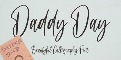 Hi...Thank for your visit :) Daddy Day a beautyful calligraphy font with beginning and ending swash. It features ligatures characters that will take your projects to the next level! This font is PUA code which means you can easily access all the glyphs and swash that are full of beautyful! It also features many special features including glyphs. font designs that are made for various vector designs, printing such as digital wedding blogs, online shops, social media, while printing can be used in the field of product clothing, accessories, bags, pins, logos, business cards, watermarks and many others ... so it can make your product look beautyful and attractive, and also Multilingual support!!! Happy design ...
 - Sasa by NJ Studio,
$19.00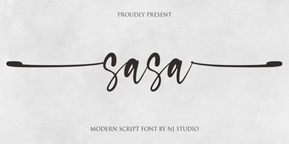 Hi...Thank for your visit :) Sasa a modern script font with beginning and ending swash. It features ligatures characters that will take your projects to the next level! This font is PUA code which means you can easily access all the glyphs and swash that are full of authentic! It also features many special features including glyphs. font designs that are made for various vector designs, printing such as digital wedding blogs, online shops, social media, while printing can be used in the field of product clothing, accessories, bags, pins, logos, business cards, watermarks and many others ... so it can make your product look authentic and attractive, and also Multilingual support!!! Happy design ...
 - Sweet Song by NJ Studio,
$19.00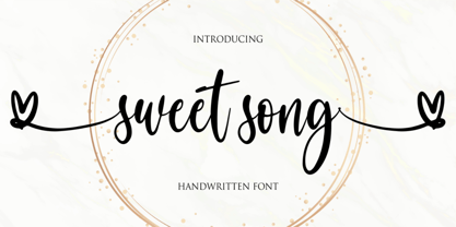 Hi...Thank for your visit :) Sweet song a handwritten script font. It features beginning swash and ending swash characters that will take your projects to the next level! This font is PUA code which means you can easily access all the glyphs and swashes that are full of swash! It also features many special features including glyphs. font designs that are made for various vector designs, printing such as digital wedding blogs, online shops, social media, while printing can be used in the field of product clothing, accessories, bags, pins, logos, business cards, watermarks and many others ... so it can make your product look cute and attractive, and also Multilingual support!!! Happy design ...
 - Make Cake by NJ Studio,
$19.00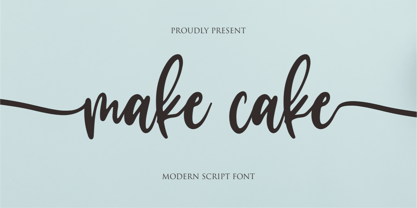 Hi...Thank for your visit :) Make cake a script font. It features beginning swash and ending swash characters that will take your projects to the next level! This font is PUA code which means you can easily access all the glyphs and swashes that are full of swash! It also features many special features including glyphs. font designs that are made for various vector designs, printing such as digital wedding blogs, online shops, social media, while printing can be used in the field of product clothing, accessories, bags, pins, logos, business cards, watermarks and many others ... so it can make your product look cute and attractive, and also Multilingual support!!! Happy design ...
 - Amberly by DearType,
$35.00 Meet Amberly! This friendly font family consists of a casual, connecting script that comes in six weights and a cute accompanying sans in ten weights. Amberly Script is fresh and charming, based on a real handwriting, while Amberly Sans is rounded, somewhat narrow and very affable. Both the script and the sans are quite versatile and will fit perfectly on applications where you want the design to appear genuine and full of personality (logos, packaging, posters, cards, titles, blogs, etc.). When it comes to OpenType features, Amberly has a great deal of swashes and alternates, as well as various ligatures to sparkle your creativity. Last, but not least, this playful font family is sure to grab attention and evoke positivity and delight.
 - Ventella by Kereatype,
$12.00 Ventella is a beautifully nostalgic upper and lowercase typeface that works best as a focal display text (think logos, headers, pretty quotes, calls to action, etc.). Featuring an elegant upright serif, light and clean italic, this duo brings a splendid, clean visage to websites, logos, brand identities, quotes, and anything else you can think of! Ventella serif is a versatile font that gives your projects a modern and minimalist look. Ventella is a classy and supremely legible font that stands out in both large and small designs be it a display or body text. Ventella comes with adorable 89 quirky ligatures and alternates for a custom typography look. All duo fonts provide a full set of uppercase and lowercase letters, numerals, and punctuation.
 - Sadi Sans by Koray Özbey,
$19.00 Sadi Slab is designed to be used on small scales like book texts, newspapers, magazines etc. Also its large counters make the font suitable for digital screens. The anatomy of the typeface gives a formal appearance which is a more fitting choice for subjects like law, finance, medical science etc. Another member of Sadi family is Sadi Slab.
 - ID Gotira by Izouuss Design,
$15.00 Inspired by many Blackletter styles, ID Gotira Blackletter is a contemporary take of the historic Blackletter, also sometimes referred to as Old English. Modern, versatile, while not losing it's classic touch, it's also equipped with multi-language support and works best for headlines, body text, branding, packaging and posters.
 - Kegger by Chank,
$59.00Show you school spirit with this sporty, collegiate font. These big chunky serifs let the world know you speak with authority, and they'll read your message clear as a bell. It's like a traditional college font, but it's got a chanky flair. Good for hockey jerseys and house parties. - Christmas Warmth by HandletterYean,
$14.00 This font is made special for the most wonderful time of the year, Christmas. Enjoy the warmth of Christmas with your family and friends by making a simple Christmas design using this font. It's casual style suitable for your various design needs like greeting cards, posters, invitations, social media posts, advertisements, product packaging, product designs, label, photography, watermark, special event, magazine, web design, etc. To access the alternate glyph, you need a program that supports Open-type features such as Adobe Illustrator CS, Adobe Photoshop CC, Adobe Indesign, and CorelDraw. More information about how to access alternate glyph, check out this link: http://goo.gl/ZT7PqK
 - Rondell by Scrowleyfonts,
$12.00 Rondell was originally designed in 2011 as a reasonably priced variable width and weight font. There were a couple of things about it that I didn't like and so I withdrew it from sale. Since then I have found myself using it for many different projects and have realised how useful and versatile it is. Therefore I have fixed the things I didn't like about it and it is now available again. Rondell is a simple, smart, sans serif font. Rounded corners make it slightly informal and friendly.
 - SAV PT by Puckertype,
$29.00SAV Display PT is directly inspired from hand-painted commercial signage found around Savannah, Georgia. There is a strong tradition of hand-painted signs adorning small car wash stations, to beauty salons, to mechanics and restaurants. Currently a collection of about four to five painters account for the majority of the signs. This font was derived from 10 uppercase letters that seemed to represent the aesthetic thread found throughout the signs. There are no lowercase letters found in these signs, so the lowercase of the font had to be designed from scratch. I felt this added versatility to the font and its possibilities for usage. This font is strictly a display font. However, because of the apparent roots (intended or unintended) of the lettering to transitional/modern modulated fonts, it does read surprising well at smaller sizes. - Fairbank by Monotype,
$29.99Monotype Bembo is generally regarded as one of the most handsome revivals of Aldus Manutius' 15th century roman type, but the original had no italic counterpart. The story is told that Stanley Morison commissioned Alfred Fairbank, a renowned calligrapher, to create the first italic for Bembo, which was released as metal fonts in 1929. Alfred Fairbank, however, claimed that he drew the design as an independent project and then sold his drawings to Monotype. According to him, the statement has been made that I was asked to design an italic for the Bembo roman. This is not so. Had the request been made, the italic type produced would have been different." Whichever version you believe, it was obvious that Fairbank's design - while undeniably beautiful - was not harmonious with Bembo roman. A second, more conventional italic was eventually drawn and added to the Bembo family. Fairbank's first design, which was based on the work of sixteenth-century writing master Ludovico degli Arrighi, managed to have a modest life of its own as a standalone font of metal type. It never made the leap into phototype fonts, however, and the face could have been lost, were it not for Robin Nicholas, Monotype Imaging's Head of Typography in the United Kingdom, and Carl Crossgrove, a senior designer for Monotype Imaging in the US. Nicholas and Crossgrove used the original drawings for Fairbank as the starting point for a new digital design, but this was only the beginning. They improved spacing, added subtle kerning and optimized the design for digital imaging. In addition, Nicholas created an alternative set of lowercase letters, fancy and swash capitals and enough alternate characters to personalize virtually any design project. By the time his work was complete, Nicholas and Crossgrove had created a small type family that included Fairbank, a revived version of the earlier metal font, and Fairbank Chancery, a more calligraphic rendition of the design. An additional suite of ornate caps, elegant ligatures, and beginning and ending letters accompanies both fonts, as does a full complement of lowercase swash characters. Now, instead of a failed Bembo italic, Fairbank emerges in its true glory: a sumptuous, elegant design that will lend a note of grace to holiday greetings, invitations, and any application where its Italianate beauty is called for." - Brasserie by Wilton Foundry,
$29.00Brasserie, the font, is a tribute to all brasseries since they are wonderful places to relax and enjoy food, wine and friends. It is also a salute to Parisian neon sign makers who continue in their difficult quest to adapt type, including script, into fragile, gas-filled, electric glass tubes. I tried to capture the spirit of these neon signs and combined it with the loosely styled handwritten menus written on blackboards that are usually placed outside Brasseries. You will find Brasserie to be very useful in many situations where you need clarity with style in a reasonably compact width. It is also creates an unusually even texture in sentences. Brasserie is a fairly upright script with a large x-height, which helps to save on overall width. Like a brasserie, the font is a relaxed and informal script, useful for logo, packaging, menus, editorial, advertising, invitations, etc and is available for Mac and PC in Opentype, Truetype and Postscript versions. In France, a brasserie is a café doubling as a restaurant with a relaxed setting, which serves single dishes and other meals. It can be expected to have professional service and printed menus (unlike a bistro which may have neither), but has more informal eating hours than a full-fledged restaurant. Typically, a brasserie is open every day of the week and the same menu is served all day. The word 'brasserie' is also French for brewery and, by extension, "the brewing business". - Fd Vienna by Fortunes Co,
$9.00 Vienna is Modern Serif is a font style that blends traditional and modern design elements to create a distinct, stylish look. This typeface is characterized by serifs, or small lines added to the end of a stroke, that give it a classic and sophisticated feel. The font is often used in high-end fashion magazines and advertisements to evoke a sense of luxury and elegance. Fashion serif typeface is versatile and can be used for various purposes, from headings and titles to body text. Overall, this typeface is a perfect choice for designers looking to create a high-end, fashionable aesthetic.
 - Mars Model by Kustomtype,
$25.00 Mars Model is a font that's originated from a concept for a rock band. With its 5 fun styles, Mars Model gives your graphic work a futuristic look that is reminiscent of the warm look and touch of Arts & Crafts. This style of type is instantly associated with advertising and design for high-end products. Mars Model is an entirely hand-drawn font, perfectly vectorized and meticulously digitized for quality and readability. Also, the font can be used for a refined vintage feeling or an industrial and futuristic atmosphere. Mars Model is great for display, logos, branding, packaging, advertising, food, sports, titles, film, TV, and much more. Doesn't that sound perfect to you?
 - Tellumo by Monotype,
$52.99 Tellumo, a new humanist geometric sans serif typeface, has all the attributes you need for a workhorse sans with a few surprising details. It has moderate proportions, a low stroke contrast, open apertures, and an x-height that makes it drive with ease in running text. A modest range of six weights, from Thin to ExtraBold, make it versatile without being overwhelming. The lightest and heaviest weights are best saved for headlines and subheads. It features a set of swash caps that can add magnitude and sparkle to short headlines, making it excel in packaging designs. Tellumo feels at home with Mid-century Modern and Art Deco aesthetics. It looks precise, tidy, and welcoming for architecture and home goods. It looks clean, fresh and modern for beauty and wellness, or elegant and approachable for fashion. It has a balance of clarity and personality, suitable for branding and advertising of all kinds, print & digital design alike. Tellumo radiates warmth, charm, and joyfulness from its geometric foundation.
 - Tellumo Variable by Monotype,
$313.99 Tellumo, a new humanist geometric sans serif typeface, has all the attributes you need for a workhorse sans with a few surprising details. It has moderate proportions, a low stroke contrast, open apertures, and an x-height that makes it drive with ease in running text. A modest range of six weights, from Thin to ExtraBold, make it versatile without being overwhelming. The lightest and heaviest weights are best saved for headlines and subheads. It features a set of swash caps that can add magnitude and sparkle to short headlines, making it excel in packaging designs. Tellumo feels at home with Mid-century Modern and Art Deco aesthetics. It looks precise, tidy, and welcoming for architecture and home goods. It looks clean, fresh and modern for beauty and wellness, or elegant and approachable for fashion. It has a balance of clarity and personality, suitable for branding and advertising of all kinds, print & digital design alike. Tellumo radiates warmth, charm, and joyfulness from its geometric foundation.
 - Schism One by Alias,
$55.00 Schism is a modulated sans-serif, originally developed from our Alias Didot typeface, as a serif-less version of the same design. It was expanded to three sub-families, with the thin stroke getting progressively heavier from Schism One to Schism Three. The different versions explore how this change in contrast between thick and thin strokes changes the character of the letterforms. The shape is maintained, but the emphasis shifts from rounded to angular, elegant to incised. Schism One has high contrast, and the same weight of thin stroke from Light to Black. Letter endings are at horizontal or vertical, giving a pinched, constricted shape for characters such as a, c, e and s. The h, m, n and u have a sharp connection between curve and vertical, and are high shouldered, giving a slightly square shape. The r and y have a thick stress at their horizontal endings, which makes them impactful and striking at bolder weights. Though derived from an elegant, classic form, Schism feels austere rather than flowery. It doesn’t have the flourishes of other modulated sans typefaces, its aesthetic more a kind of graphic-tinged utility. While in Schism Two and Three the thin stroke gets progressively heavier, the connections between vertical and curves — in a, b, n etc — remain cut to an incised point throughout. The effect is that Schism looks chiselled and textural across all weights. Forms maintain a clear, defined shape even in Bold and Black, and don’t have the bloated, wide and heavy appearance heavy weights can have. The change in the thickness of the thin stroke in different versions of the same weight of a typeface is called grading. This is often used when the types are to used in problematic print surfaces such as newsprint, or at small sizes — where thin strokes might bleed, and counters fill in and lose clarity, or detail might be lost or be too thin to register. The different gradings are incremental and can be quite subtle. In Schism it is extreme, and used as a design device, giving three connected but separate styles, from Sans-Didot to almost-Grotesk. The name Schism suggests the differences in shape and style in Schism One, Two and Three. Three styles with distinct differences, from the same start point.
 - Schism Three by Alias,
$55.00 Schism is a modulated sans-serif, originally developed from our Alias Didot typeface, as a serif-less version of the same design. It was expanded to three sub-families, with the thin stroke getting progressively heavier from Schism One to Schism Three. The different versions explore how this change in contrast between thick and thin strokes changes the character of the letterforms. The shape is maintained, but the emphasis shifts from rounded to angular, elegant to incised. Schism One has high contrast, and the same weight of thin stroke from Light to Black. Letter endings are at horizontal or vertical, giving a pinched, constricted shape for characters such as a, c, e and s. The h, m, n and u have a sharp connection between curve and vertical, and are high shouldered, giving a slightly square shape. The r and y have a thick stress at their horizontal endings, which makes them impactful and striking at bolder weights. Though derived from an elegant, classic form, Schism feels austere rather than flowery. It doesn’t have the flourishes of other modulated sans typefaces, its aesthetic more a kind of graphic-tinged utility. While in Schism Two and Three the thin stroke gets progressively heavier, the connections between vertical and curves — in a, b, n etc — remain cut to an incised point throughout. The effect is that Schism looks chiselled and textural across all weights. Forms maintain a clear, defined shape even in Bold and Black, and don’t have the bloated, wide and heavy appearance heavy weights can have. The change in the thickness of the thin stroke in different versions of the same weight of a typeface is called grading. This is often used when the types are to used in problematic print surfaces such as newsprint, or at small sizes — where thin strokes might bleed, and counters fill in and lose clarity, or detail might be lost or be too thin to register. The different gradings are incremental and can be quite subtle. In Schism it is extreme, and used as a design device, giving three connected but separate styles, from Sans-Didot to almost-Grotesk. The name Schism suggests the differences in shape and style in Schism One, Two and Three. Three styles with distinct differences, from the same start point.
 - Schism Two by Alias,
$55.00 Schism is a modulated sans-serif, originally developed from our Alias Didot typeface, as a serif-less version of the same design. It was expanded to three sub-families, with the thin stroke getting progressively heavier from Schism One to Schism Three. The different versions explore how this change in contrast between thick and thin strokes changes the character of the letterforms. The shape is maintained, but the emphasis shifts from rounded to angular, elegant to incised. Schism One has high contrast, and the same weight of thin stroke from Light to Black. Letter endings are at horizontal or vertical, giving a pinched, constricted shape for characters such as a, c, e and s. The h, m, n and u have a sharp connection between curve and vertical, and are high shouldered, giving a slightly square shape. The r and y have a thick stress at their horizontal endings, which makes them impactful and striking at bolder weights. Though derived from an elegant, classic form, Schism feels austere rather than flowery. It doesn’t have the flourishes of other modulated sans typefaces, its aesthetic more a kind of graphic-tinged utility. While in Schism Two and Three the thin stroke gets progressively heavier, the connections between vertical and curves — in a, b, n etc — remain cut to an incised point throughout. The effect is that Schism looks chiselled and textural across all weights. Forms maintain a clear, defined shape even in Bold and Black, and don’t have the bloated, wide and heavy appearance heavy weights can have. The change in the thickness of the thin stroke in different versions of the same weight of a typeface is called grading. This is often used when the types are to used in problematic print surfaces such as newsprint, or at small sizes — where thin strokes might bleed, and counters fill in and lose clarity, or detail might be lost or be too thin to register. The different gradings are incremental and can be quite subtle. In Schism it is extreme, and used as a design device, giving three connected but separate styles, from Sans-Didot to almost-Grotesk. The name Schism suggests the differences in shape and style in Schism One, Two and Three. Three styles with distinct differences, from the same start point.
 - Scala Pro by Martin Majoor,
$49.00 The award-winning Scala family (1990-1993) is a worldwide bestseller and has established itself as a ‘classic’ among digital fonts. It was one of the first serious digital text fonts to support small caps, ligatures and different set of numbers. In fact Scala and Scala Sans (1990-1993) are two different typefaces sharing a common form principle: the skeletons of both Scala and Scala Sans are identical. Scala’s dark colour and low contrast works to prevent the thin parts from breaking up. The generous length of Scala italic’s serifs gives it a strong rhythm. The bold weight has the same character widths as the normal weight, so changing a text from normal into bold does not affect the set width. Another part of Scala is very popular among its users: Scala Hands, containing more than one hundred decorative hands and pointers, is a free bonus. Scala Jewels is a set of four highly decorative typefaces, based on the bold capitals of Scala.
 - Malden Sans by Monotype,
$49.00 Malden Sans is a mischievous grotesque sans serif with charming details that gives designers a solid typographic voice. It was created by Michele Patanè with regular and condensed widths, as a utilitarian typeface family for print and digital environments. It was originally designed as part of a type system for cinema magazines, and embodies the devil-may care attitude of the silver screen. Designer Michele Patanè looked back to an earlier era of typography to create the typeface, embracing unusual details, rather than ironing them out. “There is a very naive way of using typography in the 30s and 40s, something not as clean as how it’s used in the late 50s and 60s when everything passed through a rationalisation of the typographic palette,” he explains. “In film magazines you can still see a bit of roughness, and I like that.” This is a design that’s desperate to be used in editorial environments, and has been created to stand up to lower quality paper. It would be equally at home on posters, packaging, and even in digital environments where designers are looking for something more expressive than another geometric sans serif. Malden Sans includes a Normal and Condensed range, with 7 weights in the normal and 6 in the Condensed, both including italics.
 - The Longlight by Colllab Studio,
$15.00 Presenting The Longlight! An Elegant Calligraphy Font with some alternates and ligatures. This font made with the perfect combining of each character. It looks original and can be used for all your project needs. Each glyph has its own uniqueness and when meeting with others will provide dynamic and pleasing proximity. This font can be used at any time and any project. You can see in the presentation picture above, The Longlight looks elegant and stylish on design projects. So, The Longlight can't wait to give its touch to all your design projects such as quotes, poster design, personal branding, promotional materials, website, logotype, product packaging, etc. Besides that, The Longlight also has some ligature that gives a surprise when you type certain characters combining. The ligatures are ee, ff, gg, gg1, ii, jj, ll, ll1, mm, nn, oo, pp, ss, tt, tt1, pp, and yy. WHAT'S INCLUDED? 1. The Longlight • The first version comes with uppercase, lowercase, ligatures, numeral, punctuation, symbols, and Standard Latin Multilingual Support (Afrikaans, Albanian, Catalan, Danish, Dutch, English, French, German, Icelandic, Indonesian, Italian, Malay, Norwegian, Portuguese, Spanisch, Swedish, Zulu, and More). 2. The Longlight Alternate • Included some alternates: f, g, i, j, l, p, s, t, y, and g. A Million Thanks Colllab Studio
 - Careless Carry by Gassstype,
$25.00 Here comes a New font,Introducing Careless Carry is aRough Brush Typeface Bold handmade Font with ligature and Multilanguage support. Best for halloween poster, horror poster, , cartoon, comic etc .This handmade font will make your design has a beautiful natural touch for each details. It is perfect for any design project as Invitation,logo, book cover, craft or any design purposes,photos, photography overlays, signs, window art, scrapbooking, tags and so much more! This font is PUA encoded which means you can access all of ligatures glypsh.
 - Kuda by Gassstype,
$23.00 Hello Everyone, introduce our new product Kuda is Simple Display Font with a natural feel. This handmade font will make your design has a beautiful natural touch for each details. It is perfect for any design project as Invitation,logo, book cover, craft or any design purposes. Kuda is Inspired by Food Logo style and combination with Unique Craft style. that will fulfill your design needs for quotes,sporty theme, logotype, wordmark, etc. You can activate 10 Ligatures glyphs and 8 Alternates glyphs OpenType panel.
 - Taurunum by Kostic,
$40.00 The initial idea for this font came when a friend of mine asked me to create a logo for a sports team that he was forming. Since it was a martial arts competitive sport, bold and striking lettering was needed to reflect that. When the logo was finished, I was really pleased whith the letters so I decided to create the entire font. Taurunum is made with intention to be used for display design (logos, posters, etc.), and combining the weights should give best results.
 - Step Better by Ronny Studio,
$19.00 Step better font Inspired by street graffiti markings, Urban Tag comes with the iconic round tip markers, this style is often used by several graffiti artists around the world because of its very unique style, very fun to write on markers. Perfect if you want a realistic street art or hip hop style for your designs, posters, props, etc. Features : All Caps numbers and punctuation multilingual Swash / Ornament PUA encoded Please contact us if you have any questions. Enjoy Crafting and thanks for supporting us! :) Thank you
 - Plants by Artisan Studio,
$15.00 Plants Clean & Rough is 2-style family. The brush script is beautiful and unique; it is a model of modern calligraphy typefaces, in combination with a calligraphy writing style. Can be used for various purposes.such as headings, logos, wedding invitation, t-shirt, letterhead, labels, news, posters, badges etc. This font's features are: - Contextual Alternates - Standard ligatures - Discretionary ligatures - Stylistic Alternates - Stylistic sets OpenType features can be accessed by using OpenType smart programs such as Adobe Illustrator and Adobe InDesign, Adobe Illustrator CS, CorelDraw X6-X7.
 - Blackthorn by Scriptorium,
$24.00Blackthorn draws on the tradition of Art Nouveau font design with some elements of western or circus style fonts, but an overall effect which may have more in common with the psychedelic era than anything else. It has a feel somewhat akin to some of the lettering of Alphons Mucha particularly the Abaddon and Gehenna fonts. It's very stylized and kind of wicked looking. You can see where the name comes from if you note the thorn-like spurs on the upper part of each character. - Baked Milk by Struvictory.art,
$15.00 Baked Milk is a display font family with nostalgic motives. The font is created in a groovy retro style. Baked Milk includes Regular and Symbol Styles. The font is suitable for retro summer posters, menu and social media design, branding, event design etc. Baked Milk has extensive language support, it includes English, French, German, Italian, Spanish, Portuguese, Danish, Norwegian, Swedish, Finnish, Estonian, Turkish. Baked Milk font contains ligatures: aa, dd, ff, ft, hh, jj, kk, ll, mm, nn, oo, pp, rf, rr, rt, ss, tt, uu, Ti.