10,000 search results
(0.036 seconds)
- Mr. Jenkins by Lindstrom Design,
$13.00 Mr. Jenkins is designed to fill the void between the crazy, wacky and reckless comic style fonts, and the standard boring but very readable sans-serif typefaces. It makes for a distinctive bold headline, but is also quite legible at small sizes. It’s just off kilter enough to not take itself too seriously. A deceptively care-free font, each character was carefully drawn. The spacing and kerning of each letter and letter combination were painstakingly considered. Particular attention was paid to maintaining consistent optical weights and a spontaneous appearance. Mr. Jenkins is inspired heavily by humanist sans-serif faces such as Myriad and Lucida Sans, with its open apertures, and low contrast but almost calligraphic line weights. The lowercase a is single story in the italic face, but two story in the regular face. It contains uncommon features amongst many “quirky” fonts, including a full set of latin accented characters, lining and proportional figures, math symbols, standard fractions, foreign currency marks, contextual alternates, and even a few ligatures.
 - Savu by Hiekka Graphics,
$18.00 Savu is a hand-lettering font in four styles: regular, bold, condensed and condensed bold. It is recommended for use as a display typeface.
 - Strongloves by FHFont,
$17.00 Strongloves is dry brush, hand-lettered script. It is suitable for design, element design, weddings, events, t-shirt, logos, badges, sticker, and awesome work.
 - Poster Plain JNL by Jeff Levine,
$29.00 Poster Plain JNL and its oblique counterpart offer the simple, hand-lettered look of home-made poster board projects with a bold, friendly typeface.
 - Biotech by Arendxstudio,
$20.00 Biotech is hand painted typeface with a messy, rough and strong feel, perfectly suited for any design occasions. Get inspired by its bold charm!
 - Zerpixl by ffeeaarr,
$11.00 Zerpixl is insipred and was made by a pixel. it's sci-fi, science also technology looks, it's perfect for games, movies, & more
 - Black Bamboo by Hanoded,
$15.00 Black Bamboo is a beautiful plant. My father in law, who recently passed away, loved it and had a prized specimen growing in his garden. This font was named in his honour. Black Bamboo font is a bold typeface, created using a good brush and quality paint. It is all caps, but upper and lower case differ and can be freely interchanged. Of course, Black Bamboo comes with all diacritics.
 - Blessed Love by MJB Letters,
$18.00 Blessed Love is an elegant script font featuring graceful letterforms and captivating swashes. With beginning and ending swashes, it adds sophistication and visual interest to designs. The ligature support ensures seamless connections between letters, creating a harmonious typographic appearance. Additionally, Blessed Love is multilingual, making it versatile for diverse projects, allowing you to communicate effectively in various languages. Elevate your designs with Blessed Love’s charm, elegance, and versatility.
 - Calma Display by Walking Fearless,
$30.00 Calma Display is a very elegant font fitting perfectly in high-end environment, like perfumes & cosmetics, fashion, retail and magazines. It has unique terminals which enhances a beautiful and elegant personality to the typeface, being really useful for editorial purposes. It also has a great amount of lower and uppercase ligatures and an Art Nouveau alternate stylistic set to help you to create some differentiation throughout your projects.
 - Wallet by Fontforecast,
$19.00 Wallet is an expressive handwritten font with loads of personality, suitable for many different projects. It comes in three styles: Felt, Felt bold and Chalk. Wallet has 391 glyphs and supports multiple languages. Opentype features, such as contextual alternates, for replacing beginning and ending glyphs as you type and double letter ligatures are also included. To make full use of its potential Wallet requires an opentype-savvy application.
 - Big Stomach by Haksen,
$13.00 "Big Stomach" is a stylish modern handwritten font with casual quirky style. It is perfect for branding, birthday/valentine invitation, promotion, product packaging, and other needs. You will get full set of lowercase and uppercase letters, numerals and punctuation, multilingual symbols, ligatures and extra swashes that giving realistic hand-lettered style. In order to use the beautiful swashes, you need a program that supports OpenType features such as Adobe Illustrator, Adobe Photoshop, Adobe Indesign and Corel Draw. Or please check the end of the preview to know how to get the swashes. Thanks and have a wonderful day, Haksen Std
 - Baby Bloom by Haksen,
$14.00 "Baby Bloom" is a stylish modern handwritten font with casual quirky style. It is perfect for branding, birthday/valentine invitation, promotion, product packaging, and other needs. You will get full set of lowercase and uppercase letters, numerals and punctuation, multilingual symbols, ligatures and extra swashes that giving realistic hand-lettered style. In order to use the beautiful swashes, you need a program that supports OpenType features such as Adobe Illustrator, Adobe Photoshop, Adobe Indesign and Corel Draw. Or please check the end of the preview to know how to get the swashes. Thanks and have a wonderful day, Haksen
 - Valentine Heart by Haksen,
$13.00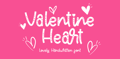 "Valentine Heart" is a stylish modern handwritten font with casual quirky style. It is perfect for branding, birthday/valentine invitation, promotion, product packaging, and other needs. You will get full set of lowercase and uppercase letters, numerals and punctuation, multilingual symbols, ligatures and extra swashes that giving realistic hand-lettered style. In order to use the beautiful swashes, you need a program that supports OpenType features such as Adobe Illustrator, Adobe Photoshop, Adobe Indesign and Corel Draw. Or please check the end of the preview to know how to get the swashes. Thanks and have a wonderful day, Haksen
 - Quality Times by Gilar Studio,
$16.00 Quality Times is a stylish modern calligraphy font with casual chic flair. It is perfect for branding, wedding invites and cards, and maybe for red wine label. Quality Times includes full set of gorgeous uppercase and lowercase letters, numerals, a large range of punctuation and ligatures. All lowercase letters include beginning and ending swashes, giving realistic hand-lettered style. What you get, darling? In order to use the beautiful swashes, you need a program that supports OpenType features such as Adobe Illustrator CS, Adobe Photoshop CC, Adobe Indesign and Corel Draw. Check my other Font here : https://gilarstudio.com/
 - RF Marshall by Magpie Paper Works,
$18.00 RF Marshall was inspired by an 1883 tombstone, tucked away in a pioneer cemetery. The 4-sided marker is sparsely adorned with homespun carvings of a handprint, two tulip poplar leaves, and these words: "RF Marshall died 1883 Aged 72 years." The font faithfully reproduces the stone's hand-carved lettering and artwork, as well as artwork from other 18th and 19th century American headstones. It was drawn with calligraphy nibs dipped in walnut ink and delights in a range of end uses including period films, rustic decor, Halloween decorations, historical logos and branding, and on the pages of children's books.
 - Women Frame by Wildan Type,
$11.00 Women Frame is a modern calligraphy font with sweet pressure. i hope this font perfect for creating signature logos and watermarks for photography studio or wedding invitation. I made it with love and magic!! Women Frame includes full set of beautifull hand lettered uppercase and lowercase letters, numerals, a large range of punctuation and ligatures. All lowercase letters include beginning and ending swashes. In order to use the beautiful swashes, you need a program that supports OpenType features such as Adobe Illustrator CS, Adobe Photoshop CC, Adobe Indesign and Corel Draw. if you have questions, please provide a short message to us
 - Sui Generis by Typodermic,
$11.95 Looking for a typeface that’s as unique as your personality? Look no further than Sui Generis, the rounded square sans-serif that’s unlike any other. With its technical letterforms and boxy curves, Sui Generis has an industrial character that’s all its own. It’s the kind of typeface that demands attention, without ever feeling pushy or obnoxious. In fact, its understated charm is part of what makes it so special. But don’t let its quirky personality fool you—Sui Generis is as practical as it is unique. With four weights, two widths, italics, and an outline style, it’s incredibly versatile and perfect for any project that requires a touch of character. So if you’re tired of bland, run-of-the-mill typefaces that all look the same, give Sui Generis a try. Its square letterforms and distinctive voice will make your design stand out from the crowd, and leave a lasting impression on anyone who sees it. Most Latin-based European writing systems are supported, including the following languages. Afaan Oromo, Afar, Afrikaans, Albanian, Alsatian, Aromanian, Aymara, Bashkir (Latin), Basque, Belarusian (Latin), Bemba, Bikol, Bosnian, Breton, Cape Verdean, Creole, Catalan, Cebuano, Chamorro, Chavacano, Chichewa, Crimean Tatar (Latin), Croatian, Czech, Danish, Dawan, Dholuo, Dutch, English, Estonian, Faroese, Fijian, Filipino, Finnish, French, Frisian, Friulian, Gagauz (Latin), Galician, Ganda, Genoese, German, Greenlandic, Guadeloupean Creole, Haitian Creole, Hawaiian, Hiligaynon, Hungarian, Icelandic, Ilocano, Indonesian, Irish, Italian, Jamaican, Kaqchikel, Karakalpak (Latin), Kashubian, Kikongo, Kinyarwanda, Kirundi, Kurdish (Latin), Latvian, Lithuanian, Lombard, Low Saxon, Luxembourgish, Maasai, Makhuwa, Malay, Maltese, Māori, Moldovan, Montenegrin, Ndebele, Neapolitan, Norwegian, Novial, Occitan, Ossetian (Latin), Papiamento, Piedmontese, Polish, Portuguese, Quechua, Rarotongan, Romanian, Romansh, Sami, Sango, Saramaccan, Sardinian, Scottish Gaelic, Serbian (Latin), Shona, Sicilian, Silesian, Slovak, Slovenian, Somali, Sorbian, Sotho, Spanish, Swahili, Swazi, Swedish, Tagalog, Tahitian, Tetum, Tongan, Tshiluba, Tsonga, Tswana, Tumbuka, Turkish, Turkmen (Latin), Tuvaluan, Uzbek (Latin), Venetian, Vepsian, Võro, Walloon, Waray-Waray, Wayuu, Welsh, Wolof, Xhosa, Yapese, Zapotec Zulu and Zuni.
 - DT Lythmore by Dragon Tongue Foundry,
$9.00 Lythmore This font is called Lythmore and is inspired by Lithos. Lithos was originally designed for Adobe by Carol Twombly in 1990, based it on the lettering from ancient Greek inscriptions. The Capitals are similar in feel and design, but is totally original and built from scratch. It is designed to be similar intentionally, but it is not a clone or rip off. Lithos is an example of a simple blocky san serif font style, with subtly concave sides, angled ends, and off centred curves. Lythmore is also an example of that same style. But is also different in places where I felt it could be improved. And it has a complete lower case set, which Lithos doesn't. I built Lythmore with 8 different weights. Lythmore can be very effective when used in advertising and general display work, but it can also be used for much more. Although it was never designed to be body copy, when used as such, it is still perfectly readable and adds its own version of sans serif style and flavour. I have included two versions of the Lythmore family. Lythmore A and Lythmore B. In the Lythmore A family, the lighter 4 weights all vary in weight in both the horizontal and vertical axis. The heavier 4 weights all vary in the horizontal axis only. In the Lythmore B family, the transition is even in both directions across the entire family. The result of this difference is that the A and B versions difference is most noticeable between the Regular and Medium weights. While the extreme ends of each family version are virtually identical.
 - Chopper by Canada Type,
$24.95 In 1972, VGC released two typefaces by designer friends Dick Jensen and Harry Villhardt. Jensen’s was called Serpentine, and Villhardt’s was called Venture. Even though both faces had the same elements and a somewhat similar construct, one of them became very popular and chased the other away from the spotlight. Serpentine went on to become the James Bond font, the Pepsi and every other soda pop font, the everything font, all the way through the glories of digital lala-land where it was hacked, imitated and overused by hundreds of designers. But the only advantage it really had over Venture was being a 4-style family, including the bold italic that made it all the rage, as opposed to Venture’s lone upright style. One must wonder how differently things would have played if a Venture Italic was around back then. Chopper is Canada Type’s revival of Venture, that underdog of 1972. This time around it comes with a roman, an italic, and corresponding biform styles to make it a much more attractive and refreshing alternative to Serpentine. Chopper comes in all popular formats, boasts extended language support, and contains a ton of alternate characters sprinkled throughout the character map.
 - The Wayfaring Font by Set Sail Studios,
$13.99 Hey guys, I'm really excited to introduce The Wayfaring Font Duo! A hand-painted set of fonts designed to add a rustic and whimsical charm to your design projects. It's rough around the edges and not without imperfections - but aren't we all? With distinctive bold & playful brush strokes, The Wayfaring Font Duo is ideal for your logo designs, product packaging, wedding designs, book covers, social media posts, merchandise & more. The awesome thing about this typeface duo is that it's so easy to mix up the various font styles and create totally unique, hand-made looking words each time. Not only are there 2 sets of upper & lowercase characters, there is also a unique 'all-caps' version - which not only looks great as a supporting font, but can also be combined with the regular Wayfaring font to give you even more layout options. I'm serious! Just throw a small-caps character in the middle of a word, it's really fun to play around with.
 - Gilmore Sans by Red Rooster Collection,
$45.00 Gilmore Sans Extra Bold Extra Condensed Titling is a sans serif typeface that was inspired from early designs by the renowned English typographer Eric Gill. It was designed in 1992 by A. Pat Hickson (P&P Hickson) and Steve Jackaman (ITF) exclusively for the Red Rooster Collection. It has a clean, fresh, sturdy feel that is exceptionally powerful at display size. The typeface lends itself well to a variety of projects, including everything from packaging to signage to high-profile advertising campaigns.
 - Lectori Salutem Sans by HoboArt,
$10.00Is it royal, or is it dandyish? Either way it's sure to catch the eye. Prepare for titling figures any movie executive would be jealous of using. Do you write sci-fi, fantasy, costume, or cult; or is your announcement for an off-beat wedding? Lectori Salutem Sans offers salutations to the reader, and an edge. Lectori Salutem Sans is the sans serif counterpart of the Lectori Salutem font. A postmodern font with slightly romantic features, cut off at the stem. - Deliscript by Alphabet Soup,
$29.00 Although initially inspired by the neon sign in front of Canter’s Delicatessen in Los Angeles, the design of Deliscript Upright and Deliscript Slant soon took on a life of its own–and its own distinctive look. Like its sibling Metroscript, Deliscript has many features that expand its usability such as the the variable length tails which can be accessed in 6 different styles, and the never before seen crossbars which can be extended outward in either direction from the lower case “t”. Throw in the special “WordLogos”, tons of ligatures and foreign accented characters, and you have a recipe for typesetting that approaches the look of hand-lettering. For a better understanding of its unique features please download The Deliscript User Manual—available in the Gallery section.
 - Aarde by Scholtz Fonts,
$19.00This is the definitive standard African font. It combines wonderful readability with tremendous panache. The fact that it has a full character set (UPPER and lower case), all punctuation and all special characters, means that it can be used in just about any African design context. If you had only one African font in your arsenal, it would have to be Aarde Black. The name "Aarde" means "earth" and refers to the gutsy, earthy character of the letterforms. It includes a full character set: characters for English, French, Italian, German, and Portuguese. The numerals are mono-spaced, and are very readable so that they will line up correctly in columns of figures. The letters of the alphabet are correctly kerned so that they appear correctly in text. - Mikal by Eurotypo,
$88.00 David was promised Saul’s daughter in marriage after he defeated Goliath. However, while Saul procrastinated in delivering his elder daughter for marriage, David fell in love with the younger daughter Mikal (1 Samuel 18:20,28). Mikal was the only wife who was reported to have loved David. Her name, Mikal, meant brook, or stream, a symbol of the water of the word. Mikal is a versatile and elegant script font; well suited in the area of magazines, web pages, packaging, logotypes and advertising, etc. This font can be used as body text for its good legibility and accurate kerning. Mikal font has all the advantages of OpenType technology that allows a variety of combinations: Swash, old style numerals, standard and discretionary ligatures, contextual alternates, word ending and tails. Mikal supports all Central European character set as well as basic Western languages.
 - Enchanted Land DS by Sharkshock,
$125.00 The 2nd installment of the Enchanted Land family takes us on another medieval adventure, opting to completely rebuild instead of refining the legacy script. More emphasis was put into the undulating nature of the Uppercase characters and how they keep your eyes flowing. For this reason, straight lines and right angles are rarely used in favor of flamboyant terminals and wispy swashes. Lowercase characters, by contrast, adhere to a consistent model defined by its straightened edges and sharp corners. This script flirts with several old world styles but seeks only to borrow elements rather than completely emulate them. German Blackletter, Old English, Uncial, Victorian, it’s in there! Enchanted Land DS would work well in a book, video game, or medieval signage. This family is equipped with Basic Latin, Extended Latin, ligatures, punctuation, a few alternates, and kerning.
 - Terfens Gothic by insigne,
$29.00 Terfens Gothic is the perfect choice for your next project! With its medium contrast and approachable design, this calligraphic sans serif has a classic feel that will never go out of style. Terfens Gothic is the perfect typeface for anyone looking to add a touch of uniqueness to their designs. With its generous x-height and rounded terminals, it's perfect for creating one-of-a-kind designs that are sure to impress. Its large x-height gives it a welcoming, but not too casual vibe. With forty-eight different typefaces, it has the versatility and aesthetic options you need to make your project stand out. Choose from regular, condensed, and extended styles, each with nine different weights and italics. Terfens Gothic has the look you need to make a powerful impression. Terfens is the ideal typeface for any project that has to stand out, thanks to its towering verticality. Terfens may be utilized for a variety of purposes because of its adaptable design. Terfens is a sans unlike any other- it starts with a beautiful calligraphic chancery script and then adds movement and personality. This sans is guaranteed to make your next project more exciting! The Terfens Type System's third typeface, Terfens Gothic, is an amazing addition to any type collection. The Terfens Type System's adaptability is unrivaled, with its vast choice of styles, widths, and weights. This font family has everything you need to create unique, customized designs that will suit your individual needs. Whether you need a narrow or wide font, or a hairline or bold weight, the Terfens Type System has you covered! And, with its Opentype features, the Terfens Type System is perfect for anyone who wants to add a personal touch to their projects.
 - Sketchen by Mike Zuidgeest,
$10.00 Hey there! As the proud creator of Sketchen, I'm stoked to introduce you to my latest font creation! Sketchen is a sketch style font that's just perfect for outdoor advertising and menus. Imagine a beachy vibe, summer vibes, and a whole lot of fun – that's what Sketchen brings to the table! I designed Sketchen to capture the essence of summertime and the carefree attitude of beach life. With its playful, hand-drawn style, Sketchen adds a whimsical touch to any design project. Whether you're creating a menu for a tiki bar or promoting a surf competition, Sketchen is the perfect font to convey a sunny, laid-back feeling. Sketchen's bold, eye-catching letters ensure that your designs won't be missed. And with its relaxed, playful vibe, it's sure to make a splash in any setting. So why not give Sketchen a try and see what kind of summery designs you can come up with? With Sketchen, you can add a touch of fun to all your outdoor advertising and menu design projects. So let your creativity run wild and see where Sketchen takes you!
 - Too Much by Comicraft,
$19.00If you've had too much coffee but not enough of Too Much Coffee Man you can now indulge in an excess of characters created by the hand of Too Much Coffee Man's creator, Mister Shannon Wheeler. Don't worry, in our efforts to ensure clean and confident lettering samples, we kept Shannon on decaf until he was done. Dip this font in your system folder and your hard drive will get a caffeine and sugar rush guaranteed to increase its memory partition and bring the images on your monitor into sharper focus. - Libelle by Linotype,
$29.99 Libelle is a 21st century English Copperplate Script typeface. Created by Jovica Veljović, a designer with decades of experience as a calligrapher, typeface designer, and professor, Libelle differentiates itself from other Copperplates Scripts because its letterforms are less mechanical. The hand of the calligrapher shows through the forms, breathing new life into this historic genre. Libelle includes approximately 400 extra glyphs, including alternate forms of many letters and special forms for the beginnings and ends of words. The font includes several stylistic sets, as well as ligatures and ornaments.
 - Nvma Titling by Stone Type Foundry,
$49.00 Nvma is based on Roman letterforms which appeared during the period from the earliest extant examples in the sixth or seventh century BC until the end of the third century BC. For Nvma the J, U and W had to be fantasies as they did not exist until much later, similar to the G, numerals and other non-alphabetic signs in the font. Thus not all of the archaic forms are represented in Nvma. Nvma was designed to work with Magma, as it matches the weights and heights for Magma Thin and Magma Titling Thin.
 - Bloody Charm by PizzaDude.dk,
$20.00 Is it blood, melted ice, water or something slimy? Choose yourself, because Bloody Charm can be used for all purposed that needs something either scary or melting. I've added two versions: Regular and Drips. The Drips versions is (you may have guessed it already!) a bit more drippy than the regular version. Both versions uses contextual alternates, which in this case means that there is 3 different versions of all lowercase letters - and these automatically cycles as you type!
 - Journey Signature by Azetype,
$19.00 Presenting Journey Signature! An Authentic Script Font crafted carefully. Based on original signature hand scratches that look Classy and Vintage style. This font can be used at any time and in any project. You can see in the presentation picture above, how it's working! So, this font can give a different touch to all your design projects e.g. watermark, quotes, logotype, poster design, personal branding, lettering, photography needs, blog header, wedding, letter, invitation, stationery, etc. WHAT'S INCLUDED? 1. Journey Signature • This one comes with Standard Characters and 3 Stylistic Alternates (uppercase, lowercase) numeral, punctuation, symbols, and huge multilanguage support e.g. Afrikaans, Albanian, Catalan, Czech, Danish, Dutch, English, Estonian, Finnish, French, German, Hungarian, Icelandic, Indonesian, Italian, Latvian, Lithuanian, Maltese, Malay, Norwegian, Polish, Portuguese, Spanisch, Slovak, Slovenian, Swedish, Zulu, and Many More). • Multilingaul Glyphs: ÀÁÂÃÅÄĀĂǺĄÆǼǢÇĆČĈĊĎÐÈÉÊËĘĒĖĚĔĞĢĠĜÌÍÎǏÏĪĮĬĨļĶĿĽĻĹŁÑŃŇŅŊÒÓÔÕÖŌŐŎØŒÞŔŘŖŚŠŞŜ ŦŤŢÙÚÛÜŪŮŰŲŨŬŴÝŸŶŻŹŽàáâãåäāăǻąæǣçćčċĉďđðèéêëęěēėĕğģġĝĥħıìíîǐïīįĭĩķłŀĺñńňŋʼnņòóôõöőŏøœ þŕřŗśšşşŝßŧťţùúûüūůűųŭŵýÿŷżźž 2. Journey Signature Swash • This One comes with an underline swash that makes your design project looks standout and classy. For feature, you just type A-Z or a-z, choose the Swash version, and than ready to use. Thank You Azetype Std.
 - Glitten by ryan creative,
$10.00 Glitten is a rough, chalk-textured typeface. With hand-drawn strokes and broken lines that make this font look like chalk. Get every stroke real and realistic, with glyphs and open type features with styles and straps, ornaments, and alternative additions. It can be used for various purposes. such as, greeting cards, t-shirt designs, product designs, etc. Glitten is supported with additional characters that have Alternate and Ornament forms, which will help you achieve a realistic style with your own creations. FEATURES; -Support Foreign, Numbers and Punctuation -Alternative, Ornament -Works on PC -Simple installation -Accessible in Adobe Illustrator, Adobe Photoshop. Adobe InDesign, even works in Microsoft Word -Fully accessible without additional design software. Glitten is encoded with Unicode PUA, which allows full access to all additional characters without having to design special software. Mac users can use the Font book, and Windows users can use the Character map to view and copy any extra characters to paste into your favorite text editor/app.
 - Dienstag by insigne,
$24.99 With its extended sans-serif style, Dienstag boasts a sleek and sophisticated look that's perfect for a wide range of projects. Whether you're designing a website, creating branding materials, or producing print publications, Dienstag's refined elegance is sure to make a lasting impression. Compared to Montag, Dienstag has a slightly more formal feel, thanks to its lack of rounded terminators. But that doesn't mean it's any less versatile – in fact, Dienstag's four original weights have now been expanded to ten, giving you even more flexibility in your designs. With OpenType features that include simplified versions of many characters, you can easily create unique and eye-catching titles that stand out from the crowd. But Dienstag is just one part of the larger Montag superfamily, which also includes Mittwoch, and Donnerstag. Each font in this collection offers its own unique style and flair, giving you a wealth of options to choose from when it comes to your next project. Whether you're looking for a bold and dynamic font or a more refined and understated style, you're sure to find the perfect fit in the Montag family. So why wait? Check out Dienstag and the rest of the Montag superfamily today, and start creating designs that are sure to captivate and inspire! With its elegant style and versatile functionality, Dienstag is the perfect choice for designers who demand the best.
 - Antikor by Taner Ardali,
$35.00 Antikor is "mono geometric sans" family consist of 3 styles, 55 fonts with real italics... All fonts of family contains 800+ glyphs, and equipped with many typographic features. (Styles: Mono, Text and Display) Antikor Text is designed for those who prefer to use monospaced fonts not only in coding but in many different media of graphic design. The idea came from creating a typeface with monospaced aesthetic without disturbing aspects of monospaced typefaces . Antikor text has proportional spacing and precise kerning to avoid poor rhythm and track in reading text. It also provides wide range of useful features with extended glyph sets and opentype features. Antikor Mono is geometric sans monospaced typeface with all typographic features except spacing and kerning. As other styles it has many opentype features and extended character set including SmallCaps, Stylistic Alternatives, Scientific Numbers, Fractions, Oldstyle Numbers, Case Sensitive Forms, Arrows, Circled numbers and etc... It is designed to meet all the needs of the monospaced text medias... As Antikor is a versatile family, Antikor Display is a very alternative typeface with playful calligraphic curves. It is designed with the idea of creating a contrast and eye catching touch in display use of typography. It creates tasty contrast against the serious and solid monospace look. Each style has 11 weights ranging from Hairline to ExtraBold + real italics, consist of 22 fonts.
 - Neacademia by Rosetta,
$70.00 Neacademia is a Latin and Cyrillic type family inspired by the types cut by 15th century punchcutter Francesco Griffo for Venetian printer Aldus Manutius. Beyond the letterforms themselves, however, the digital fonts themselves are based on the techniques and methods Griffo employed. The family comprises four distinct variants optimised for specific point sizes, as was traditional in metal type. While the display sizes maintain a visual link to calligraphic roots, text sizes exhibit more typographic qualities, following the hand of the carver. Likewise, Neacademia maintains its even colour on the page by carefully employing alternative letterforms, rather than leaning on a multitude of kerning pairs. A geeky little detail you’ll likely need to point out with a magnifying glass to your type friends, but creating a neat texture that works in readers favour nonetheless. Neacademia’s historically sensitive eye is put to work for modern typographers’ needs. It incorporates Griffo’s italic capitals and harmonizes them with the lowercase and the romans — where the original Aldine italics had no capitals of their own and simply re-used the uprights. It was designed with specific allowances for letterpress photopolymer printing. Printed digitally, it can tolerate – and even benefit from – low resolution, rough paper, and low-grade presswork. In many ways, it feels like using metal type again!
 - Origins by Laura Worthington,
$39.00 Origins is based on letters hand-drawn with a crow quill on parchment paper, a testament to calligraphic grace and antique ambiance. Its tight, energetic angularity can be complemented with swooping swash capitals, alternate ascending and descending letterforms, and graceful ending characters. Origins sings in settings related to food and wine, celebrations, travel, and history. Origins features 120 alternates and swashes, 8 ligatures and 20 ornaments. See what’s included! http://bit.ly/2ci2wgE *NOTE* Basic versions DO NOT include swashes, alternates or ornaments This font has been specially coded for access of all the swashes, alternates and ornaments without the need for professional design software! Info and instructions here: http://lauraworthingtontype.com/faqs/
 - Brahma Rounded by Tall Chai,
$15.00 Brahma Rounded is a modern geometric rounded sans-serif font family with weights ranging from Thin (100) to Black (900). It is a sibling of the Brahma font family. Features: Available in 9 weights Over 550 glyphs supporting extended Latin Ideal for display texts: Titles, Logos and Headlines etc. Perfect for branding and rebranding Supports OpenTypes features like Ligatures and Stylistic Alternates Tabular Numerals included Symbols for 10 major currencies including Bitcoin provided in all weights Description: The name comes from Brahmā who is known as the god of creation. And manifesting the same spirit, the Brahma font family focuses on modern creativity. With its smooth and polished curves, Brahma Rounded provides friendly, casual vibes to all its characters. Every character effortlessly integrates with current design standards and interfaces. The fonts are professional yet have a hint of informal personality in them. This makes Brahma Rounded perfect for use in modern apps and websites. Brahma Rounded is built for the influencing, designing and marketing squads. It has a trendy geometric characteristic which is ideal for any branding and rebranding. Brahma has lot of OpenType features (like ligatures and tabular numerals) and the Extended Latin character set supports over a hundred languages. Start Creating!
 - Imperfection by LIGHTDESIGNS,
$9.00 IMPERFECTION Is a hand-written san-serif font inspired by human imperfections (mistakes). This is the first font created by LIGHTDESIGNS. It has no consistency in it's design which made the font looks like a lot of mistakes has been made. But this is done with purpose. With these characteristics, the font is given the name "IMPERFECTION', With surprising font and glyph designs, the intent of this font design is to pass a message that says, "SUCCESS IS NOT THE ACHIEVEMENT OF PERFECTION, BUT THE ACCOMMODATION OF IMPERFECTION™ This font design will be a fit in every design project it is utilised like logos, posters, flyers, magazine, card designs e.t.c. This font can be nicely pairs with script fonts & San serif font.