10,000 search results
(0.1 seconds)
- Gnuolane Jump by Typodermic,
$11.95 Meet Gnuolane Jump, the lighthearted typeface that bounces with personality. Inspired by early twentieth-century grotesque designs, Gnuolane Jump is a typeface with a playful 1960s twist. Its superelliptical appearance gives it a unique charm that sets it apart from other headline fonts. Gnuolane Jump features old-style numerals, adding to its vintage appeal. But what really makes this font stand out is its OpenType ligatures. With tailored combos that automatically substitute common character sequences, Gnuolane Jump creates a bouncing effect that brings your text to life. If you’re looking for a more subdued style, be sure to check out Gnuolane and Gnuolane Stencil. But if you want to inject some fun and personality into your headlines, give Gnuolane Jump a try. Its lively spirit and unique character will add an extra touch of charm to your design. Most Latin-based European writing systems are supported, including the following languages. Afaan Oromo, Afar, Afrikaans, Albanian, Alsatian, Aromanian, Aymara, Bashkir (Latin), Basque, Belarusian (Latin), Bemba, Bikol, Bosnian, Breton, Cape Verdean, Creole, Catalan, Cebuano, Chamorro, Chavacano, Chichewa, Crimean Tatar (Latin), Croatian, Czech, Danish, Dawan, Dholuo, Dutch, English, Estonian, Faroese, Fijian, Filipino, Finnish, French, Frisian, Friulian, Gagauz (Latin), Galician, Ganda, Genoese, German, Greenlandic, Guadeloupean Creole, Haitian Creole, Hawaiian, Hiligaynon, Hungarian, Icelandic, Ilocano, Indonesian, Irish, Italian, Jamaican, Kaqchikel, Karakalpak (Latin), Kashubian, Kikongo, Kinyarwanda, Kirundi, Kurdish (Latin), Latvian, Lithuanian, Lombard, Low Saxon, Luxembourgish, Maasai, Makhuwa, Malay, Maltese, Māori, Moldovan, Montenegrin, Ndebele, Neapolitan, Norwegian, Novial, Occitan, Ossetian (Latin), Papiamento, Piedmontese, Polish, Portuguese, Quechua, Rarotongan, Romanian, Romansh, Sami, Sango, Saramaccan, Sardinian, Scottish Gaelic, Serbian (Latin), Shona, Sicilian, Silesian, Slovak, Slovenian, Somali, Sorbian, Sotho, Spanish, Swahili, Swazi, Swedish, Tagalog, Tahitian, Tetum, Tongan, Tshiluba, Tsonga, Tswana, Tumbuka, Turkish, Turkmen (Latin), Tuvaluan, Uzbek (Latin), Venetian, Vepsian, Võro, Walloon, Waray-Waray, Wayuu, Welsh, Wolof, Xhosa, Yapese, Zapotec Zulu and Zuni.
 - Givry by TypeTogether,
$49.00 The bâtarde flamande is a style of writing used predominantly in France and present-day Belgium in the 15th century. The style shares an ancestry with other writing styles traditionally grouped as blackletter— fraktur, textura, rotunda, and schwabacher. It had evolved, however, into an æsthetic far removed from its relatives. While high-contrast in nature, the bâtarde flamande is more delicate and dynamic than the austere and condensed fraktur and textura. Quick curves lack the rigidity of the schwabacher and rotunda. Flair through swashes is thematic, as are the variations in letterforms. The flowing rhythm, achieved through a letterform axis that is overall slightly rightward, is most noticable in the hallmark f and long s. Round forms are fused together for economy of space. It is a writing hand that, with its syncopation and fluidity, produces a vibrance uncharacteristic of other blackletters. Givry has been created in the spirit of the bâtarde flamande. It melds the particular traits compiled from the works of the style’s prominent scribes—Jean Fouquet, Loyset Liédet, and Jean Bourdichon. While suitable as an elegant and energetic display face, Givry was conceived for setting continuous text. The result of many refinements and adjustments is the preservation of the style’s irregular nature, as well as a consistency that continuous-text typography requires. Carefully researched and developed in OpenType format for a wealth of typographic features and support for more than forty languages, Givry is neither derivative nor experimental, but historically accurate. Of the many blackletter digital typefaces available, fraktur and all its connotations have become representative. In contrast, the bâtarde flamande is essentially non-existent in digital form, and has until now been overlooked. Givry provides designers and anyone searching for typographic expression a lively, delicate, and striking side to blackletter.
 - FormPattern Color Six by Tarallo Design,
$14.99 Use this font to make lines, borders, patterns, backgrounds, unique bullets, or use it inline within text. Let your imagination explore the possibilities to combine these geometric shapes. Use letter spacing to connect the shapes in a continuous pattern, or space them apart horizontally. Stack them vertically and control their distance with leading (line spacing). Make fields of pattern and explore layering and opacity for color mixing. FormPattern Color Six takes inspiration from mosaic patterns seen in the south of Italy. It is easier to use this font to make patterns than to use drawings because you can control the size, color, and spacing from the type menu. It is also an effective way to make web graphics that are responsive with text. Using it is simple. As you type, forms will appear instead of letters. Each font in this collection is a colored set. The sets are primary, secondary, tertiary, analogous, dark, old world, vintage, greyscale, cool grey, and warm grey. There is a solid font that can be colored in the same way as regular fonts. The color fonts are accessed in the type menu where you would normally find the different weights or italics Most design software, such as Illustrator, InDesign, and Photoshop provide a glyphs palette where you can choose the precise form you want. It can work with the simplest text editors too. However, these may not support the color options. FormPattern Color Six is a vector-based and fully scalable SVG OpenType format. Color fonts are supported by Photoshop 2017, Illustrator 2018, and QuarkXPress 2018 (and later versions). This version of FormPattern Color Six is compatible with all FormPattern fonts by Tarallo Design. The display artwork shows it paired with the typeface Scanno.
 - School Trip by Epiclinez,
$16.00 School Trip is a fun and cute handwritten font. It has a playful vibe and it’s easy to read. Get inspired by its simplistic charm and use it to brighten up any creative projects Features : Basic Latin A-Z, a-z, numbers, symbols, and punctuations School Trip is supporting 66 Languages: from Afrikaans Albanian Catalan Danish to Dutch English Spanish Swedish Zulu. Accented Characters : ÀÁÂÃÄÅÆÇÈÉÊËÌÍÎÏÑÒÓÔÕÖØŒŠÙÚÛÜŸÝŽàáâãäåæçèéêëìíîïñòóôõöøœšùúûüýÿžß Thank you
 - HF HySans by HyFont Studio,
$29.00 HySans has its roots in contemporary typefaces with humanist touches. HySans is designed to fit digital screen from desktop to portable devices. It is strongly legible from headline to body copy with a high x-height design which helps the lowercase feel as imposing as it’s all caps counterpart. HySans is available in Five weights with 3 packages. Generously use it everyday, for everything.
 - Nightcap JNL by Jeff Levine,
$29.00 It's not a new idea - combining two typefaces into one design, but when it works, it makes for an interesting novelty font. Nightcap JNL is a fun typeface that can be used by itself, or along with the two original fonts that comprise it (Parkitecture JNL and Typesetter Oblique JNL) to create some wonderful retro headlines. Nightcap JNL contains only the alphabet, numbers and basic punctuation.
 - The Story Begins & Ends by Comicraft,
$19.00 It is NOT the END, my friend. Beyond the Saga, beyond the Hype, Beyond the expectations of marketing executives and studio shareholders lie prequels AND sequels. It has been said that every journey has a first step as THE STORY BEGINS, and every Generation has a Legend, a Story, a Franchise and an inevitable descent into mindless exploitation where THE STORY ENDS. It's true, all of it!
 - Lakshmi by Océane Moutot,
$32.90 Lakshmi is an elegant and friendly script font. Inspired by brushed typography, it adds elegance, tension and typographic rigour to traditional script fonts. It's identified by its dynamic curves and the softness of its design. Lakshmi is ideal for display use, logotype, headline, packaging and advertising. Lakshmi is designed with extended language support, alternative characters as well as various ligatures and old-style numbers.
 - Dic Sans by CAST,
$70.00 DicSans is a square sans-serif typeface, inspired by Aldo Novarese’s Eurostile, it was meant as a sort of contemporary "open" Eurostile. It is a semi-custom font, designed and expanded according to costumers’ requests, since 2004 up to 2013. For this reason it has many glyph variants (up to three variants per lowercase glyphs and numbers, special smallcaps etc.) and wide language coverage.
 - Rhea by Dominik Krotscheck,
$7.00 Rhea is a family of condensed all-caps sans serif fonts. It is equipped with a bunch of accented characters. There are alternate letterforms for M & W, easily accessible via opentype features. Due to its nine styles, ranging from an elegant thin to a blatant fat, it gives you the opportunity to easily define a hierarchy between your headlines or the content on your poster, etc.
 - Satchell by Lemonthe,
$13.00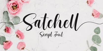 Satchell is a lovely and relaxed handwritten font. It is PUA encoded which means you can access all of the glyphs and swashes with ease! it has a gentle and beautiful flow, and as a result it will elevate each of the designs you wish to create!. It’s the perfect font for wedding invitations, stationery, photography, social media posts, product packaging, greeting cards, and much more!
 - Anthurea by Invasi Studio,
$19.00 Anthurea is a modern classy serif typeface. Featuring an elegant and classic all-caps style, this font reflects the elegance and style of the past. With its modern and minimal treatment, it makes a great starting point as well as an enhancement for your design. It is perfect for Logotype, printed quotes, invitations, cards, product packaging, headers, Letterhead, Apparel, Web design, magazines, books, etc.
 - Commander by Red Rooster Collection,
$45.00 Commander is a compressed serif font family and is an original creation of Steve Jackaman (ITF). It was designed in 1994 exclusively for the Red Rooster Collection. The family excels at display sizes and in headlines, and its masculine nature lends itself well to projects about sports, science fiction, and academia. Wherever Commander ends up in your project, it is guaranteed to draw attention!
 - Letta Rillok Cyrillic by Ira Dvilyuk,
$19.00 The Letta Rillok Cyrillic font is a handwritten calligraphic signature script font paired with additional symbols font with extras. It is the font pair with will be the best option for branding, logos, wedding invitations, social media, packaging, business cards, DIY projects, social media, and many others. Letta Rillok Symbols is the font with 62 lovely hand-drawn flourishes and illustrations. Letta Rillok script Latin part contains a full set of uppercase letters and 3 full sets of lowercase letters, (standard, initial, and final forms with flourishes or teils. To make a needed form type a letter with a number such as a1, b1, c1...after that select the word and apply the Open Type Features in programs such as Adobe Illustrator, Photoshop, and others) And 53 ligatures can be used to create a handwritten calligraphy look. The Cyrillic part of the font contains uppercase letters and 3 complete sets of lowercase letters, (standard, initial, and final form. To make a needed form type a letter with a number such as a1, б1 в1... After that select the word and apply the Open Type Features in programmes such as Adobe Illustrator, Photoshop, and others) Letta Rillok Symbols is a font with over 36 hand-drawn elements, floral illustrations, and swashes and can help to make your design unique and matchless. Combine and merge swashes and illustrations to create your own designs and make borders, frames, dividers, logos, and more (just use A-Z or a-z and 0-9 keys in the included Letta Rillok Symbols font). A different symbol is assigned to each uppercase or lowercase standard character, so you do not need graphics software, just type the letter you need. Multilingual Support for 33 languages: Latin glyphs for Afrikaans, Albanian, Basque, Bosnian, Catalan, Danish, Dutch, English, Estonian, Faroese, Filipino, Finnish, French, Galician, Indonesian, Irish, Italian, Malay, Norwegian Bokmål, Portuguese, Slovenian, Spanish, Swahili, Swedish, Turkish, Welsh, Zulu. And Cyrillic glyphs support Russian, Belorussian, Bulgarian, Ukrainian, and Kazakh languages.
 - Open Book ING by Ingrimayne Type,
$9.00 OpenBookING is a gimmick or novelty font that has letters on pages of a book. It is caps only and monospaced. The letters on the upper-case keys are on the left-handed pages of an open book and the letters on the lower-case keys are the same letters but on the right-handed pages of an open book. One could alternate upper and lower case keys to get letters on complete books, but the Opentype feature of contextual alternatives (calt) does this automatically. Several previous typefaces from IngrimayneType used the calt feature to alternate shapes that fit together in an interlocking pattern, such as alternating concave and convex shapes. OpenBookING uses the calt feature in a different way, to alternate two halves of a symmetrical shape. To provide two copies of numbers and common symbols, some non-alphabetical characters are unavailable because their slots were taken by the second form of the number or common symbol. If stylistic set one (ss01) is turned on, spaces are replaced with empty pages. This may leave you with unwanted spaces at the end of lines, and to eliminate them, turn off the feature (or change the font) for these spaces. The empty pages can be used in a layer to add color to the text. There is also a second set of empty pages with a filled page that can also be used in layers. (See poster for examples.) These pages are on the (logicalnot multiply) and (register divide) characters for the first set and on the (ordmasculine ellipsis) and (macron trademark) keys for the second set. Finally, OpenBookING has a large set of accented characters if anyone should need them. The letters used on the books were derived from the font Myhota-Bold. For a related typeface of letters on book covers, see NewLibrary. OpenBookING has limited uses and is priced accordingly.
 - Bright Gabbemy Cyr Gr by Ira Dvilyuk,
$20.00 The Bright Gabbemy Cyrillic Greek is handwritten monoline signature script font and additional symbols font with extras. It is the font pair with will be the best option for branding, logos, wedding invitations, social media, packaging, business cards, DIY projects, social media, and many others. Bright Gabbemy Symbols is the font with 36 lovely hand-drawn flourishes and illustrations. Bright Gabbemy Cyrillic script font contains the Cyrillic and Greek glyphs too. Bright Gabbemy script Latin part contains a full set of uppercase letters and 2 full sets of lowercase letters, (standard, and final forms with flourishes or teils. To make a needed form just type a letter with a number such as a1, b1, c1...after that select the word and apply the Open Type Features in programs such as Adobe Illustrator, Photoshop, and others) And 53 ligatures - which can be used to create a handwritten calligraphy look. The Cyrillic part of the font contains uppercase letters and 2 full sets of lowercase letters, (standard, initial and final form. To make a needed form just type a letter with a number such as a1, б1 в1... After that select the word and apply the Open Type Features in programmes such as Adobe Illustrator, Photoshop, and others) Bright Gabbemy Symbols is a font with over 36 hand-drawn elements, floral illustrations, and swashes and can help to make your design unique and matchless. Combine and merge swashes and illustrations to create your own designs and make borders, frames, dividers, logos, and more (just use A-Z or a-z and 0-9 keys in the included Bright Gabbemy Symbols font). A different symbol is assigned to each uppercase or lowercase standard character, so you do not need graphics software, just type the letter you need. Multilingual Support for 33 languages: Latin glyphs for Afrikaans, Albanian, Basque, Bosnian, Catalan, Danish, Dutch, English, Estonian, Faroese, Filipino, Finnish, French, Galician, Greek, Indonesian, Irish, Italian, Malay, Norwegian Bokmål, Portuguese, Slovenian, Spanish, Swahili, Swedish, Turkish, Welsh, Zulu. And Cyrillic glyphs support Russian, Belorussian, Bulgarian, Ukrainian, and Kazakh languages.
 - Scriptina Pro by CheapProFonts,
$- This is the 100th font released by CheapProFonts, and I wanted to make something special - so I have chosen to upgrade one of the most popular free fonts ever: the one and only Scriptina by the infamous Fredrick “Apostrophe” Nader! After first cleaning up the outlines, spacing and kerning, Scriptina Pro has been expanded with a set of alternate letters without the loops and swashes, using the OpenType contextual alternates feature to switch them around automatically to avoid too many overlapping and repeating elements. You can also manually turn off the loops and swashes with the OpenType titling and swash features respectively. The originals alternate letters have been incorporated as stylistic alternates (and stylistic set 02) and the ligatures as discretionary ligatures if you should want them. The alternate non-script lowercase z is programmed as stylistic set 01. In addition Scriptina Pro has been given the usual CheapProFonts large multilingual character set, of course. I hope many will enjoy the improvements and additional language support. And, naturally: it is still free! ALL fonts from CheapProFonts have very extensive language support: They contain some unusual diacritic letters (some of which are contained in the Latin Extended-B Unicode block) supporting: Cornish, Filipino (Tagalog), Guarani, Luxembourgian, Malagasy, Romanian, Ulithian and Welsh. They also contain all glyphs in the Latin Extended-A Unicode block (which among others cover the Central European and Baltic areas) supporting: Afrikaans, Belarusian (Lacinka), Bosnian, Catalan, Chichewa, Croatian, Czech, Dutch, Esperanto, Greenlandic, Hungarian, Kashubian, Kurdish (Kurmanji), Latvian, Lithuanian, Maltese, Maori, Polish, Saami (Inari), Saami (North), Serbian (latin), Slovak(ian), Slovene, Sorbian (Lower), Sorbian (Upper), Turkish and Turkmen. And they of course contain all the usual “western” glyphs supporting: Albanian, Basque, Breton, Chamorro, Danish, Estonian, Faroese, Finnish, French, Frisian, Galican, German, Icelandic, Indonesian, Irish (Gaelic), Italian, Northern Sotho, Norwegian, Occitan, Portuguese, Rhaeto-Romance, Sami (Lule), Sami (South), Scots (Gaelic), Spanish, Swedish, Tswana, Walloon and Yapese.
 - Snacko by Eko Bimantara,
$22.00 Snacko is one dope display font. It’s got that casual vibe mixed with some 70s soft serif styles, and a playful italic angle that’ll make your designs move and groove! This font is perfect for titling, branding, logos, and all kinds of digital or printed materials. It’s fun and playful, so it’s perfect for designs that are targeted at a younger crowd or need a fresh and modern feel. Snacko’s funky, soft, and cool design makes it the bomb for all kinds of design fields, from advertising to packaging to social media graphics. It’s got a style that’s all its own and can make your designs pop and stand out from the crowd. This font only comes in one style, but don’t trip, it’s versatile and can be used in all kinds of ways. It’s approachable and friendly with a softness that’s off the hook, but also funky and expressive with a unique personality that can take your designs to the next level. Bottom line, Snacko is one creative and versatile font that’ll bring a playful and fun energy to all your designs. It’s got a unique style that’s perfect for any designer’s font collection, so don’t sleep on this one!
 - Abode - Unknown license

- Chalkboy by Typefactory,
$14.00 Chalkboy – Handwritten Chalk Font is a fun and casual display font suited for kids, playground, or school theme. Whether you’re using it for crafting, digital designing, presentations, or greeting card making, it’s perfect!
 - Hopeless Heart by PizzaDude.dk,
$22.00Hopeless Heart isn't really all that hopeless! With its jumpy baseline and the different sized serifs, it’s a font full of fun and games, suitable for your next wedding invitation or love letter. - Velourist by Fargun Studio,
$15.00 Velourist is a bold display type that’s absolutely perfect for editorial headlines with retro looks. It’s unique, bold, and slim figure make it a great fit for t-shirts, posters, and magazine covers.
 - Dungarees by Victory Type,
$-Dungarees is a font on caffeine... It's a normal sans-serif typeface gone wild: jagged in some places, smooth in others. It makes documents not only fun to read but really interesting too! - Deseada by Type-Ø-Tones,
$40.00 Deseada is a blurred roman face with a small x-height —actually a modified Caslon— that fits perfectly into retro environments. Use it as a parody, it's just a sort of Catalan custom.
 - Hola by Cuda Wianki,
$35.00 Hola! This is our new handwritten font. It's casual, young and pretty, perfect for logotypes, magazines, writing notes and comments. Thanks to many ligatures and alternate characters it is varied handwriting font. Enjoy!
 - Phylactere by Cubo Fonts,
$29.00 This font draws its inspiration from handwriting, in order to maintain a certain dynamism and irregularity. It's a serifless font, with small capital characters, always readable at any dimension, despite a tight tracking.
 - Lamiar by Antipixel,
$15.00 Lamiar is a decorative, fun, san serif handwritten font. This rounded monoline font will add an fancy, weird and unique look to your work. It's recommended for display usage for its glyph quality.
 - Gruffly by Stripes Studio,
$19.00 Gruffly is a new font brushed very interesting, also provided some ligatures. It is perfect for projects for brands, logos, product packaging, posters, invitations, greeting cards, news, blogs, everything including personal charm etc.
 - MTF Sunny Days by Miss Tiina Fonts,
$9.00 Sunny Days is a fun, cartoon-like display font capable of taking any product out of the ordinary! Use it on bold and bright creations such as banners, posters, covers, titles, magazines, etc.
 - Palmaton by Fikryal,
$15.00 Palmaton is a new modern & stylish handwritten font. It's perfect for logo, branding, invitation, tittle, wedding designs, social media posts, advertisements, product packaging, product designs, label, photography, watermark, special events, magazine, web design, etc. What's Included : Ligature Multilingual support If you have any questions please don't hesitate to contact me at : mfikryalif@fmail.com
 - Sortemun by Mandarin,
$15.00 Sortemun is a modernist display font based on heavy metal band graphics with a touch of horror movies from the 70/80’s. Bold, mysterious and vampiric it’s suitable for use in various projects such as rock/metal albums, scary games, horror movie titles, swag graphics, headlines, book covers, Halloween based parties etc.
 - Gelato Script by Eclectotype,
$40.00 The original Gelato Script has been updated and improved, not once, but twice. This version is kept here for legacy and compatibility issues, but I would encourage new users to check out Gelato Luxe or Gelato Fresco instead. Gelato Script is a smooth-flowing typeface with an air of familiarity. Influenced by both formal scripts and mid-Twentieth Century hand lettering. The power of OpenType is used with precision in the Contextual Alternate feature to make sure letters connect seamlessly, t’s cross where they can and swashes don't crash into neighboring glyphs. 781 glyphs make up this font, which is capable of speaking in many different languages. Alternate forms are grouped into stylistic sets to make it easy to change the mood of the text. For example, ss01 makes droopable letters drop below the baseline to break it up a little if required. I recommend using it sparingly, one glyph at a time, but if you do enable it for a whole chunk of text, the clever OpenType programming ensures that it doesn't go overboard. Sets 2, 3 and 4 bring about alternate forms of S, s, B and Q. Set 5 changes AE and OE to some perhaps controversial Upper/lowercase ligatures. Engage ss06 for the underline feature. After a word, simply type two or more underscores and a line extends backwards under the word you just typed. Don't worry if you have to break for a descender, the OpenType programming will take care of making sure it connects properly to the preceding character. Sets 7 and 8 are for alternate ampersands, and ss09 swaps the script r for a regular shaped r. There are swash capitals available for most uppercase letters, and the OpenType programming makes sure there is room for them under or over the following letters. There’s also a good amount of ligatures thrown in. The localised forms feature can be set for Polish, where acutes get steeper and lslash takes on its script form; Dutch, where IJ and ij digraphs become cool ligatured combinations; and Romanian and Moldovan, where cedillas are subsituted for comma accents. The stylistic alternates feature groups together a few of the stylistic sets for users that can't get to them directly. Gelato Script is a highly usable, powerful typeface. Perfect for everything from food packaging to wedding invitations, sports team logos to magazine headings. Use it however you see fit. Just one thing - it’s not designed for all-caps settings, so avoid that at all costs!
 - Pariphoom Compressed by Jipatype,
$27.00 ขอแนะนำ Pariphoom Compressed ส่วนเสริมของฟอนต์ Pariphoom ด้วยอักษรอันโฉบเฉี่ยวและทันสมัย เหมาะสำหรับงานออกแบบหลากหลายประเภท ด้วยอักษรแบบ sans-serif condensed และมุมโค้งมน แบบอักษรนี้ให้ความสมดุลที่ระหว่างความเป็นทางการและความเข้าถึงได้ง่าย ชื่อปริภูมิมาจากภาษาไทย แปลว่า “Space” และเช่นเดียวกับชื่อของมัน ฟอนต์นี้สามารถให้พื้นที่มากขึ้นในงานออกแบบของคุณ ไม่ว่าคุณกำลังสร้างสื่อสำหรับสร้างแบรนด์ พัฒนาแคมเปญการตลาด หรือออกแบบเว็บไซต์ Pariphoom Compressed มอบความยืดหยุ่นและความอเนกประสงค์เพื่อให้ได้รูปลักษณ์ที่คุณต้องการ Pariphoom Compressed มาพร้อมกับรูปแบบที่แตกต่างกันถึง 18 รูปแบบ สิ่งนี้ทำให้คุณมีตัวเลือกมากมายและมีความยืดหยุ่นในการใช้งานในหลากหลายบริบท นอกจากนี้ ฟอนต์นี้รองรับหลายภาษาสำหรับภาษาต่างๆ มากมาย แต่นั่นไม่ใช่ทั้งหมด Pariphoom Compressed มาพร้อมกับฟีเจอร์ Opentype เจ๋ง ๆ เช่น Small Caps และ Tabular ซึ่ง Small Caps เป็นวิธีที่ยอดเยี่ยมในการเพิ่มความหลากหลายให้กับงานออกแบบของคุณโดยใช้ตัวพิมพ์ใหญ่แทนตัวพิมพ์เล็ก ในขณะเดียวกัน Tabular ก็สมบูรณ์แบบสำหรับการสร้างตารางและจัดตำแหน่งตัวเลขเพื่อให้ดูเป็นระเบียบมากขึ้น โดยรวมแล้ว Pariphoom Compressed ทำให้เป็นตัวเลือกที่ยอดเยี่ยมสำหรับนักออกแบบที่ต้องการสร้างผลงานการออกแบบที่น่าจดจำและมีประสิทธิภาพ Introducing Pariphoom Compressed, a extended of Pariphoom with sleek and modern typeface that is perfect for a wide range of design projects. With its condensed sans-serif design and rounded corners, this font offers a unique balance of professionalism and approachability. Derived from the Thai language, the name Pariphoom means "Space" and just like its name suggests, this font can give you more space in your design. Whether you're creating branding materials, developing marketing campaigns, or designing websites, Pariphoom Compressed offers the flexibility and versatility you need to achieve your desired look. Pariphoom Compressed comes with 18 different styles. This gives you plenty of options to choose from and the flexibility to use it in various design contexts. Additionally, this font offers multi-language support for a wide range of languages. But that's not all – Pariphoom Compressed comes with some cool Opentype features such as Small Caps and Tabular. Small Caps are a great way to add variety to your design by using small capital letters instead of lowercase letters. Meanwhile, Tabular is perfect for creating tables and aligning numbers for a more organized look. Overall, Pariphoom Compressed making it a great choice for designers who want to create memorable and effective design projects.
 - Kontext H by Elster Fonts,
$20.00 Imagine a font that is easier to read the smaller it is – or the further away the text is. There are already many line screen fonts, I wanted to take it to the extreme and use as few lines as possible, while keeping the grid of the fonts metrics. The result is a typeface that lives up to its name. Each individual line makes no sense on its own; individual letters are only recognisable in the context of all associated lines, individual letters are most likely to be recognised in the context of whole words. Attached to a building wall, text would be readable from a great distance and become increasingly difficult to decipher the closer you get to the building. Placed on the ground or on a large flat roof, text would only be readable from an aeroplane or - depending on the size - in Google Earth. Kontext has old style figures, superscript numerals, case-sensitive questiondown and exclamdown and an alternative ampersand, 390 glyphs at all. Use the same value for font size and line spacing to keep the lines in the grid, or change the line spacing in 10% steps. Change the spacing in 100-unit or 25-percent increments increments to keep the grid. The »H« in the font name stands for horizontal (lines). The numbers in the font name refer to the brightness of the background and letters themselves, with the first number describing the background and the second the letters. Starting with »00« (white) to »200« (dark) See also my Family Kontext Dot
 - Rather Risque by SilverStag,
$14.00 RATHER RISQUÉ is a brand new & creative contrast serif font, my take on a classical serif typeface, with over 165 unique ligatures and alternates for all uppercase and lowercase letters. This serif font was inspired by fashion editorial fonts, I wanted it to be bold but with a contrast thin touches, modern ligatures and unique features. RATHER RISQUÉ serif font comes with over 165 ligatures and alternates, full language support and it will be perfect for any kind of design work. Whether you're making a poster, logo design, full branding or a website, you can use it and get an amazingly creative result. I invite you to check out the preview images, and I hope you will be immersed in my vision for this creative typeface that, I am sure, will work for all kinds of interesting projects you might be working on this year. It also includes full language support, punctuation, numerals and detailed instructions how to use alternate letters most of the apps on your computer, as well as in Canva. If you end up publishing your designs on Instagram, tag me - @silverstagco and I will make sure to showcase your design and work to my audience as well! RATHER RISQUE | A Ligature Serif Font Includes: RATHER RISQUE.otf - Classical Serif Typeface With Modern Alternates & Ligatures 165+ Creative Alternates & Ligatures Numerals & Punctuation Language Support Web Font Kit is included as well Detailed instructions on how to use alternates in most of the apps on your computer and in Canva Happy creating everyone!
 - Kontext V by Elster Fonts,
$20.00 Imagine a font that is easier to read the smaller it is – or the further away the text is. There are already many line screen fonts, I wanted to take it to the extreme and use as few lines as possible, while keeping the grid of the fonts metrics. The result is a typeface that lives up to its name. Each individual line makes no sense on its own; individual letters are only recognisable in the context of all associated lines, individual letters are most likely to be recognised in the context of whole words. Attached to a building wall, text would be readable from a great distance and become increasingly difficult to decipher the closer you get to the building. Placed on the ground or on a large flat roof, text would only be readable from an aeroplane or - depending on the size - in Google Earth. Kontext has old style figures, superscript numerals, case-sensitive questiondown and exclamdown and an alternative ampersand, 390 glyphs at all. Use the same value for font size and line spacing to keep the lines in the grid, or change the line spacing in 10% steps. Change the spacing in 50-unit or 25-percent increments to keep the grid. The »V« in the font name stands for vertical (lines). The numbers in the font name refer to the brightness of the background and letters themselves, with the first number describing the background and the second the letters. Starting with »00« (white) to »200« (dark) See also my family Kontext Dot
 - Haboro Squared by insigne,
$25.00 Haboro Squared is a formidable typeface, created for a variety of uses. Clean and consistent, it evokes the 1950s and 1960s. Haboro Squared conveys accuracy and utility with its clean, consistent strokes. In the 1950s and 1960s, designers and the general public began to reject the austerity of the war years in favor of a new sense of American optimism. This era is reflected in Haboro Squared’s gently rounded letters, playful alternates, and multi-purpose use. Whether you are creating a logo, crafting a website, or designing a magazine article, Haboro balances modernity with a hint of nostalgia. Haboro Squared achieves a balance between fashion and practicality. Even though it has an angular, modern design, it radiates friendliness and warmth. Haboro Squared works well for headings and brief texts. This collection of fonts consists of eight weights, from Thin to Black, each with a corresponding italic. Your design will seem robust and fashionable with so many options. Haboro plenty of alternate glyphs from which you can select an alternative or adjust the appearance of each letter. You’ve found a secret weapon. The Haboro Hyperfamily features a whole array of options, from Haboro Sans, Serif, to Haboro Didone. Take a look at the entire family. Even the most serious texts have a touch of whimsy thanks to the quirky alternate terminals in this multipurpose text face. Impress clients with your next branding package, web site, or magazine spread. Let the nostalgia of America’s post WWII heyday fill you with inspiration! Supercharge your next branding package, web site, or magazine spread with Haboro Squared!
 - When Suddenly by Comicraft,
$49.00 From completely OUT OF THE BLUE, here’s a font you'll need when, unexpectedly -- with a sense of immediate urgency -- your characters abruptly call out without warning and on the spur of the moment! When Suddenly ’s prompt! It’s abrupt! It responds in a flash! Now you can put all the words you need in your comic book in such a way that they'll come as a complete surprise to all your readers! When Suddenly is BOLD! It’s ITALIC! It’s anything but REGULAR!
 - JUSTICE LEAGUE - Personal use only

- Xiomara - Personal use only


