10,000 search results
(0.029 seconds)
- Grindmore by LetterStock,
$25.00 **Grindmore Font** This pair was inspired by the vintage poster design that i saw on some coffee shop, It was crafted by hand specially to add natural handmade feeling in its brand identity than i make it clean with pentool. **Opentype features** Grindmore font has 222 character set included Cricket Font is very good looking in logo, labels, t-shirt prints, product packaging, invitations, advertising and others. * Multilingual support (Western European characters). This fonts works with folowing languages: English, Danish, Dutch, Estonian, Faroese, Filipino, Finnish, French, German, Hungarian, Icelandic, Irish, Italian, Norwegian, Polish, Portuguese, Spanish, Swedish. Thank you for using this font. LS
 - Go Home JNL by Jeff Levine,
$29.00 Sheet music for another one of those songs from the early part of the 20th Century with a wonderfully wordy hand lettered title was the model for the Art Nouveau flavored Go Home JNL, which is available in both regular and oblique versions. 1908's "I Used to be Afraid to Go Home in the Dark (Now I'm Afraid to Go at All)" is comprised of eighteen words. It may have been a mouthful to request from the local sheet music shop, but the lettering on its cover made it a great candidate for preserving as a digital typeface.
 - Brazza by Scholtz Fonts,
$17.00Brazza is a a font that fuses the look of handwriting, brush and comic script. It is loose, very versatile and informal, yet it is very readable. Suggestions for use: - music video marketing - greeting cards - valentines day media - comic books - captions The font is fully professional: carefully letterspaced and kerned. It contains over 235 characters - (upper and lower case characters, punctuation, numerals, symbols and accented characters are present). - Kingstone Sans by Unitype Studio,
$19.00 Introducing the majestic "Kingstone Sans" a typeface that exudes power, elegance, and timeless appeal. With its commanding presence and exquisite details, this font is designed to make a bold statement in your designs. Let the "Kingstone Sans " reign over your projects and elevate them to new heights of sophistication. Its sturdy serifs and balanced letterforms exude a sense of authority, making it ideal for prestigious branding, editorial designs, and luxury packaging.
 - Michael Signature by Stefani Letter,
$14.00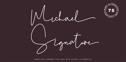 Michael Signature feels just as charming and elegant. This stunning Monoline script font is a stylish homage to classic handwriting. It features a varied baseline, smooth lines, gorgeous glyphs, and stunning alternatives. This font is PUA-coded which means you can access all the amazing glyphs and swashes with ease! It also features many special features including glyphs and alternate ligatures so that it displays natural and original handwriting.
 - Seashell Paradise by Letterhanna Studio,
$19.00 Introducing "Seashell Paradise," a delightful new handwritten font. This font captures the essence of tranquility and elegance with its flowing lines and graceful curves. "Seashell Paradise" is a versatile typeface that can be used for a wide range of design applications, from invitations and greeting cards to branding and product packaging. Its clean, modern look makes it a perfect choice for projects that require a contemporary and sophisticated feel.
 - Boldoni by Forte Type,
$4.90 Boldoni is like a caricature: it brings with itself exaggerated elements of the modern typefaces, that has as main names Giambattista Bodoni and François-Ambroise Didot. Boldoni takes to the limit its width and serifs, causing a ultra fat type feeling, and its styles causes a monochromatic effect that remember the colors Black, Gray and White. Boldoni is good for titles, initials, drop caps, lettering, posters and vertical writing.
 - TE Heading by Tharwat Emara,
$20.00 It is known as the THARWAT M EMARA HEADING (NASKH) Font for its extensive use in the copying and transmission of books because it helps the writer to write more quickly than any other font since the Islamic times and then THARWAT M EMARA HEADING(NASKH) font wrote the "HEADING" And the advantages of THARWAT M EMARA HEADING (NASKH)font are clarifying the letters and show their beauty and splendor
 - Sweet Missy by Olivetype,
$18.00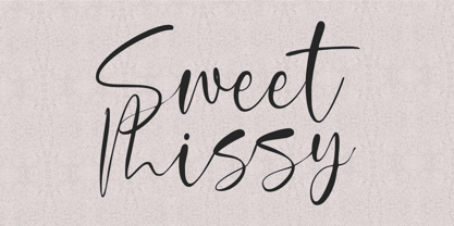 With its modern calligraphy script style, Sweet Missy is perfect for adding a touch of elegance to logos, branding, and more. Its stylish yet simple design makes it versatile and easy to use for a variety of projects. So what’s included : Basic Latin Uppercase and Lowercase Numbers, symbols, and punctuations Ligatures. Multilingual Support. PUA Encoded and fully accessible without additional design software Simple Installations Works on PC & Mac Thank You.
 - Stories by Aestherica Studio,
$9.00 Stories is a Charming Quotable font with a Brush style and extended kerning, special for your quotes. It puts a bold accent to your projects and it will inspire you to create something playful and unique. Stories will help you create special and touching typographical designs for your display quote projects. It is perfect for headings, flyers, greeting cards, product packaging, book cover, printed quotes, logotype, apparel design, and album covers.
 - I Love Summer by Seemly Fonts,
$12.00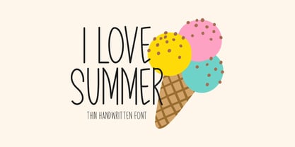 I Love Summer is a sweet and friendly handwritten font. Its natural and unique style makes it incredibly fitting for a large pool of designs. The only limit is your imagination!
 - Crafty Notes by Illushvara,
$12.00 Crafty Notes is a clean, thin and simple handwritten font. Its natural and unique style makes it incredibly fitting to a large pool of designs. The only limit is your imagination!
 - Adept Sans by Lumiks Design,
$8.00 Adept Sans is a rounded, modern and clean font that make it suited for small text to high-impact headlines. The family contains six fonts, 3 weights and its matching italics.
 - Dense by North Type,
$- Dense is a versatile, elegant, geometric and compact sans-serif typeface. Though it is a very flexible typeface, it truly shines at larger sizes when used for headlines and poster design.
 - Maron American by Zeenesia Studio,
$12.00 Maron American is a sweet unique and natural handwritten font. Its unique and neat style makes it incredibly versatile, fitting a wide range of designs. The only limit is your imagination!
 - Diamond Pride by Illushvara,
$15.00 Diamond Pride is a sweet and beautiful script font. It features an elegant style that makes it perfect for logos, branding, invitations, stationery, wedding designs, social media posts, and much more.
 - Bubblegum Cartoon by WAP Type,
$20.00 Bubblegum is a font made in styles: With its nice and sweet appeal, it is perfect for scrapbooking, print design, stationery, blog header, greeting cards, posters, blog header and art quote.
 - Gold Empire by Rockboys Studio,
$23.00 Gold Empire is an incredibly unique and distinct blackletter font. It will add a unique touch to your designs. Use it for tattoo designs, logos, posters, book covers, albums and more!
 - Charly Dreams by Awan Senja,
$14.00 Charly Dreams is a sweet, colorful and friendly display font. Add it to your most creative ideas and notice how it makes them stand out! The only limit is your imagination!
 - SF Atlantida by Supfonts,
$19.00 Atlantida it is a Calligraphy chick font with exquisite accents. It is perfect for branding, wedding invitations and invitation cards and many more What's inside: Atlantida Script Multilingual support Cricut support
 - Catalina by Kimmy Design,
$10.00 Earlier this year I visited a bakery in Newport Beach, CA and fell in love with the organic design and typography of the place. Hand-drawn menus, table cards, chalkboards, and wall quotes surrounded the charming spot. It inspired me to create a new font family based on the combination of hand drawn fonts. Included in this package are 5 font families, with 2 graphic ornament fonts. Each font family contains at least a light, medium and bold. Here is a breakdown of what's cookin' at Catalina's Bakery: Catalina Anacapa: Tall and skinny, this font comes in 3 weights for both sans and slab serif styles. It includes contextual alternatives (giving 3 versions of each letter), stylistic alternatives for select letters (A, K, P, Q, R, Y) and also includes Small Caps. Catalina Avalon: Based off Anacapa, this sub family has a high contrasting line weight. It comes in light, regular and bold as well as an inline alternative for both sans and slab serif styles. Avalon also includes opentype features such as contextual alternatives (giving 3 versions of each letter), stylistic alternatives for select letters (A, K, P, Q, R, Y) and small caps for each letter. Catalina Clemente: In a more standard width, Clemente is one of the two sub families that can be used for paragraph text as well as headlines. It's organically geometric in style and comes in ALL CAPS and lowercase, includes upright and custom italics, and has the opentype feature giving 3 versions of each letter. Catalina Script: A great compliment with the display sub-families, Catalina Script rounds out the package with a hand-drawn cursive flair. It includes contextual alternatives (giving 2 variations to each letter) as well as stylistic alternatives for many of the capital and lowercase letters. It has special ligatures for some letter combinations, and titling alternatives for all the capital letters. Catalina Typewriter: The second of the paragraph text sub-families, this typewriter inspired hand-drawn font family works great as either a display or paragraph text. It has contextual alternatives with 3 versions of each letter, and comes in both upright and custom italics versions. Catalina Extras! These two fonts go perfectly with the Catalina Family. They includes borders, frames, arrows, banners, flourishes and more. Catalina Flourish has all of it's options in a light and bold style, to use the light version type all lowercase letters, then to make something bold, used it's uppercase (or shift+) characters. For a breakdown of graphic/letter correlation, see the breakdown PDF. All of Catalina was drawn by the same hand, using the same ink and technique. While they contrast in their type styles, they work together perfectly to create one cohesive font family.
 - Seconda XtraSoft by Durotype,
$49.00 Seconda XtraSoft is the extra soft companion of Seconda and Seconda Soft. Friendlier, easier on the eye, more informal, more fashionable — but still the refined and reliable Seconda. Seconda XtraSoft’s extra softness comes from the moderate rounding of both the edges and the inner corners of its characters. Seconda XtraSoft has sixteen styles, extensive language support, eight different kinds of figures, sophisticated OpenType features — so it’s ready for advanced typographic projects. For text and display use. When using Seconda XtraSoft in small text sizes, it will be a reliable and legible text face. When using it in big display sizes, it will show its interesting details. For more information about Seconda XtraSoft, download the PDF Specimen Manual.
 - SK Cuber by Shriftovik,
$10.00 SK Cuber™ is an expanded monumental pseudo-pixel typeface. It is based on a strict grid that is not broken in any glyph. This makes the type more organic and consistent. The type's characters are monospaced, but they do not look ridiculous and do not cause discomfort as it usually happens. This could only be achieved by carefully working out each glyph. The type also deliberately uses the contrast between geometric strokes and smooth transitions. It adds to his liveliness and character. SK Cuber is inspired by the monumental architecture of our days. It is brutal and extremely stable, which makes it an excellent font for working with posters, headlines, etc.
 - Draetha by Hackberry Font Foundry,
$24.95 Draetha is the 6-font companion to Biblia and Biblia Serif. But it is definitely designed to be used with Biblia Serif for book design and production. It is a nearly monoline sans with a clean style which contrast beautifully with Biblia serif. The Black versions push monoline to the extreme of boldness. It has the same font metrics as Biblia and Biblia Serif. The only compromise is that Ultra is too extreme to be able to provide small caps or oldstyle figures. It is designed with text spacing, to work in text with Biblia and Biblia Serif. For heads and subheads, you will need to adjust the tracking. But it tracks well.
 - SD Quainton by Sawdust,
$35.00 SD Quainton was created in 2016 by Jonathan Quainton the co-founder of graphic design studio Sawdust. With a harmonious blend of Didone and Bauhaus elements Quainton embarks on a fresh and innovative direction. Drawing inspiration from revered typefaces like Bodoni and Didot, SD Quainton evokes the same sense of awe that captivated its creator. Designed with specific contexts in mind, SD Quainton finds its perfect home in the realms of fashion, retail, and premium products, where its captivating charm can truly shine. Although ideally suited for eye-catching headlines and titles due to its delicate strokes, the possibilities of where this remarkable typeface may find its place are as limitless as the designer's imagination.
 - Carrara by Hoftype,
$49.00 Carrara is a highly readable text face with a loose reference to classical transitional types. Carrara was designed 2016. It presents a solid structure which makes it very assertive in text applications. In headlines it shows the individual details of the forms which gives it a gentle flow and makes for a distinguished and distinct appearance, while avoiding any noisiness. The Carrara family consists of 12 styles and is well equipped for ambitious typography. It comes in OpenType format with extended language support. All weights contain ligatures, superior characters, proportional lining figures, tabular lining figures, proportional old style figures, lining old style figures, matching currency symbols, fraction- and scientific numerals, matching arrows and alternate characters.
 - Holgada by Graviton,
$24.00 Holgada font family has been designed for Graviton Font Foundry by Pablo Balcells in 2020. It is a geometric sans serif typeface with refined rounded endings that provide a soft and friendly appearance. Its generic shapes make it suitable for any kind of project, text length and size. Thanks to its clear legibility, it can be used in long body texts in very small sizes, in big size headlines and everything in between. The rounded endings not only provide a particular softness when used in body text, but also a distinctive touch when used in display situations such as logos and headlines. Holgada consists of 12 styles, each containing small caps and glyph coverage for several languages.
 - Wolpe Fanfare by Monotype,
$50.99 “Fanfare is such a fun typeface,” says Toshi Omagari, who revived the design for The Wolpe Collection. “It was my happiest discovery when I was digging through the Monotype archive. I came across it and had to check the designer’s name.” No wonder: Fanfare is modern, light and playful – not what you’d expect from an 80-year old design. From the original, very heavy weight design, Omagari started by creating a black weight, followed by four lighter weights for Wolpe Fanfare, preserving the character of the letterforms all the way down to a thin version. “I wanted to do more than digitize the original weight,” he says. “It’s surprisingly modern, and its skeleton, its basic structure, is so beautiful.” The new design packs more into a small space than most typefaces. It’s a natural for publication and advertising design. With displays capable of revealing fine details such as Fanfare’s subtly slanted baseline, its lovely forms will easily translate to mobile devices. With an extended European character set that includes Greek and Cyrillic language support, Wolpe Fanfare can speak in many languages.
 - Zooja by Aerotype,
$48.00 Zooja™ and Zooja Light have alternates for every capital and lowercase letter, consecutive characters are controlled with the OpenType Ligature feature. Zooja Elements & Borders has 90+ fun decorative doodads, borders and corners that play well with the fonts. Zooja Catchwords has 60+ hand drawn word glyphs and Zooja Banners & Patterns has 17 repeatable patterns and 50+ banner and frame elements to help pull it all together.
 - Affair by Sudtipos,
$99.00 Type designers are crazy people. Not crazy in the sense that they think we are Napoleon, but in the sense that the sky can be falling, wars tearing the world apart, disasters splitting the very ground we walk on, plagues circling continents to pick victims randomly, yet we will still perform our ever optimistic task of making some little spot of the world more appealing to the human eye. We ought to be proud of ourselves, I believe. Optimism is hard to come by these days. Regardless of our own personal reasons for doing what we do, the very thing we do is in itself an act of optimism and belief in the inherent beauty that exists within humanity. As recently as ten years ago, I wouldn't have been able to choose the amazing obscure profession I now have, wouldn't have been able to be humbled by the history that falls into my hands and slides in front of my eyes every day, wouldn't have been able to live and work across previously impenetrable cultural lines as I do now, and wouldn't have been able to raise my glass of Malbeck wine to toast every type designer who was before me, is with me, and will be after me. As recently as ten years ago, I wouldn't have been able to mean these words as I wrote them: It’s a small world. Yes, it is a small world, and a wonderfully complex one too. With so much information drowning our senses by the minute, it has become difficult to find clear meaning in almost anything. Something throughout the day is bound to make us feel even smaller in this small world. Most of us find comfort in a routine. Some of us find extended families. But in the end we are all Eleanor Rigbys, lonely on the inside and waiting for a miracle to come. If a miracle can make the world small, another one can perhaps give us meaning. And sometimes a miracle happens for a split second, then gets buried until a crazy type designer finds it. I was on my honeymoon in New York City when I first stumbled upon the letters that eventually started this Affair. A simple, content tourist walking down the streets formerly unknown to me except through pop music and film references. Browsing the shops of the city that made Bob Dylan, Lou Reed, and a thousand other artists. Trying to chase away the tourist mentality, wondering what it would be like to actually live in the city of a billion tiny lights. Tourists don't go to libraries in foreign cities. So I walked into one. Two hours later I wasn't in New York anymore. I wasn't anywhere substantial. I was the crazy type designer at the apex of insanity. La La Land, alphabet heaven, curves and twirls and loops and swashes, ribbons and bows and naked letters. I'm probably not the very first person on this planet to be seduced into starting an Affair while on his honeymoon, but it is something to tease my better half about once in a while. To this day I can't decide if I actually found the worn book, or if the book itself called for me. Its spine was nothing special, sitting on a shelf, tightly flanked by similar spines on either side. Yet it was the only one I picked off that shelf. And I looked at only one page in it before walking to the photocopier and cheating it with an Argentine coin, since I didn't have the American quarter it wanted. That was the beginning. I am now writing this after the Affair is over. And it was an Affair to remember, to pull a phrase. Right now, long after I have drawn and digitized and tested this alphabet, and long after I saw what some of this generation’s type designers saw in it, I have the luxury to speculate on what Affair really is, what made me begin and finish it, what cultural expressions it has, and so on. But in all honesty it wasn't like that. Much like in my Ministry Script experience, I was a driven man, a lover walking the ledge, an infatuated student following the instructions of his teacher while seeing her as a perfect angel. I am not exaggerating when I say that the letters themselves told me how to extend them. I was exploited by an alphabet, and it felt great. Unlike my experience with Ministry Script, where the objective was to push the technology to its limits, this Affair felt like the most natural and casual sequence of processions in the world – my hand following the grid, the grid following what my hand had already done – a circle of creation contained in one square computer cell, then doing it all over again. By contrast, it was the lousiest feeling in the world when I finally reached the conclusion that the Affair was done. What would I do now? Would any commitment I make from now on constitute a betrayal of these past precious months? I'm largely over all that now, of course. I like to think I'm a better man now because of the experience. Affair is an enormous, intricately calligraphic OpenType font based on a 9x9 photocopy of a page from a 1950s lettering book. In any calligraphic font, the global parameters for developing the characters are usually quite volatile and hard to pin down, but in this case it was particularly difficult because the photocopy was too gray and the letters were of different sizes, very intertwined and scan-impossible. So finishing the first few characters in order to establish the global rhythm was quite a long process, after which the work became a unique soothing, numbing routine by which I will always remember this Affair. The result of all the work, at least to the eyes of this crazy designer, is 1950s American lettering with a very Argentine wrapper. My Affair is infused with the spirit of filete, dulce de leche, yerba mate, and Carlos Gardel. Upon finishing the font I was fortunate enough that a few of my colleagues, great type designers and probably much saner than I am, agreed to show me how they envision my Affair in action. The beauty they showed me makes me feel small and yearn for the world to be even smaller now – at least small enough so that my international colleagues and I can meet and exchange stories over a good parrilla. These people, whose kindness is very deserving of my gratitude, and whose beautiful art is very deserving of your appreciation, are in no particular order: Corey Holms, Mariano Lopez Hiriart, Xavier Dupré, Alejandro Ros, Rebecca Alaccari, Laura Meseguer, Neil Summerour, Eduardo Manso, and the Doma group. You can see how they envisioned using Affair in the section of this booklet entitled A Foreign Affair. The rest of this booklet contains all the obligatory technical details that should come with a font this massive. I hope this Affair can bring you as much peace and satisfaction as it brought me, and I hope it can help your imagination soar like mine did when I was doing my duty for beauty.
 - Catchye by MJType,
$25.00 Introducing catchye a captivating serif font that combines timeless elegance with modern flair. Its refined letterforms and balanced proportions make it perfect for logos, editorial designs, and packaging. Embrace Catchye’s allure and elevate your typographic compositions with sophistication and charm.
 - Kigelio by Ivan Rosenberg,
$15.00 KIGELIA is a stylish display serif font inspired by fashion magazines and romance. It is great for short headlines and titles, but it looks great in advertising, vintage mood board, branding, logotypes, packaging, titles, editorial design and modern and vintage design.
 - Bokeseni by AukimVisuel,
$9.00 Bokeseni is a cute and casual sans serif font with an undeniably clean feel. It includes a condensed, and expanded version. With its neat and beautiful arrangement of letters, this typeface will look outstanding in both formal and non-formal designs.
 - Nigo by Linecreative,
$16.00 Nigo is a stylish font It has both modern and retro look - clear, modern and fun, Perfect for make any project like header, quote, layout magazine and other. Even better if you use it on 60s and 70s design project
 - Aphrodite Slim by Typesenses,
$57.00 Aphrodite Slim Pro is not just a lighter version of its sister Aphrodite Pro. Aphrodite Slim Pro has duplicated the quantity of characters of its partner, and that means more than 500 new glyphs, reaching a total of more than 1000. More delicate and meticulous, Aphrodite Slim Pro is once more a new typography with deep calligraphic ideals: We immersed ourselves into the world of each calligraphy ductus and each calligraphy masters by studying from decoration to lettering books. This was the key for the logic of Aphrodite Slim’s behavior. The new concept of Aphrodite Slim Pro was to join diverse styles of calligraphy in one in order to achieve an autonomous expressiveness, in fact, this is what calligraphy aims to, and we agreed to bring those ideals to the world of typography: It is justifiable to be inspired in hundred-year-old calligraphies, but it is even better if the results you obtain have a plus. A personal plus. During the creation process we were wondering whether it was possible to mix certain strokes of such rigid styles as uncial, (Li·n’s favourite style), with strokes of the copperplate, (Sav’s favourite style), and also to take and mix cualities of cancelleresca cursiva, formata and moderna; finally giving our creation a roman-transition italic look. So Aphrodite Slim takes ideals and aspects from those formal styles, following its own logic though, and emphasizing the fact of being a decorative typography. Calligraphy masters of our past are who we are in debt with. They are the cause we have lovely letters now. They have been spontaneous at the moment of creation, what differs from the type-designers of nowadays, whose spontaneity is more limited. Digital faces that we are used to see these days are a result of long hours of optical adjustments, grids, macros and inspirations of other existing typography, but without personal contributions. Aphrodite Slim wants to refute this. Its mission is to rescue de spontaneity of the artesanal lettering in order to obtain unique words; those which only calligraphy masters of our past or lettering artists of our present could give us. We have worked hard to achieve this, making Aphrodite the most universal font we could: It was necessary to study the most common words, focalizing more in the ones referring to “sensitivity”, of four of the most spoken languages in the world. Aphrodite Slim has an enormous quantity of decorative characters and special ligatures for phrases and words in English, French, Spanish and German. (See English, Français, Español, Deutsch PDF in the gallery section). We promise there is no existing type that decorates/ligates glyphs and words like Aphrodite Slim does: It is the first time a font like this really considers its purpose. -The way glyphs are ligated is insane- : Aphrodite Slim rescues some ideals of persons like Jan van den Velde (Italian cancilleresca writing of XVI Century) who understands ascenders and descenders as possibilities to beautify the lines of writing with curved strokes that seem to be dancing above and below of the words. This master also creates ascenders and descenders even where they are not necessary, on letters that do not actually need them: Aphrodite Slim takes this ideal. The font counts with a wide range of glyphs that seem not to be satisfied with its more primitive form and prefer to extreme their parts to be decorative. It also existed masters of calligraphy like José de Casanova of XVII Century, who, with a magnificant skill and a really personal mark, had the particularity of ligating words that were actually separated with spaces. This is another innovative feature in Aphrodite Slim. An investigation of the most common beginnings and endings words of the English language was done. Having that feature activated (discretionary ligatures), common words will start to ligate or to be decorated even when they are separated by spaces. Impossible to forget Francesco Periccioli of XVII Century and our experience us designers to face with works of him: His letters, that today are included in the group of cancellerescas modernas, have been a direct inspiration to the oldstyle figures and historical forms variables in Aphrodite Slim. Giovanni Antonio Tagliente (XVI Century) and his particular way of making tails and diagonals longer than usual, qualities that our creation reflects too. Finally, our adventures in Biblioteca Nacional and Barrio San Telmo, Buenos Aires, were essential for us to make Aphrodite Slim more complete and interesting: Sav did an excellent work when studying how the decorative miscellanea and swirls of early XX century were. She also investigated what particularities made those roman titling characters look antique so she could rescue some ideals for the oldstyle figures and historical forms variables. This also leaded her to create the ornaments variable in Aphrodite Slim. We are really proud of presenting Aphrodite Slim Pro, a typography that was the result of days and nights of working hard, because we do love what we do; and we are glad we are living in a present that gives us the possibility to spread this kind of art, because that is the way we consider our job: Aphrodite Slim Pro is Art. Hope you can appreciate the enormous work this type has. Features. Aphrodite Slim Pro is the most complete variable. It includes more than 1000 glyphs. Thanks to the Open-Type programming, it counts with a easy way to change/alternate glyphs if the application in which the font is used supports this. The variables contained in Aphrodite Slim Pro are also offered separately. Aphrodite Slim Text: It is the variable for lines and paragraphs. Thus it is the least ornamental and the most accurate to achieve a satisfying legibility. It has the Standard Ligatures feature in order to improve the possible conflicts some glyphs could have by others. Aphrodite Slim Contextual: It is the one that makes emphasis in decorating. It has the particularity of ligating/decorating words of common use in English, French, Spanish and German. It also has the quality of ligating common beginnings and endings of the common words in English. Aphrodite Slim Stylistic: With similar features of Slim Contextual. It includes a set of decorative numbers for a display use. Aphrodite Slim Swash: This one has special beginnings and endings to decorate words. Aphrodite Slim Endings: It makes words look as a signature. Aphrodite Slim Historical: It adds an antique look to the written word. It also has the special historical ligature function. Aphrodite Slim Titling: This one is the most decorative. Its copperplate inspired ornaments give words a special color, in order to handle the quantity of decoration, it comes with the standard ligature feature, which has the most common ligatures plus others that make decorative swirls not to be conflictive. Aphrodite Slim Ornaments: A set of 52 ornaments. Aphrodite Slim Pro includes all this features plus the Stylistic Set 1; Stylistic Set 2 and the possibility of Slashed Zero. We recommend you to check out the gallery in order to see all these features in action.
 - FF Kaytek Slab by FontFont,
$50.99 Kaytek™ Slab is a fresh take on the correspondence typefaces of the 90s - which were originally designed for the demands of office environments. Just like its predecessors, this text typeface is robust and hard-working - meaning it works well in challenging design or printing environments - but it’s not without personality. Look closer at the lowercase g and a, especially in the italic, and you can see some unexpected elements of subversiveness within the design. This blend of sturdiness and quirkiness means it’s just as relevant for information-heavy projects, such as annual reports, as it is in more expressive environments. Although first and foremost designed for text, Kaytek Slab’s details shine through in its heavier weights and larger sizes, meaning it also has display potential. Every style of the typeface takes up exactly the same amount of space, thanks to the way Radek Łukasiewicz created the design. He based the entire typeface on a single, master set of proportions. This means designers can switch between styles without the text being reflowed, making it particularly useful in magazines, where space might be limited, and also on the internet, where hover links appear in a different style. As well as its roots in the office, Kaytek Slab draws on a little bit more 90s nostalgia. It’s named for the first and only Polish walkman, and embodies the same solid, no-nonsense shapes that made the analogue technology of the era so charming. Kaytek Slab is robust and solid. Kaytek Slab comes in 12 weights, from Thin to Black Italic, and offers multi-language support. Kaytek Sans, Kaytek Headline and Kaytek Rounded, are also available.
 - Befrung by IbraCreative,
$17.00 Berfung is an elegant and commanding black condensed sans-serif font that exudes a sense of modern sophistication. With its tall, slender letterforms, this typeface makes a bold statement, offering a perfect balance between space efficiency and visual impact. The even stroke width and sharp edges contribute to its contemporary aesthetic, while the condensed design allows for efficient use of space, making it ideal for impactful headlines, striking signage, and sleek branding applications. Berfung’s distinctive presence and streamlined structure make it a versatile choice for design projects that demand a refined, edgy, and space-conscious typographic solution.
 - Avris by Miosis,
$30.00 This is Avris, an exceptional and feminine stencil font. The base was designed in 2015. The word ‘avris’ derives from the latin rara avis, which means “rare bird”. Stencil fonts were initially designed for mass production and transportation companies. Unlike this one, Avris’ curvy and minimalistic design feels and looks like the wings of birds, flying above the quiet ocean. It also has a roman, calligraphic and cryptographic touch to it. It can be used for editorial (fashion) magazines and poster designs. Looks great in headlines! Also the numerals are a must see when you put it in use.
 - Nacinth by Mans Greback,
$29.00 Nacinth is a wild calligraphy script. The typeface was drawn and created by Måns Grebäck between 2018 and 2020. Its open shapes are inspired by mid-century advertising, is full of life and emits liberty and optimism. The handwritten family consists of three weights: Nacinth Thin, Nacinth Medium and Nacinth Bold. Its multiple alternate alphabets gives the font a true handwritten feeling. Use it for a logotype, a greeting card or as a headline. The font contains all characters you'll ever need, including all punctuation and numbers. It has an extensive lingual support, covering all European Latin-based scripts.
 - Baby Rihana by Strong,
$19.00 Baby Rihana is a smooth, elegant and flowing handwritten font. It has a very well balanced character and as a result it fits into a wide range of designs. Blushing's history features varied baselines, smooth lines, beautiful glyphs and stunning alternatives. Add to your most creative ideas and see how they make it happen! Baby Rihana has 387 Alternatives, including multi-language support. With OpenType features with alternative styles and elegant binding. The OpenType feature works automatically, but you can access it manually and for the best results necessary for your creativity in combining these Glyph variations.