10,000 search results
(0.056 seconds)
- As of my last update in April 2023, there's no widely recognized or standard font specifically named "Signboard" that's known across major font repositories or among typographic tools; however, the i...
- Sure, imagine for a moment that the Shadowed Serif font by J. Fordyce attended a high school reunion. It would be the character that managed to age remarkably well, maintaining an elegant yet bold ap...
- Hiragino Sans by SCREEN Graphic Solutions,
$210.00 Mindful that Hiragino Sans (Kaku Gothic) would be used in conjunction with Hiragino Serif (Mincho), SCREEN developed a font that anticipated today’s world where most people do their reading on displays and yet still has an orthodox letterform that does not blur when printed on paper. In short, our goal with this font was to create a new concept that responds to the demands of today’s times. This font offers weight variations from W0 to W9 and is extremely versatile. This makes it well-suited to all visual expression media including paper, metallic textures, resins, cloth, television, movies, broadcasting, websites, and electronic displays. One of the design’s strongpoints is that it elides serif on the right side of each stroke, thus delivering more spacious counters and a comfortable appearance. Thanks to this, the typeface not only delivers a contemporary, lively impression same as Latin sans serif typefaces, but also heightens the natural continuity and readability of text whether it is set vertically or horizontally. As a result, it makes it possible to bring a strong appealing power to text. Without a doubt, this is typeface that above else embodies the role of Sans Serif.
 - Weekly by Los Andes,
$29.00 Weekly: a slab serif that wants to be a sans. The font was created under the premise that it can be used as a sans: a fresh design without that retro feel typical of slab fonts. As a result, we developed an Egyptienne font—more simple compared to others of its kind, a feature that gives it its unique personality. Weekly was based on fonts with humanist proportions, such as ‘Oficina’ and ‘Caecilia’, both created in the ’90s. Typefaces like these give designers the possibility to use them in books or magazines, in contrast to geometric slab fonts or early 20th century fat faces, which are mainly used for advertising or display text. Another feature that reminds us of humanist sans fonts is the small difference between x-height and cap-height. Some characters in Weekly like ‘a’ or ‘g’ lack serifs and some like ‘c’ or ’s’ have short serifs, giving it a semi-serif air. Weekly comes in both light and heavy weights. The heavier ones bear resemblance to Egyptienne slab serif typefaces with strong personality. These variants are ideal for use in posters and big, powerful headings.
 - Stray by Tour De Force,
$25.00 Stray might be the lonesome cowboy in this big odd world, but it's his just public façade. Stray is handsome player that works well with any team or in any environment. He doesn't have a horse, but he can be the one, he can carry any weight. OK, let's talk serious now: Stray is distinctive geometric sans serif family in 9 weights and matching Italics. By it's design, Stray flirts with humanistic typefaces in some elements, while on the other side, we can see vintage letter forms as well. It is well balanced typeface, fully legible in any (reasonable) size, with power to present versatile tasks and situations. Specific joining of letter stem and bowl is one of design characteristics of Stray, so it is not just another geometric sans family, it really differs in it's own details. Contains extended Latin character map support and Cyrillic (no localizations, sorry). As any serious working horse family, it is equipped with decent OpenType features like Small Caps (for basic Latin only), Fractions, Tabular Figures, Denominator, Numerator, Ordinals and Ligatures. It also comes with small interesting set of dingbats. This Stray is not homeless, he just looks for the proper job :-)
 - Whiskey Sour by Fenotype,
$25.00 Whiskey Sour, a robust vintage serif that is as delightful as it is confident. With its soft and warm aesthetic, this typeface effortlessly captures the essence of approachable confidence, making it a tasteful choice for your typographic needs. Whiskey Sour is based on Tomato Ketchup, an earlier release of Fenotype. It has larger and taller uppercase and plenty of differences in lowercase characters, the most significant ones being letters a, h, m and n. Whiskey Sour is an excellent choice for modern graphic design, offering a distinctive touch of familiarity. Whether gracing logos, packaging, restaurant graphics, or any display application, this versatile typeface shines in headlines and shorter texts. Experiment with reduced tracking for a more compact visual impact, or, when using it in small sizes, add a touch of tracking to ensure legibility. Whiskey Sour is naturally equipped with lots of OpenType features: try spicing up your designs with Swash, Stylistic, or Titling Alternates or Discretionary Ligatures. In total Whiskey Sour has 134 Alternate glyphs that can be accessed from OpenType controls or Character Window. See the full selection of Alternates in the specimen posters.
 - Essonnes by James Todd,
$40.00 Made up of sixteen individual weights and spread over three different optical sizes, Essonnes is designed to bring utility back to the Didot genre. It’s a common belief among designers that Didones don’t work for text. This wasn’t true in 1819 and it isn’t true today. Like its forbearers, Essonnes is a truly optical family—not just a study in adjusting contrast. The text and display weights have been designed from the ground up for their intended roles. This means that everything from the height of the uppercase & lowercase letters have been specifically tuned for their intended purpose. Like many typefaces, Essonnes started after falling in love with a piece of history. In this case, it was the eccentric forms of Pierre Didot’s Type and the evolution of the High contrast Didone throughout the 19th century. It was out of curiosity and love for these forms that led to the first draft of what would become Essonnes back in 2011. These unique situations—screens, modern printing methods, the previous 200 years of typographic innovation since the original design, my own life experiences—have led to a typeface that, while based on history, is not stuck in it.
 - FF Mode01 by FontFont,
$30.99 Italian type designer Fabrizio Schiavi created this pi and symbols FontFont in 1995. The font is ideally suited for music and nightlife and software and gaming. It comes with proportional lining figures.
 - Brewery No 2 Paneuropean by Linotype,
$103.99An entry in the Second Linotype Design Contest, Linotype Brewery, designed by Gustavs Andrejs Grinbergs, became part of the TakeType Collection in 1997. Brewery No 2 represents a significantly improved version of its precursor, and the typeface has been both extended and enhanced. When asked about prototypes, Grinbergs cites German typefaces of the early 20th century. It is thus not surprising that the characters of Brewery™ No 2 are based on geometrical forms. However, this is no mere synthetic Grotesque-derived typeface. It has significant contrasts in line thickness and triangular line terminals that are not unlike serifs, placing it in the middle ground somewhere between a Grotesque and serif font. The contrast between the features of a synthetic Grotesque and an Antiqua gives the characters of Brewery No 2 their distinctive charm and is the distinguishing attribute of this contemporary typeface. Additional vibrancy is provided by bevelled line endings (as in the case of the 'E' and the 'F'), the circular punctuation marks and the slight curve of the descending bar of the 'k'. Thanks to a generous x-height and its open counters, Brewery No 2 is also highly legible in small point sizes. Only in its bolder versions is another aspect of Brewery No 2 apparent; Grinbergs has here made the linking elements more rectangular and has emphasized the counters, so that the Bold variants of Brewery No 2 exhibit elements typical of a broken typeface. Brewery No 2 is available in seven finely graduated weights, ranging from Light to Black. Every variant has a corresponding, slightly narrower Italic version. In addition, the lowercase 'a' is given a closed form, the 'e' is more rounded and the 'f' has a descender. The character sets of Brewery No 2 leave nothing to be desired. In addition to small caps and ligatures, there are various numeral sets with old style and lining figures for setting proportional text and table columns. In its most extensive form (the Pan-European variant), Brewery No 2 can be used to set texts in many languages that employ the Latin alphabet and also texts in international languages that use Cyrillic or monotonic Greek orthography. Although some of the features of Brewery No 2, such as the tiny serifs, are only evident in the larger point sizes, this typeface is not just at home when used to set headlines. Brewery No 2 also cuts a good figure in short or medium length texts. This contemporary typeface with its formally elegant quality looks good, for example, on posters, in newspapers and promotional material. It can also be used for websites as it is also available as a web font. - Brewery No 2 by Linotype,
$40.99 An entry in the Second Linotype Design Contest, Linotype Brewery, designed by Gustavs Andrejs Grinbergs, became part of the TakeType Collection in 1997. Brewery No 2 represents a significantly improved version of its precursor, and the typeface has been both extended and enhanced. When asked about prototypes, Grinbergs cites German typefaces of the early 20th century. It is thus not surprising that the characters of Brewery™ No 2 are based on geometrical forms. However, this is no mere synthetic Grotesque-derived typeface. It has significant contrasts in line thickness and triangular line terminals that are not unlike serifs, placing it in the middle ground somewhere between a Grotesque and serif font. The contrast between the features of a synthetic Grotesque and an Antiqua gives the characters of Brewery No 2 their distinctive charm and is the distinguishing attribute of this contemporary typeface. Additional vibrancy is provided by bevelled line endings (as in the case of the 'E' and the 'F'), the circular punctuation marks and the slight curve of the descending bar of the 'k'. Thanks to a generous x-height and its open counters, Brewery No 2 is also highly legible in small point sizes. Only in its bolder versions is another aspect of Brewery No 2 apparent; Grinbergs has here made the linking elements more rectangular and has emphasized the counters, so that the Bold variants of Brewery No 2 exhibit elements typical of a broken typeface. Brewery No 2 is available in seven finely graduated weights, ranging from Light to Black. Every variant has a corresponding, slightly narrower Italic version. In addition, the lowercase 'a' is given a closed form, the 'e' is more rounded and the 'f' has a descender. The character sets of Brewery No 2 leave nothing to be desired. In addition to small caps and ligatures, there are various numeral sets with old style and lining figures for setting proportional text and table columns. In its most extensive form (the Pan-European variant), Brewery No 2 can be used to set texts in many languages that employ the Latin alphabet and also texts in international languages that use Cyrillic or monotonic Greek orthography. Although some of the features of Brewery No 2, such as the tiny serifs, are only evident in the larger point sizes, this typeface is not just at home when used to set headlines. Brewery No 2 also cuts a good figure in short or medium length texts. This contemporary typeface with its formally elegant quality looks good, for example, on posters, in newspapers and promotional material. It can also be used for websites as it is also available as a web font.
 - Big Welly by Inclusive Fonts,
$19.95 Big Welly …in the United Kingdom we have a very British phrase which is ‘Give it some Welly (Wellie)’ this is often shouted to a person as encouragement or criticism, it asks for more effort to be put into whatever he or she is doing. The saying comes from an informal name for Wellington Boots; Wellies - named after The Duke of Wellington. Hence, ‘Big Welly’ the font, this font is bold and big on the one hand and handwritten on the other. These two attributes make this font ideal as a poster font or t-shirt font for instance to make your message really stand out. So, if you need a bit of added oomph in your design – look no further than ‘Big Welly’.
 - Apparel by Latinotype,
$35.00 Inspired by the MacFarland series in the 1912 ATF catalog, Apparel is a typeface that shares similar functional characteristics with Times New Roman and Caslon fonts yet it has its own personality: A great choice for high-impact design. Apparel is a contemporary, classy and fresh serif typeface with a laid-back attitude that best suits your design needs. Its medium-large x-height makes it ideal for headlines and brand identity design. Apparel also includes a version, with a greater contrast between thick and thin strokes, for use in even larger sizes. The font comes with italic styles which can be used individually or in combination with the upright variant. Moderately slanted italics are also available as OpenType Stylistic Alternates. Each font style supports more than 200 Latin-based languages, as you would expect from Latinotype fonts. Apparel also includes a basic Cyrillic set, old style & lining figures, fractions and alternates, among other OpenType features.
 - Beardstown by Swell Type,
$15.00 Beardstown is solid, hardworking & no-nonsense. It may be a little gritty & rough around the edges, but it can also be open, warm and welcoming. Beardstown is a little Midwestern town on a river with a town square where you can buy comic books from a spinner rack at the front of the drugstore and read 'em with a root beer float from the soda counter in the back. The Beardstown font is perfect for t-shirts, sports graphics, beer cans, trading cards, carnival posters and record albums. But that’s it. I mean, you could use it on foofy hipster stuff like organic produce, vegan meat substitutes, electric car accessories or mountain bike parts, but you risk Beardstown coming over there to kick your butt. Features: three versions of each letter and two versions of each number automatically rotate for authentic print texture thirteen catchwords (like "and" "of" "for" & "the") accessible in Discretionary Ligatures support for 223 languages including Western & Central Europe, Vietnamese & Cyrillic
 - Grand Slam SG by Spiece Graphics,
$39.00 Grand Slam is based on an old cardwriting style known as Poster Gothic. This dynamic letterstyle was used in the heyday of the Hollywood movie poster because of its powerful and snappy appeal. The face is of uniform thickness and made as wide as possible without interfering with legibility. Its vertical strokes seem to be thickened slightly where normal serifs would be. It is interesting to note that another group of tiny little serifs populate the entire design. Grand Slam comes with a complete set of alternates including small caps and small figures. A lowercase has been added for greater versatility. Grand Slam is now available in the OpenType format. In addition to small caps, lining figures, oldstyle figures, petite lining figures, and swashes, this expanded OpenType version contains some new stylistic alternates. These advanced features work in current versions of Adobe Creative Suite InDesign, Creative Suite Illustrator, and Quark XPress. Check for OpenType advanced feature support in other applications as it gradually becomes available with upgrades.
 - OCR B by Linotype,
$40.99OCR A and OCR B are standardized, monospaced fonts designed for Optical Character Recognition" on electronic devices. OCR A was developed to meet the standards set by the American National Standards Institute in 1966 for the processing of documents by banks, credit card companies and similar businesses. This font was intended to be "read" by scanning devices, and not necessarily by humans. However, because of its "techno" look, it has been re-discovered for advertising and display graphics. OCR B was designed in 1968 by Adrian Frutiger to meet the standards of the European Computer Manufacturer's Association. It was intended for use on products that were to be scanned by electronic devices as well as read by humans. OCR B was made a world standard in 1973, and is more legible to human eyes than most other OCR fonts. Though less appealingly geeky than OCR A, the OCR B version also has a distinctive technical appearance that makes it a hit with graphic designers. - Aldine 401 by ParaType,
$30.00Aldine 401 is a Bitstream version of Bembo type family. It was designed on the base of artwork of Francesco Griffo for Aldus Manutius. Originally the font appeared in “De Aetna” in 1495 — the book by Pietro Bembo about his journey to Mount Etna. Griffo’s design was one of the first old style typefaces followed by Garamond. It was the forerunner for the standard text types in Europe for the next two centuries. A modern version of Bembo was designed at Monotype under the supervision of Stanley Morison in 1929. Aldine 401 is still very popular in book design due to its well-proportioned classic letterforms and lack of peculiarities. Italic was based on the handwriting of Giovanni Tagliente. Books and other texts set in Aldine 401 can encompass a large variety of subjects and formats because of its classical beauty and high readability. Cyrillic version was developed by Isabella Chaeva and released by ParaType in 2008. - Academica by Storm Type Foundry,
$44.00 Josef Týfa first published the Academia typeface in 1967-68. It was the winning design from competition aimed at new typeface for scientific texts, announced by Grafotechna. It was cut and cast in metal in 1968 in 8 and 10 point sizes of plain, italic and semi-bold designs. In 2003 Josef Týfa with František Štorm began to work on its digital version. During 2004 Týfa approved certain differences from the original drawings in order to bring more original and timeless feeling to this successful typeface. Vertical stem outlines are no more straight, but softly slendered in the middle, italics were quietened, uppercase proportions brought closer to antique principle. Light and Black designs served (as usual) as starting points for interpolation of remainig weights. The new name Academica distinguishes the present digital transcription from the original idea. It comprises Týfa’s rational concept for scientific application with versatility to other genres of literature.
 - Neotuba by IbraCreative,
$17.00 Neotuba – A Display Racing Serif Font Neotuba, a captivating display racing serif font, seamlessly marries classic elegance with a contemporary edge. Its sleek, elongated letterforms convey a sense of speed and dynamism, making it an ideal choice for racing-themed designs or any project that demands a touch of velocity. The font exudes a refined sophistication through its precisely crafted serifs and balanced letter proportions, ensuring readability even at high speeds. Neotuba’s distinctive design captures the essence of speed and precision, making it a versatile and eye-catching choice for headlines, logos, or any creative endeavor where a racing-inspired aesthetic is desired. Neotuba is perfect for branding projects, logo, wedding designs, social media posts, advertisements, product packaging, product designs, label, photography, watermark, invitation, stationery, game, fashion and any projects. Fonts include multilingual support for; Afrikaans, Albanian, Czech, Danish, Dutch, English, Estonian, Finnish, French, German, Hungarian, Italian, Latvian, Lithuanian, Norwegian, Polish, Portuguese, Slovak, Slovenian, Spanish, Swedish.
 - BlackHand by JOEBOB graphics,
$39.00 Finally the time has come to publish our new ‘BlackHand’ font. It is a bold and upright handwritten font featuring 150 ligatures, which make for a credible handwritten look and feel. The ligatures will appear quasi random without the user having to search for the right alternate character in a list of glyphs. As you will notice, the font does well in both headers (it even has an ‘instant logo’ quality) and in plain text. The font finds it’s origin in handwritten notes which were done without paying attention to aesthetics. The regular characters and the ligatures were handpicked to form an organic and natural, very readable result. The original writing was done with an Edding 1340 brushpen, giving the font frivolous thick/ thin strokes. We hope you enjoy using the font as much as we did creating it. As an introduction offer, you can get it now at 50% off in the first month after publishing.
 - OCR A Extended by Monotype,
$40.99OCR A and OCR B are standardized, monospaced fonts designed for Optical Character Recognition" on electronic devices. OCR A was developed to meet the standards set by the American National Standards Institute in 1966 for the processing of documents by banks, credit card companies and similar businesses. This font was intended to be "read" by scanning devices, and not necessarily by humans. However, because of its "techno" look, it has been re-discovered for advertising and display graphics. OCR B was designed in 1968 by Adrian Frutiger to meet the standards of the European Computer Manufacturer's Association. It was intended for use on products that were to be scanned by electronic devices as well as read by humans. OCR B was made a world standard in 1973, and is more legible to human eyes than most other OCR fonts. Though less appealingly geeky than OCR A, the OCR B version also has a distinctive technical appearance that makes it a hit with graphic designers. - Apocalyptic by Artisticandunique,
$9.00 Apocalyptic - Sans Serif Font Family - Multilingual - 24 Style (2022) Apocalyptic - Sans serif font family is a futuristic-modern font. The emotional integrity it creates due to its structure is suitable for use in technology, science, space and similar subject contents.Apocalyptic - sans serif font family, from Thin to Heavy, offers a full range of expression for interfaces and corporate design; in multiple languages, from print to screen media.It offers rich solutions to your creative projects with its alternative versions.You can easily use the sans serif font feature in many areas.You can create your text with normal characters and highlight Heavy characters and titles. It is functional in many sizes and environments that you can use as a main actor in strong headlines. If you are looking for a font with these features, Apocalyptic sans serif font family may meet your needs. With this font you can create your unique designs. If you have a question, please contact me. Have a good time.
 - Second Lesson by Mans Greback,
$59.00 Second Lesson is a classic handwriting typeface. A calligraphic typeface family, Second Lesson follows the flowing and traditional handwritten typography taught at school. The script lettering is provided in styles Regular and Bold, and consists of over 1000 glyphs and support all Latin based languages as well as Russian, Bulgarian and other Cyrillic languages. Drawn and created by Mans Greback in 2021, this lettering has a slanted style and a beautiful personality. The font is built with advanced OpenType functionality and has a guaranteed top-notch quality, containing stylistic and contextual alternates, ligatures and more features; all to give you full control and customizability. It has extensive lingual support, covering all Latin-based languages, from North Europe to South Africa, from America to South-East Asia. It also supports Cyrillic. It contains all characters and symbols you'll ever need, including all punctuation and numbers.
 - Sister Pamella Font Cyrillic Duo by Ira Dvilyuk,
$18.00 Sister Pamella font duo Cyrillic is a pair of script and sans serif fonts, which perfectly complement one another. With a handwritten script font and a modern sans serif Sister Pamella font duo Cyrillic will be perfect for use in all your design projects be it logos, signatures, labels, packaging design, blog headlines. Also, it will look great on mugs, cards, gorgeous typographic designs, wedding stationery and much more. The Cyrillic part of the font contains the uppercase letters and lowercase letters and 17 ligatures, giving a realistic hand-lettered style. Sister Pamella script Cyrillic includes a full set of uppercase 2 sets of lowercase letters, numerals, a large range of punctuation and 38 ligatures, giving a realistic hand-lettered style. Sister Pamella sans serif containing uppercase only characters, numerals and a large range of punctuation. Creates a perfect contrast with the Sister Pamella script font. Multilingual Support for 32 languages: Afrikaans, Albanian, Basque, Bosnian, Catalan, Danish, Dutch, English, Estonian, Faroese, Filipino, Finnish, French, Galician, Indonesian, Irish, Italian, Malay, Norwegian Bokmål, Portuguese, Slovenian, Spanish, Swahili, Swedish, Turkish, Welsh, Zulu. And Cyrillic glyphs support for Russian, Belorussian, Bulgarian, Ukrainian and Kazakh languages. Works perfectly on the Canva platform. For Cricut & Silhouette recommended.
 - Cocogoose Pro Narrows by Zetafonts,
$39.00 Cocogoose Pro Narrows has been completely re-engineered in 2020 to include extra features and technologies. A darkmode weight range has been added to the whole family, to keep consistency of effect when the typeface is used in reverse on the web and in dark mode interfaces. Also, a new Ultra Compressed subfamily has been developed for display usage. Designed by Cosimo Lorenzo Pancini in 2013, Cocogoose was first expanded in 2015 with the help of Francesco Canovaro who co-designed the decorative display weights and Andrea Tartarelli who developed the condensed widths. In 2020 a full redesign of the typeface has been published: Cocogoose Pro now includes new widths, weights, open type features and characters, thanks to the help of Mario De Libero. Influenced by vernacular sign-painting and modernist ideals, Cocogoose is drawn on a classic geometric sans skeleton, softened by rounded corners and slight visual corrections. Its very low contrast, dark colour and tall x-height make it a solid choice for all designers looking for a powerful display typeface for logos, headings and vintage-inspired branding. The tall x-height makes texts set in Cocogoose very readable even at small sizes, while the bold regular weight allows for maximum impact when used as a branding, signage or decorative typeface. Cocogoose Pro was designed as a highly reliable tool for design problem solving, and given all the features a graphic designer needs, starting from its wide range of widths and weights. Its 2000+ latin, cyrillic and greek characters make sure it covers over 200 languages worldwide, while its comprehensive set of open type features allows faultless typesetting thanks to small capitals, positional numbers & case sensitive forms. A wide range of alternate letterforms, developed along nine different stylistic sets, gives you an extra level of design fine-tuning. The layerable and colour-ready display variants include inline, outline, shadow and a letterpress version that can simulate the effect of old print, also thanks to programmed randomization of its letters.
 - FF Good by FontFont,
$72.99 FF Good is a straight-sided sans serif in the American Gothic tradition, designed by Warsaw-based Łukasz Dziedzic. Despite having something of an “old-fashioned” heritage, FF Good feels new. Many customers agree: the sturdy, legible forms of FF Good have been put to good use in the Polish-language magazine ‘Komputer Swiat,’ the German and Russian edition of the celebrity tabloid OK!, and the new corporate design for the Associated Press. Although initially released as a family of modest size, the typeface was fully overhauled in 2010, increasing it from nine styles to 30 styles, with an additional 30-style sibling for larger sizes, FF Good Headline. In 2014, the type system underwent additional expansion to become FontFont’s largest family ever with an incredible 196 total styles. This includes seven weights ranging from Light to Ultra, and an astonishing seven widths from Compressed to Extended for both FF Good and FF Good Headline, all with companion italics and small caps in both roman and italic. With its subtle weight and width graduation, it is the perfect companion for interface, editorial, and web designers. This allows the typographer to pick the style best suited to their layout. As a contemporary competitor to classic American Gothic style typefaces—like Franklin Gothic, News Gothic, or Trade Gothic—it was necessary that an expanded FF Good also offers customers both Text and Display versions. The base FF Good fonts are mastered for text use, while FF Good Headline aims for maximum compactness. Its low cap height together with trimmed ascenders and descenders give punch to headlines and larger-sized copy in publications such as newspapers, magazines, and blogs. There is even more good news about FF Good: it has something of a serif companion. Łukasz Dziedzic built FF Good to work together with FF More, creating in a powerhouse superfamily that is versatile in both its function and aesthetic.
 - Caslon Graphique by ITC,
$29.99 The Englishman William Caslon punchcut many roman, italic, and non-Latin typefaces from 1720 until his death in 1766. At that time most types were being imported to England from Dutch sources, so Caslon was influenced by the characteristics of Dutch types. He did, however, achieve a level of craft that enabled his recognition as the first great English punchcutter. Caslon's roman became so popular that it was known as the script of kings, although on the other side of the political spectrum (and the ocean), the Americans used it for their Declaration of Independence in 1776. The original Caslon specimen sheets and punches have long provided a fertile source for the range of types bearing his name. Identifying characteristics of most Caslons include a cap A with a scooped-out apex; a cap C with two full serifs; and in the italic, a swashed lowercase v and w. Caslon's types have achieved legendary status among printers and typographers, and are considered safe, solid, and dependable. Caslon Antique was designed by Berne Nadall and brought out by the American type foundry Barnhart Bros & Spindler in 1896 to 1898. It doesn't bear any resemblance to Caslon, but has the quaint crudeness of what people imagine type looked like in the eighteenth century. Use Caslon Antique for that old-timey" effect in graphic designs. It looks best in large sizes for titles or initials. Caslon Black was designed by David Farey in the 1990s, and consists of one relatively narrow and very black weight. It is intended exclusively for titles or headlines. Caslon Black has a hint of the original Caslon lurking in the shadows of its shapes, but has taken on its own robust expression. Caslon Graphique was designed by Leslie Usherwood in the 1980s. The basic forms are close to the original Caslon, but this version has wide heavy forms with very high contrast between the hairline thin strokes and the fat main strokes. This precisely drawn and stylized Caslon has verve; it's ideal for headlines or initials in large sizes."
 - Sunset Imaginary by Din Studio,
$29.00 Sunset Imaginary is a captivating duo of fonts that brings together the charm of a handwritten style and the timeless elegance of a serif typeface. This combination creates a harmonious and versatile typographic pairing, perfect for a wide range of design projects. The first font in the Sunset Imaginary duo is a beautiful handwritten font. Its letterforms are intricately crafted, with each letter seamlessly connected to the next, creating a flowing and cohesive script. This handwritten style exudes a sense of warmth and authenticity, as if each word was lovingly penned by hand. The connected letters add a touch of fluidity and rhythm to the text, enhancing its visual appeal. Complementing the handwritten font is a refined serif typeface. With its classic and elegant characteristics, the serif font provides a sense of stability and sophistication to the overall design. The carefully designed serifs and balanced proportions give the text a timeless and polished look. The combination of the handwritten font and serif font in Sunset Imaginary offers a versatile typographic palette. It allows you to create striking contrasts and establish hierarchy within your designs. Enjoy the various features available in this font. Features: Stylistic Sets Ligatures Multilingual Supports PUA Encoded Numerals and Punctuations Sunset Imaginary fits in invitation posters, branding materials, packaging, editorial layouts, or any project that demands a balance of personal touch and timeless elegance Find out more ways to use this font by taking a look at the font preview. Thanks for purchasing our fonts. Hopefully, you have a great time using our font. Feel free to contact us anytime for further information or when you have trouble with the font. Thanks a lot and happy designing
 - ChefScript by Andinistas,
$79.95 Chef Script is an experimental font designed by Carlos Fabian Camargo G. Its fantasy design contains 1463 glyphs to compose words, phrases and short messages on small and large sizes. The idea was born in a sketchbook that was perfected again by hand and achieving "non-neutral drawings" on tracing paper. With bezier digitization the empty and full parts of letters appeared with soft and eloquent curves as calligraphic result produces optimal readability. Chef Script combines warmth and good humor running in countless design applications such as labels and base plates, covers, posters, movie titles, seals and any printed design that needs an unusual typographic tool. In that sense, Chef Script is influenced by Speedball lettering manual (1957), Ross F. George. The illustrative nature of "ChefScript-complete" does not look anything like the traditional type design hierarchies. Therefore offers 7 hierarchical resource groups to design comfortable contexts flavored with illustration and typography: • ChefScript-Basic: Letters with horizontal and vertical thrifty proportions mimic an uninterrupted calligraphy brush made with flat tip. Thus its letters have ascenders and descenders strokes perpendicular to its base line and equal to the height of the lowercase. • ChefScript-Swashes: Letters expressive and unique flourishes to design highlighted words or phrases. • ChefScript-Caps: Uppercase with lowercase height give the impression of interrupted uppercase italics writing within what is written with uninterrupted lowercase letters producing strong contrast within a paragraph fragment. • ChefScript-Containers: Container drawings designed to exchange with infinite possibilities each order so that its inferior serve to store information written or drawn. • ChefScript-Dingbats: Pictograms that communicate: kitchen, chef, restaurant, food, etc. • ChefScript-Numbers: Bulky and useful numbers to highlight prices or figures containing points or dollar signs. • Chef Script-Words: Predesigned words with uninterrupted letters diagonally leveled highlighting various thoughts in writing.
 - Miaupaws by Aisyah,
$12.00 Meows Display Font is a fun and playful font that is perfect for a variety of design projects. This font features a unique paw print in place of a traditional dot over the letter "i" giving it a playful and whimsical feel. The Meows Display Font is a bold and attention-grabbing font that is sure to make a statement in any design. The paw print feature gives the font a touch of personality and quirkiness, making it ideal for use in children's books, animal-themed designs, and other creative projects. The Meows Display Font is designed to be used as a display font, meaning it is best used in larger sizes such as headlines, titles, and logos. The font includes a full set of upper and lowercase letters, as well as numbers and punctuation, making it a versatile and practical choice for designers. Overall, Meows Display Font is a fun and unique font that brings a touch of playfulness and quirkiness to any design project. Whether you're creating a children's book, designing a pet-themed product, or working on a logo, this font is sure to make your project stand out.
 - Soleil by TypeTogether,
$49.00 Soleil, designed by Wolfgang Homola, is a geometric sans serif typeface. Unlike most existing geometric sans serif typefaces, it has asymmetrical counters, making it look fresher, more dynamic and more contemporary. Simple geometric forms – such as the circle or the square – played a certain role in the design of the letterforms, but in order to introduce more fluidity into the rather stiff and rigid concept of geometric sans serif typefaces, a lot of optical corrections were necessary. Soleil is based on the modernist ideas of simplicity, clarity and reduction to essential forms. Yet its letter shapes are not the result of geometric construction, but of a design process that brings together simplicity and fluidity, clarity and rhythm. Soleil has a rather large x-height, making it legible also in small sizes or from a bigger distance. The typeface family consists of six weights. The Opentype version also allows for the implementation of typographic features such as Small Caps, lining and old-style figures, both tabular and proportional, ligatures, alternate characters, case-sensitive variants and fractions. Soleil offers a wide range of potential applications: signage and wayfinding systems, book and magazine design, branding and corporate publications.
 - PT Root by ParaType,
$40.00 PT Root is a contemporary sans serif with strict, laconic forms. It’s a versatile typeface that provides a wide range of possibilities. Regular style works great in long texts (both on screen and in print), as well as in the interfaces. Medium and Demibold are good for signage, while the lightest and boldest styles look great in large sizes and are suitable for the brand identity. PT Root is a sans serif with 10 weights and a variable version. Its character set includes extended Latin and extended Cyrillic, three arrow variants, fractions, index numbers and letters. PT Root automatically lifts dashes and brackets with the case change. Its characters have stylistic variants, including the single-storey a, a strikethrough zero and some local alternates for Bulgarian and Serbian Cyrillic. PT Root can work in a project both independently and in pairs. Contemporary serif typefaces are the best text companions for it — try for example PT Serif, Yefimov Serif or Scientia. In case PT Root is the only text typeface in the project, then combine it with serious typefaces, such us technical (Din Condensed as an example) or pronouncedly contemporary typefaces, including postmodern ones, from Stapel or Spile to Helsa.
 - Lomesty by Sabrcreative,
$25.00 Introducing Lomesty, a captivating signature monoline font that exudes elegance and style. Designed with precision and attention to detail, Lomesty is the perfect choice for adding a touch of sophistication to your projects. Whether you're creating wedding invitations, branding materials, or personal stationery, this font will leave a lasting impression. With its seamless integration of uppercase and lowercase letters, Lomesty offers versatility and flexibility in your designs. Its extensive range of numbers and punctuations ensures consistency and harmony throughout your typography. Lomesty goes beyond language barriers with its multilingual support, allowing you to express yourself in various languages and cater to a diverse audience. From English to Spanish, French to German, Lomesty has got you covered. Unlock the full potential of Lomesty with its PUA encoding, which provides easy access to alternate glyphs and ligatures. This feature enhances the flow and uniqueness of your designs, making them truly stand out. Experience the beauty and finesse of Lomesty, where every stroke embodies elegance. Let this signature monoline font elevate your projects and bring them to life. Whether it's a logo, a website, or an art print, Lomesty will leave a lasting impression.
 - Harajuku Script by Hanoded,
$15.00 Harajuku Script is an ‘easy-on-the-eye’ script font. I made it with a Japanese brush pen. The font is quite stylish, so I named it after Tokyo’s Harajuku area, which is known internationally as a center of Japanese youth culture and fashion. Harajuku Script would look good anywhere, but product packaging, websites and magazines could profit from this handwritten gem.
 - CA Sensuell by Cape Arcona Type Foundry,
$37.00 Stefan Claudius developed this font while he was sitting in a small chalet in Denmark with a hot wood-oven and nothing but snow outside. Probably the amount of white led him to make it so thin and to have as much space between the lines as possible. If you have that in mind, it looks best in large sizes.
 - Body Copy Sans Pro by Hackberry Font Foundry,
$24.95This new OpenType pro family has four members so far with 473 characters and glyphs each. It is a redrawing of Albe Sans, which has been found to be very readable, elegant, and extremely useful for books, newsletters, or anything you need. It is a humanist sans that works well for body copy or headlines. A black version is in the works. - Kittle Rough by Talbot Type,
$19.50 Kittle Rough is a robust display font with a time-worn texture. It has a strong, pared down look based on bold geometric forms. Loaded with personality, Kittle Rough features a full upper and lower case character set and an extended set of accented characters for Central European languages. It is also available as Kittle Round, with a smooth, clean look.
 - Cupcake Pastry by Abo Daniel,
$12.00 introducing CUPCAKE PASTRY -quirky script font duo- This font is designed for crafters. It is great for branding, packaging, quotes, t-shirt design, card, banners, and anything of craft projects. Uppercase and lowercase characters match each other. What's included? CUPCAKE PASTRY LINE CUPCAKE PASTRY SOLID Features: Uppercase Lowercase Numeral Multilingual 37 Ligatures PUA encoded I hope you love it. regards, Abo Daniel Studio
 - Feeling Lovely by Subectype,
$14.00 Feeling Lovely is an elegant calligraphy font. It features a varying baseline, is modern and looks stunning. It can be used for various purposes such as headings, weddings, invitations, signatures, logos, branding, t-shirts, letterheads, and much more! I hope you enjoy this font. If you have any questions please don't hesitate to drop me a message :) Thank You, Subectype
 - Shadow Party by Balpirick,
$15.00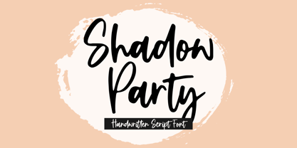 Shadow Party is a Handwritten Script Font. Shadow Party is a flowing handwritten font, described by an elegant touch, perfect for your favorite projects. Fall in love with its incredibly distinct and timeless style and use it to create spectacular designs! Shadow Party also multilingual support. Enjoy the font, feel free to comment or feedback, send me PM or email. Thank you!
 - Chizcake by Tigade Std,
$35.00 Chizcake. Do you love random shape thick font? This font is cuteness overload. It is for everyone, for various design purpose. This font is suitable for happy theme, cute, party, holiday, kids and many more. It is also suitable for Logo, Cards, Branding, Social Media, Youtube Thumbnail, Advertisement, Posters, any many others. Features: – Standard Characters (Uppercase and Lowercase) – Numerals – Punctuation – International Characters