10,000 search results
(0.045 seconds)
- Melancholie by Anmark,
$18.00 I’m pleased to introduce my handwritten font Melancholie. Melancholie is a calm and elegant font. It is perfect for invitations, cards, branding projects, packaging, magazines, social media, logos, signatures, quotes, headers and many more... You can use it for long texts or short phrases. The modern calligraphy uppercase letters are ideal for monograms and logos. Melancholie supports Spanish, German, French, Italian, Portuguese, Swedish, Norwegian, Danish, Finnish and others.
 - Volika by Slide Shoot,
$17.00 Volika Sans Serif is a balanced, smooth, elegant and stylish sans serif font. He has a beautiful character. It fits perfectly with invitation card designs, company logos, movie titles, movie names, business cards, book titles, brand names and various other designs. Volika Sans Serif is a subtle sans serif font that exudes sophistication and elegance. Its stylish alternations and ligatures make this font the perfect partner for any project.
 - Brushin by Mandarin,
$15.00 Brushin is an handwritten display font inspired by the straightforward rigidness of Grotesque sans-serif fonts. It features two stylistic sets for every glyphs in font so it gives you the choice to not repeat the same glyph design in big titles and/or small statements. The font was designed on paper with a brush and then scanned, vectorised through Photoshop and finally compiled in Glyphs as and OTF font file.
 - Bergen Text by Mindburger Studio,
$40.00 Bergen Text is the younger twin and a lifetime companion of Bergen Sans with perfect legibility and adorable personality. It has been carefully crafted to improve readability experience particularly on small text sizes. Bergen Text is a family of of 6 fonts. While being a small font family it has plenty of Open Type features for highly professional use and Extended Latin, Cyrillic (including Bulgarian character set) and Greek language support.
 - Peaceful Island by Invasi Studio,
$16.00 Peaceful Island is a handwritten combo pairing font. It combines script and handwritten sans. This font has a retro feel, playful handwritten sans, and a casual script. This attractive combination with retro vibes is perfect for your Display Design. You can use it for logo designs, title vloggers, brand imagery, quotes, merchandise, social media posts, and more. Features: - Uppercase & Lowercase - Numerals & Punctuation - Alternates and Ligatures - Multilanguage Supports 60+ Latin based languages
 - Sign Card JNL by Jeff Levine,
$29.00 The addition of serifs to an existing typeface can drastically change the look and feel of a design. Sign Card JNL and its oblique version is just such a treatment of Sign Shop JNL. By adding the serifs, there is not only a brand-new Art Deco typeface possessing a regal and formal style, but a distant resemblance to a Russian Cyrillic font with its mechanical form and function.
 - Quiche Sans by Adam Ladd,
$25.00 Quiche Sans is a high-contrast, sans serif with monoline stroke endings, angled stems, and geometric proportions. A sibling to the Quiche family, with the ball terminal endings removed. The design is influenced by the serif didone genre, characterized by its elegance and extreme thick/thins, but it removes the serifs for a unique and modern expression and tapers out the stroke endings for a sophisticated monoline appearance.
 - Santanelli by Pisto Casero,
$19.00 Santanelli is a rounded all caps display typeface. It is intended to be used in posters, editorial headlines and logotypes. It comes in three weights: Thin, Medium and Bold. Each letter has been designed with two different styles or flavors: decorative and clean. You can access each of them by typing uppercase and lowercase respectively. These two styles fit perfectly when combined within the same word or message.
 - Lucky Days by PizzaDude.dk,
$19.00 This is your Lucky Day, and if you are really lucky...it could turn into Lucky Days! :) Just go ahead and type with Lucky Days, it has 6 different versions of each letter...and they are all handmade. The letters are super legible, and can be used for a great variety: posters, postcards, invitations, comics or crafts. I even imagined a label for a beer, using this font!!!
 - Laugh Together by Invasi Studio,
$19.00 Laugh Together is a dynamic display font inspired by urban streetwear culture and the vibrant world of brush paint tagging graffiti. With its bold and expressive style, Laugh Together makes a fun and bold statement in any design. This all-caps font features a complete set of A-Z alternates, allowing you to experiment and create unique combinations. Additionally, Laugh Together supports multilingual characters, making it versatile for various language requirements.
 - Flood by Adobe,
$35.00Flood was designed by Joachim M�ller-Lanc� and is not just another handwritten face. At smaller point sizes it exhibits the natural, dynamic, and spontaneous flow of felt tip marker writing. At larger sizes Flood is immediate, urgent, and provocative in its stylized detailing, without being overly dramatic. Flood�s energetic rhythm is well suited for informal menus, logos, and brief ad copy, as well as personal correspondence. - Wallet by Fontforecast,
$19.00 Wallet is an expressive handwritten font with loads of personality, suitable for many different projects. It comes in three styles: Felt, Felt bold and Chalk. Wallet has 391 glyphs and supports multiple languages. Opentype features, such as contextual alternates, for replacing beginning and ending glyphs as you type and double letter ligatures are also included. To make full use of its potential Wallet requires an opentype-savvy application.
 - Sanity by Popkern,
$- The design of Sanity typeface is modernized by abandoning any characteristics associated with hand writing, such as curved lines or elaborate corner details. The design is based on a rigid geometric grid and radiates confidence with its daring contrasts and provocative style. In large amounts of text the font “Sanity” can be hard to read due to a «dazzle» effect caused by alternating thick and thin strokes, particularly as the thin strokes are hardly visible at small point si es. Due to this quality, the “Sanity” font-family is best suitable for titles or large print advertisements. There are five key stylistic principles taken as a main framework for the creation of the “Sanity”: symmetry, contrast, geometry, artificiality and monospacing.
 - Quasix by Typodermic,
$11.95 Introducing Quasix—the typeface that defies logic! With its compact industrial headline design, this font is the perfect choice for anyone looking to add an edge to their design work. But beware, its quirky design might have you scratching your head at first. Just like the inside of a machine, Quasix is full of moving parts, each with its own unique purpose—but don’t worry, you don’t have to be an engineer to appreciate its beauty. This typeface is perfect for those who want to convey the concept of engineering devices without using typical techno typefaces or cliche physical symbols like gears and bolts. Quasix will elevate your design to the next level, and its versatility makes it suitable for a range of themes, from retro to modern and even futuristic. Don’t be afraid to get creative with Quasix—this typeface was made to be bold and unconventional. Let it take center stage and watch as it transforms your design into something truly unique. Quasix defies convention and breaks the mold, making it the perfect choice for those who aren’t afraid to think outside the box. Try it out and see for yourself! Most Latin-based European writing systems are supported, including the following languages. Afaan Oromo, Afar, Afrikaans, Albanian, Alsatian, Aromanian, Aymara, Bashkir (Latin), Basque, Belarusian (Latin), Bemba, Bikol, Bosnian, Breton, Cape Verdean, Creole, Catalan, Cebuano, Chamorro, Chavacano, Chichewa, Crimean Tatar (Latin), Croatian, Czech, Danish, Dawan, Dholuo, Dutch, English, Estonian, Faroese, Fijian, Filipino, Finnish, French, Frisian, Friulian, Gagauz (Latin), Galician, Ganda, Genoese, German, Greenlandic, Guadeloupean Creole, Haitian Creole, Hawaiian, Hiligaynon, Hungarian, Icelandic, Ilocano, Indonesian, Irish, Italian, Jamaican, Kaqchikel, Karakalpak (Latin), Kashubian, Kikongo, Kinyarwanda, Kirundi, Kurdish (Latin), Latvian, Lithuanian, Lombard, Low Saxon, Luxembourgish, Maasai, Makhuwa, Malay, Maltese, Māori, Moldovan, Montenegrin, Ndebele, Neapolitan, Norwegian, Novial, Occitan, Ossetian (Latin), Papiamento, Piedmontese, Polish, Portuguese, Quechua, Rarotongan, Romanian, Romansh, Sami, Sango, Saramaccan, Sardinian, Scottish Gaelic, Serbian (Latin), Shona, Sicilian, Silesian, Slovak, Slovenian, Somali, Sorbian, Sotho, Spanish, Swahili, Swazi, Swedish, Tagalog, Tahitian, Tetum, Tongan, Tshiluba, Tsonga, Tswana, Tumbuka, Turkish, Turkmen (Latin), Tuvaluan, Uzbek (Latin), Venetian, Vepsian, Võro, Walloon, Waray-Waray, Wayuu, Welsh, Wolof, Xhosa, Yapese, Zapotec Zulu and Zuni.
 - FS Jack by Fontsmith,
$80.00 a, g, k and y It was a forensic examination by Jason Smith of his existing designs that laid the groundwork for FS Jack. Jason made a list of unique characteristics that would give the sans serif font its typographic thumbprint, which included an unusually large x-height and slightly off-the-wall letters like the lower-case “a”, “g”, “k” and “y”. “I wanted to make something that was slightly uncomfortable,” says Jason, “and in doing so simplify the quirkiness down to a few letters.” Fernando Mello did “the rest of the cooking”, filling the design out and making the additional weights. Tipos Latinos Upon its release in 2010, FS Jack was submitted by Fernando, who is Brazilian, for the esteemed type design biennial, Tipos Latinos, where it was selected as a winner in the Families category. It went on to be selected for type exhibitions throughout Latin America and around the world. “FS Jack is a workhorse,” says Fernando, “but also very ownable and distinctive, and available in a good range of weights, crafted by Jason and I.” Corporate “FS Jack took a couple of years to get noticed and is still fairly underused,” says Jason, “which is good in a way, for our Brandfont clients that have adopted it.” FS Jack was chosen as the signature font for The Shard in London, from its signage down to business cards. Fontsmith also worked with Lloyds Bank to customise FS Jack into a bespoke font for the bank’s updated brand identity – part of Fontsmith’s Brandfont service, which you can read about here. Fat Jack Included in the FS Jack family – just – is FS Jack Poster, the super-heavy weight of the range. “That was a last minute addition,” says Fernando, “after Jason and I started talking about how much we liked Gill KO, a typeface that is almost comically fat.”
 - Refillia Calligraphy by Aldedesign,
$18.00 Refillia Calligraphy is a stylish calligraphy font that features a varying baseline, smooth line, modern and with a depth love. For those of you who are need a touch of love and modernity for your designs or branding, it can be used for various purposes such as headings, wedding, invitation, signature, logos, branding, t-shirt, letterhead, signage, label, news, posters, badges etc. Just imagine that your customers love to see something beautiful, elegant, and warm, right? You don’t need to get confused to find an interesting font to attract their attention. We have a special font namely Refillia. The font design looks simple without losing its elegance and warmness. The function of the font is to show that you have a modern spirit to serve high-quality products and services. We design this font with OpenType features to give an artistic touch on it. This font is also applicable for numbers, punctuation, and other languages. It is also a multifunction font where you can use for a business logo, branding, wedding invitation, and anything you want. We'll have more great and artistic fonts. Just check our font collection by visiting Our Profile. Then, pick your most favorite font and use it to reach your goals.
 - Neue Plak by Monotype,
$57.99 Originally designed in 1928, Plak is something of a lost gem in the type world. Despite being drawn by Futura creator Paul Renner, it never achieved the same popularity and spent decades lacking a much-needed digital revival. Monotype designers Linda Hintz and Toshi Omagari have taken its existing three weights and, after extensive research into the original wood type, extended them into the vast Neue Plak family. The typeface is available in 60 weights that stay true to Renner’s intentions, and offer the same blend of “quirky” details and “German stiffness” – as Hintz describes it. The design is an unusual mixture, bringing together a defiant outer appearance that’s counteracted by more playful details found in the lowercase r, and the large dots of the lowercase i. Other distinctive details include open or strikethrough counters, and a set of hairline widths that reduce Renner’s original design to its bare bones. Neue Plak’s display weights are crying out to be used in editorial, on packaging or in logos, while its text weight works well in both print and digital environments. Neue Plak Text Variables are font files which are featuring one axis and have a preset instance from Thin to Black
 - Rougon by VanderKeur,
$30.00 The reason for Nicolien van der Keur to design the Rougon font was the translation of twenty novels written by Emile Zola, a French writer, and translated by Martine Delfos. It follows the lives of the members of the two titular branches of a fictional family living during the Second French Empire (1852–1870) and is one of the most prominent works of the French naturalism literary movement. This series deserved a font with French roots and corresponded to the period in which Zola’s books were written and published, the period between 1870 and 1893, the end of the nineteenth century. Extensive research into French historical typefaces has led to a type specimen from the French type foundry Deberny et Cie in Paris around 1907. It turned out to be good and helpful source as it contained a sample of a typeface that reflected the content and style of the novels, but also represented the period in which the books were written in France. A large part of the novels are about the generations of Rougon, so it seemed a natural choice to give the font that name. It is available in one weight and contains stylized portraits of Emile Zola and the French Marianne. This font also contains various ornaments.
 - Crayond by Dora Typefoundry,
$15.00 - Elegan / Bergaya / Modern - Introducing a beautiful and classy Crayond modern san serif typeface with lots of alternative styles to choose from, planting it firmly in a modern design. It is a careful collaboration between beauty and function. The beautiful modern Crayond sans serif is available in 3 regular and Italic weights including Light, Regular, and Bold. The style of the font family stems from the classic Didone, but makes steps to simplify and modernize some letterforms and make Didone feel more contemporary. If you want to get that classic Haute Couture look - Crayond Sans is a great choice. It is the perfect choice for fashion logos, headlines, short text, magazines, because its simplicity looks great in big typography, branding, identity, website design, album art, covers, posters, advertisements, etc. This purchase includes: Crayond - San serif typeface containing upper and lowercase characters, numbers 0-9, as well as a series of punctuation marks and symbols as well as an alternative style. If you have trouble finding a certain character, you can access it via the glyph panel. You can see all the characters available in the screenshot above, and you can try the font below. Please let me know if you have any questions, leave a comment!
 - Arabesque by Scholtz Fonts,
$15.00 Arabesque is a romantic, ornamental font, in which intertwining, flowing lines and generous loops enhance the beauty of the basic shapes. Arabesque successfully combines legibility with a decorative, sumptuous style. In its European interpretation it was also called "Moresque". The font "Ability" was the origin of Arabesque, however, numerous, subtle changes set it apart. Arabesque, is characterised by a small x-height and relatively large ascenders and descenders (loops). The loops are created out of two or three delicate, intertwined lines that contrast with the much less expansive bowls and shapes of the lowercase letters. The capitals, more complex and composed of intertwined lines, echo the elegance of the loops on the lowercase letters. As a result of these changes "Arabesque" is both more readable, controlled and extravagant than "Ability". Suggestions for use: - wedding stationery - greeting cards - valentines day media - beauty products media - lingerie tags - women's magazine pages - classical music media - award certificates - magazine pages The font is fully professional: carefully letterspaced and kerned. It contains over 235 characters - (upper and lower case characters, punctuation, numerals, symbols and accented characters are present). It has all the accented characters used in the major European languages. Arabesque works well in Application packages such as Microsoft Word that do not support professional kerning.
 - Biome by Monotype,
$29.99 In the sketches that formed the basis for his typeface Biome, Crossgrove experimented with inner and outer shapes in different styles, adapted letters to the form of the super-ellipse, and added curves only to remove these again. His challenge was to find a harmonious and coherent approach that provided sufficient contrast with existing fonts. Biome is essentially in the sans serif tradition and the letters exhibit only minor variations in terms of line thickness. There is still a suggestion of the super-ellipse at many points, but this never becomes the predominant design factor. While most of the terminals of the vertical strokes are only slightly rounded, the horizontals and diagonals have pronounced arches and it is these that basically determine the round and soft character of the typeface. The more unconventionally shaped letters, such as the lowercase 'g' with its two semi-open counters and the 'k' and 'x' with their crossbars, provide Biome with an individual personality. And this effect is emphasized by the generously rounded links in the 'v' and 'w' and the uppercase 'M' and 'N'. Biome has been designed as a typeface super-family. From the near hairline Extra Light to the amply proportioned Ultra, there are seven clearly differentiated weights and three tracking widths. There are oblique italic versions of all variants. The range includes small caps and numeral sets containing lowercase and uppercase digits. With its available range of characters, Biome can be used to set texts in all Eastern European languages. Although the remarkable individuality of Biome is most clearly apparent in the larger point sizes, this typeface is not just suitable for producing headlines and logos. Biome's elegant visual effects mean that it is equally comfortable in short texts while its large x-height and generous counters make it readily legible even in the small font sizes. Biome is a contemporary typeface that employs mid-20th century futurist elements which ironically give it a retro feel.
 - Billie James by Ardian Nuvianto,
$23.00 Billie James is a sophisticated and elegant script font that exudes timeless beauty and grace. With its fluid and graceful letterforms, this font brings a touch of refinement and luxury to any design project. Inspired by classic calligraphy, Billie James is perfect for wedding invitations, high-end branding, and any project that requires a touch of sophistication and charm. Its cursive strokes and gentle curves create a sense of movement and rhythm, adding a sense of elegance to your designs.
 - Classic Grotesque by Monotype,
$40.99 Classic Grotesque by Rod McDonald: a traditional font with a modern face. The growing popularity of grotesque typefaces meant that many new sans serif analogues were published in the early 20th century. Setting machines were not compatible with each other but all foundries wanted to offer up-to-date fonts, and as a result numerous different typeface families appeared that seem almost identical at first glance and yet go their separate ways with regard to details. One of the first fonts created with automatic typesetting in mind was Monotype Grotesque®. Although this typeface that was designed and published by Frank Hinman Pierpont in 1926 has since been digitalised, it has never achieved the status of other grotesque fonts of this period. But Monotype Grotesque was always one of designer Rod McDonald’s favourites, and he was overjoyed when he finally got the go-ahead from Monotype in 2008 to update this “hidden treasure”. The design process lasted four years, with regular interruptions due to the need to complete projects for other clients. In retrospect, McDonald admits that he had no idea at the beginning of just how challenging and complex a task it would be to create Classic Grotesque™. It took him considerable time before he found the right approach. In his initial drafts, he tried to develop Monotype Grotesque only to find that the result was almost identical with Arial®, a typeface that is also derived in many respects from Monotype Grotesque. It was only when he went back a stage, and incorporated elements of Bauer Font’s Venus™ and Ideal Grotesk by the Julius Klinkhardt foundry into the design process, that he found the way forward. Both these typefaces had served as the original inspiration for Monotype Grotesque. The name says it all: Classic Grotesque has all the attributes of the early grotesque fonts of the 20th century: The slightly artificial nature gives the characters a formal appearance. There are very few and only minor variations in line width. The tittles of the ‘i’ and ‘j’, the umlaut diacritic and other diacritic marks are rectangular. Interestingly, it is among the uppercase letters that certain variations from the standard pattern can be found, and it is these that enliven the typeface. Hence the horizontal bars of the “E”, “F” and “L” have bevelled terminals. The chamfered terminal of the bow of the “J” has a particular flamboyance, while the slightly curved descender of the “Q” provides for additional dynamism. The character alternatives available through the OpenType option provide the designer with a wealth of opportunities. These include a closed “a”, a double-counter “g” and an “e” in which the transverse bar deviates slightly from the horizontal. The seven different weights also extend the scope of uses of Classic Grotesque. These range from the delicate Light to the super thick Extrabold. There are genuine italic versions of each weight; these are not only slightly narrower than their counterparts, but also have variant shapes. The “a” is closed, the “f” has a semi-descender while the “e” is rounded. Its neutral appearance and excellent features mean that Classic Grotesque is suitable for use in nearly all imaginable applications. Even during the design phase, McDonald used his new font to set books and in promotional projects. However, he would be pleased to learn of possible applications that he himself has not yet considered. Classic Grotesque, which has its own individual character despite its neutral and restrained appearance, is the ideal partner for your print and web project.
 - Rogelio Script by Joelmaker,
$15.00 Rogelio Script is a stylish modern calligraphy font with casual chic flair. It is perfect for branding, wedding invites and cards, signature and maybe for red wine label. Rogelio Script includes full set of gorgeous uppercase and lowercase letters, numerals, a large range of punctuation and variation ligatures. All lowercase letters include beginning and ending swashes, giving realistic hand-lettered style. What you get, darling? In order to use the beautiful swashes, you need a program that supports OpenType features such as Adobe Illustrator CS, Adobe Photoshop CC, Adobe Indesign and Corel Draw.
 - Central Point by Great Studio,
$19.00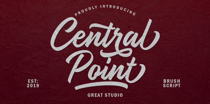 Central Point is a bold script font and a combination of original handwriting styles inspired by hand lettering. This versatile script includes many different alternatives for each lowercase letter, you can see some examples of design results in the preview image. This typeface works very well for logo design, clothing, handwritten quotes, product packaging, headers, posters, merchandise, social media, greeting cards and all your artwork. Central Point is equipped with uppercase and lowercase letters, numbers, punctuation and symbols, swash and ligature. It has Multilingual support. Thank you for purchasing our products and enjoy.
 - Beckford Script by Dear Alison,
$29.00 Brush lettered scripts have such a quick expressive quality to them and have amazed me since I was a little girl. The quick whip of the wrist can make or break a letterform so easily. They are filled with personality and visual flavor. Beckford Script taps into that association and brings a quick handed sassiness reminiscent of vintage travel brochures and old pulp and romance novels. But for whatever you might need this script for, you'll find it up for the task. Spice up your font collection and pick up Beckford Script today!
 - Manifold CF by Connary Fagen,
$35.00 Manifold® CF is a utilitarian typeface inspired by the precision of a computer terminal, softened by contemporary design and rounded corners. Manifold's unified letterforms and tall x-height are great for user interfaces, or track it out for a sophisticated look. Manifold also offers wide language support, including Cyrillic script, Vietnamese, and Pinyin Romanization. Manifold® CF excels as a headline or display typeface, and pairs well with contrasting simple serifs like Artifex CF and Artifex Hand CF. All typefaces from Connary Fagen include free updates, including new features, and free technical support.
 - Bonnycastle by Three Islands Press,
$39.00 Sir Richard Henry Bonnycastle (1791–1847) was an English officer and military engineer who served in the War of 1812 and ultimately settled in Canada. I stumbled upon copies of some of his charts and maps, became infatuated with the hand-lettered titles—and the result is the eponymous Bonnycastle. The font has a bold weight and an italic style but is intended as an eye-catching standalone, evocative of its period in history. Use as a titling face on branding materials, event posters, book covers, presentation graphics, historical illustrations, and the like.
 - Authentica Bethany by Pen Culture,
$17.00 Introducing "Authentica Bethany Signature Font" This font was born with a sweet touch of hand lettering technique, with a unique and beautiful shape that makes this font very authentic. This font include uppercase and lowercase, number and punctuation, have more than 80 ligature, and beginning and ending swash in lowercase. I really hope you enjoy it – please do let me know what you think, comments & likes are always hugely welcomed and appreciated. More importantly, please don’t hesitate to drop me a message if you have any issues or queries. Thank you
 - Siena by Monotype,
$29.99The blackness of the Siena Black font makes it a good choice for display and packaging. - Gal MF by Masterfont,
$59.00 Even stroke widths with geometrical symmetric structure will make it into a great signage and logo.
 - JH Noha by JH Fonts,
$40.00 JH Noha is a geometric modern Arabic typeface. It includes black, bold, medium and regular weights.
 - DB Vintage Halloween by Illustration Ink,
$3.00DoodleBat Vintage Halloween is a classic collection of Halloween clip art and words. Check it out! - Buddy Slam by PizzaDude.dk,
$15.00A quick scribbled font, made to look written in a hurry...and believe me, it was! - Peach Plum by Melonaqua,
$8.00 Peach Plum is an elegant handwritten font style. It contains three styles: regular, oblique, and outline.
 - Viva Olivia by PizzaDude.dk,
$17.00With its elegant twists, romantic curves and bulge lines, this handwritten font presents one thing: love! - NorB Architect by NorFonts,
$35.00 NorB Architect fonts will add a beautiful architectural hand-lettering style to all your CAD project drawings. Architects have always wanted their CAD drawings to look more like they were drawn by hand, rather than by a CAD program. These AutoCAD fonts are the first step in bringing back that “artistic hand-drawn” feel to your CAD drawings or any graphic design project that can use true type fonts. NorB Architect is actually my emulation of architectural lettering, it comes with 4 weights: Medium, Regular, Semi Light and Bold along with their Condensed and Extra Condensed version. NOTE: For more variations of "NorB Architect" font please visit click on this link.
 - Xkanz by Xuveki,
$10.00 XKANZ is a futuristic, robotic, variable display font geared towards cyberpunk poster text, cover text, and futuristic UI. It can easily shine as both as header and body. Wide glyphs, high weight and corner contrast, and "connectors" that bridge the gap between the stems, it's this mix of elements that give XKANZ its unique look. The purchase includes two static styles, regular and oblique, and a variable font file with a interpolatable 0-12 degree slant axis. Extensive multilingual support covering most latin characters 4 stylistic sets that include alternates for the D, I, R, and E glyphs, along with symbol/punctuation alternates such as the parenthesis, brackets, and more. Possible updates include condensed versions. The updates will be free and available to everyone who has already purchases XKANZ. This one was a wild and weird journey. It took A LOT of iteration to get to this end product. I'm proud to share it. Enjoy All questions, requests, or inquiries can be sent to abe.xuveki@gmail.com or DM'd to Xuveki on Instagram (https://www.instagram.com/xuveki)
 - Strikt by NaumType,
$25.00 Strikt is a variable modular font family with 2 axes, build on a 3x3 grid. It was designed by Peter Bushuev and released in August of 2020. It was inspired by the idea of utilizing the variable font technology to make a font with build-in animation potential. Strikt has 2 variable axes: weight and animation. The first one is self-explanatory, but the animation axis is the main feature of the font. It allows you to morph any glyph to a 3x3 dot array and back. In Strikt Plus modification, this array is the same for each letter, which gives the possibility to transform one glyph to the other. Strikt is also a very sturdy and unique display font. In "Plus" modification it gives even more sci-fi and techno vibes. And in light weights, Strikt becomes more architectural and gives the possibility to make unusual ornamental layouts. Get Strikt to jazz up your design! Try variable versions for kinetic typography and motion graphic. Strikt is a bold choice for posters, album covers, experimental identity and packaging, games, and editorial design.
 - Diad by Andinistas,
$29.95 Diad was born on 2000 in order to design posters about second World War. The original idea was obtained by breaking, burning and getting wet a bunch of written copies with an old writing machine. Today, Diad is a small typographic system useful for bringing relevance to any content with a grunge look. Each and every detail passed through a strict experimentation process. Its outrageous and unconventional spirit travels from high leveled corrosion, up to a delicate visual neglect. Diad 2 and 3 work for designing words. Diad 1 is ideal for long phrases and titles. Diad dingbats includes 26 illustrations about motocross. In total, adding Diad 1,2 and 3, it has around 260 glyphs. Diad will make your design shine providing different graphic atmospheres, optimizing time and work to its users. Diad is perfect for graphic design on contexts such as death metal, drum and bass, films, war and horror video games. It could work also for logos, words, titles and short texts in covers, tags, clothes, wraps, cards, stickers, toys, bicycles, surf boards, etc.