10,000 search results
(0.068 seconds)
- Brix Sans by HVD Fonts,
$40.00 It took Hannes von Döhren and Livius Dietzel two years to develop and complete the Brix Sans family – the companion of the well-known Brix Slab . The approach was to design an independent type family following the rules of the “Sans-Serif” genre, harmonizing with its older sister Brix Slab from the “Slab-Serif” genre. The result is a family of 6 weights with matching italics, which works perfectly for corporate design & editorial design. Combined with Brix Slab, high and complex typographical challenges can be solved. The Brix Sans OpenType fonts feature small caps, five variations of numerals, arrows and an extended character set to support Central and Eastern European as well as Western European languages.
 - Brix Slab by HVD Fonts,
$40.00 Brix Slab and Brix Slab Condensed is an extended family of 24 fonts. It was designed by Hannes von Döhren & Livius Dietzel in 2011. Brix Slab is a robust slab serif family with subtle details. It's optimized for longer texts and highly readable in small sizes. Brix Slab is intended to be used in applications like magazines, newspapers and digital devices. It also works great as a corporate typeface. With more than 700 glyphs in each font, Brix Slab is equipped for complex, professional typography. As an exclusively OpenType release, these fonts feature small caps, five variations of numerals, arrows and an extended character set to support Central and Eastern European as well as Western European languages.
 - Digital Sans Now by Elsner+Flake,
$59.00 Digital Sans Now combines and completes the many diverse requests and requirements by users of the past years. By now, 36 versions for over 70 Latin and Cyrillic languages have become available, including Small Caps. Digital Sans Now is also available as a webfont and reflects, with its simplified and geometric construction and its consciously maintained poster-like forms as well as with its ornamental character, the spirit of the decorative serif-less headline typefaces of the 1970s. The basic severity of other grotesque typefaces is here repressed by means of targeted rounds. Exactly these formal breaks allow the impression that it could be used in a variety of visual applications. Short texts, headlines and logos of all descriptions are its domain. It is because of this versatility that the typeface has become a desirable stylistic element, especially in such design provinces as technology, games and sports, and that, for many years now, it appears to be timeless. Additional weights designed on the basis of the original, from Thin to Ultra, the Italics, Small Caps and alternative characters allow for differentiated “looks and feels”, and, with deliberate usage, give the “Digital Sans Now” expanded possibilities for expression. The basis for the design of Digital Sans Now is a headline typeface created in 1973 by Marty Goldstein and the Digital Sans family which has been available from Elsner+Flake since the mid-1990s under a license agreement. The four weights designed by Marty Goldstein, Thin, Plain, Heavy and Fat, were originally sold by the American company Visual Graphics Corporation (VGC) under the name of “Sol”. Similarly, the company Fotostar International offered film fonts for 2” phototypesetting machines, these however under the name “Sun”. The first digital adaptation had already been ordered in the mid 1970s in Germany by Walter Brendel for the phototypesetting system Unitype used by the TypeShop Group, in three widths and under the name “Digital Part of the Serial Collection.” Based on the versions by VGC, Thin, Plain, Heavy and Fat, new versions were then created with appropriate stroke and width adaptations for data sets for the fonts Light, Medium and Bold as well as for the corresponding italics
 - Techstencil by Stereo Type Haus,
$20.00 A futuristic stencil typeface characterized by its extended forms and rounded terminals.
 - ATFAntique - Unknown license

- Adagio Serif by Borutta Group,
$25.00 The Adagio Family is a part of Mateusz Machalski’s, Warsaw Academy of fine arts Master Degree Diploma in multimedia studio, conducted by Professor Stanisław Wieczorek and his brave PHD Jakub Wróblewski. Adagio is a modern type family. It consists of 3 main varieties: sans, serif and slab. Each one of them has its own “true italic” set. All of the styles together have over 400 characters in 9 different thicknesses. The Adagio family was created mostly for company identities. The idea was to create a wide range of different varieties which are stylistically consistent. Adagio Serif - Characterises with strong contrast and high detail in calligraphic character cuts, what gives it a light feeling. Unlike the Slab version, serif variety has asymmetrical serifs. Thanks to large X length, and highly stretched descenders, it also works correct in longer text, while its strong detail is good for headlines. The Serif version is a great complement for Adagio Sans and Adagio Slab.
 - Finador by Julien Fincker,
$24.00 Finador is a modern, soft geometric sans family. The functional style of a geometric sans has been soften by open apertures and rounded corners. This makes it functional and friendly. The default version has open, modern apertures. Stylistic Set 2 includes the whole set with closed, classic apertures. A slightly different look. It´s like having a second font in just one font. So it´s up to you to choose the right look for your projects. The Finador family includes 8 weights, from thin to heavy + their matching italics. With 900+ glyphs per style it supports over 200+ latin based languages, includes an extended currency symbol set and a lot of Open Type Features like small caps, ligatures, fractions, alternates and many more. The lightest and boldest weights are good for display usage, while the middle weights can be also used for body text. As a versatile allrounder Finador supports almost every of your needs. It has the ability to become your next favorite workhorse family.
 - ITC Berkeley Old Style by ITC,
$29.99 ITC Berkeley Old Style is based on a typeface designed by Frederic W. Goudy in 1938 called University of California Old Style. It was a private press type for the publishing house of that school. In 1958, about ten years after Goudy's death, Monotype re-issued the type under the name Californian, and it became a very successful face for book typography. Goudy himself said he designed this face to have the greatest legibility possible, and it is indeed free from the exuberances in some of his other faces. Tony Stan redrew the family for ITC for 1983, and it was named ITC Berkeley Old Style, Berkeley being the city where the University of California Press is located. Stan did a careful drawing of eight styles including italics. ITC Berkeley Old Style is a crisply beautiful tribute to a distinguished typeface, and it works well for books, magazines, and advertising display. Featured in: Best Fonts for Tattoos
 - Scottsdale Desert by Adam Fathony,
$39.00 Scottsdale Desert is inspired by a classic contemporary Display combined with a simple modern Serif look. It's a versatile font, it can be used for a lot of design styles. Characteristic for Scottsdale are the small to bigger rounded serif strokes that make it look sharp and comfy. Thin, light strokes define the modernity and simplicity of the typeface itself. The OldStyle Numerical match with the characteristic of this fonts. Using Scottsdale Desert's lowercases for a long text will work, but it is at its best as Header or Display. Scottsdale Desert comes with most OpenType Features: - Powerful ligatures as Discretionary Ligatures - Stylistic Alternates on Uppercase and Lowercase - Contextual Swashes adding a Terminal (first swash) on the First Uppercase letters - Small Capitals (can be operated with the Titling Alternates button) - Catchword are created with Contextual alternates (see the images to show how it works). - Punctuation and Symbol are perfectly matched with all letters - Numerical features are available : Tabular Figures Numerator Denominator Superscript/Superior -Subscript/Inferior and Fraction.
 - Aviano Silk by insigne,
$22.00 A premier product from insigne, the powerful Aviano redefines its classic lines for the contemporary elegance of Aviano Silk. This modern development of a timeless font, part of insigne's annual tradition in adding to the Aviano family, was elected the clear leader in a poll of insigne design's social media followers. Aviano Silk refers to the smooth flowing feel that the negative space gives the font. This particular example is sort of a hybrid between the stencil and a centerline. It has a certain amount of velocity to it. Extended characters lend formality and a sense of wealth and power. Due to the modifications required for the new look, the Silk family cannot work as an overlay for Aviano, though it pairs nicely with it. There are also 12 Aviano families that work well with Silk. Aviano Silk is particularly suited to high-end luxury applications and especially branding projects. Use Aviano Silk to lend refinement and luxurious elegance to your design.
 - Sequel Sans by OGJ Type Design,
$35.00 Sequel Sans is a new chapter in the book of neogrotesque typefaces. Its core idea and its name were conceived in collaboration with the max bill georges vantongerloo foundation. The main inspiration for its design were the sans-serif typefaces used by Max Bill, the larger-than-life Swiss architect, artist, and designer. Honoring these roots, I designed Sequel Sans to be a clean and adaptable font family that is built upon a comprehensive system of styles. 8 weights, each with a corresponding italic, and a matching set of Variable Fonts are available in 4 optical sizes. These range from standard (for text sizes) to Subhead to Headline to Display—larger optical sizes come with tighter spacing and a number of gently adjusted glyph shapes. Like the great neogrotesques found in mid-century Swiss Style designs, Sequel Sans is a vessel that you can fill with any kind of content. It will amplify your message while retaining its own modernist character.
 - Boyers by Craft Supply Co,
$20.00 Boyers – The Adorable Bubble Font Bubble-Inspired Cuteness Boyers radiates the delightful embodiment of bubble-inspired cuteness, making it the perfect choice for all your display needs. Its playful charm captures the essence of balloons and whimsical awn, creating a font that’s both fun and endearing. Imaginative Playfulness Going beyond mere cuteness, Boyers showcases an imaginative playfulness that makes it a versatile choice for a wide range of creative projects. Whether you’re designing greeting cards, posters, or children’s book covers, Boyers adds a touch of whimsy to your creations. Versatile for Various Creations Boyers boasts impressive versatility that seamlessly enhances designs. No matter the project, Boyers brings a playful and charming flair, making your content engaging and incredibly memorable. In Conclusion In summary, Boyers – Bubble Font, with its inspiration drawn from balloons and awn, offers endless creative possibilities. Its playful versatility guarantees that your projects stand out, accessible to a diverse audience. With Boyers, your designs come to life with a charming, bubbly flair.
 - Fieldwork by TipoType,
$24.00 Download Fieldwork’s PDF Type Specimen Fieldwork brings back the manual tradition of typography production, veering away from lab interpolations. Each of its 24 variants was drawn based on optical evaluation; many of its curves and details were specifically adjusted for each weight, reformulating them to better suit the requirements of the distinct stroke weighs. It is the product of a collaborative effort by the TipoType team, combining their personal strengths and “most importantly” their enriching individual outlooks to achieve a more versatile and fresh outcome. Its shapes successfully combine geometric strokes (in the Geo variants) with the humanistic warmth of the double-storey glyphs (like a and g in the Hum variant) in a system that grows with alternates, swashes and the corresponding italics for every weight. It includes a very thorough coverage for a wide variety of Latin alphabet-based language families. Special thanks to: • José “Pollo” Perdomo: Font production assistent. • Rasmus Jappe Kristiansen: Detroit City project
 - Sinadey by Craft Supply Co,
$20.00 Introducing Sinadey – Cute Sans Serif Adorable Simplicity Sinadey – Cute Sans Serif is the epitome of adorable simplicity, offering a charming sans serif font with a crisp shape. Crisp Elegance What sets Sinadey apart is its crisp elegance. It’s the ideal choice when you need a cute sans serif font that still maintains sharp and well-defined characters. Playful Charm Sinadey’s playful charm adds a delightful touch to your designs, making it perfect for a wide range of creative projects. Versatile Application This font’s versatility shines through, ensuring that it can be used in various design contexts, from invitations to logos and more. In Conclusion In summary, Sinadey – Cute Sans Serif is your go-to when you desire a cute sans serif font with crisp, well-defined shapes. Its adorable simplicity, crisp elegance, and playful charm make it versatile and suitable for a diverse array of design projects, ensuring that your content remains engaging and inviting to all readers.
 - Monck by Putracetol,
$28.00 Introducing Monck, a modern display font that combines the best of modern typography and classic serif styles. With its sleek design and unique lettering options, Monck is perfect for a wide range of design projects. Whether you're creating logos, posters, quotes, or social media graphics, Monck offers a plethora of alternates and end swashes through its OpenType features. Monck comes with three different file formats - otf, ttf, and woff - making it compatible with various design software programs such as Adobe Illustrator CS, Adobe Photoshop CC, Adobe InDesign, and Corel Draw. This means you can easily access and utilize the alternate glyphs in Monck to create eye-catching lettering compositions. The OpenType features in Monck allow you to access uppercase and lowercase letters, as well as alternates and ligatures, giving you endless possibilities for creative combinations. Additionally, Monck supports multiple languages, making it a versatile choice for designers around the world. In your zip package, you'll find the Monck font files in otf, ttf, and woff formats, providing flexibility for different design projects. The font includes uppercase and lowercase letters, numerals, punctuation, and symbols, ensuring that you have all the tools you need to create stunning designs. Monck is a versatile font that can be used for various design purposes, such as logotypes, headings, covers, posters, product packaging, headers, merchandise, social media graphics, greeting cards, and more. Its modern and classic fusion style adds a unique and contemporary touch to your designs, making them stand out in any context. In summary, Monck is a modern display font that offers a wide range of alternates and ligatures through its OpenType features, making it a powerful tool for creative lettering compositions. With its multilingual support and compatibility with popular design software, Monck is a must-have font for any designer looking to add a touch of modernity and versatility to their projects. So why wait? Get Monck now and start creating stunning designs with ease!
 - Combine by Andinistas,
$49.00 Combine, designed by Carlos Fabian Camargo G, is powerful and attractive, multi-layered chromatic type family that consists of 12 fonts, typographically grouped in two logics: “Script and Caps”, so that they could be colored separately or in group. Both designed with contrasting optical techniques and combinable at the same time. The unforgettable central idea of Combine was inspired by unique types of speedball letters designed by ancient artists in Canadian posters of shows and fairs in 1930. This is why its Typographical tools work independently or in group, resulting in highly polished designs that need fonts with coupled effusiveness. Their combined resources offer guaranteed distinguishing letters with shadow effects and worn, in order to help enhance their expressiveness. Combine is excellent in any project on paper or screen as it has more than 2100 glyphs and features of OpenType distributed strategically in fonts easy to use. SEE BELOW THE MAIN ADVANTAGES: • Combine Script & Shadow: It offers incredible case sensitive fluency and eloquence drawn with vertical cursive letters with ornamental non-stop excitement and complementation. It also has a variety of significant upward and downward, alternative strokes combined with its vintage ties that also give authenticity to their designs. • Combine Caps 1,2,3 & Shadow1,2: Guarantees you a colorful horizontal area of narrow case with 2 types of shadows, sound and other shade with diagonal stripes. Its geometric uniformity gives a friendly, open and subtle character by Typographic and special resources and visual properties coloring layers separately or in groups. In addition, its 2 layers of skeletal illuminations, adding internal lines and simultaneously contributing to play perfect confrontation and contrast with their geometric ideas and aesthetics for special attention. • Combine Words & Shadow: It can be used to design a perfect tone in each one of the 50 slogans written diagonally, making a brilliant feeling suggestive seductive style. Compatibility and flexibility works by monoline thin cursive strokes ideal for featured items with and without shade. Combine was selected at the Bienal Tipos Latinos 2016
 - Ability by Scholtz Fonts,
$15.00 Ability is a family of stylish and contemporary handwriting fonts that combine the vigor of hand-drawn fonts such as Affable with the elegance of fonts such as Blythe. What is unusual about Ability is that it enables a word to be formed from a group of letters in a variety of ways: not only the conventional linking of letters as in a cursive script or the placing of letters close to each other on a common baseline, but it uses the overlapping of the swashes and swirls that contribute to the individuality of the characters to integrate the letters into a single word. Ability comes in a number of styles: Legacy - Regular (medium weighted and the basic type of the other styles); - Black (a vigorous and dramatic version of Regular); - Condensed Medium - Condensed Light - Linear 45 (medium-weight font made from a mono-width line) - Linear 25 (light-weight font made from a mono-width line) Suggestions for use: - wedding stationery - greeting cards - valentines day media - beauty products media - lingerie tags - women’s magazine pages - classical music media - award certificates - magazine pages The font is fully professional: carefully letterspaced and kerned. It contains over 235 characters - (upper and lower case characters, punctuation, numerals, symbols and accented characters are present). It has all the accented characters used in the major European languages.
 - Prismatic Spirals Pro by MMC-TypEngine,
$182.00 PRISMATIC SPIRALS PRO FONT! The Prismatic Spirals PRO is a Decorative Type-System and ‘Assembling Game’, itself. Settled in squared pieces modules or tiles, embedded by unprecedented Intertwined Prismatic Structures Design, or intricate interlaced bars that may seem quite “impossible” to shape. Although it originated from the ‘Penrose Square’, it may not look totally as an Impossible Figures Type of Optical Illusions. More an “improbable” Effect in its intertwined Design, that even static can seem like a source of Kinetical Sculptures, or drive eyes into a kind of hypnosis. Prismatic Spirals Pro has two related Typefaces both more basic or easier to use versions, the Default Family plus its “bold” braided version Prismatic Interlaces… PRO provides a more advanced, complex, and twisted Design, plus requires to be typed alternating caps. Instructions: Use the Map Font Reference PDF as a guide to learn the 'tiles' position on the keyboard, then easily type and compose puzzle designs with this font! All alphanumeric keys are intuitive or easy to induce, you may easily memorize it all! Plus, often also need to consult it! *Find the Prismatic Spirals Pro Font Map Reference PDF Here! (!) Is recommended Print it to have the Reference or open the PDF to also copy and paste, when consulting is required or when it may be difficult to access, depending on the keyboard script or language. The 2 glyphs sets are separated in colors for facilitating. Also use the Map Font with key captions or switch to it for ensure that the characters are alternating between both uppercase and lowercase letters as other Keys as numbers, marks, and punctuation along the strings, holding Shift one by one or actually two by two. As a Tiles Type-System, the line gap space value is 0, this means that tiles line gaps are invisibly grouted, so the user can compose designs, row by row, descending to each following row by clicking Enter, same as line break, while advances on assembling characters. Background History: The first sketches of my Prismatic Knots or Spirals Designs dates back then from 2010, while started developing hand-drawn Celtic Knots and Geometric Drawings in grid paper, while engage to Typography, Sacred Geometry and the “Impossible Figures” genre… I started doing modulation tests from 2013, until around 2018, I got to unravel it in square modules or tiles from the grid, then idealized it as fonts, along with other Type projects. This took 13 years to come out since the first sketches and 6 months in edition. During the production process some additional tiles or missing pieces were thought of and added to the basic set, which firstly had only the borders, corners, crossings, nets, Trivets connectors or T parts and ends, then added with nets and borders integrations. Usage Suggestions: This type-system enables the user to ornate and generate endless decorative patterns, borders, labyrinthine designs, Mosaics, motifs, etc. It can seem just like a puzzle, but a much greater tool instead for higher purposes as to compose Enigmas and use seriously. As like also to write Real Text by assembling the key characters or pieces, this way you can literarily reproduce any Pixel Design or font to its Prismatic Spirals correspondent form, as Kufic Arabic script and further languages and compose messages easily… This Typeface was made to be contemplated, applied, and manufactured on Infinite Decorative Designs as Pavements, Tapestry, Frames, Prints, Fabrics, Bookplates, Coloring Books, Cards, covers or architectonic frontispieces, storefronts, and Jewelry, for example. Usage Tips: Notice that the line-height must be fixed to 100% or 1,0. In some cases, as on Microsoft Word for example, the line-height default is set to 1,15. So you’ll need to change to 1,0 plus remove space after paragraph, in the same dropdown menu on Paragraph section. Considering Word files too, since the text used for mapping the Designs, won't make any literal orthographical sense, the user must select to ignore the Spellcheck underlined in red, by clicking over each misspelled error or in revision, so it can be better appreciated. Also unfolding environments as Adobe Software’s, the Designer will use the character menu to set body size and line gap to same value, as a calculator to fit a layout for example of 1,000 pts high with 9 tiles high, both body size and line gap will be 111.1111 pts. Further Tips: Whenever an architect picks this decorative system to design pavements floor or walls, a printed instruction version of the layout using the ‘map’ font may be helpful and required to the masons that will lay the tiles, to place the pieces and its directions in the right way. Regarding to export PNGs images in Software’s for layered Typesetting as Adobe Illustrator a final procedure may be required, once the designs are done and can be backup it, expanding and applying merge filter, will remove a few possible line glitches and be perfected. Technical Specifications: With 8 styles and 4 subfamilies with 2 complementary weights each (Regular and Bold) therefore, Original Contour, Filled, Decor, with reticle’s decorations and 2 Map fonts with key captions. *All fonts match perfectly when central pasted for layered typesetting. All fonts have 106 glyphs, in which 96 are different keys with 2 versions of each of both caps and shift keys, plus a few repeated for facilitating. It was settled this way in order for exchanging with its Prismatic relative fonts which has only 48 different keys repeated twice. Concerning tiles manufacturing and Printed Products as stickers or Stencils, any of its repeated pieces was measured and just rotated in different directions in each key, so when sided by other pieces in any direction will fit perfectly without mispatching errors. Copyright Disclaimer: The Font Software’s are protected by Copyright and its licenses grant the user the right to design, apply contours, plus print and manufacture in flat 2D planes only. In case of the advent of the same structures and set of pieces built in 3D Solid form, Font licenses will not be valid or authorized for casting it. © 2023 André T. A. Corrêa “Dr. Andréground” & MMC-TypEngine.
 - Betterworks by Letteralle,
$16.00 Betterworks is a modern and charming hand-brushed font. Betterworks has a detailed brush that makes a natural impression. Betterworks comes with alternates (uppercase and lowercase). You can access it through the Opentype feature or by installing the alternates font file and also Swashes which you can access in separate fonts by typing A-I. This Font perfect for branding, advertising design, T-shirts, Websites, magazines, packaging, merchandise, and many others. Enjoy the font and feel free to comment and feedback. Thank you!
 - Korey Sister by Dhan Studio,
$20.00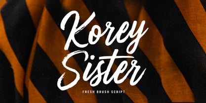 Korey Sister is a beautiful brush font, a contemporary approach to design, this is intentionally made by hand to make it more natural and attractive when used in your design. Suitable for use in title design. Such as clothing, invitations, book titles, stationery designs, quotes, branding, logos, greeting cards, t-shirts, packaging designs, posters, and others. Korey Sister includes a complete set of upper and lower case letters, and multi-language support, numbers, punctuation, and also has Alternatives and ligatures.
 - Peloponeso by Intellecta Design,
$9.00Note: The Frame style is no longer available due its complexity and the resulting memory and performance issues. - Fridha by Intellecta Design,
$27.90Note: The Shadow style is no longer available due its complexity and the resulting memory and performance issues. - Feosa by Intellecta Design,
$14.95Note: The Lined style is no longer available due its complexity and the resulting memory and performance issues. - Porcupine by Intellecta Design,
$9.00Note: The Shadow style is no longer available due its complexity and the resulting memory and performance issues. - Easy Callig by Intellecta Design,
$17.90Note: The Italic style is no longer available due its complexity and the resulting memory and performance issues. - Deco Experiment 3 by Intellecta Design,
$9.00Note: The Decorative style is no longer available due its complexity and the resulting memory and performance issues. - Floresco by Intellecta Design,
$21.90Note: The Lined style is no longer available due its complexity and the resulting memory and performance issues. - Earthling by Atlantic Fonts,
$26.00 Bold and Benevolent, Earthling is funky and fun to use. Mix it up with caps for extra groove.
 - Frutisis by Intellecta Design,
$21.90Note: The Lined style is no longer available due its complexity and the resulting memory and performance issues. - Shiver by Volcano Type,
$19.00The displayfont Shiver is characterized by its strong shaped letters and the mix of angular and round shapes. - Biza by Intellecta Design,
$9.00Note: The Lined style is no longer available due its complexity and the resulting memory and performance issues. - Samantha by Intellecta Design,
$27.90 Note: The Shadow style is no longer available due its complexity and the resulting memory and performance issues.
 - Hustyle by Skiiller Studio,
$20.00 Hustyle is a lovely and fun handwritten font. It is great for logos, invitations, posters and much more!
 - Janda Cheerful Script by Kimberly Geswein,
$5.00 Perfect for happy occasions, this font is optimistic, natural, and friendly. It connects nicely and is perfectly handwritten.
 - MHF Gothic by MetalHead,
$14.95 Equal parts Sabbath and Blackletter. Its distinctive serifs will make any metalhead want to stand up and shout!
 - Boliche by Intellecta Design,
$12.00Note: The Lined style is no longer available due its complexity and the resulting memory and performance issues. - Mrs Eaves XL Serif by Emigre,
$59.00 Originally designed in 1996, Mrs Eaves was Zuzana Licko’s first attempt at the design of a traditional typeface. It was styled after Baskerville, the famous transitional serif typeface designed in 1757 by John Baskerville in Birmingham, England. Mrs Eaves was named after Baskerville’s live in housekeeper, Sarah Eaves, whom he later married. One of Baskerville’s intents was to develop typefaces that pushed the contrast between thick and thin strokes, partially to show off the new printing and paper making techniques of his time. As a result his types were often criticized for being too perfect, stark, and difficult to read. Licko noticed that subsequent interpretations and revivals of Baskerville had continued along the same path of perfection, using as a model the qualities of the lead type itself, not the printed specimens. Upon studying books printed by Baskerville at the Bancroft Library in Berkeley, Licko decided to base her design on the printed samples which were heavier and had more character due to the imprint of lead type into paper and the resulting ink spread. She reduced the contrast while retaining the overall openness and lightness of Baskerville by giving the lower case characters a wider proportion. She then reduced the x-height relative to the cap height to avoid increasing the set width. There is something unique about Mrs Eaves and it’s difficult to define. Its individual characters are at times awkward looking—the W being narrow, the L uncommonly wide, the flare of the strokes leading into the serifs unusually pronounced. Taken individually, at first sight some of the characters don’t seem to fit together. The spacing is generally too loose for large bodies of text, it sort of rambles along. Yet when used in the right circumstance it imparts a very particular feel that sets it clearly apart from many likeminded types. It has an undefined quality that resonates with people. This paradox (imperfect yet pleasing) is perhaps best illustrated by design critic and historian Robin Kinross who has pointed out the limitation of the “loose” spacing that Licko employed, among other things, yet simultaneously designated the Mrs Eaves type specimen with an honorable mention in the 1999 American Center for Design competition. Proof, perhaps, that type is best judged in the context of its usage. Even with all its shortcomings, Mrs Eaves has outsold all Emigre fonts by twofold. On MyFonts, one of the largest on-line type sellers, Mrs Eaves has been among the 20 best selling types for years, listed among such classics as Helvetica, Univers, Bodoni and Franklin Gothic. Due to its commercial and popular success it has come to define the Emigre type foundry. While Licko initially set out to design a traditional text face, we never specified how Mrs Eaves could be best used. Typefaces will find their own way. But if there’s one particular common usage that stands out, it must be literary—Mrs Eaves loves to adorn book covers and relishes short blurbs on the flaps and backs of dust covers. Trips to bookstores are always a treat for us as we find our Mrs Eaves staring out at us from dozens of book covers in the most elegant compositions, each time surprising us with her many talents. And Mrs Eaves feels just as comfortable in a wide variety of other locales such as CD covers (Radiohead’s Hail to the Thief being our favorite), restaurant menus, logos, and poetry books, where it gives elegant presence to short texts. One area where Mrs Eaves seems less comfortable is in the setting of long texts, particularly in environments such as the interiors of books, magazines, and newspapers. It seems to handle long texts well only if there is ample space. A good example is the book /CD/DVD release The Band: A Musical History published by Capitol Records. Here, Mrs Eaves was given appropriate set width and generous line spacing. In such cases its wide proportions provide a luxurious feel which invites reading. Economy of space was not one of the goals behind the original Mrs Eaves design. With the introduction of Mrs Eaves XL, Licko addresses this issue. Since Mrs Eaves is one of our most popular typefaces, it’s not surprising that over the years we've received many suggestions for additions to the family. The predominant top three wishes are: greater space economy; the addition of a bold italic style; and the desire to pair it with a sans design. The XL series answers these requests with a comprehensive set of new fonts including a narrow, and a companion series of Mrs Eaves Sans styles to be released soon. The main distinguishing features of Mrs Eaves XL are its larger x-height with shorter ascenders and descenders and overall tighter spacing. These additional fonts expand the Mrs Eaves family for a larger variety of uses, specifically those requiring space economy. The larger x-height also allows a smaller point size to be used while maintaining readability. Mrs Eaves XL also has a narrow counterpart to the regular, with a set width of about 92 percent which fulfills even more compact uses. At first, this may not seem particularly narrow, but the goal was to provide an alternative to the regular that would work well as a compact text face while maintaining the full characteristics of the regular, rather than an extreme narrow which would be more suitable for headline use. Four years in the making, we're excited to finally let Mrs Eaves XL find its way into the world and see where and how it will pop up next.
 - Tulipán Broken Caps Pro by Estudio Calderon,
$40.00 Tulipán Broken Caps Pro is new variable/complement of Tulipán Broken Caps, it includes 200 interesting ligatures, specially designed for games, apps, books, logos and packaging. Its bold structure is perfect to give great effects.
 - White Buttell by Trustha,
$14.00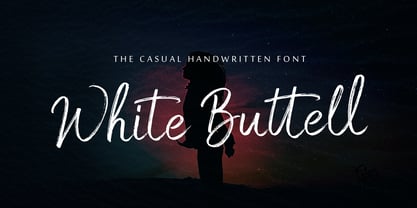 White Buttell is a handwritten brush script font. It has a natural style of a dry marker which makes it perfect for branding, advertising, poster designs, logos, book covers, magazines, packaging, website headers, and more.
 - Sandikza by Falling Angel,
$- Sandikza started out as an idea for a metal titles and some games. Or anything that was printed distorted. In other word something harsh. It makes a death or dirt feeling anywhere it is used.
