10,000 search results
(0.089 seconds)
- Exelancer Extra by Popskraft,
$9.00 Introducing the cutting-edge Excelancer Extra font, a modern masterpiece born from the rich heritage of classic sci-fi typography. Our inspiration? The boundless allure of outer space. And bestseller — the Excelancer font! https://www.myfonts.com/collections/exelancer-font-popskraft Excelancer Extra font is a harmonious blend of sleek, contemporary design, drawing from the timeless elegance of its predecessor. What sets Excelancer Extra apart is its captivating fusion of bold, ornate uppercase characters with meticulously crafted lowercase letters that maintain exceptional readability, even in extensive text. With Excelancer, you possess an all-encompassing font toolkit, designed to tackle every facet of forward-looking design. But that's not all. This font isn't just for intergalactic tales; it's also a striking choice for anything related to technology, innovation, progress, and even the world of sports. In essence, Excelancer embodies the pure essence of the future—an infusion of dynamism that knows no bounds!
 - Martita by GRIN3 (Nowak),
$24.00 Martita is an elegant, handwritten, fully connected script with ligatures to help with flow and readability. Martita can be used for invitations, greeting cards, posters, advertising, weddings, books, menus etc. Language support includes Western, Central and Eastern European character sets, as well as Baltic and Turkish languages.
 - Unblessed by Gassstype,
$27.00 Unblessed is Horror And Scary Typeface Font with ligature and Multilanguage support dramatic movement. Best for halloween poster, horror poster, childrenbook, cartoon,comic.This font is great for your next creative project such as logos, printed quotes, invitations, cards, product packaging, headers, Logotype, Letterhead, Poster, Label, and etc.
 - Gorus Duo by Smartfont,
$20.00 Gorus Duo is a modern and futuristic display font family. This is irreproachable font to diversify your headlines, logo, poster, branding visual identity, magazines and etc. Gorus Duo includes 5 fonts. Goes well with Gorus typefamily. The combination of futuristic and geometric elements renders a modern design.
 - Brush In Space by Gassstype,
$25.00 **Brush in Space** - Handwritten Brush font with a natural Rough style and comical type. Crafted manually with love and passion, This font is great for your next creative project such as logos, printed quotes, invitations, cards, product packaging, headers, Logotype, Letterhead, Poster, Label, Game project and etc.
 - Trust Issue by Gassstype,
$23.00 Trust Issue - Natural Fun Handmade Font Handwritten Allcaps Font with a natural style and dramatic movement. Crafted manually with love and passion, This font is great for your next creative project such as logos, printed quotes, invitations, cards, product packaging, headers, Logotype, Letterhead, Poster, Label, and etc.
 - Antebas by Lafontype,
$35.00 Antebas is a sans serif family with a geometric touch. Available in 16 styles from Thin to Heavy and it's matching italics. OpenType features such as fractions, ordinal, superscript, subscript, numerators, denominators and tabular figures are available. besides Latin letters, Antebas also supports Cyrillic and Greek letters.
 - Night Michy by Zeenesia Studio,
$16.00 Have a great day! My new font was present, Night Michy!! Night Michy is a Bold vintage style serif font with strong character and soft features. modern and classic serif font with a clear and bold look. It’s a very versatile font that works great in large.
 - Bokis by Sign Studio,
$10.00 Bokis is a sans serif family that has simple and strong characters. This font will provide a confident and impressive base headline to any of your designs. Balance on each side is well maintained. It's ideal for headlines, titles, posters, branding, and logotypes that require big impact.
 - Shaker Script by Fenotype,
$19.00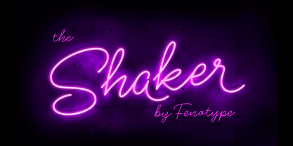 Shaker is a neon style monoline Script. Shaker has Swash Alternates for every uppercarse and lowercase standard character and it’s equipped with Contextual Alternates that keep the flow and connections smooth. Shaker is great for headlines, packaging, neon sign or as a logotype or any display use.
 - Analogy by Jafar07,
$10.00 Analogy is a bold typeface that is strong, geometric, and confident. Manifolds will give your design alternatives a modern look and make your creative work stand out with lots of unique ligatures. highly recommended and those who are planning a poster design, logo, headline, t-shirt, etc.
 - Pine Nuts United by Jonahfonts,
$35.00 Pine Nuts-United is the little sister of the popular "Pine Nuts" and "Pony Tale" family fonts. It's a connected (United) version with some new ligatures, stylistic alternates and alternate glyphs, small-caps are also included. See the 'Pine Nuts', 'Pony Tale' and 'Pony Tale Pro' versions.
 - Heavy Boxing by Vozzy,
$10.00 Introducing a vintage look label duo font named "Heavy Boxing". This family includes regular bold and strong font and cute handwritten script font. Regular font have different small and capitali letters. This font will good viewed on any retro design like poster, t-shirt, label, logo etc.
 - Roselina Script by Seniors Studio,
$21.00 Roselina Script is a modern calligraphy, with a vintage feel. moving baseline and elegant touch. Can be used for various purposes.such as headings, signature, logos, wedding invitation, t-shirt, letterhead, signage, lable, news, posters, badges etc. Including initial and terminal letters, alternates, ligatures and multiple language support.
 - Marbellya by Namara Creative Studio,
$5.00 Marbellya an Condensed Sans Serif Font with luxurious style. Available in 6 styles : Regular, Italic, Outline, Bold, Bold Italic and Bold Outline. Included alternates, ligatures and multilingual support. It's perfect for headlines, logos, quotes, packaging, magazine covers, editorial design, and many more project with suitable purpose!
 - Toykids by Sakha Design,
$10.00 Toykids is a playful and stylish font with a youthful spirit. Is suitable for both professional-looking projects such as branding designs, labels, websites, and business cards as well as casual designs like packaging, posters, flyers, quotes, social media posts, invitations, and special occasions cards, etc
 - Maiola by TypeTogether,
$49.00 Being inspired by early Czech type design, Maiola is clearly a contemporary typeface, that is mindful of its historical heritage, implementing old-style features and calligraphic reminiscence, more frankly so in the Italic. Nevertheless, through its personality, it attempts to create a welcoming tension on the page, without shouting too loudly at the reader. It handles its expressive tendencies with care and in doing so increases its usability, with legibility being of great importance. Subtle irregularities of the letterforms enhance furthermore the dynamic spirit and liveliness of the typeface. With the advent of Opentype, allowing for bigger character-sets and better language support, as a natural consequence, Maiola Multiscript covers Latin A, Cyrillic and Greek. Although basically independent from each other, they are, however, designed in the same spirit as the Latin, and harmonize well in multilingual text settings. The update to this beautiful font family includes the addition of over 240 glyphs featuring new ornaments, stylistic alternates, ligatures, superior letters, fractions and more. Furthermore, several glyphs were significantly improved and the kerning was fine tuned for better performance. Originally released in 2005, Maiola was an immediate success. It won the renowned TDC competition in 2004 where it was also recognized as a “judge’s choice”, was part of the touring exhibition e-a-t, and was selected in the Creative Review design competition in 2005.
 - Sashay Script by Ivan Angelic,
$19.99 Sashay Script is an elegant yet friendly script font. It is a rich smooth voice that gives an immediate human connection to any design. Do you need to display: speech; thought; emotions; desires…Sashay Script says it all in a clear legible script. It struts down the runway with panache, accompanied by: 13 Icons, 42 Ligatures and 21 Alternates. Although it is clearly a font that represents handwriting, it is very versatile and usable in that it is: easy to read; has good flow and looks great in both paragraph form or as a standalone word or line. As a bonus, since each and every letter was crafted from the ground up, Sashay Script can be used at larger sizes without losing any of its elegance as its edging is well groomed, without the raw edges that can be the terror of handwritten fonts at larger sizes. Sashay Arrows & Underlines was designed to match with Sashay Script. Often a font such as Sashay is used descriptively and the flow and line-weight of the 68 arrows and underlines match Sashay Script in look and feel. Please take a look at the gallery posters that show both Sashay Script and Sashay Arrows & Underlines, in use. We just know you'll have a perfect project for this little model of a font 'Sashaying' down the font runway.
 - BF Garant Pro by BrassFonts,
$39.99 BF Garant™ Pro elegantly balances geometric design with dynamic character! (This Pro-Edition is the fully packed upgrade of the well-known Hot New Fonts #1 BF Garant.) The strict architecture is combined with open counters, tapered spurs and diagonal cut ascenders and descenders that create an open, lively character without denying the straightness of geometry. 10 weights from Thin to Black and matching (oblique) Italics ensure versatile use of the type family. BF Garant Pro’s characters include the extended Latin Unicode range (incl. Vietnamese), Cyrillic and Greek. So it is very suitable for branding and packaging. “The last modern geometric typeface you really need!” The large x-height, dynamic details and some more conventional, humanist-inspired letter alternatives (a, g, k, u, y, G, Q - some of which are grouped together in the style set “Text”), make it not only a contemporary graphic element, but a highly legible timeless design tool, is not only ideal for logotypes or contemporary branding use, but also for modern editorial design. The 1,760 characters per font include ligatures, alternates, line figures and old style figures, small caps, numerals for small caps, fractions, symbols (incl. Peace sign), currencies, different arrows etc. In addition, 23 useful OpenType features make BF Garant™ Pro a workhorse for many typographic applications. With the 11 style sets, BF Garant™ can be fully adapted to the user’s requirements without losing its unique character. And for those who ever wanted to open a bar on Tatooine, BF Garant™ Pro also includes the currency sign of Galactic Credits! Feel the Font!
 - AT Allowe by Ardyanatypes,
$15.00 AT Allowe comes with a geometric sans serif style and a modern and elegant sans serif tagline. This font comes in eight thickness levels, from thin to black to suit your needs. AT Allowe is also equipped with the latest professional characteristics that can present an elegant and attractive identity for your company or project for business purposes. It goes well with modern serifs and scripts depicted or stands firm as a title and brand representative for an elegant look. AT Allowe also comes with multiple languages, making it easy to use for any country and language use. It also comes with alternative Ligatures and styles to make your designs more attractive. AT Allowe is suitable for branding projects and various design purposes such as business cards, name tags, advertisements, posters, invitations, branding, logos, magazines, merchandise, presentations, etc. Supports languages: Afrikaans, Albanian, Asturian, Asu, Azerbaijani, Basque, Bemba, Bena, Bosnian, Breton, Catalan, Chiga, Colognian, Cornish, Croatian, Czech, Danish, Dutch, Embu, English, Esperanto, Estonian, Faroese, Filipino, Finnish, French, Friulian, Galician, German, Gusii, Hungarian, Icelandic, Igbo, Indonesian, Irish, Italian, Kabuverdianu, Kalaallisut, Kalenjin, Kamba, Kikuyu, Kinyarwanda, Latvian, Lithuanian, Low German, Lower Sorbian, Luo, Luxembourgish, Luyia, Machame, Makhuwa-Meetto, Makonde, Malagasy, Malay, Maltese, Manx, Meru, Morisyen, North Ndebele, Norwegian Bokmål, Norwegian Nynorsk, Nyankole, Oromo, Polish, Portuguese, Quechua, Romanian, Romansh, Rombo, Rundi, Rwa, Samburu, Sango, Sangu, Scottish Gaelic, Sena, Shambala, Shona, Slovak, Slovenian, Soga, Somali, Spanish, Swahili, Swedish, Swiss German, Taita, Teso, Turkish, Turkmen, Upper Sorbian, Vietnamese, Vunjo, Walser, Welsh, Western Frisian, Yoruba, Zulu
 - Klainy by Identity Letters,
$29.00 An unadorned Grotesque with a refreshingly personal touch. If “Grotesque” mainly means “industrial, mechanical, anonymous typeface” to you, Klainy might redefine your image of the genre. Yes, it’s a Grotesque—but with a contemporary look and a lot of personality. Klainy’s apertures are more closed at the top and more open at the bottom, creating an informal rhythm that sets Klainy apart: a confident, optimistic voice with a clean appearance. Terminals are subtly back-bent: these quaint “hooks” make Klainy a bit more personal, a bit friendlier. (You can find them in the a, c, f, and r.) Just like its old-style Grotesque ancestors, Klainy is optimized for display sizes and short texts. There, its unobtrusive quirks can be wholly appreciated. However, the familiar Grotesque appearance makes sure that the typeface is comfortable to read in smaller sizes, as well. Use Klainy whenever a basically classic sans-serif typeface with a modern and individual twist is called for. This font family comes in eight weights ranging from Thin to Black, each with a matching italic style. More than 500 glyphs and a bunch of Open Type Features make it a reliable companion for all of your projects. You can fine-tune the flavor of Klainy with Stylistic Alternates such as a one-story a and a two-story g. Their simple construction blends perfectly with the design concept of this typeface. Klainy is a seasoned blue-collar worker that surprises you with wit and team spirit. It’ll be a great addition to your font library.
 - Enjoy Doodle by Nathatype,
$29.00 Looking for a font that’ll make your branding radiate elegance? A versatile, modern, and happy font? Then we’ve got just the font for you! Enjoy Doodle-Handwritten Font Enjoy Doodle is a modern hand-crafted font that’ll make your audience swoon and enhance your branding projects, printed materials, and website design. Every stroke and curve was created to portray the essence of elegance and style. Go ahead and use it on your headings, promote your online sales, Instagram quotes, and even printed materials like business cards, t-shirts, or invitations. Features: Stylistic Set Ligatures Swashes PUA Encoded Numerals and Punctuation Thank you for downloading premium fonts from Nathatype
 - Chiavettieri by Kostic,
$50.00 Chiavettieri draws inspiration from Humanist types, marked by low contrast between thick and thin strokes and the angle of stress in the bowls of letters. On the other hand, generous x-height, clean angled serifs and sharp cuts in the ball terminals suggest a more contemporary look. All these characteristics make it a robust, well balanced, legible typeface ideally suited for book text, editorial and publishing, as well as web and screen text. With distinct Italics, small capitals, complete set of superior lowercase (Latin), oldstyle and lining figures (each in tabular and proportional widths), ligatures, fractions, superior and inferior characters – Chiavettieri is equipped for proper typography.
 - Kathedral by Scratch Design,
$16.00 Please welcome, Kathedral! Kathedral is a stylish signature script font that will give instant and gorgeous flair to your designs. This font is highly detailed and has a beautiful shape. It will give you vintage, dazzling and memorable vibes in your design. All lowercase letters include beginning and ending swashes, giving a realistic and beautiful hand-lettered style. This font will be perfect for wedding cards, invitations, branding, wine industry branding, posters, magazines, logos and many more. What you'll get : Uppercase and lowercase Numbers & punctuation Multilingual support Alternates for Uppercase and lowercase (with swashes) Ligatures Line Swashes Thank you for your purchase! Hope you enjoy our font!
 - Tofes by Putracetol,
$28.00 Tofes - Modern Serif Font Tofes - Modern Serif Font is a versatile typeface that exudes elegance and sophistication. This font is perfect for any project that requires a touch of luxury and class, such as branding, packaging, logos, and more. The font's name is inspired by the Hebrew word for "apple," which symbolizes beauty and perfection. With its clean lines and modern look, Tofes is a must-have for any designer looking to create stunning and professional designs. If you're looking to create a romantic and elegant branding, Tofes is the perfect font for you. Its clean lines and modern look give it a timeless quality that works well for a variety of design projects. This font is particularly well-suited for use in packaging and logos, where it can help convey the quality and sophistication of your brand. Tofes comes with a range of features that make it a versatile and useful typeface. The font includes both uppercase and lowercase letters, as well as Opentype features such as alternates and ligatures. It also includes support for a wide range of languages, making it a great choice for designers working on international projects. Additionally, Tofes comes with number, punctuation, and symbol glyphs, allowing you to create a wide range of design elements with ease. In the font package, you will find Tofes in three different file formats: OTF, TTF, and WOFF. These formats ensure that the font is compatible with a wide range of software applications, including Adobe Creative Suite, Microsoft Office, and more. This means that you can use Tofes in virtually any design project, whether you're creating graphics for a website, designing a logo, or working on a print project. In summary, Tofes - Modern Serif Font is a versatile and elegant typeface that is perfect for a wide range of design projects. With its clean lines, modern look, and support for multiple languages, Tofes is an excellent choice for designers looking to create sophisticated and professional designs. Its features, including Opentype alternates and ligatures, make it a valuable addition to any designer's toolkit.
 - Grindmore by LetterStock,
$25.00 **Grindmore Font** This pair was inspired by the vintage poster design that i saw on some coffee shop, It was crafted by hand specially to add natural handmade feeling in its brand identity than i make it clean with pentool. **Opentype features** Grindmore font has 222 character set included Cricket Font is very good looking in logo, labels, t-shirt prints, product packaging, invitations, advertising and others. * Multilingual support (Western European characters). This fonts works with folowing languages: English, Danish, Dutch, Estonian, Faroese, Filipino, Finnish, French, German, Hungarian, Icelandic, Irish, Italian, Norwegian, Polish, Portuguese, Spanish, Swedish. Thank you for using this font. LS
 - Go Home JNL by Jeff Levine,
$29.00 Sheet music for another one of those songs from the early part of the 20th Century with a wonderfully wordy hand lettered title was the model for the Art Nouveau flavored Go Home JNL, which is available in both regular and oblique versions. 1908's "I Used to be Afraid to Go Home in the Dark (Now I'm Afraid to Go at All)" is comprised of eighteen words. It may have been a mouthful to request from the local sheet music shop, but the lettering on its cover made it a great candidate for preserving as a digital typeface.
 - Futuramano by Wiescher Design,
$39.50 Futuramano was the kind of typeface we scribbled in those old days, when I was an art-director in advertising agencies. We used it to simulate the headlines and the subheads, so the client could read what the copywriters had in mind. As Futura was the font of choice in those days (as it still is), our scribbled typeface looked much like Futura. The second half of the name “mano” means hand, so that is what it is, kind of a handwritten Futura. Futuramano is very practical if you want to have that unfinished touch! Yours very nostalgic Gert Wiescher
 - DT Lythmore by Dragon Tongue Foundry,
$9.00 Lythmore This font is called Lythmore and is inspired by Lithos. Lithos was originally designed for Adobe by Carol Twombly in 1990, based it on the lettering from ancient Greek inscriptions. The Capitals are similar in feel and design, but is totally original and built from scratch. It is designed to be similar intentionally, but it is not a clone or rip off. Lithos is an example of a simple blocky san serif font style, with subtly concave sides, angled ends, and off centred curves. Lythmore is also an example of that same style. But is also different in places where I felt it could be improved. And it has a complete lower case set, which Lithos doesn't. I built Lythmore with 8 different weights. Lythmore can be very effective when used in advertising and general display work, but it can also be used for much more. Although it was never designed to be body copy, when used as such, it is still perfectly readable and adds its own version of sans serif style and flavour. I have included two versions of the Lythmore family. Lythmore A and Lythmore B. In the Lythmore A family, the lighter 4 weights all vary in weight in both the horizontal and vertical axis. The heavier 4 weights all vary in the horizontal axis only. In the Lythmore B family, the transition is even in both directions across the entire family. The result of this difference is that the A and B versions difference is most noticeable between the Regular and Medium weights. While the extreme ends of each family version are virtually identical.
 - Botuna Merisa by IbraCreative,
$23.00 Botuna Merisa is an exquisitely elegant script typeface that radiates sophistication and grace. With its fluid and refined letterforms, Botuna Merisa captures the essence of timeless beauty and classic charm. The delicate curves and ornate details of this typeface add a sense of opulence and refinement, making it the perfect choice for high-end branding, wedding invitations, and upscale packaging.
 - Child by Trim Studio,
$12.00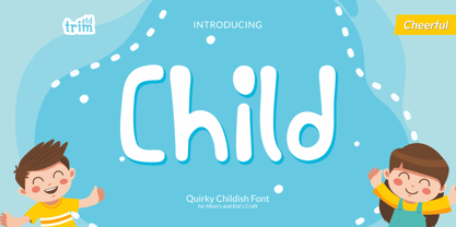 Child is a cute and quirky display font. It will attach a very playful and childish style to any design you wish to develop! Its perfectly suited for crafter and graphic artist to complete their design such as invitation, advertisement, poster, logo, birthday, product sign, and many more! Child Font is also Lightweight and contains All Standard glyphs and punctuations.
 - New Romantine by Orenari,
$18.00 Hi! It's Orenari here want to introduce a romantic display serif font, New Romantine. This font has lovely curves and almost of all the uppercase and lowercase has stylishtic alternates. The fact of this font is Romantine was my very first font. This New Romantine is the newer version of Romantine. It's bolder than the old version. Just launch the New Romantine in February so this font will bring the Valentine's Vibe to your creative projects.
 - Sofimaria by Qaratype,
$18.00 Sofimaria is a super unique ligature font that you wont forget! It’s a high contrast serif that has loads of style. A modern take on a Caslon style typeface, this font is ideal for those bold headings or wedding invitations. It’s got hundreds of characters and ligatures plus all those European letters! Sofimaria pairs perfectly with a light scripts font or minimal sans serif. Main Features: Uppercase & Lowercase letters Punctuation and special characters Multilingual support Ligatures & Alternate glyphs
 - Monden by Tour De Force,
$29.00 If you'd like to scream, but you have no self esteem, or you'd love to start a fight, but you're scared of the night, I made this font for you all, whether you're short or tall. Monden is wide, gentle and fun, but it wasn't born under the Sun, it was my intention to make it unique, I surely hope I didn't make some freak, it looks a bit classical, in moments maybe here and there radical, but it surely is really graphical with a dose of something magical. Want a logo, poster or any other design, but you'd rather cry and then run, even this description sounds lousy, at least it isn't so drowsy, so meet Monden family from our hood and keep your spirit in good mood, and do the things on any way you think they should.
 - Bessemer by Sivioco,
$10.00 Bessemer is an all-caps sans-serif display font inspired by industrial lettering from the 20th century. On its own, it has a predominantly factory-made feel, but is versatile enough to work well in a variety of settings. In other words, it feels just at home on a series of technical guides as it does on a range of hair styling products. Bessemer comes in 5 weights ranging from Light to Bold and has been designed with chamfered edges. This makes it really easy to customize and create your own custom type. It also includes the following OpenType features: • Proportional Lining Figures • Tabular Lining Figures • Superior & Inferior Figures • Numerators & Denominators • Ordinals • Fractions Perfect for logos, posters, t-shirts, packaging and use in video. Delivered in TTF and OTF format. Supports all Western, Central and South Eastern European languages.
 - AE Prosperity by Altered Ego,
$50.00 Well suited for headlines, packaging and display applications, AE Prosperity will be a robust and versatile addition to your script library. It’s purposefully designed to infer the visual connections of letters for a hand-lettered feel. Some characters will connect, and others will guide your eye to the next letter from, making it highly legible. In 1779, the schooner Prosperity sailed the high seas. Commissioned by a young continental congress, with 6 guns & at twenty tons, she sailed under a Letter of Marque for patriotism and profit. Look lively, because with contextual and alternate glyph sets (contextual glyphs, alternate lower case glyphs and an extended set of alternate capitals), this robust typeface is as inspiring as her namesake and adapts to whatever winds may blow. Prosperity is designed as a free-flowing script, for a spontaneous and historic aesthetic. Contextual glyphs include variations on tt (short and longbar), t longbar, ll, cc and other characters. Contextual features change ascender heights and descender styles. Alternate glyphs (set 1) include variations on b,d,f,g,h,l,o,p,r,s,t,y. Alternate capitals (set 2) include a complete set of alternate upper case letters. Most useful with Adobe® InDesign®, multiple variations of letter combinations can be achieved by selecting Contextual glyphs, and/or set 1 and set 2 from the Character Palette: OpenType: Stylistic Sets menu. Alternate glyphs and contextual characters will be available based on the OpenType support of your application. AE Prosperity™ is available exclusively in OpenType format.
 - Sugar Pie by Sudtipos,
$79.00 When Candy Script was officially released and in the hands of a few designers, I was in the middle of a three-week trip in North America. After returning to Buenos Aires, I found a few reactions to the font in my inbox. Alongside the congratulatory notes, flattering samples of the face in use, and the inevitable three or four “How do I use it?” emails, one interesting note asked me to consider an italic counterpart. I had experimented with a few different angles during the initial brainstorming of the concept but never really thought of Candy Script as an upright italic character set. A few trials confirmed to me that an italic Candy Script would be a bad idea. However, some of these trials showed conceptual promise of their own, so I decided to pursue them and see where they would go. Initially, it seemed a few changes to the Candy Script forms would work well at angles ranging from 18 to 24 degrees, but as the typeface evolved, I realized all the forms had to be modified considerably for a typeface of this style to work as both a digital font and a true emulation of real hand-lettering. Those were the pre-birth contractions of the idea for this font. I called it Sugar Pie because it has a sweet taste similar to Candy Script, mostly due to its round-to-sharp terminal concept. This in turn echoes the concept of the clean brush scripts found in the different film type processes of late 1960s and early 1970s. While Candy Script’s main visual appeal counts on the loops, swashes, and stroke extensions working within a concept of casual form variation, Sugar Pie is artistically a straightforward packaging typeface. Its many ligatures and alternates are just as visually effective as Candy Script’s but in a subtler and less pronounced fashion. The alternates and ligatures in Sugar Pie offer many nice variations on the main character set. Use them to achieve the right degree of softness you desire for your design. Take a look of the How to use PDF file in our gallery section for inspiration.
 - Mrs Eaves XL Serif by Emigre,
$59.00 Originally designed in 1996, Mrs Eaves was Zuzana Licko’s first attempt at the design of a traditional typeface. It was styled after Baskerville, the famous transitional serif typeface designed in 1757 by John Baskerville in Birmingham, England. Mrs Eaves was named after Baskerville’s live in housekeeper, Sarah Eaves, whom he later married. One of Baskerville’s intents was to develop typefaces that pushed the contrast between thick and thin strokes, partially to show off the new printing and paper making techniques of his time. As a result his types were often criticized for being too perfect, stark, and difficult to read. Licko noticed that subsequent interpretations and revivals of Baskerville had continued along the same path of perfection, using as a model the qualities of the lead type itself, not the printed specimens. Upon studying books printed by Baskerville at the Bancroft Library in Berkeley, Licko decided to base her design on the printed samples which were heavier and had more character due to the imprint of lead type into paper and the resulting ink spread. She reduced the contrast while retaining the overall openness and lightness of Baskerville by giving the lower case characters a wider proportion. She then reduced the x-height relative to the cap height to avoid increasing the set width. There is something unique about Mrs Eaves and it’s difficult to define. Its individual characters are at times awkward looking—the W being narrow, the L uncommonly wide, the flare of the strokes leading into the serifs unusually pronounced. Taken individually, at first sight some of the characters don’t seem to fit together. The spacing is generally too loose for large bodies of text, it sort of rambles along. Yet when used in the right circumstance it imparts a very particular feel that sets it clearly apart from many likeminded types. It has an undefined quality that resonates with people. This paradox (imperfect yet pleasing) is perhaps best illustrated by design critic and historian Robin Kinross who has pointed out the limitation of the “loose” spacing that Licko employed, among other things, yet simultaneously designated the Mrs Eaves type specimen with an honorable mention in the 1999 American Center for Design competition. Proof, perhaps, that type is best judged in the context of its usage. Even with all its shortcomings, Mrs Eaves has outsold all Emigre fonts by twofold. On MyFonts, one of the largest on-line type sellers, Mrs Eaves has been among the 20 best selling types for years, listed among such classics as Helvetica, Univers, Bodoni and Franklin Gothic. Due to its commercial and popular success it has come to define the Emigre type foundry. While Licko initially set out to design a traditional text face, we never specified how Mrs Eaves could be best used. Typefaces will find their own way. But if there’s one particular common usage that stands out, it must be literary—Mrs Eaves loves to adorn book covers and relishes short blurbs on the flaps and backs of dust covers. Trips to bookstores are always a treat for us as we find our Mrs Eaves staring out at us from dozens of book covers in the most elegant compositions, each time surprising us with her many talents. And Mrs Eaves feels just as comfortable in a wide variety of other locales such as CD covers (Radiohead’s Hail to the Thief being our favorite), restaurant menus, logos, and poetry books, where it gives elegant presence to short texts. One area where Mrs Eaves seems less comfortable is in the setting of long texts, particularly in environments such as the interiors of books, magazines, and newspapers. It seems to handle long texts well only if there is ample space. A good example is the book /CD/DVD release The Band: A Musical History published by Capitol Records. Here, Mrs Eaves was given appropriate set width and generous line spacing. In such cases its wide proportions provide a luxurious feel which invites reading. Economy of space was not one of the goals behind the original Mrs Eaves design. With the introduction of Mrs Eaves XL, Licko addresses this issue. Since Mrs Eaves is one of our most popular typefaces, it’s not surprising that over the years we've received many suggestions for additions to the family. The predominant top three wishes are: greater space economy; the addition of a bold italic style; and the desire to pair it with a sans design. The XL series answers these requests with a comprehensive set of new fonts including a narrow, and a companion series of Mrs Eaves Sans styles to be released soon. The main distinguishing features of Mrs Eaves XL are its larger x-height with shorter ascenders and descenders and overall tighter spacing. These additional fonts expand the Mrs Eaves family for a larger variety of uses, specifically those requiring space economy. The larger x-height also allows a smaller point size to be used while maintaining readability. Mrs Eaves XL also has a narrow counterpart to the regular, with a set width of about 92 percent which fulfills even more compact uses. At first, this may not seem particularly narrow, but the goal was to provide an alternative to the regular that would work well as a compact text face while maintaining the full characteristics of the regular, rather than an extreme narrow which would be more suitable for headline use. Four years in the making, we're excited to finally let Mrs Eaves XL find its way into the world and see where and how it will pop up next.
 - Nortune by Ardyanatypes,
$10.00 Nortune is inspired by modern style combined with retro style so that it has a dynamic and elegant shape. This will be very suitable for use in any design that has a modern, retro, and classic feel. Nortune also has 10 thicknesses so it will be very easy to use on any design you have in mind. It also comes with multiple languages, making it easy to use for any country and language. Nortune also comes with alternative Ligatures and styles to make your designs more attractive. Alternate fonts will also create lots of options to combine. This modern letter shape will be very suitable to be combined with various types of fonts. Nortune is suitable for branding projects and various design purposes such as business cards, name tags, advertisements, posters, invitations, branding, logos, magazines, merchandise, presentations, etc. Supports languages: Afrikaans, Albanian, Asturian, Asu, Azerbaijani, Basque, Bemba, Bena, Bosnian, Breton, Catalan, Chiga, Colognian, Cornish, Croatian, Czech, Danish, Dutch, Embu, English, Esperanto, Estonian, Faroese, Filipino, Finnish, French, Friulian, Galician, German, Gusii, Hungarian, Icelandic, Igbo, Indonesian, Irish, Italian, Kabuverdianu, Kalaallisut, Kalenjin, Kamba, Kikuyu, Kinyarwanda, Latvian, Lithuanian, Low German, Lower Sorbian, Luo, Luxembourgish, Luyia, Machame, Makhuwa-Meetto, Makonde, Malagasy, Malay, Maltese, Manx, Meru, Morisyen, North Ndebele, Norwegian Bokmål, Norwegian Nynorsk, Nyankole, Oromo, Polish, Portuguese, Quechua, Romanian, Romansh, Rombo, Rundi, Rwa, Samburu, Sango, Sangu, Scottish Gaelic, Sena, Shambala, Shona, Slovak, Slovenian, Soga, Somali, Spanish, Swahili, Swedish, Swiss German, Taita, Teso, Turkish, Turkmen, Upper Sorbian, Vietnamese, Vunjo, Walser, Welsh, Western Frisian, Yoruba, Zulu
 - Morning Cookie by Bogstav,
$17.00 Yet again, a font inspired by my work as a kindergarten teacher! The other day, I had a conversation with some of the kids, about what they ate for breakfast. Some had oatmeal, some bread and others yogurt. But this kid - he insisted that every morning, his mother would serve him cookies, “morning cookies”. It sounded too good to be true, and when I asked his mother, it turned out that “cookies” were actually bread, but to make it sound more appetising, they called it cookies! The letters are rounded and in some way quite naive, but still clear and legible. With an extreme ascender and descender, the font stands out with its oddities. I’ve added 3 different versions of each lowercase letter!