10,000 search results
(0.051 seconds)
- EFCO Boldfrey by Ilham Herry,
$20.00 Inspired by vintage labels where there are many types of style in one design label, that's why Boldfrey came up with 6 styles, compressed to superwide for mixing and match each other for design needs. Boldfrey is also available in variable font format. Opentype features with stylistic character, lining figure, and ligature in Co. and LTD. Suitable in display needs, such as headline, logo, T-shirt, signage, poster, etc
 - Negara Serif by Monoco Type,
$15.00 Negara Serif is typeface that have classic and elegant vibe, designed for any headline and short paragraph use. Featured with Latin Plus that have include 219 Language support so it will usable in wide range country, Beside latin there is Cyrillic Support in Negara Serif. You can see more about this font usage and feature in the preview image. [New Update with Variable Font File available to purchase]
 - Isagi Blue by Lurinzu Studios,
$10.25 A techy, sci-fi condensed typeface that is inspired by the mixture of futuristic and athletic vibes into one out of this world headline typeface. This headline font best fits in large scale design when you want to immediately capture the attention of the viewers. This also fits with school-related, athletics, sports, future and science themed designs. *This font includes letters, numbers, multi-language, and all essential marks needed.
 - ITC Odyssée by ITC,
$29.99ITC Odyssée is the work of French designers Roselyne and Michel Besnard, who were inspired by the digital imagine of type which opened up possibilities for new visual illusions. The serifs of this font recreate the virtual lines formed by optical residue" on TV screens, looking like horizontal serifs trailing off to the right. ITC Odyssée is a clear and legible typeface which features a simplicity and grace in its forms." - Smart Deco by Lindstrom Design,
$15.00 A nostalgic font referencing the 1920s and 1930s during the Golden Age of Hollywood, art moderne and the rise of luxury items. Highly geometric with wild variations in glyph widths that demand attention. Smart Deco is a display font with clean simple lines, tall ascenders and expressive Capitals that descend below the baseline. The intention is to create a sleek elegance that symbolizes the sophistication of a bygone era.
 - ST Saturn by ShimanovTypes,
$9.00 SATURN is a retro futuristic modern editorial font with vintage vibes, inspirated by Soviet sci-fi book's headers and posters. It has a spirit of Space race, brave hearts and cosmic dreams. It's good for social media, headlines, large-format print, branding, posters, fashion designs and websites. Language Support: Latin: English, French, German, Dutch, Italian, Spanish, Danish, Norwegian, Portuguese, Croatian, Swedish, Hungarian, Estonian. Cyrillic: Russian, Belorussian, Ukrainian, Serbian, Kazakh, Bulgarian.
 - Dad Collections by Ake,
$12.00 Introducing Dad Collections, a versatile duo font consisting of a modern script and display font that's perfect for a wide range of design projects. Whether you're designing wedding invitations, postcards, magazines, or any other project, Dad Collections adds a touch of elegance and sophistication to your work. With its clean lines, stylish curves, and legible characters, this font is sure to become a favorite in your design arsenal.
 - Matteo scary by Scratch Design,
$14.00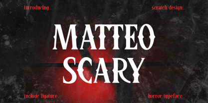 Please Welcome Matteo Scary. Matteo Scary is a horror and creepy font inspired by classic horror movie posters. It gives us the spirit of horror, spooky, frightening and suitable for poster movies, especially Halloween-themed, horror or thriller. This font is perfect also for branding, book cover, magazine header, and others which has horror or spooky vibes. What’s included? Uppercase & lowercase Number & Punctuation Ligatures Multilingual support Enjoy this font!
 - Pure Psychedelia by Mysterylab,
$19.00 For a versatile timeless look that's sure to bring any groovy graphic idea to life, we have dubbed this offering: Pure Psychedelia. This condensed font is shot through with twin strands of modernized Art Nouveau and reimagined 1960s psych. This classic stylistic mélange is distilled down to a heady mix of hippy-trippy lava lamp blobs and assertively pointy end tapers, for a unique vibe and a dynamic linear flow.
 - Ordina Variable by Schriftlabor,
$600.00 Developed by Indonesian designer Fadhl Haqq, Ordina is a grotesque-style superfamily with no less than 90 styles to choose from. It supports Latin including Pinyin and Vietnamese, Greek and Cyrillic, complete with Bulgarian alternates. Choose from Ordina’s eight figure sets, fine-tune its appearance with stylistic alternates for key lowercase letters, and put the reliable yet stylish sans-serif workhorse to good use in virtually any typographic application.
 - Nanami by Thinkdust,
$10.00 A font inspired by the oriental flavours of Japan, Nanami a confident font with clear, clean lines which are well defined without being obtrusive. The distinctly sharp edges slice through empty space like Samurai swords, proudly wearing curves and corners like a Samurai wears their traditional ceremonial armour, and just as fierce. If Nanami isn't quite floating your boat why not check out its counterparts Nanami Rounded and Nanami Handmade.
 - Humble Craftman by Invasi Studio,
$17.00 Humble Craftman is a super versatile font that pairs script and sans typefaces. Each letter features a swashy touch, making Drippy more remarkable in the industry. This script font blends classic historical ambiance with pop modern retro vibes. Be the best version of your vision statement, and stand out from the crowd. A perfect pair for your logotype, branding project, label design, sign painting, and a very wide of advertising needs.
 - Fleurons of Paris by Outside the Line,
$19.00 The Fleurons of Paris were inspired by an iron gate, an iron railing, a Metro tile, a Metro stop, the Eiffel Tower, Notre Dame, a rainy afternoon, a glass of wine, an outdoor cafe and the list goes on and on. Absorbing all things visual was immensely satisfying second only to coming home and reliving the trip tiny graphic by tiny graphic. Also look at the Ornaments of Paris.
 - Unblocker by IKIIKOWRK,
$17.00 Proudly present Unblocker - Headline Type Unblocker emanates a bold personality that draws the eye and demands attention. Each letter strikes a perfect blend of boldness and finesse. The finely weighted strokes offer a sense of stability, making it an excellent choice for imposing headlines, titles, and banners that need to make an impact. Get a good offer & FREEBIE at www.ikiiko.com if you have any questions, you can contact us ikiikowrk@gmail.com
 - Blippo by Linotype,
$40.99Blippo Black with its constructed style is a typical headline typeface. Its robust figures with their even strokes were composed using the basic forms of the circle and rectangle. Its curves are often not completely closed. The figures of Blippo Black form dark, heavy lines, making the typeface suitable only in middle and larger point sizes. Blippo Black will make an impression when used for flyers and correspondence. - Bonema by Typebae,
$15.00 Bonema is a retro-style font that encapsulates the spirit of the psychedelic era. The letters are decorated with elaborate, sparkling patterns that give off a surreal, free-spirited vibe. The fascinating and intriguing personality of the typeface will undoubtedly transport viewers to another time and place. Features: Full Set of standard alphabet and punctuation PUA Encoded - no special software is needed to access extra characters Multilingual Character
 - Zoom by MDS,
$9.00 This font is fast. Carving apexes, drafting competitors, and breaking away for the finish line. This is a sleek and extended font family designed for top speed while squeezing into tight places. Zoom is intended for display and would be right at home, nested gently on a carbon fiber bike frame, forged as the nameplate on the back of a vehicle, or printed stoutly on any number of sporting products.
 - Eastern by me55enjah,
$14.00 Eastern family, sans serif fonts designed with a vintage print look. Rounded edges and imperfections were added to the characters to give a vintage vibe. The font family also works great for creating quotes, title, and still legible in a bunch of text. For those looking for some peculiar characters, available on Blind and Rusty texture versions as well. Add some Ornament to complete your vintage print look.
 - Yoga Studio by Outside the Line,
$19.00 15 poses as line drawings and the same 15 in reverse, plus the OM graphic and a lotus flower. Yoga Studio, a set of detailed yoga poses that are both useful and elegant. Tadasana, trikonasana, savasana -- from mountain pose to relaxation pose you will find what you need to put together a sun salutation vinyasa, basic instructions for beginning students or a visual guideline for your own personal practice.
 - LCT Ragnarök PE by LCT,
$29.90 The LCT Ragnarök is inspired by the cinematographic universe. Its thick and generous shape makes this typeface naturally stand out. In addition, its lines embody soft serifs thus adding elegance to it. This original font endows two styles; regular and slant. It is an asset for the creation of titles, logos or even generics. LCT Ragnarök encompasses a rich alphabet going from Latin PRO going to Greek , Polytonic Greek and Cyrillic.
 - Graphy by Ahmad Jamaludin,
$17.00 Introducing Graphy, the font that fuses the energetic spirit of street art and the trendsetting vibes of y2k culture. This unique typeface offers three distinct styles: Filled, Anti Counter, and Outline, whether you're working on logos, branding, or social media graphics Graphy Main File Has 3 style: Filled, Anti Counter, and Outline Instructions (Access special characters, even in Cricut Design) Unique Letterforms Works on PC & Mac Thank you, Dharmas Studio
 - Visigoth by Linotype,
$29.00Visigoth font was created in 1988 by Arthur Baker for AlphaOmega Typography. He designed it specifically for setting the text of A Dante Bestiary published in 1989 for Ombondi Editions in New York. Highly expressive and unusual letter shapes make Visigoth unique among script faces: it has bold, pen written lines, a slight incline, and a distinct variation in stroke weights, making it ideal for advertising and other display work. - Molecula by Northeast Type Foundry,
$22.99 Molecula is grotesque sans serif of slightly condensed proportions and humanist-grotesk features. The family features 9 weights from Thin to Black, each of which has an italic. The character set is robust, covering extended latin. All completely equipped with opentype features, alternative glyphs, fractions, lining numbers, small caps, subscript and superscript. Molecula has been designed for advertising, branding, packaging or anywhere a clean and contemporary voice is needed.
 - Erangle by Gatype,
$14.00 Erangle is an elegant serif typeface inspired by a vintage type specimen I found recently at an art fair. Thin to thick contrasting lines and elegant curves make Beginta the perfect font for this type of logo and display purposes. Hope you enjoy it Feel free to contact you with any questions or concerns you may have and I will get back to you as soon as I can.
 - WallAxe by Nocturnal Workspace,
$17.00 WallAxe Typeface is the first commercial typeface from illusletra Co. A Victorian font with a classic, elegant, vintage, luxury, and clean feel. It comes in 2 styles, inline and bold. Released since 2018. FEATURES Standard Ligature Stylistic Alternate Fraction, Numerator, Denominator Number Styles, Lining Figures, Old Style Ordinals Multi-lingual Characters WallAxe Typeface is suitable for various purposes like logotypes, signage, labels, posters, titles, letterhead, book covers and more. Thank you!
 - Chipper by ITC,
$29.99Chipper is the work of British designer Andrew Smith, an adorably awkward typeface resembling the first printing of a child. Shaky lines and irregular forms combine for this naive look, which is completed by tiny specks surrounding each form as well as a number of illustrations. Chipper reflects an innocent fun and is perfect for children's greeting cards, certificates, or magazines and advertising for or about the little ones. - Chokana by NREY,
$19.00 Introducing Chokana, a nostalgic multi-line font inspired by the 70's aesthetic. Font looks amazing as alone words and as full text blocks. Also it good for bright captions and unforgettable logos. This font could be the perfect solution if you want to give a lovely retro touch to your designs. If you have any questions, please let me know. Thank you and have a great day!
 - Emosia by Gatype,
$14.00 Emosia is an elegant serif typeface inspired by a vintage type specimen I found recently at an art fair. Thin to thick contrasting lines and elegant curves make Beginta the perfect font for this type of logo and display purposes. Hope you enjoy it Feel free to contact you with any questions or concerns you may have and I will get back to you as soon as I can.
 - Wusel by Loreley Design,
$28.00 Named by the german word for bustling around, to scurry or swarming the Wusel has a very active appearance. It's completely handmade and doodely because of all the crisscrossing lines, which forms big, bold, sanserif letters. These are very good to read wether they're big or small. Just a very playful, fun and simple font to use for headlines, tags and all kind of things which need al little attention.
 - Ashemore Softened by insigne,
$32.00 Following the success of the Ashemore family, it became clear that a rounded version of Ashemore would be a great addition to the product line that would allow designers even more design choices. Ashemore Softened’s rounder forms compliment the face well as the original font eschewed straight lines. The rounded terminators give the face a sense of friendliness that is unsurpassed. The distinct and flamboyant style of Art Nouveau and the Arts and Crafts style remain, but the blunted terminators give the face a more technological and contemporary look and feel. The Ashemore Softened family has a full range of six weights from thin to black and includes condensed and extended options for a total of 36 fonts. The typeface also includes some unique OpenType alternates that make the superfamily even more versatile. Ashemore Softened is equipped for complex professional typography, including alternates, small caps and many alternate characters. The face also has a number of numeral sets, including tabular figures, fractions, old-style, lining figures and superiors and inferiors. OpenType-capable applications such as Quark or the Adobe Suite can take full advantage of automatic ligatures and alternates. You can find these features demonstrated in the .pdf brochure. Ashemore Softened also includes the glyphs to support a wide range of languages, including Central, Eastern and Western European languages. In all, Ashemore Softened supports over 40 languages that use the extended Latin script, making the new addition a great choice for multi-lingual publications and packaging. The original Ashemore was designed by Jeremy Dooley with production assistance from Lucas Azevedo and Marcelo Magalhaes. Kerning assistance from iKern.
 - P22 Curwen by IHOF,
$24.95 P22 Curwen was originally designed by an unknown designer. This version was created by Colin Kahn. P22 Curwen Poster is a digitized version of a rare wood type used by the Curwen Press in England in the early 20th Century for poster work. The font was known to have been cut in 6 sizes—from 3-line (3/4 inch) to 16-line (3 inch) in height. The font was based from impressions made of the 6-line type. P22 Curwen Maxima is a hyper-stylized re-interpretation of Curwen Poster by Colin Kahn. As a post-modern poster type, it evokes an organic nature within a novel maximalist framework. It is reminiscent of early phototype display faces with an illogical three-dimensionality which serves to give the font continuity. The capitals are buried beneath stylistic wood shavings complementing the sculpture like quality of the lowercase. Perfect for (almost) any project.
 - Nosara by Never Better,
$9.00 Inspired by a trip to Costa Rica and named after its famous beach town, Nosara is a layered vector font that's perfect for projects that require a realistic, hand-painted desert-island look. It comes in three styles: Regular, Outline, and Fill. The styles can be layered to create authentic-looking hand-painted letters and icons—in vector! You can create outlines from this font in order to customize to your heart's desire. Millions of bespoke combinations are possible. This typeface was made by hand, meaning each letter was painted with real paint and digitized, not created on an iPad, which is why this font looks great and has a warm natural quality even at large sizes. Nosara is perfect for packaging, parties, signage, and even looks great in long-form text! Nosara Xtra is a set of pictograms, also in 3 styles that can be layered for the same effect, evoking the imagery and happy vibes of a sunny tropical vacation.
 - Mr. Jenkins by Lindstrom Design,
$13.00 Mr. Jenkins is designed to fill the void between the crazy, wacky and reckless comic style fonts, and the standard boring but very readable sans-serif typefaces. It makes for a distinctive bold headline, but is also quite legible at small sizes. It’s just off kilter enough to not take itself too seriously. A deceptively care-free font, each character was carefully drawn. The spacing and kerning of each letter and letter combination were painstakingly considered. Particular attention was paid to maintaining consistent optical weights and a spontaneous appearance. Mr. Jenkins is inspired heavily by humanist sans-serif faces such as Myriad and Lucida Sans, with its open apertures, and low contrast but almost calligraphic line weights. The lowercase a is single story in the italic face, but two story in the regular face. It contains uncommon features amongst many “quirky” fonts, including a full set of latin accented characters, lining and proportional figures, math symbols, standard fractions, foreign currency marks, contextual alternates, and even a few ligatures.
 - DF Dejavu Pro by Dutchfonts,
$39.00 This font is an orphanage where all the beautiful details of classical grotesque typefaces from the early twentieth century are gathered, and thus living together, are forming a ‘new’, happy family. The aim was to collect my favorite characters in one font. The start was an eclectic collection orientated on British types from the Caslon Doric No. 4, the Monotype Grotesque, the Gill, the Franklin Gothic up to the Transport. In this amalgamation I avoided the narrow apertures in the ‘e’, ‘c’ and in the numerals ‘5’, ‘6’ and ‘9’ and enlarged the x-height dramatically. To the classical slanted form of the italics I added real italic forms for ‘a’, ‘e’ and ‘g’ in order to obtain a more distinguished italic style. DF-Dejavu Pro supports all Latin-based languages (Western, Central-European, Eastern-European, Baltic and Turkish) and includes small capitals, ligatures, inferior & superior numerals and letters, fractions, various numeral styles: proportional lining, tabular lining, proportional old-style, tabular old-style and last but not least a slashed zero.
 - Kade by Re-Type,
$45.00 Kade is a display/semi display sans family of fonts based on vernacular lettering photographed over the last ten years in and around the harbors of Amsterdam and Rotterdam. Hence the name Kade that translates into English as ‘quay’, also the name of its designer. Kade grew slowly from many different ideas and elements. The letters reflects the industrial method in which they are cut for the side of ships from large steel plates. Frequently subtleties of curves are compromised due to the cutting tools and the fact engineers are in control. Kade’s italics have an experimental character and were produced in an unorthodox manner by rotating 8 degrees, rather than slanting the roman characters, a method sometimes employed in shipyards. Kade constructed character is ideal for contemporary editorial works, architecture magazines, museums communication and posters. The six distinct styles are published in OpenType format, featuring small caps and four sets of numbers (proportional old style, tabular old style, proportional lining and tabular lining), as well as matching currency symbols and a complete set of fractions.
 - Meisuer by Craft Supply Co,
$20.00 Introducing Meisuer – Handwritten Font A Delightfully Cute and Fun Script Meisuer – Handwritten Font is more than just a font; it’s a charming and whimsical script cursive typeface that brings a cheerful and playful vibe to your designs. Irresistibly Cute Meisuer is undeniably cute; each character exudes cuteness with its endearing strokes and whimsical swirls. It’s perfect for creating designs that radiate positivity and cuteness, making it impossible to resist. Infusing Playfulness Furthermore, this font effortlessly injects playfulness into your projects. Whether it’s greeting cards, invitations, or children’s books, Meisuer adds a touch of joy and lightheartedness that takes your design to the next level. Versatile Cheerfulness Meisuer’s versatility shines in various design applications. Its friendly appearance appeals to all age groups, making it a go-to choice for cheerful projects that need to reach a wide audience. In Conclusion In conclusion, Meisuer – Handwritten Font is your ultimate tool for creating designs that are cute, fun, and filled with cheerful vibes. Embrace the whimsical charm of Meisuer, and infuse your projects with a delightful playfulness that captivates hearts and brings smiles to faces.
 - Castle On The Hill by Hanoded,
$15.00 When I started working on this font, I had the radio on. Ed Sheeran was singing his song ‘Castle On The Hill’ and when I looked at this new font of mine, I couldn’t help but notice it had a bit of a medieval look. So I named it Castle On The Hill. COTH is a very lively, messy handpainted serif. It was made with a Japanese brush pen. I actually had a different look in mind, but this is what came out of the pen and I quite liked its looks. It is especially useful for children’s book covers, apps and posters, but be my guest and use it as you like. All it needs is a designers’ touch, a nice tune and a sunset.
 - Softly Bright by Ditatype,
$29.00 Introducing Softly Bright, a dynamic font duo that effortlessly combines the contrasting styles of sans-serif and brush fonts. The sans-serif component of this font is a testament to clean lines and modern minimalism. Its characters are created with precision and defined strokes, offering a sharp and sleek appearance that exudes professionalism and readability. On the other hand, the brush font in Softly Bright adds an expressive touch to your designs. It embodies the authenticity of hand-lettered strokes, with each character bearing the organic irregularities of brushwork. This brush font retains the proportions of the sans-serif, ensuring that the two styles harmoniously coexist. Softly Bright fits in headlines, logos, posters, flyers, branding materials, print media, editorial layouts, and many more designs. Find out more ways to use this font by taking a look at the font preview.
 - Fundstueck by Ingo,
$12.00 Inspired by a find a coarse but decorative font was created. "Fundstueck" ist the German term for it. Fonts can be so simple. That is what I was thinking as my attention was turned to this rusty piece of metal. Only a few centimeters in size, I couldn’t imagine which purpose it might truly serve. But my eyes also saw an E, even a well-proportioned E: a width to height ratio of approximately 2/3, black and fine strokes with a 1/2 proportion — could I create more characters on this basis? Thought it, did it. The form is based on a 5mm unit. The strikingly thick middle stroke of E suggests that the emphasis is not necessarily placed on the typical stroke, and likewise with the other characters. But if the font is going to be somewhat legible, then you cannot leave out slanted strokes completely. Eventually I found enough varying solutions for all letters of the alphabet and figures. A font designed in this way doesn’t really have to be extremely legible, which is why I forwent creating lower case letters. Nevertheless, Fundstueck still contains some diverse forms in the layout of upper and lower case letters. Thus, the typeface is a bit richer in variety. By the way — the “lower” letters with accents and umlauts stay between the baseline and cap height. And with that, you get wonderful ribbon-type lines.
 - Cerulean by Elemeno,
$25.00Cerulean echoes the elegant lines of an Old English typeface, but is pared down for versatility. The alternative characters, available in the swash version are intended to compliment the more legible regular style.