10,000 search results
(0.027 seconds)
- Battista by preussTYPE,
$29.00 The BATTISTA typeface stands in the long tradition of the designs developed by Giambattista Bodoni, who made his famous typefaces in the end of the eighteenth century. Similar designs can be found on various specimen books e.g. Alexander Wilson, John Bell, Edmund Fry and Alexander Thibaudeau. One of the best italics was available by Stephenson Blake & Co. foundry form Sheffield, England. In the end of the nineteenth century an unknown punch cutter at the German type foundry Schelter & Giesecke made an very bold cut of this Bodoni design. He brought both designs, the regular and the italic to an new level of harmony. Compared to the original Bodoni designs the new typeface was a lot bolder, which was well taken by the audience in this time. The BATTISTA typeface is an remarkable design, assembled of ultra bold and very fine shapes, but in all, the spirit of Bodonis design was well preserved. BATTISTA is a classic display design. The fine details are best shown on larger text sizes.
 - Barbou by Besnowed,
$19.99 Barbou was originally cut in 1925 by Monotype as a counterpart to Fournier, siblings that were different in design but both based on the work of Pierre-Simon Fournier. Whether by choice, accident or oversight, Fournier was preserved digitally, and Barbou was lost to history. Barbou was notably used by Stanley Morrison, in particular as the face of The Fleuron. I fell in love with Barbou when I saw it, and knew that I wanted to bring it to a new generation of designers and readers. This is a revival of Barbou, a faithful recutting with new weights, characters and many of the best features that modern font technology brings. Particular attention was paid to the original Monotype Barbou 178 specimen sheet. Originally only available in a single weight, Barbou has been recut with a variable weight, providing a large degree of flexibility between Regular and Bold. Barbou excels as a comfortable reading face for books, and the variable weight allows you to fine tune the darkness and texture of the page in a way never before possible. Barbou has a distinctive softness, and this revival of Barbou preserves much of the effect the medium of metal type had on the letterforms. This results in a subtly rounded yet defined type, elegant not worn, with the utmost attention and respect to the smallest of details. Barbou was originally cut with disparate x-heights for roman and italic, and this revival of Barbou features both the original italic, as well as a new italic redesigned at the same height as the roman. In Fournier’s time, roman and italic would not be mixed on the same line, but the type must change to meet the needs of a new generation. Barbou also features unique ligatures and alternates, old style numbers, small caps and a full Greek alphabet. Barbou is perfect for books and anywhere a comfortable reading face is required, and excels in flexibility.
 - FF Celeste Small Text by FontFont,
$65.99 British type designer Chris Burke created this serif FontFont in 1994. The family contains 4 weights: Regular, Italic, Bold, and Bold Italic and is ideally suited for editorial and publishing and small text. FF Celeste Small Text provides advanced typographical support with features such as ligatures, small capitals, alternate characters, case-sensitive forms, fractions, and super- and subscript characters. It comes with a complete range of figure set options – oldstyle and lining figures, each in tabular and proportional widths. This FontFont is a member of the FF Celeste super family, which also includes FF Celeste and FF Celeste Sans.
 - Marne by Eurotypo,
$30.00 “Marne” is a new font inspired by letter designs from the 80's but updated. Standing out for its condensation, its angular touch, its slight slant and its thick and thin lines, “Marne” is the perfect mix of elegance and informality. Open Type features include a full complement of international characters, alternatives and ligatures. With all this, the text will look alive and dynamic, without the monotony of repeated letterforms. “Marne” can be the choice to create titles, logos and posters for branding and packaging, invitations, greeting cards, magazine and book covers, children's material, fashion, and wherever you want!
 - FF Fago Correspondence Serif by FontFont,
$68.99 German type designer Ole Schäfer created this sans FontFont in 2000. The family contains 4 weights: Regular, Italic, Bold, and Bold Italic and is ideally suited for advertising and packaging, editorial and publishing, logo, branding and creative industries, small text as well as wayfinding and signage. FF Fago Correspondence Serif provides advanced typographical support with features such as ligatures, alternate characters, case-sensitive forms, fractions, super- and subscript characters, and stylistic alternates. It comes with tabular lining figures. This FontFont is a member of the FF Fago super family, which also includes FF Fago, FF Fago Correspondence Sans, and FF Fago Monospaced.
 - FF Absara Headline by FontFont,
$62.99 French type designer Xavier Dupré created this serif and slab FontFont in 2007. The family contains 4 weights: Regular, Medium, Bold, and Black and is ideally suited for editorial and publishing. FF Absara Headline provides advanced typographical support with features such as ligatures, alternate characters, case-sensitive forms, fractions, and super- and subscript characters. It comes with a complete range of figure set options – oldstyle and lining figures, each in tabular and proportional widths. This FontFont is a member of the FF Absara super family, which also includes FF Absara, FF Absara Sans, and FF Absara Sans Headline.
 - SK Klyaksa by Shriftovik,
$32.00 SK Klyaksa is an experimental font inspired by the most striking and unusual artistic techniques of graffiti art. Its non-standard shapes, rounded points and hypnotic curved lines immerse you in the world of bright colors and unlimited creative freedom on the streets of the city. The SK Klyaksa font plays on the contrast between lightness and heaviness, creating an effect of brightness and dynamism, creating bright and emotional compositions that perfectly emphasize youth and individuality. Like graffiti art, the font speaks its own language and provokes bold decisions in graphic design, bringing originality and character to any project.
 - Miklos by George Tulloch,
$21.00 The gifted Hungarian punch-cutter and printer Miklós Kis was active in Amsterdam in the 1680s. Among the many fonts that he cut during those years were a ‘mediaen’ (pica-sized) roman and italic, and the digital Miklós fonts are an interpretation of these ‘mediaen’ types. The character set has been extended to cover all the European languages that use the Latin alphabet, and the fonts offer OpenType features such as small capitals; old-style and lining figures, both proportional and tabular; fractions; superior and inferior numbers; superior alphabet; contextual and stylistic alternates; and intelligent application of long ‘s’.
 - FF Fago Correspondence Sans by FontFont,
$68.99 German type designer Ole Schäfer created this sans FontFont in 2000. The family contains 4 weights: Regular, Italic, Bold, and Bold Italic and is ideally suited for advertising and packaging, editorial and publishing, logo, branding and creative industries as well as software and gaming. FF Fago Correspondence Sans provides advanced typographical support with features such as ligatures, alternate characters, case-sensitive forms, fractions, super- and subscript characters, and stylistic alternates. It comes with tabular lining figures. This FontFont is a member of the FF Fago super family, which also includes FF Fago, FF Fago Correspondence Serif, and FF Fago Monospaced.
 - FF Tartine Script by FontFont,
$51.99 French type designer Xavier Dupré created this script FontFont between 2002 and 2007. The family contains 3 weights: Regular, Bold, and Black and is ideally suited for advertising and packaging, logo, branding and creative industries as well as sports. FF Tartine Script provides advanced typographical support with features such as ligatures, alternate characters, case-sensitive forms, fractions, super- and subscript characters, and stylistic alternates. It comes with a complete range of figure set options – oldstyle and lining figures, each in tabular and proportional widths. As well as Latin-based languages, the typeface family also supports the Greek writing system.
 - FF Masala Script by FontFont,
$68.99 French type designer Xavier Dupré created this script FontFont in 2009. The family contains 3 weights: Regular, Bold, and Black and is ideally suited for advertising and packaging, festive occasions, editorial and publishing as well as poster and billboards. FF Masala Script provides advanced typographical support with features such as ligatures, alternate characters, case-sensitive forms, fractions, super- and subscript characters, and stylistic alternates. It comes with a complete range of figure set options – oldstyle and lining figures, each in tabular and proportional widths. This FontFont is a member of the FF Masala super family, which also includes FF Masala.
 - CA Negroni by Cape Arcona Type Foundry,
$29.00 A dinner is not complete without a fine appetizer. Whatever you dinner will be, CA Negroni is the perfect introduction. Delivered in three flavors, Normal (Light + Black + Fill), Inline and Round. Versatility is proved by the extensive language support, covering whole Central Europe. CA Negroni is the well aged and improved version of a typographic classic: in the beginning of the 20th century, type in advertising was mostly drawn by hand. A master of this art and pioneer in logo-design was Wilhelm Deffke (1187–1950). CA Negroni is inspired by his kind of bold and solid letterings, picking up some of the charming details while leaving away other that might have a disturbing effect on the general look. Two stylistic sets let you choose between a more serious or a more playful look.
 - ZT Frimpong by Khaiuns,
$12.00 ZT Frimpong is a sans serif look made by hand, all the letters are drawn one by one, so that no one line is exactly the same. This is a closed, low contrast typeface with an emphasis on connecting strokes. Sensational style, potentially unique atmosphere, ZT Frimpong comes in three thicknesses, and each type has a different feel, namely each weight of the font texture is getting denser, so there are fewer cavities. It can be used to create almost any type of design project such as Poster materials, logos and web designs. Just use your imagination and your project will come alive and alive than ever with the ZT Frimpong Font. I hope you have fun using ZT Frimpong Thanks for using this font ~ Khaiuns X zelowtype
 - Raph Lanok by Alit Design,
$12.00 Introducing Raph Lanok Typeface which has a elegant hand lettering brush style. So it looks natural like a handmade, because Raph Lanok family have a more choice characters. This font is best used for your design project that have the concept of fun, brave and sporty. Can also be applied to the design of a logotype, header website, making some lettering for a quote, t-shirt design etc. Raph Lanok has three font styles that are similar but with a different character, named Raph Lanok Future and Raph Lanok Rusty but that you also get Raph Lanok Swash with a line fast brushed of a used font. Raph Lanok Typeface deserve to be in your fonts collections, because it is unique and has many options of alternative glyphs. Thank you and enjoy :)
 - Weg by Huerta Tipográfica,
$18.00 WEG* font is an experimental type system where legibility isn’t the focus. This project studies how glyphs are constructed and how their ductus can be modified. I explored how far I can move the limits if I don’t worry about the legibility. In Weg, letters are built by a single line that connects them, along with words and paragraphs. When weight decreases, the legibility of the signs increases. This is the first stage. It’s a project in expansion. The set contains uppercase, lining figures and basic punctuation in three weights: Regular, Light and Thin. The current supported languages are Spanish, Guaraní and English. If you need any other language, please let me know. I would like to expand the character set. Second stage project WEG is an experimental in-expansion font family. Here I present to you the second stage. I’m planning the first upgrade for middle 2021. I’m preparing a pattern set for July 2021. Here you can see the first four patterns. If you buy the font before July 2021, you’ll get this upgrade! • Second stage April - July 2021: pattern set (first four ready). • This upgrade will be available on August 2021.
 - Diotima Classic by Linotype,
$29.99Diotima Classic is a total upheaval for the 21st century of Gudrun Zapf von Hesse's mid-20th-century Diotima, one of the most beautiful types ever cast in metal. Its roots lay in a calligraphic sheet written by Gudrun Zapf von Hesse. The text was the Hyperion to Diotima" by Friedrich Hölderlin; Diotima is the name of a Greek priestess in Plato's dialogue about love. In the philosopher's imagination, she should appear slim and beautiful. In 1948, Gudrun Zapf von Hesse finished the typeface's Roman. The Diotima family was released as a metal typeface for hand setting by D. Stempel AG in 1951-53. This original Diotima is a festive design particularly suited to invitations, programs, and poems. The delicate Italic drew attention to text passages that should be emphasized. Linotype's previous digital Diotima only had one weight, which looked great in display sizes, but was too thin for text setting. Diotima Classic has four weights. The new Regular has more robust serifs and thicker hairlines, making it more appropriate for text sizes. The Diotima variation with finer serif remains under the name Light. Gudrun Zapf von Hesse also took the opportunity in 2008 to add an extremely heavy weight to the family. In comparison to the old Diotima, letterforms of the Diotima Classic are more harmonious and balanced. The rhythm of the Italic letters in Diotima Classic is more consistent. The lining figures of the Diotima Classic align with caps, and the letter spacing of the tabular lining figures in Diotima Classic is significantly better. The forms of the figures have been improved as well." - Trepa by Tipo Pèpel,
$22.00 From time to time at Tipo Pèpel we like to play like children and get our hands dirty with whatever implement that can be used to mark or draw on the walls, even if the grown-ups don’t like it. And this is more or less what happened with “Trepa” (catalan for “stencil”), a typeface with a fresh and uninhibited appearance, inspired by commercial signs and the 1950’s French art movement “Graphie Latine”. Far removed from the straight lines of vector art, “Trepa” has the necessary roughness to make this class of font stand out and what’s more it has an extensive range of latin characters covering more than 200 languages, and a pair of complementary texture fonts which further multiply its creative possibilities. If you want to protest with elegance, “Trepa” is your best choice.
 - Disforia Inersia by Skinny Type,
$15.00 Introducing Disforia Inersia! Your purchase includes Disforia Inersia Script, conjunctive handwritten script, and Print, handwritten, printed script typeface. Disforia Inersia created side by side to work together. All lowercase letters are placed to receive a connecting tail from Disforia Inersia. You can mix and match in the same word to your heart's content! Disforia Inersia was also created with the crafter in mind: there are no closed counters in either type, meaning they can easily be used for stencils and electronic cutters such as the Cricut line and the Silhouette. Disforia Inersia Package includes: - Nearly 300+ glyphs in Inertia Dysphoria font, designed to work together! - No closed counters - useful for stencils and vinyls! - More than 200 accented characters in each font. - Double letter staggered ligatures for a hand-drawn look! - PUA-encoded for easy character map access! Enjoy and thank you. Skinny Type
 - LTC Goudy Text by Lanston Type Co.,
$39.95 Frederic Goudy designed this blackletter face based on Gutenberg's 42-line Bible. The Lombardic Caps were designed as an accompaniment to Goudy Text and are offered paired with the lower case as an alternate option. The Goudy Text Shaded is an inline variant that was added later by Lanston Monotype. Both varieties of capitals, as well as an expanded Central European character set, are offered in the Opentype set versions.
 - Rum Sans by Trine Rask,
$30.00 Rum Sans is designed inside out based on modular counters. Rum Sans is a text & display family suitable for any purpose, any media, any size. A humanistic modular sans serif in five weights containing small caps, italic, swashes, alternative characters, old style, lining, tabular & proportional figures. Design date: 2001-2014 The complete family consists of Sans Serif & Serif in both sharp and soft version + the display fonts Rum Plakat & Rum Silhouette.
 - Batternotch by Maulana Creative,
$13.00 Batternotch is a casual modern fun font. With regular mono-line stroke, fun character. To give you an extra creative work. Batternotch font support multilingual more than 100+ language. This font is good for logo design, Social media, Movie Titles, Books Titles, a short text even a long text letter and good for your secondary text font with sans or serif. Make a stunning work with Batternotch font. Cheers, Maulana Creative
 - Nistiver by Aga Silva,
$24.99 This font works beautiful for headers and signature looks. There are plenty of alternate letters to fine tune your creations. If required - there is an extra number of initial/end swashes which give that beautiful flowy look to your wording. Also please note that some of the short swashes if placed together make beautiful ornaments as well. Nistiver can write in other languages if such is your demand :)
 - Draftside by Rvandtype,
$10.00 Introducing Draftside, a captivating typewriter-inspired font meticulously crafted with a touch of vintage allure. This font seamlessly merges elegance with a cool, timeless aesthetic, rendering it an impeccable choice for a myriad of design applications. Draftside's distinctive charm elevates logos, giving them a unique and sophisticated edge. Whether you're working on branding projects, invitations, stationery, or designing for weddings, this font lends a classic yet contemporary vibe to your creations.
 - Night Halloween by Wyarecreatype,
$13.00 Night Halloween is a lovely halloween themed. Wide variety of halloween line art for Stylistic Alternates. Masterfully designed to become a true favourite, this font has the potential to bring each of your creative ideas to the highest level! Perfectly fit for the visual project such as logo, branding, poster, food and beverages, social media content, website, UI/UX design, youtube thumbnail, CV, mood board, wedding, you name it.
 - Buroek by Twinletter,
$18.00 Buroek is a display font that is not just letters, but also a spirit of courage that is expressed in every line and curve. Created in a stunning superhero style, Buroek is the perfect choice for projects that require a visual punch. What’s Included : File font All glyphs Iso Latin 1 Alternate, Ligature Simple installations PUA Encoded Characters – Fully accessible without additional design software. Fonts include Multilingual support
 - Shaky Monday by Bogstav,
$17.00 It’s Monday, the weekend’s just ended and there’s a looong way to friday. But let’s get things shaking, even though Monday is considered the worst day of the week (by many, but not all, people!) I like Mondays, that’s why I made this font - in order for you to have a great day using this comic thin lined party font! Fun fact: This font was finished on a Tuesday! :)
 - Library Book Initials JNL by Jeff Levine,
$29.00 Library Book Initials JNL was modeled from examples of Sidney Gaunt's Publicity Initials; originally sold in metal type by Barnhart Brothers and Spindler as a companion to the Publicity Gothic typeface. The smoothed-down lines of the original characters allow for these initials to balace better when set against complementary type faces. A regular version is on the upper case keys, with an oblique version on the lower case keys.
 - Rum Serif by Trine Rask,
$30.00 Rum Serif is designed inside out based on modular counters. Rum Serif is a text & display family suitable for any purpose, any media, any size. A humanistic modular Serif in five weights containing small caps, italic, swashes, alternative characters, old style, lining, tabular & proportional figures. Design date: 2011-2014 The complete family consists of Sans Serif & Serif in both sharp and soft version + the display fonts Rum Plakat & Rum Silhouette.
 - Business Letter JNL by Jeff Levine,
$29.00 One of the text fonts showcased within the pages of the John Ryan Foundry (Baltimore, MD) specimen book from 1894 is a squared type face with rounded corners called “Geometric”. The original design has been updated slightly by substituting straight lines for the inner corner curves to add a small contemporary touch to a classic alphabet from the 19th century. Business Letter JNL is available in both regular and oblique versions.
 - Radial by A New Machine,
$19.00 Radial is a multi-line retro sans-serif font that is reminiscent of fonts from the 70s / disco era. It is all caps, but the lower case glyphs have rounded edges for a subtle difference if you are looking for a softer look. Use open type for some discretionary ligatures of common letter pairs (when set in all caps). Great for use on posters and in headline copy.
 - PAG Ministero by Prop-a-ganda,
$19.99Prop-a-ganda offers retro-flavored fonts inspired by lettering on retro propaganda posters, retro advertising posters, retro packages all the world over. This is perfect font for your retrospective project. PAG Minister reminds us of old cinema posters or old magazine advertisements. Its vertical line is extremely bold, some of the stroke are curled and winding. With PAG Minister, usual typed text is changed into impressive design. - Idiot Boy by The Type Fetish,
$60.00 Idiot Boy was inspired and named after a design by Huw Morgan from the book Typographics 1. Idiot Boy is built from The Type Fetish’s distressed collection of fonts, including a few that have never been released. The OpenType version contains eight alternative glyphs for each character within the single font file. The TrueType version offers nine different fonts, each with a unique variation of the character in its character set.
 - Straight Wave by Sipanji21,
$15.00 "Straight Wave" is a natural monoline handwritten graffiti font that includes swash characters. This font merges the consistent line thickness of monoline style with the organic, handcrafted essence of graffiti. Additionally, the inclusion of swash characters adds decorative elements or flourishes, enhancing the font's stylistic versatility. It's ideal for designs requiring an urban and authentic handwritten aesthetic with a touch of artistic flair provided by the swash characters. ** Uppercase
 - THE BERLIN by Look Minus Today,
$14.00 Introducing THE BERLIN - A Elegant Font With A Ligatures & Alternates by Rijesain x Look minus today THE BERLIN - a modern serif font that will add a touch of sophistication to any design Project. With its sleek lines and contemporary design, The Berlin is the perfect font for anyone looking to create a modern, stylish look in their designs. Features: Uppercase Lowercase Ligatures & Alternates Numerals & Punctuation Multilingual Thanks & Happy Designing!
 - I am online with u by Pisto Casero,
$19.00 The "Line" style of "I am online with u" font family was inspired by the idea of the digital connection of two people living in different parts of the world. Later on this idea was expanded, including different styles such as "Dashed" or "Dotted", which built the font family taking the initial idea to another level and keeping the connectivity concept alive. This typeface works best when used in big sizes.
 - Under Terror by Sarid Ezra,
$15.00 Under Terror is a rough handwritten font with creepy vibes that will suitable for your next halloween poster. You can use this font for any project especially horror movie poster. With unique lowercase and uppercase, you can combine both to get more handwritten looks. You can access the underline from ligatures, just type underline + number(1-6) in the middle of the text. For example: TeR_2roR. This font also support multilingual.
 - Kaufmann LT by Linotype,
$29.99Kaufmann font was designed in 1936 for the American Type Founders by Max R. Kaufmann, a letterer, typographer, and one-time art director for McCalls magazine. Kaufmann is a connecting script typeface with a smooth, slightly whimsical look. Its monoweight is unusual in a script type but allows for a nice texture on the page when it is combined with sans serif text type. The bold Kaufmann is fine display type. - Neptunian by Aiyari,
$16.00 Introducing a new casual handwriting typeface called Neptunian. Inspired by quick dry brush strokes combined with the spirit of sea, sun and summer vibes. The typeface is ideal for logos, quotes, invitations, signage, posters, websites, greeting cards, packaging, headers, printed quotes, cover albums, etc. Neptunian comes with open type features such as stylistic alternates, stylistic sets, & ligatures. To help you make stunning design, Neptunian also comes with extras swash.
 - Hatchira by Maulana Creative,
$13.00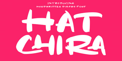 Hatchira is a Japan vibes handwritten display font. With reverse contrast stroke, fun character. To give you an extra creative work. Hatchira font support multilingual more than 100+ language. This font is good for logo design, Social media, Movie Titles, Books Titles, a short text even a long text letter and good for your secondary text font with sans or serif. Make a stunning work with Hatchira font. Cheers, Maulana Creative
 - Presser by Konstantine Studio,
$9.00 80s. , 90s, y2k, sometimes we just wonder, "what year is it today?" everything looks like we're going backward (in a good way though, calm down). Since luck is a form of preparation that meets a chance, again, we came up prepared. Introducing PRESSER. A new sans-serif family with the diverse vibes of nostalgia and modernism in one shot. ps: it's WIDE, like seriously wide, extended. We warned you.