10,000 search results
(0.034 seconds)
- Byblos by Wiescher Design,
$39.50 “Byblos” is the name of a town in Lebanon and the name of a famous hotel in St. Tropez. Some time ago I discovered their original logo in an old french magazine, just 5 by 3 centimeters small without any text, address, telephone number not even a picture. They did not need that, that’s how famous the hotel and its old logo was. Well they abandoned their identity when the place was sold to a big chain – I think. But the logotype, just those five letters inspired me to this new font. It evokes times past and has a little Bauhaus in it – as well as a really modern touch, all depends on the way you use it. Your strange typedesigner Gert Wiescher
 - United Kings by Mans Greback,
$59.00 United Kings is a masterfully crafted formal script font that exudes an air of perfection and fine art. Designed for high-end projects and showcasing genuine, authentic craftsmanship, this font brings an unparalleled sense of balance and beauty to your creative work. The exquisite, well-crafted letterforms of United Kings make it an exceptional choice for logotypes, professional branding, and artisanal projects that require a touch of finesse and sophistication. Use ¤ to make tail swashes, or multiple for longer swashes. Example: Kingdom¤¤¤ Use underscores _ anywhere in a word to make an underline. Example: Belo__ved Use # after any letter to give it a crown. Example: Que#en The United Kings font family includes six elegant styles to suit various design needs: The weights Thin, Regular and Bold, enabling your design to range from a delicate and graceful style for a refined touch, to a more bold, assertive and captivating presence for impactful designs. In addition to the thicknesses, each style is provided as Italic. Built with advanced OpenType functionality, United Kings ensures top-notch quality and provides you with full control and customizability. It includes stylistic and contextual alternates, ligatures, and other features to make your designs as unique and impressive as the font itself. United Kings offers extensive lingual support, covering all Latin-based languages, from Northern Europe to South Africa, from America to South-East Asia. It contains all the characters and symbols you'll ever need, including all punctuation and numbers.
 - Termit by Ditatype,
$29.00 Termit is a striking display font designed with a game theme, featuring large letters with a fairly thick weight and a rectangular shape with sharp corners. This font shows large letters that demand attention and create a bold statement. The rectangular shape with sharp corners in Termit adds a sense of structure and stability to the font. The clean lines and defined angles create a visually bold and impactful appearance. This unique feature evokes a sense of strength and resilience, reflecting the competitive and strategic nature of the gaming world. Each character shares the same height and width, creating a cohesive and pleasing visual experience. With its low-contrast design, it offers a subtle and understated look. The minimal variation in stroke width adds a sense of uniformity and simplicity to the font, allowing the overall design to take center stage. This feature ensures that the focus remains on the content while still maintaining a strong visual impact. Enjoy the available features here. Features: Stylistic Sets Multilingual Supports PUA Encoded Numerals and Punctuations Termit fits in headlines, logos, posters, titles, branding materials, print media, editorial layouts, website headers, and any other game-themed projects. Find out more ways to use this font by taking a look at the font preview. Thanks for purchasing our fonts. Hopefully, you have a great time using our font. Feel free to contact us anytime for further information or when you have trouble with the font. Thanks a lot and happy designing.
 - Black Wizard by Mans Greback,
$59.00 Black Wizard is a bold and funky sans-serif font that is perfect for adding a touch of playfulness to your designs. With its wobbly and uneven letters, Black Wizard exudes a playful and cartoonish quality that is sure to make your project stand out. This font is ideal for Halloween-themed designs, as its bold and scary appearance can add an extra element of spookiness to your work. But it's not all frights and scares - the funny and lighthearted nature of Black Wizard also bring a touch of humor. Black Wizard comes in four styles: Regular, Italic, Straight, and Straight Italic, giving you plenty of options to choose from for your design needs. Additionally, a Symbols font is included with various Halloween-themed symbols that can be added to your text to enhance the spooky vibe. Use the character ¤ anywhere in a word to make a Halloween symbol. Example: Scare¤Crow. To add different symbols like ghosts and bats, use multiple ¤ characters. Example: Dark¤¤¤Night. The font is built with advanced OpenType functionality and has a guaranteed top-notch quality, containing stylistic and contextual alternates, ligatures and more features; all to give you full control and customizability. It has extensive lingual support, covering all Latin-based languages, from Northern Europe to South Africa, from America to South-East Asia. It contains all characters and symbols you'll ever need, including all punctuation and numbers.
 - Turnkey by wearecolt,
$19.00 Turnkey is a modern grotesque typeface, it could be described as a neo-grotesque with hints of geometric shapes. A workhorse typeface designed to be versatile for both small and large sizes, ink traps have been used as a design feature above 26pt and a technical feature when printing small body text. The combination of 36 weights and styles allows you the freedom to create. Each weight includes extended support for over 90 languages (Including Cyrillic), fractions, tabular figures, arrows, ligatures, alternate glyphs, and more. Demo licenses are available from colttypeco.com In addition to a standard style set, the Turnkey family also has an italic set plus soft versions of both. Turnkey Soft is a slightly rounded version of the standard and italic, which looks more friendly, warm, and soft. It's corporate but with a personality. Current instances are: Turnkey Standard - Thin, Thin Italic, Extra Light, Extra Light Italic, Light, Light Italic, Regular, Regular Italic, Medium, Medium Italic, SemiBold, SemiBold Italic, Bold, Bold Italic, Extra Bold, Extra Bold Italic, Heavy, Heavy Italic. Turnkey Soft - Thin, Thin Italic, Extra Light, Extra Light Italic, Light, Light Italic, Regular, Regular Italic, Medium, Medium Italic, SemiBold, SemiBold Italic, Bold, Bold Italic, Extra Bold, Extra Bold Italic, Heavy, Heavy Italic When used as body type, Turnkey pairs well with: Take Note, Stroom and Markout. Turnkey is perfect for; headings, titles, body copy, logos, magazines, editorial design, corporate branding, brand identity, websites, blogs, apps, games, ebooks, publications, and signage. Turnkey can be found in the Typodarium 2024 OpenType features: Access All Alternates, Glyph Composition / Decomposition, Discretionary Ligatures, Denominators, Fractions, Kerning, Standard Ligatures, Localized Forms, Mark Positioning, Mark to Mark Positioning, Numerators, Proportional Figures, Scientific Inferiors, Stylistic Set 1, Stylistic Set 2, Stylistic Set 3, Subscript, Superscript, Tabular Figures. Support for 95 languages: Belarusian, Russian, Ukrainian, Afrikaans, Albanian, Asu, Basque, Bemba, Bena, Breton, Catalan, Chiga, Colognian, Cornish, Croatian, Czech, Danish, Dutch, Embu, English, Esperanto, Estonian, Faroese, Filipino, Finnish, French, Friulian, Galician, Ganda, German, Gusii, Hungarian, Inari Sami, Indonesian, Irish, Italian, Jola-Fonyi, Kabuverdianu, Kalenjin, Kamba, Kikuyu, Kinyarwanda, Latvian, Lithuanian, Lower Sorbian, Luo, Luxembourgish, Luyia, Machame, Makhuwa-Meetto, Makonde, Malagasy, Maltese, Manx, Meru, Morisyen, North Ndebele, Norwegian Bokmål, Norwegian Nynorsk, Nyankole, Oromo, Polish, Portuguese, Quechua, Romanian, Romansh, Rombo, Rundi, Rwa, Samburu, Sango, Sangu, Scottish Gaelic, Sena, Serbian, Shambala, Shona, Slovak, Soga, Somali, Spanish, Swahili, Swedish, Swiss German, Taita, Teso, Turkish, Upper Sorbian, Uzbek (Latin), Volapük, Vunjo, Walser, Welsh, Western Frisian, Zulu
 - Classical Romance by Ardyanatypes,
$10.00 Voila! This is it . . Classical Romance Decorative Serif Family Classic serif with 125 stylistic alternates for a uniquely vintage, yet modern feel. Each letterform has a slightly rough exterior that works beautifully to enhance Classical Romance’s soft, conventional details. This versatile display typeface has enough character for logos and branding, as well as headlines, apparel, alcohol labels, poster, online magazine, automotive, and much more. Keep it classic, or get decorative with ornate alternates for both uppercase and lowercase glyphs! This Classical Romance font was handwritten under the inspiration of traditional calligraphy and the wonderful magical vibe of Bali Island. Classical Romance brings more lovely old day vibes with 12 weights to matchmaking with your own style and it has Multilingual support (Western European characters) and works with the following languages: English, Danish, Dutch, Estonian, Faroese, Filipino, Finnish, French, German, Hungarian, Icelandic, Irish, Italian, Norwegian, Polish, Portuguese, Spanish, Swedish. Immerse more your arts in the classic feel with Classical Romance, and be classy! A guide to accessing all alternatives can be read at: http://adobe.ly/1m1fn4Y Features: A-Z Character Set a-z Characters set Numerals & Punctuations (OpenType Standard) Multilingual Thank you and have a nice day
 - Algerian Mesa by FontMesa,
$25.00 Inspired by the old Stephenson Blake Caps only font Algerian from 1908, this version, named Algerian Mesa, has been freshened up with a new matching lowercase. The original Algerian, on page 142 of the 1908 Stephenson Blake specimen book, was a small caps to a more decorative lining caps and the plain black version, without the shadow line, was named Gloria. Also on page 142 of the 1908 Stephenson Blake specimen book is a shaded Latin font that gave me the idea for the Alt version of Algerian Mesa. The Alt version works well at smaller point sizes combined with the regular Algerian Mesa font on the same page. New for 2016 were Opentype features including original alternates, oldstyle numerals and case sensitive forms, also new is a fully usable Alt version. New for 2022 are the higher x-height, 90% small caps, 80% small caps and all new italic versions. Also new for 2022 are straight sided accent marks replacing the flared or curved accents. While Algerian Mesa includes some alternates our related Tavern font will still remain the version with more alternates and more weights.
 - Hazel Page by Fromletterel,
$14.00 Hazel Page has natural stroke and casual look that gives youth and friendly vibes, suitable for branding, video editing material, printing and any other kind of designs
 - Alyanda by Nissa Nana,
$20.00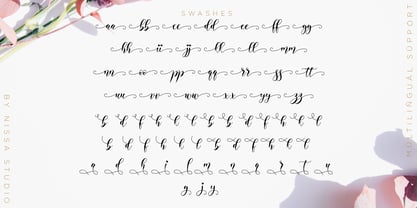 Alyanda is a beautiful script with a classy, elegant, and modern look. Fall in love with its authentic vibe, and turn any design project into a standout!
 - Reverberation JNL by Jeff Levine,
$29.00 Reverberation JNL and its slanted counterpart are a throwback to the 1970s and 1980s when fonts featuring horizontal white lines of varying widths implied movement or activity.
 - Guy Doodles by Outside the Line,
$19.00 Fun, illustrations of guy stuff. This font is another of the many doodle fonts from Outside the Line. Goes well with Diva Doodles and Diva Doodles Too.
 - Office Doodles by Outside the Line,
$19.00 Fun, little illustrations in line and reverse of what one finds in an office-- or at least my office. See Food Doodles for more matching little drawings.
 - Thunderblack by Dieza Design,
$11.00 Thunderblack is a type of display letter that is made with firm lines and angles. This font is very suitable when combined with various types of typography.
 - Zan Zan by Pitt's Hand,
$20.00 A fun font to create pop and young graphics, with a non-obvious font created starting from a handcrafted line. For an urban, snappy and fresh result.
 - Ankertill Brewer by PizzaDude.dk,
$20.00A nice legible, slanted handwritten font with occasional rough lines. That is exactly what Ankertill Brewer is! Use this font to copycat real handwriting with big success! - Aero Blend by Design A Lot,
$25.00 Meet AeroBlend Display Font, a modern and futuristic typeface that brings a touch of sleekness to your creative projects. With its clean lines, intersecting curves, and contemporary vibe, AeroBlend is the perfect typography solution for bold and innovative projects. Designed with precision, this font strikes the right balance between style and readability. It offers a single weight/style that effortlessly combines elegance with a touch of technological sophistication. This makes it incredibly versatile and suitable for a wide range of design applications. From attention-grabbing headlines to memorable branding projects, AeroBlend Display Font helps you make an impact. Its strong presence adds a sense of modernity to your designs, ensuring that your message stands out from the crowd. With AeroBlend Display Font, you have access to an extensive character set. It includes lowercase and uppercase letters, numerals, special characters, accented characters, and a variety of symbols. This comprehensive collection gives you the freedom to express your creativity and bring your vision to life with clarity and precision. Crafted with meticulous attention to detail, this font is available in the .OTF (OpenType) file format, ensuring compatibility across various design software and platforms. One of the notable features of it is its set of alternates. Certain letters have carefully designed alternatives, adding even more versatility and creative possibilities to your designs. Whether you’re a graphic designer, web developer, or simply a typography enthusiast, AeroBlend Display Font is a must-have in your toolkit. It’s crafted to meet the demands of modern design, offering versatility, legibility, and a hint of futuristic charm. It’s perfect for branding, headlines, posters, packaging, monogram designs and more. Take your projects to the next level with AeroBlend Display Font and unleash your creative potential. Let AeroBlend add a touch of modern sophistication to your designs and create an unforgettable visual experience.
 - Thrusters by Typodermic,
$11.95 Welcome to the world of Thrusters—the angular, twin-line display typeface inspired by the timeless classic, Space Duel. Thrusters is the perfect way to bring the retro, arcade vibes to your designs! This bold and futuristic typeface is the ultimate tribute to the iconic arcade legacy, and it’s available in four different forms that can be used as layers to create stunning multicolor effects. Whether you’re creating a high-energy video game title screen, a promotional poster for a local arcade, or even a custom t-shirt design, Thrusters has got you covered. With its sharp angles and sleek curves, Thrusters is sure to turn heads and capture attention. It’s the perfect way to add some excitement and nostalgia to any design project. So what are you waiting for? Blast off into the world of retro gaming with Thrusters today! Most Latin-based European writing systems are supported, including the following languages. Afaan Oromo, Afar, Afrikaans, Albanian, Alsatian, Aromanian, Aymara, Bashkir (Latin), Basque, Belarusian (Latin), Bemba, Bikol, Bosnian, Breton, Cape Verdean, Creole, Catalan, Cebuano, Chamorro, Chavacano, Chichewa, Crimean Tatar (Latin), Croatian, Czech, Danish, Dawan, Dholuo, Dutch, English, Estonian, Faroese, Fijian, Filipino, Finnish, French, Frisian, Friulian, Gagauz (Latin), Galician, Ganda, Genoese, German, Greenlandic, Guadeloupean Creole, Haitian Creole, Hawaiian, Hiligaynon, Hungarian, Icelandic, Ilocano, Indonesian, Irish, Italian, Jamaican, Kaqchikel, Karakalpak (Latin), Kashubian, Kikongo, Kinyarwanda, Kirundi, Kurdish (Latin), Latvian, Lithuanian, Lombard, Low Saxon, Luxembourgish, Maasai, Makhuwa, Malay, Maltese, Māori, Moldovan, Montenegrin, Ndebele, Neapolitan, Norwegian, Novial, Occitan, Ossetian (Latin), Papiamento, Piedmontese, Polish, Portuguese, Quechua, Rarotongan, Romanian, Romansh, Sami, Sango, Saramaccan, Sardinian, Scottish Gaelic, Serbian (Latin), Shona, Sicilian, Silesian, Slovak, Slovenian, Somali, Sorbian, Sotho, Spanish, Swahili, Swazi, Swedish, Tagalog, Tahitian, Tetum, Tongan, Tshiluba, Tsonga, Tswana, Tumbuka, Turkish, Turkmen (Latin), Tuvaluan, Uzbek (Latin), Venetian, Vepsian, Võro, Walloon, Waray-Waray, Wayuu, Welsh, Wolof, Xhosa, Yapese, Zapotec Zulu and Zuni.
 - Neutraface Slab Text by House Industries,
$33.00 From fine print and red ink in corporate annual reports to huge three dimensional signage, Neutraface has become the definitive designers’ workhorse. Now this geometric juggernaut boasts even more font firepower with the addition of the Neutraface Slab family. Neutraface Slab features five display weights, four text weights with italics plus a unique stencil style that work together like a typographic symphony or can stand alone like accomplished soloists. Just like its sans-serif counterparts, Neutra Slab Text includes small caps, seven figure styles and a host of other sophisticated OpenType features that have been integrated in a single seamless package. The complementary display weights afford an uncompromising statement that can range from thin and delicate to bold and bombastic. FEATURES: MORE ALTS: Neutraface Slab comes with several alternate characters, accessed through either OpenType stylistic sets or through the Stylistic Alternates feature. TITLING ALTERNATES: The distinctive lower crossbars of the original Neutraface are included in Neutraface Slab as the Titling Alternates OpenType feature. TEXT FIGURES: All variations of Neutraface Slab Text feature seven figure styles. Included are text figures for use in running text, lining figures for use with uppercase forms and small caps figures. Each of these styles is supplemented with tabular figures for use in columnar settings. Plus, superscript and subscript figures are included for use in fractions, footnotes, etc. NEUTRAFACE SLAB CREDITS: Typeface Design: Christian Schwartz, Kai Bernau, Susana Carvalho Typeface Production: Ben Kiel, Hannes Famira Typeface Direction: Christian Schwartz, Andy Cruz, Ken Barber Like all good subversives, House Industries hides in plain sight while amplifying the look, feel and style of the world’s most interesting brands, products and people. Based in Delaware, visually influencing the world.
 - Terfens Gothic by insigne,
$29.00 Terfens Gothic is the perfect choice for your next project! With its medium contrast and approachable design, this calligraphic sans serif has a classic feel that will never go out of style. Terfens Gothic is the perfect typeface for anyone looking to add a touch of uniqueness to their designs. With its generous x-height and rounded terminals, it's perfect for creating one-of-a-kind designs that are sure to impress. Its large x-height gives it a welcoming, but not too casual vibe. With forty-eight different typefaces, it has the versatility and aesthetic options you need to make your project stand out. Choose from regular, condensed, and extended styles, each with nine different weights and italics. Terfens Gothic has the look you need to make a powerful impression. Terfens is the ideal typeface for any project that has to stand out, thanks to its towering verticality. Terfens may be utilized for a variety of purposes because of its adaptable design. Terfens is a sans unlike any other- it starts with a beautiful calligraphic chancery script and then adds movement and personality. This sans is guaranteed to make your next project more exciting! The Terfens Type System's third typeface, Terfens Gothic, is an amazing addition to any type collection. The Terfens Type System's adaptability is unrivaled, with its vast choice of styles, widths, and weights. This font family has everything you need to create unique, customized designs that will suit your individual needs. Whether you need a narrow or wide font, or a hairline or bold weight, the Terfens Type System has you covered! And, with its Opentype features, the Terfens Type System is perfect for anyone who wants to add a personal touch to their projects.
 - Neutraface Slab Display by House Industries,
$33.00 From fine print and red ink in corporate annual reports to huge three dimensional signage, Neutraface has become the definitive designers’ workhorse. Now this geometric juggernaut boasts even more font firepower with the addition of the Neutraface Slab family. Neutraface Slab features five display weights, four text weights with italics plus a unique stencil style that work together like a typographic symphony or can stand alone like accomplished soloists. Just like its sans-serif counterparts, Neutra Slab Text includes small caps, seven figure styles and a host of other sophisticated OpenType features that have been integrated in a single seamless package. The complementary display weights afford an uncompromising statement that can range from thin and delicate to bold and bombastic. FEATURES: MORE ALTS: Neutraface Slab comes with several alternate characters, accessed through either OpenType stylistic sets or through the Stylistic Alternates feature. TITLING ALTERNATES: The distinctive lower crossbars of the original Neutraface are included in Neutraface Slab as the Titling Alternates OpenType feature. TEXT FIGURES: All variations of Neutraface Slab Text feature seven figure styles. Included are text figures for use in running text, lining figures for use with uppercase forms and small caps figures. Each of these styles is supplemented with tabular figures for use in columnar settings. Plus, superscript and subscript figures are included for use in fractions, footnotes, etc. NEUTRAFACE SLAB CREDITS: Typeface Design: Christian Schwartz, Kai Bernau, Susana Carvalho Typeface Production: Ben Kiel, Hannes Famira Typeface Direction: Christian Schwartz, Andy Cruz, Ken Barber Like all good subversives, House Industries hides in plain sight while amplifying the look, feel and style of the world’s most interesting brands, products and people. Based in Delaware, visually influencing the world.
 - Anatole France by Ingo,
$36.00 handwritten decorative variable font A few fonts already exist which have been drawn in accordance with the exact same principles. But these are just drawn - only drawn. The ANATOLE FRANCE retains the hand script character in spite of its stringent composition. An old portfolio of script patterns from the 1920s or 1930s, which appeared in the Georg D. W. Callwey Publishing House in Munich, includes among its pages one with a handwritten poster script, as was very typical for the 1920s. To begin with, there is the emphasized decorative character, which stands out due to stressing the stems. Next, the attempt to portray the character forms with the help of a few but always recurring basic elements is driven to the limits. Theoretically speaking, that which should have led to a contrived, geometrically determined type, obtains a likeable and pleasant look through the ductus of the manually guided brush. The classic version of ANATOLE FRANCE includes 5 fonts: Light, SemiLight, Normal, SemiBold, Bold. The variable font allows seamless font weights from 300 (Light) to 700 (Bold). Alternate letterforms are available through the appropriate OpenType features: style set 1 (O Q V) style set 2 (v w)
 - Bodrum Sans by Bülent Yüksel,
$19.00 You can download usiful link: Bodrum Sans PDF Type Specimen Bodrum Sans is a sans serif type family. Designed by Bülent Yüksel in 2018/19. The font, influenced by style serifs, popular in the 1920s and 30s, is based on optically corrected geometric forms for better readability. Bodrum Sans is not purely geometric; it has vertical strokes that are thicker than the horizontals, an “o” that is not a perfect circle, and shortened ascenders. These nuances aid in legibility and give Bodrum Sans a harmonious and sensible appearance for both texts and headlines. Bodrum Sans provides advanced typographical support for Latin-based languages. An extended character set, supporting Central, Western and Eastern European languages, rounds up the family. The designation “Bodrum Sans 14 Regular” forms the central point. "Bodrum Sans" is available in 10 weights (Hair, Thin, Extra-Light, Light, Regular, Meduim, Bold, Extra-Bold, Heavy and Black) and 10 matching italics. The family contains a set of 650+ characters. Case-Sensitive Forms, Classes and Features, Small Caps from Letter Cases, Fractions, Superior, Inferior, Denominator, Numerator, Old Style Figures just one touch easy in all graphic programs. Bodrum Sans is the perfect font for web use.
 - Bodrum Style by Bülent Yüksel,
$19.00 "Bodrum Style" is a serif Style family designed by Bülent Yüksel in 20018/19. The font, influenced by serif styles that were popular in the 1920s and 30s, is based on optically corrected geometric forms for a better readability. "Bodrum Style" is not purely geometric; it has vertical strokes that are thicker than the horizontals, an “o” that is not a perfect circle, and shortened ascenders. These nuances help the legibility and give "Bodrum Style" an harmonious and sensible appearance for both texts and headlines. Bodrum Style provides advanced typographical support for Latin-based languages. An extended character set - supporting Central, Western and Eastern European language - rounds up the family. “Bodrum Style 14 Regular” forms the central point. "Bodrum Style" is available in 10 weights (Hair, Thin, Extra-Light, Light, Regular, Medium, Bold, Extra-Bold, Heavy and Black) and 10 matching italics. The family contains a set of 650+ characters. Case-Sensitive Forms, Classes and Features, Small Caps from Letter Cases, Fractions, Superior, Inferior, Denominator, Numerator, Old Style Figures just one touch easy In all graphic programs. Bodrum Style is the perfect font for web use. Enjoy using it.
 - Bodrum Slab by Bülent Yüksel,
$19.00 “Bodrum Slab” is a slab serif type family. Designed by Bülent Yüksel in 20018/19. The font, influenced by style serifs, popular in the 1920s and 30s, is based on optically corrected geometric forms for better readability. “Bodrum Slab” is not purely geometric; it has vertical strokes that are thicker than the horizontals, an “o” that is not a perfect circle, and shortened ascenders. These nuances aid in legibility and give “Bodrum Slab” a harmonious and sensible appearance for both texts and headlines. Bodrum Slab provides advanced typographical support for Latin-based languages. An extended character set, supporting Central, Western and Eastern European languages, rounds up the family. The designation “Bodrum Slab 14 Regular” forms the central point. “Bodrum Slab” is available in 10 weights (Hair, Thin, Extra-Light, Light, Regular, Meduim, Bold, Extra-Bold, Heavy and Black) and 10 matching italics. The family contains a set of 650+ characters. Case-Sensitive Forms, Classes and Features, Small Caps from Letter Cases, Fractions, Superior, Inferior, Denominator, Numerator, Old Style Figures just one touch easy In all graphic programs. Bodrum Slab is the perfect font for web use.
 - King Tut by Canada Type,
$24.95 King Tut is a restoration and expansion of the original Egyptian Expanded, a single bold face cut in 1850 by Miller & Richard, the famous Edinburgh founders. This aesthetic, though originally issued to help drive simple print advertising of those days, is perhaps the longest lasting genre of typeface. This aesthetic flourished in the later part of the 19th century, helped by the surge of similar faces from England (such as Figgins' Antique 6 and Expanded Antique), and became the defining index of the old American wild west that continues to this very day. King Tut serves up its impact through a balance between the wide, compact letterforms and elegant curvature that manages to come through even in confined areas. The family's weight variety allows for more options in counterspace use as well as precision in the amount of curve definition and contrast needed by the typographer. The lighter weights completely oppose that 19th century boldness and expose the alphabet's skeleton in a strive for simplicity that fits modern applications. With generous language support to boot, King Tut's diverse offerings make it an essential addition to today's designer repertoire.
 - Untitled - Unknown license

- Far Away, So Close - Unknown license

- Stamina by Studio K,
$45.00 Bold and compact, Stamina is a solid, sporty font that punches beyond its weight. Ideal for product logos, headlines and signage, it has both power and panache!
 - Gabton Malgora by Letterena Studios,
$17.00 Gabton Malgora is a bold and stylish serif font. This font is PUA encoded which means you can access all of the glyphs and swashes with ease!
 - Revorioum by Seventh Imperium,
$35.00 Revorioum has a classical bold contemporary typeface with a dynamic and flexibility touch, it is equipped with lots of opentype features making it easy to play with.
 - Valiante by Gerald Gallo,
$20.00 Valiante is a bold contemporary sans serif font. It is ideal for headlines, titles, branding, small blocks of text or wherever a fresh new look is desired.
 - Price Tag by Turtle Arts,
$20.00Price Tag is a bold, graphic alphabet inspired by labels and vintage price tags. A touch of grunginess makes this alphabet look extra cool in larger sizes. - Highriser by Nicolas Deslé,
$19.90 Highriser is a highly legible, uppercase-only bold condensed sans. Designed to be used for headlines, or visual identities, both digital and print. One weight, fits all.
 - BD Pankow by Typedifferent,
$25.00 BD Pankow is inspired and designed during a stay in Berlin. It’s an uppercase alphabet with alternates. Bold, rock-solid, modern and ideal for branding and titling.
 - Margie by Solotype,
$19.95Originally issued as Marggraff Bold Script by the Dresden foundry of A.G. Vorm Brüder Butter. Minor variations were given to a few letters to even the color. - KP Duty JNL by Jeff Levine,
$29.00KP Duty JNL emulates the lettering found on military equipment. It's a bold and macho design, perfectly suited for any project which has an armed forces theme. - Loyola Pro by RodrigoTypo,
$30.00 It is a redesign of "Loyola". This family contains Light, Regular, Bold, ExtraBold, Black, also a set of shadows and dingbats, special for short titles and children.
 - Podunk JNL by Jeff Levine,
$29.00The term "podunk" usually refers to a small, insignificant town. In this case, Podunk JNL refers to a bold and brash font that resembles cut-paper characters. - Bell Centennial by Linotype,
$40.99Bell Centennial was created by Matthew Carter in 1976 for the American telephone company Bell. Its bold, clear characters make it an extremely legible and distinctive font. - Hiew by Okaycat,
$29.95 Okaycat presents "Hiew". Hiew is a connected font with serif, some bold personality making your message clear. Includes European accents and extra characters to meet publication needs.

