10,000 search results
(0.059 seconds)
- Rabona by AcidType,
$15.00 Rabona is a typeface for designers; easy to implement, clean and utilisable. A quintessentially modern geometric san-serif, filtered through a gently humanist lens.
 - Shatter by ITC,
$40.99 A basic sans serif letterform was used to create the impression of broken glass in this unique typeface. Created by talented designer Vic Carless.
 - Rolhausen by Patria Ari,
$12.00 Rolhausen is a Sans Serif Typeface which is suitable for you who needs a typeface for headline, logotype, apparel, invitation, branding, packaging, advertising etc.
 - Endast by Cercurius,
$19.95 Sans-serif reversed capitals in outlined circles, resembling old-fashioned typewriter keys. Intended for logos and signs, and for enhancement in lists and maps.
 - KG LET HER GO by Kimberly Geswein,
$5.00 Tall, chunky title-friendly sans serif capitals in 3 styles. Use all caps for even lettering or alternate caps and lowercase for bouncy lettering.
 - Tomino by Mans Greback,
$59.00 Tomino is a dot serif, or a sans-serif decorated with dots. It's wide and clear, and works great in small and large sizes.
 - Illuminati by Fatchair,
$9.95Originally designed as an experiment in monospacing (Illuminati Mono), Illuminati is a mixture of sans-serif and serif. The Italics have some cursive features. - Geopa by Baqoos,
$15.00 Geopa is a fractional conversant tech sans apt for headline, editorial, branding, packaging, printed materials and typographic applications. 200+ glyphs with ligatures and fractions.
 - Brilliante by Gerald Gallo,
$20.00 Brilliante is a geometric, uniform stroke, sans serif font with rounded end strokes. It is ideal for headlines, titles, branding, small blocks of text.
 - Maesgo by Baqoos,
$12.00 Maesgo is a bodacious joculatory linear sans apt for headline, editorial, branding, packaging, printed materials and typographic applications. 200+ glyphs including punctuation and numerical.
 - Traklin MF by Masterfont,
$59.00 Great sans text font family for all your needs, text, signage, logos etc. Very elegant and suitable for classic as well as formal design.
 - Auxilia by Typomancer,
$20.00 Auxilia is a geometric sans serif font with a bit of humanist feeling, comes with various weights and condensed width for all purpose design.
 - Rugen by Variatype,
$12.00 Rugen is an urban all-caps sans serif that perfectly matches your branding project and more. FONT FEATURES Additional Accents 66 Languages Kerning Alternates
 - Final Edition JNL by Jeff Levine,
$29.00 A classic sans grotesk wood type design, Final Edition JNL was modeled from actual headlines found in online examples of an old daily newspaper.
 - Kernig Braille by Echopraxium,
$5.00 This font is the younger sister of HexBraille with which it may be combined to create new patterns. This also explains why their introductory text are similar. Introduction The purpose of this monospace font is to display braille in an original and "steganographic" way. The Kernig prefix means "Robust" in German, this is because of the crank shapes . The core of the glyph design is a flat hexagon which can be read as 3 rows of 2 dots (i.e. regular braille glyph grid). Even if within a glyph, braille dots ("square dots" indeed) are placed on the vertices of a flat hexagon, the difference with HexBraille is that edges connecting vertices are not straight lines but "crank shapes" instead. This can be summarized by saying that the whole glyph is a Hexcrank (a flat hexagon where vertice pairs are connected by a crank shape) NB: The initial design is illustrated by glyphs 'ç' (no dot) and 'û' (6 dots) as shown by poster 6. A. "Kernig Lattice" In KernigBraille, glyphs are connected to each other, thus for each Hexcrank glyph there are 6 connections: 2 on left/right and 4 on top/bottom. In the final design some cranks were removed for esthetical reason (i.e. leave empty space for allowing patterns diversity). In summary, a text using this font won't display a honeycomb but a lattice instead. NB: Please notice that in order to obtain the lattice without vertical gaps, you must set the interline to 0. The lattice is made from 3 kind of shapes: a.1. Hexcrank a.2. Square a.3. Irregular cross (mostly unclosed) The design favored squares over crosses. The whole slightly resembling a PCB. B. Text Frames It's possible to frame the text with 4 sets of frame glyphs (as illustrated by poster 2) b.1. Kernig { € ° £ µ § ¥ ~ ¢ } b.2. Rectangular-High { è é ê ï î à â ä } b.3. Rectangular-Low { Â ù Ä Ê Ë Ô õ ö } b.4. Mixed Kernig+High: a mix of Kernig and Rectangular-High frame glyphs When using frame glyphs, it is advised to show Pilcrow (¶) and Non Breaking Space, which are replaced by empty shapes in this font (e.g. in Microsoft Word, use CTRL+8 or use [¶] button in the ribbon).
 - Pierrot by Linotype,
$29.00Günter Jäntsch designed Pierrot in 1973. Its irregular flowing letterforms express the design from this time, where many personal irregular designs had been made. Pierrot is suitable for invitation cards, posters and signage. - ITC Ellipse Neo by Typorium,
$30.00 The Typorium presents a new optimized and enriched version of ITC Ellipse which first appeared in 1996 in the International Typeface Corporation typeface library. ITC Ellipse Neo design has been lightly modified. Three weights have been added (light, Medium, Extra Bold, including Italics) to the original Regular and Bold styles. ITC Ellipse Neo is both modern and classic. Modern in the unusual shape based on the geometric ellipse form. And classic in the structure of some letters like the lower cases c, e, g, o, s. These letters alone could come from a traditional typeface, but they fit perfectly with the atypical rest of the alphabet giving it a present-day and traditional mix. Furthermore, the ellipse shape fits naturally in the italic styles, giving the font an organic and fluid feeling. ITC Ellipse Neo offers OpenType features such as alternate characters for upper and lower case, and an extended accented character set to support many languages. Five weights have been created for each style to offer a wide range of graphic possibilities in a tidy digital footprint. Designer: Jean-Renaud Cuaz Publisher: Typorium MyFonts debut: December 15, 2020 Le Typorium présente une nouvelle version optimisée et enrichie d'ITC Ellipse qui est apparue pour la première fois en 1996 dans la bibliothèque de caractères de l'International Typeface Corporation. Le design de ITC Ellipse Neo a été légèrement modifié. Trois graisses ont été ajoutées (léger, moyen, extra gras, y compris les italiques) aux styles originaux Regular et Bold. ITC Ellipse Neo est à la fois moderne et classique. Moderne dans le dessin inhabituel basé sur la forme géométrique de l’ellipse. Et classique dans la structure de certaines lettres comme les minuscules c, e, g, o, s. Ces lettres pourraient provenir d'une police de caractères traditionnelle, mais elles s'intègrent parfaitement avec le reste de l'alphabet plus insolite en lui donnant un mélange de modernité et de tradition. De plus, la forme de l'ellipse s'intègre naturellement dans les styles italiques, donnant à la police une sensation organique et fluide. ITC Ellipse Neo offre des fonctionnalités OpenType telles que des caractères alternatifs pour les capitales et les bas de casse, et un jeu de caractères accentués étendu pour prendre en charge de nombreuses langues. Cinq graisses ont été créés pour chaque style afin d'offrir un large éventail de possibilités graphiques pour une empreinte numérique rigoureuse.
 - Balboa by Parkinson,
$20.00 Balboa is a display design combining elements of early sans serif and grotesque types with contemporary types. It evolved from ATF Headline Gothic, Banner (a headline typeface I drew for the San Francisco Chronicle), and Newsweek No.9, a Stephenson Blake-like grotesque I designed for Roger Black's 1980 redesign of Newsweek Magazine. There are nine styles, including the three new styles that have been added in 2014: Medium, Light and Ultra Light.
 - Burgundy by Sarid Ezra,
$17.00 Introducing, Burgundy - Curly Sans Serif with a bunch of alternates! Burgundy is a sans serif based typeface that have curly and elegant looks with a bunch of alternates that will make your presentation or logo even more stunning and stand out! This font is so fit for wedding invitation or celebrations. Burgundy also support Multi Language and already PUA Encoded! Features Uppercase & Lowercase Number & Symbol Multi language Alternates for each characters PUA Encoded
 - New West by Fontysia,
$15.00 New West is a modern clean soft round sans serif font. With bold stroke, fun character. To give you an extra creative work. New West font support multilingual and ligatures. This font is good for logo design, branding design, Social media, Movie Titles, Books Titles, a short text even a long text letter and good for your secondary text font with sans or serif. Make a stunning work with New West font.
 - Nickels by Maulana Creative,
$15.00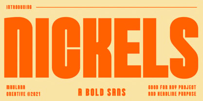 Nickels is a Fancy Bold Sans Serif font. fun character with a bit of ligatures. To give you an extra creative work. Nickels font support multilingual more than 100+ language. This font is good for Headline, logo design, Social media, Movie Titles, Books Titles, a short text even a long text letter and good for your secondary text font with sans or serif. Make a stunning work with Nickels font. Cheers, MaulanaCreative
 - Visuela by Maulana Creative,
$14.00 Visuela is a modern clean soft round sans serif font. With bold stroke, fun character. To give you an extra creative work. Visuela font support multilingual more than 100+ language. This font is good for logo design, Social media, Movie Titles, Books Titles, a short text even a long text letter and good for your secondary text font with sans or serif. Make a stunning work with Visuela font. Cheers, Maulana Creative
 - Boscha by Maulana Creative,
$17.00 Boscha is a condensed sans serif font. With medium tall stroke, fun character with a bit of ligatures. To give you an extra creative work. Boscha font support multilingual more than 100+ language. This font is good for logo design, Social media, Movie Titles, Books Titles, a short text even a long text letter and good for your secondary text font with sans or serif. Make a stunning work with Boscha font. Cheers, Maulana Creative
 - Susan by ParaType,
$30.00 An original text and display type family was designed for ParaType in 2007 by Manvel Shmavonyan. The face was named after the designer’s wife. This is an open sans serif font with soft letterforms distinguished by rounded details resembling rudimentary serifs. The family contains true italics developed like in humanist sans serif fonts. Susan is well suited for short and middle range text composing as well as for use in advertising and display typography.
 - Aron by Artisticandunique,
$12.00 Aron - Sans Serif Font Family - Multilingual supports - 6 Style Aron Sans serif font family, with is geometric structure and 6 styles, helps you create many alternatives in your creative projects. It is also assertive about being a highly readable font with different weights in creating striking and powerful titles. Ideal for books and magazines, editorials, headlines, websites, logos, branding, advertising and more. If you have a question, please contact me. Have a good time.
 - Morque by Craft Supply Co,
$20.00 Morque – Sans Serif Font: Bold and Expressive Boldness in Every Letter: Morque – Sans Serif Font stands out with its all caps design. It’s perfect for impactful titles and displays. This font commands attention in any visual space. Ideal for Titles and Displays: Morque’s bold structure makes it ideal for titles and visual displays. It enhances the readability of headlines. This font is a go-to for designers aiming for a strong statement.
 - Sorren by Reserves,
$49.00 Sorren is a definitive bold condensed sans influenced by neo-grotesque designs. A relatively low stroke contrast complimented with sharp, horizontal stroke ends lend an unyielding appearance, while it’s rounded forms and refined curves juxtapose its inherent strength with grace. Stylistically, Sorren has a classic, timeless feel with a contemporary finish and attention to detail. It is characteristically more elegant and considerably sturdier than the typical condensed sans, lending to its singular disposition.
 - Spoodbrush by Dhan Studio,
$20.00 Spoodbrush is a new lowercase brushed textured font family designed to perfectly combine the different styles with one another and allow you to create beautiful designs with a personal touch. It also contains some ligatures and swashes and additionally a Spoodbrush Sans style. Perfect for branding, logos, product packaging, posters, invitations, greeting cards, news, blogs, and everything requesting personal charm. Fonts Included : Spoodbrush One Spoodbrush Two Spoodbrush Bold Spoodbrush Slant Spoodbrush Sans Spoodbrush Extra
 - Migo by Maulana Creative,
$29.00 Migo is a modern sans display font. With three weight stroke, fun character with a bit of ligatures. To give you an extra creative work. Migo font support multilingual more than 100+ language. This font is good for logo design, Social media, Movie Titles, Books Titles, a short text even a long text letter and good for your secondary text font with sans or serif. Make a stunning work with Migo font. Cheers, Maulana Creative
 - Arkarna by Gatra Std,
$10.00 Introducing a cute handwriting "ARKARNA" Simple Sans-Serif Font! If you are needing a touch of casual modern San-Serif for your designs, this font was created for you! What's Included: Uppercase and Lowercase Number and Punctuation Support Language This font works best in a program that supports OpenType features such as Adobe Indesign, Adobe Illustrator CC and CS, or Adobe Photoshop CC and CS also CorelDraw Multilingual Support is included for Western European Languages
 - Choegs by Maulana Creative,
$16.00 Choegs is a distressed sans font. With bold stroke, fun character with a bit of ligatures and alternates. To give you an extra creative work. Choegs font support multilingual more than 100+ language. This font is good for logo design, Social media, Movie Titles, Books Titles, a short text even a long text letter and good for your secondary text font with sans or serif. Make a stunning work with Choegs font. Cheers, Maulana Creative
 - Mangiola by UICreative,
$23.00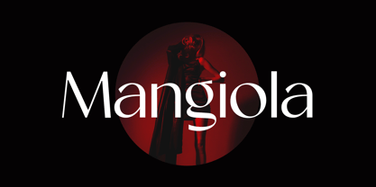 Introducing our new product the name Mangiola Modern Sans Serif Font Family comes with 9 different weights. Modern Sans Serif font that feels beautiful classy, elegant, and modern. This font is perfectly suited for a wide variety of projects, such as signature, stationery, logo, wedding, typography quotes, magazine or book covers, website headers, clothing, branding, packaging design, and more. Also for fashion-related branding or editorial design and displays both masculine and feminine qualities.
 - Easysans by Gassstype,
$23.00 Introducing Easysans is a All Caps Handmade Sans Serif Font,Textured Sans Serif Font that is written casually and quickly. Letters are made with brushes on Procreate. Then crafted carefully drawn into vector format. That is why Easysans has charming, authentic and relaxed characteristic more natural look to your text with a more natural look to your text,design more interesting. Easysans is perfect for homeware designs,branding projects, Logo design, Quotes product packaging
 - Galvanizer by UICreative,
$23.00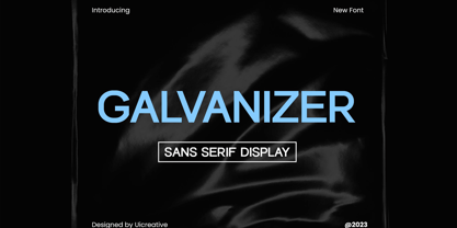 Introducing our new product the name Galvanizer Sans Serif Display Family Font comes with 9 different weights. Modern Sans Serif font that beautiful classy, elegant, and modern. This font is perfectly suited for a wide variety of projects, such as signature, stationery, logo, wedding, typography quotes, magazine or book covers, website headers, clothing, branding, packaging design, and more. Also for fashion-related branding or editorial design and displays both masculine and feminine qualities.
 - Monotype News Gothic by Monotype,
$40.99 Similar in design to Franklin Gothic, News Gothic was one of a number of sans serif faces manufactured by American Type Founders in the early years of the twentieth century. Initially cut as a light sans, heavier versions were made in the 1940s and 50s along with some condensed weights. The News Gothic font family offers an uncomplicated design that is well suited for use in newspapers and magazines for headlines and in advertisements.
 - Skala Display by Hazztype,
$20.00 Skala is a contemporary display, semi condensed, semi sans serif. It has unique diagonal stress, pointy bowls, and terminals, mixing straight and bowed stems. The unique style of Skala makes it look masculine, tough, and strong. Inspired by earlier semi-serif typefaces, Skala mixed and matched serif and sans serif characters that bring attention to any design which makes this display font a great option for logos, labels, signs, headlines, business cards, etc.
 - Bergsland Fashion by Hackberry Font Foundry,
$24.95 This is a stylized sans serif font family that is very high-waisted and sleek. The stroke is only slightly modulated. The letterforms are higher, with a more open aperture, and sprinkled with breaks to add light and sparkle. This an attempt at a readable sans serif for text. It has many OpenType features and 465 characters per font: Caps, lower case, small caps, old style figures, numerators, denominators, accents characters and so on.
 - Fieldstones by UICreative,
$23.00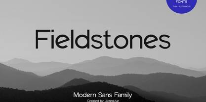 Introducing our new product the name Fieldstones Sans Serif Font Family comes with 9 different weights. Modern Sans Serif font that beautiful classy, elegant, and modern. This font is perfectly suited for a wide variety of projects, such as signature, stationery, logo, wedding, typography quotes, magazine or book covers, website headers, clothing, branding, packaging design, and more. Also for fashion-related branding or editorial design and displays both masculine and feminine qualities.
 - Monotype News Gothic Paneuropean by Monotype,
$92.99Similar in design to Franklin Gothic, News Gothic was one of a number of sans serif faces manufactured by American Type Founders in the early years of the twentieth century. Initially cut as a light sans, heavier versions were made in the 1940s and 50s along with some condensed weights. The News Gothic font family offers an uncomplicated design that is well suited for use in newspapers and magazines for headlines and in advertisements. - Rydero by Maulana Creative,
$14.00 Rydero is softest sans serif font ever character with a bit of ligatures and alternates. To give you an extra creative work. Rydero font support multilingual more than 100+ language. This font is good for logo design, Social media, Movie Titles, Books Titles, a short text even a long text letter and good for your secondary text font with sans or serif. Make a stunning work with Rydero font. Cheers, Maulana Creative