10,000 search results
(0.044 seconds)
- Diomeca by Pandastock,
$12.00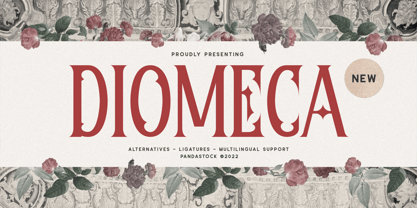 Diomeca is modern fonts with visual elegance, smooth curves and beautiful ligatures clear, making your work look true and attractive. A very versatile font that works in both large and small sizes. This font is suitable for a wide variety of projects such as invitations, logo, branding, magazine, photography, card, product packaging, mugs, quotes, poster, label, signature and more. Font which is perfect for all business sectors including personal projects, studio, corporate, creative agency, industrial, company, etc.
 - Jonueir by Pandastock,
$12.00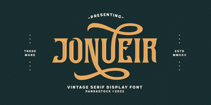 Jonueir is modern typeface with visual elegance, smooth curves and beautiful ligatures clear, making your work look true and attractive. A very versatile font that works in both large and small sizes. This font is suitable for a wide variety of projects such as invitations, logo, branding, magazine, photography, card, product packaging, mugs, quotes, poster, label, signature and more. Font which is perfect for all business sectors including personal projects, studio, corporate, creative agency, industrial, company, etc.
 - Misses Twiggs by Type Innovations,
$39.00 Misses Twiggs is a contemporary modern serif created by the American type designer Alex Kaczun. It compliments its partner Mister Twiggs and is a perfect marriage of two fonts. Mister Twiggs brings his tall good looks and Misses Twiggs bring her cute little serifs to the relationship. There are absolutely no curves in these elegant typefaces. Both fonts have sharp corners with extra tall capitals and narrow waistlines. Misses Twiggs also comes in 3 flavors: regular, thin and heavy.
 - Silk Goned by Imoodev,
$20.00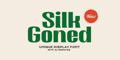 Silk Goned is cool modern fonts with visual elegance, smooth curves, and beautiful ligatures clear, making your work look true and attractive. A versatile font that works in both large and small sizes. This font is suitable for a wide variety of projects such as invitations, logos, branding, magazine, photography, card, product packaging, mugs, quotes, poster, labels, signatures, and more. A font which is perfect for all business sectors including personal projects, studio, corporate, creative agency, industrial, company, etc.
 - Avelia by Fatih Güneş,
$16.00 Avelia is a high contrast typeface with multilingual applications. Slender lines and great legibility make it perfect as a display font. With curves in all the right places, it is great for editorials and other commercial use. Avelia decorative font consists of 426 characters, including uppercase, lowercase, numbers, small caps, ligatures and accents. With its condense character, Avelia is very effective and useful for uses in works such as Packaging, Logo design, Headlines and derivatives of modern Art Deco.
 - Bloomsburg by Sharkshock,
$115.00 Bloomsburg is a sharp, modern, everyday font with a multitude of uses. This family is characterized by its high legibility, delicate curves, and vertical cuts to most lowercase terminals. Its humanist features are most evident in the lightest versions making it a versatile choice for showcasing warmth and personality. Use Bloomsburg for eye catching headlines or try the Bold version for a company logo. A wide range of languages are supported including European accents and Cyrillic characters.
 - Macis by Stabenfonts,
$30.00 Macis is a real-and-fake-retro-modern font-family containing five weights from thin to black. It is inspired by shop signs, packaging and typography from around the middle of 20th century. Though it is strictly geometrically constructed, it contains some hand-crafted influences as well as some irregularities. Some say, it dances on the baseline, ’cause the bowls and curves reach far out over the stems. Use it in big sizes, especially the extreme weights!
 - The Morydane by Letterhend,
$19.00 Introducing Morydane a script font perfect for designers looking for a modern and casual style. With its clean lines and flowing curves, this font is ideal for adding an interesting touch to your designs,especially in logo, and the other various formal forms such as invitations, labels, logos, magazines, books, greeting / wedding cards, packaging, fashion, make up, stationery, novels, labels or any type of advertising purpose. Features : Uppercase & lowercase Numbers and punctuation Alternates & Ligatures Multilingual PUA encoded
 - Durer Display by iframe,
$28.00 Durer is a modern font, its soft curves and refined details create a sense of elegance. Inspired by the work of Albrecht Dürer (21 May 1471 – 6 April 1528), who was a German painter, printmaker, and theorist of the German Renaissance. Born in Nuremberg, Dürer established his reputation and influence across Europe in his twenties due to his high-quality woodcut prints. 551 Glyphs Upper / lower case, numbers, punctuation Language support: Latin / Greek Designed by iframe type foundry
 - Vokrad by Imoodev,
$20.00 Vokrad is modern vintage font with visual elegance, smooth curves, and beautiful ligatures clear, making your work look true and attractive. A very versatile font that works in both large and small sizes. This font is suitable for a wide variety of projects such as invitations, logos, branding, magazine, photography, card, product packaging, mugs, quotes, poster, labels, signatures, and more. A font that is perfect for all business sectors including personal projects, studio, corporate, creative agency, industrial, company, etc.
 - Oblonga by Eurotypo,
$28.00 Oblonga shows thin, elegant lines. The continuity of the trace is only suggested through the curves of the letters, a soft effect of bonding that maintains the identity of each character. Oblonga is an Art-Déco font proposed in a modern key, a revival performed without aggression. More than three hundred glyphs (regular and Italic) that ensure legibility in Central-European and Slavic languages, enriched by some appropriate discretionary ligatures that enhance the charme of a time gone away.
 - Argot by K-Type,
$20.00 Argot is inspired by condensed grotesque letterforms and would be a monolinear sans except for an unorthodox disparity between inner and outer shapes. Elegantly curved outlines contrast starkly with austere rectangular counters, suggesting a no-frills functionality, 20th century modernism, or an unsettling discordance. The squared off inner spaces also add clarity and crispness. Argot is available in three widths — Wide, Normal and Narrow. Each width is supplied in three weights — Regular, Bold and Black — with corresponding italics (obliques).
 - Gunar by The Northern Block,
$39.00 A geometric sans serif with a square chiseled appearance. Precise curves are met with straight lines and tapered angles to produce a fresh, technical typeface. It’s large x-height and neutral width give it good legibility at small point sizes. These refined rectangular features make it ideally suited to a wide range of modern applications. Details include 550 characters with alternative lowercase a, e, g and y. 5 variations of numerals, manually edited kerning and Opentype features.
 - Brignell Sunday by IB TYPE Inc.,
$40.00 BRIGNELL SUNDAY is an eight font family designed by Ian Brignell. A relaxed, easy-reading companion for any day of the week. A clean, modern, friendly sans serif characterized by an open style with occasionally rounded corners, occasional curved junctures on diagonals and a slightly sloped lower case A. Brignell Sunday was born in 2006 and was inspired by corporate custom font ideas Ian designed for an LG Electronics sub-brand called Best Shop. Extended Latin set.
 - Rockabilly by TypeCase.std,
$17.00Rockabilly is a modern, minimalist serif that works beautifully in modern design pieces, clean lines; serifs are modern, and a little vintage. Looks great in logo work, magazine titles, books and printed materials. - Alchemila by Heyfonts,
$18.00 Alchemila "UNIQUE serif modern font" likely refers to a typeface that combines elements of traditional serif design with contemporary and distinctive features. Serif fonts have small lines or strokes attached to the ends of characters, which can contribute to a more formal or traditional appearance. The term "modern" in this context typically implies a contemporary or updated style. Here's an explanation of the characteristics and significance of a UNIQUE serif modern font: -Serif Elements: Serifs are the small lines or strokes at the ends of characters, and they are a hallmark of traditional typography. In a UNIQUE serif modern font, these serif elements are likely to be present but may have a distinctive shape or style that sets them apart from more conventional serif fonts. -Contemporary Design: The "modern" aspect of the font suggests a contemporary or updated design. This may involve a departure from the more classical serif styles seen in traditional typefaces, incorporating modern design principles, cleaner lines, and a more minimalist aesthetic. -Distinctive Characters: A UNIQUE serif modern font is likely to feature characters with unique and individual design elements. This could include unconventional serifs, letter shapes, or other stylistic details that make the font stand out and contribute to its uniqueness. -Versatility: While serif fonts are often associated with formality and readability, a UNIQUE serif modern font may offer versatility suitable for a range of design applications. It could be used in both traditional and modern contexts, providing flexibility for various design projects. -Applicability to Branding: Fonts play a crucial role in branding, and a UNIQUE serif modern font could be an excellent choice for businesses or projects that want to convey a sense of tradition and reliability while maintaining a contemporary and innovative image. -Digital and Print Design: Modern serif fonts are often designed with both digital and print applications in mind. The clarity of the typeface, even at smaller sizes, and its aesthetic appeal make it suitable for a variety of design projects, from websites and apps to print materials like brochures and posters. -Attention to Detail: The uniqueness of the font may be reflected in the careful attention to detail in each character. This could include refined curves, balanced proportions, and other design elements that contribute to the overall visual appeal and readability of the font. -Available Features: Unique serif modern fonts may come with additional features, such as alternative characters, ligatures, or stylistic sets, allowing designers to customize the appearance of the text for specific design needs. When selecting or working with a UNIQUE serif modern font, designers should consider the overall design goals, the intended audience, and the context in which the font will be used
 - Trypillya 2D by 2D Typo,
$36.00 This ornamental font is the interpretation of ornaments of Trypillya culture. Trypillya culture, or Cucuteni-Trypillya is an archaeological culture of neolithic times. Its name derives from the name of the village of Trypillya nearby Kyiv. This culture experienced its culmination between 5500 and 2750 BC. The Trypillians lived in the territories between the Carpathian Mountains and the Dniper River of the modern Ukraine, Moldova and Romania. Many interesting ceramics decorated with original geometric ornaments survived to amaze us. Its heritage is still a little unknown to the public and therefore the patterns that are reproduced in this font have no analogues in the digital format.
 - Monotalic by Kostic,
$30.00 Monotalic was created as a fun experiment, exploring better solutions for the monospaced type design. Most monospaced (fixed-width) typefaces have the same main design problem regarding the lowercase – filling the empty space around l, f, i, j and r. That usually brings the addition of slab serifs to those narrow characters, causing many monospaced fonts to look and feel alike. Monotalic solves that problem by adopting the handwritten (or cursive) form for those problematic characters, which allows them to be defined in more strokes, thus getting a better distribution of form in that fixed-width space. On the other hand, cursive writing usually lacks the legibility of a Roman (Regular upright) style, so Monotalic was created to be a hybrid, taking the best of both worlds. Monospaced fonts today are mostly used for coding. Modern code editors use colored text in order to differentiate between different kinds of code. So, in that environment there’s actually no need for traditional text styling by adding Italics, Bold or other styles, because the code lines are overstated as it is. That is why Monotalic focuses on one style only, in three widths and four weights. The weights allow users to choose the perfect contrast of text on screen, depending on their monitor resolution and background color in the editor. Movie scripts are almost exclusively set in 12pt Courier. It became the industry standard because when set in the specific “screenplay format" it helps with the breakdown of the schedule and budgeting process of the film production. Although it looks completely different, text set in Monotalic (Normal width) will take the same amount of space as Courier.
 - Octagen Condensed by deFharo,
$11.00 Octagen is a family of 16 condensed Sans Serif fonts of geometric construction and neo-Gothic style with short descenders and a humanistic finish in the curves and auctions of the tiny letters to avoid the coldness of the grotesque typographies, providing expressiveness, energy, warmth and docility , resulting in a friendly typography with a lot of personality and readability, specially drawn for the composition of short and medium texts, signage or headlines where horizontal space saving is needed. The typography has 529 glyphs (Latin Extended-A) with advanced OpenType functions, several number games, a complete set of neutral-style alternative lower case letters and the Bitcoin symbol. For Octagen cursive styles I used a set of lowercase letters without terminal finishes, more neutral than the regular versions, this being compensated by the expressiveness of the italics inclination, thus achieving important morphological, coherent differences within the conceptual development of this typographic family.
 - Geefray by Muksal Creatives,
$12.00 Geefray is a Modern Sans Serif A new Sans serif that we created special for branding needs, with extra ligature in unique shape add value of your brand. It so nice to leverage designer or product owner that need solutions to make their design look more stylish and modern.We prepared any ligatures, characters to help you create unlimited variations for your creative needs.
 - Cooper BT by ParaType,
$30.00Bitstream Cooper was designed at Bitstream in 1986 by means of adding light, medium, and bold styles, with the corresponding italics, to the existing black ones. Based on Cooper Black, 1919, by Oswald Bruce Cooper, which was firstly released as a hand composition font in 1922 by Barnhart Brothers & Spindler of Chicago and later spread by ATF. Cooper Black is an extra bold face based on Cooper Old Style. Bitstream Cooper is an old style face with rounded serifs and tilted back ovals. For use both in text (normal weights) and in advertising and display typography (heavy weights). Cyrillic version was developed for ParaType in 2000 by Manvel Shmavonyan and based on TM Oswald face of TypeMarket, 1996, by Victoria Grigorenko. - MondoRedondo - Unknown license

- Agile Jewelry by Nathatype,
$29.00 Agile Jewelry a stylish, modern display serif font to give you informal, modern impressions. The characteristics of this font are the extra hooks on the letters’ edges and some of the letters have curvy ending wipes. The thick and thin lines on every letter are clearly visible. For a legibility reason, apply this font for big-sized texts instead of the body texts. Features: Stylistic Sets Ligatures Multilingual Supports PUA Encoded Numerals and Punctuations Agile Jewelry fits for various design projects, such as posters, banners, logos, magazine covers, quotes, headings, printed products, merchandise, social media, etc. Find out more ways to use this font by taking a look at the font preview. Thanks for purchasing our fonts. Hopefully, you have a great experience using our font. Feel free to contact us if you require more information when you are dealing with a problem. Thank you. Happy designing.
 - Reclaim - Personal use only

- Saracen by Hoefler & Co.,
$51.99 Saracen is the Latin (wedge serif) member of The Proteus Project, a collection of four interchangeable type families designed in different nineteenth century styles. The Saracen typeface was designed by Jonathan Hoefler in 1992. Saracen is a design in the ‘latin’ style, characterized by wedge-shaped serifs, a genus of type that emerged in the mid-nineteenth century. A part of The Proteus Project, the typographic theme-and-variations based on related Regency styles, Saracen was created for Rolling Stone, in whose pages the typeface first appeared in 1993 . From the desk of the designer: Though the wedge serif printing type is a nineteenth century innovation, Saracen does not resemble any font from this era. It’s mysterious that typefounders of the Victorian age who sought the extreme and fanciful in their work — exploring all manner of serif treatments, and creating extra-condensed and super-expanded designs — never made a latin font of this straightforward proportion. <
 - Ressonant by Octopi,
$9.00 With reference to the Type Heritage Project, this font (designer unknown) was cut by Henry Brehmer of New York for the Dickinson Type Foundary of Boston in c1879 and had the original trade name of Renaissant. John F. Cumming later cut a light-face derivative called “Artistic.” A history of the un-patented face can be found at the Type Heritage Project website. Ressonant has a full character set as well as ligatures, superiors, inferiors, numerators, denominators, old style figures, and auto-fractions. There are also alternate caps for N and M as in the original, and, unlike the original, comes in four weights. This font is a documented revival of a 19th-century typeface. The year, country, designer and/or foundry of origin will be published in a series of textbooks entitled “The Type Heritage Project.” Volume I explores quintessential Victorian faces, a spectacular trove of innovative gems; you can see samples by clicking the Type Heritage Project link above.
 - Bizarries by Typephases,
$25.00 This series, with 104 illustrations in three files, collects original ink drawings with absurdities, bizarre people, whimsical personalities and risky behaviors! There is a very peculiar sense of narrative in the sucession of characters, even if they came out rather spontaneously and their order is random.With a vintage look and feel, these people seem to come out of a time capsule from Victorian times. Almost everything in the Bizarries (and also in their close relatives, our Illustries, Whimsies, Ombres, Absurdies and Genteta dingbats) is invented and drawn with no references —just a handful of images were sketched from historical photography. These illustrations can be very useful for a variety of projects, either in black and white, or colored in a paint or drawing application. You can use them at any size, from a small spot illustration to a huge poster, depending on your needs. The outlines remain crisp and clear no matter how much you enlarge, reduce, distort or tweak their shapes.
 - ITC Atelier Sans by ITC,
$29.99ITC Atelier Sans began as one of Curtis's renovations. His goal was to create a monoline design with Art Deco “sensibilities,” but without the geometric precision and relatively small x-height of faces like Futura or Kabel. Gentle curves and suggestions of serifs create a crisp, clean and open face that is at once sleek, sensuous and still affable. Available as a two-weight family with complementary italics, ITC Atelier Sans is another successful and usable revival from Nick Curtis. - Tumbasan by Look Minus Today,
$16.00 Introducing Tumbasan - Modern Minimalist Sans Serif by Look Minus Today. Tumbasan is designed with a modern and minimalist aesthetic in mind. This versatile font is perfect for all design needs, from print materials to digital media. Geometric shapes give it a contemporary feel that will add a touch of sophistication to any project. The font's design is based on a simple and legible sans serif style, with just the right balance of thickness and spacing to ensure clarity and ease of reading. Its simple, elegant lines and smooth curves make it a great choice for a variety of design applications, including branding, advertising, packaging, and editorial design. Our modern and minimalist sans serif font is a versatile and stylish choice for any design project. Its clean lines, geometric shapes, and legibility make it an excellent choice for a wide range of applications, while its modern aesthetic ensures it will stand out and make a bold statement in any design. Features: - Uppercase - Lowercase - Alternates & Ligatures - Numerals & Punctuation - Multilingual & Symbol - HOW TO ACCESS ALTERNATE CHARACTERS - Open glyphs panel: In Adobe Illustrator go to Window - Type – glyphs In Adobe Photoshop go to Window – glyphs For any further questions or assistance, please feel free to contact us at look.minus.today@gmail.com Thank you and have a nice day!
 - Xpress Rounded by Wiescher Design,
$12.00 »XPress-Rounded« is my new addition to »XPress«, my Sans-Serif that impresses – especially in small sizes – with its outstanding readability. »XPress-Rounded« looks very different, almost like a completely new font. But the rounded version has the same seven precisely calibrated weights from »Thin« to »Heavy« and its corresponding italics make this font-family universally usable. The »XPress« fonts got their bearings from the fabulous American »Gothic« fonts of the twenties of last century. Modern, present day elements, high lowercase letters and infinitesimal elegant slight curves in start- and end strokes make the font family not only great for body copy, but also very useful in advertising. Enjoy! »XPress-Rounded« ist meine neue Erweiterung zur »XPress« Familie, die durch aussergewöhnliche Lesbarkeit auffällt. »XPress-Rounded« sieht jedoch vollkommen anders aus als sein älterer Bruder. »XPress-Rounded« hat jedoch die selben sieben präzise aufeinander abgestimmten Schnitte von »Thin« bis »Heavy« und die dazu passenden Kursiven. Das macht die Schriftfamilie vielseitig einsatzfähig. Die »XPress« Schriften basieren auf der Formensprache der grossen amerikanischen Groteskschriften der zwanziger Jahre des letzten Jahrhunderts. Durch moderne Formelemente, große Mittellängen und unendlich leichte, elegante An- und Abstriche ist die Schrift jedoch nicht nur als Textschrift, sondern auch im gesamten Bereich der Werbung vielseitig einsetzbar. Viel Erfolg!
 - Trocadero Pro by RMU,
$35.00 In 1927 Albert Auspurg cut Trocadero for the Trennert foundry in Hamburg. This new version is not a mere digitalization, but many letterforms were altered and updated, and missing links in the complete alphabet had been drawn afresh. Out came a beautiful cursive font with a certain charm of its own which covers beside the West European languages also those of Central Europe and Turkish.
 - Didgeree Doodle NF by Nick's Fonts,
$10.00The pattern for this delightful little font was originally released as Bernhard Heavy Antique Cursive by the Bauersche Geißerei of Frankfurt am Main and designed, of course, by Lucien Bernhard. Dippy, trippy, under the radar and over the top. The Postscript and Truetype versions contain a complete Latin language character set (Unicode 1252); in addition, the Opentype version supports Unicode 1250 (Central European) languages as well. - LC Merkén by Compañía Tipográfica de Chile,
$30.00 Merkén is a typeface inspired in the Slab Serif fonts designed by Vincent Figgins in the early 20th century: his famous designs; Antique and Egiziano, were the main references when developing this project. The typeface is perfect for headlines, medium length texts, branding and advertising. His original set is strong and spicy but it also has an alternative set which is cursive and kind.
 - Kyrenia by Talavera,
$60.00 Calligraphic font born from mixing chancery cursive strokes with some copperplate gestures. Kyrenia is the italic counterpart of Agony TTW. You can combine Kyrenia’s four different styles to create the illusion of handmade, along with a lot of ligatures and some alternate endings. This four styles are Quill (the basic one), Broad (taller and stiffer), Swash (ornamental and romantic) and Monster (a hypnotic strange blend).
 - Cardamon by Linotype,
$50.99 “My goal in creating the Cardamon family,” says Brigitte Schuster of her first design, “was to make an unobtrusive serif typeface which, at the same time, has a determined and straightforward demeanor.” “I wanted to design a typeface with sharp edges and corners,” explains Schuster. “I was influenced by the angularities in Vojtěch Preissig‘s “Antiqua” and “Cursive” in addition to Oldřich Menhart‘s “Menhart” typeface.”
 - Ottocento by Eurotypo,
$39.00 Ottocento is an elegant chancery cursive, derived from XIXth century Italian calligraphy. Slightly inclined and with a fast and marked ductus, this font is well balanced between thick and thin strokes and shows marked ascendings and descendings. Ottocento is rich in stylistic variations with its elaborated upper cases, and stylistically different in traits and different ligatures are considered to make the most of the many OpenType features.
 - Catchfire by Alan Smithee Studio,
$10.00 Warm and human, yet reliable and precise. Catchfire blends humanist proportions and geometric features. The result is a sans serif typeface with strong personality traits, but that can fulfil everyday needs. It is very legible due to its open counters. It boasts a large character-set, OpenType features, circled numbers, wide range of weights, cursive italics : everything needed to become your new companion for years to come!
 - Subito - Personal use only

- GALLAECIA - Unknown license

- Best Choice by Dharma Type,
$9.99 Best Choice is a family of next-generation monospaced fonts for developing, programming, coding, and table layout. Some desirable features in monospaced fonts are listed below. 1.Easy to distinguish 2.Easy to identify 3.Easy to read Best Choice has very distinguishing letterforms for confusable letters such as Zero&Oh, One&I, and Two&Z. A lot of ingenuity makes this family very distinguishable. Italics have a very large inclination angle to be distinguished from their Roman. For the same reason, Italics are slightly lighter than Romans. Italic is not cursive Italic. It is near the slanted Roman. This is an intentional design to identify Italic letters. Cursive is not suitable for programming font. Very clean and natural letterform is good for reading. Common curvature for tails and hooks makes harmony and a sense of unity. Best Choice supports almost all Latin including Vietnamese and Cyrillic. Try this all-new experiment.


