10,000 search results
(0.027 seconds)
- ReskaGraf - Unknown license
- Venice Classic - Unknown license
- Librium - Unknown license
- M+ 2c - Unknown license
- Mellifluos - Unknown license
- GrandPrix - Unknown license
- Mechanic - 100% free
- KG Fractions - Personal use only
- Tube Station - Unknown license
- M+ 2m - Unknown license
- trashco - Unknown license
- M+ 1p - Unknown license
- Libritabs - Unknown license
- red shirt - Unknown license
- M+ 2p - Unknown license
- Electric Pickle - Unknown license
- SPARKS Scrapbook - Unknown license
- GalacticaBats - Unknown license
- Urban - 100% free
- Monsterchild - Unknown license
- Life Support - 100% free
- Paper Cut - Unknown license
- Blaster Infinite - 100% free
- M+ 1c - Unknown license
- Zenda - Unknown license
- Blaster Eternal - 100% free
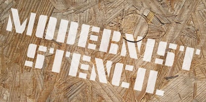
- Modernist Stencil by K-Type,
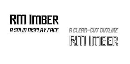
$20.00 - RM Imber by Ray Meadows,
$19.00 - Ruina Inline by RodrigoTypo,
$25.00 - Appetite New by Serebryakov,
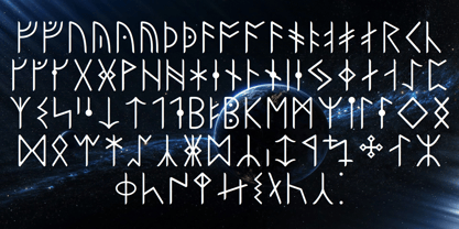
$49.00 - Ongunkan Runic Unicode by Runic World Tamgacı,
$50.00 - Engravers' Old English BT by Bitstream,
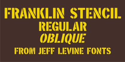
$29.99 - Franklin Stencil JNL by Jeff Levine,
$29.00 - Playwright JNL by Jeff Levine,
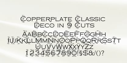
$29.00 - Copperplate Deco by Wiescher Design,
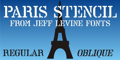
$39.50 - Paris Stencil JNL by Jeff Levine,
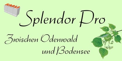
$29.00 - Splendor Pro by RMU,
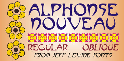
$35.00 - Alphonse Nouveau by Jeff Levine,
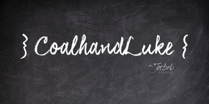
$29.00 - CoalhandLuke by JOEBOB graphics,
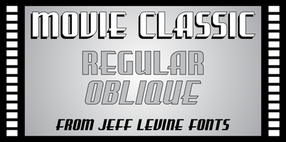
$39.00 - Movie Classic JNL by Jeff Levine,
$29.00


