10,000 search results
(0.028 seconds)
- Jocker Block by Figuree Studio,
$21.00 Introducing Jocker Block! Jocker Block is natural and strong hand-drawn brush font that combines attractive curves with a fresh urban edge; delivering a stylish brush font that is guaranteed to add an eye-catching appeal to your logo designs, brand imagery, handwritten quotes, product packaging, merchandise, social media post, or website font. Features: All Caps Font Support for MAC or PC PUA Encoded Versatile for branding, headline, or printing product Detailed dry brush markers I hope you enjoy this font. If you have questions, don't hesitate to give me a message :) Thank You!
 - Astogria Bejha by Figuree Studio,
$18.00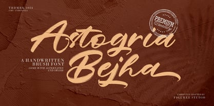 Introducing Astogria Bejha! Astogria Bejha is modern hand-drawn brush font that combines attractive curves with a fresh urban edge; delivering a stylish brush font that is guaranteed to add an eye-catching appeal to your logo designs, brand imagery, handwritten quotes, product packaging, merchandise, social media post, or website font. Features: Uppercase and Lowercase Number and Punctuation Ligature Stylistic Alternate Swash Versatile for branding, headline, or printing product Detailed dry brush markers I hope you enjoy this font. If you have questions, don't hesitate to give me a message Thank You!
 - Mostera by Mega Type,
$17.00 INTRODUCING Mostera is a fun unique display serif font. This font looks sturdy and fun with a retro touch and curves giving it a playful personality. Mostera is a versatile display serif that works in both large and small sizes. This font is suitable for a wide variety of projects such as: headlines, logos, labels, branding projects, weddings, magazines, product packaging, mugs, quotes, posters, and more. Have fun using Mostera!!! I really hope you enjoy it! Feel free to follow, like and share. Thank you so much for checking out my shop!
 - Satnight Script by Picatype,
$17.00 Introducing Satnight, a classy and contemporary modern script font. This versatile script typeface includes many different alternatives for each lowercase letter. It's fun to use because every word can be changed according to your wishes. Satnight offers beautiful typographic harmony for a variety of design projects, including logos & branding, wedding designs, social media posts, advertising & product design. That's it! I hope you enjoy this type!! Let me know what do you think!!! Feel free if you have a question, please contact me : picatypestudio@gmail.com Thank you and keep creative!
 - Cheva Display by Letteralle,
$24.00 Introducing, Cheva Display! a bold font with a touch of fine curves. Cheva Display brings vintage look as well as modern designs. With a variety of alternative letters and ligatures, it will make your text more unique and interesting. Cheva Display is a very versatile font, perfect for editorial projects, Logo design, Wedding, Clothing Branding, product packaging, magazine headers, or simply as a stylish text overlay to any background image. What's you get : - Full Uppercase & Lowercase Character. - Alternates & Ligatures. - Numeral, Punctuation, Multilingual Accents. Any Questions? Just Ask! I hope you enjoy! Letteralle Studios
 - Antiquarian Scribe by Three Islands Press,
$39.00 Henri Abraham Chatelain was a cartographer and publisher of the famous Atlas Historique, ou Nouvelle Introduction a L'Histoire, a world atlas released between 1705 and 1732 in Amsterdam. A few years ago, at an antique book shop in London, I bought a page from Chatelain's atlas—a page covering the Near East, India, the Indian Ocean—that had a particularly alluring, oblique handlettering style. The text is in French, which gave me plenty of samples of diacritics and accented characters. The overall effect is neat and legible, with a distinctly historical flair.
 - The Brother Hoops by Figuree Studio,
$24.00 Introducing The Brother Hoops! The Brother Hoops is strong hand-drawn brush font that combines attractive curves with a fresh urban edge; delivering a stylish brush font that is guaranteed to add an eye-catching appeal to your logo designs, brand imagery, handwritten quotes, product packaging, merchandise, social media post, or website font. Features: Uppercase and Lowercase Number and Punctuation Ligature Extra Swash Versatile for branding, headline, or printing product Detailed dry brush markers I hope you enjoy this font. If you have questions, don't hesitate to give me a message
 - Crostini by Scholtz Fonts,
$19.00 Crostini was designed as a fun-filled, vigorous brush script, originally intended for restaurant logos and menus. As it evolved, I realized that it was more versatile than I'd thought - great for feminine, girly media as well as for more “in your face” marketing. While the characters are bold and dramatic, they are also feminine and rounded. Crostini contains all the accented characters used in the major European languages. Use Crostini for invitations, scrap-booking, advertising media, fashion media, restaurant media, food media, greeting cards - it’s great fun!
 - Waylom by Eurotypo,
$26.00 Waylom is based on 19th century letters written in calligraphy. These writings had some glyphs of a height higher than the others, which together with the flowing lines, the elegant curves and the flourishes, gave it a very interesting rhythm and a lot of personality. Using this font you will achieve a very elegant, and warm style. This font is slim, feminine, friendly and sexy. Waylom includes a wide range of latin languages, 720 glyphs with many stylistic variations, initial forms, swashes and ligatures, which you can mix and match to achieve a more interesting effect. I separated the highest glyphs to create Waylom Pro, to which I added some very useful ornaments to improve its possibilities, with a total of 823 glyphs. Waylom is very versatile and is ideal for high-end logos, magazines and book covers, fashion, headlines, cards, posters, websites, and packaging.
 - Despeinada by EdyType,
$60.00 Despeinada, which means "uncombed" in Spanish, is a loose script, perfect for when you want to convey informality. It'll look good in a long text, or when a few rough and spontaneous word are needed... Being a packaging designer, my faces are mostly oriented toward that sector, although they won't look in any way out of place in the editorial world or in advertising, for example. This face was generated in the University of Barcelona Master of Typography, in 2010, where I dictated the “Practicum” It's a very versatile design that can be used in small sizes or enlarged as needed. It won't deceive you! I think that this particular face is halfway between Mistral and Zapfino: rough but clean at the same time. None of its glyphs follow any order, nor do their weights... In short, if you start writing with Despeinada you won't want to stop.
 - Magiona Display by Dora Typefoundry,
$20.00 Magiona Display - A modern classic serif font, perfect for creating bold & beautiful designs. Magiona Display is classic and sophisticated typography with 2 weights to captivate your next project. A very versatile font that works in both large and small sizes. This font is suitable for a wide variety of projects such as: headlines, logos, labels, branding projects, magazines, homeware designs, product packaging, mugs, quotes, posters, and more. It can also be more expressive and fun, thanks to the many alternatives and binders that combine harmoniously in this font and make it more interesting and versatile. Try to change alternatives, binders and you will get many options for your project which will make it bold & beautiful. Features: • Full set of uppercase, lowercase letters • 55 Ligatures • 245 Alternates • Big range of numbers, symbols & punctuation • Characters with accents • Supports Multiple Languages • PUA Encoded WHAT’S INCLUDED: • Magiona Display – Regular • Magiona Display – Outline This type of family has become a work of true love, making it as easy and enjoyable as possible. I really hope you enjoy it! I can't wait to see what you do with Magiona Display! Feel free to use the #Dora Typefoundry tag and # Magiona Display font to show what you've done visit my Instagram : https://www.instagram.com/doratypefoundry/ Thank You!
 - Giro by Suomi,
$25.00 I saw an old logo for Giro d'Italia on telly, and was just smitten by the truly ugly type: just ruler and compass work, no intakes or optical corrections whatsoever. I just had to turn that into a font.
 - Scripio A by AType,
$24.95Scripio A was the first font which I submitted to MyFonts.com. It is a decorative font. Little bit technical. I wanted to make a font which would be interesting to all. To some extent it has justified my hopes. - Green Fairy by Maria Montes,
$39.00 Green Fairy is a chromatic font family highly ornamented for display purposes. Green Fairy’s characters have been specifically designed to accommodate its loops and ornaments following a modern typeface structure. Green Fairy has four chromatic weights: 1. Green Fairy Outline 2. Green Fairy Dots 3. Green Fairy Stencil 4. Green Fairy Full The outline weight has been created as the base or structure for the other weights. You can combine these weights as well as add colours to obtain multiple effects and type styles. Green Fairy has also three combined weights (combos) to simplify your work flow, for these occasions when you only want to use one single colour in your font: 5. Green Fairy Dots Combo 6. Green Fairy Stencil Combo 7. Green Fairy Full Combo GREEN FAIRY ORIGINS The origin of this typeface is the lettering I designed in October 2015 as part of my illustrated cocktail artwork called “Absinthe. La Fée Verte (The Green Fairy)”. Originally, this lettering only featured eight letters “AB·SINTHE” vector drawn in Illustrator. Right after creating the full-colour artwork, I designed a fountain-letterpress print version of it, in collaboration with Ladies of Letters, A.K.A. Carla Hackett and Amy Constable from Saint Gertrude Fine Printing. At the beginning of 2016 –and thanks to the project @36daysoftype– I found the motivation, and most importantly the deadline, to draw the rest of the twenty-six letters of the uppercase alphabet using Illustrator. I started 2017 having my first two calligraphy courses sold out, so I took this amazing opportunity to devote myself to Green Fairy for a few months. In February 2017, I purchased the font software Glyphs and I started to re-draw all twenty-six letters of the uppercase alphabet again. PRODUCTION PROCESS Green Fairy started being one weight, but quickly turned into a layered/chromatic font. Things were going more or less fine till I arrived to the Dots weight: 1) I started drawing squares following a grid; 2) Then, the squares turned into diamonds following the same grid; 3) Then, the grid wasn’t working so well on the round letters so I tried randomising the position of the diamonds but it didn’t work; 4) So I went back to the grid, and this time scaled down the size of the diamonds creating a visual half-tone effect. I spent over four weeks working on the Dots weight and I felt like I was in the middle of a very long tunnel and I couldn’t see the light at the end. I encountered many other problems along the way but by June 2017, I felt I was back on track again. I kept working, tweaking, re-drawing and re-adjusting, and then the diacritics came on board… And then more re-drawing, re-tweaking, re-adjusting and then numbers… And then spacing, symbols, and currencies… And then more spacing, kerning, contextual kerning for triplets… In September 2017 I told myself “that’s it, I’m going to finish it now!” But guess what? More re-tweaking, testing, hinting, testing, rendering, testing… For those of you not familiarized with typeface design, it is extremely time consuming and it requires a lot of hard work, focus and determination. This project could not have been possible without the help of these generous professionals: Jose Manuel Urós, typeface designer based in Barcelona and my teacher twice in the past; Jamie Clarke, freelance letterer and typeface designer who has released a couple of chromatic fonts recently; Troy Leinster, Australian full-time typeface designer living and working in New York City; Noe Blanco, full-time typeface designer and hinting specialist based in Catalonia; And Nicole Phillips, typographer currently relocating from Australia to New Zealand. To all of you: THANK YOU VERY MUCH!
 - Steagal by insigne,
$24.75 I love geometric sans serifs, their crispness and rationality. Le Havre taps into this style, but for a while, I've wanted to create a font recalling the printed Futura of the 1940s, which seems to have an elusive quality all its own. After seeing an old manual on a World War II ship, I developed a plan for "Le Havre Metal" but chose to shelve the project due to Le Havre's small x-height. That's where Steagal comes in. When Robbie de Villiers and I began the Chatype project in early 2012 (a project which led one publication to label me the Edward Johnston of Chattanooga!), we started closely studying the vernacular lettering of Chattanooga. During that time, I also visited Switzerland, where I saw how designers were using a new, handmade aesthetic with a geometric base. I was motivated to make a new face combining some of these same influences. The primary inspiration for the new design came from the hand-lettering of sign painters in the United States, circa 1930s through 1950s. My Chatype research turned up a poster from the Tennessee Valley Authority in Chattanooga, Tennessee, which exhibited a number of quirks from the unique hand and style of one of these sign artists. Completing the first draft of Steagal, however, I found that the face appeared somewhat European in character. I turned then to the work of Morris Fuller Benton for a distinctly American take and discovered a number of features that would help define Steagal as a "1930s American" vernacular typeface--features I later learned also inspired Morris Fuller Benton's Eagle. The overall development of Steagal was surprisingly difficult, knowing when to deliberately distort optical artifacts and when to keep them in place. Part of type design is correcting optical illusions, and I found myself absentmindedly adjusting the optical effects. In the end, though, I was able to draw inspiration from period signs, inscriptions, period posters, and architecture while retaining just enough of the naive sensibility. Steagal has softened edges, which simulate brush strokes and retain the feeling of the human hand. The standard version has unique quirks that are not too intrusive. Overshoots have almost been eliminated, and joins have minimal corrections. The rounded forms are mathematically perfect, geometric figures without optical corrections. As a variation to the standard, the “Rough” version stands as the "bad signpainter" version with plenty of character. Steagal Regular comes in five weights and is packed with OpenType features. Steagal includes three Art Deco Alternate sets, optically compensated rounded forms, a monospaced variant, and numerous other features. In all, there are over 200 alternate characters. To see these features in action, please see the informative .pdf brochure. OpenType capable applications such as Quark or the Adobe Creative suite can take full advantage of the automatically replacing ligatures and alternates. Steagal also includes support for all Western European languages. Steagal is a great way to subtly draw attention to your work. Its unique quirks grab the eye with a authority that few typefaces possess. Embrace its vernacular, hand-brushed look, and see what this geometric sans serif can do for you.
 - Selfie Neue Sharp by Lián Types,
$29.00 INTRODUCTION When I started the first Selfie back in 2014 I was aware that I was designing something innovative at some point, because at that time there were not too many, (if any) fonts which rescued so many calligraphy features being at the same time a monolinear sans. I took inspiration from the galerías’ neon signs of my home city, Buenos Aires, and incorporated the logic and ductus of the spencerian style. The result was a very versatile font with many ligatures, swashes and a friendly look. But… I wasn’t cognizant of how successful the font would become! Selfie is maybe the font of my library that I see the most when I finally go out, (type-designers tend to be their entire lives glued to a screen), when I travel, and also the font that I mostly get emails about, asking for little tweaks, new capitals, new swashes. Selfie was used by several renowned clients, became part of many ‘top fonts of the year’ lists and was published in many magazines and books about type-design. These recognitions were, at the same time, cuddles for me and my Selfie and functioned as a driving force in 2020 to start this project which I called Selfie Neue. THE FONT "Selfie for everything" Selfie Neue, because it’s totally new: All its glyphs were re-drawn, all the proportions changed for better, and the old and somehow naive forms of the first Selfie were redesigned. Selfie Neue is now a family of many members (you can choose between a Rounded or a Sharp look), from Thin to Black, and from Short to Tall (because I noticed the feel of the font changed notoriously when altering its proportions). It also includes swashy Caps, which will serve as a perfect match for the lowercase and some incredibly cute icons/dingbats (designed by the talented Melissa Cronenbold, see also Selfie Neue Rounded for more!) which, as you see in the posters, make the font even more attractive and easy to use. You'll find tons of alternates per glyph. It's impossible to get tired with Selfie! Like it happened with the old Selfie, Selfie Neue Sharp was thought for a really wide range of uses. Magazines, Book-covers, digital media, restaurants, logos, clothing, etc. Hey! The font is also a VF (Variable Font)! So you can have fun with its two axes: x-height and weight, in applications that support them. Let me take a New Sharp Selfie! TECHNICAL If you plan to print Selfie Neue VF (Rounded or Sharp), please remember to convert it to outlines first. The majority of the posters above have the "contextual" alternates activated, and this makes the capitals a little smaller. I'd recommend deactivating it if you plan to use Selfie for just one word. Use the font always with the "fi" feature activated so everything ligatures properly. The slant of the font is 24,7 degrees, so if you plan to have its stems vertical, you may use Selfie with that rotation in mind. THANKS FOR READING
 - Feuerfeste - Unknown license

- Bodybag - Unknown license

- Crispy Orange by Bogstav,
$16.00 The other day, I ate an orange - and I absolutely love oranges! This one was perfect - juicy, sweet and crispy in a very delicate way. This font is also juicy, sweet and crispy and on top of that, organic and handmade!
 - Venice Initials by Wiescher Design,
$39.50 Venice Initials are my redesign of a 15th century venetian original by an unknown calligrapher. Unfortunately only parts of the letters existed, so I had to design about half of them myself. Of course I enjoyed doing that. Yours Gert Wiescher
 - Andtioh by Andfonts,
$19.00 Andtioh is my vision of sci-fi font. I want to propose the idea of simplicity and techno in two ways. I think this font can find its place in logos and names and will make your business look innovative.
 - Disclover by Zang-O-Fonts,
$25.00Disclover came about when I was doodling on a pad of paper. I was thinking about contemporary font designs, and disclover came to mind. The original sketches were scanned and then re-drawn in Illustrator. The name is just made up. - Cheat Sheet by Hanoded,
$15.00 Cheat Sheet is a handwritten typeface that looks like, well, handwriting. It is loose, legible and useful and comes with extensive language support. It goes without saying that I have never used a cheat sheet when I was in school… (ahum)…
 - Boldu by Ryzhychenko Olga,
$4.00 Boldu is a simple grotesque font. I created it using simple forms. I love geometry and tried use only one size of lines. Boldu was created being impressed by works of beginning of 20th century - period of strict and geometric forms
 - Blowfish Inline by Robert Petrick,
$19.95 Blowfish Inline is a new addition to my Blowfish Family. Based on my original Blowfish design I have created a more illustrative form. I think it adds to the feeling of "Classic" and extends it's functionality and novelty.- Robert W. Petrick
 - Ornata E by Wiescher Design,
$39.50 Ornata E is the fifth of a series of old ornaments that I am trying to save from oblivion. I am completely redesigning the ornaments from scratch, trying in this one to keep the rough "letterpress" character. These ornaments were designed around 1910, I could not find out by whom. This set is perfect to design flowery frames since it has an enormous amount of flowery things. Your digitizing type-designing savior, Gert Wiescher
 - Symbolic Prophecy by Hanoded,
$15.00 I am not one for prophecies of impending disaster and all that, don’t worry! I just liked the name and it seems to suit this handmade font quite well. Symbolic Prophecy was made with a broken bamboo satay skewer and Chinese ink. I quite like using broken satay skewers, as they give a fantastic ‘random’ effect. Use Symbolic Prophecy for your posters, your product packaging and, just maybe, a sign about the end of times… ;-)
 - Vulnerable by Gian Studio,
$12.00 Vulnerable is an elegant script typeface inspired by a vintage type specimen I found some time ago at an art fair. Thin to thick contrasting lines and elegant curves make Beginta the perfect font for this type of logo and display purposes. Hope you enjoy it Feel free to contact me if you have any questions or concerns you may have and I will get back to you as soon as I can.
 - Brauhaus by MADType,
$21.00 I enjoy and am inspired by many blackletter designs, but find that their uppercase characters are generally too complex to be very usable. I also found that very few, if any were designed with perfect 45 degree angles. I set out to design a textura blackletter with unique features and a usable uppercase. What resulted is an interesting, yet usable, geometric design with unusual features that make it stand out from existing texturas.
 - Oslo Stitch by Hanoded,
$15.00 The Oslo Stitch is a technique used in Nålebinding, a kind of fabric creation predating knitting and crochet. I have no particular interest in Nålebinding (nor in knitting), but I needed a name with ‘stitch’ in it and this is what I found! Oslo Stitch font is a nice, handmade, all caps font, which you can use for your book covers, posters and anything else that needs a bit of stitching up.
 - Nonsense Note by Bogstav,
$19.00 There really is no nonsense in this font - but the name comes from my original sketches, where I drew a lot of nonsense! Actually, I couldn't figure out what letters to use from the sketches, so I picked them all!!! That's why each letter has 10 different versions! And what is cool is that they automatically cycles as you type. All you have to do is turn on Contextual Alternates, and the rest is magic!
 - Brouillard by Hanoded,
$15.00 Brouillard means ‘fog’ in French. I like the ‘oui’ letter combination and I was looking for a name for this font that contained those letters. I found Brouillard and presto: a new font was born! Brouillard font was handmade with a Japanese pen. It is an elegant, curvy and quite stylish font with a bit of a roughness to it - just enough to catch your attention. All three styles come with a load of diacritics.
 - Hollywood 69 by Fonts of Chaos,
$10.00 This is not Hollywood. You may be surprised but I am not inspired by the famous Hollywood sign for this type but a grid on a roof of Barcelona. I walked down the street observing the architecture of buildings in the area of the Marina when I saw a grid on a roof. One of the workers put a board on them and the magic happen. Hollywood 69 is now free with 99 !
 - Sforza by Ampersand Type Foundry,
$65.00 After visiting Milan, I stumbled upon the Sforza castle, and found some interesting type on the inner courtyard castle walls. I became inspired by what I found, and decided to design a typeface based off of the limited quirky letterforms. Thus Sforza was born, with ligatures galore, alternates, pictograms, and swooshes. Sforza is a roman style typeface with a quirky flair. It has loads of ligatures, nested letterforms, and tails and swooshes for endless combinations.
 - Cirquela by Funk King,
$5.00 Cirquela is a new direction in type design for me. This is my first calligraphy font and my first hand drawn. This is a limited character set, but as I continue to explore this space, I hope to expand the character sets of fonts I offer for sale. In the meantime, please enjoy Cirquela. This is a fun font. Eccentric, yet it possesses a subtle formality in spite of itself. Passionate, furious, yet sublime.
 - Crocodile Feet by Hanoded,
$15.00 I had a Neneh Cherry song in my head when I made this font. In ‘Buffalo Stance’ she sings about a gigolo with his hands in his pockets and his crocodile feet. I liked the sound of it, so Crocodile Feet font was born. Crocodile Feet is a children’s book font: bold and cute, with easy to read glyphs. Comes with double letter ligatures in both the regular and the dots style.
 - Hyperloopa2104 by Andrew Tomson,
$10.00 Hello, friends! I recently bought myself an old game console, the SEGA Mega Drive 2. For a long time I couldn't understand why, when I was a kid, it seemed incredible to play it. Nowadays there are a lot of games with stunning graphics and realism, but still there is something warm and light in old games. Maybe it's just a memory of a carefree childhood. After playing it, I decided to create this font so that everyone could do something in the style of old games that an army of designers and programmers hadn't worked on yet. Good luck and love to you!
 - Uncle Edward by Hanoded,
$15.00 First of all, I don’t have an uncle called Edward, nor do I know anyone by that name. When I had finished this font, it had a strong ‘Uncle Edward’ feeling to it, so the name stuck. Uncle Edward is a handmade script font. I used a Japanese brush pen and some rough paper to create that ‘vintage’ look. Use Uncle Edward for your book covers, your invitations or your product packaging. Create labels for your vintage record collection with it, or print a guest list for your Christmas dinner party. Uncle Edward gives you his blessing. Comes with ligatures for double letters and a whole bunch of accents.
 - Space Time by Lauren Ashpole,
$15.00 What can I say? I like fonts with stars. Space Time is a hand drawn font with a lot of variety. I started designing the regular version with the characters slightly touching but it wasn't quite what I had in my head. I’d imagined tightly spaced letters with overlapping shadows and the only way to get that effect was to create a second version with stackable layers. That means this download includes regular, base, outline, shadow, and stars files. Plus, the base and outline can be used for stacking or work fine as standalone fonts. This font is all caps but the lowercase letters feature alternative styles.
 - Southwark by Hanoded,
$15.00 London is one of my favourite cities, so it was about time I named a font after it. Well, technically, I named a font after one of London’s districts. Southwark comes from the Anglo-Saxon word Suthriganaweorc, which means ‘Fort of the men of Surrey’. The font Southwork is a handmade Clarendon. I used a Japanese brush pen to create the outlines. I gave the glyphs texture by filling them in with a brush and Chinese ink. Southwark, therefore, has an uneven look and a brushy texture. It looks good on just about anything, but posters, greeting cards and product packaging come to mind.

