8,281 search results
(0.012 seconds)
- Linka by Vanarchiv,
$41.00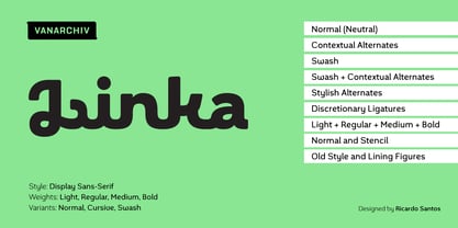 This font family is display sans-serif with different stylistic layers available as open type font. The main characters are geometric and neutral but when we change the contextual alternates open type feature the letterforms activate the cursive stylish set. The word composition is divided by initial, medial and final forms, available for all uppercase and lowercase, the diacritics for Latin encodings (Western and central Europe and Baltic countries) are available. However the contextual alternate features (cursive mode) can only work on Adobe CS Indesign and Illustrator softwares. This typeface also has uppercase swash and stylish alternates. A large group of discretionary ligatures are also available to improve better legibility and readability on specific characters combinations, giving a natural and simple solution.
 - La Sonnambula by deFharo,
$18.00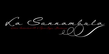 The Sonnambula is a handwritten and expanded font with terminal ornaments, designed to write very elegant titles or calligraphic texts. The name of this typography is dedicated to the opera La Sonnambula by Vincenzo Bellini. - Use the following characters for terminal ornaments: () [] - 380 glyphs. Latin Extended-A • OTF & TTF - OpenType Functions: Discretionary Ligatures, Kerning, All Alternates, Additional languages, Standard Ligatures, Slashed Zero, Capital Spacing, Ornaments, Ordinals, Mathematical Greek, Fractions, Localized Forms. - Bitcoin symbol: b# (ligatures)
 - Sentinel by Comicraft,
$19.00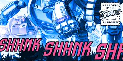 Common use(s) of Comicraft's All-new, All-different SENTINEL font include FACTOR-X, X-MAN, GENERATION NEXT and X-CALIBRE. Possible Side Effects: This font should not be used if you are trapped in a world you never made or a world full of people that hate and fear you. Prolonged exposure to this font during an Age of Apocalypse may cause fatigue, muscle soreness, first degree burns and immobility. Contraindications in Homo Superior may manifest as an outbreak of large purple automatons. Interactions: Before using this font in either regular or bold doses, notify your doctor of any recent exposure to mechanoids, synthezoids or paranoid androids. Reprogrammed Sentinel has improved spacing and kerning, Western & Central European accents, alternate lettershapes, and a new Interlocking Mode with over 100 connecting letter combinations!
 - Mr Happy by Hipopotam Studio,
$22.00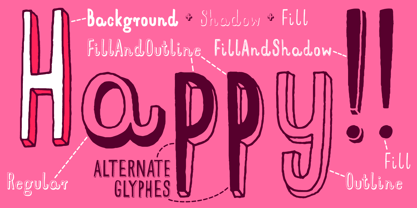 Hand drawn narrow typeface designed for one of our books. You can layer different styles over the background style to achieve lots of colorful effects. Use just one style to get a single color letter or set the shadow and fill over the background style to get a full, three color mode. Mr Happy has upper and lowercase characters with up to three alternate glyphs. Build in OpenType Contextual Alternates feature will automatically set alternate glyphs depending on frequency of appearance of the same character (even in web font but only in HTML5 browsers). The script doesn’t throw random glyphs. For example in the word “HIPPOPOTAMUS” you will automatically get three different “P” glyphs and two “O” glyphs. It really works great but of course you can always fine tune it by hand.
 - Pardner by Stiggy & Sands,
$29.00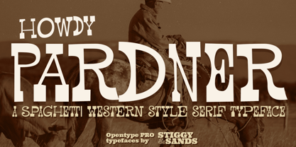 Our Pardner font finds its inspiration from the title screens of the 1965 film “West and Soda”, an animated Italian film that was a parody on American Westerns. Director Bruno Bozetto claimed in an interview that he was in fact the originator of the Spaghetti Western, not Sergio Leone. This offbeat and animated serif typeface has characters of varying width and weighting incorporated into opentype scripting as well as numerous alternates to give a lot of fun and frolicking play in typesetting. You can type with just as much diversity as the titling themselves. Opentype features include: - 6 Stylistic Alternate Sets. - A collection of ligatures as well as programming to automatically alternates between Caps and Lowercase. - Full set of Inferiors and Superiors for limitless fractions. - 731 characters of pure joy.
 - Henderson Sans by Sudtipos,
$39.00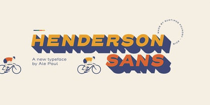 The first thought that crosses a type designer’s mind upon seeing a slab serif is: I wonder what it would look if it was serifless. And so, after building Henderson Slab , I followed my instincts and gave it a sans serif companion. Henderson Sans comes in seven weights plus italics, each of which casting an eye on the crafty lettering origins of what is now the ubiquitous mode of corporate communication. This sans serif is a glyph-for-glyph match for Henderson Slab , inheriting pretty much all of its features and quirks, like the wealth of alternates and swashed variants — simple, endearing or otherwise. Henderson Sans is a family of seven weights plus italics, all full of open features and extended Latin language support. (Basic version do not include alternates, swashes, etc).
 - Contamination by Kenn Munk,
$42.00Vowels produce 'end-characters'. These are used whenever a string of symbols start or end. Consonants make 'middle-characters'. Numerals are zero-width characters. these can be used whenever you feel like it, they will float above and below the string of symbols. Puncuation adds extra spice. Hold down 'shift' and you get the individual symbols mirrored. (very useful with the vowels.) Check my website for a more graphic representation and play, for gods sake, play! - Deco Donut by Just My Type,
$20.00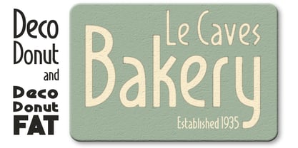 On the very northern edge of South Tucson lies an Old Pueblo institution, Le Caves Bakery, Home of the Vegetable Donut. That’s what they were called when Le Caves opened; now you’d say Vegan Donut, or No Animal Products Used. Radical concept in the Brave New World of 1935. I started with the letters from their sign and extrapolated the rest of the font from those. Deco Donut Fat is extrapolated from Deco Donut. If you want a donut, type a 0 (zero).
 - Expedition One by Gustav & Brun,
$6.00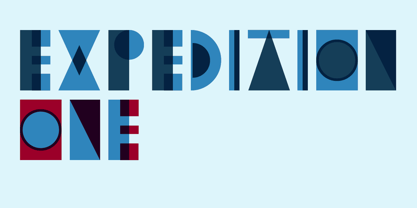 To be independent or to be dependent? The formula “one plus one is one” is here essential for this to work. The different cases, upper and lower is dependent on one another. To give us clarity they have to work together, to be like one the upper and lower cases must work together. Expedition One works best in InDesign or equivalent software. How to use it: write your text in lower case, copy the text frame and ”Paste in Place”, change your lower case text to upper case (you do that under top menu->type->change case). Change colour if you want to and maybe change the blending mode in the effects window to “multiply” makes it even more sparkling. On numbers and ampersand for example, you have to use the glyph window in InDesign to find their second half.
 - Consta by Identitype Co,
$29.00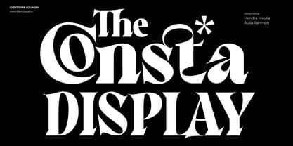 Consta Serif is a seven-weight typeface that wishes to express a tribute to the gracious and delicate forms of the human body. Consta is a standout display font that is a mode to Contrast Serif typography in the present day. Its elaborate curves and unique shapes make it perfect for headings, logos & wedding invitations. Consta is all class so if you want a stylish font that is guaranteed to draw the eye, then this is it! All seven weights (Extralight, Light, Regular, Medium, Semibold, Bold, Extra Bold) contain character sets that include uppercase, lowercase, numerals, diacritics, punctuation, ligatures, alternates, and symbols. Furthermore, this Human Grade Type supports more than 89 languages derived from Latin, namely Western, Central, and South-Eastern European languages, making it a perfect fit to be used either in titles or other typographic compositions.
 - Peanut Donuts by IKIIKOWRK,
$17.00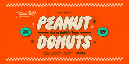 Proudly Present Peanut Donuts - Retro Bubble Type, created by ikiiko. Peanut Donuts is a font that perfectly encapsulates nostalgia, you can travel back in time to a time of delectable delicacies and mouthwatering delights. This retro bubble font, which was meticulously crafted, is the ideal option for your vintage products. The Peanut Donut blends your packaging, labeling, and advertising with delectably nostalgic appeal to bring the happiness and enjoyment of the past to the present. It instantly conjures up images of vintage cafes, soda fountains, and recognizable food trucks with its rounded corners and bubbly shapes. This typeface is perfect for an vintage stuff, retro poster layout, children book, comic, packaging, food & beverages and also good for quotes, or simply as a stylish text overlay to any background image. What's included? Uppercase & Lowercase Number & Punctuation Multilingual Support Works on PC & Mac
 - Merimount by Rillatype,
$19.00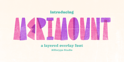 Introducing Merimount - Your Ultimate Layered Overlay Font Elevate your design game with Merimount, a versatile and innovative layered overlay font that allows you to create stunning typographic masterpieces effortlessly. With three unique styles—Merimount Regular, Merimount One, and Merimount Two—this font opens up a world of creative possibilities. What sets Merimount apart is its layered design, enabling you to stack the fonts for a dynamic and dramatic effect. Experiment with different combinations and take advantage of the blending mode feature to achieve the perfect look for your project. Whether you're going for a bold and impactful design or a subtle and sophisticated feel, Merimount has you covered. Ideal for a wide range of design projects, from posters to branding, Merimount adds a touch of creativity and flair. Unlock the full potential of your designs with this must-have layered overlay font. Uppercase
 - CEO Roman by BA Graphics,
$45.00A very clean conservative corporate look, very simple yet very dignified. Great for text and head lines, just about any application. - Edgar Pirámide Fuente LCD diseñada con mucho cariño para recordar las pirámides que abundan por toda mi Nación de México desde playas al raz del mar como Tulum hasta lo más alto como Teo...
- BD Gitalona Variable by Balibilly Design,
$139.00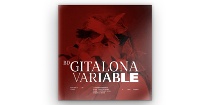 We introduce our Variable Font from the high-complex BD Gitalona font family. Consisting of 3 axes; weight, optical size, and serif, that will give you a different experience extending the family of BD Gitalona. We don't want to mention how many families can be generated from this variable font. During the development process, we got up to more than 50 families and stopped to allow you to continue to play with the slide buttons. And again, BD Gitalona is filled with an explorative and experimental decorative version that we present separately. Figure out the decorative version BD Gitalona Moxa to make the aesthetic appeal of this whole typeface here! Inspiration The world of entertainment moves non-stop. One by one, figures appeared and left. We expect to create something to entertain previous trends with packaging more relevant to the present. More specifically, we admire and are inspired by some of the world's leading and top singers with a segmented nature. We imagine so many figures that can affect every viewer. However, each artist or singer has a segment because almost all of them have characteristics. The Design The basic design of this typeface begins with a transitional serif shape with sharp, shapeless corners. Then in the middle of the invention, there was an opportunity to explore it further from the readability side by adding an optical variable that can adjust the serif thickness when used together between large, medium to paragraph text sizes for editorials. The shift from serif to sans-serif with the contrast initiated by the shift of the serif family form as a different variable also makes this font richer in terms of the features it contains. Parts are expected to add to the user satisfaction with the complexity of this font. The Features BD Gitalona consists of one sub-family intended for body text with nine weights from Thin(100) to Black(900) and four other display sub-families such as Display serif, Flick, Harmony Sans and Contrast Sans. Each consists of four weights Thin(100), Regular Weight(400), Bold(700), and Black(900). And again, there are also retailed separately; the BD Gitalona Variable font, which is designed to accommodate all Subfamily in 1 font file, and BD Gitalona Moxa, an experimental typeface. A total of 700+ glyphs in each style. Advanced OpenType features functionally and aesthetically, such as Case-sensitive forms, small caps, standard and discretionary ligatures, stylistic alternates, ordinals, fractions, numerator, denominator, superscript, subscript, circled number, slashed zero, old-style figure, tabular and lining figure. Supports multi-languages including Western Europe, Central Europe, Southeast Europe, South America, and Oceania.
 - BD Gitalona by Balibilly Design,
$22.00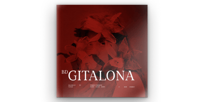 We introduce our high-complex typeface. A wide range of serifs for text and display titles are divided into one prominent sub-family and four display sub-families. Comes shifted from serif to sans serif to fulfilling the completeness of this font family that we named BD Gitalona. In addition to these massive things, this font family is filled with an explorative and experimental decorative version that we present separately. Figure out the decorative version BD Gitalona Moxa to make the aesthetic appeal of this whole typeface! Inspiration The world of entertainment moves non-stop. One by one, figures appeared and left. We expect to create something to entertain previous trends with packaging more relevant to the present. More specifically, we admire and are inspired by some of the world's leading and top singers with a segmented nature. We imagine so many figures that can affect every viewer. However, each artist or singer has a segment because almost all of them have characteristics. The Design The basic design of this typeface begins with a transitional serif shape with sharp, shapeless corners. Then in the middle of the invention, there was an opportunity to explore it further from the readability side by adding an optical variable that can adjust the serif thickness when used together between large, medium to paragraph text sizes for editorials. The shift from serif to sans-serif with the contrast initiated by the shift of the serif family form as a different variable also makes this font richer in terms of the features it contains. Parts are expected to add to the user satisfaction with the complexity of this font. The Features BD Gitalona consists of one sub-family intended for body text with nine weights from Thin(100) to Black(900) and four other display sub-families such as Display serif, Flick, Harmony Sans and Contrast Sans. Each consists of four weights Thin(100), Regular Weight(400), Bold(700), and Black(900). And again, there are also retailed separately; the BD Gitalona Variable font, which is designed to accommodate all Subfamily in 1 font file, and BD Gitalona Moxa, an experimental typeface. A total of 700+ glyphs in each style. Advanced OpenType features functionally and aesthetically, such as Case-sensitive forms, small caps, standard and discretionary ligatures, stylistic alternates, ordinals, fractions, numerator, denominator, superscript, subscript, circled number, slashed zero, old-style figure, tabular and lining figure. Supports multi-languages including Western Europe, Central Europe, Southeast Europe, South America, and Oceania.
 - Sealt by Michael Rafailyk,
$9.00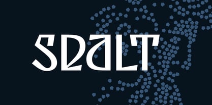 Sealt Typeface is inspired by the oldest saltworks in Eastern Europe, founded in 1390 in Drohobych. Sealt means salt in Old English, so most letters are rough and sharp like salt crystals and seem to be carved out of the rock. View PDF Specimen: https://michaelrafailyk.com/typeface/specimen/Sealt.pdf Variable font: Sealt VF has weight axis and includes hundreds of weights ranging from Light (300) to Bold (700), so feel free to choose the most accurate weight that you need, using a slider. Localized Forms: 47 character substitutions for Azeri, Bulgarian, Catalan, Dutch, German, Kazakh, Moldavian, Polish, Romanian, Tatar, Turkish. Glyph Composition/Decomposition (Diacritics): Full Latin and based Vietnamese set of diacritics (561 characters). Precomposed. Ordinals: adehnorst. Superscript, Subscript, Numerator, Denominator: 0123456789. Fractions: ¼½¾⅐⅑⅒⅓⅔⅕⅖⅗⅘⅙⅚⅛⅜⅝⅞⅟ (precomposed). Any other fractions (even those typed through a slash) will also be displayed correctly, with the automatic replacement to Numerator + fraction + Denominator. Slashed Zero: All 0 figures, including Lining, Superscript, Subscript, Numerator, Denominator, and Fractions. Contextual Alternates: ΆΈΉΊΌΎΏ. Greek uppercase accented characters lose their tonos accent and retain only dieresis in All Caps mode. Turned on by default. If you need tonos accents in All Caps then turn off Contextual Alternates (calt) feature. Standard Ligatures: OO TT tt fi. Turned on by default. Language count: 480+. Kerning Class pairs: 4295. The promo images used photos of Albin Berlin, Hervé Piglowski, Karolina Grabowska, Scott Webb from Pexels and Dollar Gill from Unsplash.
 - Mr Lucky by Hipopotam Studio,
$22.00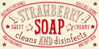 Mr Lucky is Mr Happy's slab brother and a hand-drawn narrow typeface designed for one of our books. You can layer different styles over the background style to achieve lots of colorful effects. Use just one style to get a single color letter or set Fill over Background or Stripped Background to get a two color mode. Mr Lucky has upper and lowercase characters with up to three alternate glyphs and special alternate uppercase diacritics. Build in OpenType Contextual Alternates feature will automatically set alternate glyphs depending on frequency of appearance of the same character (even in web font but only in HTML5 browsers). The script doesn’t throw random glyphs. For example in the word “HIPPOPOTAMUS” you will automatically get three different “P” glyphs and two “O” glyphs. It really works great but of course you can always fine tune it by hand.
 - Rebelton by Konstantine Studio,
$7.00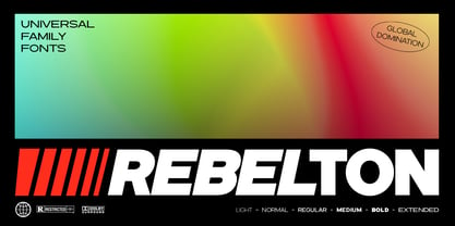 note: it's an All-Caps font, so there's no Lowercase letters in this font. Fast-forward to the modern and futuristic era, a font with strong characters and a long versatility in any era is a must-have survival mode item. Rebelton family was born to company that mission on earth. A set of family fonts with special mood and characters in every single one. Team up with each other to make a strong vibe in your visual project. Because that's what family stands out for. Language Support: Albanian, Basque, Catalan, Cornish, Croatian, Czech, Danish, Dutch, English, Esperanto, Estonian, Faroese, Finnish Scots, French, Gaelic, Galician, German, Greek Transliterated, Hawaiian, Hungarian, Icelandic, Indonesian, Irish, Italian, Latvian, Lithuanian, Maltese, Nynorsk Bokmal Norwegian, Polish, Portuguese, Romanian, Slovak, Slovenian, Spanish, Swedish, Turkish, Welsh. If you doubt with it please type it out in the text box below, I hope it will support your language too :)
 - Ganges by ROHH,
$40.00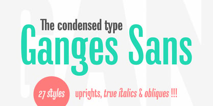 Ganges is a condensed sans serif typeface inspired by Central European advertising typography from late XIX century. The font has condensed proportions and original letter shapes. Ganges is designed mainly for editorial design, especially for display use, as well as short paragraphs of text. Its narrow proportion makes it very practical to use for posters and magazine covers. Characteristic letter forms fit great for branding, logo and packaging design. It is also a very interesting choice for websites and e-book headlines. Ganges family consist of 27 fonts - 9 weights, 9 italics and 9 obliques. It supports extended set of latin languages, as well as broad number of OpenType features, such as case sensitive forms, standard and dicretionary ligatures, stylistic alternates, contextual alternates, lining, oldstyle and tabular figures, slashed zero, fractions, superscript and subscript, ordinals, currencies and symbols.
 - Clearmont by BA Graphics,
$45.00An exciting new contemporary serif face; very powerful but yet very elegant. - Yonkers by Jonahfonts,
$25.00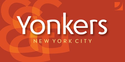 Yonkers a classic gothic face a very legible face. Very suitable for various applications.
 - Qualion Text by ROHH,
$39.00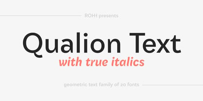 Qualion Text™ is a modern geometric sans serif typeface with humanist and calligraphic inspirations. It is a text family designed for excellent legibility. Qualion Text™ is a sibling of Qualion™ & Qualion Round™, geometric family with lots of swashes and ornaments. Letter shapes and proportions has been adjusted to fit paragraph text and small sizes: - typeface is narrower now in order to fit more text in the design space - larger stroke contrast - pronounced ink traps and tapering - elegant true italics made even more calligraphic - adjusted spacing and kerning - adjusted font weights The main purpose of the family is clean and legible paragraph text, however it is very attractive choice for branding, headlines and display use, too. The italic styles as well as thin, bold and black upright styles have very strong character and look great in display sizes. Italics are very fluent, calligraphic, subtle and elegant, from the other side bold and black uprigths are very modern, powerful and unique thanks to the pronounced ink traps. Qualion Text™ family consists of 20 styles - 10 weights with corresponding true italics. Both have extended language support, as well as broad number of OpenType features, such as small caps, case sensitive forms, standard and discretionary ligatures, swashes, stylistic sets, contextual alternates, lining, oldstyle, tabular and small cap figures, slashed zero, fractions, superscript and subscript, ordinals, currencies and symbols.
 - Cocogoose Pro Narrows by Zetafonts,
$39.00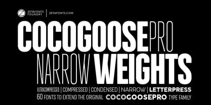 Cocogoose Pro Narrows has been completely re-engineered in 2020 to include extra features and technologies. A darkmode weight range has been added to the whole family, to keep consistency of effect when the typeface is used in reverse on the web and in dark mode interfaces. Also, a new Ultra Compressed subfamily has been developed for display usage. Designed by Cosimo Lorenzo Pancini in 2013, Cocogoose was first expanded in 2015 with the help of Francesco Canovaro who co-designed the decorative display weights and Andrea Tartarelli who developed the condensed widths. In 2020 a full redesign of the typeface has been published: Cocogoose Pro now includes new widths, weights, open type features and characters, thanks to the help of Mario De Libero. Influenced by vernacular sign-painting and modernist ideals, Cocogoose is drawn on a classic geometric sans skeleton, softened by rounded corners and slight visual corrections. Its very low contrast, dark colour and tall x-height make it a solid choice for all designers looking for a powerful display typeface for logos, headings and vintage-inspired branding. The tall x-height makes texts set in Cocogoose very readable even at small sizes, while the bold regular weight allows for maximum impact when used as a branding, signage or decorative typeface. Cocogoose Pro was designed as a highly reliable tool for design problem solving, and given all the features a graphic designer needs, starting from its wide range of widths and weights. Its 2000+ latin, cyrillic and greek characters make sure it covers over 200 languages worldwide, while its comprehensive set of open type features allows faultless typesetting thanks to small capitals, positional numbers & case sensitive forms. A wide range of alternate letterforms, developed along nine different stylistic sets, gives you an extra level of design fine-tuning. The layerable and colour-ready display variants include inline, outline, shadow and a letterpress version that can simulate the effect of old print, also thanks to programmed randomization of its letters.
 - Marons and Glance by Jehansyah,
$15.00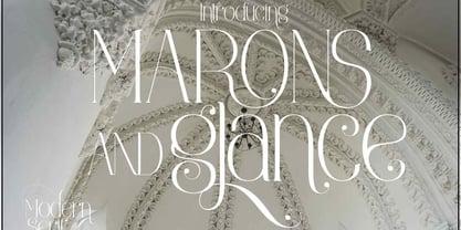 Marons and Glance This is a very charming and elegant font, very beautiful to look at and displays the impression of endless luxury, very suitable for all types of designs that want to display the impression of deep beauty. there are several characters that you can use, and combine them, very easy to use can be accessed with the glyph you are using include: numeric punctuation latin Alternate Thank you very Much
 - Air Crash by Jehansyah,
$12.00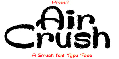 Air Crush is a modified font of the previous design, I tried to give it a touch of brush, because it will look very strong and bold, and after finishing this boomb the result, looks very energized and very exotic, very suitable for all kinds of designs, titles, books, movies, t-shirts, and much more
 - Beardstown by Swell Type,
$15.00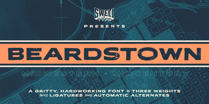 Beardstown is solid, hardworking & no-nonsense. It may be a little gritty & rough around the edges, but it can also be open, warm and welcoming. Beardstown is a little Midwestern town on a river with a town square where you can buy comic books from a spinner rack at the front of the drugstore and read 'em with a root beer float from the soda counter in the back. The Beardstown font is perfect for t-shirts, sports graphics, beer cans, trading cards, carnival posters and record albums. But that’s it. I mean, you could use it on foofy hipster stuff like organic produce, vegan meat substitutes, electric car accessories or mountain bike parts, but you risk Beardstown coming over there to kick your butt. Features: three versions of each letter and two versions of each number automatically rotate for authentic print texture thirteen catchwords (like "and" "of" "for" & "the") accessible in Discretionary Ligatures support for 223 languages including Western & Central Europe, Vietnamese & Cyrillic
 - Hyperspace Race Capsule by Swell Type,
$25.00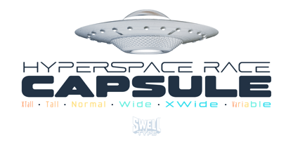 Welcome aboard the Hyperspace Race Capsule! Let the weight of gravity slip away as our interplanetary transport system takes you around the solar system in unparallelled style and comfort. Our reclaimed UFO has been remodeled with soft, luxurious curves on the interior and the latest cutting edge flight technology under the hood, to meet all your typographic travel desires. Each weight and package includes these luxurious five-star amenities: Kick your Capsule into TURBO mode to access eleven sleek, fast-moving alternate letter shapes. Hit WARP SPEED to cross time and space with hundreds of auto-connecting letter pairs. Chat with passengers from all over Earth, as Hyperspace Race Capsule effortlessly presents speech in 224 languages. Use the versatile Variable font to access 20 preset weights plus over 100,000 options between. Hyperspace Race Capsule is a versatile, full-featured font that's perfect for galaxy-wide branding projects, now and into the future.
 - Beethink by Gassstype,
$25.00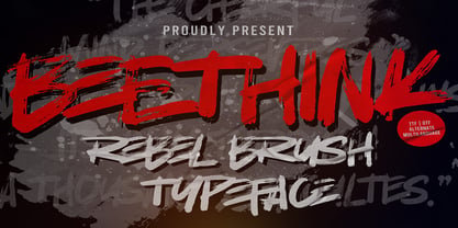 Bee Think This is a Rough Brush Typeface that is written casually and quickly. comes in two mode Standart this font are made with brushes on Procreate. Then crafted carefully drawn into vector format. That is why Bee Think has Rough and strong characteristic more natural look to your text with a more modern look to your text. You can activate Ligature OpenType panel to make these two styles. Bee Think is perfect for homeware designs,branding projects, Logo design, Quotes product packaging, especially with horror and scary themes Bee Think a natural Hand Drawn feel. This handmade font will make your design has a beautiful natural touch for each details. It is perfect for any design project as Invitation,logo, book cover, craft or any design purposes,photos, photography overlays, signs, window art, scrapbooking, tags and so much more! That is has charming, authentic and relaxed characteristic more natural look to your text.
 - Ransahoff CT by CastleType,
$19.00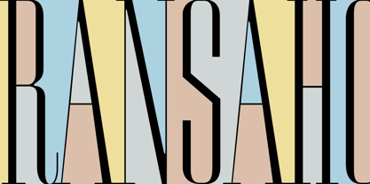 A very light, elegant, condensed typeface, which must be used very large (at least 100 points).
 - OL Hebrew Cursive by Dennis Ortiz-Lopez,
$30.00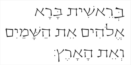 This font contains every variant found in the Hebrew Bible such as the “mutilated” Waw in Numbers 25: verse 12, the small Heh in Genesis 2: verse 4 and the Nun Inversum before Numbers 10: verse 35 and after verse 36 and elsewhere as well as oversized consonants and various double-wide consonants used in inscriptions.
 - OL Hebrew Formal Script by Dennis Ortiz-Lopez,
$30.00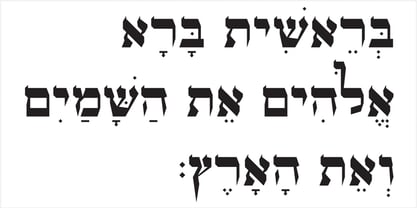 This font contains every variant found in the Hebrew Bible such as the “mutilated” Waw in Numbers 25: verse 12, the small Heh in Genesis 2: verse 4 and the Nun Inversum before Numbers 10: verse 35 and after verse 36 and elsewhere as well as oversized consonants and various double-wide consonants used in inscriptions.
 - Fantastic Christmas by Yoga Letter,
$14.00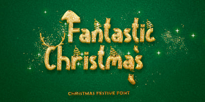 "Fantastic Christmas" is a very elegant Christmas themed font. This font is very unique with its embellished Christmas hat, Christmas tree, and reindeer antlers. "Fantastic Christmas" is perfect to add to your Christmas atmosphere. This font is very easy to use and very complete because it contains basic characters, swash uppercase, swash lowercase, ligatures, multilingual support, numerals and punctuations.
 - OL Hebrew Formal Script With Tagin by Dennis Ortiz-Lopez,
$30.00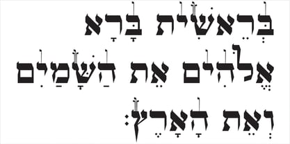 This font contains every variant found in the Hebrew Bible such as the “mutilated” Waw in Numbers 25: verse 12, the small Heh in Genesis 2: verse 4 and the Nun Inversum before Numbers 10: verse 35 and after verse 36 and elsewhere as well as oversized consonants and various double-wide consonants used in inscriptions.
 - Nirwana by Arendxstudio,
$14.00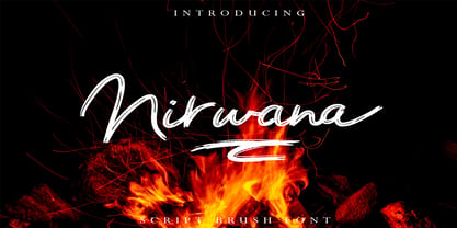 Introducing Nirwana, a Brush font script that is very suitable and captivating, with a very detailed hand touch so that the characters are the same and that Nirwana will be very suitable for your project design needs.
 - Debugger by Dharma Type,
$9.99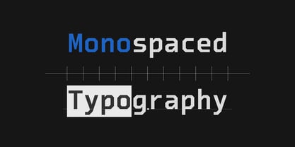 Debugger is a futuristic, sicentific, digital family of next-generation monospaced fonts for developing, programming, coding, and table layout. Some desirable features in monospaced fonts are listed below. 1.Easy to distinguish 2.Easy to identify 3.Easy to read Debugger has very distinguishing letterforms for confusable letters such as Zero&Oh, One&I, and Two&Z. A lot of ingenuity makes this family very distinguishable. Italics have somewhat large inclination angle to be distinguished from their Roman. For the same reason, Italics are slightly lighter than Romans. Italic is not cursive Italic. It is near the slanted Roman. This is an intentional design to identify Italic letters. Cursive is not suitable for programming font. Octagonal and diagonal letterform is good for sci-fi, digital projects. Common elements for each letterform makes harmony and a sense of unity. Debugger supports almost all Latin languages. Try this all-new experiment.
 - Ganges Slab by ROHH,
$40.00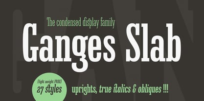 Ganges Slab is a condensed slab serif typeface inspired by Central European advertising typography from late XIX century. It is a perfect match for Ganges Sans. The font has condensed proportions and original letter shapes. Ganges is designed mainly for editorial design, especially for display use, as well as short paragraphs of text. Its narrow proportion makes it very practical to use for posters and magazine covers. Characteristic letter forms fit great for branding, logo and packaging design. It is also a very interesting choice for websites and e-book headlines. Ganges Slab family consist of 27 fonts - 9 weight, 9 italics and 9 obliques. It supports extended set of latin languages, as well as broad number of OpenType features, such as case sensitive forms, standard and dicretionary ligatures, stylistic alternates, contextual alternates, lining, oldstyle and tabular figures, slashed zero, fractions, superscript and subscript, ordinals, currencies and symbols.
 - Bunuelo Clean Pro by Buntype,
$39.00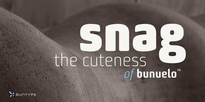 A contemporary, clear and minimalistic font with a friendly and smooth appearance. Bunuelo™ Clean is based on a squarish form, all edges are slightly rounded and spurs are completely absent. In addition, the endings of terminals follow the curvature. This gives the glyphs a very smooth, friendly and a little bit bubbly look - especially in the bolder styles because the smoothing increases with the weight. Together with the minimalistic and clear letterforms, Bunuelo™ Clean has become a very distinct, strong character. Bunuelo™ Clean ships with 8 upright and 7 real italic styles from an unusually thin Hair to a pretty fat Heavy weight. It provides a bunch of professional typographic features like stylistic alternates, ligatures, Small Capitals, 9 sets of figures, slashed zeros, support for at least 58 languages and much more. Each professional style contains up to than 870 Characters. BunueloClean Specimen PDF
 - Senpai Coder by Dharma Type,
$9.99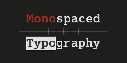 Senpai Coder is a family of typewrighter-style monospaced font for developing, programming, coding, and table layout. Some desirable features in monospaced fonts are listed below. 1.Easy to distinguish 2.Easy to identify 3.Easy to read Senpai Coder has very distinguishing letterforms for confusable letters such as Zero&Oh, One&I, and Two&Z. A lot of ingenuity makes this family very distinguishable. Italics have somewhat large inclination angle to be distinguished from their Roman. For the same reason, Italics are slightly lighter than Romans. Italic is not cursive Italic. It is near the slanted Roman. This is an intentional design to identify Italic letters. Cursive is not suitable for programming font. Typewriter letterform (serif) is good for reading. Common elements for each letterform makes harmony and a sense of unity. Senpai Coder supports almost all Latin languages. Try this all-new experiment.
 - New Epoch by Jonahfonts,
$35.00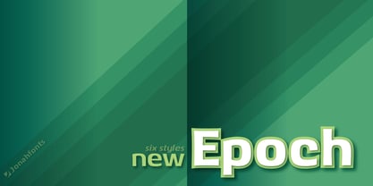 A very graphic font with emphasis on legibility, dynamics and modern. Very suitable for a variety of applications.