4,146 search results
(0.018 seconds)
- Okoye by XO Type Co,
$40.00 Okoye occupies a liminal space between the bonkers curviness of 19th-century grotesques and the sandblasted neutrality of 20th-century models. Both extremes are nice, but there’s something to be said for some neutrality with character left in place, yes? Okoye comes in 9 weights, Thin to Black. If you’re using it for interfaces, each weight lines up from 100-900 in the CSS specification you already know, with Regular sitting at 400 and Bold at 700. You’ll see what you expect to see without extra font-weight specification. There’s extensive Latin language support, a set of small caps which mirrors full-size caps (good for control labels), and arrows. Okoye will be your quirkhorse: hardworking, with personality.
 - Ongunkan Sweden Futhark by Runic World Tamgacı,
$40.00 Prior to 500 AD the 24-rune Elder Futhark was used in Sweden. From 500 AD until 800 AD there were many Futharks which were transitions from the 24-rune Futhark to one of the 16-rune Futharks. By the end of this period the 24-rune Futhark was completely out of use , and only 16-runes Futharks were in use. By 900 AD two different types of Shorttwigs-Futharks had been born. One was popularized in Norway and the other was used in the west (the British islands). By 1000 AD the adjustment of the runes to the Latin alphabet had begun, and several versions are found up until the Dalrunes, about 1700-1800 AD.
 - Framer Sans by 23-Jun,
$35.00 Framer Sans is sans-serif condensed type-family, created by June 23 Foundry. It is a geometric, lightly robust, simple and clean font, with a low contrast width. Framer Sans perfectly conforms to the ever-increasing demand for a diverse set of weights and additional support for non-Latin languages. The type system consists of 7 weights that for the clarity and users convenience is labelled with numbers from 100 to 700 (100 for “Thin”, 200 - “Ultra-Light”, and so on till 700 for “Bold”). It supports full Latin (European) character set, as well as Turkish, Vietnamese, Greek (basic) and Cyrillic languages. Framer Sans includes alternate characters, ligatures, symbols and 253 country codes that perfectly expand the design’s capabilities. Numerals contain six figure sets and Roman numbers. The variety of choices is expanded with additional stylistic sets for lowercases "a" and "g", as well as 3 stylistic sets for Latin uppercases with crossbars and letter “Q”.
 - Metrika by Fidan Fonts,
$21.50 Metrika is a sans serif font inspired by the trends of technology. It's works perfectly for headlines, logos, posters, packaging, T-shirts, postcards and many more. It includes full set of uppercase and lowercase basic characters, multilingual symbols, numerals and punctuation (check the previews in order to see them all). Weight: extra light (200 pt), regular (400 pt), bold (700 pt), outline (400 pt). Style: plain, oblique. Latin-based Language Support (You can check your language typing characters in text box below). A summary of what's included: Metrika extra light (otf) Metrika extra light oblique (otf) Metrika regular (otf) Metrika regular oblique (otf) Metrika bold (otf) Metrika bold oblique (otf) Metrika outline (otf) Metrika outline oblique (otf) Happy creating!
 - Lady Ice - Small Caps - Unknown license

- Moonless by Franzi draws,
$- Moonless is a charming handmade font duo, designed for texts, with a matching display font for titles in four different styles. The text font has true-drawn small caps available as an OpenType feature. In case you have no access to OpenType features, there is "Moonless SC" - the small caps version of the font. Moonless is perfect for children's books, poetry, invitations and design magazines. Moonless for texts comes in four different weights: light regular semi bold bold Moonless SC the small caps version of Moonless Moonless SC Regular is free! :) The display font comes in four styles: regular ("night") engraved ("shine") with dots ("stars") outline ("space") The font name was inspired by one simple word from Farid Attar's poem "The Conference Of The Birds".
 - Etruscania by Beewest Studio,
$10.00 Etruscania font is base on Anchient Etruscan Alphabet. The Etruscan alphabet is an Ancient Italian alphabet used by the Etruscans, an ancient civilization of the central and northern lands, to write their language, from around 700 BC to around 100 AD. The Etruscan alphabet took inspiration from the Phoenician alphabet. The earliest known Etruscan abecedarium inscribed on an ivory wax tablet frame, measuring 8.8x5 cm, was found at Marsiliana near Grosseto, Tuscany in Italy. It dates from around 700 BC.
 - Moranga by Latinotype,
$29.00 Moranga is a contemporary, serif, retro-style typeface with a strong personality. Its design is a mixture between Café Brasil's flowing, organic shapes and elements from 70's popular fonts such as Cooper and Souvenir. Moranga, in 5 weights and matching italics, is the perfect choice for headlines, display use and high-impact or friendly designs. Moranga contains a set of more than 400 characters and supports over 200 Latin-based languages.
 - Misty by Gaslight,
$20.00 Misty - a two weight wild west style serif with numerous alternatives, swashes and irregular alternatives for numerous characters in SC style. Interchanging regular characters with alternatives and vice versa, it allow you to do slightly strange inscriptions. Plus deco style.
 - Saffron by Tall Chai,
$15.00 Saffron is a contemporary, luxurious sans-serif font family with weights ranging from Light (300) to Bold (700). Features: Available in 5 weights Over 320 glyphs supporting extended Latin Ideal for display texts: Titles, Logos and Headlines etc. Perfect for branding and rebranding Supports OpenTypes features like Ligatures and Stylistic Alternates Symbols for 10 major currencies including Bitcoin provided in all weights
 - Ongunkan Danish Futhark by Runic World Tamgacı,
$40.00 THE DANISH RUNES Prior to 500 AD the 24-rune Elder Futhark was used in Denmark. From 500 AD to 800 AD there were many transitional futharks, reflecting a change from the 24-rune Futhark to the 16-rune Futharks. By the end of this period, the 24-rune Futhark went completely out of use and the 16-rune Futharks had prevailed. From 900 AD some of the runes changed, visually and phonetically. This occurred again about 950 AD and 1100 AD due to language changes. Runes dated to 1300 AD show evidence of being influenced by the Latin alphabet. Runes found in Skåne, Halland and Blekinge in Sweden, and runes found in Schleswig-Holstein in Germany, is counted among Danish runes, because in the Runic period, this was Danish land.
 - ChileanBugs - Unknown license

- bithand - Unknown license

- The Youngest by My Creative Land,
$39.00 The Youngest is a unique modern font family that contains a handwritten signature script and a classic mid-contrast elegant classic serif in two styles - Display and Book. Both serif and handwritten script benefit from stylistic alternates and ligatures that give your creativity a wide variety of design options. The Book serif is optimized to be comfortably read on screen in small sizes. The Youngest Script has more than 600 ligatures (100+ unique basic Latin ligatures, their multilingual variations, and 70+ Cyrillic ligatures) to mimic a realistic handwriting. The serif style has a lot to offer too - more than 300 ligatures including 40+ basic latin ligatures, their multilingual variations and 30+ Cyrillic ones. All three styles support most of the Latin based languages as well as have basic (Russian) Cyrillic support. All three styles, as usually, fully unicode mapped and can be used in the majority of applications available on the market.
 - Ongunkan Norwegian Futhark by Runic World Tamgacı,
$40.00 THE NORWEGIAN RUNES The oldest runes discovered in Norway date from 400 AD. They were based upon the 24 - rune Elder Futhark of Germanic origin. Two of the runes in the Elder Futhark, Pertra and Eoh, have never been found in any Norwegian rune text. From 550 AD to 700 AD there was a transition period between the older 24-rune Futhark and the newer 16-rune Futharks. By the end of this period, the 24-rune Futhark went completely out of use and the 16-rune Futharks had prevailed. Then, about 900 AD, the Shorttwiggs-runes were introduced from Sweden. Shortly thereafter, from 1000 AD, Futharks with more than 16 runes became more prevalent, as these were more consistent with the Latin alphabet. These types of runes were used in Norway up to 1800 AD.
 - BD Gitalona Moxa by Balibilly Design,
$19.00 This is an Experimental typeface, a direct descendant of the BD Gitalona font family, which has a supermassive family with Variable technology. However, this version is more on the aesthetic aspect, which is experimental and exploratory. It complements the beauty of the primary typeface that we released separately. If you are a fan of Effectiveness and flexibility, please learn more about BD Gitalona and BD Gitalona Variable! Inspiration The world of entertainment moves non-stop. One by one, figures appeared and left. We expect to create something to entertain previous trends with packaging more relevant to the present. More specifically, we admire and are inspired by some of the world's leading and top singers with a segmented nature. We imagine so many figures that can affect every viewer. However, each artist or singer has a segment because almost all of them have characteristics. The Design The basic design of this typeface begins with a transitional serif shape with sharp, shapeless corners. Then in the middle of the invention, there was an opportunity to explore it further from the readability side by adding an optical variable that can adjust the serif thickness when used together between large, medium to paragraph text sizes for editorials. The shift from serif to sans-serif with the contrast initiated by the shift of the serif family form as a different variable also makes this font richer in terms of the features it contains. Parts are expected to add to the user satisfaction with the complexity of this font. The Features BD Gitalona consists of one sub-family intended for body text with nine weights from Thin(100) to Black(900) and four other display sub-families such as Display serif, Flick, Harmony Sans and Contrast Sans. Each consists of four weights Thin(100), Regular Weight(400), Bold(700), and Black(900). And again, there are also retailed separately; the BD Gitalona Variable font, which is designed to accommodate all Subfamily in 1 font file, and BD Gitalona Moxa, an experimental typeface. A total of 700+ glyphs in each style. Advanced OpenType features functionally and aesthetically, such as Case-sensitive forms, small caps, standard and discretionary ligatures, stylistic alternates, ordinals, fractions, numerator, denominator, superscript, subscript, circled number, slashed zero, old-style figure, tabular and lining figure. Supports multi-languages including Western Europe, Central Europe, Southeast Europe, South America, and Oceania.
 - Tresor by Resistenza,
$39.00 Tresor is a new Sans Serif font family with contrast. It has a classic look and a romantic twist thanks to its extended set of decorative alternates and ligatures. Tresor, meaning “treasure” in French, is full of jewels, including a beautiful collection of swashes. More than 1000 glyphs accessible through OpenType features invite you to customize your test. This stylish & modern font family includes 2 different styles and 3 different weights. The thinnest weight is Tresor 100, with Tresor 200 and 400 you get an extra thickness, heavier weights that are perfect for small sizes. Tresor works beautifully for headlines, weddings invitations, instagram posts, packaging design, stationery and logos.
 - SantaCruz - Unknown license

- Chilespice by Just My Type,
$25.00 Chilespice was originally designed to head a newspaper article on chiles. Use it when you need something verdant and organic.
 - Ah, Verdana! Picture this: you're browsing through your computer, searching for that perfect, clear, and friendly font that just screams "readability." Boom, there you land on Verdana, and it's like ...
- Fifty Fifty by Up Up Creative,
$16.00 Fifty Fifty is an editorial serif font (regular and italic) with smooth curves and more than 100 ligatures. It’s gorgeous in all caps, but the lowercase letters can really hold their own. Fifty Fifty is perfect for headlines, editorial design, monograms, branding, logos, poster design, and more. Fifty Fifty includes approximately 700 glyphs and a whopping 115 standard and discretionary ligatures. Additional OpenType features include character variants, stylistic sets, and multilingual support (including multiple currency symbols).
 - Bunbury by Monotype,
$15.99 For playfulness and something a little less ordinary, Bunbury is a wonderful script that’s packed with personality. Created using a felt marker and available as an all capitals display font, SC Bunbury’s style is sort of awkward and a lot of fun, with defined outlines and uneven line thicknesses that make for letters packed with hand drawn quirks.
 - Levnam by ParaType,
$30.00 Levnam is a sans-serif family with quite wide proportions, slightly thickened terminals and wide sidebearings. The font is well suitable for setting text in small point sizes, similar to Bell Centennial or Verdana. Designed by Manvel Shmavonyan. Released by ParaType in 2015.
 - BD Gitalona Variable by Balibilly Design,
$139.00 We introduce our Variable Font from the high-complex BD Gitalona font family. Consisting of 3 axes; weight, optical size, and serif, that will give you a different experience extending the family of BD Gitalona. We don't want to mention how many families can be generated from this variable font. During the development process, we got up to more than 50 families and stopped to allow you to continue to play with the slide buttons. And again, BD Gitalona is filled with an explorative and experimental decorative version that we present separately. Figure out the decorative version BD Gitalona Moxa to make the aesthetic appeal of this whole typeface here! Inspiration The world of entertainment moves non-stop. One by one, figures appeared and left. We expect to create something to entertain previous trends with packaging more relevant to the present. More specifically, we admire and are inspired by some of the world's leading and top singers with a segmented nature. We imagine so many figures that can affect every viewer. However, each artist or singer has a segment because almost all of them have characteristics. The Design The basic design of this typeface begins with a transitional serif shape with sharp, shapeless corners. Then in the middle of the invention, there was an opportunity to explore it further from the readability side by adding an optical variable that can adjust the serif thickness when used together between large, medium to paragraph text sizes for editorials. The shift from serif to sans-serif with the contrast initiated by the shift of the serif family form as a different variable also makes this font richer in terms of the features it contains. Parts are expected to add to the user satisfaction with the complexity of this font. The Features BD Gitalona consists of one sub-family intended for body text with nine weights from Thin(100) to Black(900) and four other display sub-families such as Display serif, Flick, Harmony Sans and Contrast Sans. Each consists of four weights Thin(100), Regular Weight(400), Bold(700), and Black(900). And again, there are also retailed separately; the BD Gitalona Variable font, which is designed to accommodate all Subfamily in 1 font file, and BD Gitalona Moxa, an experimental typeface. A total of 700+ glyphs in each style. Advanced OpenType features functionally and aesthetically, such as Case-sensitive forms, small caps, standard and discretionary ligatures, stylistic alternates, ordinals, fractions, numerator, denominator, superscript, subscript, circled number, slashed zero, old-style figure, tabular and lining figure. Supports multi-languages including Western Europe, Central Europe, Southeast Europe, South America, and Oceania.
 - BD Gitalona by Balibilly Design,
$22.00 We introduce our high-complex typeface. A wide range of serifs for text and display titles are divided into one prominent sub-family and four display sub-families. Comes shifted from serif to sans serif to fulfilling the completeness of this font family that we named BD Gitalona. In addition to these massive things, this font family is filled with an explorative and experimental decorative version that we present separately. Figure out the decorative version BD Gitalona Moxa to make the aesthetic appeal of this whole typeface! Inspiration The world of entertainment moves non-stop. One by one, figures appeared and left. We expect to create something to entertain previous trends with packaging more relevant to the present. More specifically, we admire and are inspired by some of the world's leading and top singers with a segmented nature. We imagine so many figures that can affect every viewer. However, each artist or singer has a segment because almost all of them have characteristics. The Design The basic design of this typeface begins with a transitional serif shape with sharp, shapeless corners. Then in the middle of the invention, there was an opportunity to explore it further from the readability side by adding an optical variable that can adjust the serif thickness when used together between large, medium to paragraph text sizes for editorials. The shift from serif to sans-serif with the contrast initiated by the shift of the serif family form as a different variable also makes this font richer in terms of the features it contains. Parts are expected to add to the user satisfaction with the complexity of this font. The Features BD Gitalona consists of one sub-family intended for body text with nine weights from Thin(100) to Black(900) and four other display sub-families such as Display serif, Flick, Harmony Sans and Contrast Sans. Each consists of four weights Thin(100), Regular Weight(400), Bold(700), and Black(900). And again, there are also retailed separately; the BD Gitalona Variable font, which is designed to accommodate all Subfamily in 1 font file, and BD Gitalona Moxa, an experimental typeface. A total of 700+ glyphs in each style. Advanced OpenType features functionally and aesthetically, such as Case-sensitive forms, small caps, standard and discretionary ligatures, stylistic alternates, ordinals, fractions, numerator, denominator, superscript, subscript, circled number, slashed zero, old-style figure, tabular and lining figure. Supports multi-languages including Western Europe, Central Europe, Southeast Europe, South America, and Oceania.
 - Kyotce by Soerat Company,
$24.00 Kyotce is inspired by the Egyptian serif which has a strong and bold typeface. This family of 8 weights from Light to Bold along with italics and is perfect for advertising, packaging, logo, editorial and publishing, branding and other creative industries. Each style includes 700+ glyphs, Kyoto supports around 200 languages in the Latin and Cyrillic. This font provides advanced typographic support with features such as ligatures, alternate characters, old-style figures, fractions, numerator/denominator, superior/inferior, and various symbols.
 - Orchid Key by Missy Meyer,
$12.00 I built the Orchid Key font family from the ground up with the idea that there would be several different styles; the Inline Spurs style was the first to be built, which let me then subtract the spurs, inline slices, or both to make the other styles. I've never made a font quite like this before, which shows in the time it took - it's been over 5 months since I started construction! Each style contains the same character set, with 700 total glyphs. Each has the usual basics: letters, numbers, and punctuation; plus over 300 extended Latin characters for language support, and almost 200 alternates for tons of variety! There's a swash alternate for every uppercase letter, at least 6 alternates for every single lowercase letter, and a set of 10 extra swashes and flourishes so you can customize! Whether you're looking for a western or country look, a retro look, or a modern hipster look for your project, check out Orchid Key!
 - Gather round, fellow digital travelers, for the tale of Verdana, the oft-overlooked hero of our screens. Born in the digital renaissance of the 1990s, Verdana was a child prodigy among fonts, designe...
- Battleslab by Kostic,
$40.00 Battleslab is a slab serif made for setting few words in large sizes. Two heavily contrasted weights work well when combined, with its mono-line wide light and heavy black it is perfect for making that "one-two punch" in headlines or logotypes. Display oriented Battleslab derived from Battlefin Family (which is much more comprehensive with its ligatures, italics and SC).
 - Novelo by AcidType,
$60.00 Novelo is a 9 weight neo-grotesk typeface family. Featuring; over 800 characters and symbols, including over 100 ligatures, with extended language support, and true italics. The wide selection of alternate characters allows for deep customisation, making the Novelo family a powerful and flexible toolkit for the modern designer.
 - Adamant BG - 100% free

- The Subway Types by HVD Fonts,
$30.00 The idea was to create a package containing prominent tag styles of graffiti strongholds like New York, Berlin and Paris. Shik (New York), Deon (Paris) and Etan (Berlin) came together to show the typical tag styles of their respective metropolitan areas. The fonts were digitized, spaced, kerned and programmed by Hannes von Döhren. The Subway Types are highly equipped. Each one consists of 4 alphabets (Uppercase, Lowercase, Small Caps & Swash). They also include ligatures and some specials like underlines and a huge range of accents for a wide language support. With the OpenType technology these features can be applied easily. For those who never used the OpenType features, we created the Std (Standard) and the SC (Small Caps) versions of the fonts. They contain the same basic characters like the OT versions but are split in two fonts. Hence you don’t need any OpenType knowledge to use the Std and SC fonts.
 - Barbaros by MoodyType,
$49.00 An Art Deco condensed display sans font with 8 styles, +800 glyphs, +100 ligatures, +30 languages and many opentype features. It is perfect for poster designs, magazines, book covers, logotypes, headlines, newspapers and press. It's bold, daring, modern, geometric and covers a good range of weights from light to block.
 - Gabriela by Latinotype Mexico,
$29.00 The Gabriela project is of great importance to us since it is the first font published by Latinotype México which is our brand-new sister foundry in Mexico. Gabriela, yet more versatile, shares all of its DNA with Gabriela Stencil. The font is an excellent choice for short and medium-length text. Gabriela is a Didone typeface well-suited to classy branding and editorial designs. Its alternate version includes swashes and more than 300 glyphs and 75 ligatures, allowing for more stylized designs. It may look different from its "regular" counterpart, but the essence of both is the same. Gabriela comes in 9 styles, ranging from Thin to Black, and includes matching true italics. Each font weight has an average of 750 characters which support more than 200 Latin-based languages.
 - Alchemist by Carmel Type Co.,
$39.00 Inspirited as much by nature and the elements as it was by the decorative and ornate alphabets of early sign-painting and lettering books, Alchemist aspires to become the next surefire, go-to staple in the display type community. This semi-condensed, high contrast, and stylish take on classic Roman forms is certain to stand out in your arsenal.Alchemist lends itself adeptly to signage, headlines, cinematic and gaming titles, packaging design and much more. This protean display face can shift and adapt to your every need with over 100 alternate characters and more than 40 ligatures. Explore this massive 500+ character font today and see what you can create with it. 100+ Stylistic Alternates Standard & Discretionary Ligatures Uppercase & Lowercase Numerals & Punctuation 500+ glyphs Supports 75+ Latin based languages OTF file Design by Jason Carne
 - Medieval Pixel VP by VP Type,
$11.00 Medieval Pixel VP is a highly stylized family of three fonts that combine familiar pixelfont forms with unique sharp details - evocative of a fantasy and historical aesthetic, retro video games, and horror movies. All styles include an extensive character set and numerous advanced OpenType features. Over 800 glyphs in each font ensure full support for over 200 languages.
 - Lansonia by Bosstypestudio,
$12.00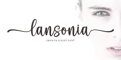 Lansonia is a modern calligraphy font with a dancing baseline and a clean, classic and elegant touch. It can be used for various purposes such as headings, signature, logos, wedding invitations, t-shirt, letterhead, signage, lable, news, posters, badges etc.Hello Bella Script features 300 total glyphs with 100 alternate characters including OpenType Stylistic alternates, ligatures and international language suppor
 - Syntho by Gspr one,
$5.00 Syntho is a modular typeface with 18 variants and a Variable Font. Its structure is geometric and modular, but its proportions resemble those of classic grotesque typefaces, giving it a familiar feel to the designer. It also includes two subfamilies, 200 and 300, which are expansions of the typeface in width, providing greater possibilities for the designer in any project.
 - dearJoe 3 by JOEBOB graphics,
$39.00 Finally it’s done! The DearJoe 3 ‘Ultimate handwriting’ font, composed of scanned handwriting which makes it look quite convincingly real. It contains over 500 characters, 200 of them ligatures. Typing your text with this font feels like old-school writing with a pen, especially since every word will be constructed of different letter combinations. Give it a try and you’ll probably be surprised…
 - HGB Info OSF by HGB fonts,
$20.00 It's nice when a font provides old style figures, small caps and alternate letters. But what to do if my typesetting program doesn't support Open Type features? The solution may be old-fashioned, but it's effective: the variants are placed in separate font families: Standard, Old Style Figures (OSF), and Small Caps (SC). Any word processor can handle it. As a special feature, my OSF fonts also contain alternative letters such as a looped g or descenders in the italic f.


